The CSS position property decides what top, right, bottom and left are measured from. static (the default) ignores them. relative measures from the element's own normal spot.
absolute measures from the nearest positioned ancestor. fixed measures from the viewport. sticky scrolls normally, then holds at the offset you give it.
Try it first. Switch the value and change top and left. The green outline shows what the box is measured from.
<!doctype html>
<html lang="en">
<head>
<meta charset="utf-8">
<meta name="viewport" content="width=device-width, initial-scale=1">
<title>CSS position playground</title>
<style>
  body { margin: 0; font-family: system-ui, sans-serif; background: #f4f5f7; color: #1d2330; }
  .controls { display: flex; flex-wrap: wrap; gap: 8px 14px; align-items: center; padding: 12px 14px 8px; }
  .modes { display: flex; flex-wrap: wrap; gap: 4px; }
  .modes label {
    padding: 6px 10px; border-radius: 8px; background: #fff; border: 1px solid #d5d9e0;
    font: 600 13px ui-monospace, Consolas, monospace; cursor: pointer;
  }
  .modes input { position: absolute; opacity: 0; }
  .modes label:has(input:checked) { background: #1d2330; color: #fff; border-color: #1d2330; }
  .num { font: 600 13px ui-monospace, Consolas, monospace; }
  .num input { width: 52px; padding: 5px; font: inherit; border: 1px solid #d5d9e0; border-radius: 6px; }
  #note { margin: 0 14px 8px; font-size: 14px; line-height: 1.4; min-height: 40px; }

  .scroller {                      /* the scrolling container */
    height: 260px; margin: 0 14px; overflow: auto;
    background: #fff; border: 1px solid #d5d9e0; border-radius: 10px; padding: 0 12px;
  }
  .scroller p { margin: 12px 0; color: #6b7280; font-size: 14px; }
  .parent {                        /* the positioned ancestor */
    position: relative;
    padding: 10px; margin: 12px 0; background: #eef4ff; border-radius: 8px;
  }
  .parent code { font-size: 12px; color: #1d4ed8; }
  .box {
    position: static; top: 20px; left: 20px;   /* the demo changes these */
    width: 90px; padding: 10px 0; text-align: center; border-radius: 8px;
    background: #2563eb; color: #fff; font-weight: 700; z-index: 2;
    pointer-events: none;   /* so it never blocks the buttons when it lands on them */
  }
  .ghost { position: fixed; pointer-events: none; border: 2px dashed #16a34a; border-radius: 8px; z-index: 3; }
  .ghost span {
    position: absolute; top: -2px; left: -2px; padding: 2px 6px; border-radius: 6px 0 6px 0;
    background: #16a34a; color: #fff; font: 700 11px ui-monospace, Consolas, monospace;
  }
</style>
</head>
<body>
<div class="controls">
  <div class="modes" id="modes">
    <label><input type="radio" name="pos" value="static" checked>static</label>
    <label><input type="radio" name="pos" value="relative">relative</label>
    <label><input type="radio" name="pos" value="absolute">absolute</label>
    <label><input type="radio" name="pos" value="fixed">fixed</label>
    <label><input type="radio" name="pos" value="sticky">sticky</label>
  </div>
  <label class="num">top <input type="number" id="top" value="20" step="10"></label>
  <label class="num">left <input type="number" id="left" value="20" step="10"></label>
</div>
<p id="note"></p>

<div class="scroller" id="scroller">
  <p>Scroll this box. Line 1.</p>
  <p>Line 2 of the scrolling container.</p>
  <div class="parent" id="parent">
    <code>.parent { position: relative }</code>
    <p>Text before the box.</p>
    <div class="box" id="box">box</div>
    <p>Text after the box.</p>
    <p>More text inside the parent.</p>
    <p>Still inside the parent.</p>
    <p>End of the parent.</p>
  </div>
  <p>Line 3, after the parent.</p>
  <p>Line 4.</p>
  <p>Line 5.</p>
  <p>Line 6.</p>
  <p>Line 7.</p>
  <p>Line 8, the end.</p>
</div>

<!-- green outline: what top and left are measured from -->
<div class="ghost" id="ghost"><span id="ghostLabel"></span></div>

<script>
  const box = document.getElementById('box');
  const parent = document.getElementById('parent');
  const scroller = document.getElementById('scroller');
  const ghost = document.getElementById('ghost');
  const ghostLabel = document.getElementById('ghostLabel');
  const note = document.getElementById('note');
  const topIn = document.getElementById('top');
  const leftIn = document.getElementById('left');

  const notes = {
    static: 'static: the default. The box sits in the normal flow and top/left are ignored.',
    relative: 'relative: moved from its own normal spot. The gap it left behind stays empty.',
    absolute: 'absolute: taken out of the flow, placed from the nearest positioned ancestor (.parent).',
    fixed: 'fixed: placed from the viewport. Scroll the box: it does not move.',
    sticky: 'sticky: scrolls normally until it is top px from the scroller\'s edge, then sticks until .parent ends.'
  };

  // Outline the padding box of an element (the edges top/left are measured from)
  function outline(el, label) {
    const r = el.getBoundingClientRect();
    ghost.style.display = 'block';
    ghost.style.left = (r.left + el.clientLeft) + 'px';
    ghost.style.top = (r.top + el.clientTop) + 'px';
    ghost.style.width = el.clientWidth + 'px';
    ghost.style.height = el.clientHeight + 'px';
    ghostLabel.textContent = label;
  }

  function update() {
    const mode = document.querySelector('input[name=pos]:checked').value;
    box.style.position = mode;
    box.style.top = topIn.value + 'px';
    box.style.left = leftIn.value + 'px';
    note.textContent = notes[mode];
    ghost.style.clipPath = 'none';

    if (mode === 'static') {
      ghost.style.display = 'none';
    } else if (mode === 'relative') {
      // the normal spot = where the box is now, minus the offset
      const r = box.getBoundingClientRect();
      Object.assign(ghost.style, {
        display: 'block', left: (r.left - topLeft().left) + 'px', top: (r.top - topLeft().top) + 'px',
        width: r.width + 'px', height: r.height + 'px'
      });
      ghostLabel.textContent = 'normal spot';
      clipTo(scroller);
    } else if (mode === 'absolute') {
      outline(parent, '.parent');
      clipTo(scroller);
    } else if (mode === 'fixed') {
      Object.assign(ghost.style, { display: 'block', left: '0px', top: '0px', width: innerWidth + 'px', height: innerHeight + 'px' });
      ghostLabel.textContent = 'viewport';
    } else {
      outline(scroller, 'scroller');
    }
  }

  // Hide the part of the outline that has scrolled out of the scroller
  function clipTo(el) {
    const c = el.getBoundingClientRect(), g = ghost.getBoundingClientRect();
    const px = (n) => Math.max(0, n) + 'px';
    ghost.style.clipPath = 'inset(' + [px(c.top - g.top), px(g.right - c.right), px(g.bottom - c.bottom), px(c.left - g.left)].join(' ') + ')';
  }

  function topLeft() {
    return { top: Number(topIn.value) || 0, left: Number(leftIn.value) || 0 };
  }

  document.getElementById('modes').addEventListener('change', update);
  topIn.addEventListener('input', update);
  leftIn.addEventListener('input', update);
  scroller.addEventListener('scroll', update);
  window.addEventListener('resize', update);
  update();
</script>
</body>
</html>
Notice that static ignores both number fields, and that with absolute and fixed the text closes up where the box used to be.
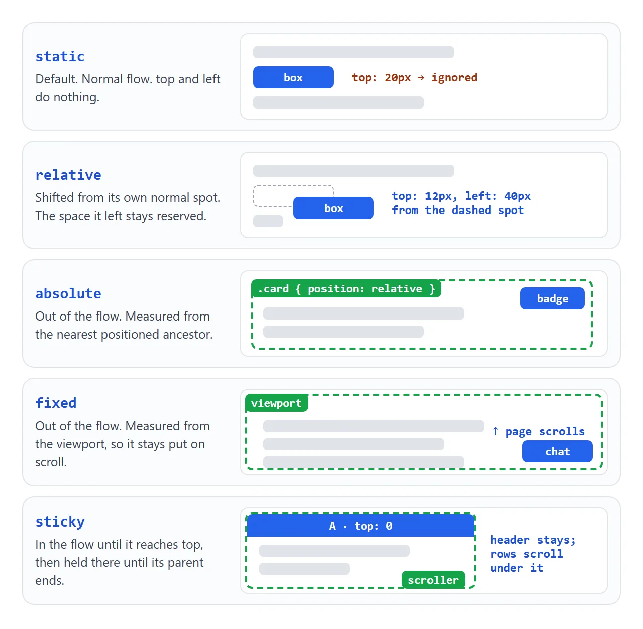
| Value | Stays in the flow? | top / left measured from | Typical use |
|---|---|---|---|
static |
Yes | Ignored | Everything, by default |
relative |
Yes, space kept | Its own normal spot | Small nudges; a parent for absolute children |
absolute |
No | Nearest positioned ancestor | Badges, overlays, close buttons |
fixed |
No | The viewport | Chat buttons, cookie bars, fixed headers |
sticky |
Yes | The edge of its scrolling box | Section headings, table headers |
"Out of the flow" means the other elements behave as if the box were not there. They close up the space, and the box can land on top of them.
absolute and the nearest positioned ancestor
An absolute element does not measure from its parent. It measures from its containing block: the nearest ancestor whose position is anything other than static. The edges it uses are that ancestor's padding edges, inside the border.
The browser walks up the tree from the element, skipping every static ancestor. If it reaches the top without finding one, it uses the initial containing block, a viewport-sized rectangle at the top of the page.
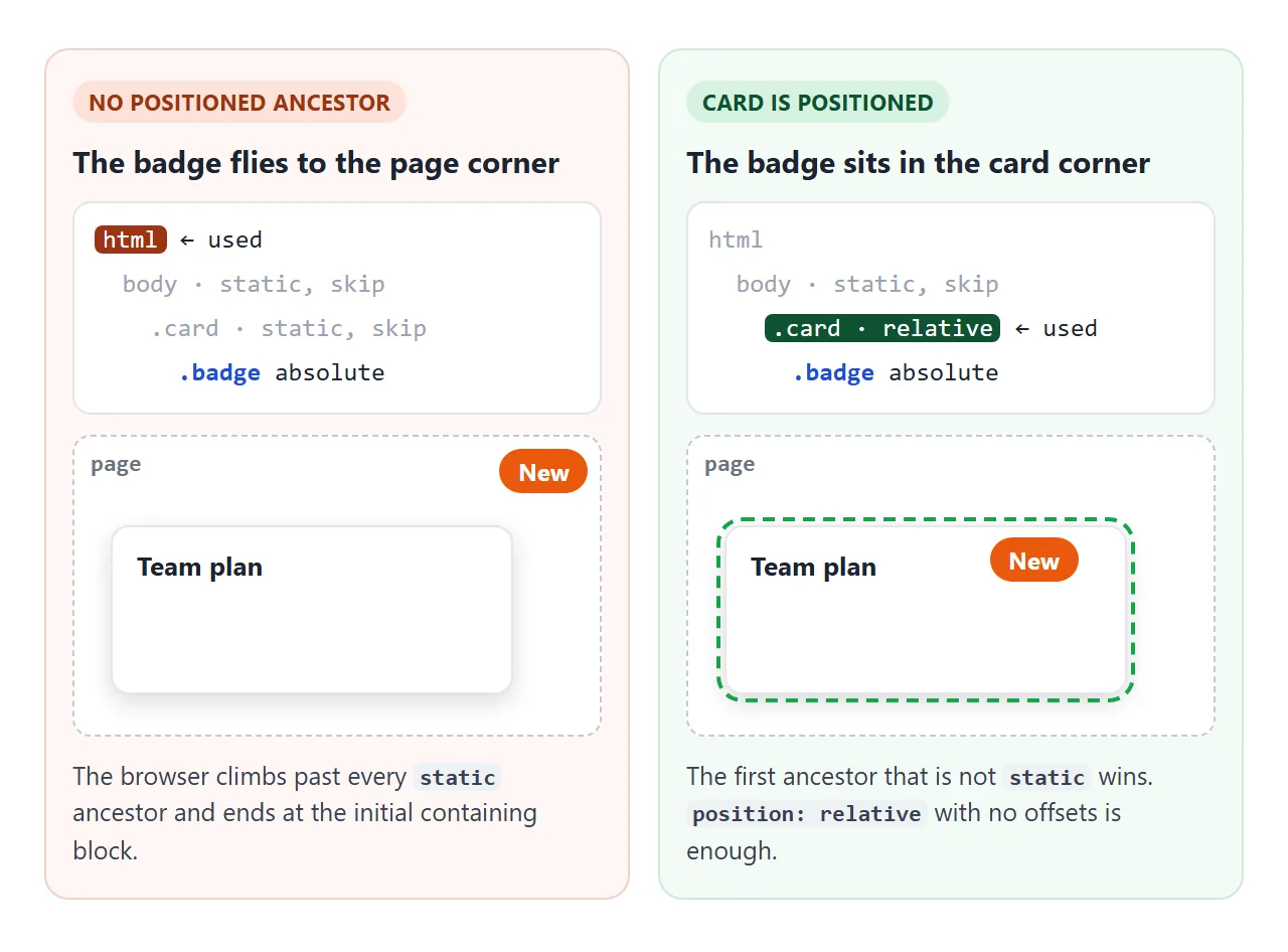
That is why a badge written for the corner of a card lands in the corner of the page. Toggle the checkbox and watch it move:
<!doctype html>
<html lang="en">
<head>
<meta charset="utf-8">
<meta name="viewport" content="width=device-width, initial-scale=1">
<title>Absolute badge and its parent</title>
<style>
  body { margin: 0; padding: 16px; font-family: system-ui, sans-serif; background: #f4f5f7; color: #1d2330; }
  .toggle { display: flex; gap: 8px; align-items: center; font-size: 15px; cursor: pointer; }
  .toggle input { width: 18px; height: 18px; }
  pre {
    margin: 10px 0 18px; padding: 10px 12px; border-radius: 8px; background: #1d2330; color: #e5e7eb;
    font: 13px/1.5 ui-monospace, Consolas, monospace; white-space: pre-wrap;
  }
  .card {
    max-width: 300px; padding: 18px; border-radius: 12px;
    background: #fff; box-shadow: 0 4px 14px rgba(0, 0, 0, .1);
  }
  .card.positioned { position: relative; }   /* the switch: now the badge measures from the card */
  .card h3 { margin: 0 0 6px; }
  .card p { margin: 0; color: #6b7280; }
  .badge {
    position: absolute; top: 8px; right: 8px;  /* 8px from the top-right corner of... what? */
    padding: 4px 10px; border-radius: 99px;
    background: #ea580c; color: #fff; font: 700 12px system-ui, sans-serif;
  }
</style>
</head>
<body>
<label class="toggle"><input type="checkbox" id="fix"> Give the card <b>position: relative</b></label>
<pre id="code"></pre>

<div class="card" id="card">
  <h3>Team plan</h3>
  <p>Up to 10 people, shared folders.</p>
  <span class="badge">New</span>
</div>

<script>
  const card = document.getElementById('card');
  const code = document.getElementById('code');

  function update() {
    const on = document.getElementById('fix').checked;
    card.classList.toggle('positioned', on);
    code.textContent = on
      ? '.card  { position: relative; }\n.badge { position: absolute; top: 8px; right: 8px; }\n/* badge sits in the card corner */'
      : '.card  { }  /* static */\n.badge { position: absolute; top: 8px; right: 8px; }\n/* no positioned ancestor: badge goes to the page corner */';
  }

  document.getElementById('fix').addEventListener('change', update);
  update();
</script>
</body>
</html>
position: relative with no offsets is the usual fix. It does not move the card at all. It only makes the card the reference for anything absolute inside it. An ancestor with a transform also becomes the containing block, even while it stays static.
Badges, overlays and centering
The pattern behind every badge, ribbon and caption strip is the same four steps:
- Give the card
position: relative. - Give the badge
position: absolute. - Set two offsets for a corner, such as
top: 10px; right: 10px. - Add
overflow: hiddenon the card if the corner is rounded or the overlay must be clipped.
.card    { position: relative; overflow: hidden; }
.badge   { position: absolute; top: 10px; right: 10px; }
.caption { position: absolute; left: 0; right: 0; bottom: 0; }
Setting both left and right on an absolute element stretches it between the two edges. That is how the caption spans the full width without a width value.
inset: 0 is short for all four offsets set to zero, and makes an overlay that covers the whole card.
When two positioned elements overlap, the later one in the HTML paints on top. To change that order, use z-index. CSS z-index covers why a large number sometimes still loses.
To center something over the card, such as a play button, two recipes cover it. Both need the parent to be positioned.
/* 1. Known size: stretch to all four edges, then let margin: auto center it */
.center { position: absolute; inset: 0; margin: auto; width: 52px; height: 52px; }

/* 2. Any size: move the top-left corner to the middle, then pull back by half */
.center { position: absolute; top: 50%; left: 50%; transform: translate(-50%, -50%); }
The first one needs a width and height. Without them, a div simply stretches to fill the parent.
The second one works with any size, because translate percentages refer to the element's own size. If the element is not an overlay and can stay in the flow, flexbox centering is usually simpler.
fixed, and why it sometimes scrolls
A fixed element is placed from the viewport, so it stays in the same spot on screen while the page scrolls. That makes it suitable for a chat button or a bar along the bottom edge.
There is one catch. If any ancestor has a transform, perspective or filter other than none, among a few other properties, that ancestor becomes the containing block for fixed descendants. The element is then fixed to the ancestor, and scrolls away with it.
.page-wrapper { transform: translateZ(0); } /* fixed children now stick to this, not the screen */
The fix is to move the fixed element out of that ancestor, for example as the last child of body, or to drop the transform. CSS transform explains what else a transform changes.
sticky: a threshold, a scroller and a parent
A sticky element stays in the flow and scrolls like a static one until it reaches the offset you gave it. Then it holds there, but only as long as its parent is still on screen.
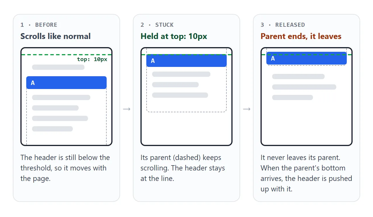
Three things have to be true for it to stick:
- A threshold.
top: 0(orbottom,left,right). With none set, sticky behaves likerelative. - The right scroller. It sticks inside its nearest ancestor with
overflowset tohidden,autoorscroll. If that ancestor does not actually scroll, nothing happens. - Room in the parent. It never leaves its parent. If the parent is only as tall as the sticky element, there is no distance to travel.
For a page header specifically, HTML sticky header covers the sticky versus fixed choice and the anchor links that land underneath it.
A finished example: badge, overlay and sticky headings
This combines the patterns above. The card holds a corner badge, a centered play button and a caption along the bottom, all absolute inside a relative card. The list next to it scrolls on its own and each letter heading is sticky inside its section.
<!doctype html>
<html lang="en">
<head>
<meta charset="utf-8">
<meta name="viewport" content="width=device-width, initial-scale=1">
<title>Badge, overlay caption and sticky headers</title>
<style>
body { margin: 0; padding: 16px; font-family: system-ui, sans-serif; background: #f4f5f7; color: #1d2330; }
.wrap { display: flex; flex-wrap: wrap; gap: 16px; align-items: flex-start; }
/* 1. Card with a corner badge and an overlay caption */
.card {
position: relative; /* containing block for the badge and caption */
width: 260px; height: 180px; border-radius: 12px; overflow: hidden;
background: linear-gradient(135deg, #0ea5e9, #6366f1 60%, #a855f7);
}
.badge {
position: absolute; top: 10px; right: 10px;
padding: 4px 10px; border-radius: 99px; background: #fff; color: #1d2330;
font-size: 12px; font-weight: 700;
}
.play { /* centered: inset 0 + margin auto + a fixed size */
position: absolute; inset: 0; margin: auto;
width: 52px; height: 52px; border-radius: 50%; border: 0;
background: rgba(255, 255, 255, .9); font-size: 20px; cursor: pointer;
}
.caption {
position: absolute; left: 0; right: 0; bottom: 0; /* stretched along the bottom edge */
padding: 22px 12px 10px; color: #fff;
background: linear-gradient(transparent, rgba(0, 0, 0, .65));
}
.caption b { display: block; }
.caption small { opacity: .85; }
/* 2. Scrolling list with sticky section headers */
.list {
width: 260px; height: 260px; overflow: auto; /* the scrolling ancestor */
border-radius: 12px; background: #fff; box-shadow: 0 4px 14px rgba(0, 0, 0, .08);
}
.list h4 {
position: sticky; top: 0; /* sticks to the top of .list, until its section ends */
margin: 0; padding: 6px 12px; background: #1d2330; color: #fff; font-size: 13px;
}
.list ul { margin: 0; padding: 0; list-style: none; }
.list li { padding: 10px 12px; border-bottom: 1px solid #eef1f5; font-size: 14px; }
#log { flex-basis: 100%; margin: 0; font-size: 14px; color: #374151; }
</style>
</head>
<body>
<div class="wrap">
<div class="card">
<span class="badge">4K</span>
<button class="play" id="play" aria-label="Play">▶</button>
<div class="caption"><b>Harbour at dawn</b><small>2 min 14 s</small></div>
</div>
<div class="list" id="list">
<section><h4>A</h4><ul><li>Ada</li><li>Alan</li><li>Amir</li><li>Anna</li></ul></section>
<section><h4>B</h4><ul><li>Bea</li><li>Ben</li><li>Bora</li></ul></section>
<section><h4>C</h4><ul><li>Cara</li><li>Chen</li><li>Cleo</li><li>Cyrus</li></ul></section>
<section><h4>D</h4><ul><li>Dana</li><li>Dev</li><li>Dora</li></ul></section>
</div>
<p id="log">Scroll the list: each letter sticks, then the next one pushes it away.</p>
</div>
<script>
document.getElementById('play').addEventListener('click', () => {
document.getElementById('log').textContent = 'Play clicked. The button stays centered at any card size.';
});
</script>
</body>
</html>
Each heading is wrapped in a <section> with its names. That wrapper is the parent that ends, so heading A leaves when section A has scrolled past, and heading B takes its place.
When it does not work
| What you see | Cause | Fix |
|---|---|---|
| An absolute element jumps to the page corner | No ancestor is positioned | position: relative on the intended parent |
top and left do nothing |
The element is position: static |
Set relative, absolute, fixed or sticky |
| Sticky scrolls away like normal | No top (or other offset) value |
Add top: 0 |
| Sticky does nothing inside a wrapper | An ancestor has overflow: hidden or auto |
Remove it, or use overflow: clip |
| Sticky lets go almost at once | The parent is barely taller than the sticky element | Put the sticky element in the taller container it should travel through |
| A fixed element scrolls with the page | An ancestor has transform, filter or perspective |
Move the element out of that ancestor |
| Content is hidden under a fixed header | Fixed removes the header from the flow | padding-top on body equal to the header height, or use sticky |
| Anchor links land under the header | The browser scrolls the target to the very top | scroll-padding-top on html |
Share it as a link
Positioning is easier to show than to describe. A screenshot cannot scroll, so it cannot show a sticky heading holding or a fixed button staying put, and an .html attachment may open as plain code on a phone.
To send the working version, paste the page into a NOS document and choose Create share link. HTML to link walks through it.
The page renders as written and its scripts run, so the people you send it to can scroll and click it themselves. If you change the code later, the same link shows the new version.