An HTML sticky header is a header given position: sticky and top: 0 in CSS.
header {
  position: sticky;
  top: 0;
  z-index: 10;
  background: #0e1014;
  border-bottom: 1px solid #23262d;
}
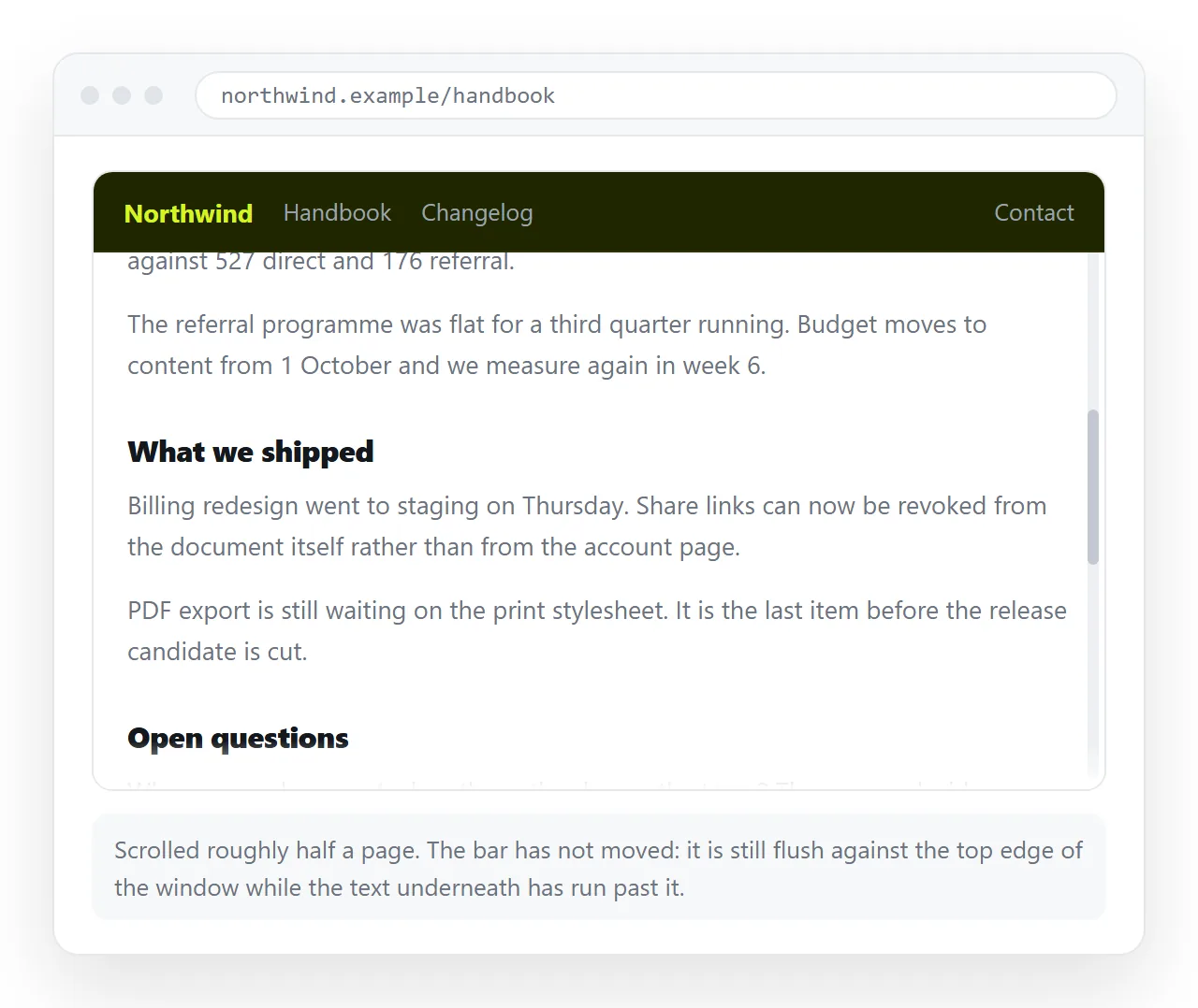
Both declarations are required. position: sticky with no top value never sticks to anything, and produces no warning of any kind.
HTML sticky header versus fixed header
sticky |
fixed |
|
|---|---|---|
| Stays in the document flow | Yes | No |
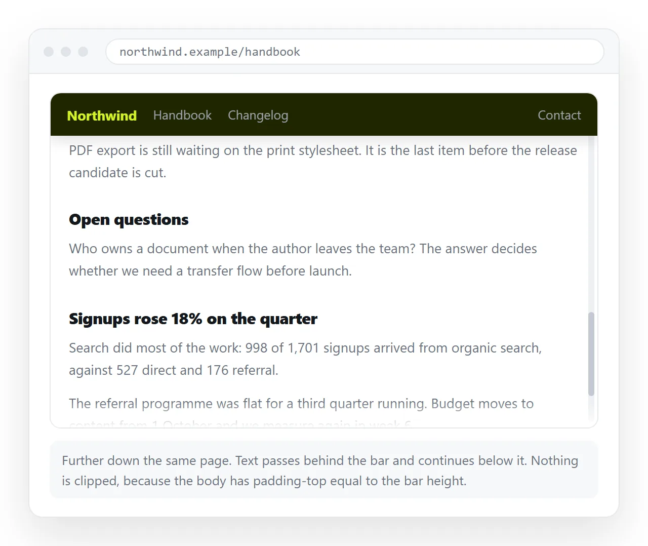
| Content slides under it | No | Yes, unless you pad |
| Scrolls with the page first | Yes, until it reaches top |
No, pinned from the start |
| Confined by its parent | Yes | No, relative to the viewport |
| Broken by ancestor overflow | Yes | No |
Sticky is the right default for a page header. It needs no padding compensation on the body and it cannot overlap the first paragraph, which is the single most common bug with fixed headers.
Fixed is right when the bar must be visible from the first pixel and the page below is a scrolling region, which is the header and footer case.
The four reasons sticky does nothing
No top value. The most common by a distance. Sticky positions against an offset, and with none given there is nothing to stick to.
An ancestor has overflow set. Any ancestor with overflow: hidden, auto or scroll becomes the scrolling context, and the header sticks inside that box instead of the page. This is frequently a wrapper someone added to clip a decoration.
.wrapper { overflow-x: hidden; } /* this silently kills sticky inside it */
Replace that with overflow-x: clip, which clips without creating a scroll container.
The parent is not tall enough. A sticky element only travels within its parent. If the header's parent ends after 300 pixels, the header unsticks there and scrolls away with it.
The scroll container has a fixed height with no overflow. Nothing scrolls, so nothing sticks.
The background and the layer
header { background: #0e1014; }
Without an opaque background, the page content scrolls visibly through the header text. It looks like a rendering fault and is simply a missing fill.
z-index matters because the header is now a positioned element competing with whatever else is positioned. Give it a value, and keep it modest so a modal can still appear above it.
Be aware that the header creating a stacking context is exactly what traps modals nested inside it. Keep modals at the end of <body>, or use <dialog> with showModal(), which is drawn above everything.
Anchor links landing underneath
The browser scrolls a target to the very top of the viewport. The header now covers that strip, so the heading you linked to ends up hidden.
:target, h2, h3 { scroll-margin-top: 4.5rem; }
Set the value to the header height plus a little breathing room. This is CSS only and needs no script.
Smooth scrolling is a separate line and worth pairing with a preference check:
html { scroll-behavior: smooth; }
@media (prefers-reduced-motion: reduce) { html { scroll-behavior: auto; } }
Height on small screens
A header that takes a third of a phone screen leaves very little room for the page. Shrink it, or hide part of it.
@media (max-width: 40rem) {
  header { padding: .4rem .75rem; }
  header .subtitle { display: none; }
}
A common pattern is to hide the header on scroll down and show it on scroll up. It works and it costs a scroll listener plus a transform. Decide whether the returned space is worth a component that moves under the reader.
Sticky section headings
The same two declarations work on anything, not only the page header. A heading inside a long list can stick while its own section is on screen and then be pushed off by the next one.
h2 { position: sticky; top: 3.5rem; background: #0e1014; padding: .5rem 0; }
The top value is the page header height, so the two stack rather than overlap. This is where the sticky behaviour earns its keep: each heading is confined to its parent, so it leaves automatically when its section ends.
For that to happen, each section needs to be a real element wrapping its heading and content. A flat sequence of headings and paragraphs with no wrapper gives every heading the whole page as its parent, and they pile up.
<section><h2>Q1</h2><p>...</p></section>
<section><h2>Q2</h2><p>...</p></section>
The same idea applied to a table is in sticky table headers, where the container is the table rather than a section.
Shrinking the header after scroll
If you want the header to compact once the page moves, use an IntersectionObserver rather than a scroll listener.
<div id="sentinel"></div>
new IntersectionObserver(function (e) {
  document.querySelector('header').classList.toggle('is-small', !e[0].isIntersecting);
}).observe(document.getElementById('sentinel'));
The sentinel sits above the header. When it leaves the viewport, the header is pinned. This fires once per state change rather than on every scroll frame.
Printing
A sticky header prints on the first page only, which is usually what you want. If it is repeating or getting in the way:
@media print { header { position: static; } }
Print stylesheets cover the rest.
Checking it
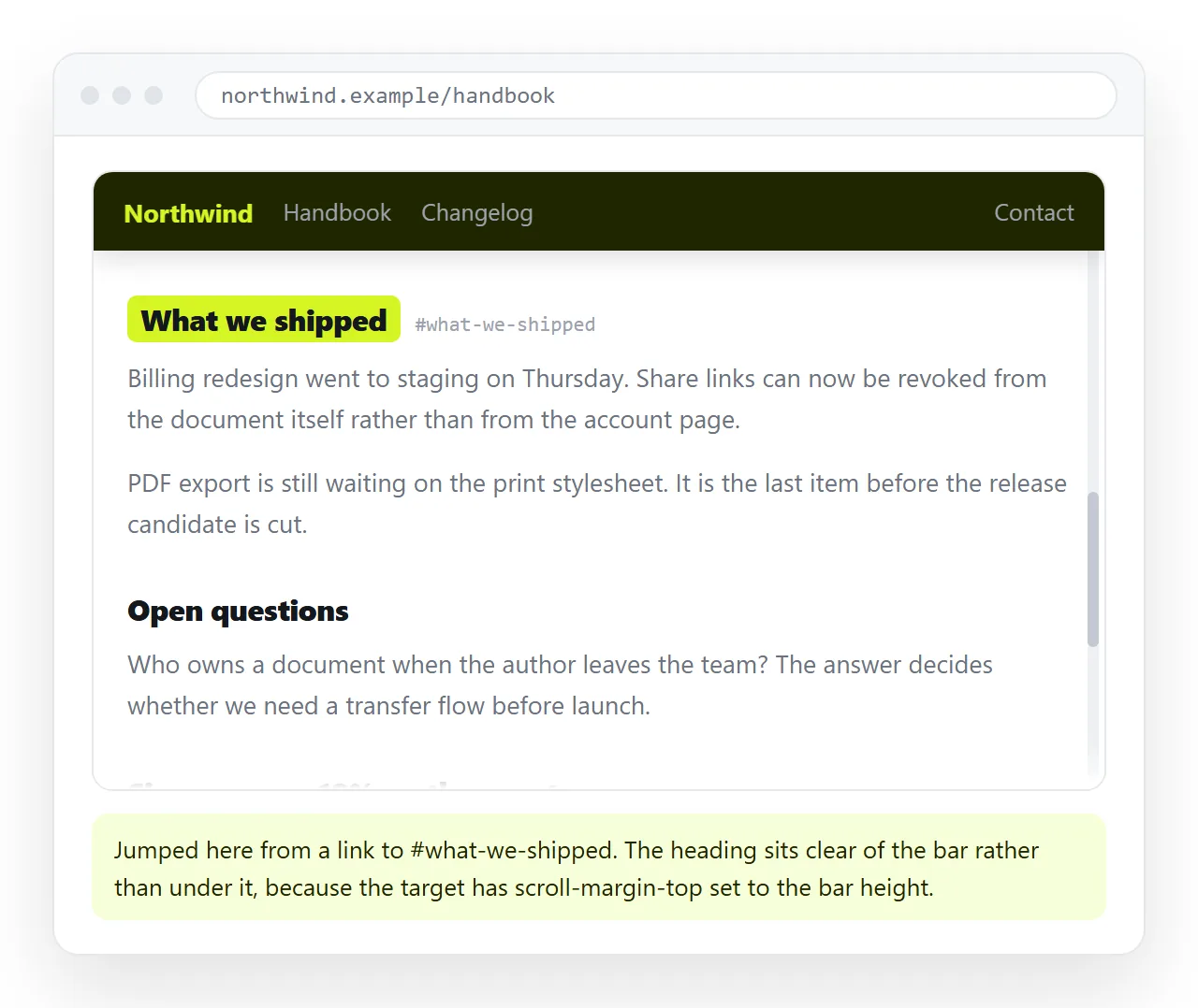
Open the file in the HTML file opener and scroll the full length of the page. Click an in-page link and confirm the heading lands below the header, not under it.
Narrow to phone width and scroll again. Then paste the HTML into a NOS document, where the header renders and sticks at the document's own address, so the reader gets the working page from a link.
The bar itself is covered in navbars, and the same technique applied to a table is in sticky table headers. For the overall page frame, CSS grid is often simpler than stacking positioned boxes.