To get smooth scroll with CSS, add one line to your stylesheet: html { scroll-behavior: smooth; }. Every link that points to a section on the same page, such as <a href="#pricing">, then glides to that section instead of jumping there in a single frame.
Try it. Click the links in the grey bar.
<!doctype html>
<html lang="en">
<head>
<meta charset="utf-8">
<meta name="viewport" content="width=device-width, initial-scale=1">
<title>Smooth scroll with one CSS line</title>
<style>
  html { scroll-behavior: smooth; }  /* the one line */

  body { margin: 0; font-family: system-ui, sans-serif; color: #1d2330; }
  nav { display: flex; gap: 8px; flex-wrap: wrap; padding: 14px 16px; background: #f4f5f7; }
  nav a {
    padding: 6px 12px; border-radius: 99px; background: #fff;
    color: #1d4ed8; text-decoration: none; font-weight: 600; font-size: 14px;
  }
  section { min-height: 420px; padding: 20px 16px; border-top: 1px solid #e5e7eb; }
  section:nth-of-type(2n) { background: #fafbfc; }
  h2 { margin: 0 0 8px; }
  .top { font-size: 14px; }
</style>
</head>
<body>
<nav>
  <a href="#intro">Intro</a>
  <a href="#features">Features</a>
  <a href="#pricing">Pricing</a>
  <a href="#contact">Contact</a>
</nav>

<section id="intro"><h2>Intro</h2><p>Click a link above. The page glides instead of jumping.</p></section>
<section id="features"><h2>Features</h2><p>Each link points to a section id: <code>href="#features"</code>.</p><a class="top" href="#intro">Back to the top</a></section>
<section id="pricing"><h2>Pricing</h2><p>No JavaScript is needed for the smooth part.</p><a class="top" href="#intro">Back to the top</a></section>
<section id="contact"><h2>Contact</h2><p>The last section.</p><a class="top" href="#intro">Back to the top</a></section>

</body>
</html>
What scroll-behavior: smooth changes
By default, following an in-page link moves the view to the target at once. With scroll-behavior: smooth, the browser animates the same move over a short time, so the reader can see where they went.
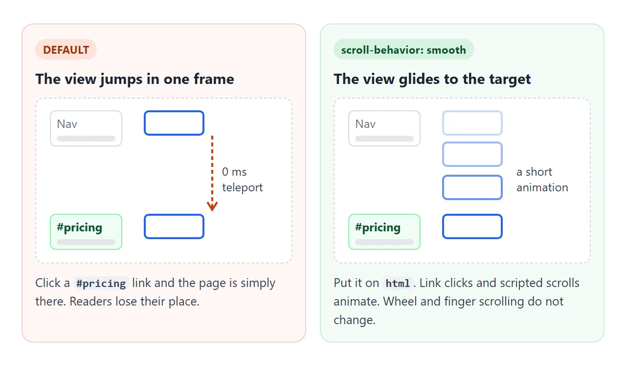
The property changes scrolls that the page starts:
- following a link to
#some-id element.scrollIntoView()andwindow.scrollTo()called without abehavioroption
It does not change scrolling the reader does with a mouse wheel, a trackpad or a finger. That keeps normal reading exactly as it was.
Anchor links: the id and the href
Smooth scrolling needs something to scroll to. Give each section an id and point a link at it with # in front:
<nav>
  <a href="#features">Features</a>
  <a href="#pricing">Pricing</a>
</nav>

<section id="features">...</section>
<section id="pricing">...</section>
The href must match the id exactly, including capital letters. #Pricing does not find id="pricing". HTML link to anchor on the same page covers the pattern in more detail.
Keep a sticky header off the heading
A sticky header creates a new problem. The browser scrolls the target's top edge to the top of the window, and the header is sitting there. The heading ends up hidden behind it.
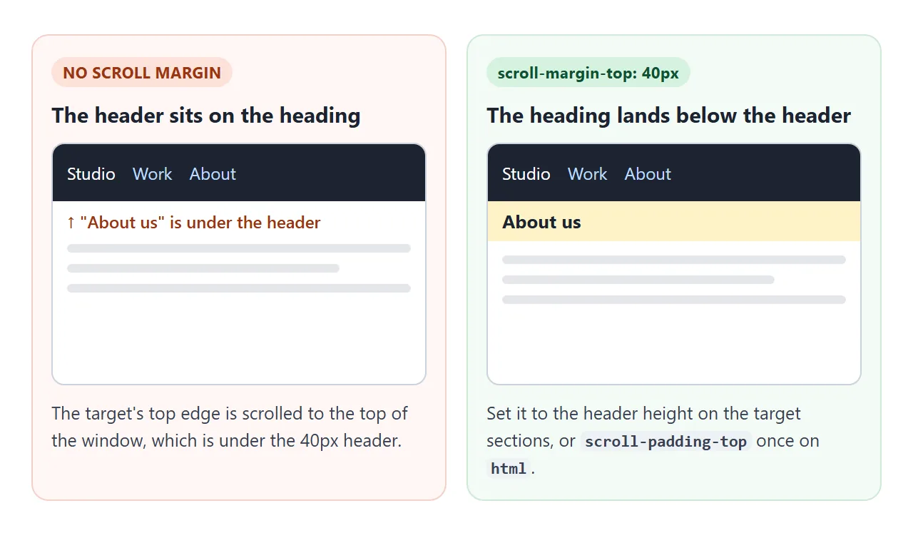
The fix is scroll-margin-top on the targets, set to the header's height:
header { position: sticky; top: 0; height: 64px; }
section { scroll-margin-top: 64px; }
Turn the checkbox on and off in the next example and click "Two" each time.
<!doctype html>
<html lang="en">
<head>
<meta charset="utf-8">
<meta name="viewport" content="width=device-width, initial-scale=1">
<title>scroll-margin-top under a sticky header</title>
<style>
  html { scroll-behavior: smooth; }
  body { margin: 0; font-family: system-ui, sans-serif; color: #1d2330; }

  header {
    position: sticky; top: 0; z-index: 1;
    height: 64px; box-sizing: border-box; padding: 10px 14px;
    background: rgba(29, 35, 48, .94); color: #fff;
  }
  header nav { display: flex; gap: 14px; margin-top: 4px; }
  header a { color: #bfdbfe; font-weight: 600; font-size: 14px; }
  .switch { font-size: 13px; display: flex; gap: 6px; align-items: center; }

  /* The fix: leave room for the header when scrolling to a target */
  .fixed section { scroll-margin-top: 64px; }

  section { min-height: 380px; padding: 0 16px 20px; border-top: 1px solid #e5e7eb; }
  h2 { margin: 0; padding: 8px 0; background: #fef3c7; }
</style>
</head>
<body>
<header>
  <label class="switch"><input type="checkbox" id="fix"> scroll-margin-top: 64px</label>
  <nav><a href="#one">One</a><a href="#two">Two</a><a href="#three">Three</a></nav>
</header>

<section id="one"><h2>One: the heading</h2><p>Click "Two" with the box off, then on.</p></section>
<section id="two"><h2>Two: the heading</h2><p>With the box off, the header covers this heading.</p></section>
<section id="three"><h2>Three: the heading</h2><p>With the box on, the heading lands just below the header.</p></section>

<script>
  document.getElementById('fix').addEventListener('change', (e) => {
    document.documentElement.classList.toggle('fixed', e.target.checked);
  });
</script>
</body>
</html>
If you would rather set it in one place, html { scroll-padding-top: 64px; } does the same job for every target on the page. HTML sticky header explains the header itself.
Scroll from a button with JavaScript
A <button> has no href, so it needs one line of JavaScript. Call scrollIntoView() on the element you want to reach:
button.addEventListener('click', () => {
  document.getElementById('contact').scrollIntoView();
});
With no options, scrollIntoView() follows the CSS scroll-behavior, so it glides when the rule is set. You can also write scrollIntoView({ behavior: 'smooth' }). That forces the animation even when your CSS says auto, which matters for the next section.
To scroll to a position instead of an element, window.scrollTo({ top: 0 }) works the same way.
Turn it off for reduced motion
Some people set their system to reduce motion, because animation on screen makes them unwell or distracts them. The prefers-reduced-motion media query tells your CSS about that choice:
html { scroll-behavior: smooth; }

@media (prefers-reduced-motion: reduce) {
  html { scroll-behavior: auto; }
}
For this to reach your buttons too, leave out the behavior option in scrollIntoView(). An explicit behavior: 'smooth' ignores the CSS and animates anyway. If you do need it in JavaScript, check matchMedia('(prefers-reduced-motion: reduce)').matches first.
Highlight the section in view
A one-page site feels finished when the menu shows where the reader is. An IntersectionObserver reports when each section enters a thin band across the middle of the screen, and the script marks the matching link.
const links = document.querySelectorAll('header a');
const observer = new IntersectionObserver((entries) => {
  entries.forEach((entry) => {
    if (!entry.isIntersecting) return;
    links.forEach((a) => a.classList.toggle('active',
      a.getAttribute('href') === '#' + entry.target.id));
  });
}, { root: document, rootMargin: '-40% 0px -55% 0px' });

document.querySelectorAll('section').forEach((s) => observer.observe(s));
The negative rootMargin shrinks the watched area to the band between 40% and 45% from the top. Only one section can cross it at a time, so only one link lights up.
root: document names the page's own viewport. Without it, a page shown inside a frame from another site ignores rootMargin, and the wrong link lights up.
Here is everything together: sticky header, smooth links, a button, the reduced-motion rule and the active link.
<!doctype html>
<html lang="en">
<head>
<meta charset="utf-8">
<meta name="viewport" content="width=device-width, initial-scale=1">
<title>One-page layout with an active nav link</title>
<style>
  html { scroll-behavior: smooth; }
  @media (prefers-reduced-motion: reduce) {
    html { scroll-behavior: auto; }  /* respect the user's setting */
  }

  body { margin: 0; font-family: system-ui, sans-serif; color: #1d2330; }
  header {
    position: sticky; top: 0; z-index: 1; height: 56px;
    display: flex; align-items: center; gap: 4px; padding: 0 10px;
    background: #fff; border-bottom: 1px solid #e5e7eb; overflow-x: auto;
  }
  header b { margin-right: auto; padding-right: 8px; }
  header a {
    padding: 6px 10px; border-radius: 8px; white-space: nowrap;
    color: #4b5563; text-decoration: none; font-size: 14px; font-weight: 600;
  }
  header a.active { background: #dcfce7; color: #0f5132; }  /* the section in view */

  section { min-height: 460px; padding: 24px 16px; scroll-margin-top: 56px; }
  section:nth-of-type(2n) { background: #f8fafc; }
  h2 { margin: 0 0 8px; }
  button {
    padding: 10px 16px; border: 0; border-radius: 10px;
    background: #1d4ed8; color: #fff; font: 600 15px system-ui, sans-serif; cursor: pointer;
  }
</style>
</head>
<body>
<header>
  <b>Studio</b>
  <a href="#home">Home</a>
  <a href="#work">Work</a>
  <a href="#about">About</a>
  <a href="#contact">Contact</a>
</header>

<section id="home">
  <h2>We design small, fast websites</h2>
  <p>Scroll, or use the menu. The menu marks the section you are reading.</p>
  <button id="cta">Get in touch</button>
</section>
<section id="work"><h2>Work</h2><p>Recent projects go here.</p></section>
<section id="about"><h2>About</h2><p>A short story about the team.</p></section>
<section id="contact"><h2>Contact</h2><p>hello@example.com</p></section>

<script>
  // A button is not a link, so scroll with JavaScript.
  // No behavior option: the CSS rule (and the reduced-motion query) decides.
  document.getElementById('cta').addEventListener('click', () => {
    document.getElementById('contact').scrollIntoView();
  });

  // Mark the menu link of the section that crosses the middle of the screen.
  const links = document.querySelectorAll('header a');
  const observer = new IntersectionObserver((entries) => {
    entries.forEach((entry) => {
      if (!entry.isIntersecting) return;
      links.forEach((a) => {
        a.classList.toggle('active', a.getAttribute('href') === '#' + entry.target.id);
      });
    });
  }, {
    root: document,                   // this page's own viewport, also inside a frame
    rootMargin: '-40% 0px -55% 0px',  // a thin band near mid-height
  });
  document.querySelectorAll('section').forEach((s) => observer.observe(s));
</script>
</body>
</html>
When it does not work
| What you see | Cause | Fix |
|---|---|---|
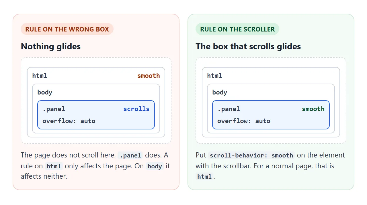
| Links still jump | The rule is on body, which does not scroll the page |
Put scroll-behavior: smooth on html |
| A scrolling panel jumps while the page glides | The panel has overflow: auto and scrolls by itself |
Add the rule to the panel too |
| The heading is hidden after the jump | A sticky header covers the top of the window | scroll-margin-top on the targets, or scroll-padding-top on html |
| Nothing happens on click | The href does not match any id (spelling or capital letters) |
Make href="#x" and id="x" identical |
| Smooth for you, instant for someone else | Their system has reduced motion on, and your media query honours it | Working as intended |
| The button glides even with reduced motion on | scrollIntoView({ behavior: 'smooth' }) overrides the CSS |
Leave out behavior, or check matchMedia first |
| The wrong menu link is highlighted | The observer has no rootMargin, or the page is inside a frame without root: document |
Use a thin band and pass root: document |
Share it as a link
Smooth scrolling is something people need to try, not read about. A screenshot cannot scroll, and an .html attachment may open as plain code on a phone.
To send the working page, paste it into a NOS document and choose Create share link. HTML to link walks through it.
The page renders as written and its scripts run, so the people you send it to can click the menu and watch it glide. If you change the code later, the same link shows the new version.