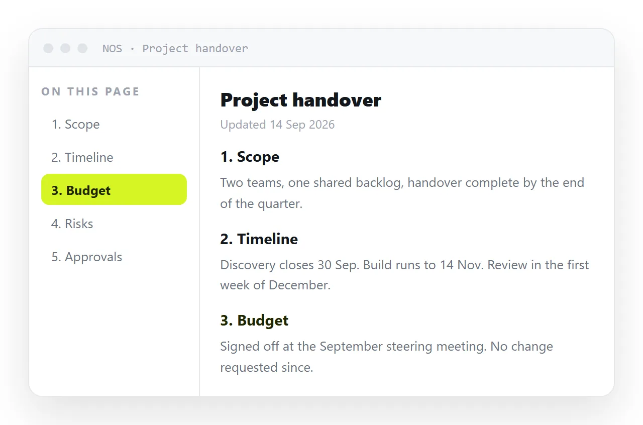
An HTML table of contents is a list of links pointing at id values on the headings of the same page, and the browser handles the jumping with no script.
<nav aria-label="On this page">
  <ol>
    <li><a href="#scope">Scope</a></li>
    <li><a href="#pricing">Pricing</a></li>
  </ol>
</nav>

<h2 id="scope">Scope</h2>
That is the working version. Everything below is about the four things that go wrong afterwards.
Write the ids by hand
Generated ids are convenient and fragile. Reword a heading and the slug changes, which breaks every link pointing at it, including bookmarks you never see.
Keep ids short, lowercase, hyphenated, and tied to the topic rather than the exact wording. #pricing survives a heading changing from "Pricing" to "What it costs". #what-it-costs does not.
Ids must be unique in the document. Two headings with the same id means the browser jumps to the first one and the second is unreachable.
Fix the sticky header collision
The most common complaint about anchor links is that the heading lands under the fixed bar at the top of the page.
One CSS property solves it.
h2, h3 { scroll-margin-top: 84px; }
Set the value to the header height plus a little breathing room. The browser now stops that far short, and the heading is visible.
The same property fixes it for keyboard focus and for the browser restoring a position on reload. No script needed, which is why any JavaScript scroll offset you find is worth deleting.
Add scroll-behavior: smooth on the root if you want the animated scroll, and pair it with a prefers-reduced-motion guard.
Sticky on desktop, collapsed on phones
A sidebar table of contents that scrolls away is half useless on a long document.
.toc { position: sticky; top: 100px; max-height: 80vh; overflow: auto; }
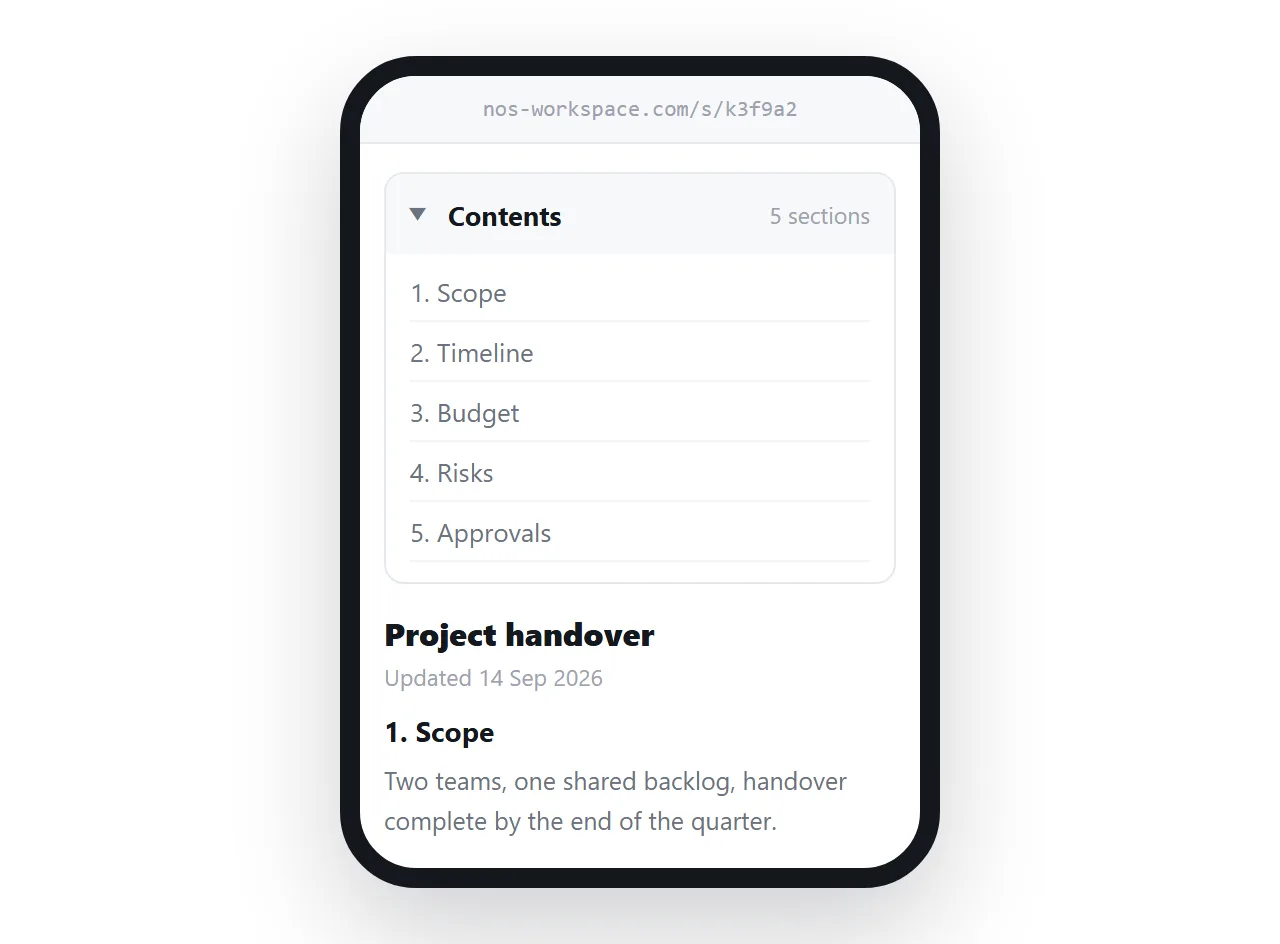
On a phone there is no room for a sidebar. Put the same list inside a <details> element at the top of the page, closed by default, so it is one tap and costs three lines of height.
Switch between the two with a media query at whatever width your content column stops being comfortable.
Which HTML table of contents fits which document
| Document | Table of contents shape |
|---|---|
| Under about 800 words | None. It is overhead |
| A long guide, read top to bottom | Inline list after the intro |
| Reference material, read by lookup | Sticky sidebar |
| A spec with numbered clauses | Nested list, numbers preserved |
| Read mostly on phones | Collapsed details element |
| Printed and circulated | Inline list plus a print rule hiding the links |
The first row matters. A five-item table of contents above a short page pushes the actual content below the fold and helps nobody.
Highlighting the current section
Marking where the reader is takes a little script, and it is the only part of this that does.
An IntersectionObserver watching the headings is the cheap version. When a heading crosses the top of the viewport, add a class to the matching link and remove it from the others.
Mark the active link with aria-current="location" as well as a colour, so the state is announced rather than only shown.
If you would rather avoid script entirely, skip this. A table of contents without a current marker is still perfectly usable.
Numbering, nesting, and depth
Use <ol> when the document has real section numbers, <ul> when it does not. Do not fake numbers with text if the list can produce them.
Nest at most two levels. A three-level table of contents is usually a sign the headings themselves need reorganising.
Nest by wrapping the child list inside the parent <li>, not as a sibling. That keeps the structure correct for semantic HTML and for assistive technology.
Printing and search
A printed page cannot be clicked, so a table of contents in print should either carry page numbers or be hidden.
Page numbers need a print stylesheet with generated content, which not every browser supports well. Hiding the list is the safer default for a document people print occasionally. A print stylesheet covers the wider set of rules worth adding.
For search engines, a table of contents on a long page sometimes produces jump links directly in the result. Nothing special is required for that beyond stable ids and headings that describe their sections accurately.
Descriptive headings are the part you control. "Refund window" earns a jump link; "More detail" does not.
Share it, and link to a section
Once the page is at an address, the hash becomes a shareable position.
- Open your file in the HTML file opener to confirm it renders outside your folder.
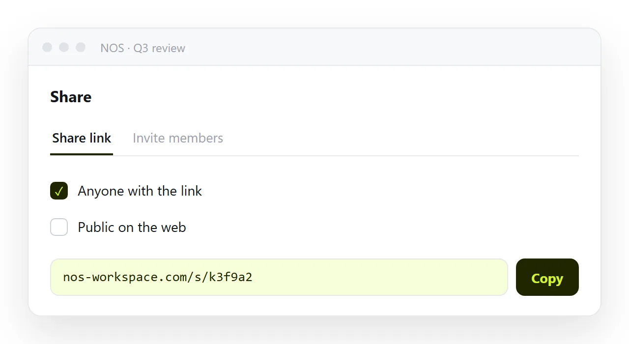
- Paste the HTML into a NOS document. The anchors and the sticky sidebar render as written.
- Share, then Share link, then Create link.
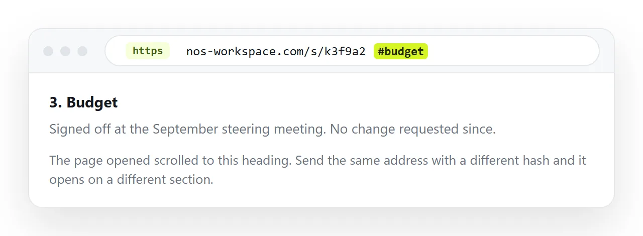
- To point someone at one section, append the heading id to the link with a hash.
That last step is what people actually want. Sending a fifty-page onboarding document is less useful than sending the line of it that answers the question.
The address does not move when you edit, so those section links keep working. This is the same argument as in onboarding docs in HTML and product specs in HTML.
Before you publish it
- Is every id unique, and written by hand rather than generated?
- Does clicking each entry land the heading clear of the sticky header?
- Does the list collapse to something usable on a phone?
- Does every entry match a heading that still exists?
- Is there a
<title>, and does the page need to stay unlisted?