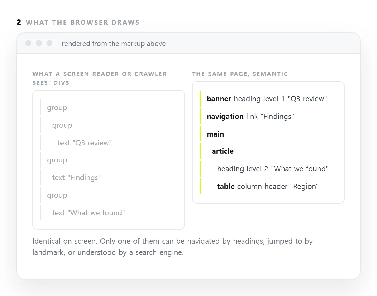
Semantic HTML means using the element that says what a piece of content is: an <h2> for a heading rather than a bold div, a <table> with header cells for a table rather than a grid of boxes, <nav>, <main> and <article> for the regions of the page.
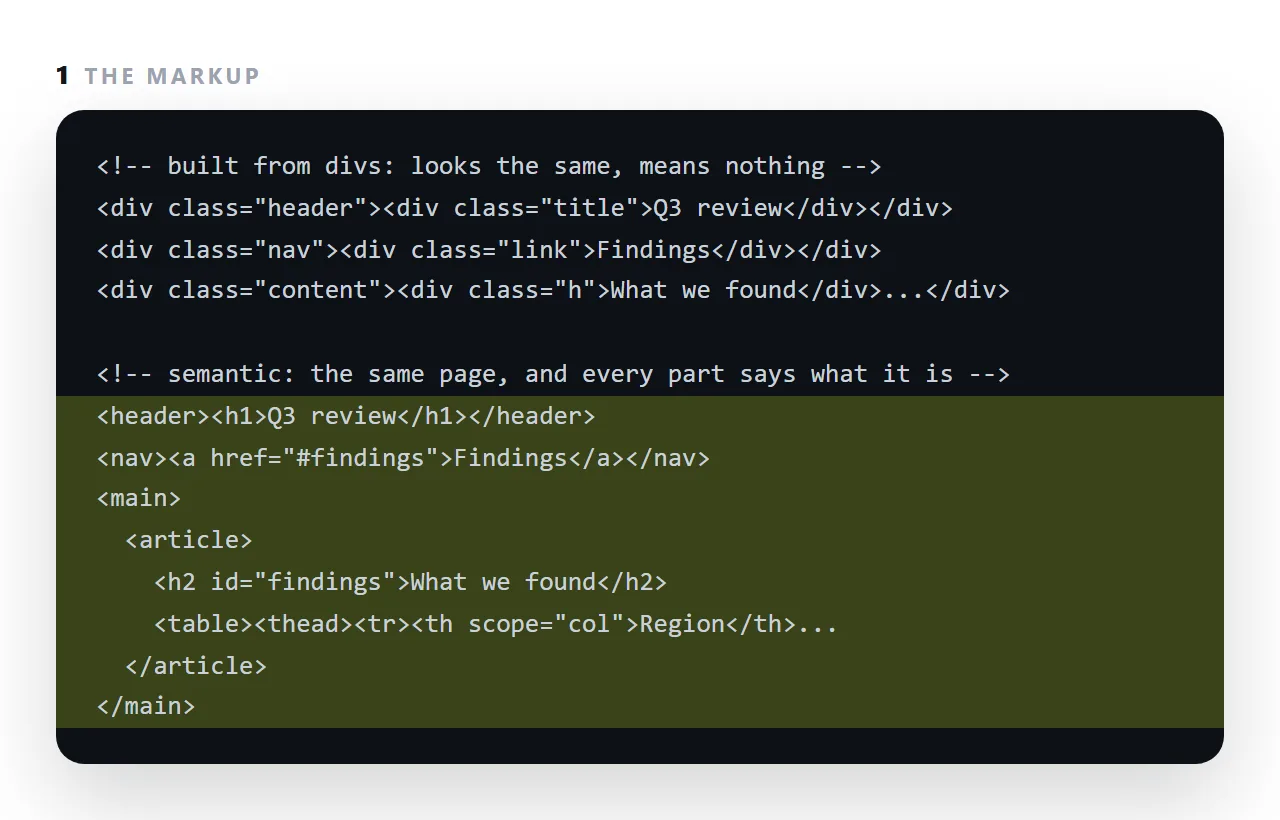
The page looks the same either way. The difference is what a screen reader can announce, what a keyboard can jump to, what a search engine can understand, and what the next person to edit the markup can read.
This guide covers what the real element gives you, the substitutions worth making, and the ones that do not matter.
<!-- looks like a button -->
<div class="btn" onclick="save()">Save</div>

<!-- is a button -->
<button type="button" onclick="save()">Save</button>
Identical on screen. The second one gets six behaviours the first does not.
What the real element gives you in semantic HTML
| Behaviour | <button> |
Styled <div> |
|---|---|---|
| Reachable by Tab | Yes | No |
| Fires on Enter and Space | Yes | No |
| Announced as "button" | Yes | Announced as nothing |
| Disabled state | disabled attribute |
Hand-rolled |
| Submits a form | Yes | No |
| Focus ring | Provided | Hand-rolled |
Reproducing those on a div takes tabindex, a role, two key handlers, an aria-disabled attribute and a focus style — about fifteen lines to arrive back where <button> started.
The substitutions worth making
| Instead of | Use | What you gain |
|---|---|---|
<div class="btn"> |
<button> |
The six rows above |
<div class="link"> |
<a href> |
Middle-click, open in new tab, right-click menu |
<div class="nav"> |
<nav> |
"Skip to navigation" for screen readers |
<div class="table"> |
<table> |
Row and column announcement |
<div class="header"> |
<header> |
Landmark navigation |
<b> for emphasis |
<strong> |
Announced with emphasis |
<div> list of items |
<ul><li> |
"List, four items" |
<div class="accordion"> |
<details><summary> |
Works with no JavaScript at all |
<span onclick> toggle |
<input type="checkbox"> |
Keyboard, state, form value |
The <details> row is the most underused. An expandable section with no script:
<details>
  <summary>Does the viewer run JavaScript?</summary>
  <p>Yes. Charts and calculators behave as they would in a browser tab.</p>
</details>
Keyboard accessible, announced correctly, and searchable by the browser's find-in-page — which a script-driven accordion with hidden content is not.
Headings are structure, not sizes
<!-- wrong: chosen for appearance -->
<h4>How it works</h4>

<!-- right: chosen for level, sized with CSS -->
<h2 class="small">How it works</h2>
Screen reader users navigate by jumping between headings, so the levels are a table of contents. Skipping from h2 to h4 reads as a missing section. Use one h1, then h2 for sections and h3 beneath them, and set the sizes in CSS.
Tables need their parts
<table>
  <caption>Launch checklist</caption>
  <thead>
    <tr><th scope="col">Task</th><th scope="col">Owner</th></tr>
  </thead>
  <tbody>
    <tr><td>Pricing page</td><td>Jae</td></tr>
  </tbody>
</table>
thead, tbody and scope="col" are what let a screen reader announce "Owner, Jae" rather than reading an undifferentiated stream. A table built from divs looks identical and is unusable without sight. See sharing a table.
Labels, properly
<!-- placeholder only: disappears when typing starts -->
<input type="email" placeholder="Email">

<!-- a real label -->
<label for="email">Email</label>
<input id="email" type="email" autocomplete="email">
A real label is announced with the field, and tapping it focuses the field — which on a phone roughly doubles the size of the target. See turning a form into a link for the rest of the form details.
ARIA is the fallback, not the default
<!-- unnecessary -->
<button role="button">Save</button>

<!-- necessary, because HTML has no element for this -->
<div role="tablist">…</div>
The first rule of ARIA is to not use ARIA when a real element exists. It is for patterns HTML does not have — tabs, live regions, complex widgets. See aria-label.
Why it is worth the attention
The accessibility argument is the strongest one. The practical one is that semantic markup is less code: every behaviour you do not have to reimplement is code you do not have to maintain, and browser-provided behaviour is more correct than hand-rolled behaviour on devices you have never tested.
Three substitutions that matter most
A bold paragraph for a heading. Screen readers list headings for navigation; a bold paragraph is not on the list. Use h2 and style it.
Divs in a grid for a table. A table of numbers built from divs cannot be read row by row with its column headers. Use table, thead, th with scope="col".
A styled div for a button. It is not focusable, not announced as a button, and does not respond to Enter. Use button.
What generated HTML gets wrong here
Assistants produce headings and tables correctly most of the time, and produce clickable divs and bold-paragraph headings when asked for something that sounds visual.
A quick pass with the headings list in an accessibility inspector, or a screen reader's heading navigation, shows whether the structure is in the elements or only in the CSS. The ten-problem checklist has it as one of the checks.
Making a page semantic: 4 steps
- Use headings in order for the structure. One
h1,h2for sections,h3inside them. Do not skip a level to get a smaller size; size is CSS. - Mark the regions.
header,nav,main,article,footer. A screen reader can jump between them; a crawler knows which part is the content. - Use real tables and lists for tabular and listed content.
thead,thwithscope,tbody;ulorolfor lists. Not divs styled to look like them. - Reserve
divandspanfor grouping and styling. They mean nothing, which is exactly right when nothing needs to be meant. aria-label covers the cases where a real element still needs a name.