The <strong> tag marks words that are important, serious or urgent, such as the "do not" in a warning. The <b> tag marks words that should catch the eye without being more important, such as a product name.
Both are bold by default, so on screen you cannot tell them apart.
Compare them in one sentence. The third line uses a plain <span> with a CSS class.
<!doctype html>
<html lang="en">
<head>
<meta charset="utf-8">
<meta name="viewport" content="width=device-width, initial-scale=1">
<title>strong vs b vs span</title>
<style>
body { margin: 0; padding: 16px; font: 16px/1.5 system-ui, sans-serif; color: #1d2330; background: #f6f7f9; }
.row { background: #fff; border: 1px solid #e2e5ea; border-radius: 10px; padding: 10px 14px; margin-bottom: 10px; }
.row p { margin: 0 0 4px; }
.meta { font: 12.5px/1.4 ui-monospace, Consolas, monospace; color: #5b6472; }
.meta em { font-style: normal; color: #0f5132; }
.bold { font-weight: 700; } /* the span gets its weight from a class */
/* the toggle switches off the browser's built-in bold for strong and b */
body.reset strong, body.reset b { font-weight: normal; }
label { display: flex; gap: 8px; align-items: center; font-size: 14px; margin-top: 4px; cursor: pointer; }
</style>
</head>
<body>
<div class="row">
<p>Back up your files <strong>before</strong> you update.</p>
<div class="meta"><strong> · weight <span class="w"></span> · <em>means: this is important</em></div>
</div>
<div class="row">
<p>Back up your files <b>before</b> you update.</p>
<div class="meta"><b> · weight <span class="w"></span> · <em>means: look here, nothing more</em></div>
</div>
<div class="row">
<p>Back up your files <span class="bold">before</span> you update.</p>
<div class="meta"><span class="bold"> · weight <span class="w"></span> · <em>means: nothing</em></div>
</div>
<label><input type="checkbox" id="reset"> Remove the browser's default bold (strong, b { font-weight: normal })</label>
<script>
const rows = document.querySelectorAll('.row');
// show the computed font-weight of the marked word in each row
function update() {
rows.forEach((row) => {
const word = row.querySelector('p > *');
row.querySelector('.w').textContent = getComputedStyle(word).fontWeight;
});
}
document.getElementById('reset').addEventListener('change', (e) => {
document.body.classList.toggle('reset', e.target.checked);
update();
});
update();
</script>
</body>
</html>
All three show weight 700. With the box ticked, strong and b go back to normal text, while the span stays bold because its weight comes from your own class. The tag carries the meaning; CSS decides the look.
strong vs b: which one to use
Ask what the reader would lose if they skipped the words. If they would miss something that matters, like a deadline or a danger, use strong. If the words are just a label to spot while scanning, use b.
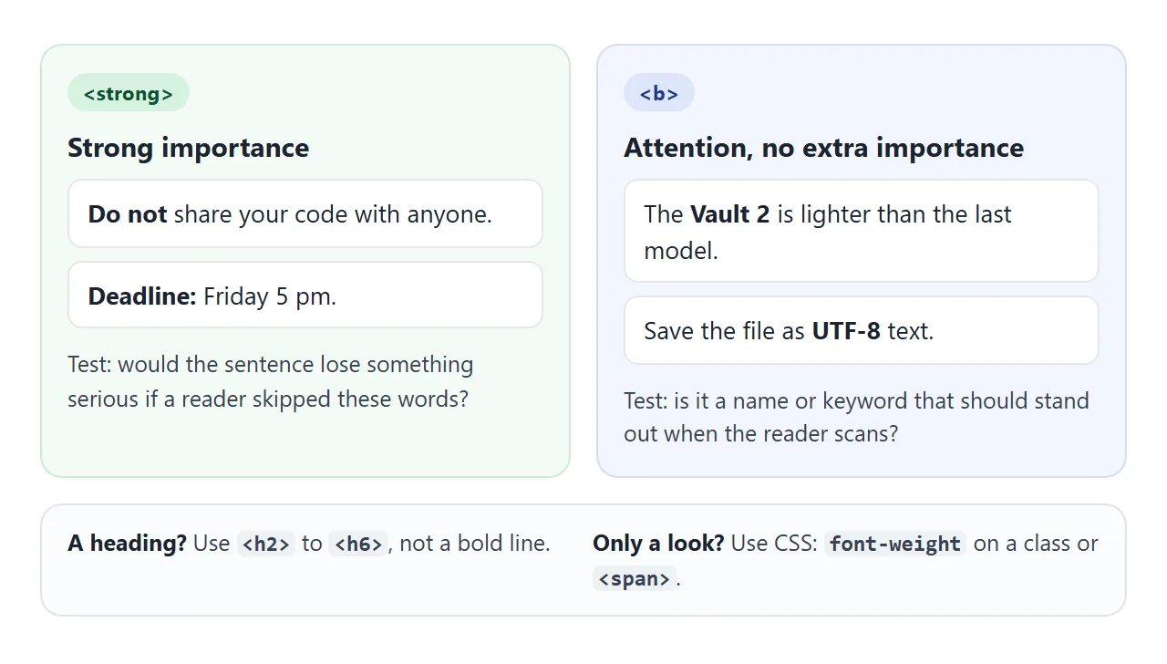
| You want to mark | Use | Example |
|---|---|---|
| A warning or something serious | <strong> |
<strong>Do not</strong> unplug |
| An urgent or key fact | <strong> |
<strong>Deadline:</strong> Friday |
| A product name or keyword | <b> |
the <b>Vault 2</b> drive |
| Stress that changes the meaning | <em> |
I <em>did</em> reply |
| A heading | <h2> to <h6> |
<h2>Setup</h2> |
| Only a visual look | a class on a <span> |
<span class="price"> |
The HTML standard calls b a last resort, used when no other element fits. It is not deprecated. For other inline tags such as mark and code, see the span tag guide, and for the page-level idea, semantic HTML.
What makes them bold: font-weight
Browsers ship a small built-in stylesheet. For these two tags it says:
b, strong { font-weight: bolder; }
font-weight takes keywords or numbers:
normalis the same as 400, andboldis the same as 700.- Numbers run from 1 to 1000. The common steps are 100, 200 and so on up to 900.
bolderandlighterare relative. They look at the parent's weight and step up or down.
bolder and lighter depend on the parent
Because the default is bolder, not 700, a strong does not always end up at 700. The result depends on the text around it.
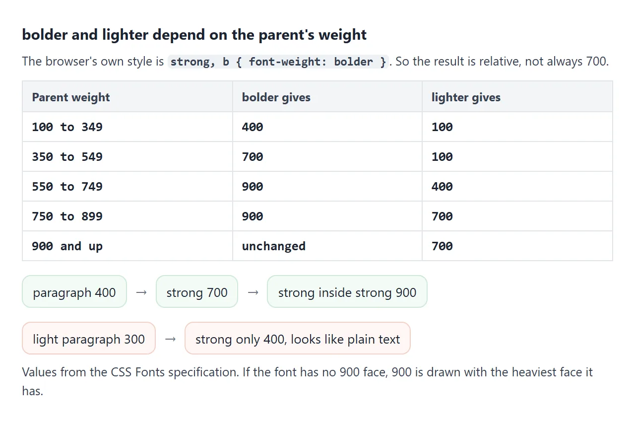
In a normal paragraph, strong becomes 700. A strong inside that strong becomes 900. In a light paragraph set to 300, strong only reaches 400, which is ordinary text. It is still marked important; it just does not look it.
If you want a fixed look, set it yourself:
strong { font-weight: 700; }
Why 600 may look like 700
A number is a request, not a promise. The browser picks the closest face the font actually has. Many fonts installed on a computer have only a regular and a bold face.
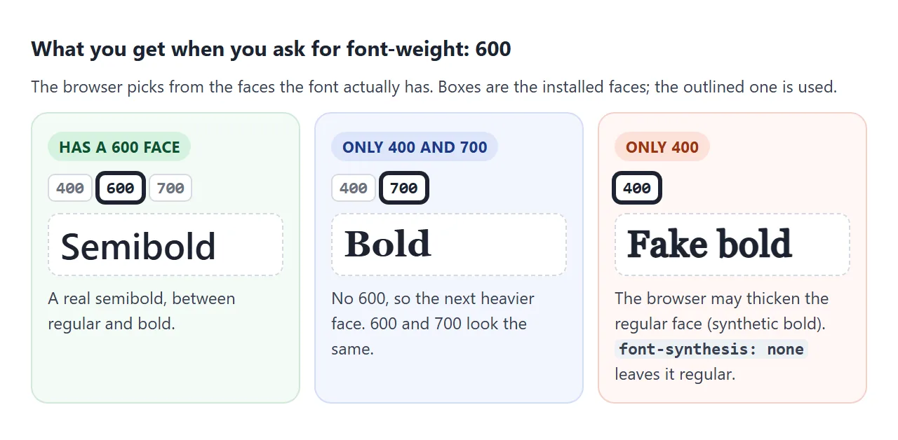
- The font has a 600 face. You get a real semibold.
- It has only 400 and 700. For 600 the browser takes the next heavier face, so 600 and 700 look the same.
- It has only 400. The browser may thicken the regular face, called synthetic bold. It can look smeared.
font-synthesis: noneswitches that off, and the text stays regular.
The demo below draws every weight from 100 to 900 in two font stacks and compares the pixels with the weight above. What you see depends on the fonts your device has installed.
<!doctype html>
<html lang="en">
<head>
<meta charset="utf-8">
<meta name="viewport" content="width=device-width, initial-scale=1">
<title>font-weight 100 to 900</title>
<style>
  body { margin: 0; padding: 14px; font: 14px/1.4 system-ui, sans-serif; color: #1d2330; background: #f6f7f9; }
  .cols { display: grid; grid-template-columns: 1fr 1fr; gap: 10px; }
  .col { background: #fff; border: 1px solid #e2e5ea; border-radius: 10px; padding: 10px 12px; min-width: 0; }
  h3 { margin: 0 0 2px; font-size: 14px; }
  .fam { font: 11.5px ui-monospace, Consolas, monospace; color: #5b6472; margin-bottom: 6px; overflow-wrap: anywhere; }
  .line { display: flex; justify-content: space-between; align-items: baseline; gap: 6px; font-size: 19px; padding: 2px 0; border-top: 1px solid #f0f1f4; }
  .same { font: 11px system-ui, sans-serif; color: #9a3412; background: #fde2da; border-radius: 99px; padding: 1px 6px; white-space: nowrap; }
  .new { font: 11px system-ui, sans-serif; color: #0f5132; background: #d6f2df; border-radius: 99px; padding: 1px 6px; white-space: nowrap; }
  .note { font-size: 12.5px; color: #5b6472; margin: 10px 2px 0; }
</style>
</head>
<body>
<div class="cols">
  <div class="col" data-font="system-ui, sans-serif">
    <h3>System stack</h3>
    <div class="fam">system-ui, sans-serif</div>
  </div>
  <div class="col" data-font="'Times New Roman', serif">
    <h3>Few weights</h3>
    <div class="fam">'Times New Roman', serif</div>
  </div>
</div>
<p class="note">Each weight is drawn on a hidden canvas and compared pixel by pixel with the weight above it. "= 500" means your browser drew it exactly like 500, because no closer face is installed. Results differ between devices.</p>

<script>
  const canvas = document.createElement('canvas');
  canvas.width = 220; canvas.height = 40;
  const ctx = canvas.getContext('2d', { willReadFrequently: true });

  // draw a sample at one weight and return its pixels as a string we can compare
  function fingerprint(weight, family) {
    ctx.clearRect(0, 0, canvas.width, canvas.height);
    ctx.font = weight + ' 24px ' + family;
    ctx.fillText('Bold Rag 600', 4, 30);
    return ctx.getImageData(0, 0, canvas.width, canvas.height).data.join('');
  }

  document.querySelectorAll('.col').forEach((col) => {
    const family = col.dataset.font;
    let prev = null;
    for (let w = 100; w <= 900; w += 100) {
      const print = fingerprint(w, family);
      const line = document.createElement('div');
      line.className = 'line';
      line.style.fontFamily = family;
      line.style.fontWeight = w;
      const tag = print === prev
        ? '<span class="same">= ' + (w - 100) + '</span>'
        : '<span class="new">new</span>';
      line.innerHTML = '<span>Aa ' + w + '</span>' + tag;
      col.appendChild(line);
      prev = print;
    }
  });
</script>
</body>
</html>
When a font has only regular and bold, the 100 to 500 rows collapse into one look and 600 to 900 into another.
For more real steps, load a font that has them; web fonts covers that, and changing the font covers the stack.
Styling strong without bold
Bold is only the default. You can show importance with colour, an underline or a background, and keep the tags for meaning. In a nested warning, style the inner strong differently so the extra level is still visible.
<!doctype html>
<html lang="en">
<head>
<meta charset="utf-8">
<meta name="viewport" content="width=device-width, initial-scale=1">
<title>strong and b, styled</title>
<style>
  body { margin: 0; padding: 16px; font: 15px/1.55 system-ui, sans-serif; color: #1d2330; background: #f6f7f9; }
  .notice { background: #fff7ed; border-left: 4px solid #ea580c; border-radius: 8px; padding: 10px 14px; margin-bottom: 14px; }
  .notice p { margin: 0; }

  /* strong: importance shown with colour, not extra weight */
  .notice strong { font-weight: inherit; color: #b91c1c; }
  /* strong inside strong: even more important, so add an underline */
  .notice strong strong { text-decoration: underline 2px; text-underline-offset: 3px; }

  .card { background: #fff; border: 1px solid #e2e5ea; border-radius: 10px; padding: 12px 14px; }
  .card h3 { margin: 0 0 6px; font-size: 16px; }
  .card ul { margin: 0; padding-left: 18px; }
  .card li { margin: 3px 0; }

  /* b: draws the eye to product names and key terms, no extra meaning */
  .card b { font-weight: 600; background: #eef2ff; border-radius: 4px; padding: 0 4px; }

  /* "Show tags" labels every strong and b so you can see which is which */
  body.tags strong, body.tags b { outline: 1px dashed #64748b; }
  body.tags strong::after { content: " strong"; }
  body.tags b::after { content: " b"; }
  body.tags strong::after, body.tags b::after {
    font: 600 10px ui-monospace, Consolas, monospace; color: #475569; vertical-align: super;
  }
  button { margin-top: 12px; font: inherit; font-size: 14px; padding: 7px 14px; border-radius: 8px; border: 1px solid #cbd5e1; background: #fff; cursor: pointer; }
</style>
</head>
<body>
<div class="notice" role="note">
  <p><strong>Firmware update in progress. <strong>Do not unplug the drive</strong> until the light turns green.</strong> It takes about two minutes.</p>
</div>

<div class="card">
  <h3>What is in the box</h3>
  <ul>
    <li>One <b>Vault 2</b> external drive, 2 TB</li>
    <li>A <b>USB-C</b> cable, 50 cm</li>
    <li>Reads and writes on <b>Windows</b> and <b>macOS</b></li>
    <li>Drive is formatted <b>exFAT</b> out of the box</li>
  </ul>
</div>

<button id="toggle" type="button">Show tags</button>

<script>
  const btn = document.getElementById('toggle');
  btn.addEventListener('click', () => {
    const on = document.body.classList.toggle('tags');
    btn.textContent = on ? 'Hide tags' : 'Show tags';
  });
</script>
</body>
</html>
.notice strong { font-weight: inherit; color: #b91c1c; }
.notice strong strong { text-decoration: underline 2px; }
.card b { font-weight: 600; background: #eef2ff; }
Keep one rule per meaning across the page. If important text is red in one place and bold in another, readers stop trusting either signal.
When it does not work
| What you see | Cause | Fix |
|---|---|---|
| strong or b is not bold at all | A CSS reset sets font: inherit or font-weight: normal on every element |
Add strong, b { font-weight: 700; } after the reset |
A font shorthand removed the bold |
The shorthand resets font-weight to normal |
Put the weight in the shorthand, or set it after |
| 600 looks the same as 700 | The font has no 600 face | Use a font with a semibold face, or pick 700 |
| Bold text looks smeared | Synthetic bold on a font with no bold face | Load the bold face, or use font-synthesis: none |
| strong in a light paragraph looks normal | bolder on 300 gives only 400 |
Set strong { font-weight: 700; } |
| strong inside a heading looks no bolder | bolder on 700 gives 900, and the font has no 900 |
Use colour for the inner words, or a font with 900 |
| A bold line is not treated as a heading | strong or b was used instead of a heading tag |
Use <h2> to <h6> and style it |
Share it as a link
Weights depend on the fonts installed on each device, so a screenshot from your computer may not match what a colleague sees. Sending the page itself lets them check it on their own phone or laptop.
Paste the page into a NOS document and choose Create share link. HTML to link walks through it.
The page renders as written and its scripts run, so the people you send it to can tick the boxes and toggles themselves. If you change the code later, the same link shows the new version.