To change the font in HTML, set the CSS font-family property on body inside a <style> block in the head.
<head>
  <style>
    body {
      font-family: "Segoe UI", Roboto, Arial, sans-serif;
      font-size: 1rem;
      line-height: 1.6;
    }
  </style>
</head>
font-family inherits, so one rule changes every paragraph, heading and list on the page.
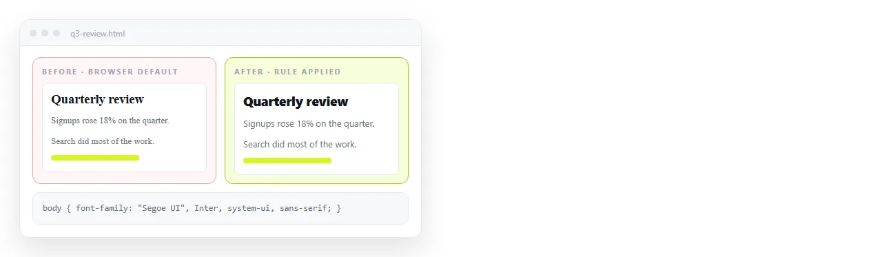
The four places a font rule can go
| Where | Travels with the file | Overridable | Verdict |
|---|---|---|---|
<style> in the head |
Yes | Yes | Use this |
style attribute on an element |
Yes | Poorly | One-off emphasis only |
External .css file |
No | Yes | Site work, not a file you send |
<font face="..."> |
Yes | No | Removed from the specification |
The second column is what decides it for a page you intend to share. An external stylesheet stays behind when the HTML file is emailed or copied elsewhere.
Changing the font for part of the page
Target a class rather than repeating inline styles.
<style>
  .figures { font-family: ui-monospace, Menlo, Consolas, monospace; }
  h1, h2, h3 { font-family: Georgia, "Times New Roman", serif; }
</style>

<p class="figures">Q3 revenue: 1,482,900</p>
Monospace for columns of numbers is the one case where a second family genuinely helps. Digits line up, so totals are scannable.
The font shorthand
font sets several properties at once. The order is strict and the last two are required.
body { font: italic 600 1rem/1.6 "Segoe UI", Arial, sans-serif; }
That reads as style, weight, size slash line height, then the family list. Anything omitted resets to its initial value, which is why the shorthand quietly wipes a font-weight set elsewhere.
For most work, write the individual properties. The shorthand is worth knowing mainly because font: inherit on form controls is the shortest fix for inputs that ignore the page font.
Size units
- rem scales with the reader's browser setting.
1remis the root size, normally 16px. This is the default choice for body text. - px ignores the reader's preference. Use it for structural values, not for text.
- em compounds through nesting, so a 0.9em list inside a 0.9em section lands at 0.81. Useful deliberately, surprising otherwise.
- clamp() for headings that should shrink on narrow screens:
font-size: clamp(1.6rem, 4vw, 2.6rem).

Elements that ignore the change
Buttons, inputs, selects and textareas use the operating system font by default. One rule fixes all of them.
button, input, select, textarea { font: inherit; color: inherit; }
Without it, a form in an otherwise consistent page renders in a different face and a smaller size, which reads as a rendering fault.
Line height and measure
Changing the font is half the job. Two other settings decide whether the result is readable.
Line height. Set it unitless so it scales with the font size. Body text sits well between 1.5 and 1.7; headings want 1.1 to 1.25.
Measure, the line length. Between 60 and 80 characters is the comfortable range. A full-width paragraph on a wide monitor runs well past that.
body { line-height: 1.6; }
h1, h2, h3 { line-height: 1.2; }
.prose { max-width: 68ch; }
The ch unit is the width of the zero character in the current font, so 68ch tracks the typeface you chose rather than a fixed pixel guess.
Weight, style and spacing
| Property | Typical values | Note |
|---|---|---|
font-weight |
400, 600, 700 | Stay on these for system stacks |
font-style |
normal, italic |
Synthesised if the face lacks an italic |
letter-spacing |
-0.01em on large headings |
Tighten headings, never body text |
font-variant-numeric |
tabular-nums |
Aligns digits in a column |
text-wrap |
balance on headings |
Evens out a two-line heading |
tabular-nums is the one worth remembering for reports. It makes figures in a table line up without switching to a monospace family.
td.num { font-variant-numeric: tabular-nums; text-align: right; }
Fonts and print
A page that will be printed or saved as PDF needs a separate consideration. Screen stacks are often too light on paper.
@media print {
  body { font-family: Georgia, "Times New Roman", serif; font-size: 11pt; color: #000; }
}
Point units are appropriate here and nowhere else, since print has a physical size. A print stylesheet covers the rest of the adjustments.
Using a specific typeface
If the exact face matters, you need a web font, which brings a file the page depends on.
Two things then matter for a file that has to travel:
- Load it from a full address, not a folder path. A relative path breaks as soon as the file moves, the main cause of fonts not loading.
- Set a real fallback list after the web font name, so the page is readable while the font loads or if it fails.
If neither is possible, stay on a system stack. HTML font family list has ready-made ones.
Checking the change on someone else's machine

Your computer has fonts other people's do not. A rule naming a font you installed years ago resolves for you and falls back for everyone else, silently.
Open the file in the HTML file opener, which has never seen your project. If the type looks right there, the stack is resolving through the fallbacks rather than a private installation.
To have a colleague confirm it, paste the HTML into a document and share it as a link. They open a rendered page on their own device, and the address keeps working when you adjust the sizes.
Next: HTML font color for the colour half of the same job.