HTML font color is set with the CSS color property, applied either in a stylesheet or in a style attribute on the element.
<p style="color: #e5e7eb;">Text in a light grey.</p>
The old <font color="red"> element was removed from the HTML specification. Browsers still render it, so pages using it do not break, but it is not markup you should write now.
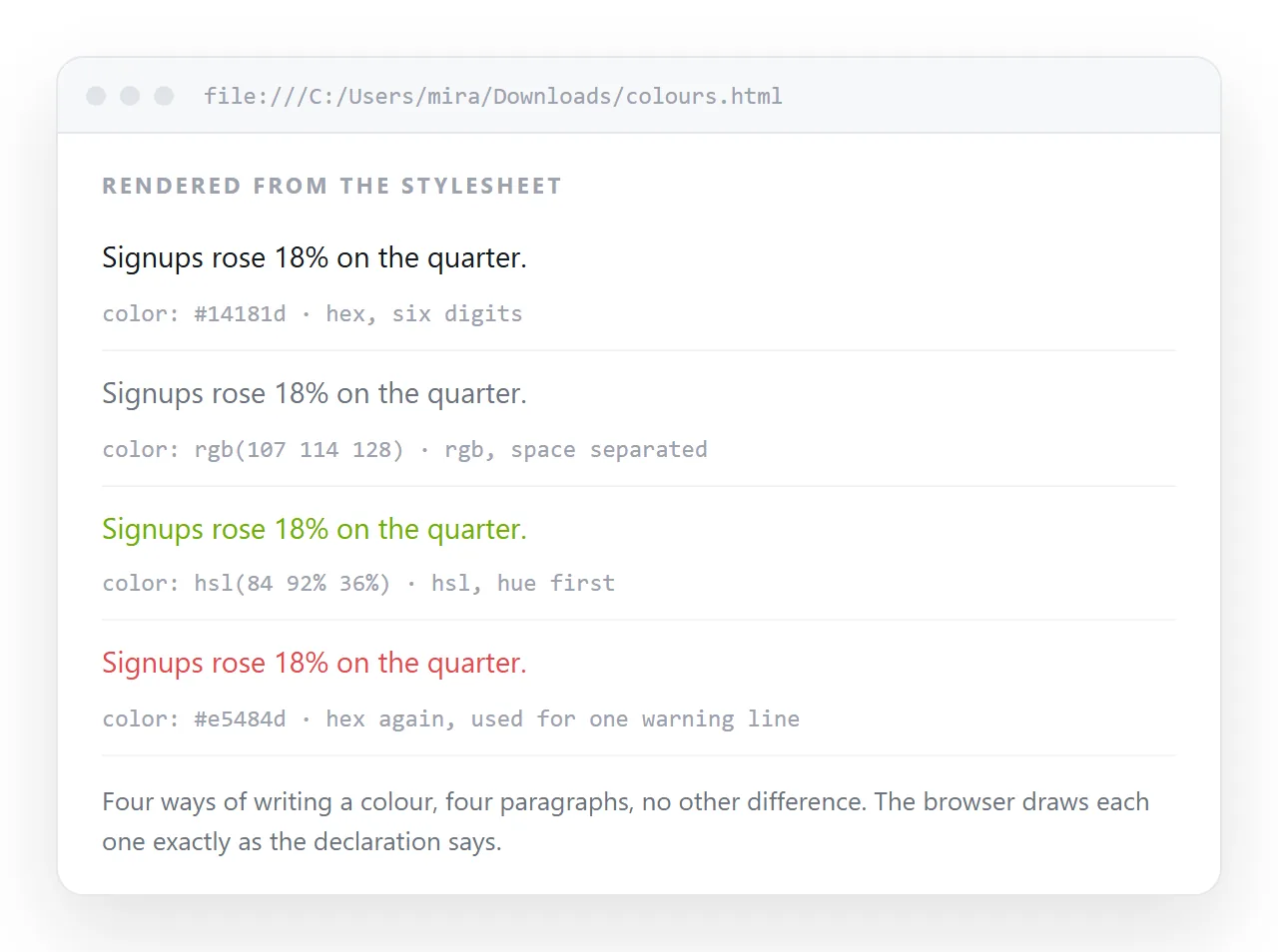
Value formats
| Format | Example | Alpha | Notes |
|---|---|---|---|
| Hex | #2563eb |
No | The most portable, six digits |
| Hex with alpha | #2563eb80 |
Yes | Eight digits, last two are opacity |
| Named | rebeccapurple |
No | 147 names, useful for quick tests |
rgb() |
rgb(37 99 235 / 60%) |
Yes | Space syntax is current |
hsl() |
hsl(221 83% 53%) |
Yes | Adjust lightness without changing hue |
currentColor |
currentColor |
Inherits | Matches the element's own text colour |
currentColor is the useful one people miss. Set it on a border or an SVG fill and it tracks the text colour automatically.
Where to put the declaration
Three places, in increasing order of maintainability.
- Inline on the element.
style="color: #ef4444". Highest specificity, hardest to override. Fine for one-off emphasis, bad as a system. See inline CSS. - In a
<style>block in the head. Keeps the page self-contained while still centralising the rule. This is the right default for a file you intend to send. - In an external stylesheet. Correct for a site, wrong for a single file that has to travel, because the CSS file will not go with it.
<style>
  :root { --text: #e5e7eb; --muted: #9ca3af; --accent: #60a5fa; }
  body  { color: var(--text); background: #0b1220; }
  .muted { color: var(--muted); }
  a     { color: var(--accent); }
</style>
Custom properties put the palette in one block. Changing the body colour later is one edit, not a search across the file.
Inheritance
color inherits. Set it on body and every descendant picks it up unless something overrides it.
Three things override it without you asking:
- Links. The browser default styles
awith its own colour. Seta { color: ... }explicitly. - Form controls. Inputs and buttons often use the system colour rather than inheriting. Add
color: inheritto them. - Elements with their own defaults, such as
mark, which carries both a colour and a background.
button, input, select, textarea { color: inherit; font: inherit; }

Contrast that holds up
The common failure is mid grey on a light background. It reads fine to the person who wrote the sentence and poorly to everyone else.
| Pair | Ratio | Verdict |
|---|---|---|
#111827 on #ffffff |
About 17 to 1 | Body text, comfortable |
#6b7280 on #ffffff |
About 4.8 to 1 | Body text, at the limit |
#9ca3af on #ffffff |
About 2.5 to 1 | Fails, even for large text |
#e5e7eb on #0b1220 |
About 14 to 1 | Body text on dark, comfortable |
Aim for 4.5 to 1 on normal text. For secondary labels, reduce size or weight rather than fading the colour further.
currentColor and colour-mix
currentColor resolves to whatever color is on that element. It removes a whole class of duplicated values.
.badge {
  color: #f59e0b;
  border: 1px solid currentColor;
}
.icon { fill: currentColor; }
Change the text colour and the border and the icon follow. This is the standard way to make an inline SVG icon match the text beside it.
color-mix() goes further, deriving a related colour arithmetically.
.subtle {
  color: color-mix(in oklab, currentColor 60%, transparent);
}
That produces a muted version of whatever colour is in force, without naming a second hex value. It degrades cleanly, since an unsupported function invalidates only that declaration and the inherited colour stands.
Colour on specific element types
| Element | Behaviour |
|---|---|
a |
Uses the browser default until you set it |
button, input |
Uses the system colour, needs color: inherit |
::placeholder |
Separate pseudo-element, set it explicitly |
::selection |
Sets the highlight text and background |
mark |
Carries its own colour and background |
hr |
Takes border-color, not color, in most browsers |
Placeholder text is the one most often missed. A default placeholder on a dark background is frequently unreadable.
::placeholder { color: #6b7280; opacity: 1; }
::selection { background: #2563eb; color: #ffffff; }
The opacity: 1 line matters because some browsers apply a default opacity to placeholders on top of the colour.
Semantic colour names
Hard-coding hex values throughout a document makes a later theme change a search and replace across the file. Name the roles instead.
:root {
  --text: #111827;
  --text-muted: #4b5563;
  --text-inverse: #ffffff;
  --link: #1d4ed8;
  --danger: #b91c1c;
  --success: #15803d;
}
Naming by role rather than by hue means --danger can change from red to orange without every reference reading wrong.
Colour and dark mode
A fixed dark text colour becomes unreadable when the surface changes. Pair every color with an explicit background-color on the same element, or handle it at the theme level.
@media (prefers-color-scheme: dark) {
  :root { --text: #e5e7eb; --muted: #9ca3af; }
  body  { background: #0b1220; }
}
Dark mode CSS covers the full set of adjustments, including images and borders.
Checking the result outside your editor

Screens vary more than people expect. A grey that reads well on a calibrated monitor can vanish on a laptop at low brightness.
Open the file in the HTML file opener to confirm the rules survive outside your project, then paste it into a document and turn it into a link so someone else can check it on their own screen.
Because color needs no external file, the page stays self-contained and looks the same from a link as it does locally.
Next: HTML font family list for typeface stacks, and how to change the font in HTML for the rest of the type settings.