A colour in HTML is written in CSS, on a property such as color or background-color. The value can be a name (rebeccapurple), a hex code (#663399), or a function: rgb(), hsl() or oklch(). You can mix them freely on one page.
Here is one purple written six ways. Type any colour into the box to see how the browser reads it.
<!doctype html>
<html lang="en">
<head>
<meta charset="utf-8">
<meta name="viewport" content="width=device-width, initial-scale=1">
<title>One colour, six spellings</title>
<style>
  body { margin: 0; padding: 16px; font-family: system-ui, sans-serif; background: #f6f7f9; color: #1d2330; }
  h2 { font-size: 15px; margin: 0 0 10px; }
  .grid { display: grid; grid-template-columns: repeat(auto-fill, minmax(150px, 1fr)); gap: 8px; }
  .chip { border-radius: 10px; overflow: hidden; background: #fff; box-shadow: 0 1px 4px rgba(0, 0, 0, .1); }
  .chip div { height: 44px; }
  .chip code { display: block; padding: 7px 9px; font-size: 13px; }
  .try { margin-top: 16px; display: flex; gap: 10px; align-items: center; flex-wrap: wrap; }
  input { font: 15px ui-monospace, Consolas, monospace; padding: 8px 10px; border: 1px solid #c9ced8; border-radius: 8px; width: 210px; }
  #swatch { width: 48px; height: 38px; border-radius: 8px; border: 1px solid #c9ced8; }
  #out { font-size: 13px; line-height: 1.5; margin-top: 8px; }
</style>
</head>
<body>
<h2>Six ways to write the same purple</h2>
<div class="grid">
  <div class="chip"><div style="background: rebeccapurple"></div><code>rebeccapurple</code></div>
  <div class="chip"><div style="background: #639"></div><code>#639</code></div>
  <div class="chip"><div style="background: #663399"></div><code>#663399</code></div>
  <div class="chip"><div style="background: rgb(102 51 153)"></div><code>rgb(102 51 153)</code></div>
  <div class="chip"><div style="background: hsl(270 50% 40%)"></div><code>hsl(270 50% 40%)</code></div>
  <div class="chip"><div style="background: oklch(44% 0.16 303.4)"></div><code>oklch(44% 0.16 303.4)</code></div>
</div>

<div class="try">
  <input id="val" value="tomato" aria-label="Any CSS colour" spellcheck="false">
  <div id="swatch"></div>
</div>
<div id="out"></div>

<script>
  const val = document.getElementById('val');
  const swatch = document.getElementById('swatch');
  const out = document.getElementById('out');

  function show() {
    const v = val.value.trim();
    // CSS.supports answers: would the browser accept this as a colour?
    if (!CSS.supports('color', v)) {
      out.textContent = 'Not a valid colour. The browser would drop this declaration.';
      swatch.style.background = 'none';
      return;
    }
    swatch.style.background = v;
    // getComputedStyle shows the value the browser actually uses
    out.textContent = 'The browser reads it as: ' + getComputedStyle(swatch).backgroundColor;
  }

  val.addEventListener('input', show);
  show();
</script>
</body>
</html>
The line under the box uses getComputedStyle, which reports the value the browser actually uses. Names, hex codes and hsl() come back as rgb(). An oklch() value stays in oklch().
Where the colour goes
The same value works in any colour property. Two places are common in HTML: a style attribute on one element, or a rule in a <style> block.
<p style="color: #663399">Purple text</p>

<style>
  .note { background-color: hsl(270 50% 95%); border: 2px solid rebeccapurple; }
</style>
This page is about the values themselves. For the properties, see HTML font color for text and CSS background-color for backgrounds.
Names and hex codes
Colour names such as red, tomato and dodgerblue are fixed keywords defined by CSS. They are not case-sensitive, so Red and RED also work. They are handy for quick tests, but only a fixed list of colours has a name.
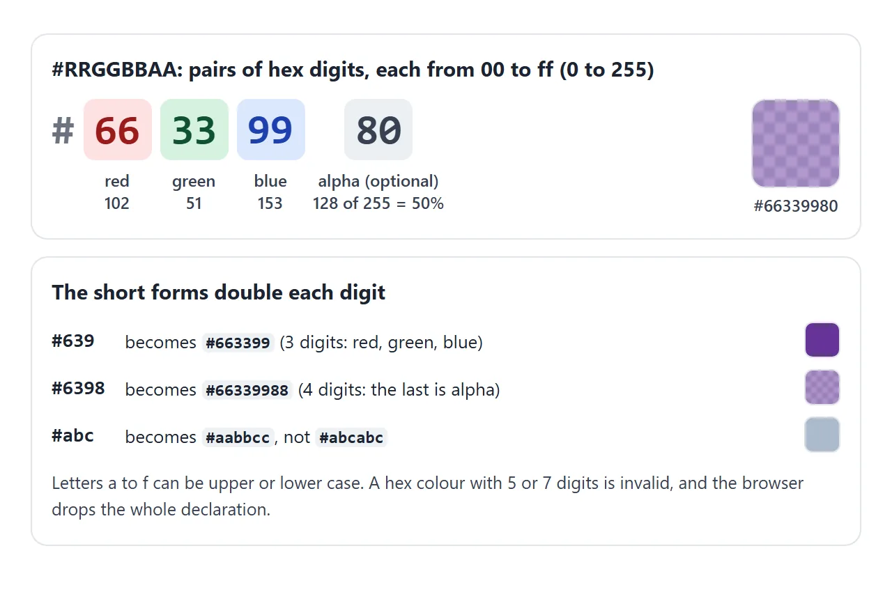
Hex codes start with # and give red, green and blue as two hexadecimal digits each, from 00 (0) to ff (255). An optional fourth pair sets the alpha, which is how see-through the colour is.
| Digits | Example | Means |
|---|---|---|
| 3 | #639 |
#663399, opaque |
| 4 | #6398 |
#66339988, with alpha |
| 6 | #663399 |
red 102, green 51, blue 153 |
| 8 | #66339980 |
the same purple at 50% alpha |
A hex code with 5 or 7 digits, or with no #, is not a colour, and the browser skips the declaration.
rgb() and hsl()
rgb() takes the same three channels as a hex code, written as decimal numbers from 0 to 255. Current CSS separates them with spaces. The older comma form still works, and rgba() is now just another name for rgb().
color: rgb(102 51 153);
color: rgb(102, 51, 153);   /* older comma form, same colour */
hsl() describes a colour by hue, saturation and lightness. Hue is an angle on the colour wheel from 0 to 360 (0 red, 120 green, 240 blue). Saturation runs from 0% (grey) to 100%, and lightness from 0% (black) to 100% (white).
color: hsl(270 50% 40%);    /* the same purple as #663399 */
color: hsl(270 50% 90%);    /* a pale version: only lightness changed */
That makes hsl() easier to adjust by hand than hex. To get a lighter or darker version, you change one number.
oklch(): lightness you can trust
hsl() has a catch. Its lightness is a formula on red, green and blue, not a measure of how light a colour looks. Yellow and blue at the same 50% look nothing alike.
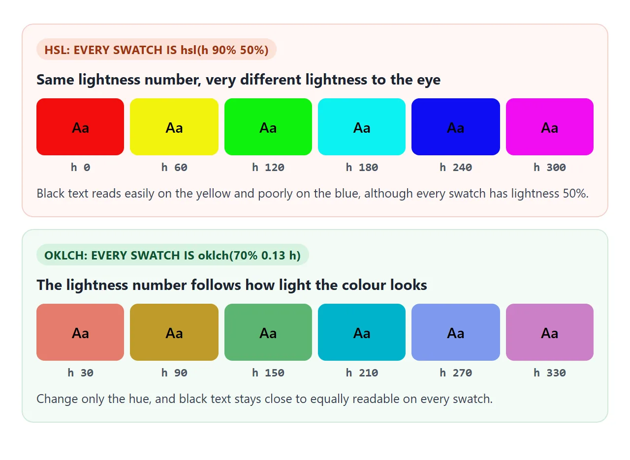
oklch() takes lightness, chroma and hue. Lightness goes from 0% to 100% and is designed to track how light the colour appears. Chroma starts at 0 for grey and grows as the colour becomes more vivid. Hue is an angle, as in hsl().
--brand: oklch(55% 0.18 260);
--brand-light: oklch(85% 0.08 260);
Because lightness stays consistent across hues, a set of colours with the same L value reads at a similar strength. To mix and adjust colours from one variable, see CSS color-mix().
Transparency: alpha, transparent and opacity
Hex codes and all three colour functions take an alpha value. It goes from 0 (invisible) to 1 (solid), or 0% to 100%. In the function forms it follows a slash.
background: #1e90ff80;               /* hex, 80 = 128 of 255 */
background: rgb(30 144 255 / 50%);
background: hsl(210 100% 56% / 0.5);
background: transparent;             /* same as rgb(0 0 0 / 0) */
Alpha on a colour only affects that one colour. The opacity property fades the whole element, text and children included. Slide the alpha and compare the two boxes.
<!doctype html>
<html lang="en">
<head>
<meta charset="utf-8">
<meta name="viewport" content="width=device-width, initial-scale=1">
<title>Transparent colours</title>
<style>
  body { margin: 0; padding: 16px; font-family: system-ui, sans-serif; color: #1d2330; background: #fff; }
  .controls { display: flex; gap: 12px; align-items: center; flex-wrap: wrap; font-size: 14px; }
  input[type=range] { width: 170px; }
  /* a striped backdrop so see-through colour is visible */
  .stage {
    margin-top: 12px; padding: 14px; border-radius: 12px; display: grid;
    grid-template-columns: 1fr 1fr; gap: 12px;
    background: repeating-linear-gradient(45deg, #ffd166 0 14px, #06d6a0 14px 28px);
  }
  .box { padding: 16px 12px; border-radius: 10px; font-weight: 600; font-size: 14px; color: #111; }
  .box small { display: block; font-weight: 400; margin-top: 4px; }
  #codes { margin-top: 12px; font: 13px/1.7 ui-monospace, Consolas, monospace; }
</style>
</head>
<body>
<div class="controls">
  <label>Colour <input type="color" id="pick" value="#1e90ff"></label>
  <label>Alpha <input type="range" id="alpha" min="0" max="100" value="50"></label>
  <span id="pct"></span>
</div>

<div class="stage">
  <div class="box" id="a">Alpha in the colour<small>Text stays solid</small></div>
  <div class="box" id="b">opacity on the box<small>Text fades too</small></div>
</div>

<div id="codes"></div>

<script>
  const pick = document.getElementById('pick');
  const alpha = document.getElementById('alpha');

  function update() {
    const hex = pick.value;                 // always "#rrggbb"
    const a = alpha.value / 100;
    const r = parseInt(hex.slice(1, 3), 16);
    const g = parseInt(hex.slice(3, 5), 16);
    const b = parseInt(hex.slice(5, 7), 16);
    const aa = Math.round(a * 255).toString(16).padStart(2, '0');

    // Left: only the background colour is see-through
    document.getElementById('a').style.background = `rgb(${r} ${g} ${b} / ${a})`;
    // Right: a solid colour, but the whole box (text included) fades
    const boxB = document.getElementById('b');
    boxB.style.background = hex;
    boxB.style.opacity = a;

    document.getElementById('pct').textContent = alpha.value + '%';
    document.getElementById('codes').innerHTML =
      `${hex}${aa}<br>rgb(${r} ${g} ${b} / ${alpha.value}%)<br>rgba(${r}, ${g}, ${b}, ${a})`;
  }

  pick.addEventListener('input', update);
  alpha.addEventListener('input', update);
  update();
</script>
</body>
</html>
When the text should stay solid, put the alpha in the background colour. CSS opacity covers the cases where fading everything is what you want.
currentColor
currentColor is a keyword that means "whatever color is on this element". Borders already default to it, which is why a border with no colour set matches the text.
.button { color: #0f5132; border: 2px solid currentColor; }
.button:hover { color: #9a3412; }   /* the border follows */
It is most useful for icons. An inline SVG with fill="currentColor" takes the text colour of its parent, so one CSS rule recolours both. Changing SVG colour in HTML shows the full pattern.
Check the contrast
A colour that looks fine on your screen may be hard to read on a phone in sunlight, or for someone with low vision. The WCAG contrast ratio turns that into a number you can check.
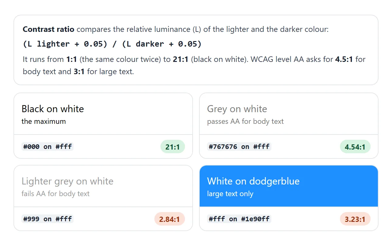
Type or pick two colours. The calculator accepts any format from this page, including oklch() and see-through values.
<!doctype html>
<html lang="en">
<head>
<meta charset="utf-8">
<meta name="viewport" content="width=device-width, initial-scale=1">
<title>Contrast ratio calculator</title>
<style>
  body { margin: 0; padding: 16px; font-family: system-ui, sans-serif; color: #1d2330; background: #f6f7f9; }
  .row { display: flex; gap: 8px; align-items: center; margin-bottom: 8px; flex-wrap: wrap; }
  .row span { width: 90px; font-size: 14px; }
  .row input[type=text] { font: 14px ui-monospace, Consolas, monospace; padding: 7px 9px; border: 1px solid #c9ced8; border-radius: 8px; width: 170px; }
  .row input[type=color] { width: 44px; height: 34px; padding: 0; border: 1px solid #c9ced8; border-radius: 6px; }
  button { font: inherit; font-size: 14px; padding: 7px 12px; border-radius: 8px; border: 1px solid #c9ced8; background: #fff; cursor: pointer; }
  #preview { margin: 10px 0; padding: 14px 16px; border-radius: 12px; border: 1px solid #d5d9e0; }
  #preview p { margin: 0 0 6px; font-size: 16px; }
  #preview .big { font-size: 24px; margin: 0; }
  #ratio { font-size: 30px; font-weight: 700; }
  table { border-collapse: collapse; margin-top: 8px; font-size: 14px; width: 100%; max-width: 420px; background: #fff; }
  td, th { border: 1px solid #e1e4ea; padding: 6px 8px; text-align: left; }
  .pass { color: #0f5132; font-weight: 700; }
  .fail { color: #9a3412; font-weight: 700; }
</style>
</head>
<body>
<div class="row"><span>Text</span><input type="text" id="fgText" value="#767676" spellcheck="false"><input type="color" id="fgPick"></div>
<div class="row"><span>Background</span><input type="text" id="bgText" value="#ffffff" spellcheck="false"><input type="color" id="bgPick"><button id="swap">Swap</button></div>

<div id="preview">
  <p>Body text at 16px. Can you read this comfortably?</p>
  <p class="big">Large text at 24px</p>
</div>

<div>Contrast ratio: <span id="ratio"></span></div>
<table>
  <tr><th>Check</th><th>Needs</th><th>Result</th></tr>
  <tr><td>AA, normal text</td><td>4.5:1</td><td id="aa"></td></tr>
  <tr><td>AA, large text</td><td>3:1</td><td id="aaL"></td></tr>
  <tr><td>AAA, normal text</td><td>7:1</td><td id="aaa"></td></tr>
  <tr><td>AAA, large text</td><td>4.5:1</td><td id="aaaL"></td></tr>
</table>

<script>
  const $ = (id) => document.getElementById(id);

  // A 1x1 canvas turns any CSS colour (name, hex, hsl, oklch...) into sRGB pixels.
  const ctx = document.createElement('canvas').getContext('2d', { willReadFrequently: true });
  function paint(color) {
    ctx.fillStyle = color;
    ctx.fillRect(0, 0, 1, 1);
    return ctx.getImageData(0, 0, 1, 1).data;  // [r, g, b, a]
  }

  // WCAG relative luminance
  function luminance([r, g, b]) {
    const lin = (c) => { c /= 255; return c <= 0.04045 ? c / 12.92 : ((c + 0.055) / 1.055) ** 2.4; };
    return 0.2126 * lin(r) + 0.7152 * lin(g) + 0.0722 * lin(b);
  }
  const toHex = (p) => '#' + [p[0], p[1], p[2]].map((n) => n.toString(16).padStart(2, '0')).join('');

  function update() {
    const fg = $('fgText').value.trim(), bg = $('bgText').value.trim();
    if (!CSS.supports('color', fg) || !CSS.supports('color', bg)) {
      $('ratio').textContent = 'enter two valid colours';
      return;
    }
    // Paint white, then the background, then the text colour on top,
    // so see-through colours are measured the way they would show.
    ctx.clearRect(0, 0, 1, 1);
    paint('#fff');
    const bgPx = paint(bg);
    const fgPx = paint(fg);

    const L1 = luminance(fgPx), L2 = luminance(bgPx);
    const ratio = (Math.max(L1, L2) + 0.05) / (Math.min(L1, L2) + 0.05);

    $('preview').style.color = fg;
    $('preview').style.background = bg;
    $('fgPick').value = toHex(fgPx);
    $('bgPick').value = toHex(bgPx);
    // Round down, so 4.499 never shows as a pass
    $('ratio').textContent = (Math.floor(ratio * 100) / 100).toFixed(2) + ':1';

    const mark = (id, need) => {
      const ok = ratio >= need;
      $(id).textContent = ok ? 'Pass' : 'Fail';
      $(id).className = ok ? 'pass' : 'fail';
    };
    mark('aa', 4.5); mark('aaL', 3); mark('aaa', 7); mark('aaaL', 4.5);
  }

  $('fgText').addEventListener('input', update);
  $('bgText').addEventListener('input', update);
  $('fgPick').addEventListener('input', () => { $('fgText').value = $('fgPick').value; update(); });
  $('bgPick').addEventListener('input', () => { $('bgText').value = $('bgPick').value; update(); });
  $('swap').addEventListener('click', () => {
    [$('fgText').value, $('bgText').value] = [$('bgText').value, $('fgText').value];
    update();
  });
  update();
</script>
</body>
</html>
The calculation has three steps:
- Turn each colour into red, green and blue values. The demo paints it on a 1-pixel canvas and reads the pixel, which works for every format.
- Convert those to relative luminance, a weighted sum in which green counts most and blue least.
- Divide the lighter luminance plus 0.05 by the darker luminance plus 0.05.
| Level | Normal text | Large text |
|---|---|---|
| AA | 4.5:1 | 3:1 |
| AAA | 7:1 | 4.5:1 |
Large text means 24px and up, or about 18.7px and up in bold. Do not round the result up: 4.49:1 does not meet 4.5:1. The demo rounds down for that reason.
When it does not work
| What you see | Cause | Fix |
|---|---|---|
| The colour is ignored | A typo, a missing #, or 5 or 7 hex digits |
Fix the value. Invalid declarations are dropped |
A hex code without # works, then stops |
The page had no doctype, so it ran in quirks mode | Add <!doctype html> and the # |
| Text fades along with the background | opacity on the element |
Use alpha in background-color |
A colour picker value is always like #1e90ff |
<input type="color"> gives lowercase 6-digit hex |
Convert it if you need another format |
A pale set of hsl() colours looks uneven |
hsl() lightness does not match how light colours look |
Use oklch() with a fixed lightness |
| An icon does not follow the text colour | The SVG has a fixed fill |
Set fill="currentColor" |
To keep colours consistent across a page, store them once in CSS variables and switch them for dark mode.
Share it as a link
A palette or a contrast check is easier to agree on when people can try it. A screenshot shows colours as your screen shows them, and nobody can type a new value into it.
To send the working version, paste the page into a NOS document and choose Create share link. HTML to link walks through it.
The page renders as written and its scripts run, so the people you send it to can pick colours and watch the ratio change. If you change the code later, the same link shows the new version.