CSS opacity sets how see-through an element is, from 0 (invisible) to 1 (solid). opacity: 0.5 makes it half transparent. It applies to the whole element: background, border, text and children fade together.
To fade only the background, use a color with an alpha value instead.
Move the slider. Both cards get the same number, applied two different ways.
<!doctype html>
<html lang="en">
<head>
<meta charset="utf-8">
<meta name="viewport" content="width=device-width, initial-scale=1">
<title>opacity vs background alpha</title>
<style>
  body {
    margin: 0; padding: 14px; box-sizing: border-box; min-height: 100vh;
    font-family: system-ui, sans-serif; color: #1d2330;
    /* a striped backdrop so you can see what shows through */
    background: repeating-linear-gradient(45deg, #2563eb 0 14px, #f59e0b 14px 28px);
  }
  .controls {
    background: #fff; border-radius: 10px; padding: 10px 12px; margin-bottom: 14px;
    display: flex; align-items: center; gap: 10px; flex-wrap: wrap; font-size: 14px;
  }
  .controls input { flex: 1; min-width: 140px; }
  .row { display: grid; grid-template-columns: repeat(auto-fit, minmax(150px, 1fr)); gap: 14px; }
  .card { border-radius: 12px; padding: 14px 16px; }
  .card h3 { margin: 0 0 6px; font-size: 16px; }
  .card p { margin: 0 0 8px; font-size: 14px; line-height: 1.4; }
  .card code { font-size: 13px; background: #eef1f5; padding: 1px 4px; border-radius: 4px; }

  /* A: opacity fades the whole card, text and children included */
  #a { background: #fff; opacity: var(--v); }

  /* B: only the background color is see-through; the text stays solid */
  #b { background: rgb(255 255 255 / var(--v)); }
</style>
</head>
<body style="--v: 0.5">
<div class="controls">
  <label for="v">Transparency</label>
  <input id="v" type="range" min="0" max="1" step="0.05" value="0.5">
  <output id="out">0.5</output>
</div>
<div class="row">
  <div class="card" id="a">
    <h3>opacity</h3>
    <p>The text fades with the card.</p>
    <code id="ca">opacity: 0.5</code>
  </div>
  <div class="card" id="b">
    <h3>background alpha</h3>
    <p>Only the white fill fades.</p>
    <code id="cb">rgb(255 255 255 / 0.5)</code>
  </div>
</div>

<script>
  const slider = document.getElementById('v');
  slider.addEventListener('input', () => {
    const v = slider.value;
    document.body.style.setProperty('--v', v);  // both cards read the same value
    document.getElementById('out').textContent = v;
    document.getElementById('ca').textContent = 'opacity: ' + v;
    document.getElementById('cb').textContent = 'rgb(255 255 255 / ' + v + ')';
  });
</script>
</body>
</html>
Values: 0 to 1, or a percentage
opacity takes one number. 0 is fully transparent, 1 is fully opaque, and anything between is partly see-through. A percentage works too, so opacity: 50% equals opacity: 0.5.
.faded  { opacity: 0.5; }
.ghost  { opacity: 20%; }
.solid  { opacity: 1; }   /* the default */
Values outside the range are clamped: 1.5 acts like 1, and -1 acts like 0. HTML has no opacity attribute for elements, so inline you write style="opacity: 0.5".
Why the text fades too
The browser paints the element and all its children into one picture, then fades that picture. That is why the card's heading turns see-through along with its white fill.
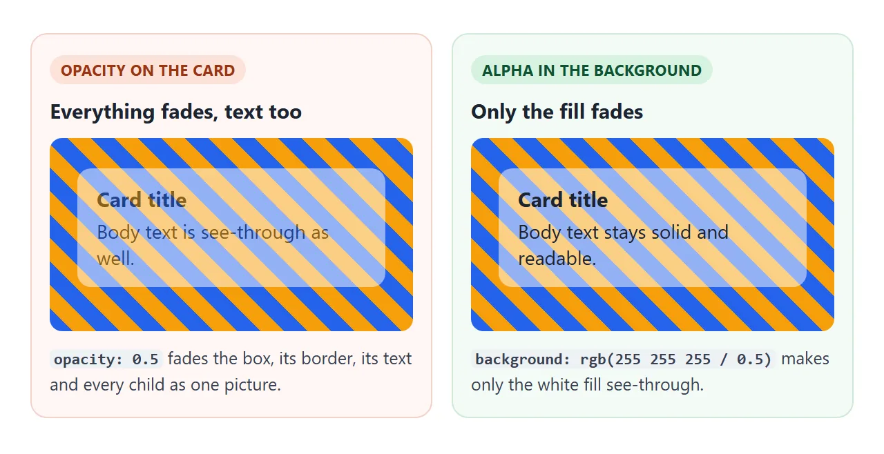
When the goal is a see-through panel over a photo with readable text, move the transparency into the color:
.panel { background: rgb(255 255 255 / 0.6); }   /* same as rgba(255, 255, 255, 0.6) */
.dark  { background: hsl(220 30% 10% / 60%); }
.hex   { background: #ffffff99; }                /* last two digits are the alpha */
.mix   { background: color-mix(in srgb, white 60%, transparent); }
All four fade only the background. The same idea works for borders, text and shadows: give that one color an alpha value. This is also the answer to "background opacity in CSS", since no separate background-opacity property exists.
opacity: 0 vs visibility: hidden vs display: none
All three make an element disappear from view. They differ in what is left behind. Hide the three buttons below, then click where they were and press Tab from the Start here button.
<!doctype html>
<html lang="en">
<head>
<meta charset="utf-8">
<meta name="viewport" content="width=device-width, initial-scale=1">
<title>opacity: 0 vs visibility: hidden vs display: none</title>
<style>
  body { margin: 0; padding: 14px; font-family: system-ui, sans-serif; color: #1d2330; background: #f4f5f7; }
  .bar { display: flex; gap: 8px; flex-wrap: wrap; margin-bottom: 12px; }
  .bar button { font: inherit; font-size: 14px; padding: 8px 12px; border-radius: 8px; border: 1px solid #c9cdd4; background: #fff; cursor: pointer; }
  .row {
    display: flex; align-items: center; gap: 8px; flex-wrap: wrap;
    background: #fff; border-radius: 10px; padding: 10px 12px; margin-bottom: 8px;
  }
  .row code { width: 150px; font-size: 13px; font-weight: 600; }
  .t { font: inherit; font-size: 14px; padding: 7px 12px; border-radius: 8px; border: 0; background: #2563eb; color: #fff; cursor: pointer; }
  .next { font-size: 13px; padding: 6px 10px; border-radius: 6px; background: #e8ebf0; }
  .status { flex-basis: 100%; font-size: 13px; color: #5b6270; min-height: 1.2em; }

  /* the three ways to hide, switched on by the "hidden" class on body */
  .hidden #op  { opacity: 0; }
  .hidden #vis { visibility: hidden; }
  .hidden #dis { display: none; }
</style>
</head>
<body>
<div class="bar">
  <button id="toggle">Hide the blue buttons</button>
  <button id="start">Start here, then press Tab</button>
</div>

<div class="row" data-name="opacity: 0"><code>opacity: 0</code><button class="t" id="op">Click me</button><span class="next">next item</span><div class="status"></div></div>
<div class="row" data-name="visibility: hidden"><code>visibility: hidden</code><button class="t" id="vis">Click me</button><span class="next">next item</span><div class="status"></div></div>
<div class="row" data-name="display: none"><code>display: none</code><button class="t" id="dis">Click me</button><span class="next">next item</span><div class="status"></div></div>

<script>
  const toggle = document.getElementById('toggle');
  toggle.addEventListener('click', () => {
    const on = document.body.classList.toggle('hidden');
    toggle.textContent = on ? 'Show the blue buttons' : 'Hide the blue buttons';
    document.querySelectorAll('.status').forEach((s) => (s.textContent = on
      ? 'Hidden. Click where the button was, or press Tab.' : ''));
  });

  document.querySelectorAll('.row').forEach((row) => {
    const status = row.querySelector('.status');
    const btn = row.querySelector('.t');
    // a click that reaches the button
    btn.addEventListener('click', (e) => {
      e.stopPropagation();
      status.textContent = 'The button got the click.';
    });
    // a click anywhere else in the row, including the empty spot
    row.addEventListener('click', () => {
      status.textContent = 'The click hit the empty row. The button did not get it.';
    });
    btn.addEventListener('focus', () => {
      status.textContent = 'Tab stopped on this button.';
    });
  });
</script>
</body>
</html>
opacity: 0 |
visibility: hidden |
display: none |
|
|---|---|---|---|
| Keeps its space | Yes | Yes | No |
| Gets clicks and taps | Yes | No | No |
| Tab key stops on it | Yes | No | No |
| Screen readers reach it | Yes | No | No |
| Can be faded with transition | Yes | Only as an on/off step | No |
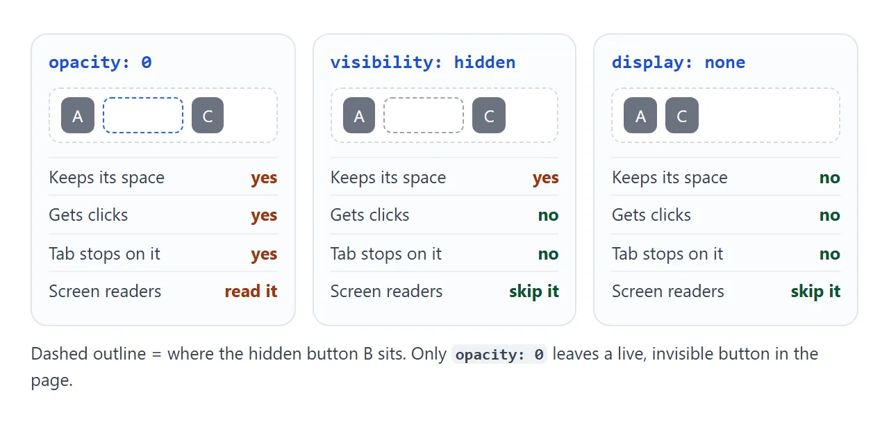
Use opacity: 0 for the start or end of a fade. Use visibility: hidden when the space should stay but nothing should respond. Use display: none when the element should be gone from the page entirely.
Fading in and out with transition
opacity animates smoothly between any two values. Put the transition on the element's normal state, and change the value on hover or with a class:
.toast {
  opacity: 0;
  visibility: hidden;
  transition: opacity .3s, visibility .3s;
}
.toast.show {
  opacity: 1;
  visibility: visible;
}
Pairing visibility with opacity fixes the click problem. visibility switches in one step, and the browser keeps it visible for the whole transition, so the fade still plays both ways. CSS hover transition covers where the transition rule goes.
Opacity creates a stacking context
Any opacity below 1, even 0.99, makes the element a new stacking context. Its children are then layered only among themselves. A child's z-index: 999 can no longer lift it above something outside the parent.
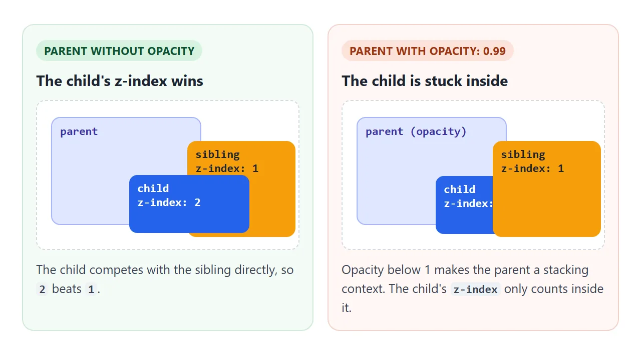
If a dropdown or tooltip slides behind its neighbours after you add a fade, this is the reason. CSS z-index explains stacking contexts in full.
Image opacity on hover
Dimming a picture on hover is one line plus a transition. A dark background behind the image makes the dimmed version darker instead of washed out. The finished tile below fades the image down and a caption up.
<!doctype html>
<html lang="en">
<head>
<meta charset="utf-8">
<meta name="viewport" content="width=device-width, initial-scale=1">
<title>Image caption that fades in on hover</title>
<style>
  body { margin: 0; padding: 14px; font-family: system-ui, sans-serif; background: #f4f5f7; }
  .hint { margin: 0 0 10px; font-size: 14px; color: #5b6270; }
  .grid { display: grid; grid-template-columns: repeat(auto-fill, minmax(150px, 1fr)); gap: 12px; }

  .tile {
    position: relative; margin: 0; border-radius: 12px; overflow: hidden;
    background: #111;  /* shows through when the image fades */
    aspect-ratio: 4 / 3;
  }
  .tile svg { display: block; width: 100%; height: 100%; transition: opacity .3s; }
  .tile figcaption {
    position: absolute; left: 0; right: 0; bottom: 0; padding: 10px 12px;
    color: #fff; font-size: 14px; line-height: 1.35;
    background: rgb(0 0 0 / .55);  /* see-through fill, solid text */
    opacity: 0;                    /* hidden, but still read by screen readers */
    transition: opacity .3s;
  }
  .tile figcaption b { display: block; font-size: 15px; }

  /* mouse over the tile, or keyboard focus on it */
  .tile:hover figcaption, .tile:focus-visible figcaption { opacity: 1; }
  .tile:hover svg, .tile:focus-visible svg { opacity: .7; }
  .tile:focus-visible { outline: 3px solid #2563eb; outline-offset: 2px; }

  /* touch screens have no hover: show the captions all the time */
  @media (hover: none) {
    .tile figcaption { opacity: 1; }
  }
  /* respect the "reduce motion" setting: switch instantly */
  @media (prefers-reduced-motion: reduce) {
    .tile svg, .tile figcaption { transition: none; }
  }
</style>
</head>
<body>
<p class="hint">Hover a picture, or press Tab to move between them.</p>
<div class="grid">
  <figure class="tile" tabindex="0">
    <svg viewBox="0 0 120 90" preserveAspectRatio="xMidYMid slice" aria-hidden="true">
      <rect width="120" height="90" fill="#7dd3fc"/><circle cx="92" cy="22" r="10" fill="#fde047"/>
      <path d="M0 90 L38 40 L62 70 L84 48 L120 90Z" fill="#166534"/>
    </svg>
    <figcaption><b>Ridge</b>Morning light over the pass.</figcaption>
  </figure>
  <figure class="tile" tabindex="0">
    <svg viewBox="0 0 120 90" preserveAspectRatio="xMidYMid slice" aria-hidden="true">
      <rect width="120" height="90" fill="#fb923c"/><circle cx="60" cy="58" r="20" fill="#fef08a"/>
      <rect y="62" width="120" height="28" fill="#1e3a8a"/>
    </svg>
    <figcaption><b>Harbour</b>Sunset from the pier.</figcaption>
  </figure>
  <figure class="tile" tabindex="0">
    <svg viewBox="0 0 120 90" preserveAspectRatio="xMidYMid slice" aria-hidden="true">
      <rect width="120" height="90" fill="#bbf7d0"/>
      <rect x="18" y="30" width="14" height="60" fill="#78350f"/><circle cx="25" cy="30" r="18" fill="#15803d"/>
      <rect x="74" y="40" width="12" height="50" fill="#78350f"/><circle cx="80" cy="40" r="15" fill="#16a34a"/>
    </svg>
    <figcaption><b>Orchard</b>Two trees, late spring.</figcaption>
  </figure>
</div>
</body>
</html>
- Hover and keyboard: the same rule lists
:hoverand:focus-visible, and each tile hastabindex="0". - Caption fill:
rgb(0 0 0 / .55)behind the caption, so the fill is see-through but the white text stays solid. - Touch screens:
@media (hover: none)shows captions all the time, since a finger cannot hover. - Reduced motion:
@media (prefers-reduced-motion: reduce)turns the transition off.
A caption at opacity: 0 is still read by screen readers, which suits a gallery. For a full grid, see HTML image gallery.
When it does not work
| What you see | Cause | Fix |
|---|---|---|
| The text fades along with the background | opacity fades the element and all its children |
Use an alpha color on background instead |
| An invisible element still catches clicks | opacity: 0 keeps it clickable and focusable |
Add visibility: hidden or pointer-events: none |
A child stays faded even with opacity: 1 |
The parent is faded as one group | Move the child out of the parent, or fade only the parent's background |
| The fade does not play when showing the element | It starts from display: none, which does not transition |
Hide with opacity: 0 plus visibility: hidden |
| A dropdown slides behind other content after adding a fade | Opacity below 1 creates a stacking context | Put the z-index on the faded parent, or fade a different element |
For the display: none case, newer CSS adds @starting-style and transition-behavior: allow-discrete to animate from it. The visibility pairing above works without them.
Share it as a link
A fade is easier to show than to describe. A screenshot catches one frame, and an .html attachment may open as plain code on a phone.
To send the working version, paste the page into a NOS document and choose Create share link. HTML to link walks through it. The page renders as written and its scripts run, so the people you send it to can drag the slider and hover the tiles themselves.
If you change the code later, the same link shows the new version.