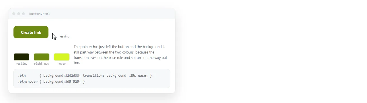
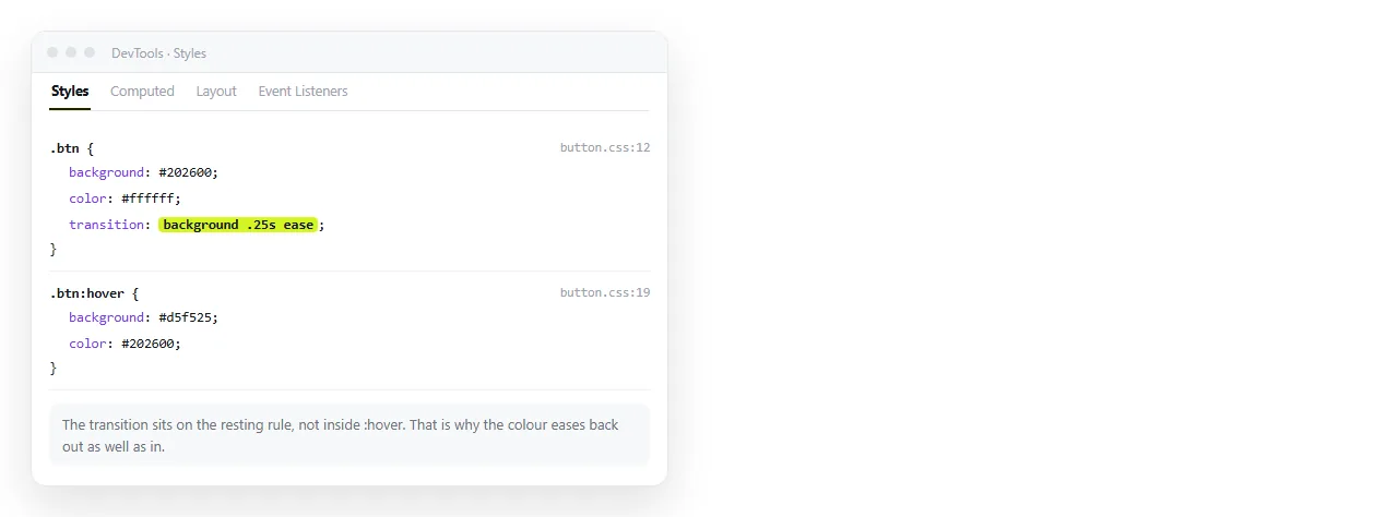
A CSS hover transition works when the transition property sits on the element's resting state, not inside the :hover rule.
/* correct: eases in and out */
.btn {
  background: #1e293b;
  transition: background 160ms ease, transform 160ms ease;
}
.btn:hover { background: #334155; transform: translateY(-1px); }
/* wrong: eases in, snaps back */
.btn { background: #1e293b; }
.btn:hover {
  background: #334155;
  transition: background 160ms ease;
}
Why the placement matters
A transition is a property of the state the element is in. When the pointer leaves, the element goes back to the base rule, and the browser looks at that rule for a transition.
If the only transition declaration lives in :hover, that declaration is gone at exactly the moment it would be needed. The return is instantaneous.
There is one deliberate use for the wrong version: a fast fade in and an instant reset, sometimes wanted for a tooltip. It is a choice, not the default.
The four parts of the shorthand
transition: background 160ms cubic-bezier(.2,.7,.3,1) 0ms;
/*          property   duration  timing function       delay */
| Part | Typical value | Notes |
|---|---|---|
| property | A named property | all is convenient and animates things you did not intend |
| duration | 120ms to 220ms | Under 100ms is not perceived, over 300ms feels slow |
| timing function | ease, ease-out, a bezier |
linear reads as mechanical for interface motion |
| delay | 0ms |
Useful on a dropdown so a brief pointer slip does not close it |
Name the properties rather than using all. all catches layout properties added later and turns a cheap effect into a per frame reflow.
Which properties are cheap
- Cheap.
opacityandtransform. Handled by the compositor, no layout recalculation. - Moderate.
background-color,color,border-color,box-shadow. A repaint each frame. - Expensive.
width,height,padding,margin,top. Layout runs every frame for the whole subtree.
A lift on hover should be transform: translateY(-1px), not margin-top: -1px. They look identical and cost very different amounts.
The difference is invisible on one button and obvious on a table of two hundred rows, where every hover reflows the page. Check a long list before deciding a layout property is fine.
What cannot transition
Transitions need two numeric or colour endpoints the browser can interpolate.
displayis discrete, sononetoblockjumps. Fadeopacityand usevisibilitywith a delay, or the newertransition-behavior: allow-discrete.height: autohas no computed number until layout runs. Transitioning height to auto covers the workarounds.- Two different
background-imagevalues swap instantly. Stack two layers and cross fade their opacity instead.
Covering keyboard and touch
Hover alone reaches only one kind of reader. Two additions handle the rest.
@media (any-hover: hover) {
  .card:hover { transform: translateY(-2px); border-color: #38bdf8; }
}

.card:focus-visible {
  transform: translateY(-2px);
  border-color: #38bdf8;
  outline: 2px solid #38bdf8;
  outline-offset: 2px;
}
The any-hover query stops a touch device entering a hover state it cannot leave. :focus-visible gives keyboard users the same feedback without putting an outline on every mouse click.
Keep the outline. Removing it and relying on the colour change leaves keyboard users guessing, and a colour shift alone can fail contrast requirements.
Reduced motion
@media (prefers-reduced-motion: reduce) {
  .btn, .card { transition: none; }
}
The end state still applies, so nothing is lost. This is the same guard used for page load animation.
Different speeds in and out
An asymmetric transition often feels better than a matched one. In fast, out slower, or the reverse for something that should feel deliberate.
.chip {
  background: #1e293b;
  transition: background 220ms ease;
}
.chip:hover {
  background: #334155;
  transition-duration: 110ms;
}
The base rule still owns the property, so the return has a transition. The hover rule only overrides the duration while the pointer is there.
This is the one legitimate reason to put a transition declaration inside :hover, and it is a single sub property rather than the whole shorthand.
Transitioning several properties
List them, with their own durations if needed.
.tile {
  transition:
    transform 180ms cubic-bezier(.2,.7,.3,1),
    box-shadow 260ms ease,
    border-color 120ms linear;
}
A slightly longer shadow than movement reads as the element lifting rather than snapping. Keep the differences small. More than about a hundred milliseconds apart and the parts look unrelated.
Group hover without extra classes
Changing a child when the parent is hovered needs no JavaScript.
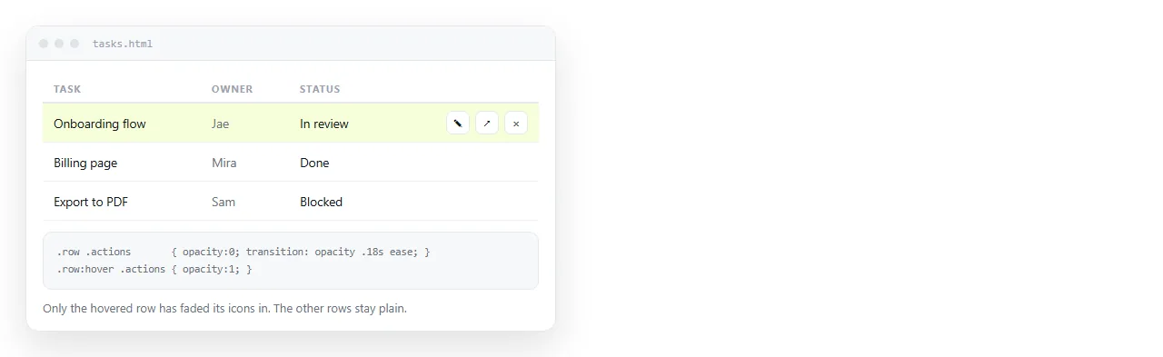
.card .arrow {
  opacity: 0;
  transform: translateX(-4px);
  transition: opacity 150ms ease, transform 150ms ease;
}
.card:hover .arrow { opacity: 1; transform: none; }
The transition sits on the child's resting state, which is the same rule as before applied one level down. This works well for revealing row actions in a table, where a persistent icon on every row is noise.
Hovering a whole row or card
Making the entire card clickable, with the hover effect on the card rather than the link, is a common pattern with one trap. A ::after overlay covers the text and stops it being selectable.
.card { position: relative; transition: border-color 150ms ease; }
.card:hover { border-color: #38bdf8; }
.card a::after {
  content: "";
  position: absolute;
  inset: 0;
}
Putting the overlay on the link rather than a separate element keeps one real anchor, so the URL appears in the status bar and the keyboard reaches it. Text selection inside the card still fails, which is the accepted cost.
If the card contains a second action, a delete button for example, give that button position: relative and a higher z-index so it sits above the overlay.
Checking it somewhere neutral
Hover effects that live in an external stylesheet disappear when the file moves, and the page then looks static rather than broken, so nobody reports it.
Paste the HTML into a NOS document and open the share link on a laptop and a phone. The CSS renders as written, so what you see there is what a reader sees.
Two things to confirm. That the ease works in both directions with a pointer, and that nothing stays stuck in the hover state after a tap on the phone.