A CSS transition animates a property from its old value to its new value whenever that value changes. You write it once on the element, for example transition: opacity 300ms ease, and every later change to opacity slides over 300 milliseconds instead of snapping.
Try it. Change the duration, the delay and the timing function, then press Move. The line under the button is the CSS that is running.
<!doctype html>
<html lang="en">
<head>
<meta charset="utf-8">
<meta name="viewport" content="width=device-width, initial-scale=1">
<title>CSS transition playground</title>
<style>
  body { margin: 0; padding: 14px; font-family: system-ui, sans-serif; background: #f4f5f7; color: #1d2330; }
  .track { position: relative; height: 56px; border-radius: 12px; background: #fff; box-shadow: inset 0 0 0 1px #dde1e7; }
  .ball {
    position: absolute; top: 8px; left: 8px;
    width: 40px; height: 40px; border-radius: 50%; background: #2563eb;
    /* the whole lesson in one line: property, duration, timing function, delay */
    transition: left 600ms ease 0ms;
  }
  .ball.on { left: calc(100% - 48px); }
  .controls { display: grid; grid-template-columns: repeat(auto-fit, minmax(160px, 1fr)); gap: 10px 14px; margin: 14px 0 12px; font-size: 13px; }
  label { display: grid; gap: 4px; }
  select, input { font: inherit; }
  button { font: inherit; font-weight: 600; padding: 8px 16px; border: 0; border-radius: 8px; background: #1d2330; color: #fff; cursor: pointer; }
  code { display: block; margin-top: 10px; padding: 8px 10px; border-radius: 8px; background: #fff; font: 13px ui-monospace, Consolas, monospace; overflow-wrap: anywhere; }
  #log { margin: 8px 0 0; font-size: 13px; color: #0f5132; min-height: 1.4em; }
</style>
</head>
<body>
<div class="track"><div class="ball" id="ball"></div></div>

<div class="controls">
  <label>Duration: <span id="durOut">600ms</span>
    <input id="dur" type="range" min="100" max="2000" step="100" value="600"></label>
  <label>Delay: <span id="delOut">0ms</span>
    <input id="del" type="range" min="0" max="1000" step="100" value="0"></label>
  <label>Timing function
    <select id="ease">
      <option>ease</option><option>linear</option><option>ease-in</option>
      <option>ease-out</option><option>ease-in-out</option>
      <option>cubic-bezier(.34, 1.56, .64, 1)</option>
      <option>steps(5)</option>
    </select></label>
</div>

<button id="go">Move</button>
<code id="css"></code>
<p id="log"></p>

<script>
  const ball = document.getElementById('ball');
  const dur = document.getElementById('dur'), del = document.getElementById('del'), ease = document.getElementById('ease');
  const log = document.getElementById('log');

  function update() {
    const t = `left ${dur.value}ms ${ease.value} ${del.value}ms`;
    ball.style.transition = t;  // same as writing it in the stylesheet
    document.getElementById('css').textContent = `transition: ${t};`;
    document.getElementById('durOut').textContent = dur.value + 'ms';
    document.getElementById('delOut').textContent = del.value + 'ms';
  }
  [dur, del, ease].forEach((el) => el.addEventListener('input', update));
  update();

  let started = 0;
  document.getElementById('go').addEventListener('click', () => {
    started = performance.now();
    log.textContent = 'Moving...';
    ball.classList.toggle('on');  // change the value; the transition animates it
  });

  // fires once per property when the transition finishes
  ball.addEventListener('transitionend', (e) => {
    const ms = Math.round(performance.now() - started);
    log.textContent = `transitionend: ${e.propertyName}, ${e.elapsedTime}s of motion, ${ms}ms after the click`;
  });
</script>
</body>
</html>
The transition does not start anything by itself. Something else changes the value: a class toggled by a click, a :hover rule, or a style set from JavaScript. The transition only decides how the change looks.
The five properties behind the shorthand
transition is a shorthand. Each part has its own property, and each has a default.
| Property | Default | What it controls |
|---|---|---|
transition-property |
all |
Which properties animate |
transition-duration |
0s |
How long the change takes |
transition-timing-function |
ease |
How speed varies along the way |
transition-delay |
0s |
How long to wait before starting |
transition-behavior |
normal |
Whether properties like display take part |
The duration default explains a common surprise. With 0s, every property already "transitions", just instantly. Nothing moves until you give a duration.
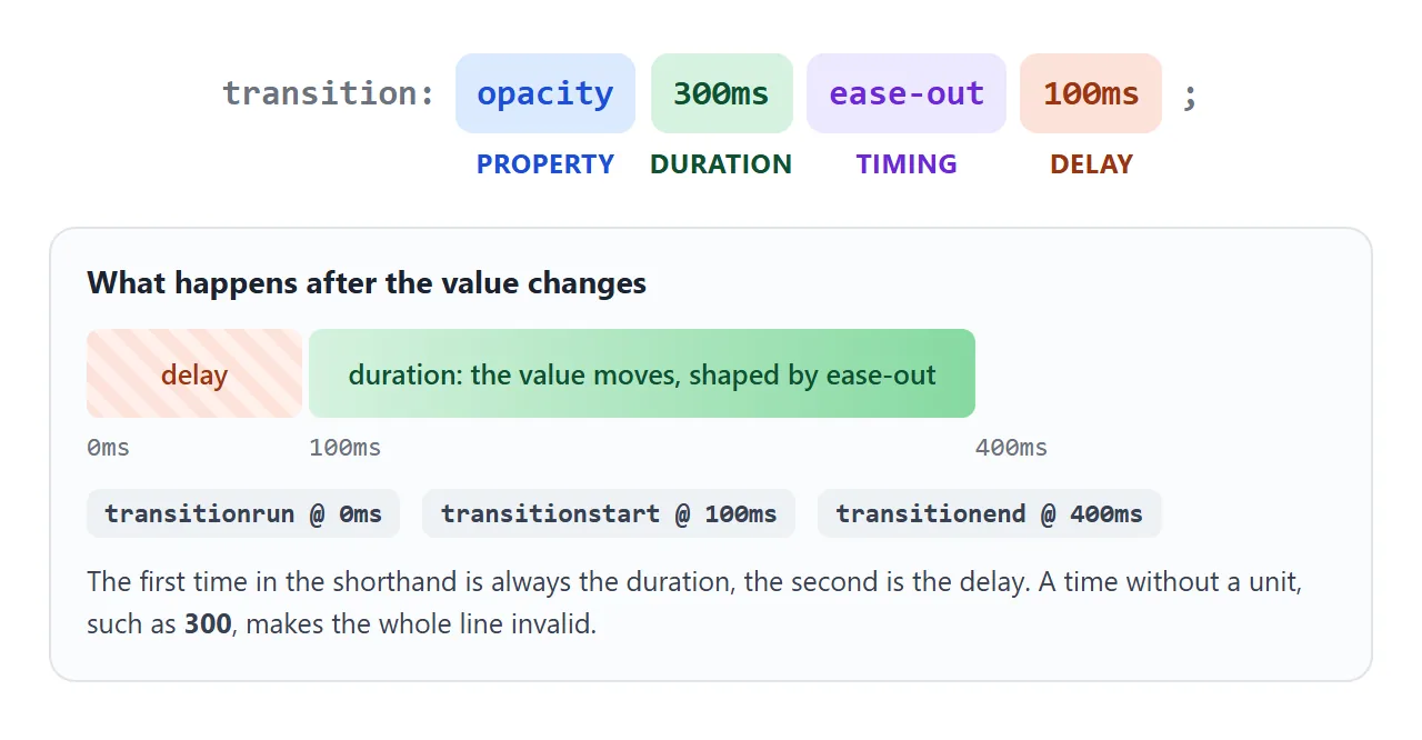
Order inside the shorthand matters only for times. The first time is the duration and the second is the delay. The property name and the timing function can sit anywhere.
Every time needs a unit, ms or s. transition: opacity 300 is invalid, and the browser drops the whole declaration.
Several properties, and staggered delays
Separate transitions with commas. Each one gets its own duration, timing and delay.
.card {
  transition:
    transform 200ms ease-out,
    box-shadow 300ms ease-out,
    background-color 150ms linear;
}
You can also write the long form with lists. The values line up by position: the first duration goes with the first property.
.card {
  transition-property: opacity, transform;
  transition-duration: 200ms, 400ms;
}
transition: all 300ms is shorter, but it animates every property that changes, including ones you did not plan for. Naming the properties keeps the motion you meant and nothing else.
transition-delay waits before the value starts moving. It is useful for staggering a list, where each item gets a slightly longer delay than the one before.
A negative delay starts the transition partway through. With transition: opacity 1s -0.5s, the fade begins as if half a second had already passed.
Keep motion short for people who have asked their system for less of it. The prefers-reduced-motion media query lets you shorten or remove transitions for them.
For where to put the rule on hover effects, and how to use different speeds on the way in and out, see CSS hover transition.
Timing functions: ease, cubic-bezier and steps
The timing function decides how the time is spent. Every dot below takes the same 1.6 seconds. Only the timing function differs.
<!doctype html>
<html lang="en">
<head>
<meta charset="utf-8">
<meta name="viewport" content="width=device-width, initial-scale=1">
<title>Timing functions side by side</title>
<style>
  body { margin: 0; padding: 14px; font-family: system-ui, sans-serif; background: #f4f5f7; color: #1d2330; }
  .lane { display: grid; grid-template-columns: 118px 1fr; align-items: center; gap: 8px; margin-bottom: 6px; }
  .lane span { font: 12px ui-monospace, Consolas, monospace; overflow-wrap: anywhere; }
  .track { position: relative; height: 34px; border-radius: 8px; background: #fff; box-shadow: inset 0 0 0 1px #dde1e7; }
  .dot {
    position: absolute; top: 5px; left: 5px; width: 24px; height: 24px; border-radius: 50%; background: #2563eb;
    transition: left 1.6s;  /* same duration for all; only the timing function differs */
  }
  .run .dot { left: calc(100% - 29px); }
  button { font: inherit; font-weight: 600; padding: 8px 16px; border: 0; border-radius: 8px; background: #1d2330; color: #fff; cursor: pointer; margin-top: 6px; }
</style>
</head>
<body>
<div id="race">
  <div class="lane"><span>linear</span><div class="track"><i class="dot" style="transition-timing-function: linear"></i></div></div>
  <div class="lane"><span>ease</span><div class="track"><i class="dot" style="transition-timing-function: ease"></i></div></div>
  <div class="lane"><span>ease-in</span><div class="track"><i class="dot" style="transition-timing-function: ease-in"></i></div></div>
  <div class="lane"><span>ease-out</span><div class="track"><i class="dot" style="transition-timing-function: ease-out"></i></div></div>
  <div class="lane"><span>ease-in-out</span><div class="track"><i class="dot" style="transition-timing-function: ease-in-out"></i></div></div>
  <div class="lane"><span>cubic-bezier(.34, 1.56, .64, 1)</span><div class="track"><i class="dot" style="transition-timing-function: cubic-bezier(.34, 1.56, .64, 1)"></i></div></div>
  <div class="lane"><span>steps(5)</span><div class="track"><i class="dot" style="transition-timing-function: steps(5)"></i></div></div>
</div>
<button id="go">Run</button>

<script>
  // every dot starts and ends together; watch how each one spends the 1.6 seconds
  document.getElementById('go').addEventListener('click', () => {
    document.getElementById('race').classList.toggle('run');
  });
</script>
</body>
</html>
The five keywords are fixed curves. Four of them are cubic-bezier curves with set numbers.
| Keyword | Same as | Feels like |
|---|---|---|
linear |
cubic-bezier(0, 0, 1, 1) |
Machine-steady |
ease |
cubic-bezier(0.25, 0.1, 0.25, 1) |
Quick start, soft landing |
ease-in |
cubic-bezier(0.42, 0, 1, 1) |
Slow start, sudden stop |
ease-out |
cubic-bezier(0, 0, 0.58, 1) |
Fast start, gentle stop |
ease-in-out |
cubic-bezier(0.42, 0, 0.58, 1) |
Slow at both ends |
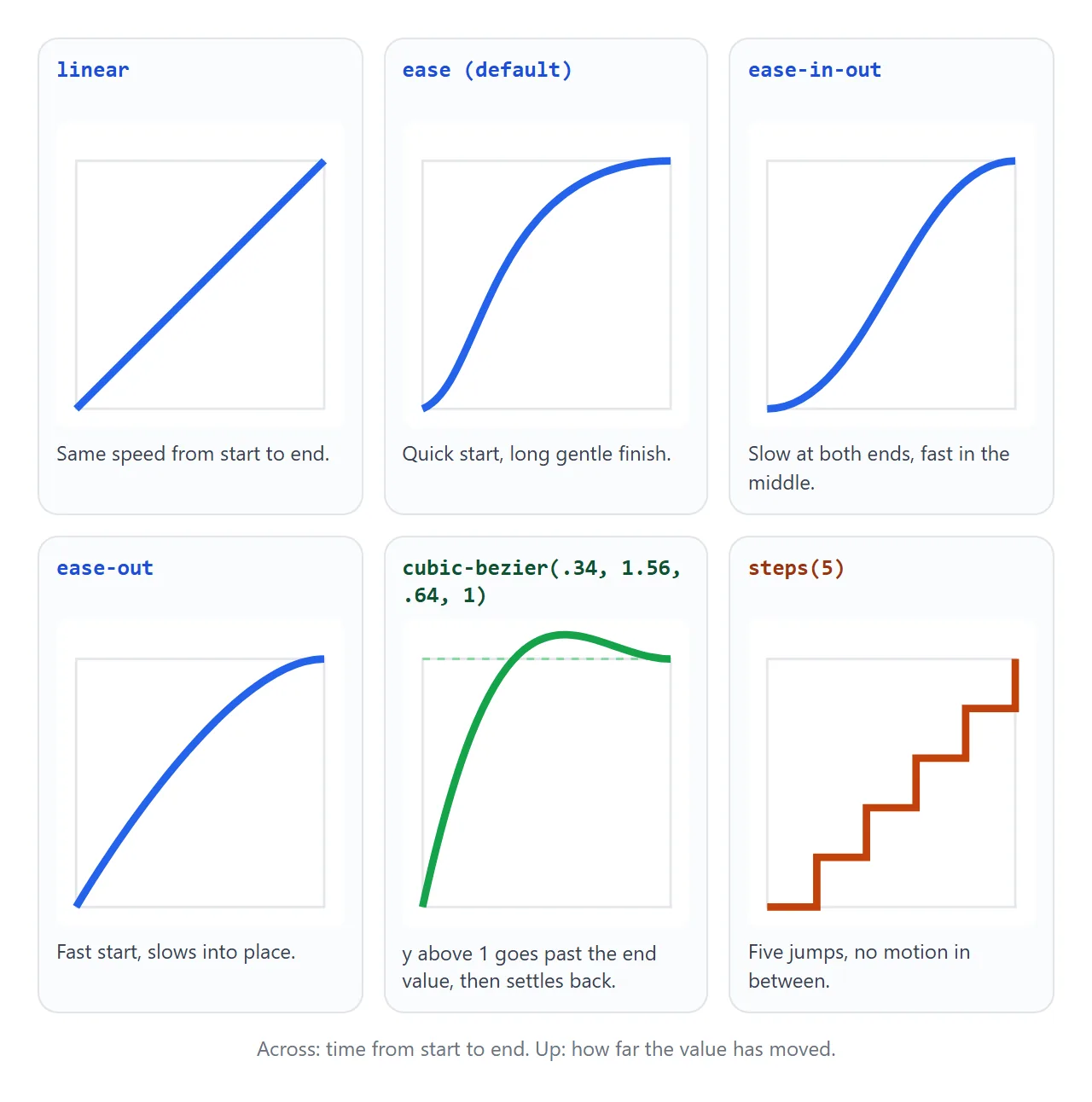
cubic-bezier(x1, y1, x2, y2) takes two control points. The x values are time and must stay between 0 and 1, or the declaration is invalid. The y values can go outside that range.
A y above 1 carries the value past its target before it settles, which reads as a small bounce.
steps(n) splits the change into n jumps with no motion in between. It suits a counter, a sprite sheet or a typing effect.
A second argument picks where the jumps fall:
jump-end(default, orend): holds the start value first.jump-start(orstart): jumps at once, so the start value never shows.jump-none: shows both the start and end values as steps.jump-both: jumps at the start and at the finish.
step-start and step-end are shortcuts for steps(1, jump-start) and steps(1, jump-end).
Fading in and out of display: none
display is a discrete property. It has no halfway point between none and block, so by default it flips instantly. On the way out, the element disappears at once and the fade on opacity never shows.
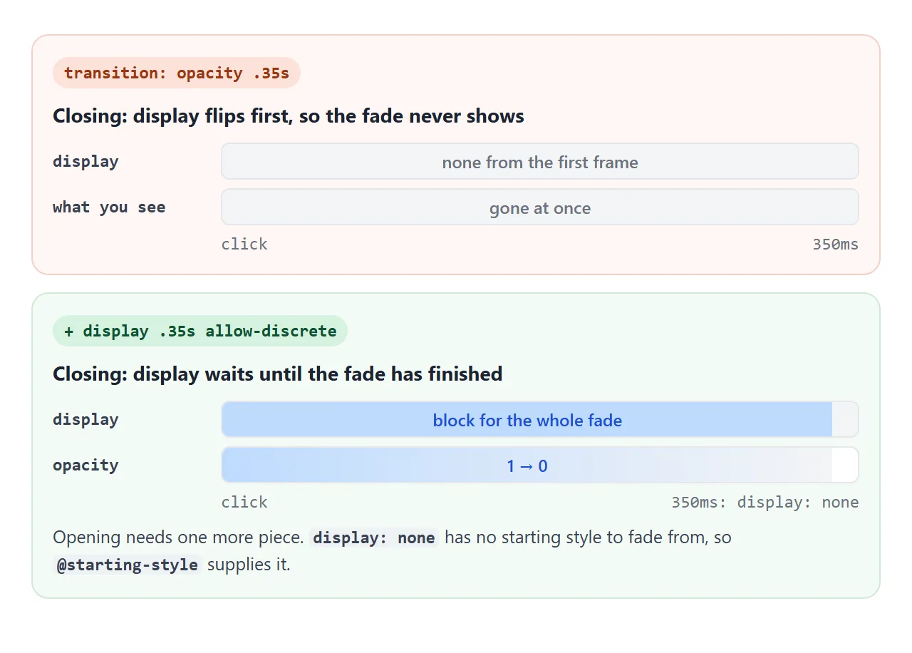
Two additions fix it:
transition-behavior: allow-discrete, orallow-discretein the shorthand, letsdisplayjoin in. On the way tonone, it waits for the fade.@starting-stylegives the browser a starting value for the way in. An element coming out ofdisplay: nonehas no previous style, so without this rule it appears at full opacity.
.panel {
  display: none;
  opacity: 0;
  transition: opacity .35s, display .35s allow-discrete;
}
.panel.open { display: block; opacity: 1; }

@starting-style {
  .panel.open { opacity: 0; }
}
Open and close the panel, then tick the box to see the same panel without the two additions.
<!doctype html>
<html lang="en">
<head>
<meta charset="utf-8">
<meta name="viewport" content="width=device-width, initial-scale=1">
<title>Fade in and out from display: none</title>
<style>
  body { margin: 0; padding: 14px; font-family: system-ui, sans-serif; background: #f4f5f7; color: #1d2330; }
  .bar { display: flex; flex-wrap: wrap; gap: 10px 16px; align-items: center; font-size: 13px; }
  button { font: inherit; font-weight: 600; padding: 8px 16px; border: 0; border-radius: 8px; background: #1d2330; color: #fff; cursor: pointer; }

  .panel {
    display: none; opacity: 0; transform: translateY(-10px);
    margin-top: 12px; padding: 14px 16px; border-radius: 12px; background: #fff;
    box-shadow: 0 8px 24px rgba(0, 0, 0, .12); font-size: 14px; line-height: 1.5;
    /* display joins the list with allow-discrete, so it waits for the fade */
    transition: opacity .35s, transform .35s, display .35s allow-discrete;
  }
  .panel.open { display: block; opacity: 1; transform: none; }
  /* where the fade-in starts, since display: none had no style to start from */
  @starting-style {
    body:not(.plain) .panel.open { opacity: 0; transform: translateY(-10px); }
  }

  /* the "without" version: same panel, no allow-discrete, no @starting-style */
  .plain .panel { transition: opacity .35s, transform .35s; }

  #log { margin: 12px 0 0; padding: 8px 10px; border-radius: 8px; background: #1d2330; color: #d1fae5;
         font: 12px/1.5 ui-monospace, Consolas, monospace; height: 96px; overflow: auto; }
</style>
</head>
<body>
<div class="bar">
  <button id="toggle" aria-expanded="false" aria-controls="panel">Show details</button>
  <label><input type="checkbox" id="plain"> Turn off allow-discrete and @starting-style</label>
</div>

<div class="panel" id="panel">
  <b>Order #1042</b><br>
  Two items, shipped Tuesday. While closed, this panel is display: none, so it takes no space and cannot be tabbed into.
</div>

<pre id="log"></pre>

<script>
  const panel = document.getElementById('panel');
  const btn = document.getElementById('toggle');
  const log = document.getElementById('log');
  const say = (s) => { log.textContent += s + '\n'; log.scrollTop = log.scrollHeight; };

  btn.addEventListener('click', () => {
    const open = panel.classList.toggle('open');
    btn.textContent = open ? 'Hide details' : 'Show details';
    btn.setAttribute('aria-expanded', open);
  });

  document.getElementById('plain').addEventListener('change', (e) => {
    document.body.classList.toggle('plain', e.target.checked);
    log.textContent = '';
  });

  // one event per property that transitioned
  panel.addEventListener('transitionrun', (e) => say(`run  ${e.propertyName}`));
  panel.addEventListener('transitionend', (e) => {
    say(`end  ${e.propertyName} (${e.elapsedTime}s)`);
    if (e.propertyName === 'opacity' && !panel.classList.contains('open')) say('-> fully closed');
  });
</script>
</body>
</html>
Other discrete properties, such as justify-content, also accept allow-discrete. They switch halfway through the duration. display is the exception that stays visible for the whole fade out and appears at the start of the fade in.
A popover or a dialog is also hidden with display: none, so it uses the same pattern.
Add overlay with allow-discrete to its list as well, so it stays on top while it fades out. More on the values themselves is in CSS display.
The transitionend event
When a transition finishes, the element receives a transitionend event. Use it to clean up after the motion: remove an element, move focus, or start the next step.
panel.addEventListener('transitionend', (e) => {
  if (e.propertyName !== 'opacity') return;  // one of several events
  // the fade has finished
});
Four things to know about it:
It fires once per property. A transition on
opacityandtransformsends two events. A shorthand such aspaddingsends four, one for each side. Checke.propertyName.e.elapsedTimedoes not count the delay. A 300ms transition with a 200ms delay reports0.3.It bubbles. A listener on a parent also hears transitions of its children. Check
e.targetif that matters.It does not fire if the transition is interrupted. Removing the transition or reversing the value midway sends
transitioncancelinstead.
transitionrun fires when the transition is created, before any delay. transitionstart fires when the delay is over and the value begins to move.
When it does not work
| What you see | Cause | Fix |
|---|---|---|
| The value snaps with no motion | No duration, or a time without a unit such as 300 |
Write 300ms or 0.3s |
The whole transition line is ignored |
A cubic-bezier x value outside 0 to 1 |
Keep x1 and x2 between 0 and 1 |
| An element you just added appears at its end state | It had no previous style, so there was nothing to animate from | Use @starting-style |
Showing from display: none does not fade in |
Same cause: display: none leaves no starting style |
@starting-style plus allow-discrete |
Hiding with display: none does not fade out |
display flips on the first frame |
Add display .35s allow-discrete to the list |
Height from 0 to auto jumps |
auto is not a number to animate toward |
See transition height auto |
| It animates on hover but snaps back | The transition is only in the :hover rule |
Put it on the element's base rule |
transitionend never fires |
The transition was cancelled, or the value never changed | Listen for transitioncancel too |
transitionend fires several times |
One event per property, and per side for shorthands | Filter on e.propertyName |
For motion that should loop, run on page load or pass through several stops, a transition is the wrong tool. Use CSS keyframes instead.
Share it as a link
Motion is hard to judge from a screenshot or a written description. The easing, the delay and the fade out only show when someone clicks.
To send a working version, paste the page into a NOS document and choose Create share link. HTML to link walks through it.
The page renders as written and its scripts run, so the person you send it to can press the buttons and see the timing themselves. If you adjust a duration later, the same link shows the new version.