A CSS animation needs an @keyframes rule with a name, and an animation property on the element that uses that name with a duration.
The keyframes list the styles at points in time. The animation properties set the length, the curve, the delay, the repeats and what happens at the end.
@keyframes move {
  from { transform: translateX(0); }
  to   { transform: translateX(200px); }
}

.box {
  animation: move 1.5s ease-in-out infinite alternate;
}
Try every setting below. The shorthand line under the controls updates as you change them, and Pause toggles animation-play-state.
<!doctype html>
<html lang="en">
<head>
<meta charset="utf-8">
<meta name="viewport" content="width=device-width, initial-scale=1">
<title>Animation property playground</title>
<style>
  body { margin: 0; padding: 14px; font-family: system-ui, sans-serif; background: #f4f5f7; color: #1d2330; }
  .track { position: relative; height: 64px; border-radius: 10px; background: #fff; border: 1px dashed #cfd4dc; }
  /* the runner is as wide as the track minus the box, so translateX(100%) lands at the end */
  .runner { position: absolute; left: 8px; top: 8px; width: calc(100% - 64px); }
  .box { width: 48px; height: 48px; border-radius: 10px; background: #2563eb; }

  @keyframes move {
    from { transform: translateX(0) scale(.6); opacity: .5; }
    to   { transform: translateX(100%) scale(1); opacity: 1; }
  }

  .controls { display: grid; grid-template-columns: repeat(auto-fit, minmax(150px, 1fr)); gap: 8px 12px; margin: 12px 0; }
  label { font-size: 13px; display: flex; flex-direction: column; gap: 3px; }
  select, input { font: inherit; }
  .buttons { display: flex; gap: 8px; flex-wrap: wrap; }
  button { font: inherit; padding: 7px 14px; border-radius: 8px; border: 1px solid #c8ced8; background: #fff; cursor: pointer; }
  button.main { background: #2563eb; color: #fff; border-color: #2563eb; }
  pre { margin: 12px 0 6px; padding: 10px 12px; border-radius: 8px; background: #1d2330; color: #e5e7eb;
        font: 13px/1.4 ui-monospace, Consolas, monospace; white-space: pre-wrap; word-break: break-word; }
  #log { font-size: 13px; color: #4b5563; margin: 0; }
</style>
</head>
<body>
<div class="track"><div class="runner" id="runner"><div class="box"></div></div></div>

<div class="controls">
  <label>duration <span><input id="duration" type="range" min="0.2" max="4" step="0.1" value="1.5"> <b id="durOut"></b></span></label>
  <label>timing-function
    <select id="timing">
      <option>ease</option><option>linear</option><option>ease-in</option><option>ease-out</option>
      <option>ease-in-out</option><option>steps(5)</option><option>cubic-bezier(.3, 1.5, .6, 1)</option>
    </select></label>
  <label>delay <span><input id="delay" type="range" min="-1" max="2" step="0.1" value="0.5"> <b id="delOut"></b></span></label>
  <label>iteration-count
    <select id="count"><option>1</option><option>2</option><option>2.5</option><option>infinite</option></select></label>
  <label>direction
    <select id="direction"><option>normal</option><option>reverse</option><option>alternate</option><option>alternate-reverse</option></select></label>
  <label>fill-mode
    <select id="fill"><option>none</option><option>forwards</option><option>backwards</option><option>both</option></select></label>
</div>

<div class="buttons">
  <button class="main" id="play">Play</button>
  <button id="pause">Pause</button>
</div>
<pre id="code"></pre>
<p id="log">Press Play.</p>

<script>
  const runner = document.getElementById('runner');
  const $ = (id) => document.getElementById(id);

  function shorthand() {
    // order: name duration timing-function delay iteration-count direction fill-mode
    return `move ${$('duration').value}s ${$('timing').value} ${$('delay').value}s ` +
           `${$('count').value} ${$('direction').value} ${$('fill').value}`;
  }

  function show() {
    $('durOut').textContent = $('duration').value + 's';
    $('delOut').textContent = $('delay').value + 's';
    $('code').textContent = `.box {\n  animation: ${shorthand()};\n}`;
  }

  $('play').addEventListener('click', () => {
    runner.style.animation = 'none';
    void runner.offsetWidth;            // force a reflow so the animation starts over
    runner.style.animation = shorthand();
    $('pause').textContent = 'Pause';
    $('log').textContent = 'Running...';
  });

  $('pause').addEventListener('click', () => {
    const paused = runner.style.animationPlayState === 'paused';
    runner.style.animationPlayState = paused ? 'running' : 'paused';
    $('pause').textContent = paused ? 'Pause' : 'Resume';
  });

  runner.addEventListener('animationstart', () => { $('log').textContent = 'animationstart fired.'; });
  runner.addEventListener('animationiteration', () => { $('log').textContent = 'animationiteration fired.'; });
  runner.addEventListener('animationend', () => {
    $('log').textContent = 'animationend fired. With fill-mode none or backwards the box snaps back to the start.';
  });

  document.querySelectorAll('input, select').forEach((el) => el.addEventListener('input', show));
  show();
</script>
</body>
</html>
@keyframes: from, to and percentages
Inside @keyframes, each block is a point on the animation's timeline. from means 0% and to means 100%. Percentages in between add more points, so one animation can grow, fade and come back.
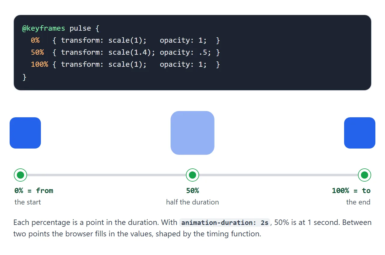
@keyframes pulse {
  0%, 100% { transform: scale(1);   opacity: 1; }
  50%      { transform: scale(1.4); opacity: .5; }
}
A few rules worth knowing:
- Points that share styles can share a selector, as
0%, 100%does above. - If you leave out
fromorto, the browser uses the element's current style for that end. - An
animation-timing-functionwritten inside a keyframe applies from that point to the next one. - Names are case sensitive.
slideInandslideinare two different animations.
The animation properties, one by one
| Property | What it sets | Common values |
|---|---|---|
animation-name |
Which @keyframes to run | the name, or none |
animation-duration |
Length of one cycle | 300ms, 2s (default 0s) |
animation-timing-function |
The speed curve | ease, linear, ease-in-out, steps(4) |
animation-delay |
Wait before starting | 0s, 200ms, -1s |
animation-iteration-count |
How many cycles | 1, 3, 2.5, infinite |
animation-direction |
Which way each cycle runs | normal, reverse, alternate, alternate-reverse |
animation-fill-mode |
Styles before and after | none, forwards, backwards, both |
animation-play-state |
Running or frozen | running, paused |
The animation shorthand takes the same values in one line. The name and the keywords can move around, but two things are fixed: the first time value is always the duration and the second is always the delay.
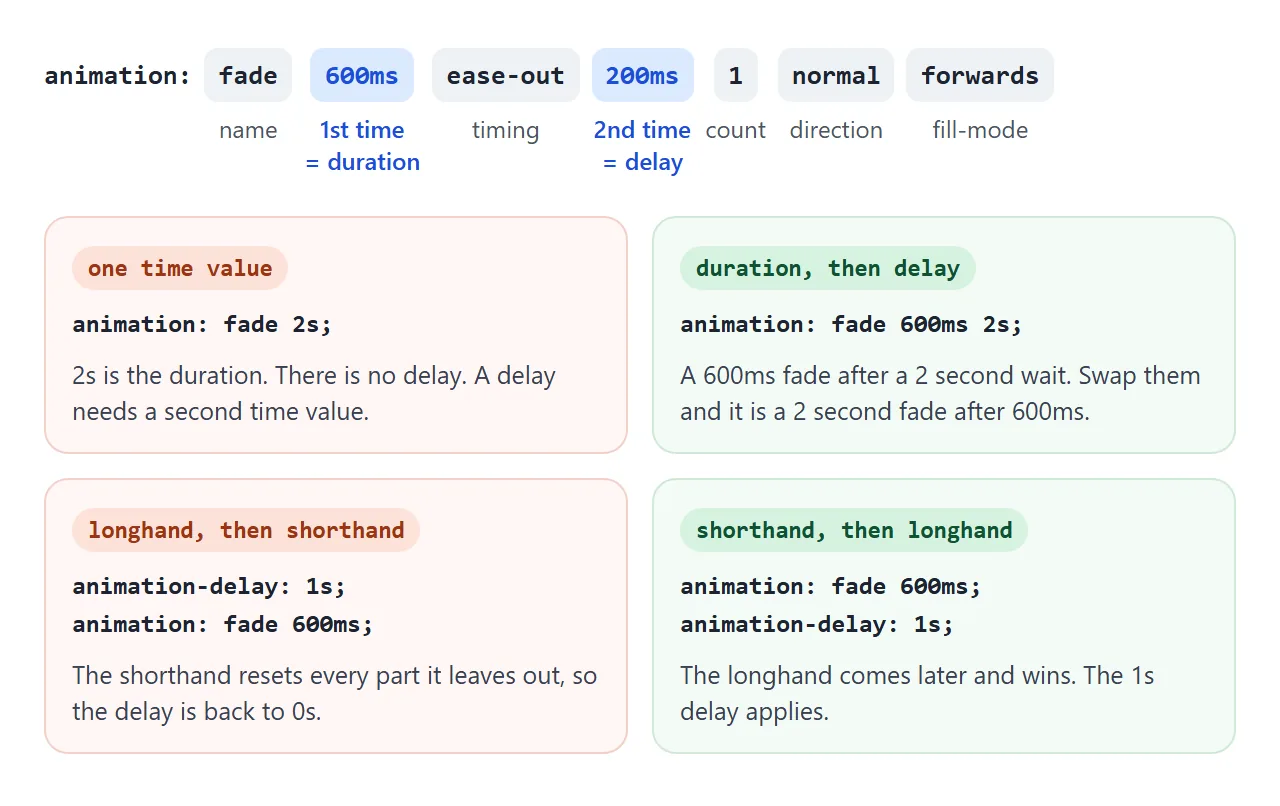
Write it as name, duration, timing function, delay, count, direction, fill-mode. That is the order the demo prints.
Also avoid naming an animation after a keyword such as ease or infinite, because the shorthand may read it as that keyword.
animation-fill-mode: where the element ends up
By default the keyframes only apply while the animation runs. When it ends, the element goes back to its own CSS, which looks like a snap back. During a positive delay, it also shows its own CSS, not the first keyframe.
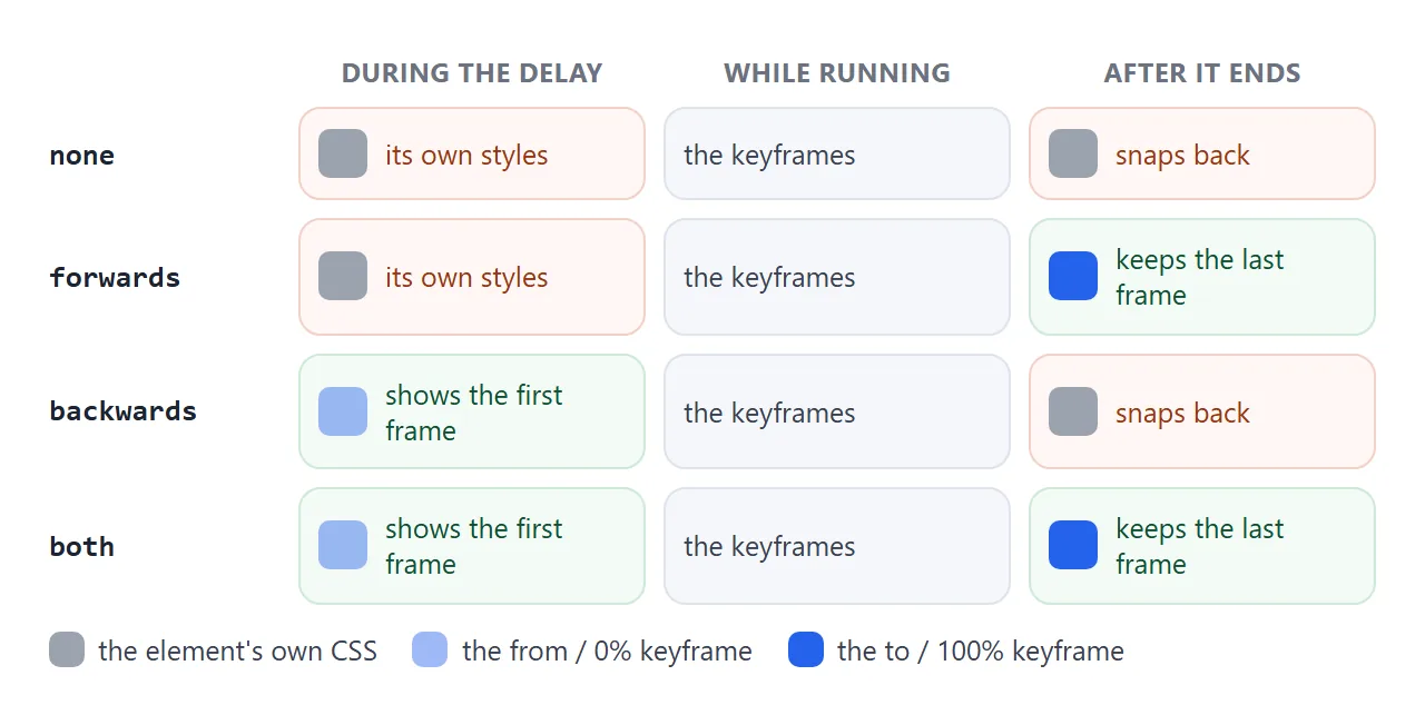
forwardskeeps the styles of the last keyframe played. Withalternateand an even count, that is thefromkeyframe.backwardsapplies the first keyframe during the delay, so nothing flashes before it starts.bothdoes the two together. For an entrance animation with a delay,bothis usually the one you want.
In the playground, set a 1.5s delay and switch between none and backwards to see the difference before the box moves.
Delays, negative delays and steps()
A positive delay makes an element wait. Giving each item in a row a slightly larger delay produces a wave. The catch is that on the first cycle, the later items sit still until their turn.
A negative delay starts the animation at once, as if it had already been running for that long. animation-delay: -0.6s on a 1.2s animation starts at the halfway point. Loaders built from several dots use this so the wave is there from the first frame.
<!doctype html>
<html lang="en">
<head>
<meta charset="utf-8">
<meta name="viewport" content="width=device-width, initial-scale=1">
<title>Delays and steps()</title>
<style>
  body { margin: 0; padding: 14px; font-family: system-ui, sans-serif; background: #f4f5f7; color: #1d2330; }
  h3 { margin: 0 0 6px; font-size: 14px; }
  h3 code { font-weight: 400; color: #4b5563; }
  .row { display: flex; gap: 12px; height: 44px; align-items: flex-end; padding: 0 4px 10px;
         background: #fff; border-radius: 10px; margin-bottom: 12px; }
  .dot { width: 16px; height: 16px; border-radius: 50%; background: #2563eb;
         animation: bounce 1.2s ease-in-out infinite; }
  .late .dot { background: #ea580c; }

  @keyframes bounce {
    0%, 100% { transform: translateY(0); }
    50%      { transform: translateY(-26px); }
  }

  /* positive delays: each dot waits, then starts */
  .late .dot:nth-child(2) { animation-delay: .15s; }
  .late .dot:nth-child(3) { animation-delay: .3s; }
  .late .dot:nth-child(4) { animation-delay: .45s; }
  .late .dot:nth-child(5) { animation-delay: .6s; }
  /* negative delays: each dot starts at once, already part way through */
  .early .dot:nth-child(2) { animation-delay: -.15s; }
  .early .dot:nth-child(3) { animation-delay: -.3s; }
  .early .dot:nth-child(4) { animation-delay: -.45s; }
  .early .dot:nth-child(5) { animation-delay: -.6s; }

  .clocks { display: flex; gap: 22px; flex-wrap: wrap; }
  .clock { text-align: center; font-size: 13px; }
  .face { position: relative; width: 110px; height: 110px; border-radius: 50%; background: #fff;
          border: 3px solid #1d2330; margin: 0 auto 4px; }
  .hand { position: absolute; left: calc(50% - 1.5px); top: 10px; width: 3px; height: 45px;
          background: #dc2626; border-radius: 2px; transform-origin: 50% 100%;
          animation: spin 60s infinite; }
  .tick .hand { animation-timing-function: steps(60); }   /* 60 jumps of 6deg */
  .smooth .hand { animation-timing-function: linear; }
  @keyframes spin { to { transform: rotate(360deg); } }

  button { font: inherit; padding: 7px 14px; border-radius: 8px; border: 1px solid #c8ced8; background: #fff; cursor: pointer; margin-top: 10px; }
</style>
</head>
<body>
<h3>Positive delays <code>0s, .15s, .3s ...</code></h3>
<div class="row late" id="late"><i class="dot"></i><i class="dot"></i><i class="dot"></i><i class="dot"></i><i class="dot"></i></div>

<h3>Negative delays <code>0s, -.15s, -.3s ...</code></h3>
<div class="row early" id="early"><i class="dot"></i><i class="dot"></i><i class="dot"></i><i class="dot"></i><i class="dot"></i></div>

<div class="clocks">
  <div class="clock tick"><div class="face"><div class="hand"></div></div><code>steps(60)</code></div>
  <div class="clock smooth"><div class="face"><div class="hand"></div></div><code>linear</code></div>
</div>

<button id="restart">Restart all</button>

<script>
  // Restart: remove the animations, force a reflow, then let the CSS apply again.
  document.getElementById('restart').addEventListener('click', () => {
    const els = document.querySelectorAll('.dot, .hand');
    els.forEach((el) => { el.style.animation = 'none'; });
    void document.body.offsetWidth;
    els.forEach((el) => { el.style.animation = ''; });
  });
</script>
</body>
</html>
steps(n) replaces the smooth curve with n jumps. A second hand is rotate(360deg) over 60 seconds in steps(60), one 6 degree tick per second. The same trick plays a sprite sheet: move a background image by one frame width per step.
.hand { animation: spin 60s steps(60) infinite; }
@keyframes spin { to { transform: rotate(360deg); } }
Running several animations at once
animation accepts a comma separated list. Each entry is its own animation with its own timing:
.badge {
  animation: fade-in 400ms ease-out both,
             wobble 2s ease-in-out 400ms infinite;
}
If two animations change the same property, such as transform, the one later in the list wins for that property. Give each a different property, or wrap the element and animate the wrapper. Longhands take lists too, and they pair up by position with animation-name.
Events, pausing and reduced motion
Animations fire DOM events. animationstart fires when it begins, animationiteration at each new cycle and animationend when it finishes. An infinite animation never fires animationend. These events bubble, so check event.animationName when a parent listens.
animation-play-state: paused freezes an animation where it is. Toggling a class that sets it is the simplest pause button.
Movement can make some people unwell. @media (prefers-reduced-motion: reduce) matches when the user has asked their system for less motion. Turn off floating and sliding there, and keep short opacity fades if the page depends on them.
For smooth motion, animate transform and opacity. Changing them does not force the browser to lay the page out again on every frame, unlike left, width or margin. CSS transform covers translate, rotate and scale.
This finished hero puts it together. The headline and text fade up once with both. The button appears on animationend of the second line. The shapes float until you press the pause button.
<!doctype html>
<html lang="en">
<head>
<meta charset="utf-8">
<meta name="viewport" content="width=device-width, initial-scale=1">
<title>Animated hero</title>
<style>
  body { margin: 0; font-family: system-ui, sans-serif; }
  .hero { position: relative; overflow: hidden; min-height: 400px; padding: 44px 24px; box-sizing: border-box;
          color: #fff; background: linear-gradient(135deg, #1e3a8a, #6d28d9); }

  /* floating shapes: transform only, so they stay smooth */
  .shape { position: absolute; border-radius: 50%; background: rgba(255, 255, 255, .14);
           animation: float 6s ease-in-out infinite alternate; }
  .s1 { width: 120px; height: 120px; right: -20px; top: 30px; }
  .s2 { width: 70px; height: 70px; right: 90px; bottom: 40px; animation-duration: 4s; animation-delay: -2s; }
  .s3 { width: 40px; height: 40px; left: 60%; top: 16px; animation-duration: 5s; animation-delay: -1s; }
  @keyframes float {
    from { transform: translateY(0) rotate(0deg); }
    to   { transform: translateY(-30px) rotate(40deg); }
  }
  .hero.paused .shape { animation-play-state: paused; }

  /* headline and text fade up once, then stay (fill-mode both) */
  .up { position: relative; animation: fade-up .7s ease-out both; }
  h1 { margin: 0 0 10px; font-size: clamp(26px, 7vw, 38px); line-height: 1.15; max-width: 14em; }
  p { margin: 0 0 20px; max-width: 30em; }
  p.up { animation-delay: .3s; }   /* after the shorthand's rule, and more specific */
  @keyframes fade-up {
    from { opacity: 0; transform: translateY(24px); }
    to   { opacity: 1; transform: translateY(0); }
  }

  .cta { position: relative; display: inline-block; padding: 11px 20px; border-radius: 10px; border: 0;
         font: 600 15px system-ui, sans-serif; background: #fff; color: #4c1d95; cursor: pointer;
         visibility: hidden; }
  .cta.show { visibility: visible; animation: pop .35s ease-out; }
  @keyframes pop { from { opacity: 0; transform: scale(.9); } to { opacity: 1; transform: scale(1); } }

  .toggle { position: absolute; right: 12px; bottom: 12px; font: 13px system-ui, sans-serif; padding: 6px 12px;
            border-radius: 99px; border: 1px solid rgba(255, 255, 255, .5); background: rgba(0, 0, 0, .25);
            color: #fff; cursor: pointer; }

  /* reduced motion: no floating, no sliding, only a short fade */
  @media (prefers-reduced-motion: reduce) {
    .shape { animation: none; }
    @keyframes fade-up { from { opacity: 0; } to { opacity: 1; } }
    .cta.show { animation: none; }
  }
</style>
</head>
<body>
<section class="hero" id="hero">
  <i class="shape s1"></i><i class="shape s2"></i><i class="shape s3"></i>
  <h1 class="up">Plans that ship on Friday</h1>
  <p class="up" id="sub">One board for the launch checklist, the copy review and the people who sign off.</p>
  <button class="cta" id="cta">Start free</button>
  <button class="toggle" id="toggle">Pause motion</button>
</section>

<script>
  const hero = document.getElementById('hero');
  const cta = document.getElementById('cta');
  const toggle = document.getElementById('toggle');

  // Reveal the button when the second line has finished fading in.
  // animationend bubbles, so check the name before acting.
  document.getElementById('sub').addEventListener('animationend', (e) => {
    if (e.animationName === 'fade-up') cta.classList.add('show');
  });

  // Pause and resume the floating shapes with animation-play-state.
  toggle.addEventListener('click', () => {
    const paused = hero.classList.toggle('paused');
    toggle.textContent = paused ? 'Play motion' : 'Pause motion';
  });
</script>
</body>
</html>
In the reduced motion block, the fade-up keyframes are replaced with an opacity-only version rather than removed. With animation: none there would be no animationend, and the button would never appear.
For hover effects that only need two states, a CSS transition is simpler than keyframes. For motion that starts with the page, see HTML animation on page load.
When it does not work
The full checklist is in CSS animation not working. The mistakes that come from the properties on this page:
| What you see | Cause | Fix |
|---|---|---|
| Nothing moves, no error | Shorthand has a name but no time value, so duration is 0s |
Add a duration after the name |
| The delay is ignored | Only one time value, so it became the duration | Write duration first, then delay |
| A delay set earlier is ignored | animation shorthand written after animation-delay reset it |
Put longhands after the shorthand |
| It jumps back at the end | Default fill-mode is none |
Add forwards or both |
| It runs once and never again | Re-adding a class that is still there does not restart it | Remove the class, force a reflow, add it again |
The restart needs the browser to see the removal before the class returns. Reading a layout value in between does that:
el.classList.remove('run');
void el.offsetWidth;   // forces a reflow
el.classList.add('run');
Share it as a link
Motion does not survive a screenshot, and an .html file sent as an attachment often opens as plain code on a phone. To show the animation itself, paste the page into a NOS document and choose Create share link. HTML to link walks through it.
The page renders as written and its scripts run, so the people you send it to see the animation play and can press the pause button themselves. If you change the timing later, the same link shows the new version.