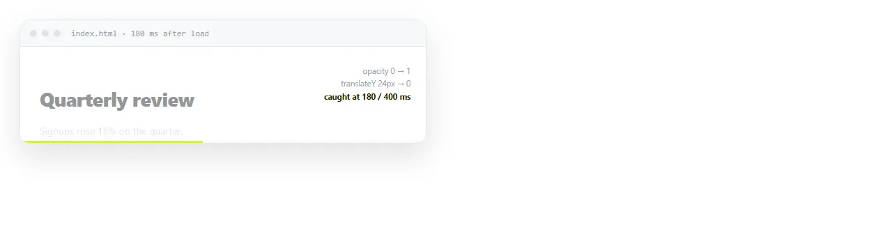
An HTML animation runs on page load when a CSS animation is set on an element with no trigger. The browser starts it as soon as the element renders, and no JavaScript is involved.
@keyframes rise {
  from { opacity: 0; transform: translateY(16px); }
  to   { opacity: 1; transform: none; }
}

.hero {
  animation: rise 500ms cubic-bezier(.2,.7,.3,1) both;
}
The keyword that removes the flash
both in that shorthand is animation-fill-mode. It matters more than the easing curve.
| Fill mode | Before the animation | After it ends |
|---|---|---|
none |
Element shows its normal styles | Snaps back to normal styles |
forwards |
Normal styles | Holds the last keyframe |
backwards |
Holds the first keyframe | Snaps back |
both |
Holds the first keyframe | Holds the last |
Without backwards or both, an element with a delay is fully visible during the delay, then jumps to opacity: 0 when the animation starts. That jump is the flash people ask about.
Staggering a list
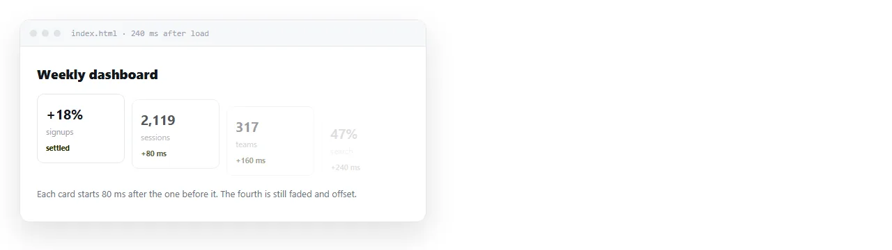
Sequential delays turn a group arriving at once into a group arriving in order. Written in plain CSS for a known count:
.card { animation: rise 420ms ease-out both; }
.card:nth-child(1) { animation-delay: 0ms; }
.card:nth-child(2) { animation-delay: 60ms; }
.card:nth-child(3) { animation-delay: 120ms; }
.card:nth-child(4) { animation-delay: 180ms; }
For an unknown count, set a custom property from script once and let CSS do the arithmetic:
document.querySelectorAll('.card').forEach((el, i) => {
  el.style.setProperty('--i', String(i));
});
.card { animation-delay: calc(var(--i, 0) * 60ms); }
Keep the total under about 400 milliseconds. A stagger long enough to notice as waiting is too long.
Waiting for the page to be ready
Sometimes the animation should not begin until fonts and images have settled, or the first frames land on a half drawn layout.
document.addEventListener('DOMContentLoaded', () => {
  requestAnimationFrame(() => document.body.classList.add('ready'));
});
body:not(.ready) .hero { opacity: 0; }
body.ready .hero { animation: rise 500ms ease-out both; }
The nested requestAnimationFrame gives the browser one frame to apply the initial state before the class flips. Without it the transition is sometimes skipped entirely.
One risk with this pattern. If the script fails, the content stays at opacity: 0 and the page looks empty. Prefer a no-preference guard or a timeout fallback for anything important.
Below the fold, reveal on scroll
Animating content the reader has not reached wastes the effect. An intersection observer runs it at the right moment.
const io = new IntersectionObserver((entries) => {
  entries.forEach(e => {
    if (e.isIntersecting) {
      e.target.classList.add('in');
      io.unobserve(e.target);
    }
  });
}, { threshold: 0.2, rootMargin: '0px 0px -10% 0px' });

document.querySelectorAll('.reveal').forEach(el => io.observe(el));
unobserve after the first hit means the element animates once, not every time it scrolls back into view.
Reduced motion, written as opt in
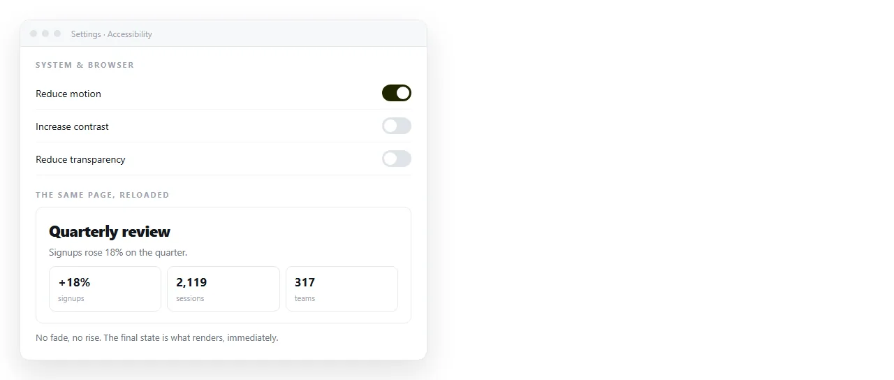
Make motion the exception rather than the default. Then an unsupported case degrades to a still page, which is always acceptable.
.hero { opacity: 1; }

@media (prefers-reduced-motion: no-preference) {
  .hero { animation: rise 500ms ease-out both; }
}
This is the same shape as a dark mode query. The base rule is the safe state and the query adds the enhancement.
animation against transition
Both can run on load, and they are not interchangeable.
animation |
transition |
|
|---|---|---|
| Starts on its own | Yes | No, needs a value change |
| Multiple steps | Yes, via keyframes | Two endpoints only |
| Repeats | Yes, animation-iteration-count |
No |
| Can be seeked from script | Yes, through the returned object | Not directly |
For a page load effect, use animation, since nothing has changed yet for a transition to respond to. A transition is the right tool once the reader acts, which is what a hover transition does.
Counting up a number
A common load effect that is not CSS at all. Animate the value, not the element.
function count(el, to, ms) {
  const start = performance.now();
  function step(now) {
    const p = Math.min(1, (now - start) / ms);
    el.textContent = Math.round(to * (1 - Math.pow(1 - p, 3)));
    if (p < 1) requestAnimationFrame(step);
  }
  requestAnimationFrame(step);
}
The cubic term is an ease out, so the number slows as it lands. Write the final value into the HTML first and let the script overwrite it, so a failed script leaves the correct figure on screen rather than a zero.
What to animate and what not to
- Animate
opacityandtransform. The compositor handles both without recalculating layout. - Avoid
width,height,topandmargin. Each one forces layout on every frame. Transitioning height to auto covers the exception. - Never animate the page's main text block. Readers came for the words.
- Keep it short. 300 to 500 milliseconds for entry motion. Anything longer is felt as lag on a second visit.
Timing values that read as considered
There is no correct number, but there are ranges that work and ranges that do not.
| Motion | Duration | Easing |
|---|---|---|
| Hero heading entry | 400 to 600ms | ease-out or a custom bezier |
| Card or list item entry | 300 to 450ms | ease-out |
| Stagger step between items | 50 to 80ms | Not applicable |
| Small element, icon or badge | 150 to 250ms | ease-out |
| Anything the reader triggered | 120 to 220ms | ease |
Entry motion eases out, meaning fast at the start and settling at the end. Easing in makes an element appear to hesitate before moving, which reads as lag.
Total time from first paint to everything settled should stay under about 800 milliseconds. Past that, a returning reader is waiting rather than watching.
Checking it honestly
You will see a load animation once and then stop noticing it. Open the page in a private window, and throttle the network in dev tools to see what the delay looks like when assets are slow.
Paste the HTML into a NOS document and open the link on a phone. The keyframes and scripts run as written, so the timing you see there is the timing a reader gets.
If you need a still copy for a ticket that only accepts images, turning the animation into a GIF covers that.