Anime.js is an open-source JavaScript animation library. In a single HTML file you need three things: the elements to move, one script tag that loads Anime.js from a CDN, and a call to animate().
There is nothing to install and no build step.
Here is the whole thing. Change x or stagger(120) and the boxes follow.
<!doctype html>
<html lang="en">
<head>
<meta charset="utf-8">
<meta name="viewport" content="width=device-width, initial-scale=1">
<title>Anime.js in one HTML file</title>
<style>
  body { margin: 0; padding: 20px; font-family: system-ui, sans-serif; background: #f4f5f7; color: #1d2330; }
  .track { display: grid; gap: 10px; }
  .box { width: 32px; height: 32px; border-radius: 8px; background: #2563eb; }
  .box:nth-child(even) { background: #f59e0b; }
</style>
</head>
<body>
<div class="track">
  <div class="box"></div>
  <div class="box"></div>
  <div class="box"></div>
  <div class="box"></div>
  <div class="box"></div>
</div>

<!-- 1. load Anime.js (pinned version). It creates one global: anime -->
<script src="https://cdn.jsdelivr.net/npm/animejs@4.5.0/dist/bundles/anime.umd.min.js"></script>

<!-- 2. take the functions you need from it, then animate -->
<script>
  const { animate, stagger } = anime;

  animate('.box', {
    x: '11rem',            // move right (a CSS transform)
    rotate: '1turn',
    delay: stagger(120),   // each box starts 120ms after the one before
    ease: 'inOutQuad',
    loop: true,            // repeat forever
    alternate: true,       // ...and come back each time
  });
</script>
</body>
</html>
The Anime.js README says it works with CSS properties, SVG, DOM attributes and JavaScript objects. If a hover or a page-load effect is all you need, CSS keyframes may do it with no library.
The smallest working file
Copy this into an empty .html file and open it in a browser:
<!doctype html>
<meta charset="utf-8">
<div class="box" style="width:40px; height:40px; background:#2563eb"></div>

<script src="https://cdn.jsdelivr.net/npm/animejs@4.5.0/dist/bundles/anime.umd.min.js"></script>
<script>
  const { animate } = anime;
  animate('.box', { x: 200, rotate: '1turn', duration: 1000 });
</script>
- The element is what moves. Any CSS selector that
querySelectorAll()accepts can target it. - The first script tag loads the UMD bundle. It creates one global,
anime, that holds every function. - The second script tag takes
animateout ofanimeand calls it with the targets and an object of properties.
x is short for translateX, so the box moves without changing the layout around it. Without duration, an animation lasts 1000 ms, and without ease it uses 'out(2)'.
Where the script tags go
Classic script tags run from top to bottom. Your code must come after the Anime.js tag, and the elements should already exist when it runs.
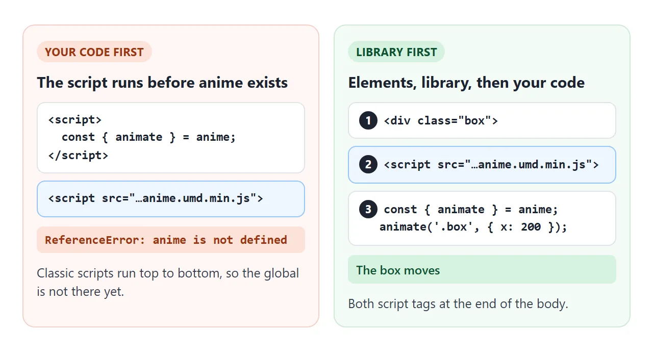
Each mistake shows up in the console:
- Your code above the library tag throws
anime is not defined. - Calling
animate()without taking it fromanimefirst throwsanimate is not defined. - A selector that matches nothing logs a "No target found" warning, and nothing moves.
Putting both script tags at the end of the <body> avoids all three. HTML JavaScript not working covers reading the console.
Version 3 code in a version 4 page
Many tutorials and AI answers still use the version 3 API, where anime was a function. With the current library that code throws anime is not a function, because anime is now an object of functions.
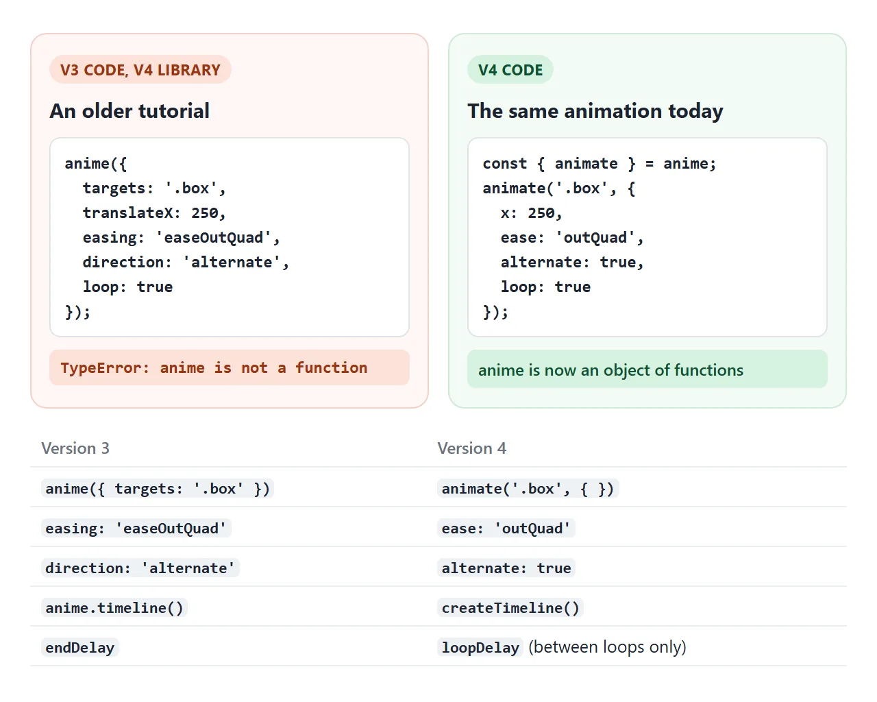
The project's migration guide lists the changes. These are the ones that show up most in copied code:
| Version 3 | Version 4 |
|---|---|
anime({ targets: '.box' }) |
animate('.box', { }) |
easing: 'easeOutQuad' |
ease: 'outQuad' |
direction: 'alternate' |
alternate: true |
direction: 'reverse' |
reversed: true |
anime.timeline() |
createTimeline() |
endDelay |
loopDelay, between loops only |
The meaning of loop changed too. In version 4 it counts repeats, so loop: 1 plays the animation twice.
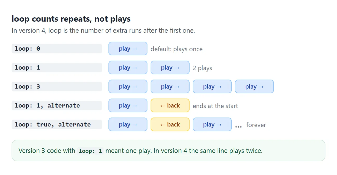
Use loop: true to repeat forever. With alternate: true, each repeat runs in the other direction, so loop: 1 ends back where it started.
Which CDN address to use
The Anime.js installation page lists this address for the global build:
<script src="https://cdn.jsdelivr.net/npm/animejs/dist/bundles/anime.umd.min.js"></script>
With no version in it, jsDelivr serves the latest release. On 1 October 2026 that is 4.5.0, and a 5.0.0 beta is already published. A pinned address keeps your page the same until you choose to upgrade:
<script src="https://cdn.jsdelivr.net/npm/animejs@4.5.0/dist/bundles/anime.umd.min.js"></script>
<!-- or -->
<script src="https://cdnjs.cloudflare.com/ajax/libs/animejs/4.5.0/anime.umd.min.js"></script>
<!-- or -->
<script src="https://unpkg.com/animejs@4.5.0/dist/bundles/anime.umd.min.js"></script>
All three load version 4.5.0. The docs also list an ES module address. In a module script, this works in a plain HTML file:
<script type="module">
  import { animate } from 'https://cdn.jsdelivr.net/npm/animejs@4.5.0/+esm';
  animate('.box', { x: 200 });
</script>
In a project with a bundler such as Vite or esbuild, the docs install the package and import named functions instead:
// npm install animejs
import { animate, stagger } from 'animejs';
That short import only works through a bundler. In a plain HTML file it fails with "Failed to resolve module specifier", because the browser does not know where animejs lives. Use the script tag or the full jsDelivr address.
Play, pause, reverse and seek
animate() returns an animation object. Set autoplay: false and it waits until you call play(). The same object has pause(), reverse() and restart().
<!doctype html>
<html lang="en">
<head>
<meta charset="utf-8">
<meta name="viewport" content="width=device-width, initial-scale=1">
<title>Anime.js play, pause, reverse</title>
<style>
  body { margin: 0; padding: 18px; font-family: system-ui, sans-serif; background: #f4f5f7; color: #1d2330; }
  .stage { position: relative; height: 120px; border-radius: 12px; background: #fff; overflow: hidden; }
  .ball { position: absolute; left: 14px; top: 40px; width: 40px; height: 40px; border-radius: 50%; background: #2563eb; }
  .bar { display: flex; flex-wrap: wrap; gap: 6px; margin: 12px 0 10px; }
  button { padding: 7px 13px; font: inherit; font-size: 14px; border: 1px solid #c9ced6; border-radius: 99px; background: #fff; color: #1d2330; cursor: pointer; }
  label { display: flex; align-items: center; gap: 10px; font-size: 14px; }
  input[type=range] { flex: 1; }
  #out { min-width: 3.2em; text-align: right; font-variant-numeric: tabular-nums; }
</style>
</head>
<body>
<div class="stage" id="stage"><div class="ball" id="ball"></div></div>

<div class="bar">
  <button id="play">Play</button>
  <button id="pause">Pause</button>
  <button id="reverse">Reverse</button>
  <button id="restart">Restart</button>
</div>
<label>Seek <input type="range" id="seek" min="0" max="1" step="0.001" value="0"> <span id="out">0%</span></label>

<script src="https://cdn.jsdelivr.net/npm/animejs@4.5.0/dist/bundles/anime.umd.min.js"></script>
<script>
  const { animate } = anime;
  const ball = document.getElementById('ball');
  const seek = document.getElementById('seek');
  const out = document.getElementById('out');

  // how far the ball can travel inside the stage
  const distance = document.getElementById('stage').clientWidth - 68;

  const animation = animate(ball, {
    x: distance,
    rotate: '1turn',
    scale: [1, 1.4, 1],     // an array is keyframes: 1 -> 1.4 -> 1
    duration: 1600,
    ease: 'inOutSine',
    autoplay: false,        // wait for the Play button
    onUpdate: (self) => {
      seek.value = self.progress;
      out.textContent = Math.round(self.progress * 100) + '%';
    },
  });

  document.getElementById('play').addEventListener('click', () => animation.play());
  document.getElementById('pause').addEventListener('click', () => animation.pause());
  document.getElementById('reverse').addEventListener('click', () => animation.reverse());
  document.getElementById('restart').addEventListener('click', () => animation.restart());

  // dragging the slider pauses and jumps to that point
  seek.addEventListener('input', () => {
    animation.pause();
    animation.progress = Number(seek.value);
  });
</script>
</body>
</html>
| You want to | Do this |
|---|---|
| Start on a click | autoplay: false, then play() |
| Stop where it is | pause() |
| Run backwards | reverse() |
| Start again from the beginning | restart() |
| Jump to a point | Set progress to a number from 0 to 1 |
| React on every frame | An onUpdate callback |
| Run code at the end | An onComplete callback |
An array as a value is a list of keyframes. scale: [1, 1.4, 1] grows the ball and shrinks it back during one run.
Transforms set in CSS are replaced
Anime.js reads transforms from the element's inline style, not from your stylesheet. The docs say so for animate(), and it shows in practice: a box with a CSS rotate(45deg) loses the rotation the moment you animate its x.
Two ways out:
// set the starting transform with Anime.js instead of CSS
const { animate, utils } = anime;
utils.set('.box', { rotate: 45 });
animate('.box', { x: 200 });

// or animate both, so the end state includes the rotation
animate('.box', { x: 200, rotate: 45 });
A related surprise: transforms do nothing on an inline element such as a <span>. Give it display: inline-block and x moves it.
A finished example: a receipt that builds itself
createTimeline() runs several animations in order. Each add() with no position goes at the end of the timeline so far. A position such as '-=200' starts it 200 ms before that end.
<!doctype html>
<html lang="en">
<head>
<meta charset="utf-8">
<meta name="viewport" content="width=device-width, initial-scale=1">
<title>Order confirmed, animated with an Anime.js timeline</title>
<style>
  body { margin: 0; padding: 16px; font-family: system-ui, sans-serif; background: #eef0f3; color: #1d2330; }
  .card { max-width: 360px; margin: 0 auto; padding: 20px; border-radius: 16px; background: #fff; box-shadow: 0 8px 24px rgba(0, 0, 0, .08); }
  .head { display: flex; align-items: center; gap: 12px; }
  .check { width: 44px; height: 44px; flex: none; }
  .check circle { fill: #d6f2df; }
  /* the tick starts hidden: dash and gap are both 30 long, offset 30 */
  .check path { fill: none; stroke: #0f7a3d; stroke-width: 4; stroke-linecap: round; stroke-linejoin: round;
                stroke-dasharray: 30; stroke-dashoffset: 30; }
  h1 { font-size: 18px; margin: 0; }
  .sub { margin: 2px 0 0; font-size: 13px; color: #6b7280; }
  ul { list-style: none; margin: 16px 0 0; padding: 0; }
  li { display: flex; justify-content: space-between; padding: 9px 0; border-top: 1px solid #eef0f3; font-size: 14px; opacity: 0; }
  .total { display: flex; justify-content: space-between; margin-top: 8px; padding-top: 10px; border-top: 2px solid #1d2330; font-weight: 700; }
  #total { font-variant-numeric: tabular-nums; }
  button { display: block; margin: 14px auto 0; padding: 8px 16px; font: inherit; font-size: 14px; border: 0; border-radius: 99px; background: #1d2330; color: #fff; cursor: pointer; }
</style>
</head>
<body>
<div class="card" id="card">
  <div class="head">
    <svg class="check" viewBox="0 0 44 44" aria-hidden="true">
      <circle cx="22" cy="22" r="22"/>
      <path d="M13 23 L19.5 29.5 L31 16"/>
    </svg>
    <div>
      <h1>Order confirmed</h1>
      <p class="sub">Receipt #2048</p>
    </div>
  </div>
  <ul>
    <li><span>Notebook, A5</span><span>$14.00</span></li>
    <li><span>Fineliner set</span><span>$22.50</span></li>
    <li><span>Desk lamp</span><span>$89.90</span></li>
    <li><span>Shipping</span><span>$2.00</span></li>
  </ul>
  <div class="total"><span>Total</span><span id="total">$0.00</span></div>
</div>
<button id="replay">Replay</button>

<script src="https://cdn.jsdelivr.net/npm/animejs@4.5.0/dist/bundles/anime.umd.min.js"></script>
<script>
  const { createTimeline, stagger, utils } = anime;
  const totalEl = document.getElementById('total');
  const sum = { value: 0 };   // a plain object: Anime.js can animate its numbers too

  const tl = createTimeline({
    defaults: { duration: 500, ease: 'out(3)' },
    // redraw the total on every frame, so Replay shows $0.00 again too
    onUpdate: () => { totalEl.textContent = '$' + sum.value.toFixed(2); },
  })
    // 1. the card pops in
    .add('#card', { scale: [0.9, 1], opacity: [0, 1] })
    // 2. the tick draws itself, starting 200ms before step 1 ends
    .add('.check path', { strokeDashoffset: 0, duration: 450 }, '-=200')
    // 3. each line slides up, 90ms apart
    .add('li', { opacity: [0, 1], y: [12, 0], delay: stagger(90) })
    // 4. the total counts up, rounded to cents
    .add(sum, { value: [0, 128.40], duration: 900, modifier: utils.round(2) }, '-=300');

  document.getElementById('replay').addEventListener('click', () => tl.restart());
</script>
</body>
</html>
- The tick: the SVG path starts with a
stroke-dashoffsetequal to its dash length, and the timeline animates it to 0. stroke-dasharray explains the trick. - The lines:
delay: stagger(90)starts each line 90 ms after the one before. - The total: a plain object
{ value: 0 }is animated to 128.40, andutils.round(2)keeps it to cents. - Replay:
tl.restart()sets everything back and plays again.
When it does not work
| What you see | Cause | Fix |
|---|---|---|
anime is not a function |
Version 3 code with the version 4 library | Use animate(targets, { }) |
anime is not defined |
Your code runs before the library tag, or the address is wrong | Put the library tag first and check the address |
animate is not defined |
animate was never taken from the global |
Add const { animate } = anime; |
| "No target found" warning | The selector matches nothing yet | Move the scripts below the elements, check the selector |
| Runs twice instead of once | loop: 1 means one repeat in version 4 |
Remove loop |
| A CSS rotation or scale disappears | Transforms in the stylesheet are not read | Set it with utils.set() or animate it too |
A <span> will not move |
Transforms do not apply to inline boxes | display: inline-block |
| "Failed to resolve module specifier" | A bundler import in a plain HTML file | Use the UMD script tag or the +esm address |
Share it as a link
Motion is hard to show in a screenshot, and an .html file sent as an attachment may open as plain code, or not at all, on a phone.
To send the working version, paste the page into a NOS document and choose Create share link. HTML to link walks through it.
The page renders as written, its scripts run and Anime.js loads from jsDelivr, so the people you send it to see the animation and can press the buttons themselves.
Anyone with the link can open it without an account. If you change the timing later, the same link shows the new version. If an AI chat wrote the page for you, Claude HTML animation covers prompts that produce usable motion.