stroke-dasharray cuts the stroke of an SVG shape into dashes and gaps. stroke-dasharray: 20 10 means a 20-unit dash, a 10-unit gap, repeated to the end of the path. stroke-dashoffset moves where the pattern starts.
Animate the offset, and dashes march, lines draw themselves and rings fill up.
Try it first. Move the sliders and watch the code below the curve change.
<!doctype html>
<html lang="en">
<head>
<meta charset="utf-8">
<meta name="viewport" content="width=device-width, initial-scale=1">
<title>stroke-dasharray playground</title>
<style>
  body { margin: 0; padding: 14px; font-family: system-ui, sans-serif; background: #f4f5f7; color: #1d2330; }
  svg { display: block; width: 100%; max-width: 520px; height: auto; background: #fff; border-radius: 10px; }
  .guide { fill: none; stroke: #d5d9e0; stroke-width: 1; }
  #line {
    fill: none; stroke: #2563eb; stroke-width: 8;
    stroke-dasharray: 20 10; stroke-dashoffset: 0; stroke-linecap: butt;
  }
  form { display: grid; grid-template-columns: repeat(auto-fit, minmax(150px, 1fr)); gap: 8px 16px; margin-top: 12px; max-width: 520px; }
  label { font-size: 13px; display: grid; gap: 2px; }
  pre { margin: 12px 0 0; padding: 10px 12px; background: #1d2330; color: #e5e7eb; border-radius: 8px; font-size: 13px; max-width: 496px; white-space: pre-wrap; }
</style>
</head>
<body>
<svg viewBox="0 0 300 120" aria-label="A dashed curve">
  <!-- thin grey copy of the same path, so you can see where the gaps are -->
  <path class="guide" d="M20 90 C 80 10, 140 10, 160 60 S 250 110, 280 30"/>
  <path id="line" d="M20 90 C 80 10, 140 10, 160 60 S 250 110, 280 30"/>
</svg>

<form id="f">
  <label>Dash <input type="range" name="dash" min="0" max="60" value="20"></label>
  <label>Gap <input type="range" name="gap" min="0" max="60" value="10"></label>
  <label>Offset <input type="range" name="offset" min="-60" max="60" value="0"></label>
  <label>Width <input type="range" name="width" min="1" max="20" value="8"></label>
  <label>Line cap
    <select name="cap"><option>butt</option><option>round</option><option>square</option></select>
  </label>
</form>
<pre id="out"></pre>

<script>
  const line = document.getElementById('line');
  const form = document.getElementById('f');
  const out = document.getElementById('out');

  function update() {
    const v = Object.fromEntries(new FormData(form));
    // the same four properties you would write in a stylesheet
    line.style.strokeDasharray = v.dash + ' ' + v.gap;
    line.style.strokeDashoffset = v.offset;
    line.style.strokeWidth = v.width;
    line.style.strokeLinecap = v.cap;
    out.textContent =
      'stroke-dasharray: ' + v.dash + ' ' + v.gap + ';\n' +
      'stroke-dashoffset: ' + v.offset + ';\n' +
      'stroke-width: ' + v.width + ';\n' +
      'stroke-linecap: ' + v.cap + ';';
  }

  form.addEventListener('input', update);
  update();
</script>
</body>
</html>
This page is about the stroke's pattern and ends. For drawing shapes, viewBox and fill, start with the SVG tag. For placing SVG in a page, see SVG in HTML.
How the dasharray numbers map onto the path
The values alternate: dash, gap, dash, gap. They are lengths along the path, measured in the SVG's own units (the viewBox coordinates), not in screen pixels. When the pattern runs out, it starts again from the first number.
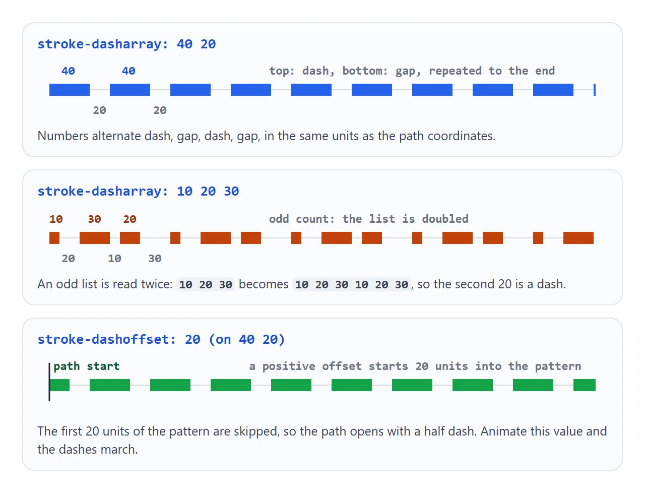
A few rules, straight from the SVG specification:
- Odd lists are doubled.
10 20 30becomes10 20 30 10 20 30, so the second 20 is a dash, not a gap. - Commas or spaces both work:
5,10is the same as5 10. noneis the default, a solid stroke. If all values add up to 0, the stroke is also drawn solid.- Negative values are invalid. The whole declaration is ignored.
You can write it as an attribute or as a CSS property. Both work the same, and the CSS property can be transitioned and animated:
<path d="..." stroke="#2563eb" stroke-dasharray="20 10" />

<style>
  path { stroke-dasharray: 20 10; stroke-dashoffset: 5; }
</style>
stroke-dashoffset: shifting the pattern
A positive stroke-dashoffset skips that many units of the pattern at the start. On 10 10 with an offset of 5, the path opens with a 5-unit dash, then a full gap.
A negative offset shifts the pattern the other way, so the path opens with a gap.
Animate the offset in a loop and the dashes appear to travel along the path. That is the "marching ants" border:
.ants { stroke-dasharray: 6 4; animation: march 1s linear infinite; }
@keyframes march { to { stroke-dashoffset: -10; } }
Moving by exactly one pattern length (6 + 4 = 10) makes the loop seamless, because the pattern at -10 looks the same as at 0.
The line-drawing animation
Make a single dash as long as the path, and a gap just as long. Push the dash off with an offset of the full length, so only the gap shows. Then animate the offset to 0.
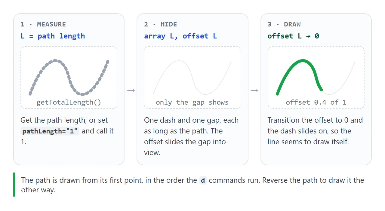
There are two ways to get the length:
getTotalLength()returns the length of the path in user units. Use it in JavaScript to set both properties.pathLength="1"on the element tells the browser to treat the path as 1 unit long for dashing. Then plain CSS works, with no script.
<!doctype html>
<html lang="en">
<head>
<meta charset="utf-8">
<meta name="viewport" content="width=device-width, initial-scale=1">
<title>SVG line drawing animation</title>
<style>
  body { margin: 0; padding: 14px; font-family: system-ui, sans-serif; background: #f4f5f7; color: #1d2330; }
  .row { display: grid; grid-template-columns: repeat(auto-fit, minmax(160px, 1fr)); gap: 12px; max-width: 520px; }
  figure { margin: 0; background: #fff; border-radius: 10px; padding: 10px; }
  figcaption { font-size: 13px; margin-top: 6px; }
  svg { display: block; width: 100%; height: 130px; }
  path { fill: none; stroke-linecap: round; stroke-linejoin: round; }

  /* Method B: pathLength="1" makes the length 1, so plain CSS is enough */
  .check { stroke: #16a34a; stroke-width: 8; stroke-dasharray: 1; stroke-dashoffset: 1; }
  .check.play { animation: draw 1s ease-out forwards; }
  @keyframes draw { to { stroke-dashoffset: 0; } }

  button { margin-top: 12px; font: inherit; padding: 8px 14px; border-radius: 8px; border: 1px solid #c7ccd6; background: #fff; cursor: pointer; }
</style>
</head>
<body>
<div class="row">
  <figure>
    <svg viewBox="0 0 200 100">
      <path id="wave" stroke="#2563eb" stroke-width="5"
            d="M10 70 C 30 10, 50 10, 60 50 S 90 90, 105 45 S 140 5, 150 50 S 180 80, 190 30"/>
    </svg>
    <figcaption>A: <code>getTotalLength()</code> = <b id="len"></b></figcaption>
  </figure>
  <figure>
    <svg viewBox="0 0 100 100">
      <circle cx="50" cy="50" r="42" fill="none" stroke="#e5e7eb" stroke-width="6"/>
      <path class="check" pathLength="1" d="M28 52 L44 67 L73 36"/>
    </svg>
    <figcaption>B: <code>pathLength="1"</code>, CSS only</figcaption>
  </figure>
</div>
<button id="again" type="button">Draw again</button>

<script>
  // Method A: measure the path, then use that length for the dash and the offset
  const wave = document.getElementById('wave');
  const len = wave.getTotalLength();
  document.getElementById('len').textContent = len.toFixed(1);
  wave.style.strokeDasharray = len;  // one dash as long as the whole path

  function drawWave() {
    wave.style.transition = 'none';
    wave.style.strokeDashoffset = len;  // dash pushed off the path: nothing shows
    wave.getBoundingClientRect();       // apply that before the transition starts
    wave.style.transition = 'stroke-dashoffset 2s ease-in-out';
    wave.style.strokeDashoffset = 0;    // slide the dash back on
  }

  const check = document.querySelector('.check');
  function drawCheck() {
    check.classList.remove('play');
    check.getBoundingClientRect();      // restart the keyframes
    check.classList.add('play');
  }

  document.getElementById('again').addEventListener('click', () => { drawWave(); drawCheck(); });
  drawWave();
  drawCheck();
</script>
</body>
</html>
The JavaScript version, as used on the left:
const len = path.getTotalLength();
path.style.strokeDasharray = len;
path.style.strokeDashoffset = len;    // hidden
path.getBoundingClientRect();         // apply it before the transition starts
path.style.transition = 'stroke-dashoffset 2s ease-in-out';
path.style.strokeDashoffset = 0;      // draws
The CSS-only version, as used on the right:
<path pathLength="1" d="M28 52 L44 67 L73 36" />

<style>
  path { fill: none; stroke-dasharray: 1; stroke-dashoffset: 1;
         animation: draw 1s ease-out forwards; }
  @keyframes draw { to { stroke-dashoffset: 0; } }
</style>
Three details decide whether it looks right:
fill="none". Otherwise the filled shape shows at once and only the outline animates.- Direction. The line draws from the path's first point, in the order of its
dcommands. Animating from minus the length to 0 draws it from the other end instead. pathLengthdoes not changegetTotalLength(). A 100 by 60 rectangle withpathLength="100"still reports 320. The attribute only rescales the dash units on that element.
Caps, corners and width
The remaining stroke properties change how dashes and lines look at their ends, at corners and at different sizes.
stroke-linecap: the ends of every dash
stroke-linecap shapes the two ends of an open line. With dashes it matters more, because each dash has two ends of its own.
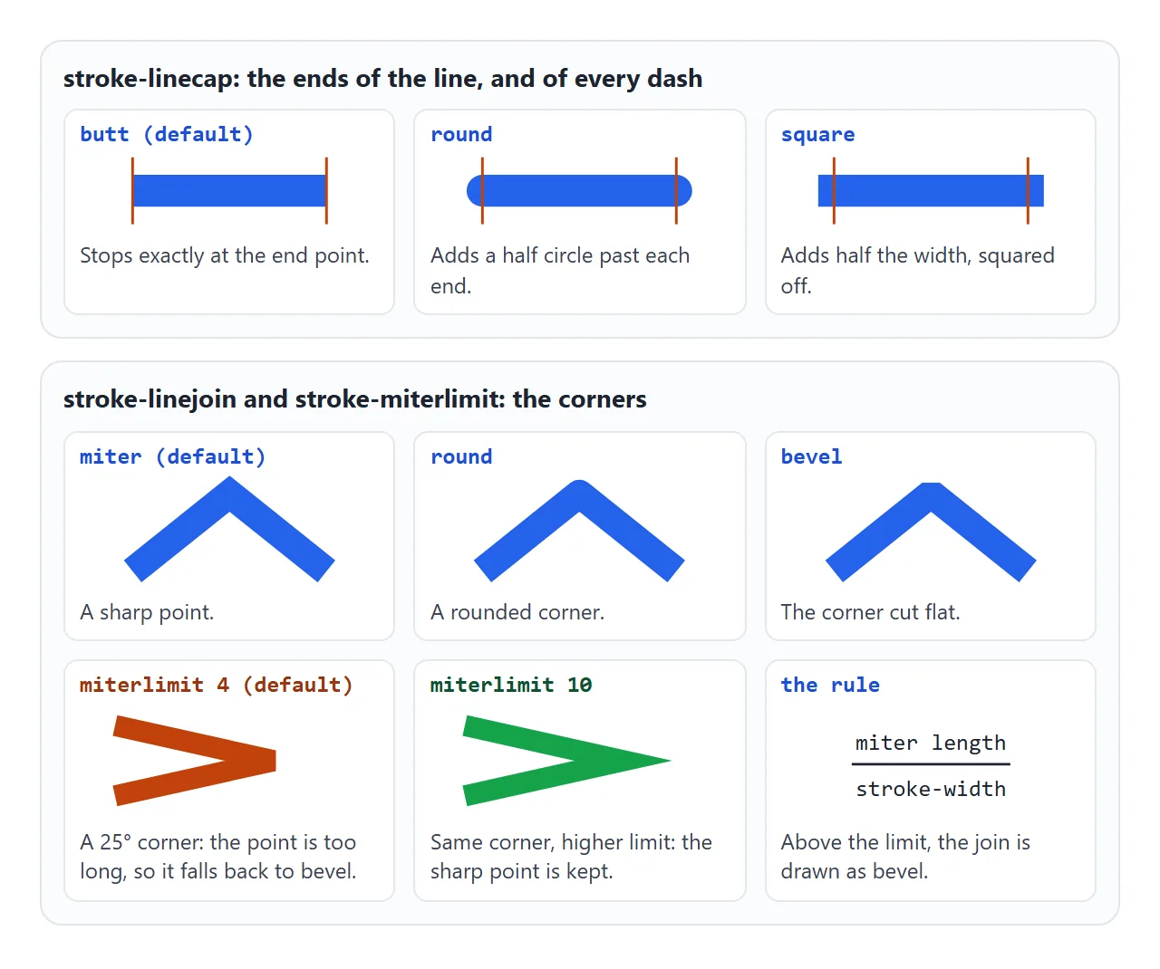
| Value | What it does | Effect on dashes |
|---|---|---|
butt (default) |
Stops exactly at the end point | Dash and gap lengths are exact |
round |
Adds a half circle past each end | Every dash grows by the stroke width |
square |
Adds half the width, squared off | Every dash grows by the stroke width |
With round or square, each cap sticks out by half the stroke width at both ends. stroke-dasharray: 10 20 with a width of 10 therefore shows 20-unit dashes and 10-unit gaps. Give gaps more room than the stroke width.
That growth is useful, too. A dash of length 0 draws nothing with butt, but a dot with round:
.dotted { stroke-width: 6; stroke-linecap: round; stroke-dasharray: 0 14; }
stroke-linejoin and stroke-miterlimit: the corners
stroke-linejoin shapes the corners where two segments meet: miter (the default, a sharp point), round or bevel (cut flat).
A miter on a very sharp corner would be a long spike. stroke-miterlimit caps it. The browser divides the miter's length by the stroke width. If the result is above the limit, that corner is drawn as a bevel instead.
The default limit is 4, which works out to corners sharper than 28.96 degrees (the angle where 1 / sin(half the angle) equals 4). In testing, a 22.6-degree corner was bevelled at the default and kept its point at stroke-miterlimit="10". Raise the limit when a chevron or star loses its tips.
stroke-width and scaling
stroke-width is also in the SVG's own units. When a 10-unit-wide viewBox is shown 100 pixels wide, a width of 1 becomes 10 pixels on screen, and dash lengths scale with it.
To keep a line the same thickness at any size, add vector-effect="non-scaling-stroke" to the shape. This fits hairlines on charts that scale to fit their box. Remember the stroke is centred on the edge of the shape, so half of it falls outside.
A finished example: a progress ring
A circular progress bar is two circles on top of each other: a grey track and a coloured bar. The bar gets pathLength="100", so one unit is one percent and no circumference maths is needed.
<!doctype html>
<html lang="en">
<head>
<meta charset="utf-8">
<meta name="viewport" content="width=device-width, initial-scale=1">
<title>SVG progress ring</title>
<style>
  body { margin: 0; padding: 14px; font-family: system-ui, sans-serif; background: #f4f5f7; color: #1d2330; }
  .ring { position: relative; width: 180px; }
  .ring svg { display: block; width: 100%; height: auto; }
  .ring circle { fill: none; stroke-width: 10; }
  .track { stroke: #e5e7eb; }
  .bar {
    stroke: #2563eb; stroke-linecap: round;
    stroke-dasharray: 100;                          /* pathLength is 100, so 1 unit = 1% */
    stroke-dashoffset: calc(100 - var(--p, 0));     /* 100 = empty, 0 = full */
    transition: stroke-dashoffset .5s ease;
  }
  .pct { position: absolute; inset: 0; display: grid; place-items: center; font-size: 34px; font-weight: 700; }
  .controls { display: flex; flex-wrap: wrap; gap: 10px; align-items: center; margin-top: 14px; }
  input[type=range] { width: 180px; }
  button { font: inherit; padding: 8px 14px; border-radius: 8px; border: 1px solid #c7ccd6; background: #fff; cursor: pointer; }
</style>
</head>
<body>
<div class="ring">
  <svg viewBox="0 0 120 120" role="progressbar" aria-label="Upload"
       aria-valuemin="0" aria-valuemax="100" aria-valuenow="0" id="svg">
    <circle class="track" cx="60" cy="60" r="50"/>
    <!-- rotate -90 so the ring starts at 12 o'clock instead of 3 o'clock -->
    <circle class="bar" id="bar" cx="60" cy="60" r="50" pathLength="100" transform="rotate(-90 60 60)"/>
  </svg>
  <div class="pct" id="pct">0%</div>
</div>

<div class="controls">
  <input type="range" id="range" min="0" max="100" value="0" aria-label="Progress">
  <button type="button" id="run">Simulate upload</button>
</div>

<script>
  const bar = document.getElementById('bar');
  const svg = document.getElementById('svg');
  const pct = document.getElementById('pct');
  const range = document.getElementById('range');
  let timer = null;

  function setProgress(p) {
    bar.style.setProperty('--p', p);  // CSS turns this into the dash offset
    svg.setAttribute('aria-valuenow', p);
    pct.textContent = p + '%';
    range.value = p;
  }

  range.addEventListener('input', () => { clearInterval(timer); setProgress(+range.value); });

  document.getElementById('run').addEventListener('click', () => {
    clearInterval(timer);
    let p = 0;
    setProgress(p);
    timer = setInterval(() => {
      p = Math.min(100, p + 4 + Math.floor(Math.random() * 9));  // fake upload: 4-12% per tick
      setProgress(p);
      if (p === 100) clearInterval(timer);
    }, 400);
  });

  setProgress(65);
</script>
</body>
</html>
<svg viewBox="0 0 120 120" role="progressbar" aria-valuemin="0" aria-valuemax="100" aria-valuenow="65">
  <circle class="track" cx="60" cy="60" r="50" />
  <circle class="bar" cx="60" cy="60" r="50" pathLength="100" transform="rotate(-90 60 60)" />
</svg>

<style>
  circle { fill: none; stroke-width: 10; }
  .track { stroke: #e5e7eb; }
  .bar { stroke: #2563eb; stroke-linecap: round;
         stroke-dasharray: 100;
         stroke-dashoffset: calc(100 - var(--p, 0));
         transition: stroke-dashoffset .5s ease; }
</style>
- Why rotate. A circle's stroke starts at its rightmost point, 3 o'clock, and runs clockwise.
rotate(-90 60 60)turns the start to 12 o'clock around the centre. - Setting the value. Script only sets
--pwithstyle.setProperty('--p', 65). CSS does the maths and the transition animates it. - Empty means empty. With the offset method, 0% leaves nothing on screen, even with round caps. The other common way,
stroke-dasharray: 0 100, draws a dot at 0% when the cap is round. - Screen readers.
role="progressbar"witharia-valuenowgives the ring a value. Update both on each change.
For a straight bar, the native element is simpler. HTML progress bar covers <progress> and CSS bars.
When it does not work
| What you see | Cause | Fix |
|---|---|---|
| The shape appears at once, then the outline animates | The shape has a fill | fill="none" |
| The line draws from the wrong end | Path direction | Reverse the d points, or animate from minus the length to 0 |
| The line is fully visible before it draws | The offset is smaller than the dash | Set dasharray and offset to the full length, or use pathLength="1" |
| Dashes run together with round caps | Caps add the stroke width to each dash | Make gaps longer than the stroke width |
| The ring starts at 3 o'clock | Circles start at the rightmost point | transform="rotate(-90 cx cy)" |
| A dot shows at 0% | dasharray: 0 100 with round caps |
Use the offset method, or hide the bar at 0 |
| Sharp corners come out flat | The miter limit was exceeded | Raise stroke-miterlimit |
| Lines get thicker when the SVG grows | Width is in viewBox units |
vector-effect="non-scaling-stroke" |
| The CSS animation plays only once | The class is already on the element | Remove the class, read layout, add it again |
Share it as a link
A line that draws itself or a ring that fills up is hard to show in a screenshot, and a GIF loses the controls. An .html attachment may open as plain code on a phone.
To send the working version, paste the page into a NOS document and choose Create share link. HTML to link walks through it.
The page renders as written and its scripts run, so the people you send it to can drag the sliders and replay the animation themselves. If you change the code later, the same link shows the new version.