A CSS loading spinner needs one element and one @keyframes rule. Make the element a square circle with a light border, paint one side in your main colour, and rotate it 360 degrees forever. No image, no library.
.spinner {
  width: 1em; height: 1em;
  box-sizing: border-box;
  border: .12em solid rgba(128, 128, 128, .25);
  border-top-color: currentColor;
  border-radius: 50%;
  animation: spin .8s linear infinite;
}
@keyframes spin { to { transform: rotate(360deg); } }
Here are five loaders built the same way. Pick one, change the size and colour, and the panel shows the CSS to copy.
<!doctype html>
<html lang="en">
<head>
<meta charset="utf-8">
<meta name="viewport" content="width=device-width, initial-scale=1">
<title>CSS loading spinners</title>
<style>
  body { margin: 0; padding: 16px; font-family: system-ui, sans-serif; background: #f4f5f7; color: #1d2330; }
  .controls { display: flex; flex-wrap: wrap; gap: 14px; align-items: center; margin-bottom: 12px; font-size: 14px; }
  .stage { display: grid; grid-template-columns: repeat(auto-fit, minmax(100px, 1fr)); gap: 10px; }
  .tile { display: flex; flex-direction: column; align-items: center; justify-content: center; gap: 10px;
          height: 130px; background: #fff; border: 2px solid transparent; border-radius: 12px;
          font: inherit; color: inherit; cursor: pointer; }  /* inherit, so the spinner gets .wrap's size and colour */
  .tile small { font-size: 13px; color: #6b7280; }
  .tile[aria-pressed="true"] { border-color: #2563eb; }
  .tile[aria-pressed="true"] small { color: #1d2330; }
  .wrap { font-size: 40px; color: #2563eb; } /* spinners are sized in em and coloured with currentColor */
  pre { margin: 12px 0 0; padding: 12px; background: #111827; color: #e5e7eb; border-radius: 10px;
        font-size: 12px; line-height: 1.45; overflow: auto; max-height: 190px; white-space: pre-wrap; }
</style>

<!-- Each spinner's CSS lives in its own style block, so the code panel can show it. -->
<style data-name="ring">
.ring {
  display: inline-block;
  width: 1em; height: 1em;         /* square, or it wobbles */
  box-sizing: border-box;
  border: .12em solid rgba(128, 128, 128, .25);
  border-top-color: currentColor;  /* the one coloured side */
  border-radius: 50%;
  animation: ring-spin .8s linear infinite;
}
@keyframes ring-spin { to { transform: rotate(360deg); } }
</style>
<style data-name="dual">
.dual {
  display: inline-block;
  width: 1em; height: 1em;
  box-sizing: border-box;
  border: .12em solid;
  border-color: currentColor transparent;  /* top and bottom only */
  border-radius: 50%;
  animation: dual-spin 1.1s linear infinite;
}
@keyframes dual-spin { to { transform: rotate(360deg); } }
</style>
<style data-name="dots">
.dots { display: inline-flex; gap: .15em; }
.dots span {
  width: .25em; height: .25em; border-radius: 50%;
  background: currentColor;
  animation: dots-bounce 1s ease-in-out infinite;
}
.dots span:nth-child(2) { animation-delay: .15s; }  /* stagger */
.dots span:nth-child(3) { animation-delay: .3s; }
@keyframes dots-bounce {
  0%, 80%, 100% { transform: scale(.4); opacity: .4; }
  40% { transform: scale(1); opacity: 1; }
}
</style>
<style data-name="bars">
.bars { display: inline-flex; gap: .1em; align-items: center; height: 1em; }
.bars span {
  width: .12em; height: 100%;
  background: currentColor;
  animation: bars-grow 1s ease-in-out infinite;
}
.bars span:nth-child(2) { animation-delay: .1s; }
.bars span:nth-child(3) { animation-delay: .2s; }
.bars span:nth-child(4) { animation-delay: .3s; }
@keyframes bars-grow {
  0%, 40%, 100% { transform: scaleY(.35); }
  20% { transform: scaleY(1); }
}
</style>
<style data-name="pulse">
.pulse {
  display: inline-block;
  width: 1em; height: 1em; border-radius: 50%;
  background: currentColor;
  animation: pulse-fade 1.2s ease-out infinite;
}
@keyframes pulse-fade {
  from { transform: scale(.2); opacity: 1; }
  to { transform: scale(1); opacity: 0; }
}
</style>
</head>
<body>
<div class="controls">
  <label>Size <input type="range" id="size" min="16" max="72" value="40"> <output id="sizeOut">40px</output></label>
  <label>Colour <input type="color" id="color" value="#2563eb"></label>
</div>

<div class="stage wrap" id="stage">
  <button class="tile" data-name="ring" aria-pressed="true"><span class="ring"></span><small>ring</small></button>
  <button class="tile" data-name="dual" aria-pressed="false"><span class="dual"></span><small>dual ring</small></button>
  <button class="tile" data-name="dots" aria-pressed="false"><span class="dots"><span></span><span></span><span></span></span><small>dots</small></button>
  <button class="tile" data-name="bars" aria-pressed="false"><span class="bars"><span></span><span></span><span></span><span></span></span><small>bars</small></button>
  <button class="tile" data-name="pulse" aria-pressed="false"><span class="pulse"></span><small>pulse</small></button>
</div>

<pre id="code"></pre>

<script>
  const stage = document.getElementById('stage');
  const size = document.getElementById('size');
  const color = document.getElementById('color');
  const code = document.getElementById('code');
  let current = 'ring';

  function render() {
    stage.style.fontSize = size.value + 'px';
    stage.style.color = color.value;
    document.getElementById('sizeOut').textContent = size.value + 'px';
    const css = document.querySelector('style[data-name="' + current + '"]').textContent.trim();
    const html = stage.querySelector('[data-name="' + current + '"] > span').outerHTML;
    code.textContent =
      '/* size and colour come from the parent */\n' +
      '.wrap { font-size: ' + size.value + 'px; color: ' + color.value + '; }\n\n' +
      css + '\n\n<!-- HTML -->\n<div class="wrap">' + html + '</div>';
  }

  stage.addEventListener('click', (e) => {
    const tile = e.target.closest('.tile');
    if (!tile) return;
    stage.querySelectorAll('.tile').forEach((t) => t.setAttribute('aria-pressed', t === tile));
    current = tile.dataset.name;
    render();
  });
  size.addEventListener('input', render);
  color.addEventListener('input', render);
  render();
</script>
</body>
</html>
How the ring spinner works
The ring is three ideas stacked on one box.
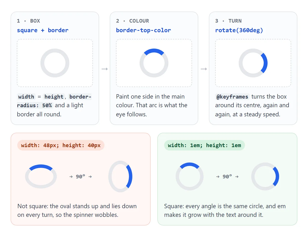
- A square circle. Equal
widthandheight,border-radius: 50%, and a light border on all four sides. - One coloured side.
border-top-colorpaints a quarter of the ring. That arc is what the eye follows. - A steady turn. The keyframe ends at
rotate(360deg).lineartiming keeps the speed even, andinfiniterepeats it.
The dual ring uses border-color: currentColor transparent, which colours top and bottom and hides the sides. Rotation itself is covered in CSS transform.
Dots, bars and pulse: the same trick with a delay
The dots and bars are several small elements running the same animation. Each one starts a little later, set with animation-delay, so the movement travels along the row.
.dots span { animation: bounce 1s ease-in-out infinite; }
.dots span:nth-child(2) { animation-delay: .15s; }
.dots span:nth-child(3) { animation-delay: .3s; }
The pulse is one circle that grows with scale and fades with opacity. Those two properties are the ones browsers can usually animate without laying out the page again.
Size it with em, colour it with currentColor
Every loader above uses em for its size and currentColor for its colour. 1em is the font size of the element, and currentColor is its text colour. Both come from the parent.
That makes a spinner drop into a button without extra CSS. In a 17px button with white text, the spinner is 17px and white. Change the button, and the spinner follows. Button styling covers the button itself.
Spinner, skeleton screen or progress bar
A spinner says "something is happening". It does not say how long, or what will appear. Two other patterns say more when you know more.
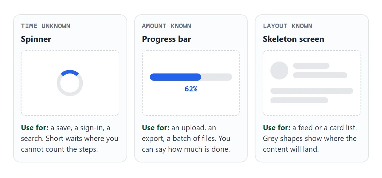
| You know | Use | Example |
|---|---|---|
| Nothing about the wait | Spinner | Saving a form, signing in |
| How much is done | Progress bar | Uploading a file, exporting a report |
| The layout of the result | Skeleton screen | A feed, a list of cards |
A skeleton screen draws grey blocks the size of the real content. When the data arrives, it takes their place and nothing jumps. Try both on the same list:
<!doctype html>
<html lang="en">
<head>
<meta charset="utf-8">
<meta name="viewport" content="width=device-width, initial-scale=1">
<title>Skeleton screen vs spinner</title>
<style>
  body { margin: 0; padding: 16px; font-family: system-ui, sans-serif; background: #f4f5f7; color: #1d2330; }
  .controls { display: flex; flex-wrap: wrap; gap: 10px 16px; align-items: center; margin-bottom: 12px; font-size: 14px; }
  button { font: inherit; padding: 8px 14px; border: 0; border-radius: 8px; background: #2563eb; color: #fff; cursor: pointer; }
  #list { min-height: 330px; position: relative; }

  /* Real cards */
  .card { display: flex; gap: 12px; align-items: center; background: #fff; border-radius: 12px; padding: 12px; margin-bottom: 10px; }
  .avatar { flex: none; width: 48px; height: 48px; border-radius: 50%; }
  .card h3 { margin: 0 0 4px; font-size: 15px; }
  .card p { margin: 0; font-size: 13px; color: #6b7280; }

  /* Skeleton: grey blocks the same size as the real content, with a shimmer */
  .sk { background: linear-gradient(90deg, #e5e7eb 25%, #f3f4f6 50%, #e5e7eb 75%);
        background-size: 200% 100%; animation: shimmer 1.2s linear infinite; border-radius: 6px; }
  .sk.line { height: 12px; margin: 6px 0; }
  @keyframes shimmer { from { background-position: 100% 0; } to { background-position: -100% 0; } }

  /* Spinner: one ring in the middle of the area */
  .center { position: absolute; inset: 0; display: grid; place-items: center; }
  .ring { width: 40px; height: 40px; box-sizing: border-box; border-radius: 50%;
          border: 4px solid #e5e7eb; border-top-color: #2563eb; animation: spin .8s linear infinite; }
  @keyframes spin { to { transform: rotate(360deg); } }

  .sr-only { position: absolute; width: 1px; height: 1px; margin: -1px; padding: 0; border: 0;
             overflow: hidden; clip: rect(0 0 0 0); white-space: nowrap; }
  @media (prefers-reduced-motion: reduce) { .sk, .ring { animation-duration: 3s; } }
</style>
</head>
<body>
<div class="controls">
  <label><input type="radio" name="mode" value="skeleton" checked> Skeleton</label>
  <label><input type="radio" name="mode" value="spinner"> Spinner</label>
  <button id="reload">Reload list</button>
</div>

<div id="list" aria-busy="false"></div>
<div id="status" role="status" class="sr-only"></div>

<script>
  const list = document.getElementById('list');
  const status = document.getElementById('status');
  const people = [
    ['Ana Lima', 'Design review at 10:00', '#f59e0b'],
    ['Ben Ortiz', 'Sent the invoice draft', '#10b981'],
    ['Chloe Kim', 'Shared a new layout', '#8b5cf6'],
    ['Dev Patel', 'Left two comments', '#ef4444'],
  ];

  function skeleton() {
    // Same layout as a real card, so nothing jumps when the data arrives
    const one = '<div class="card"><div class="avatar sk"></div><div style="flex:1">' +
                '<div class="sk line" style="width:45%"></div><div class="sk line" style="width:75%"></div></div></div>';
    return one.repeat(people.length);
  }

  let timer;
  function load() {
    clearTimeout(timer);  // a second click restarts the load
    const mode = document.querySelector('input[name="mode"]:checked').value;
    list.setAttribute('aria-busy', 'true');
    status.textContent = 'Loading messages…';
    list.innerHTML = mode === 'skeleton' ? skeleton() : '<div class="center"><div class="ring"></div></div>';

    timer = setTimeout(() => {  // pretend the network took 1.5 seconds
      list.innerHTML = people.map(([name, text, c]) =>
        '<div class="card"><div class="avatar" style="background:' + c + '"></div>' +
        '<div><h3>' + name + '</h3><p>' + text + '</p></div></div>').join('');
      list.setAttribute('aria-busy', 'false');
      status.textContent = people.length + ' messages loaded';
    }, 1500);
  }

  document.getElementById('reload').addEventListener('click', load);
  document.querySelectorAll('input[name="mode"]').forEach((r) => r.addEventListener('change', load));
  load();
</script>
</body>
</html>
The shimmer is a gradient twice as wide as the block, with its background-position animated from one side to the other. For a known amount, use a progress bar instead of either.
Tell screen readers it is loading
A spinning circle is a picture. A screen reader has nothing to read unless you give it words. Three attributes do the job:
role="status"on a text element. This role is a polite live region, so screen readers read its new text when they finish what they are saying.- Text inside it, such as "Saving…", then "Saved." or the error. The text can be visible, or hidden with a visually hidden class.
aria-busy="true"on the area being refilled, set back tofalsewhen it is done. It tells assistive technology the content is still changing.
Put the status element in the page from the start and change only its text. A live region added at the same moment as its text may not be announced.
Show the spinner only when the wait is long
If a save takes 150 ms, a spinner appears and vanishes before anyone can read it. It looks like a flicker. The fix is a short timer: start it on click, and show the spinner only if the work is still running when it fires.
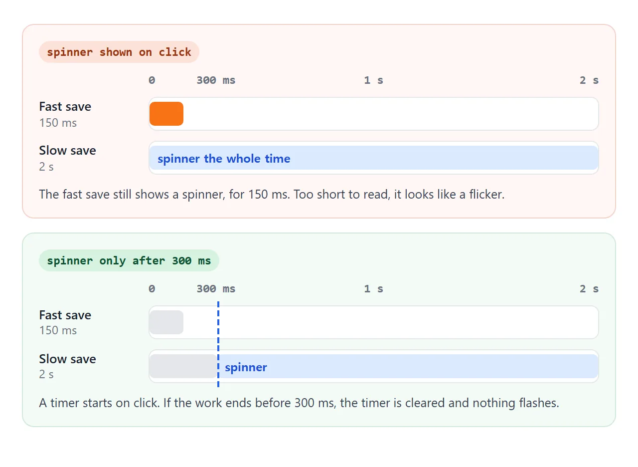
The finished button puts it all together. Choose a server speed and press Save. The log shows when the spinner appeared, if it did.
<!doctype html>
<html lang="en">
<head>
<meta charset="utf-8">
<meta name="viewport" content="width=device-width, initial-scale=1">
<title>Save button with a delayed spinner</title>
<style>
  body { margin: 0; padding: 16px; font-family: system-ui, sans-serif; background: #f4f5f7; color: #1d2330; }
  fieldset { border: 0; padding: 0; margin: 0 0 14px; display: flex; flex-wrap: wrap; gap: 6px 16px; font-size: 14px; }
  legend { font-weight: 600; margin-bottom: 6px; }

  .save {
    display: inline-flex; align-items: center; gap: .5em;
    font: 600 17px system-ui, sans-serif; padding: .6em 1.2em;
    border: 0; border-radius: 10px; background: #2563eb; color: #fff; cursor: pointer;
  }
  .save[aria-disabled="true"] { background: #6b8fe0; cursor: progress; }

  /* The spinner takes its size from the button text (em) and its colour (currentColor) */
  .spinner {
    display: inline-block; width: 1em; height: 1em; box-sizing: border-box;
    border: .15em solid rgba(255, 255, 255, .35); border-top-color: currentColor;
    border-radius: 50%; animation: spin .8s linear infinite;
  }
  .spinner[hidden] { display: none; }  /* without this, display: inline-block beats hidden */
  @keyframes spin { to { transform: rotate(360deg); } }

  /* Reduced motion: keep the signal, lose most of the movement */
  @media (prefers-reduced-motion: reduce) { .spinner { animation-duration: 2.4s; } }

  #status { min-height: 1.4em; margin: 12px 0; font-size: 15px; }
  #log { margin: 0; padding: 10px 12px; background: #fff; border-radius: 10px; font: 12.5px/1.6 ui-monospace, Consolas, monospace; color: #374151; min-height: 5em; white-space: pre-wrap; }
</style>
</head>
<body>
<fieldset>
  <legend>Pretend server</legend>
  <label><input type="radio" name="speed" value="150" checked> Fast (150 ms)</label>
  <label><input type="radio" name="speed" value="2000"> Slow (2 s)</label>
  <label><input type="radio" name="speed" value="fail"> Fails (1 s)</label>
</fieldset>

<button class="save" id="save" type="button">
  <span class="spinner" id="spinner" hidden></span>
  <span id="label">Save</span>
</button>

<!-- role="status" is a polite live region: screen readers read changes to it -->
<p id="status" role="status"></p>
<pre id="log"></pre>

<script>
  const btn = document.getElementById('save');
  const spinner = document.getElementById('spinner');
  const label = document.getElementById('label');
  const status = document.getElementById('status');
  const log = document.getElementById('log');
  const SPINNER_DELAY = 300;  // ms; fast saves never show a spinner
  let busy = false;

  function fakeSave(speed) {
    return new Promise((resolve, reject) => {
      if (speed === 'fail') setTimeout(() => reject(new Error('Network error')), 1000);
      else setTimeout(resolve, Number(speed));
    });
  }

  btn.addEventListener('click', async () => {
    if (busy) return;  // ignore double clicks
    busy = true;
    const t0 = performance.now();
    const ms = () => Math.round(performance.now() - t0) + ' ms';
    log.textContent = '0 ms: clicked\n';
    btn.setAttribute('aria-disabled', 'true');  // keeps focus, unlike disabled
    status.textContent = '';

    const timer = setTimeout(() => {  // only if the save is still running
      spinner.hidden = false;
      label.textContent = 'Saving…';
      status.textContent = 'Saving…';
      log.textContent += ms() + ': spinner shown\n';
    }, SPINNER_DELAY);

    try {
      await fakeSave(document.querySelector('input[name="speed"]:checked').value);
      status.textContent = 'Saved.';
    } catch (err) {
      status.textContent = 'Could not save: ' + err.message + '. Try again.';
    } finally {  // runs on success and on failure, so the spinner always goes away
      clearTimeout(timer);
      spinner.hidden = true;
      label.textContent = 'Save';
      btn.removeAttribute('aria-disabled');
      busy = false;
      log.textContent += ms() + ': done, status = "' + status.textContent + '"\n';
    }
  });
</script>
</body>
</html>
const timer = setTimeout(showSpinner, 300);
try { await save(); status.textContent = 'Saved.'; }
catch (err) { status.textContent = 'Could not save. Try again.'; }
finally { clearTimeout(timer); hideSpinner(); }
finally runs after success and after an error, so the spinner always goes away. The button uses aria-disabled during the save instead of disabled, because a disabled button cannot keep keyboard focus.
Respect reduced motion
Some people set their system to reduce motion. The prefers-reduced-motion media query matches that setting. For a loader, keep a signal but cut the movement: slow it down, or swap it for text.
@media (prefers-reduced-motion: reduce) {
  .spinner { animation-duration: 2.4s; }
}
The Save button above does this. The status text still says "Saving…", so the state is clear even with little movement.
When it does not work
| What you see | Cause | Fix |
|---|---|---|
| The spinner wobbles | Width and height differ, or the border adds to one of them | Same width and height, plus box-sizing: border-box |
| The spinner does not turn | The animation name and the @keyframes name differ |
Make the two names match exactly |
| A span spinner has no size and does not turn | Transforms and width do not apply to a plain inline box | Add display: inline-block |
| The spinner never goes away | An error skipped the hide code, or display in your CSS beats hidden |
Hide it in finally, add .spinner[hidden] { display: none; } |
| Screen readers say nothing | No text, or the live region was added with the text | Keep a role="status" element on the page and change its text |
| Spinners flash on fast actions | The spinner shows on click | Show it after a 300 ms timer, clear the timer when done |
| Many spinners on one page | One per card or row | Use one spinner for the area, or a skeleton screen |
More causes of a stuck animation are in CSS animation not working.
Share it as a link
A loader is about timing, and a screenshot has none. To show the real thing, paste the page into a NOS document and choose Create share link. HTML to link walks through it.
The page renders as written and its scripts run, so the people you send it to can press Save and watch the spinner appear, or not. If you change the code later, the same link shows the new version.