When a CSS animation is not working, open the element inspector and read the computed animation-name and animation-duration on the element.
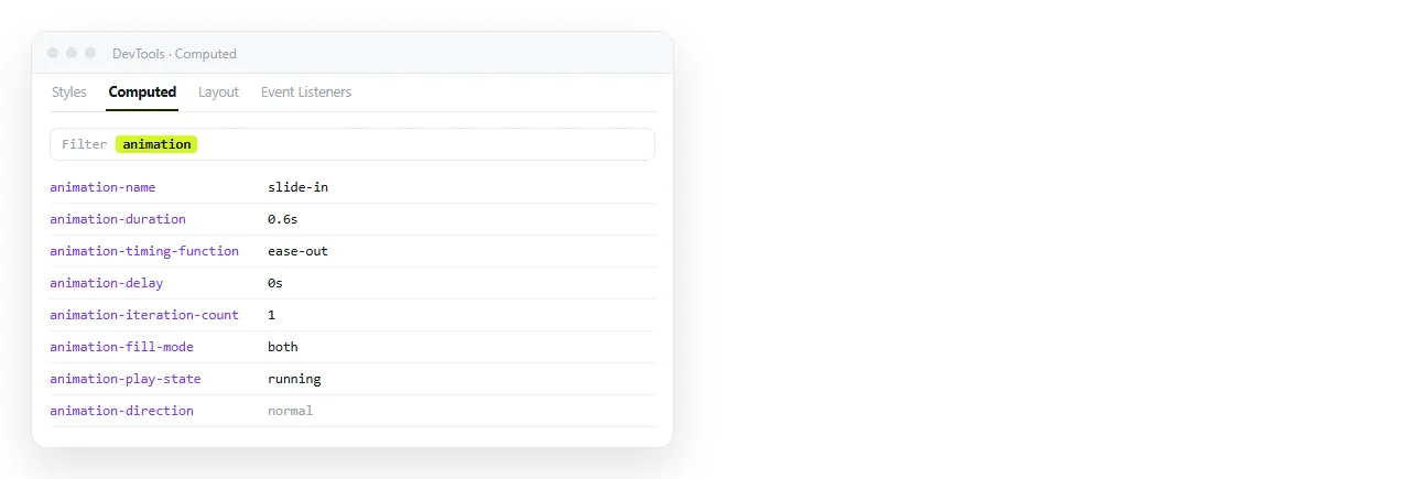
If the name reads none, the rule never matched the element. If the duration reads 0s, the animation ran and completed before a frame was drawn.
Those two readings cover most cases, and they take one look rather than a rewrite.
The five causes
| What the inspector shows | Cause | Fix |
|---|---|---|
animation-name: none |
Selector does not match, or the rule is overridden | Fix the selector, check specificity |
animation-duration: 0s |
Duration omitted from the shorthand | Add a time value |
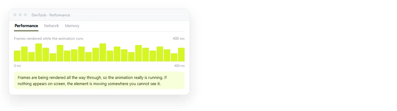
| Name and duration look right, nothing moves | Property is not animatable | Animate transform or opacity instead |
| Rule present, element invisible | display: none on it or an ancestor |
Animate visibility and opacity instead |
| Everything correct for you, still for others | Reduced motion is on | Expected, provide a static state |
Name mismatches
The name after @keyframes and the name in animation must match exactly. They are case sensitive.
@keyframes slideIn {
  from { transform: translateX(-20px); opacity: 0; }
  to   { transform: translateX(0);     opacity: 1; }
}

.panel {
  animation: slideIn 300ms ease-out forwards;
}
slidein, slide-in and SlideIn are three different names to the browser, and a mismatch produces no warning at all. It fails silently, which is why it survives review.
Also check where the keyframes live. Keyframes defined inside a media query that does not apply, or in a stylesheet that failed to load, simply are not there.
Duration is not optional
animation: slideIn; is valid CSS and does nothing visible. The default duration is 0s.
The shorthand takes the first time value as duration and the second as delay. So animation: slideIn 300ms 1s means a 300ms animation after a one second wait, and swapping them changes the meaning.
Write the duration first, always.
Properties that will not tween
Some properties are discrete. They flip at the halfway point rather than moving through intermediate values.
displayis discrete. Going fromnonetoblockis a jump.height: autohas no numeric value to interpolate from.background-imagebetween two different images does not cross fade.
The usual substitutions:
/* instead of animating display */
.menu { opacity: 0; transform: scale(0.98); pointer-events: none; }
.menu.open { opacity: 1; transform: scale(1); pointer-events: auto; }

/* instead of height auto */
.row { display: grid; grid-template-rows: 0fr; transition: grid-template-rows 200ms; }
.row.open { grid-template-rows: 1fr; }
transform and opacity are also the two properties browsers animate most cheaply, because neither forces a layout pass.
Restarting an animation from script
An animation runs once when it is applied. Adding a class that is already present changes nothing, so the second click appears to do nothing.
function replay(el) {
  el.classList.remove('slide');
  void el.offsetWidth;   // forces the browser to apply the removal
  el.classList.add('slide');
}
The middle line reads a layout property, which makes the browser flush pending style changes. Without it, the remove and add collapse into no change at all.
If nothing at all happens when you click, check whether the script ran. HTML JavaScript not working covers the ordering causes.
Elements that are not there yet
An element with display: none does not animate, and neither do its descendants. Animating the appearance of something hidden requires the element to exist in layout first.
Same for an element created and animated in the same frame. The browser has no previous state to animate from, so it renders the final state directly.
Add the element, let one frame pass with requestAnimationFrame, then add the class.
Reduced motion
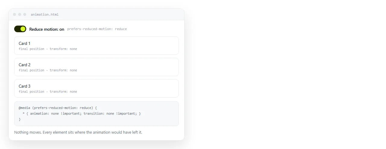
If the animation runs for you and not a colleague, check the reduce motion setting in their operating system before assuming a browser difference.
Honouring it is a single block, and it is worth having:
@media (prefers-reduced-motion: reduce) {
  *, *::before, *::after {
    animation-duration: 0.01ms !important;
    animation-iteration-count: 1 !important;
    transition-duration: 0.01ms !important;
  }
}
The rule leaves the end state in place, so the page still looks finished rather than half built. The same setting affects animated GIFs in some browsers.
Animation or transition
They fail differently, so know which one you wrote.
transition |
animation |
|
|---|---|---|
| Needs a state change | Yes | No |
| Runs on load | No | Yes |
| Multiple steps | No | Yes, via keyframes |
| Common silent failure | Property set at the same moment as the transition | Name mismatch, missing duration |
A transition on an element whose start and end state are applied in the same frame does nothing. That is the transition version of the restart problem above.
Sending a page with animation in it
Animations usually live in a stylesheet next to the HTML, which does not travel when the file is emailed. The page arrives unstyled and static.
Move the rules inline, as inline CSS describes, or paste the whole page into a NOS document. It renders exactly as written with the animations running, at an address of its own. Turning HTML into a link is that step.