The HTML tag for scrolling text is <marquee>. Wrap text in it and browsers scroll it right to left.
The tag is obsolete, though: the HTML standard lists it among non-conforming features, and MDN marks it deprecated. The modern way is a CSS animation that moves a strip of content with transform.
Both are running below. The top line is the old tag, the bottom line is CSS.
<!doctype html>
<html lang="en">
<head>
<meta charset="utf-8">
<meta name="viewport" content="width=device-width, initial-scale=1">
<title>marquee tag vs CSS</title>
<style>
body { margin: 0; padding: 14px; font-family: system-ui, sans-serif; background: #f4f5f7; }
.lane { background: #fff; border-radius: 10px; padding: 12px 14px; margin-bottom: 12px; box-shadow: 0 2px 8px rgba(0, 0, 0, .06); }
.lane h3 { margin: 0 0 2px; font-size: 14px; }
.lane p { margin: 0 0 10px; font-size: 12px; color: #5b6270; }
.strip { background: #eef1f5; border-radius: 6px; padding: 8px 0; font-size: 15px; }
/* The CSS version */
.marquee { overflow: hidden; }
.track {
display: flex; width: max-content; /* as wide as its content */
animation: scroll 12s linear infinite;
}
.track span { padding-right: 48px; white-space: nowrap; } /* the gap lives inside each copy */
@keyframes scroll {
to { transform: translateX(-50%); } /* one copy's width, then it loops */
}
</style>
</head>
<body>
<div class="lane">
<h3><marquee> (obsolete)</h3>
<p>Not part of current HTML. Browsers still render it.</p>
<div class="strip">
<marquee>Free shipping this week · New colours in stock · Open until 8 pm · Gift cards at the till · Returns within 30 days</marquee>
</div>
</div>
<div class="lane">
<h3>CSS animation</h3>
<p>Same effect, no gap, and fully styleable.</p>
<div class="strip marquee">
<div class="track">
<span>Free shipping this week · New colours in stock · Open until 8 pm · Gift cards at the till · Returns within 30 days</span>
<span aria-hidden="true">Free shipping this week · New colours in stock · Open until 8 pm · Gift cards at the till · Returns within 30 days</span>
</div>
</div>
</div>
</body>
</html>
The two look alike, but the tag leaves an empty box before each pass, and its speed and look are hard to control. The CSS version is ordinary HTML that you can style, pause and switch off.
The marquee tag, and why to stop using it
A basic example of the tag:
<marquee>Free shipping this week</marquee>
<marquee direction="up" scrollamount="3">Line one<br>Line two</marquee>
It takes a few attributes of its own:
| Attribute | What it does | CSS equivalent |
|---|---|---|
direction |
left, right, up or down |
translateX or translateY, plus animation-direction |
scrollamount |
Pixels moved per step, so the speed | animation-duration |
behavior |
scroll, slide or alternate |
animation-direction: alternate |
loop |
How many times it runs | animation-iteration-count |
The problem is not that it fails today. A validator reports it as an error.
Its motion is driven by the element itself, not by a CSS animation, so the usual CSS tools such as animation-play-state and a reduced motion query are not the way to control it. And each pass starts from an empty box. The CSS version fixes all three.
The CSS marquee: one track, two copies
The whole technique fits in a few lines. An outer box hides what overflows. Inside it, a track holds the content twice and slides left.
<div class="marquee">
  <div class="track">
    <span>Free shipping this week · Returns within 30 days</span>
    <span aria-hidden="true">Free shipping this week · Returns within 30 days</span>
  </div>
</div>
.marquee { overflow: hidden; }
.track {
  display: flex;
  width: max-content;              /* as wide as the content, not the box */
  animation: scroll 20s linear infinite;
}
.track span { padding-right: 48px; white-space: nowrap; }
@keyframes scroll {
  to { transform: translateX(-50%); }
}
A percentage in translateX() refers to the element's own width. The track is two copies wide, so -50% moves it exactly one copy. At that moment the second copy stands where the first one began, and the animation restarts without a visible jump.
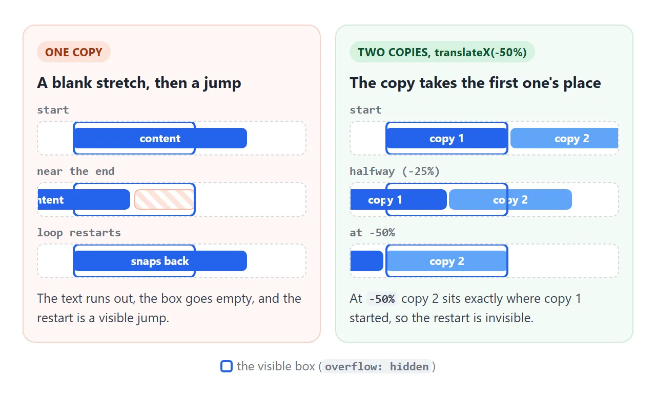
Put the spacing inside each copy, as padding-right, rather than as a gap on the track. A track gap only appears between the copies, so the two halves differ by one gap and the loop hitches.
Speed, direction, pause, and a vertical version
Speed is animation-duration. The distance is one copy's width, so the same duration moves a long strip faster than a short one. For a steady reading pace, divide the width by the pixels per second you want:
const px = group.offsetWidth;          // width of one copy
track.style.animationDuration = px / 60 + 's';   // 60 px per second
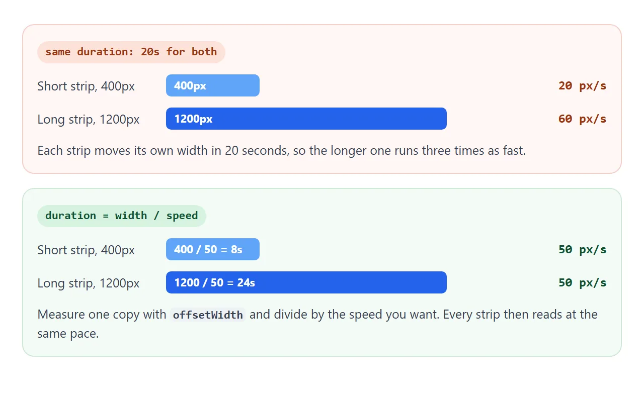
Direction is animation-direction: reverse, which scrolls left to right. Pausing takes one rule:
.marquee:hover .track,
.marquee:focus-within .track { animation-play-state: paused; }
The strip below uses all three. Hover to pause it, and drag the slider to change the speed in pixels per second.
<!doctype html>
<html lang="en">
<head>
<meta charset="utf-8">
<meta name="viewport" content="width=device-width, initial-scale=1">
<title>Seamless logo strip</title>
<style>
body { margin: 0; padding: 18px 14px; font-family: system-ui, sans-serif; background: #fff; color: #1d2330; }
h3 { margin: 0 0 12px; font-size: 14px; color: #5b6270; text-align: center; font-weight: 600; }
.marquee {
overflow: hidden; padding: 10px 0;
/* fade both edges */
-webkit-mask-image: linear-gradient(90deg, transparent, #000 12%, #000 88%, transparent);
mask-image: linear-gradient(90deg, transparent, #000 12%, #000 88%, transparent);
}
.track {
display: flex; width: max-content;
animation: scroll var(--duration, 20s) linear infinite;
}
.marquee:hover .track, .marquee:focus-within .track { animation-play-state: paused; }
.group { display: flex; gap: 14px; padding-right: 14px; } /* padding = gap, so both halves match */
.logo {
display: flex; align-items: center; gap: 8px; padding: 10px 16px;
border: 1px solid #e1e4ea; border-radius: 10px; font-weight: 700; white-space: nowrap;
}
.logo i { width: 18px; height: 18px; border-radius: 5px; display: inline-block; }
@keyframes scroll { to { transform: translateX(-50%); } }
.controls { display: flex; align-items: center; gap: 10px; justify-content: center; margin-top: 16px; font-size: 13px; }
input[type=range] { width: 160px; }
output { font-variant-numeric: tabular-nums; min-width: 64px; }
@media (prefers-reduced-motion: reduce) { .track { animation: none; } }
</style>
</head>
<body>
<h3>Hover to pause</h3>
<div class="marquee">
<div class="track">
<div class="group">
<span class="logo"><i style="background:#2563eb"></i>Northwind</span>
<span class="logo"><i style="background:#16a34a;border-radius:50%"></i>Greenleaf</span>
<span class="logo"><i style="background:#ea580c"></i>Emberline</span>
<span class="logo"><i style="background:#9333ea;border-radius:50%"></i>Violet&Co</span>
<span class="logo"><i style="background:#0891b2"></i>Tidewater</span>
<span class="logo"><i style="background:#e11d48;border-radius:50%"></i>Redwood</span>
</div>
<!-- the script adds a hidden copy of .group here -->
</div>
</div>
<div class="controls">
<label for="speed">Speed</label>
<input id="speed" type="range" min="20" max="200" value="60">
<output id="out">60 px/s</output>
</div>
<script>
const track = document.querySelector('.track');
const group = track.querySelector('.group');
// Fill at least the width of the box, so no blank stretch shows
const logos = [...group.children];
while (group.offsetWidth < track.parentElement.offsetWidth) {
logos.forEach((el) => group.appendChild(el.cloneNode(true)));
}
// Duplicate the content once, for a seamless loop
const copy = group.cloneNode(true);
copy.setAttribute('aria-hidden', 'true');
track.appendChild(copy);
// Speed in pixels per second, whatever the content width
const speed = document.getElementById('speed');
const out = document.getElementById('out');
function setSpeed() {
const pxPerSec = Number(speed.value);
track.style.setProperty('--duration', group.offsetWidth / pxPerSec + 's');
out.textContent = pxPerSec + ' px/s';
}
speed.addEventListener('input', setSpeed);
setSpeed();
</script>
</body>
</html>
The script also repeats the logos until one copy is at least as wide as the box. If one copy is narrower than the box, a blank stretch shows before the loop.
A vertical ticker works the same way, top to bottom. Stack the copies in a column, give the outer box a fixed height, and move the track with translateY:
.ticker-v { height: 120px; overflow: hidden; }
.ticker-v .track {
  display: flex; flex-direction: column;
  animation: up 12s linear infinite;
}
@keyframes up { to { transform: translateY(-50%); } }
Here the track's height is two copies, so -50% is one copy again.
Accessibility: the copy, the motion, the pause
Three things make scrolling text usable for everyone.
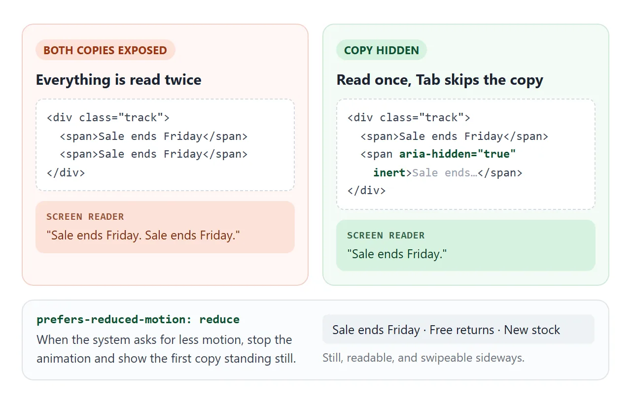
- Hide the duplicate. Screen readers read both copies unless you mark the second one
aria-hidden="true". If it contains links, addinerttoo, so Tab does not land on links nobody can hear. Label the region with aria-label if it has no heading. - Respect reduced motion. When the operating system asks for less movement,
prefers-reduced-motion: reducematches. Turn the animation off there and let the first copy stand still. - Offer a pause. WCAG asks for a way to pause, stop or hide motion that starts by itself and runs for more than five seconds alongside other content. Hover does not exist on a touch screen, so add a button.
@media (prefers-reduced-motion: reduce) {
  .track { animation: none; }
  .marquee { overflow-x: auto; }       /* swipe to read the rest */
  .track [aria-hidden] { display: none; }
}
A finished example: a news ticker
This announcement bar puts the pieces together. Two rows run in opposite directions at different speeds, a button pauses both, and the copies are hidden from screen readers and from the Tab key.
<!doctype html>
<html lang="en">
<head>
<meta charset="utf-8">
<meta name="viewport" content="width=device-width, initial-scale=1">
<title>News ticker</title>
<style>
body { margin: 0; padding: 14px; font-family: system-ui, sans-serif; background: #f4f5f7; }
.ticker { background: #111827; color: #f9fafb; border-radius: 12px; overflow: hidden; }
.head { display: flex; align-items: center; justify-content: space-between; padding: 10px 14px; border-bottom: 1px solid #1f2937; }
.head b { font-size: 13px; letter-spacing: .4px; color: #fbbf24; }
.head button {
font: 600 12px system-ui, sans-serif; color: #f9fafb; background: #374151;
border: 0; border-radius: 6px; padding: 6px 10px; cursor: pointer;
}
.row { overflow: hidden; padding: 11px 0; }
.row + .row { border-top: 1px solid #1f2937; }
.track { display: flex; width: max-content; animation: scroll 30s linear infinite; }
.row.reverse .track { animation-direction: reverse; animation-duration: 38s; }
.group { display: flex; }
.item { white-space: nowrap; padding-right: 36px; font-size: 14px; }
.item a { color: #93c5fd; }
.tag { font-size: 11px; font-weight: 700; padding: 2px 6px; border-radius: 4px; margin-right: 6px; background: #374151; }
.up { color: #4ade80; } .down { color: #f87171; }
@keyframes scroll { to { transform: translateX(-50%); } }
/* Pause on hover, when a link in the row has focus, and with the button */
.ticker:hover .track, .row:focus-within .track, .ticker.paused .track { animation-play-state: paused; }
/* Reduced motion: no scrolling, the rows can be swiped instead */
@media (prefers-reduced-motion: reduce) {
.track { animation: none; }
.row { overflow-x: auto; }
.group[aria-hidden] { display: none; }
}
</style>
</head>
<body>
<section class="ticker" aria-label="Announcements">
<div class="head">
<b>LIVE UPDATES</b>
<button type="button" id="toggle" aria-pressed="false">Pause</button>
</div>
<div class="row">
<div class="track">
<div class="group">
<span class="item"><span class="tag">NEW</span>Summer timetable starts Monday. <a href="#">Details</a></span>
<span class="item"><span class="tag">OFFICE</span>Level 3 kitchen closed until noon</span>
<span class="item"><span class="tag">EVENT</span>Town hall Thursday 4 pm, room B</span>
</div>
</div>
</div>
<div class="row reverse">
<div class="track">
<div class="group">
<span class="item">Signups <b class="up">▲ 12%</b></span>
<span class="item">Open tickets <b class="down">▼ 8</b></span>
<span class="item">Uptime <b class="up">99.9%</b></span>
<span class="item">Queue wait <b class="down">▼ 40 s</b></span>
</div>
</div>
</div>
</section>
<script>
document.querySelectorAll('.track').forEach((track) => {
const group = track.firstElementChild;
// A short row must fill the box, or a blank stretch shows before the loop
const items = [...group.children];
while (group.offsetWidth < track.parentElement.offsetWidth) {
items.forEach((el) => group.appendChild(el.cloneNode(true)));
}
// Then copy the row once. The copy is hidden from screen readers and skipped by Tab.
const copy = group.cloneNode(true);
copy.setAttribute('aria-hidden', 'true');
copy.inert = true;
track.appendChild(copy);
});
const ticker = document.querySelector('.ticker');
const btn = document.getElementById('toggle');
btn.addEventListener('click', () => {
const paused = ticker.classList.toggle('paused');
btn.textContent = paused ? 'Play' : 'Pause';
btn.setAttribute('aria-pressed', paused);
});
</script>
</body>
</html>
- Opposite rows: the second row has
animation-direction: reverseand a longer duration. - One pause for both: the button toggles a
pausedclass on the bar, and one rule pauses every track inside it. - Reduced motion: the rows stop and become swipeable, with the copies removed.
If the animation does not start at all, CSS animation not working covers the general causes.
When it does not work
| What you see | Cause | Fix |
|---|---|---|
| A gap or a jump at the loop point | Content not duplicated, or the translate distance is not one copy | Two identical copies and translateX(-50%), with spacing as padding-right inside each copy |
| An empty stretch before the text comes back | One copy is narrower than the box | Repeat the items until one copy is wider than the box |
| The text wraps onto two lines | Lines break at the box width | white-space: nowrap on the items, width: max-content on the track |
| Long strips race, short ones crawl | The duration is fixed, but the distance is each strip's width | Set the duration to width divided by pixels per second |
| The animation runs but nothing moves | The track is an inline element such as a <span>, and transform does not apply to inline boxes |
Use a <div> or set display: flex or inline-block |
| It stays still for some visitors | Their system asks for reduced motion | Intended. Make sure the still version is readable |
Share it as a link
A ticker is hard to judge from a screenshot, because the movement is the point. An .html attachment may open as plain code, or not at all, on a phone.
To send the working version, paste the page into a NOS document and choose Create share link. HTML to link walks through it.
The page renders as written and its scripts run, so the people you send it to can watch it scroll, hover to pause and try the speed slider. If you change the code later, the same link shows the new version.