A typewriter effect in CSS is one line of monospace text whose width grows from 0 in jumps of 1ch, one jump per character, using steps(). overflow: hidden hides the untyped part, and a border-right that blinks plays the caret. No JavaScript is involved.
Watch it type, then tick Proportional font and move the Step slider to see where the trick stops working.
<!doctype html>
<html lang="en">
<head>
<meta charset="utf-8">
<meta name="viewport" content="width=device-width, initial-scale=1">
<title>CSS-only typewriter</title>
<style>
  body { margin: 0; padding: 22px 18px; font-family: system-ui, sans-serif; background: #f4f5f7; color: #1d2330; }
  .stage { background: #fff; border-radius: 12px; padding: 22px 18px; box-shadow: 0 4px 16px rgba(0, 0, 0, .08); }

  .tw {
    --n: 18;                          /* number of characters in the text */
    display: inline-block;
    width: calc(var(--n) * 1ch);      /* 1ch = width of "0" in this font */
    white-space: nowrap;              /* one line only */
    overflow: hidden;                 /* hide what is not typed yet */
    border-right: .12em solid #2563eb; /* the caret */
    font: 600 22px/1.4 ui-monospace, Consolas, monospace;
    animation: caret .75s step-end infinite;
  }
  .tw.typing {
    /* width grows from 0 in --n jumps: one character per jump */
    animation: typing 2s steps(var(--n)), caret .75s step-end infinite;
  }
  .tw.prop { font-family: system-ui, sans-serif; } /* proportional font */

  @keyframes typing { from { width: 0; } }        /* ends at the width set above */
  @keyframes caret { 50% { border-color: transparent; } }

  @media (prefers-reduced-motion: reduce) {
    .tw, .tw.typing { animation: none; }           /* show the whole line at once */
  }

  .controls { display: flex; flex-wrap: wrap; gap: 10px 16px; align-items: center; margin-top: 16px; font-size: 14px; }
  button { font: inherit; padding: 7px 14px; border-radius: 8px; border: 1px solid #c9ced8; background: #fff; cursor: pointer; }
  input[type=range] { width: 150px; }
  .note { margin-top: 12px; font-size: 13px; color: #4b5563; line-height: 1.5; }
</style>
</head>
<body>
<div class="stage">
  <span class="tw typing" id="tw">Hello, typewriter!</span>
</div>

<div class="controls">
  <button id="replay">Replay</button>
  <label><input type="checkbox" id="prop"> Proportional font</label>
  <label>Step <input type="range" id="step" min="0" max="18" value="18"> <b id="stepOut">18</b>/18</label>
</div>
<p class="note" id="note">Monospace: every letter is 1ch wide, so each step shows exactly one more letter.</p>

<script>
  const tw = document.getElementById('tw');
  const step = document.getElementById('step');
  const note = document.getElementById('note');
  const stepOut = document.getElementById('stepOut');

  document.getElementById('replay').addEventListener('click', () => {
    tw.style.width = '';            // back to the full width
    step.value = 18; stepOut.textContent = 18;
    tw.classList.remove('typing');
    void tw.offsetWidth;            // force a reflow so the animation restarts
    tw.classList.add('typing');
  });

  document.getElementById('prop').addEventListener('change', (e) => {
    tw.classList.toggle('prop', e.target.checked);
    note.textContent = e.target.checked
      ? 'Proportional: "i" is narrower than 1ch and "W" is wider, so steps cut letters in half and the end leaves a gap.'
      : 'Monospace: every letter is 1ch wide, so each step shows exactly one more letter.';
  });

  // Freeze the animation at one step to see exactly what each jump reveals
  step.addEventListener('input', () => {
    tw.classList.remove('typing');
    tw.style.width = step.value + 'ch';
    stepOut.textContent = step.value;
  });
</script>
</body>
</html>
That demo is the whole technique, and also its main limit. The rest of this guide covers the JavaScript version, the caret, emoji, screen readers and reduced motion.
The CSS-only typewriter: steps() and ch
Four properties set the stage, and two animations run on top:
.tw {
  --n: 18;                       /* characters in the text */
  display: inline-block;
  width: calc(var(--n) * 1ch);
  white-space: nowrap;
  overflow: hidden;
  font-family: ui-monospace, Consolas, monospace;
  border-right: .12em solid #2563eb;   /* the caret */
  animation: typing 2s steps(var(--n)), caret .75s step-end infinite;
}
@keyframes typing { from { width: 0; } }
@keyframes caret { 50% { border-color: transparent; } }
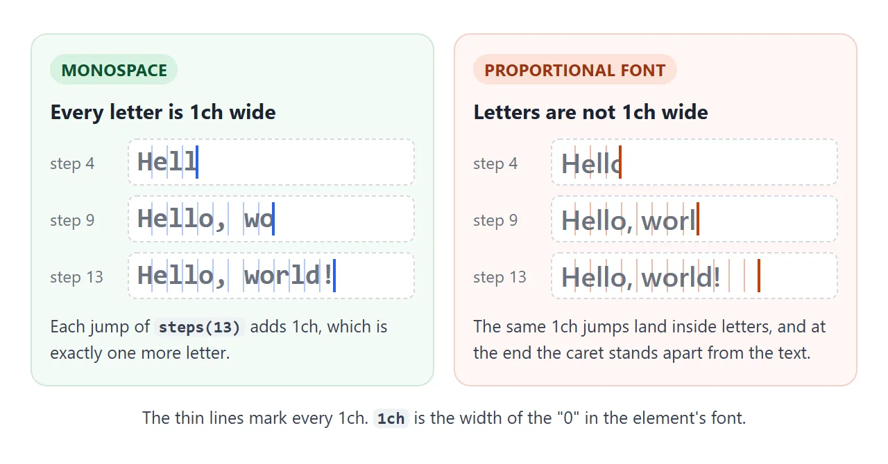
chis a unit equal to the width of the "0" glyph in the element's font. In a monospace font every character has that width, so 18ch holds exactly 18 characters.steps(18)turns a smooth animation into 18 equal jumps. Each jump adds 1ch, so one more letter appears.from { width: 0; }with notokeyframe animates towards the width the element already has. Change--nand the end point follows.
The steps() function and the other animation properties are covered in CSS keyframes.
Why a proportional font breaks it
In a normal font, "i" is much narrower than "0" and "W" is wider. The jumps are still 1ch each, so they stop partway through letters, and after the last jump the caret sits apart from the text.
The CSS-only version has other hard limits too:
| Limit | Why |
|---|---|
| One line only | white-space: nowrap is needed, or text wraps before it is revealed |
| A fixed character count | --n must match the text by hand, per element |
| Monospace only | Every character must be exactly 1ch |
| One phrase | CSS cannot swap the text for the next phrase |
| Wide characters | Emoji and many Chinese, Japanese and Korean characters are wider than 1ch even in monospace fonts |
When you hit one of these, switch to JavaScript. It types real characters, so letter widths stop mattering.
The JavaScript typewriter: type, pause, delete, repeat
The script keeps a counter n and shows the first n characters of the phrase. One setTimeout per step decides the speed. When the phrase is complete, it waits and then counts back down to zero.
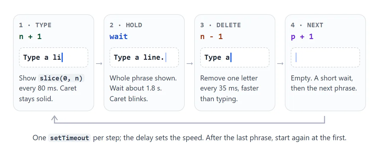
function tick() {
  const chars = split(phrases[p]);
  n += deleting ? -1 : 1;
  out.textContent = chars.slice(0, n).join('');

  let wait = deleting ? 40 : 90, idle = false;
  if (!deleting && n >= chars.length) { deleting = true; idle = true; wait = 1400; }
  else if (deleting && n <= 0) { deleting = false; idle = true; p = (p + 1) % phrases.length; wait = 400; }
  caret.classList.toggle('blink', idle);
  setTimeout(tick, wait);
}
Try the sliders. A shorter delay for deleting than for typing tends to feel natural; tune it by eye.
<!doctype html>
<html lang="en">
<head>
<meta charset="utf-8">
<meta name="viewport" content="width=device-width, initial-scale=1">
<title>JavaScript typewriter loop</title>
<style>
body { margin: 0; padding: 20px 18px; font-family: system-ui, sans-serif; background: #f4f5f7; color: #1d2330; }
.stage { background: #fff; border-radius: 12px; padding: 20px 18px; min-height: 2.9em; box-shadow: 0 4px 16px rgba(0, 0, 0, .08);
font: 600 24px/1.4 system-ui, sans-serif; }
.caret { display: inline-block; width: .08em; height: 1.1em; margin-left: 2px; vertical-align: -.15em; background: #2563eb; }
.caret.blink { animation: blink .75s step-end infinite; } /* blink only while waiting */
@keyframes blink { 50% { opacity: 0; } }
.controls { display: grid; grid-template-columns: auto 1fr auto; gap: 8px 12px; align-items: center; margin-top: 16px; font-size: 14px; }
.controls output { min-width: 4.5em; text-align: right; font-variant-numeric: tabular-nums; }
.row2 { margin-top: 12px; font-size: 14px; }
</style>
</head>
<body>
<div class="stage"><span id="out"></span><span class="caret" id="caret"></span></div>
<div class="controls">
<label for="type">Typing</label> <input id="type" type="range" min="20" max="300" value="90"> <output id="typeOut"></output>
<label for="del">Deleting</label> <input id="del" type="range" min="10" max="200" value="40"> <output id="delOut"></output>
<label for="hold">Pause</label> <input id="hold" type="range" min="200" max="3000" step="100" value="1400"> <output id="holdOut"></output>
</div>
<div class="row2"><label><input type="checkbox" id="naive"> Split with <code>split('')</code> (breaks emoji)</label></div>
<script>
const phrases = ['Type a line.', 'Delete it.', 'Type the next one.', 'Emoji too 👋🏽👩💻'];
const out = document.getElementById('out');
const caret = document.getElementById('caret');
const $ = (id) => document.getElementById(id);
// Split into what people see as characters, so an emoji is never cut in half
const seg = new Intl.Segmenter('en', { granularity: 'grapheme' });
const graphemes = (s) => Array.from(seg.segment(s), (x) => x.segment);
const split = (s) => $('naive').checked ? s.split('') : graphemes(s);
let p = 0, n = 0, deleting = false;
function tick() {
const chars = split(phrases[p]);
n += deleting ? -1 : 1;
out.textContent = chars.slice(0, n).join('');
let wait = deleting ? +$('del').value : +$('type').value, idle = false;
if (!deleting && n >= chars.length) { // phrase finished: hold, then delete
deleting = true; idle = true; wait = +$('hold').value;
} else if (deleting && n <= 0) { // all deleted: move to the next phrase
deleting = false; idle = true; n = 0; p = (p + 1) % phrases.length; wait = 400;
}
caret.classList.toggle('blink', idle); // solid while typing, blinking while waiting
setTimeout(tick, wait);
}
tick();
// Show the slider values
for (const id of ['type', 'del', 'hold']) {
const show = () => { $(id + 'Out').textContent = $(id).value + ' ms'; };
$(id).addEventListener('input', show); show();
}
</script>
</body>
</html>
A setTimeout that calls itself is simpler here than setInterval, because every step can wait a different time. setTimeout and setInterval covers both.
You do not need requestAnimationFrame for this: typing is a series of pauses, not a smooth movement.
The blinking caret, and its colour
The caret is an element you draw, not the browser's text cursor. A border on the text element works for the CSS version. In the JavaScript version, a separate thin <span> after the text follows it across line breaks.
.caret { display: inline-block; width: .08em; height: 1.1em; background: #2563eb; }
.caret.blink { animation: blink .75s step-end infinite; }
@keyframes blink { 50% { opacity: 0; } }
step-endmakes it switch on and off. The defaulteasefades it in and out instead.- Blink only while waiting. A caret that blinks mid-word looks wrong. The demo adds the
blinkclass only during pauses. - Colour. Set the border colour or background of your caret. The
caret-colorproperty does something else: it colours the real text cursor in inputs, textareas andcontenteditableelements. The finished example below uses both, in the same colour.
If "cursor" meant the mouse pointer, that is the cursor property, covered in CSS cursor.
Emoji that split in half
JavaScript strings are counted in UTF-16 units. Most emoji take two units, and some are several emoji joined together. '👋🏽'.length is 4. Slicing by those units can show half an emoji, which appears as a replacement character.
Tick Split with split('') in the demo above and watch the last phrase. The fix is to split the text into what readers see as characters:
const seg = new Intl.Segmenter('en', { granularity: 'grapheme' });
const split = (s) => Array.from(seg.segment(s), (x) => x.segment);
| Method | Pieces for "👋🏽" | Safe? |
|---|---|---|
s.split('') |
4 | No, halves of emoji |
Array.from(s) |
2 (hand, skin tone) | No broken halves, but joined emoji come apart |
Intl.Segmenter (grapheme) |
1 | Yes |
Screen readers and reduced motion
A screen reader reads the text that is in the page when it gets there. If that is half a phrase, the listener hears half a phrase, and never hears the others.
Putting the animated text in an aria-live region makes it worse, since each change would be announced.
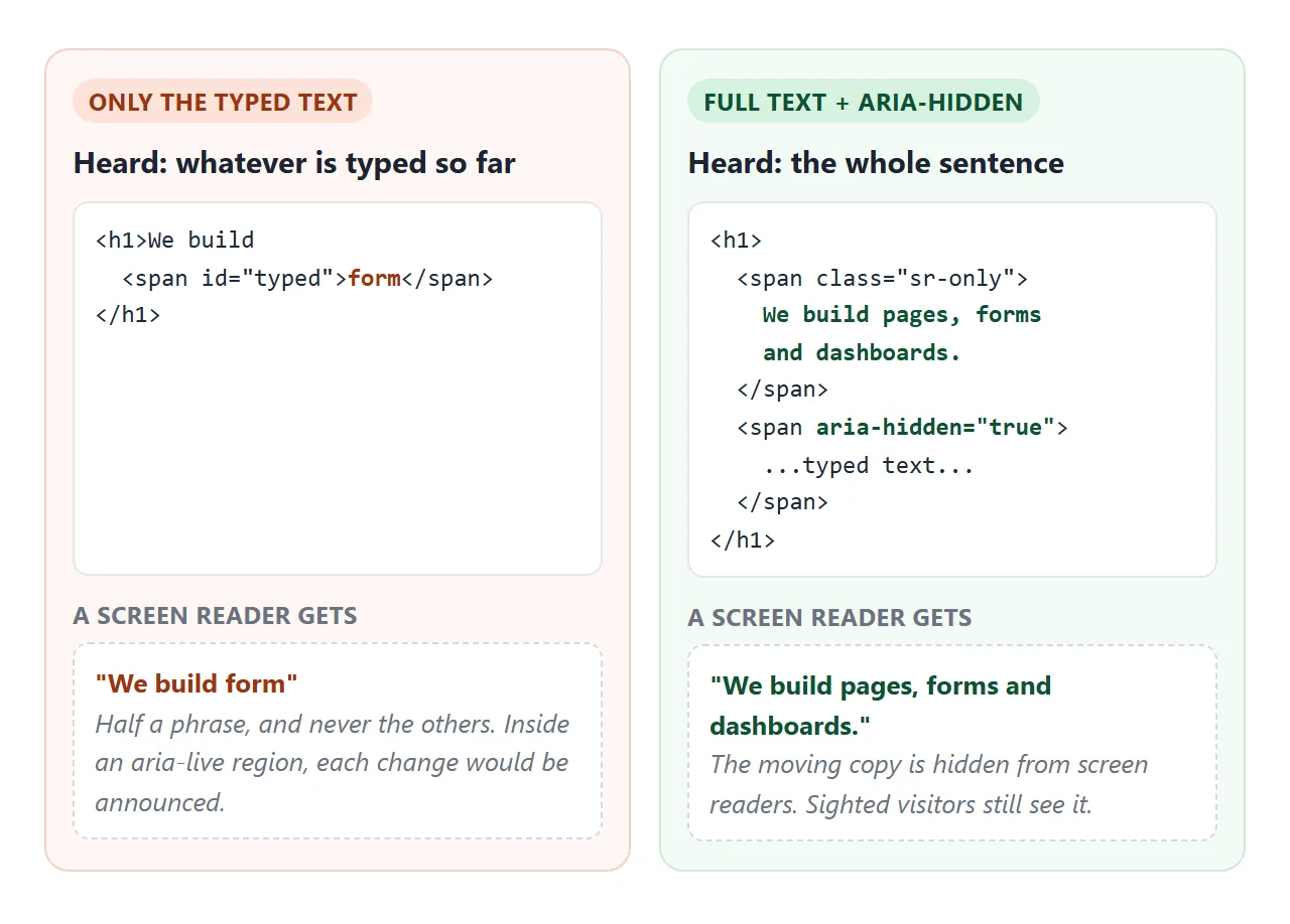
<h1>
  <span class="sr-only">We build pages, forms and dashboards.</span>
  <span aria-hidden="true">We build <span id="typed"></span></span>
</h1>
The sr-only class hides text from the eye but not from screen readers.
An aria-label on the <h1> also works, but not on a plain <span> or <div>, where the label may be ignored. aria-label explains where it applies.
For people who ask their system for less motion, show the full text and skip the typing. In CSS, @media (prefers-reduced-motion: reduce) with animation: none does it. In JavaScript:
const reduce = matchMedia('(prefers-reduced-motion: reduce)');
if (reduce.matches) { typed.textContent = phrases[0]; } else { tick(); }
A finished example: a hero headline that cycles phrases
This headline cycles three phrases, reads as one sentence to screen readers and stays still with reduced motion. Tick Preview reduced motion to see that version without changing your system settings.
<!doctype html>
<html lang="en">
<head>
<meta charset="utf-8">
<meta name="viewport" content="width=device-width, initial-scale=1">
<title>Typewriter hero headline</title>
<style>
  :root { --brand: #e11d48; }
  body { margin: 0; font-family: system-ui, sans-serif; color: #1d2330;
         background: linear-gradient(160deg, #fff1f2, #eef2ff); min-height: 100vh; }
  .hero { max-width: 560px; margin: 0 auto; padding: 32px 20px 20px; }
  h1 { font-size: clamp(26px, 7vw, 40px); line-height: 1.2; margin: 0 0 14px; }

  /* Hidden from the eye, still read by screen readers */
  .sr-only { position: absolute; width: 1px; height: 1px; overflow: hidden;
             clip: rect(0 0 0 0); clip-path: inset(50%); white-space: nowrap; }

  /* Every phrase sits in the same grid cell. The hidden ones set the size,
     so the headline never shifts while the visible one grows. */
  .slot { display: inline-grid; text-align: left; color: var(--brand); }
  .slot > * { grid-area: 1 / 1; }
  .sizer { visibility: hidden; padding-right: .1em; }

  .caret { display: inline-block; width: .07em; height: 1em; margin-left: .04em; vertical-align: -.1em;
           background: var(--brand); }                       /* caret colour */
  .caret.blink { animation: blink .8s step-end infinite; }
  @keyframes blink { 50% { opacity: 0; } }

  p { margin: 0 0 20px; color: #4b5563; line-height: 1.5; }
  form { display: flex; gap: 8px; max-width: 380px; }
  input { flex: 1; min-width: 0; font: inherit; padding: 10px 12px; border: 1px solid #d1d5db; border-radius: 10px;
          caret-color: var(--brand); }                        /* the real text cursor in the field */
  button { font: inherit; font-weight: 600; padding: 10px 16px; border: 0; border-radius: 10px; background: var(--brand); color: #fff; cursor: pointer; }
  #msg { min-height: 1.4em; margin-top: 12px; font-size: 14px; color: #0f5132; }
  .sim { display: block; margin-top: 14px; font-size: 13px; color: #6b7280; }
</style>
</head>
<body>
<section class="hero">
  <h1>
    <span class="sr-only">We build pages that load fast, forms people finish, and dashboards your team reads.</span>
    <span aria-hidden="true">We build
      <span class="slot">
        <span class="sizer">pages that load fast</span>
        <span class="sizer">forms people finish</span>
        <span class="sizer">dashboards your team reads</span>
        <span><span id="typed"></span><span class="caret" id="caret"></span></span>
      </span>
    </span>
  </h1>
  <p>Small, fast websites for small teams.</p>
  <form id="form">
    <input type="email" name="email" placeholder="you@example.com" aria-label="Email address" required>
    <button>Get updates</button>
  </form>
  <div id="msg" role="status"></div>
  <label class="sim"><input type="checkbox" id="sim"> Preview reduced motion</label>
</section>

<script>
  const phrases = [...document.querySelectorAll('.sizer')].map((s) => s.textContent);
  const typed = document.getElementById('typed');
  const caret = document.getElementById('caret');
  const reduce = matchMedia('(prefers-reduced-motion: reduce)');
  const sim = document.getElementById('sim');
  const seg = new Intl.Segmenter('en', { granularity: 'grapheme' });
  let p = 0, n = 0, deleting = false, timer;

  function tick() {
    const chars = Array.from(seg.segment(phrases[p]), (x) => x.segment);
    n += deleting ? -1 : 1;
    typed.textContent = chars.slice(0, n).join('');
    let wait = deleting ? 35 : 80, idle = false;
    if (!deleting && n >= chars.length) { deleting = true; idle = true; wait = 1800; }
    else if (deleting && n <= 0) { deleting = false; idle = true; p = (p + 1) % phrases.length; wait = 400; }
    caret.classList.toggle('blink', idle);         // blink only while waiting
    timer = setTimeout(tick, wait);
  }

  function start() {
    clearTimeout(timer);
    if (reduce.matches || sim.checked) {     // no motion: first phrase, whole, no caret
      typed.textContent = phrases[0];
      caret.style.display = 'none';
      return;
    }
    caret.style.display = '';
    p = 0; n = 0; deleting = false;
    tick();
  }
  reduce.addEventListener('change', start);  // the setting can change while the page is open
  sim.addEventListener('change', start);
  start();

  // Demo form: show what would be sent, send nothing
  document.getElementById('form').addEventListener('submit', (e) => {
    e.preventDefault();
    const email = new FormData(e.target).get('email');
    document.getElementById('msg').textContent = 'Thanks. Would sign up: ' + email;
  });
</script>
</body>
</html>
- No layout shift. Every phrase sits in the same grid cell with
visibility: hidden. The cell takes the size of the longest one, so the text below never moves as letters appear. - One colour.
--brandsets the drawn caret's background and thecaret-colorof the email field. - Emoji safe. The phrases are split with
Intl.Segmenter, as above.
The same moving-text concerns apply to scrolling tickers, covered in marquee in HTML.
When it does not work
| What you see | Cause | Fix |
|---|---|---|
| Letters cut in half, or a gap before the caret | Proportional font with ch steps |
Monospace font, or the JavaScript version |
| Text appears smoothly, not letter by letter | No steps() |
Add steps(n) with n = character count |
| Typing stops early or overshoots | n does not match the text length |
Count again, including spaces |
| Caret fades instead of blinking | Default ease timing |
step-end on the blink animation |
| Caret blinks while letters are still appearing | Blink runs all the time | Blink only during pauses |
| Content below jumps as text grows | The element changes size | Reserve the space of the longest phrase |
| Screen reader reads half words or letter by letter | Only the animated text exists, or it is in a live region | Hidden full text plus aria-hidden on the animation |
| A "?" or box appears mid-phrase | An emoji was sliced in half | Split with Intl.Segmenter |
| Nothing animates at all | Reduced motion is on, or the animation is misspelled | Check the system setting, then CSS animation not working |
Share it as a link
A screenshot of a typewriter effect shows one frozen frame. To show the motion, send the page as a link: paste it into a NOS document and choose Create share link. HTML to link walks through it.
The page renders as written and its scripts run, so the people you send it to see the phrases type and can change the speed themselves. If you change the phrases later, the same link shows the new version.