The CSS transform property moves, rotates, resizes or slants an element after the page has been laid out. You give it a list of functions, such as transform: translateX(20px) rotate(15deg), and the browser draws the element with those changes applied. Nothing around it moves.
Try it first. Drag the sliders and watch the transform line under the box update.
<!doctype html>
<html lang="en">
<head>
<meta charset="utf-8">
<meta name="viewport" content="width=device-width, initial-scale=1">
<title>CSS transform playground</title>
<style>
  body { margin: 0; padding: 14px; font-family: system-ui, sans-serif; background: #f4f5f7; color: #1d2330; }
  .stage {
    position: relative; height: 170px; border-radius: 12px; overflow: hidden;
    background: #fff; display: flex; align-items: center; justify-content: center; gap: 14px;
  }
  .side, .slot { width: 70px; height: 70px; border-radius: 10px; flex: none; }
  .side { background: #e3e7ed; }
  .slot { position: relative; }
  .ghost { position: absolute; inset: 0; border-radius: 10px; border: 2px dashed #b6bdc8; }  /* where the box sits in the layout */
  .box {
    position: absolute; inset: 0; border-radius: 10px;
    background: linear-gradient(135deg, #2563eb, #7c3aed);
    color: #fff; display: grid; place-items: center; font-weight: 700;
  }
  .controls { display: grid; grid-template-columns: repeat(auto-fit, minmax(230px, 1fr)); gap: 6px 16px; margin: 12px 0 10px; }
  label { font-size: 13px; display: grid; grid-template-columns: 74px 1fr 50px; align-items: center; gap: 6px; }
  label output { font: 12px ui-monospace, Consolas, monospace; text-align: right; }
  input[type=range] { width: 100%; margin: 0; }
  pre {
    margin: 0; padding: 10px 12px; border-radius: 8px; background: #1d2330; color: #d6f2df;
    font: 13px/1.4 ui-monospace, Consolas, monospace; white-space: pre-wrap; word-break: break-word;
  }
  button { margin-top: 8px; font: inherit; font-size: 13px; padding: 5px 12px; border-radius: 7px; border: 1px solid #c9cdd4; background: #fff; cursor: pointer; }
</style>
</head>
<body>
<div class="stage">
  <div class="side"></div>
  <div class="slot"><div class="ghost"></div><div class="box" id="box">A</div></div>
  <div class="side"></div>
</div>

<div class="controls">
  <label>translateX <input type="range" id="tx" min="-100" max="100" value="0"><output id="txv"></output></label>
  <label>translateY <input type="range" id="ty" min="-60" max="60" value="0"><output id="tyv"></output></label>
  <label>rotate <input type="range" id="r" min="-180" max="180" value="0"><output id="rv"></output></label>
  <label>scale <input type="range" id="s" min="0.3" max="2" step="0.1" value="1"><output id="sv"></output></label>
  <label>skewX <input type="range" id="k" min="-45" max="45" value="0"><output id="kv"></output></label>
</div>
<pre id="code"></pre>
<button id="reset" type="button">Reset</button>

<script>
  const box = document.getElementById('box');
  const ids = ['tx', 'ty', 'r', 's', 'k'];
  const el = (id) => document.getElementById(id);

  function update() {
    const tx = el('tx').value, ty = el('ty').value, r = el('r').value, s = el('s').value, k = el('k').value;
    // one transform property holds every function, applied in the order written
    const t = `translate(${tx}px, ${ty}px) rotate(${r}deg) scale(${s}) skewX(${k}deg)`;
    box.style.transform = t;
    el('txv').value = tx + 'px'; el('tyv').value = ty + 'px';
    el('rv').value = r + 'deg'; el('sv').value = s; el('kv').value = k + 'deg';
    el('code').textContent = '.box {\n  transform: ' + t + ';\n}';
  }

  ids.forEach((id) => el(id).addEventListener('input', update));
  el('reset').addEventListener('click', () => {
    ids.forEach((id) => { el(id).value = id === 's' ? 1 : 0; });
    update();
  });
  update();
</script>
</body>
</html>
Notice the grey boxes on either side. However far you push the blue box, they never shift. That is the defining trait of transform, and the reason it is the usual choice for hover effects and motion.
The four functions you will use most
Every transform is built from a handful of functions. You can use one, or chain several in a single value separated by spaces.
| Function | What it does | Example |
|---|---|---|
translate(x, y) |
Moves the element | translate(20px, -10px) |
rotate(angle) |
Turns it, clockwise for positive angles | rotate(45deg) |
scale(n) |
Resizes it, 1 is normal size | scale(1.2) |
skew(x, y) |
Slants it | skewX(-10deg) |
There are one-axis versions too: translateX, translateY, scaleX, scaleY, skewX and skewY. A percentage in translate is measured against the element's own size, so translateX(100%) moves it by exactly its own width.
.badge {
  transform: translate(-50%, -50%) rotate(-8deg) scale(1.1);
}
How to use CSS transform on hover
The most common use is a small change when the pointer is over something. Put the transform on the :hover rule and the transition on the element itself, so it animates both ways.
.card { transition: transform .2s; }
.card:hover { transform: translateY(-4px) scale(1.02); }
If the movement snaps instead of gliding, the transition is probably on the wrong rule. CSS hover transition covers where it belongs.
Why the order of functions matters
Functions are not independent settings. Each one works inside the coordinate system the previous function left behind. Rotating first turns the x-axis, so a later translateX moves along that tilted axis.
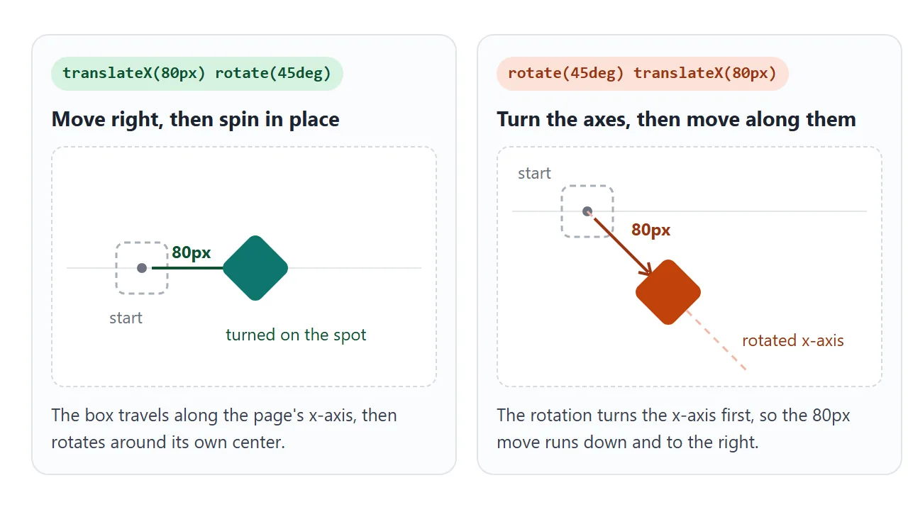
Move the slider below. Box A moves right and spins on the spot. Box B circles around its starting point, because the rotation keeps turning the direction it travels.
<!doctype html>
<html lang="en">
<head>
<meta charset="utf-8">
<meta name="viewport" content="width=device-width, initial-scale=1">
<title>Transform order matters</title>
<style>
  body { margin: 0; padding: 12px; font-family: system-ui, sans-serif; background: #f4f5f7; color: #1d2330; }
  .lanes { display: grid; grid-template-columns: 1fr 1fr; gap: 10px; }
  .lane { background: #fff; border-radius: 12px; padding: 10px; min-width: 0; }
  .lane code { display: block; font: 12px/1.35 ui-monospace, Consolas, monospace; min-height: 34px; color: #374151; }
  .area { position: relative; height: 180px; overflow: hidden; }
  .dot { position: absolute; left: 50%; top: 50%; width: 8px; height: 8px; margin: -4px; border-radius: 50%; background: #9aa3b2; }
  .box {
    position: absolute; left: 50%; top: 50%; width: 36px; height: 36px; margin: -18px;
    border-radius: 7px; color: #fff; font: 700 13px system-ui, sans-serif; display: grid; place-items: center;
  }
  .a { background: #0f766e; }
  .b { background: #c2410c; }
  label { display: flex; align-items: center; gap: 8px; margin-top: 10px; font-size: 13px; }
  input { flex: 1; }
  output { font: 12px ui-monospace, Consolas, monospace; width: 52px; text-align: right; }
</style>
</head>
<body>
<div class="lanes">
  <div class="lane">
    <code id="ca"></code>
    <div class="area"><div class="dot"></div><div class="box a" id="a">A</div></div>
  </div>
  <div class="lane">
    <code id="cb"></code>
    <div class="area"><div class="dot"></div><div class="box b" id="b">B</div></div>
  </div>
</div>
<label>angle <input type="range" id="angle" min="0" max="360" value="45"><output id="av"></output></label>

<script>
  const angle = document.getElementById('angle');

  function update() {
    const d = angle.value + 'deg';
    // same two functions, opposite order
    const ta = `translateX(50px) rotate(${d})`;  // move right, then spin in place
    const tb = `rotate(${d}) translateX(50px)`;  // turn the axes, then move along the turned x-axis
    document.getElementById('a').style.transform = ta;
    document.getElementById('b').style.transform = tb;
    document.getElementById('ca').textContent = 'transform: ' + ta;
    document.getElementById('cb').textContent = 'transform: ' + tb;
    document.getElementById('av').value = d;
  }

  angle.addEventListener('input', update);
  update();
</script>
</body>
</html>
A practical rule: put translate first when you want to move along the page's own directions. Put rotate first when you want to orbit or move along a tilted line.
transform-origin: where the pivot is
Rotation and scaling happen around a point called the transform origin. For HTML elements it defaults to the center, 50% 50%. Change it with transform-origin, using keywords, percentages or lengths.
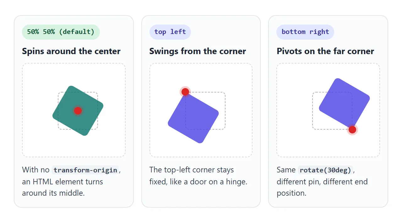
.tag { transform-origin: top left; }
.tag:hover { transform: rotate(-8deg); }
If an element seems to rotate or grow "from the wrong place", check the origin before anything else. A corner origin also makes scale grow the element away from that corner instead of evenly outwards.
transform vs changing left, top or width
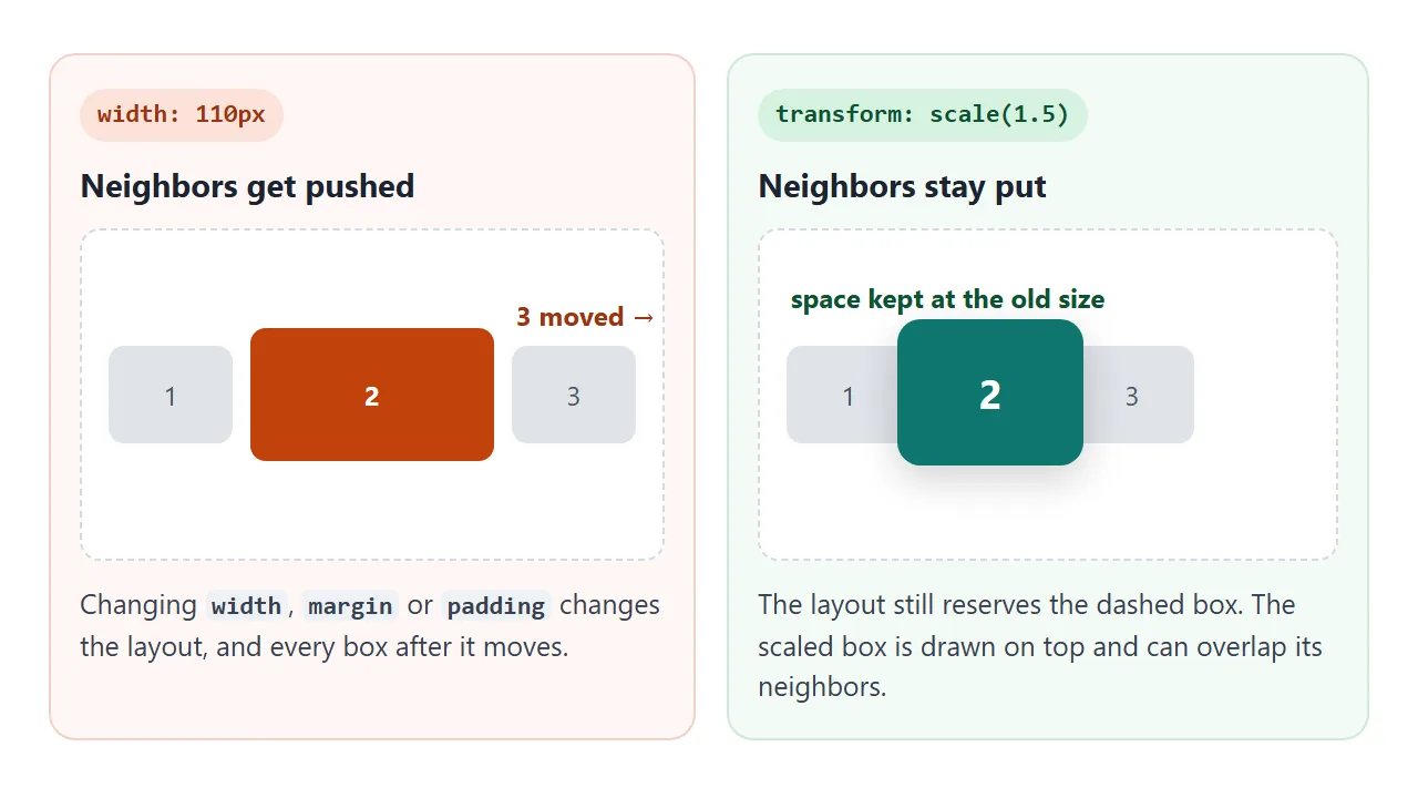
A transform only changes how the element is drawn. Its box in the layout keeps the original position and size. Changing left, top, width or margin changes the layout itself.
transform |
left / top / width |
|
|---|---|---|
| Neighbors move | No | Yes, for size and margin changes |
Needs position |
No | left and top need a positioned element |
| Good for | Hover effects, motion, flips | Real size or position changes |
| Can overlap others | Yes | Yes, when the element is positioned |
Browsers can often animate transform without recalculating layout, which helps motion stay smooth. Use layout properties when the rest of the page genuinely needs to make room.
A finished example: a card that flips
A 3D flip uses the same property with rotateY. Three extra lines make it look solid: perspective on the parent adds depth, transform-style: preserve-3d keeps both faces in 3D, and backface-visibility: hidden hides whichever face points away.
<!doctype html>
<html lang="en">
<head>
<meta charset="utf-8">
<meta name="viewport" content="width=device-width, initial-scale=1">
<title>Flip card with CSS transform</title>
<style>
  body {
    margin: 0; min-height: 100vh; display: grid; place-items: center;
    font-family: system-ui, sans-serif; background: #eceef1;
  }
  .card {
    width: 220px; height: 260px; cursor: pointer;
    perspective: 800px;               /* depth, so the turn looks 3D */
  }
  .inner {
    position: relative; width: 100%; height: 100%;
    transform-style: preserve-3d;     /* keep both faces in 3D space */
    transition: transform .6s;
  }
  .face {
    position: absolute; inset: 0; border-radius: 14px; padding: 20px;
    box-sizing: border-box; box-shadow: 0 8px 24px rgba(0, 0, 0, .15);
    backface-visibility: hidden;      /* hide a face while it points away */
    display: flex; flex-direction: column; justify-content: flex-end;
  }
  .front { background: linear-gradient(160deg, #6366f1, #0ea5e9); color: #fff; }
  .back  { background: #fff; color: #1d2330; transform: rotateY(180deg); justify-content: center; }
  .face h3 { margin: 0 0 6px; font-size: 20px; }
  .face p { margin: 0; font-size: 14px; line-height: 1.45; }

  /* flip on hover where a mouse exists, and on tap or Enter everywhere */
  @media (hover: hover) { .card:hover .inner { transform: rotateY(180deg); } }
  .card.flipped .inner { transform: rotateY(180deg); }
</style>
</head>
<body>
<div class="card" id="card" role="button" tabindex="0" aria-pressed="false">
  <div class="inner">
    <div class="face front"><h3>Front</h3><p>Hover, or tap on a phone.</p></div>
    <div class="face back"><h3>Back</h3><p>rotateY(180deg) on the inner box. This face started already turned.</p></div>
  </div>
</div>

<script>
  const card = document.getElementById('card');
  function toggle() {
    const on = card.classList.toggle('flipped');
    card.setAttribute('aria-pressed', on);
  }
  card.addEventListener('click', toggle);
  card.addEventListener('keydown', (e) => {
    if (e.key === 'Enter' || e.key === ' ') { e.preventDefault(); toggle(); }
  });
</script>
</body>
</html>
The back face carries its own rotateY(180deg) from the start. When the inner box turns another 180 degrees, the two cancel out and the back reads the right way round. The tap handler toggles a class, so phones without hover get the same flip.
If you want the page to move on load rather than on hover, see HTML animation on page load.
When it does not work
| What you see | Cause | Fix |
|---|---|---|
Nothing happens on a span or a |
Transforms do not apply to plain inline boxes | display: inline-block (or block, flex item) |
| Hover scale removes the rotation | A second transform rule replaces the first; values do not add up |
Repeat every function: rotate(10deg) scale(1.1) |
| Rotates or grows from a strange point | transform-origin is not where you expected |
Set it explicitly, e.g. transform-origin: center |
| The element covers its neighbors | Transforms do not change layout | Expected; use width/margin if others should move |
A child's z-index cannot rise above things outside its parent |
A transform creates a new stacking context | Put position: relative and the z-index on the transformed parent |
A position: fixed child scrolls with its parent |
A transformed ancestor becomes the containing block | Move the fixed element outside the transformed one |
| Change is instant, not animated | No transition: transform on the base rule |
Add transition: transform .3s to the element |
The second row catches many people. transform is one property, so .icon:hover { transform: scale(1.2); } throws away any rotate set on .icon. Write the full list again in the hover rule, or use the separate rotate and scale properties so each can change alone.
Share it as a link
A transform is easier to show moving than to describe in a screenshot. An attached .html file may open as plain text on a phone, and the hover or tap never happens.
To send the working version, paste the page into a NOS document and choose Create share link. HTML to link walks through it.
The page renders as written and its scripts run, so the people you send it to can drag the sliders and flip the card themselves. If you change the code later, the same link shows the new version.