transform-origin sets the point an element rotates, scales and skews around. The default for an HTML element is its center, 50% 50%. Write transform-origin: left top and the same rotate(30deg) swings the element from its top-left corner instead of spinning it in place.
Try it first. Press one of the nine small buttons, or click anywhere inside the dashed outline to put the pivot there, then move the sliders.
<!doctype html>
<html lang="en">
<head>
<meta charset="utf-8">
<meta name="viewport" content="width=device-width, initial-scale=1">
<title>transform-origin pivot</title>
<style>
  body { margin: 0; padding: 12px; font-family: system-ui, sans-serif; background: #f4f5f7; color: #1d2330; }
  .stage {
    position: relative; height: 220px; border-radius: 12px; overflow: hidden;
    background: #fff radial-gradient(#e1e4ea 1px, transparent 1px) 0 0 / 16px 16px;
  }
  /* the dashed outline is where the box sits in the layout; click it to move the pivot */
  .ghost, .box {
    position: absolute; left: 50%; top: 50%; width: 140px; height: 84px;
    margin: -42px 0 0 -70px; border-radius: 10px; box-sizing: border-box;
  }
  .ghost { border: 2px dashed #a8b0bd; cursor: crosshair; }
  .box {
    background: #2563eb; color: #fff; font-weight: 700; display: grid; place-items: center;
    opacity: .9; pointer-events: none;
    transition: transform .25s, transform-origin .25s;
  }
  .dot {
    position: absolute; width: 12px; height: 12px; margin: -6px 0 0 -6px; border-radius: 50%;
    background: #f97316; box-shadow: 0 0 0 4px rgba(249, 115, 22, .25); pointer-events: none;
  }
  .row { display: flex; flex-wrap: wrap; gap: 10px 16px; align-items: center; margin-top: 10px; font-size: 14px; }
  .grid { display: grid; grid-template-columns: repeat(3, 26px); gap: 3px; }
  .grid button { height: 22px; border: 1px solid #c9cdd4; border-radius: 5px; background: #fff; cursor: pointer; padding: 0; }
  .grid button.on { background: #f97316; border-color: #f97316; }
  label { display: flex; align-items: center; gap: 6px; }
  input[type=range] { width: 110px; }
  pre {
    margin: 10px 0 0; padding: 9px 11px; border-radius: 8px; background: #1d2330; color: #e5e7eb;
    font: 13px/1.5 ui-monospace, Consolas, monospace; white-space: pre-wrap;
  }
</style>
</head>
<body>
<div class="stage">
  <div class="ghost" id="ghost"></div>
  <div class="box" id="box">Box</div>
  <div class="dot" id="dot"></div>
</div>

<div class="row">
  <div class="grid" id="grid" aria-label="Origin keywords"></div>
  <label>rotate <input type="range" id="rot" min="-180" max="180" value="30"></label>
  <label>scale <input type="range" id="scl" min="30" max="170" value="100"></label>
</div>
<pre id="code"></pre>

<script>
  const box = document.getElementById('box');
  const ghost = document.getElementById('ghost');
  const dot = document.getElementById('dot');
  const rot = document.getElementById('rot');
  const scl = document.getElementById('scl');
  const grid = document.getElementById('grid');
  const X = ['left', 'center', 'right'], Y = ['top', 'center', 'bottom'];
  let origin = 'center';  // the transform-origin value in use

  // nine buttons, one per keyword pair
  Y.forEach((y, j) => X.forEach((x, i) => {
    const b = document.createElement('button');
    b.dataset.origin = x === y ? 'center' : x + ' ' + y;  // 'center center' is just 'center'
    b.title = b.dataset.origin;
    b.addEventListener('click', () => setOrigin(b.dataset.origin, i / 2, j / 2));
    grid.append(b);
  }));

  // clicking the dashed outline puts the pivot at that exact point, in px
  ghost.addEventListener('click', (e) => {
    const r = ghost.getBoundingClientRect();
    const x = Math.round(e.clientX - r.left), y = Math.round(e.clientY - r.top);
    setOrigin(x + 'px ' + y + 'px', x / r.width, y / r.height);
  });

  function setOrigin(value, fx, fy) {
    origin = value;
    // the dot marks the pivot: the same spot on the untransformed box
    dot.style.left = (ghost.offsetLeft + fx * ghost.offsetWidth) + 'px';
    dot.style.top = (ghost.offsetTop + fy * ghost.offsetHeight) + 'px';
    grid.querySelectorAll('button').forEach((b) => b.classList.toggle('on', b.dataset.origin === value));
    render();
  }

  function render() {
    const t = `rotate(${rot.value}deg) scale(${scl.value / 100})`;
    box.style.transformOrigin = origin;
    box.style.transform = t;
    document.getElementById('code').textContent =
      `.box {\n  transform-origin: ${origin};\n  transform: ${t};\n}`;
  }

  rot.addEventListener('input', render);
  scl.addEventListener('input', render);
  setOrigin('center', .5, .5);
</script>
</body>
</html>
The dot never moves. Everything else in the box turns or grows around it. That is all transform-origin does, and it is the first thing to check when something turns "from the wrong place".
This guide is about the pivot only. For the transform functions themselves and why their order matters, see CSS transform.
Keywords, percentages and lengths
The value is an x position, then a y position, then an optional z. Each position can be a keyword, a percentage of the element's box, or a length measured from its top-left corner.
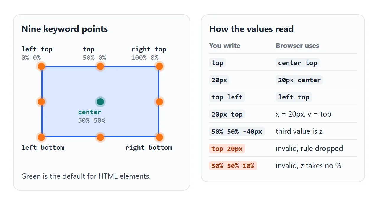
| Value | Where the pivot is |
|---|---|
center |
The middle, same as 50% 50% |
left top or top left |
The top-left corner, 0% 0% |
right bottom |
The bottom-right corner, 100% 100% |
top |
Middle of the top edge. One keyword fills the other axis with center |
25% 75% |
A quarter across, three quarters down |
20px 10px |
20px from the left edge, 10px from the top edge |
20px top |
20px from the left, on the top edge |
Two rules catch people. Two keywords can come in either order, because top and left can only mean one axis each. Once a length or percentage is involved, x must come first, so top 20px is invalid and the browser drops the whole declaration.
For HTML elements the percentages are measured against the border box. Padding and border count, and the margin does not.
What the origin changes, and what it ignores
The origin is the one point a transform leaves in place. Rotation turns everything around it. Scaling pushes everything away from it, or pulls everything toward it.
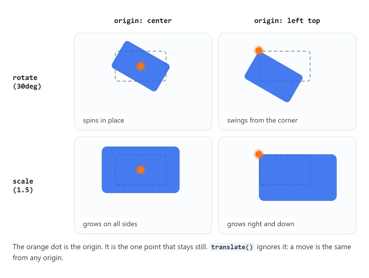
- rotate around the center spins in place. Around a corner, the element swings like a sign on a nail.
- scale around the center grows evenly on all sides. Around
left top, it grows only to the right and down, which suits a panel that opens from a button. - skew slants the element with the origin as the fixed point.
- translate does not care. A move by 40px ends up in the same place from any origin.
The separate rotate and scale properties use the same transform-origin as the transform property.
Setting transform-origin on an element with no transform does nothing visible. It waits until a transform is applied.
The third value: z for 3D
A third value moves the pivot toward or away from the viewer. It must be a length: transform-origin: 50% 50% -40px works, while a percentage there makes the declaration invalid.
.face {
  /* the pivot sits 38px behind the face */
  transform-origin: 50% 50% -38px;
}
.face:nth-child(2) { transform: rotateY(90deg); }
With the pivot behind it, rotateY(90deg) does not turn the face on the spot. It swings it round to the right side of a box.
Give four faces the same pivot at half their width and rotate them by 0, 90, 180 and 270 degrees, and they fold into the four sides of a box. The last example below builds exactly that.
To see any depth, the parent needs perspective, and perspective-origin sets where the viewer stands. Both are covered in CSS perspective.
SVG shapes: transform-box
Inside an SVG, a CSS rotate on a <rect> or <path> often sends the shape flying across the drawing.
Two defaults cause it. SVG shapes start with transform-origin: 0 0, and with transform-box: view-box, which measures positions from the SVG viewport. The pivot ends up at the top-left corner of the whole drawing.
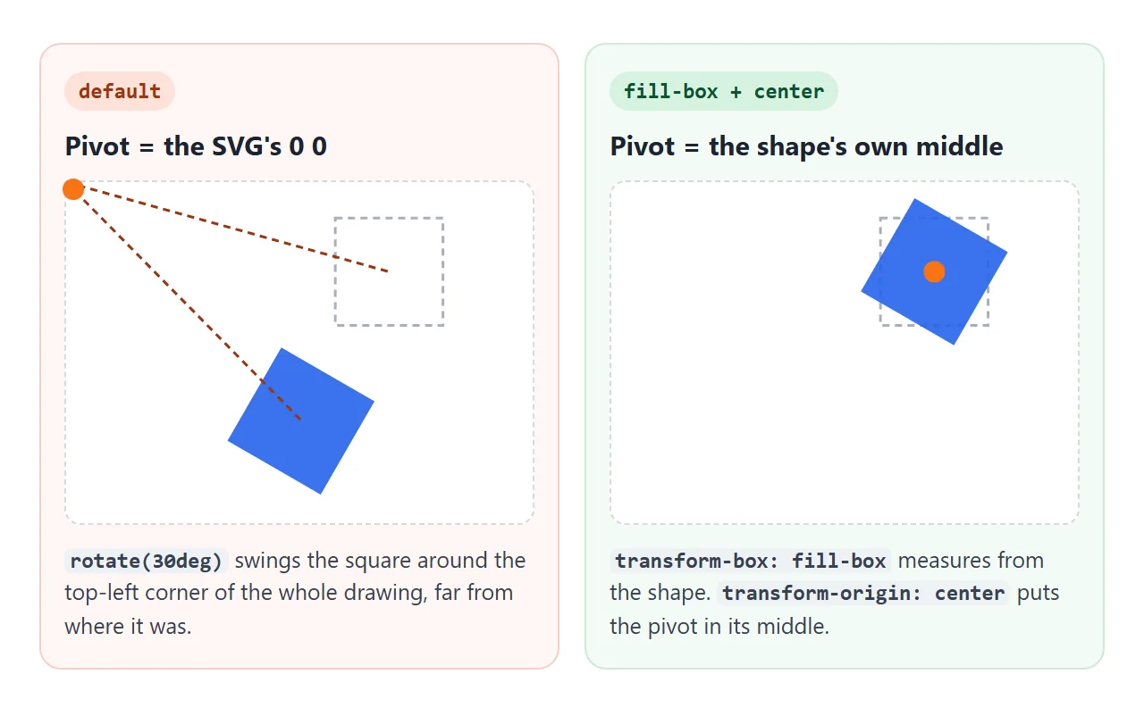
transform-box picks the box that the origin is measured against:
| transform-box | Measured from |
|---|---|
view-box |
The nearest SVG viewport. The default |
fill-box |
The shape's own bounding box, without the stroke |
stroke-box |
The shape's bounding box including the stroke |
border-box, content-box |
The CSS boxes. These are for HTML elements |
The fix is two lines on the shape:
.gear {
  transform-box: fill-box;    /* measure from the shape itself */
  transform-origin: center;   /* and pivot on its middle */
}
fill-box alone is not enough. The origin is still 0 0, now meaning the shape's own top-left corner. Compare all three below.
<!doctype html>
<html lang="en">
<head>
<meta charset="utf-8">
<meta name="viewport" content="width=device-width, initial-scale=1">
<title>transform-box in SVG</title>
<style>
  body { margin: 0; padding: 12px; font-family: system-ui, sans-serif; background: #f4f5f7; color: #1d2330; }
  .panels { display: grid; grid-template-columns: repeat(3, 1fr); gap: 8px; max-width: 560px; }
  figure { margin: 0; padding: 8px; border-radius: 10px; background: #fff; border: 1px solid #e1e4ea; }
  figcaption { font-size: 12px; line-height: 1.35; min-height: 56px; margin-bottom: 6px; }
  figcaption b { display: block; font: 700 13px ui-monospace, Consolas, monospace; margin-bottom: 2px; }
  svg { display: block; width: 100%; height: auto; background: #f8fafc; border-radius: 6px; }
  .sq { fill: #2563eb; transform: rotate(var(--a, 0deg)); }
  .pin { fill: #f97316; }
  /* the only differences between the three panels */
  .own { transform-box: fill-box; }
  .own.center { transform-origin: center; }
  .row { display: flex; flex-wrap: wrap; gap: 8px 14px; align-items: center; margin-top: 10px; font-size: 14px; }
  label { display: flex; align-items: center; gap: 6px; }
  input[type=range] { width: 150px; }
  button { font: inherit; padding: 5px 12px; border-radius: 7px; border: 1px solid #c9cdd4; background: #fff; cursor: pointer; }
</style>
</head>
<body>
<div class="panels" id="panels">
  <figure>
    <figcaption><b>default</b>Turns around the SVG's 0 0</figcaption>
    <svg viewBox="0 0 120 120"><rect class="sq" id="s1" x="45" y="45" width="30" height="30"/><circle class="pin" cx="0" cy="0" r="6"/></svg>
  </figure>
  <figure>
    <figcaption><b>fill-box</b>Turns around its own top-left</figcaption>
    <svg viewBox="0 0 120 120"><rect class="sq own" id="s2" x="45" y="45" width="30" height="30"/><circle class="pin" cx="45" cy="45" r="4"/></svg>
  </figure>
  <figure>
    <figcaption><b>fill-box + center</b>Turns in place</figcaption>
    <svg viewBox="0 0 120 120"><rect class="sq own center" id="s3" x="45" y="45" width="30" height="30"/><circle class="pin" cx="60" cy="60" r="4"/></svg>
  </figure>
</div>

<div class="row">
  <label>rotate <input type="range" id="a" min="0" max="359" value="40"></label>
  <span id="out"></span>
  <button id="spin">Spin</button>
</div>

<script>
  const panels = document.getElementById('panels');
  const a = document.getElementById('a');
  const spin = document.getElementById('spin');
  let raf = 0;

  function set(deg) {
    panels.style.setProperty('--a', deg + 'deg');  // all three squares read --a
    document.getElementById('out').textContent = deg + 'deg';
  }

  a.addEventListener('input', () => set(a.value));

  spin.addEventListener('click', () => {
    if (raf) { cancelAnimationFrame(raf); raf = 0; spin.textContent = 'Spin'; return; }
    spin.textContent = 'Stop';
    const step = () => {
      a.value = (+a.value + 2) % 360;
      set(a.value);
      raf = requestAnimationFrame(step);
    };
    raf = requestAnimationFrame(step);
  });

  set(a.value);
</script>
</body>
</html>
The SVG transform attribute has its own way to name a center: transform="rotate(30 180 50)" turns by 30 degrees around the point (180, 50) in the drawing's coordinates.
For CSS animation and transitions, the two-line CSS fix is the one to use. More on putting SVG into a page is in SVG in HTML.
Three pivots at work
Most real uses of transform-origin are one of these three: something that grows from where it was opened, something on a hinge, and something that turns around a point in depth.
<!doctype html>
<html lang="en">
<head>
<meta charset="utf-8">
<meta name="viewport" content="width=device-width, initial-scale=1">
<title>Three pivots at work</title>
<style>
  body { margin: 0; padding: 12px; font-family: system-ui, sans-serif; background: #f4f5f7; color: #1d2330; }
  .cells { display: grid; grid-template-columns: repeat(3, 1fr); gap: 8px; }
  .cell {
    position: relative; height: 230px; padding: 10px 8px; box-sizing: border-box;
    border-radius: 10px; background: #fff; border: 1px solid #e1e4ea;
    display: flex; flex-direction: column; align-items: center;
  }
  .cell h3 { margin: 0; font-size: 13px; }
  .cell code { font: 11.5px ui-monospace, Consolas, monospace; color: #9a3412; margin: 2px 0 12px; text-align: center; }
  button { font: 14px system-ui, sans-serif; padding: 6px 10px; border-radius: 7px; border: 1px solid #c9cdd4; background: #fff; cursor: pointer; }

  /* 1. Menu grows out of its top-right corner, under the button */
  .menuwrap { position: relative; align-self: flex-end; }
  .menu {
    position: absolute; right: 0; top: calc(100% + 6px); width: 100px; margin: 0; padding: 4px;
    list-style: none; border-radius: 8px; background: #1d2330; color: #fff; font-size: 13px;
    transform-origin: top right;
    transform: scale(.3); opacity: 0; transition: transform .2s, opacity .2s;
  }
  .menu li { padding: 6px 8px; }
  .menuwrap.open .menu { transform: scale(1); opacity: 1; }

  /* 2. Door hinged on its left edge, seen in 3D */
  .frame { width: 76px; height: 120px; perspective: 400px; background: #fde68a; border-radius: 4px; display: grid; place-items: center; font-size: 13px; cursor: pointer; }
  .door {
    grid-area: 1 / 1; width: 76px; height: 120px; border-radius: 4px; background: #92400e;
    transform-origin: left center;   /* the hinge */
    transition: transform .6s;
  }
  .frame.open .door { transform: rotateY(-75deg); }

  /* 3. Four faces share one pivot 40px behind them, so they fold into a box */
  .scene { width: 76px; height: 76px; perspective: 500px; margin-bottom: 12px; }
  .prism {
    position: relative; width: 76px; height: 76px; transform-style: preserve-3d;
    transform-origin: 50% 50% -38px;  /* spin around the middle of the box */
    transition: transform .6s;
  }
  .face {
    position: absolute; inset: 0; display: grid; place-items: center;
    color: #fff; font-weight: 700; border-radius: 4px;
    transform-origin: 50% 50% -38px;  /* half the width, behind the face */
  }
</style>
</head>
<body>
<div class="cells">
  <div class="cell">
    <h3>Menu</h3><code>top right</code>
    <div class="menuwrap" id="menuwrap">
      <button id="menuBtn" aria-expanded="false">Menu</button>
      <ul class="menu"><li>Profile</li><li>Settings</li><li>Sign out</li></ul>
    </div>
  </div>
  <div class="cell">
    <h3>Door</h3><code>left center</code>
    <div class="frame" id="frame" role="button" tabindex="0">Hello<div class="door"></div></div>
  </div>
  <div class="cell">
    <h3>Box</h3><code>50% 50% -38px</code>
    <div class="scene"><div class="prism" id="prism">
      <div class="face" style="background:#2563eb; transform: rotateY(0deg)">1</div>
      <div class="face" style="background:#0f766e; transform: rotateY(90deg)">2</div>
      <div class="face" style="background:#9333ea; transform: rotateY(180deg)">3</div>
      <div class="face" style="background:#c2410c; transform: rotateY(270deg)">4</div>
    </div></div>
    <button id="turn">Turn</button>
  </div>
</div>

<script>
  const menuwrap = document.getElementById('menuwrap');
  const menuBtn = document.getElementById('menuBtn');
  menuBtn.addEventListener('click', () => {
    const open = menuwrap.classList.toggle('open');
    menuBtn.setAttribute('aria-expanded', open);
  });

  const frame = document.getElementById('frame');
  frame.addEventListener('click', () => frame.classList.toggle('open'));
  frame.addEventListener('keydown', (e) => {
    if (e.key === 'Enter' || e.key === ' ') { e.preventDefault(); frame.classList.toggle('open'); }
  });

  // each click turns the box a quarter, bringing the next face round
  const prism = document.getElementById('prism');
  let angle = 0;
  document.getElementById('turn').addEventListener('click', () => {
    angle -= 90;
    prism.style.transform = `rotateY(${angle}deg)`;
  });
</script>
</body>
</html>
- Menu:
transform-origin: top rightwith ascaletransition. The menu grows out of the corner under its button instead of from its own middle. - Door:
transform-origin: left centerwithrotateY(-75deg). The left edge is the hinge and stays put. - Box: every face has
transform-origin: 50% 50% -38px, half its width behind it. The box itself uses the same origin, so it spins around its middle instead of around its front face.
When it does not work
| What you see | Cause | Fix |
|---|---|---|
| Nothing changes when you set the origin | The element has no transform | Add a rotate, scale or skew |
| The origin value is ignored | Invalid order such as top 20px |
Put x first: 20px top |
| A 3D origin is ignored | A percentage as the third value | Use a length, e.g. -40px |
| An SVG shape swings off across the drawing | Default view-box and 0 0 |
transform-box: fill-box and transform-origin: center |
| The SVG shape turns around its corner | fill-box without an origin |
Add transform-origin: center |
| The element jumps when the origin changes | It was already rotated or scaled | Set the origin before the transform starts |
| A span does not rotate at all | Plain inline elements are not transformed | display: inline-block |
Share it as a link
A pivot is much easier to understand by dragging a slider than by reading about it. A screenshot shows one angle, and an .html attachment may open as plain code on the other person's phone.
To send the working version, paste the page into a NOS document and choose Create share link. HTML to link walks through it.
The page renders as written and its scripts run, so the people you send it to can move the pivot and turn the box themselves. If you change the code later, the same link shows the new version.