The CSS perspective property gives 3D transforms depth. Put it on a parent, for example perspective: 600px, then rotate a child with rotateY() or push it with translateZ(). Without it, a 3D rotation is drawn flat: the element just gets narrower or shorter.
Try it first. Change the perspective, move the viewer left and right, and switch between the two ways of writing it.
<!doctype html>
<html lang="en">
<head>
<meta charset="utf-8">
<meta name="viewport" content="width=device-width, initial-scale=1">
<title>CSS perspective lab</title>
<style>
  body { margin: 0; padding: 14px; font-family: system-ui, sans-serif; background: #f4f5f7; color: #1d2330; }
  .stage {
    height: 190px; display: flex; justify-content: center; align-items: center; gap: 14px;
    background: #fff; border-radius: 12px; border: 1px solid #e1e4ea;
    perspective: 400px;          /* depth for the children */
    perspective-origin: 50% 50%; /* where the viewer stands */
  }
  .card {
    width: 84px; height: 110px; border-radius: 10px;
    display: grid; place-items: center; font-weight: 700; color: #fff;
    background: linear-gradient(135deg, #2563eb, #7c3aed);
    transform: rotateY(40deg);
  }
  .controls { display: grid; grid-template-columns: auto 1fr auto; gap: 8px 10px; align-items: center; margin-top: 12px; font-size: 14px; }
  .controls output { font-family: ui-monospace, Consolas, monospace; min-width: 52px; text-align: right; }
  input[type=range] { width: 100%; }
  .mode { display: flex; gap: 6px 14px; margin-top: 10px; font-size: 14px; flex-wrap: wrap; }
  pre { margin: 10px 0 0; padding: 10px 12px; background: #1d2330; color: #e5e7eb; border-radius: 8px; font-size: 12.5px; white-space: pre-wrap; }
  .off { opacity: .45; }
</style>
</head>
<body>
<div class="stage" id="stage">
  <div class="card">1</div><div class="card">2</div><div class="card">3</div>
</div>

<div class="controls">
  <label for="p">perspective</label><input id="p" type="range" min="100" max="1500" step="10" value="400"><output id="pOut">400px</output>
  <label for="o" id="oLabel">origin x</label><input id="o" type="range" min="0" max="100" value="50"><output id="oOut">50%</output>
  <label for="r">rotateY</label><input id="r" type="range" min="-80" max="80" value="40"><output id="rOut">40deg</output>
</div>
<div class="mode">
  <label><input type="radio" name="mode" value="parent" checked> perspective on the parent</label>
  <label><input type="radio" name="mode" value="fn"> perspective() on each card</label>
</div>
<pre id="code"></pre>

<script>
  const stage = document.getElementById('stage');
  const cards = document.querySelectorAll('.card');
  const p = document.getElementById('p'), o = document.getElementById('o'), r = document.getElementById('r');

  function update() {
    const mode = document.querySelector('[name=mode]:checked').value;
    const persp = p.value + 'px', rot = 'rotateY(' + r.value + 'deg)';
    if (mode === 'parent') {
      // one shared viewer for all three cards
      stage.style.perspective = persp;
      stage.style.perspectiveOrigin = o.value + '% 50%';
      cards.forEach(c => c.style.transform = rot);
      document.getElementById('code').textContent =
        '.stage { perspective: ' + persp + '; perspective-origin: ' + o.value + '% 50%; }\n.card  { transform: ' + rot + '; }';
    } else {
      // every card gets its own viewer, straight in front of it
      stage.style.perspective = 'none';
      cards.forEach(c => c.style.transform = 'perspective(' + persp + ') ' + rot);
      document.getElementById('code').textContent =
        '.stage { /* no perspective */ }\n.card  { transform: perspective(' + persp + ') ' + rot + '; }';
    }
    // perspective-origin belongs to the parent property only
    o.disabled = mode !== 'parent';
    document.getElementById('oLabel').classList.toggle('off', o.disabled);
    document.getElementById('pOut').textContent = persp;
    document.getElementById('oOut').textContent = o.value + '%';
    document.getElementById('rOut').textContent = r.value + 'deg';
  }
  document.querySelectorAll('input').forEach(i => i.addEventListener('input', update));
  update();
</script>
</body>
</html>
The number is a distance. It says how far the viewer sits from the screen, so a smaller number means a closer viewer and a stronger effect.
perspective vs perspective(): parent or element
There are two ways to add depth, and they are not interchangeable.
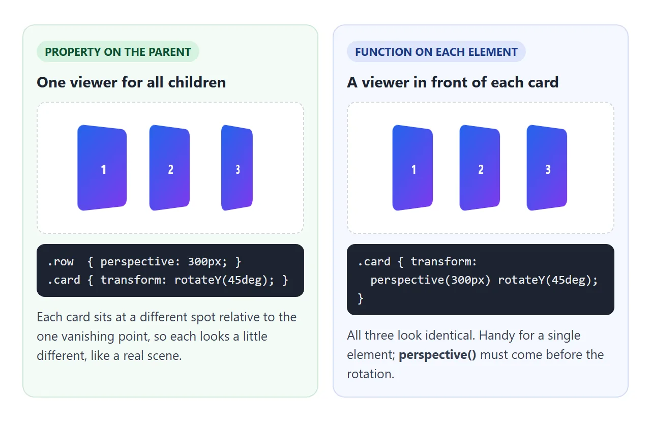
perspective: 600px |
transform: perspective(600px) ... |
|
|---|---|---|
| Goes on | The parent | The element itself |
| Affects | Every 3D child | Only that element |
| Viewer | One shared vanishing point | One per element |
| perspective-origin | Works | Ignored |
| Good for | Scenes, grids, cubes | A single card or button |
Two traps come up often. The property does nothing for the element that has it; it only affects that element's children. And the function must come before the rotation in the list. rotateY(40deg) perspective(600px) shows no depth at all.
Smaller values mean stronger 3D
The same rotateY(50deg) looks very different at three distances.
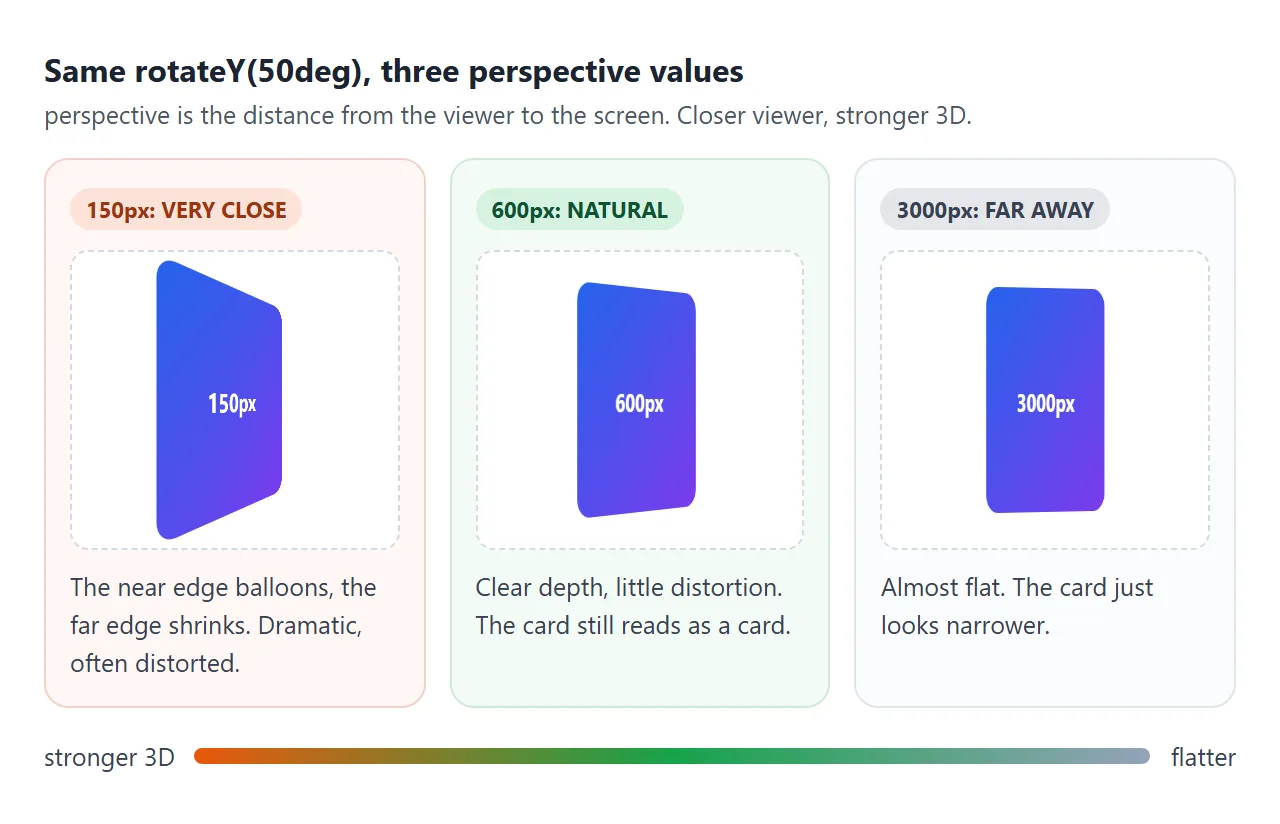
On cards the size of the ones above, values from 400px to 1000px give clear depth without heavy distortion.
Below 300px the near edge swells fast, which can suit a dramatic entrance but is hard to read. There is no single correct number; pick one by eye with the slider.
perspective-origin moves the viewer. The default is 50% 50%, the center of the parent. perspective-origin: 0% 50% puts the viewer at the left edge, so everything is seen from the left. It only works together with the perspective property on the same element.
The 3D functions: rotateX, rotateY, translateZ
The x axis runs left to right, y runs top to bottom, and z points out of the screen at you.
| Function | What it does |
|---|---|
rotateX(a) |
Tips the element forward or back, like a flap |
rotateY(a) |
Turns it left or right, like a door |
rotateZ(a) |
Spins it flat on the screen, same as rotate() |
translateZ(d) |
Moves it toward you (positive) or away (negative) |
rotate3d(x, y, z, a) |
Turns around any axis you describe |
translateZ only changes size when there is perspective. With perspective: 400px on the parent, translateZ(100px) makes an element look bigger because it is closer to the viewer. The basic 2D functions and why their order matters are covered in CSS transform.
transform-style: preserve-3d for nested 3D
By default each element flattens its children into its own plane. That is fine for one card, but a cube is six faces inside one box, and the box itself turns.
<!doctype html>
<html lang="en">
<head>
<meta charset="utf-8">
<meta name="viewport" content="width=device-width, initial-scale=1">
<title>CSS 3D cube</title>
<style>
  body { margin: 0; padding: 14px; font-family: system-ui, sans-serif; background: #f4f5f7; color: #1d2330; }
  .scene {
    height: 230px; display: grid; place-items: center;
    background: #fff; border-radius: 12px; border: 1px solid #e1e4ea;
    perspective: 600px;
    touch-action: none; cursor: grab; /* drag to turn, also with a finger */
  }
  .cube {
    position: relative; width: 120px; height: 120px;
    transform-style: preserve-3d; /* keep the faces in 3D */
    transform: rotateX(-25deg) rotateY(35deg);
  }
  .face {
    position: absolute; inset: 0; border-radius: 6px;
    display: grid; place-items: center; font-weight: 700; font-size: 18px; color: #fff;
    border: 2px solid rgba(255, 255, 255, .6);
  }
  /* each face turns to its side, then moves out by half the cube size */
  .front  { background: rgba(37, 99, 235, .8);  transform: translateZ(60px); }
  .back   { background: rgba(124, 58, 237, .8); transform: rotateY(180deg) translateZ(60px); }
  .right  { background: rgba(5, 150, 105, .8);  transform: rotateY(90deg) translateZ(60px); }
  .left   { background: rgba(234, 88, 12, .8);  transform: rotateY(-90deg) translateZ(60px); }
  .top    { background: rgba(219, 39, 119, .8); transform: rotateX(90deg) translateZ(60px); }
  .bottom { background: rgba(71, 85, 105, .8);  transform: rotateX(-90deg) translateZ(60px); }

  .cube.hide-back .face { backface-visibility: hidden; }
  .cube.flat { transform-style: flat; }
  .cube.clip { overflow: hidden; }

  .controls { display: grid; grid-template-columns: auto 1fr auto; gap: 8px 10px; align-items: center; margin-top: 12px; font-size: 14px; }
  .controls output { font-family: ui-monospace, Consolas, monospace; min-width: 48px; text-align: right; }
  input[type=range] { width: 100%; }
  .toggles { display: grid; gap: 6px; margin-top: 10px; font-size: 14px; }
  code { font-family: ui-monospace, Consolas, monospace; font-size: 13px; }
</style>
</head>
<body>
<div class="scene" id="scene">
  <div class="cube" id="cube">
    <div class="face front">front</div><div class="face back">back</div>
    <div class="face right">right</div><div class="face left">left</div>
    <div class="face top">top</div><div class="face bottom">bottom</div>
  </div>
</div>

<div class="controls">
  <label for="rx">rotateX</label><input id="rx" type="range" min="-180" max="180" value="-25"><output id="rxOut">-25deg</output>
  <label for="ry">rotateY</label><input id="ry" type="range" min="-180" max="180" value="35"><output id="ryOut">35deg</output>
</div>
<div class="toggles">
  <label><input type="checkbox" id="preserve" checked> <code>transform-style: preserve-3d</code> on the cube</label>
  <label><input type="checkbox" id="hide"> <code>backface-visibility: hidden</code> on the faces</label>
  <label><input type="checkbox" id="clip"> <code>overflow: hidden</code> on the cube</label>
</div>

<script>
  const cube = document.getElementById('cube');
  const rx = document.getElementById('rx'), ry = document.getElementById('ry');

  function update() {
    cube.style.transform = 'rotateX(' + rx.value + 'deg) rotateY(' + ry.value + 'deg)';
    document.getElementById('rxOut').textContent = rx.value + 'deg';
    document.getElementById('ryOut').textContent = ry.value + 'deg';
    cube.classList.toggle('flat', !document.getElementById('preserve').checked);
    cube.classList.toggle('hide-back', document.getElementById('hide').checked);
    cube.classList.toggle('clip', document.getElementById('clip').checked);
  }
  document.querySelectorAll('input').forEach(i => i.addEventListener('input', update));

  // drag on the scene to turn the cube
  const scene = document.getElementById('scene');
  let lastX = 0, lastY = 0;
  const wrap = v => ((Math.round(v) + 540) % 360) - 180; // keep angles in -180..180
  scene.addEventListener('pointerdown', e => {
    lastX = e.clientX; lastY = e.clientY;
    scene.setPointerCapture(e.pointerId);
  });
  scene.addEventListener('pointermove', e => {
    if (!scene.hasPointerCapture(e.pointerId)) return;
    ry.value = wrap(+ry.value + (e.clientX - lastX) * 0.6);
    rx.value = wrap(+rx.value - (e.clientY - lastY) * 0.6);
    lastX = e.clientX; lastY = e.clientY;
    update();
  });
  update();
</script>
</body>
</html>
transform-style: preserve-3d on the cube keeps its faces in the same 3D space as the cube. Each face then gets a rotation to point at its side and a translateZ of half the cube size to move out to it:
.scene { perspective: 600px; }
.cube  { transform-style: preserve-3d; transform: rotateX(-25deg) rotateY(35deg); }
.front { transform: translateZ(60px); }
.right { transform: rotateY(90deg) translateZ(60px); }
.back  { transform: rotateY(180deg) translateZ(60px); }
Inside a preserve-3d context, the element nearer the viewer is drawn in front. z-index does not reorder it. If a panel should sit in front, give it a larger translateZ. CSS z-index explains how stacking works everywhere else.
backface-visibility: hidden for flip cards
Every element has a back. When it turns more than 90 degrees away, the browser shows that back, mirrored, unless you tell it not to.
backface-visibility: hidden hides an element whenever its back faces the viewer. In the cube demo, tick it and the see-through faces stop showing the ones behind them. A flip card uses the same rule:
.flip  { perspective: 700px; }
.inner { transform-style: preserve-3d; transition: transform .6s; }
.flip.flipped .inner { transform: rotateY(180deg); }
.side  { position: absolute; inset: 0; backface-visibility: hidden; }
.back  { transform: rotateY(180deg); }
The back face starts turned 180 degrees, so it is hidden. When .inner turns another 180, the two cancel and the back reads the right way round. CSS transform has a single hover flip; the finished example below adds taps, keys and reduced motion.
What flattens 3D
preserve-3d is a request, not a guarantee. Some properties need to paint an element and its children together as one flat image, and CSS calls them grouping properties. When one is on the preserve-3d element, the browser treats it as flat.
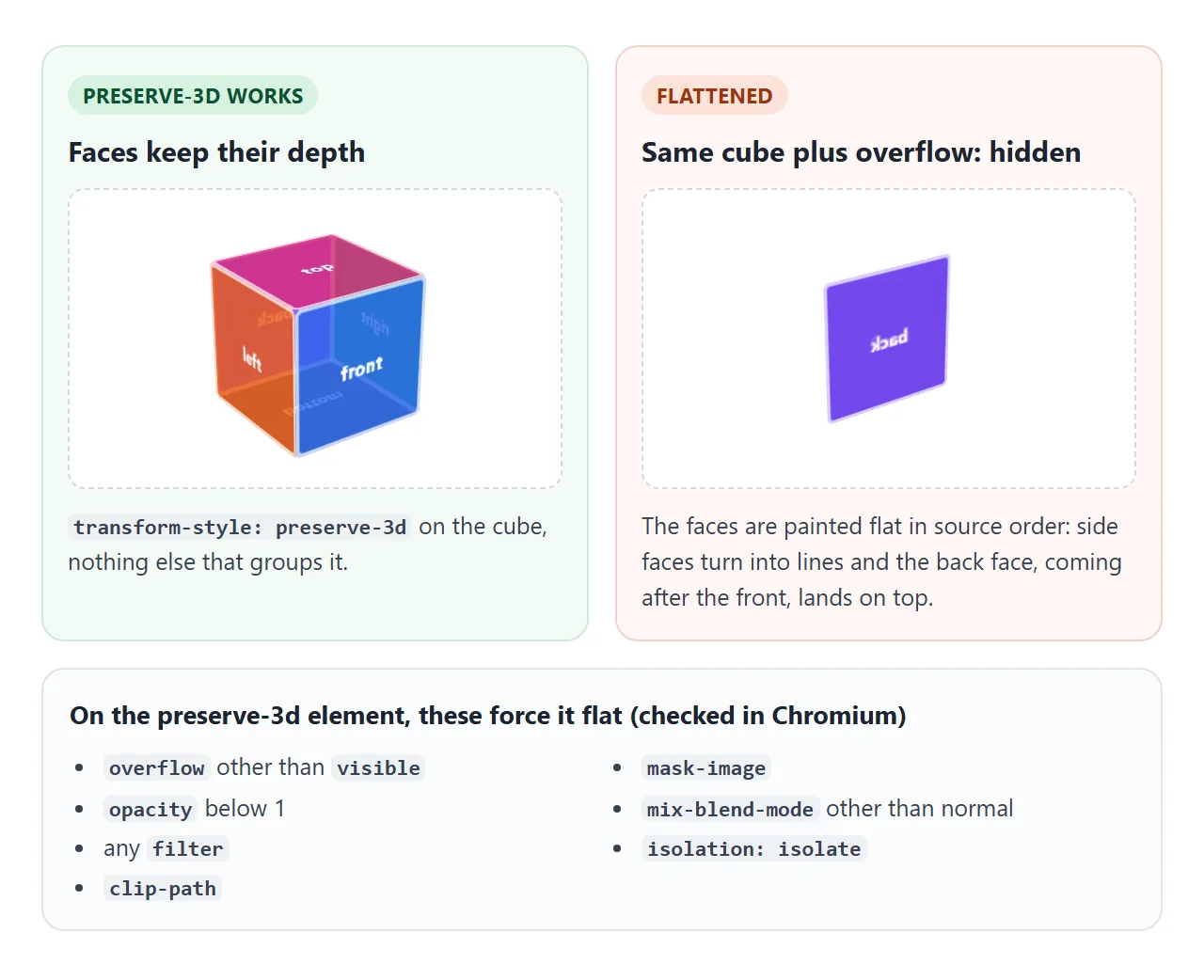
overflowset to anything other thanvisibleopacitybelow 1, even0.99- any
filter, includingblur(0) clip-path,mask-imagemix-blend-modeother thannormal, andisolation: isolate
The fix is to move the effect.
Put the opacity or filter on a wrapper outside the 3D scene, or on each face inside it. Faces with no 3D children of their own can use any of these safely. The CSS overflow guide covers the clipping values.
A finished example: tilt card and flip cards
The top card leans toward a mouse or pen. The three below flip on click, tap, or Enter.
<!doctype html>
<html lang="en">
<head>
<meta charset="utf-8">
<meta name="viewport" content="width=device-width, initial-scale=1">
<title>Tilt card and flip cards</title>
<style>
  body { margin: 0; padding: 16px; font-family: system-ui, sans-serif; background: #eef1f6; color: #1d2330; }
  h2 { font-size: 15px; margin: 0 0 10px; color: #4b5563; font-weight: 600; }

  /* ---- 1. Tilt card ---- */
  .tilt-wrap { perspective: 800px; position: relative; display: grid; place-items: center; padding: 6px 0 16px; }
  .tilt {
    width: min(300px, 100%); padding: 18px; border-radius: 16px; box-sizing: border-box;
    background: #fff; box-shadow: 0 12px 30px rgba(15, 23, 42, .15);
    transform: rotateX(var(--rx, 0deg)) rotateY(var(--ry, 0deg));
    transition: transform .4s ease;
    position: relative; overflow: hidden; /* fine here: the card has no 3D children */
  }
  .tilt.moving { transition: transform .08s linear; }
  .tilt .img {
    height: 110px; border-radius: 10px;
    background: radial-gradient(circle at 30% 35%, #fde68a 0 18%, transparent 19%),
                linear-gradient(135deg, #0ea5e9, #6366f1);
  }
  .tilt .shine {
    position: absolute; inset: 0; pointer-events: none;
    background: radial-gradient(circle at var(--mx, 50%) var(--my, 50%), rgba(255,255,255,.45), transparent 55%);
    opacity: 0; transition: opacity .3s;
  }
  .tilt.moving .shine { opacity: 1; }
  .tilt b { display: block; margin-top: 12px; font-size: 17px; }
  .tilt span { color: #6b7280; font-size: 14px; }

  /* ---- 2. Flip cards ---- */
  .grid { display: grid; grid-template-columns: repeat(3, 1fr); gap: 10px; }
  .flip {
    perspective: 700px; height: 130px;
    border: 0; padding: 0; background: none; font: inherit; cursor: pointer;
  }
  .flip .inner {
    display: block;
    position: relative; height: 100%;
    transform-style: preserve-3d;   /* both faces stay in 3D */
    transition: transform .6s;
  }
  .flip.flipped .inner { transform: rotateY(180deg); }
  .flip .side {
    position: absolute; inset: 0; border-radius: 12px;
    display: grid; place-items: center; padding: 8px; box-sizing: border-box;
    backface-visibility: hidden;    /* hide the face pointing away */
    color: #fff; font-weight: 700; font-size: 15px;
  }
  .flip .front { background: linear-gradient(135deg, #2563eb, #7c3aed); }
  .flip .back  { background: #0f5132; transform: rotateY(180deg); font-weight: 500; font-size: 13px; }
  .flip:focus-visible { outline: 3px solid #f59e0b; outline-offset: 3px; border-radius: 12px; }

  /* people who ask for less motion get instant changes */
  @media (prefers-reduced-motion: reduce) {
    .flip .inner, .tilt { transition: none; }
  }
</style>
</head>
<body>
<h2>Tilt card (mouse or pen)</h2>
<div class="tilt-wrap">
  <div class="tilt" id="tilt">
    <div class="img"></div>
    <b>Trail Camera X2</b>
    <span>Weatherproof, 4 month battery</span>
    <div class="shine"></div>
  </div>
</div>

<h2>Flip cards (click, tap or Enter)</h2>
<div class="grid">
  <button class="flip" aria-pressed="false"><span class="inner"><span class="side front">Plan A</span><span class="side back">1 user, 5 pages</span></span></button>
  <button class="flip" aria-pressed="false"><span class="inner"><span class="side front">Plan B</span><span class="side back">5 users, 50 pages</span></span></button>
  <button class="flip" aria-pressed="false"><span class="inner"><span class="side front">Plan C</span><span class="side back">Unlimited pages</span></span></button>
</div>

<script>
  // ---- Tilt ----
  const tilt = document.getElementById('tilt');
  const wrap = tilt.parentElement; // listen on the flat wrapper, not the moving card
  const lessMotion = matchMedia('(prefers-reduced-motion: reduce)');
  const MAX = 12; // degrees

  wrap.addEventListener('pointermove', (e) => {
    if (e.pointerType === 'touch' || lessMotion.matches) return; // fingers scroll; reduced motion stays flat
    // measure the card's untilted box: its tilted rect changes every frame
    const w = wrap.getBoundingClientRect();
    const x = (e.clientX - w.left - tilt.offsetLeft) / tilt.offsetWidth;  // 0 left, 1 right
    const y = (e.clientY - w.top - tilt.offsetTop) / tilt.offsetHeight;   // 0 top, 1 bottom
    if (x < 0 || x > 1 || y < 0 || y > 1) return reset();
    tilt.style.setProperty('--ry', ((x - 0.5) * 2 * MAX).toFixed(1) + 'deg');
    tilt.style.setProperty('--rx', ((0.5 - y) * 2 * MAX).toFixed(1) + 'deg');
    tilt.style.setProperty('--mx', (x * 100) + '%');
    tilt.style.setProperty('--my', (y * 100) + '%');
    tilt.classList.add('moving');
  });
  function reset() {
    tilt.classList.remove('moving');
    tilt.style.setProperty('--rx', '0deg');
    tilt.style.setProperty('--ry', '0deg');
  }
  wrap.addEventListener('pointerleave', reset);
  wrap.addEventListener('pointercancel', reset);

  // ---- Flip ----
  document.querySelectorAll('.flip').forEach((btn) => {
    btn.addEventListener('click', () => {
      const on = btn.classList.toggle('flipped');
      btn.setAttribute('aria-pressed', on);
    });
  });
</script>
</body>
</html>
- Measure a flat box. The listener sits on the wrapper, and the position comes from the card's untransformed
offsetLeftandoffsetWidth. The tilted card's own rectangle changes on every frame, which makes the tilt twitch. - Ignore touch. A finger on a phone is usually scrolling. The handler returns early when
pointerTypeistouch, andpointercancelresets the card. - Respect reduced motion.
matchMedia('(prefers-reduced-motion: reduce)')skips the tilt, and a media query removes the flip transition, so the answer still appears. - Use buttons. Each flip card is a
<button>witharia-pressed, so keyboards and screen readers can flip it too.
When it does not work
| What you see | Cause | Fix |
|---|---|---|
| rotateY only makes the box narrower | No perspective, or it is on the rotated element itself | Put perspective on the parent |
| perspective() has no effect | It comes after the rotation | Write perspective() first |
| Cube faces collapse into lines | Missing transform-style: preserve-3d |
Add it to the element that holds the faces |
| preserve-3d is set and faces are still flat | overflow, opacity, filter or clip-path on that element |
Move the effect to a wrapper or to the faces |
| Mirrored back face shows through | Faces keep their backs visible | backface-visibility: hidden on each face |
| Flip card shows the wrong side | Back face lacks its own rotateY(180deg) |
Turn the back face 180 degrees from the start |
| Tilt jumps or sticks on a phone | Touch scroll sends moves, then cancels | Skip pointerType touch, reset on pointercancel |
| Tilt twitches near the edges | Measuring the tilted rectangle | Measure the untilted box or its wrapper |
| Text looks soft while it turns | The browser may draw the moving layer as an image | Let the card come back to no transform at rest |
Share it as a link
3D is hard to judge from a screenshot. The depth only shows when something turns, and a still image of a cube is just a few shapes. An .html attachment may open as plain code on a phone.
To send the working version, paste the page into a NOS document and choose Create share link. HTML to link walks through it.
The page renders as written and its scripts run, so the people you send it to can drag the cube and flip the cards themselves. If you change the code later, the same link shows the new version.