A parallax effect in HTML means parts of the page move at different speeds as you scroll, giving the page depth. The shortest way is one CSS line: background-attachment: fixed on a section with a background image. The section scrolls, its picture does not.
Scroll inside the frame to see it, and untick the box to compare with an ordinary background.
<!doctype html>
<html lang="en">
<head>
<meta charset="utf-8">
<meta name="viewport" content="width=device-width, initial-scale=1">
<title>Parallax with background-attachment: fixed</title>
<style>
  body { margin: 0; font-family: system-ui, sans-serif; color: #1d2330; background: #fff; }
  .text { padding: 22px 20px; max-width: 520px; line-height: 1.55; }
  .text h2 { margin: 0 0 6px; font-size: 20px; }
  .text p { margin: 0 0 10px; }

  /* A band of background that acts like a window onto a still picture */
  .band {
    height: 220px;
    display: grid; place-items: center;
    color: #fff; font-size: 22px; font-weight: 700;
    text-shadow: 0 2px 8px rgba(0, 0, 0, .35);
    background-image:
      radial-gradient(circle at 75% 30%, #ffe08a 0 38px, transparent 39px),
      linear-gradient(160deg, transparent 55%, #2f4f6f 55.2%),
      linear-gradient(200deg, transparent 62%, #1e3a52 62.2%),
      linear-gradient(#6aa7e8, #f6c4a0);
    background-size: cover;
    background-attachment: fixed;   /* the line that makes the parallax */
  }
  .band.b2 { background-image:
      radial-gradient(circle at 25% 25%, #fff6d8 0 30px, transparent 31px),
      linear-gradient(170deg, transparent 58%, #3d2b56 58.2%),
      linear-gradient(#302a63, #c9679a); }
  body.off .band { background-attachment: scroll; }

  .bar {
    position: sticky; top: 0; z-index: 2;
    display: flex; flex-wrap: wrap; gap: 6px 14px; align-items: center;
    padding: 8px 14px; background: #f4f5f7; border-bottom: 1px solid #e1e4ea; font-size: 14px;
  }
  #note { color: #9a3412; font-size: 13px; }
</style>
</head>
<body>
<div class="bar">
  <label><input type="checkbox" id="fixed" checked> background-attachment: fixed</label>
  <span id="note"></span>
</div>

<div class="text">
  <h2>Scroll this frame</h2>
  <p>The coloured bands below have a fixed background. The band moves with the page, the picture inside it stays still, so it looks like a window.</p>
  <p>Untick the box to compare with a normal background.</p>
</div>
<div class="band">Mountains stay put</div>
<div class="text">
  <p>Text in between scrolls at normal speed. That difference in speed is the whole effect.</p>
  <p>No JavaScript is needed for this part. The script on this page only runs the checkbox and the note.</p>
</div>
<div class="band b2">A second window</div>
<div class="text">
  <p>On many phones the browser ignores the fixed value and draws the background as if it scrolls. The page still works, the effect just disappears.</p>
  <p>End of the page.</p>
</div>

<script>
  const box = document.getElementById('fixed');
  box.addEventListener('change', () => document.body.classList.toggle('off', !box.checked));

  // A touch-first screen is where fixed backgrounds are often ignored.
  if (matchMedia('(pointer: coarse)').matches) {
    document.getElementById('note').textContent =
      'Touch screen: if the pictures scroll with the text, this browser ignores fixed.';
  }
</script>
</body>
</html>
That line is enough for a desktop page. It has one big gap, covered next, and three other methods fill it.
Method 1: background-attachment: fixed
A background image is normally attached to its element and scrolls with it. With fixed, the browser positions the image against the screen instead. The element becomes a window, and the text above and below scrolls past it.
.band {
  height: 60vh;
  background: url(mountains.jpg) center / cover;
  background-attachment: fixed;
}
background-size: cover is also measured against the screen here, not the element. That is why a fixed picture can look more zoomed in than you expected. CSS background images covers the size and position values.
The gap: this method is often ignored on mobile. Many phone browsers draw a fixed background as if it were a normal one, so it scrolls with the band. Nothing breaks, but the effect disappears.
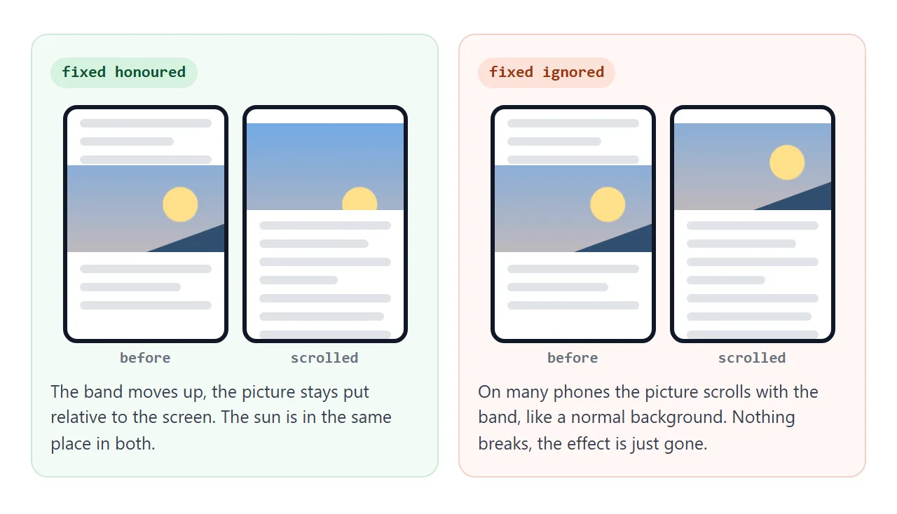
If the effect matters on phones, use one of the transform methods below.
Method 2: CSS perspective and translateZ
This one is pure CSS and works through 3D transforms. A scrolling container gets a perspective. A layer pushed back with translateZ is farther from the viewer, so it moves less on screen when the container scrolls.
.scroller {
  height: 100vh;
  overflow-y: auto;          /* this element must be the thing that scrolls */
  perspective: 1px;
}
.group { position: relative; height: 100vh; transform-style: preserve-3d; }
.back  { position: absolute; inset: 0; transform: translateZ(-1px) scale(2); }
Pushed back by 1px with a 1px perspective, the layer moves at half speed. Pushing it back also shrinks it, and scale(2) brings it back to full size. The rule is scale = 1 + depth ÷ perspective.
The effect only happens when .scroller is the element that scrolls. If the page itself scrolls and .scroller just grows taller, nothing moves at a different speed. CSS perspective covers how depth works, and CSS transform explains translateZ and scale.
Method 3: layers moved with JavaScript
For a layered hero picture, a short script works well. Each layer gets a speed from 0 to 1. On scroll, push it down by scrollY times that speed. At 0 it moves with the page; higher speeds lag behind and look farther away.
<!doctype html>
<html lang="en">
<head>
<meta charset="utf-8">
<meta name="viewport" content="width=device-width, initial-scale=1">
<title>Layered parallax hero</title>
<style>
  body { margin: 0; font-family: system-ui, sans-serif; color: #1d2330; }
  .hero {
    position: relative; height: 380px; overflow: hidden;
    background: linear-gradient(#5b8fd6, #f3c6a5);   /* the sky never moves */
  }
  .layer {
    position: absolute; inset: 0;
    will-change: transform;   /* each layer gets its own compositing layer */
  }
  .layer svg { position: absolute; bottom: 0; width: 100%; height: 100%; }
  .title {
    position: relative; z-index: 5;   /* above every layer */
    padding: 60px 20px 0; text-align: center; color: #fff;
    text-shadow: 0 2px 10px rgba(0, 0, 0, .3);
  }
  .title h1 { margin: 0; font-size: 30px; }
  .text { padding: 20px; max-width: 520px; line-height: 1.55; }
  .switch {
    position: fixed; top: 8px; right: 8px; z-index: 10;
    padding: 6px 10px; border-radius: 8px; background: rgba(255, 255, 255, .9); font-size: 13px;
  }
</style>
</head>
<body>
<label class="switch"><input type="checkbox" id="reduce"> Reduce motion</label>

<header class="hero">
  <!-- data-speed: 0 moves with the page, 1 stays still -->
  <div class="layer" data-speed="0.7">
    <svg viewBox="0 0 800 380" preserveAspectRatio="xMidYMax slice">
      <circle cx="520" cy="190" r="32" fill="#ffe08a"/>
      <g fill="#fff" opacity=".85">
        <ellipse cx="300" cy="60" rx="44" ry="14"/><ellipse cx="328" cy="50" rx="26" ry="13"/>
        <ellipse cx="470" cy="40" rx="34" ry="11"/>
      </g>
    </svg>
  </div>
  <div class="layer" data-speed="0.4">
    <svg viewBox="0 0 800 380" preserveAspectRatio="xMidYMax slice">
      <path d="M0 300 L100 210 L180 260 L280 190 L360 250 L440 170 L540 245 L620 200 L700 250 L800 215 L800 380 L0 380Z" fill="#6b7fa8"/>
    </svg>
  </div>
  <div class="layer" data-speed="0.15">
    <svg viewBox="0 0 800 380" preserveAspectRatio="xMidYMax slice">
      <path d="M0 330 L90 285 L170 320 L260 265 L350 315 L430 270 L520 320 L600 280 L690 318 L800 285 L800 380 L0 380Z" fill="#3c4f73"/>
    </svg>
  </div>
  <div class="layer" data-speed="0">
    <svg viewBox="0 0 800 380" preserveAspectRatio="xMidYMax slice">
      <path d="M0 350 Q200 318 400 345 T800 340 L800 380 L0 380Z" fill="#1f2b40"/>
    </svg>
  </div>
  <div class="title"><h1>Scroll down</h1><p>Four layers, four speeds</p></div>
</header>

<div class="text">
  <p>The sun and clouds move slowest, so they feel far away. The front hill moves with the page, so it feels close.</p>
  <p>Only <b>transform</b> changes, once per frame, inside requestAnimationFrame.</p>
  <p>Tick <i>Reduce motion</i> and every layer scrolls with the page. The box starts ticked if your system asks for reduced motion.</p>
  <p style="height: 260px">Keep scrolling.</p>
</div>

<script>
  const layers = document.querySelectorAll('.layer');
  const reduce = document.getElementById('reduce');
  const query = matchMedia('(prefers-reduced-motion: reduce)');
  reduce.checked = query.matches;
  let queued = false;

  function draw() {
    queued = false;
    const y = reduce.checked ? 0 : window.scrollY;
    layers.forEach((layer) => {
      // push the layer down by part of the scroll, so it lags behind the page
      layer.style.transform = `translate3d(0, ${y * layer.dataset.speed}px, 0)`;
    });
  }

  function requestDraw() {
    if (!queued) { queued = true; requestAnimationFrame(draw); }
  }

  window.addEventListener('scroll', requestDraw, { passive: true });
  reduce.addEventListener('change', requestDraw);
  query.addEventListener('change', () => { reduce.checked = query.matches; requestDraw(); });
  draw();
</script>
</body>
</html>
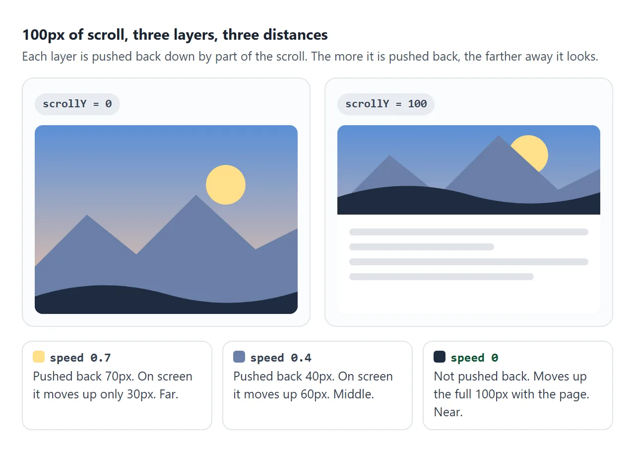
The scroll listener does as little as possible:
- Listen with
{ passive: true }. It tells the browser the handler will not callpreventDefault(). Scroll events cannot be cancelled anyway, so this matters most for wheel and touch listeners, but it costs nothing. - Queue one
requestAnimationFrame. The handler only asks for a frame. The frame readsscrollYonce and writes every layer, right before the browser paints. - Write only
transform. Nothing else changes, so the browser does not have to lay out or repaint the page.
window.addEventListener('scroll', () => {
  if (!queued) { queued = true; requestAnimationFrame(draw); }
}, { passive: true });
The title sits above the layers with position: relative and a higher z-index. Absolutely positioned layers are painted above ordinary, unpositioned content, so without it the picture covers the text. CSS z-index explains the stacking rules.
Why transform, and not top or background-position
Every property you change on scroll has a price per frame. top moves the box in the layout, so the browser recalculates layout, repaints and composites. background-position repaints. transform on a layer with its own compositing layer is only composited.
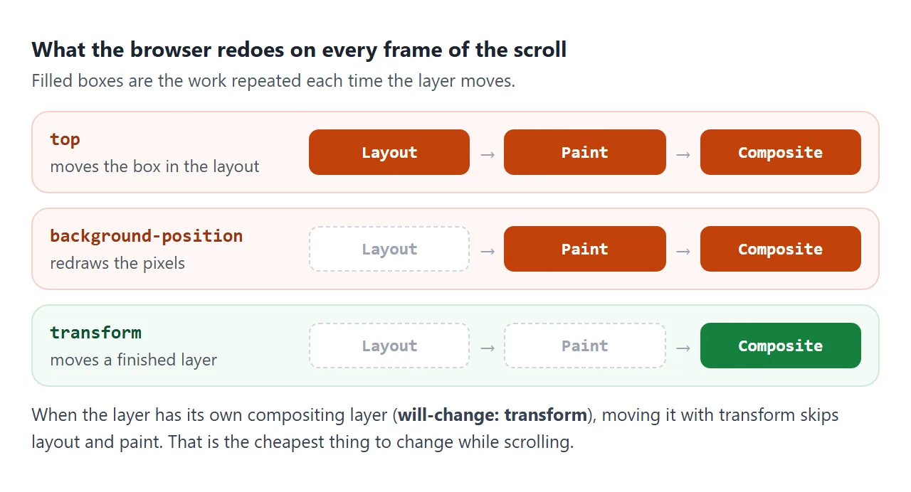
| Property changed on scroll | Work per frame | Use it? |
|---|---|---|
top, margin-top |
Layout, paint, composite | No |
background-position |
Paint, composite | No |
transform |
Composite (on its own layer) | Yes |
opacity |
Composite (on its own layer) | Yes, for fades |
will-change: transform on each layer asks the browser to give it its own layer up front. Use it on the few elements that move, not on everything.
Method 4: CSS scroll-driven animations
CSS can now tie an animation to scrolling instead of time. With animation-timeline: view(), the animation's progress follows how far an element has moved through the visible part of its scroller. No script runs on each frame.
@keyframes drift { to { transform: translateY(var(--shift)); } }

.layer {
  animation: drift linear both;  /* the shorthand first */
  animation-timeline: view();    /* then the timeline */
  animation-range: exit;         /* from when the hero starts to leave until it is gone */
}
With --shift: 40%, a layer as tall as the hero ends up 40% of its height lower by the time the hero has left. That is the same movement as a speed of 0.4 in the script.
This feature is newer and not in every browser. Check for it with CSS.supports('animation-timeline: view()') in JavaScript, or @supports (animation-timeline: view()) in CSS, and keep the script as the fallback.
Turn it off for reduced motion
Some people set their system to reduce motion because movement on screen makes them dizzy or sick. Parallax is exactly the kind of motion that option is for. Check the prefers-reduced-motion media query and leave every layer still when it says reduce.
const reduced = matchMedia('(prefers-reduced-motion: reduce)').matches;
In CSS, put the parallax rules inside @media (prefers-reduced-motion: no-preference) { ... }. The same idea applies to smooth scrolling.
A finished example: CSS first, JavaScript fallback
This scene uses scroll-driven animations when the browser supports them and the script otherwise. The badge in the picture says which one is running. With reduced motion on, neither runs.
<!doctype html>
<html lang="en">
<head>
<meta charset="utf-8">
<meta name="viewport" content="width=device-width, initial-scale=1">
<title>Parallax with scroll-driven animations and a JS fallback</title>
<style>
  body { margin: 0; font-family: system-ui, sans-serif; color: #1d2330; background: #fbfaf7; }
  .hero {
    position: relative; height: 400px;
    overflow: hidden;
    overflow: clip;   /* hidden would make the hero a scroller, and view() would watch it instead of the page */
    background: linear-gradient(#26305e, #b8607f 70%, #f0a878);
  }
  .layer { position: absolute; inset: 0; }
  .layer svg { position: absolute; bottom: 0; width: 100%; height: 100%; }
  .title {
    position: relative; z-index: 5; padding: 70px 20px 0;
    text-align: center; color: #fff; text-shadow: 0 2px 10px rgba(0, 0, 0, .35);
  }
  .title h1 { margin: 0 0 6px; font-size: 30px; }
  .badge {
    display: inline-block; padding: 5px 10px; border-radius: 99px;
    background: rgba(255, 255, 255, .92); color: #0f5132; font-size: 13px; text-shadow: none;
  }
  .text { padding: 20px; max-width: 540px; line-height: 1.55; }

  /* Engine 1: the browser runs it, no script per frame.
     The .css-timeline class is added only after CSS.supports() says yes. */
  @keyframes drift { to { transform: translateY(var(--shift)); } }
  .css-timeline .layer {
    animation: drift linear both;   /* the shorthand first ... */
    animation-timeline: view();     /* ... then the timeline, or the shorthand resets it */
    animation-range: exit;          /* 0% when the hero starts to leave, 100% when it is gone */
  }
</style>
</head>
<body>
<header class="hero">
  <!-- --shift for CSS and data-speed for JS describe the same speed -->
  <div class="layer" style="--shift: 70%" data-speed="0.7">
    <svg viewBox="0 0 800 400" preserveAspectRatio="xMidYMax slice">
      <circle cx="290" cy="175" r="30" fill="#fff4d6"/>
      <g fill="#fff" opacity=".35"><circle cx="240" cy="60" r="1.6"/><circle cx="420" cy="40" r="1.4"/>
        <circle cx="530" cy="90" r="1.8"/><circle cx="480" cy="30" r="1.2"/><circle cx="360" cy="110" r="1.3"/></g>
    </svg>
  </div>
  <div class="layer" style="--shift: 40%" data-speed="0.4">
    <svg viewBox="0 0 800 400" preserveAspectRatio="xMidYMax slice">
      <path d="M0 300 L110 205 L200 265 L300 185 L390 255 L470 175 L570 250 L650 210 L730 255 L800 225 L800 400 L0 400Z" fill="#6c4f86"/>
    </svg>
  </div>
  <div class="layer" style="--shift: 15%" data-speed="0.15">
    <svg viewBox="0 0 800 400" preserveAspectRatio="xMidYMax slice">
      <path d="M0 340 L90 290 L170 330 L260 270 L340 325 L430 280 L510 330 L600 285 L690 328 L800 290 L800 400 L0 400Z" fill="#432f5c"/>
    </svg>
  </div>
  <div class="layer" style="--shift: 0%" data-speed="0">
    <svg viewBox="0 0 800 400" preserveAspectRatio="xMidYMax slice">
      <path d="M0 368 Q200 338 400 362 T800 355 L800 400 L0 400Z" fill="#1d1630"/>
    </svg>
  </div>
  <div class="title">
    <h1>Evening ridge</h1>
    <span class="badge" id="engine">checking...</span>
  </div>
</header>

<div class="text">
  <p>The label in the picture says which engine is running. Browsers that support <b>animation-timeline</b> run the parallax in CSS. The rest get the same movement from a small script.</p>
  <p>If your system asks for reduced motion, neither engine runs and the layers scroll with the page.</p>
  <p style="height: 300px">Scroll on to watch the layers separate.</p>
</div>

<script>
  const label = document.getElementById('engine');
  const layers = document.querySelectorAll('.layer');
  const reduced = matchMedia('(prefers-reduced-motion: reduce)').matches;

  if (reduced) {
    label.textContent = 'Motion off (reduced motion)';
  } else if (CSS.supports('animation-timeline: view()')) {
    document.documentElement.classList.add('css-timeline');
    label.textContent = 'Active: CSS animation-timeline';
  } else {
    label.textContent = 'Active: JavaScript fallback';
    let queued = false;
    const draw = () => {
      queued = false;
      layers.forEach((l) => {
        l.style.transform = `translate3d(0, ${scrollY * l.dataset.speed}px, 0)`;
      });
    };
    addEventListener('scroll', () => {
      if (!queued) { queued = true; requestAnimationFrame(draw); }
    }, { passive: true });
    draw();
  }
</script>
</body>
</html>
Two details in this version are easy to miss:
overflow: clipon the hero, nothidden.overflow: hiddenturns the hero into a scroll container.view()then tracks the layers inside the hero, which never scrolls, and nothing moves.clipcuts off the overflow without creating a scroller.- One speed, two notations. Each layer carries
--shiftfor CSS anddata-speedfor the script, so both engines draw the same picture.
When it does not work
| What you see | Cause | Fix |
|---|---|---|
| Fixed background scrolls normally on a phone | Many mobile browsers ignore background-attachment: fixed |
Use a transform-based method |
| Scrolling stutters | Layers moved with top or background-position |
Move them with transform only |
| Perspective layers move at normal speed | The page scrolls, not the container with perspective |
Give the container a height and overflow-y: auto |
view() animation never moves |
An ancestor has overflow: hidden, so it is the scroller |
Use overflow: clip on that ancestor |
| Layers jump to their end position at once | animation shorthand written after animation-timeline resets it |
Put animation-timeline after the shorthand |
| Title or buttons hidden behind the picture | Later layers stack on top | position: relative and a higher z-index on the content |
| Readers feel sick or dizzy | Motion runs for everyone | Turn it off under prefers-reduced-motion: reduce |
Share it as a link
Parallax only shows while you scroll, so a screenshot cannot show it. An .html attachment may open as plain code on a phone, or not at all.
To send the working version, paste the page into a NOS document and choose Create share link. HTML to link walks through it.
The page renders as written and its scripts run, so the people you send it to can scroll the scene themselves. If you change the code later, the same link shows the new version.