To add a CSS background image, give the element a size and set background-image: url("photo.jpg"). The picture is painted behind the element's content. Three more properties control it: background-size for how big, background-position for which part shows, background-repeat for tiling.
.hero {
  min-height: 300px;
  background-image: url("images/photo.jpg");
  background-size: cover;
  background-position: center;
  background-repeat: no-repeat;
}
Try the three properties on a box. Change a value and the CSS below the box updates.
<!doctype html>
<html lang="en">
<head>
<meta charset="utf-8">
<meta name="viewport" content="width=device-width, initial-scale=1">
<title>background-image builder</title>
<style>
  :root {
    /* a landscape drawn in SVG; in your own page use url("images/photo.jpg") */
    --scene: url("data:image/svg+xml,%3Csvg xmlns='http://www.w3.org/2000/svg' width='1200' height='600' viewBox='0 0 1200 600' preserveAspectRatio='none'%3E%3Cdefs%3E%3ClinearGradient id='s' x1='0' y1='0' x2='0' y2='1'%3E%3Cstop offset='0' stop-color='%23ffe3a3'/%3E%3Cstop offset='1' stop-color='%23f59e62'/%3E%3C/linearGradient%3E%3C/defs%3E%3Crect width='1200' height='600' fill='url(%23s)'/%3E%3Ccircle cx='900' cy='230' r='70' fill='%23fffbea'/%3E%3Cpath d='M0 420L220 250L420 400L640 220L900 420L1200 280V600H0Z' fill='%23b07aa1'/%3E%3Cpath d='M0 500L300 380L600 480L900 360L1200 470V600H0Z' fill='%235b4a7a'/%3E%3Crect y='540' width='1200' height='60' fill='%232f2a4a'/%3E%3C/svg%3E");
  }
  body { margin: 0; padding: 16px; font-family: system-ui, sans-serif; background: #f4f5f7; color: #1d2330; }
  .box {
    height: 220px;                 /* no height = no background to see */
    border-radius: 12px;
    border: 2px dashed #9aa3b2;
    background-color: #e8ebf0;     /* shows wherever the image does not cover */
    background-image: var(--scene);
    background-size: cover;
    background-position: center;
    background-repeat: no-repeat;
  }
  .controls { display: grid; grid-template-columns: repeat(3, 1fr); gap: 10px; margin: 14px 0 10px; }
  label { font-size: 13px; font-weight: 600; display: grid; gap: 4px; }
  select { font: inherit; font-weight: 400; padding: 6px; border-radius: 8px; border: 1px solid #c9ced6; background: #fff; }
  pre { margin: 0; padding: 12px 14px; border-radius: 10px; background: #1d2330; color: #e5e9f0; font-size: 13px; line-height: 1.5; overflow-x: auto; }
  @media (max-width: 480px) { .controls { grid-template-columns: 1fr 1fr; } .box { height: 170px; } }
</style>
</head>
<body>
<div class="box" id="box"></div>

<div class="controls">
  <label>background-size
    <select id="size">
      <option>cover</option><option>contain</option><option>auto</option>
      <option>50%</option><option>200px</option><option>100% 100%</option>
    </select>
  </label>
  <label>background-position
    <select id="position">
      <option>center</option><option>left top</option><option>right bottom</option>
      <option>75% 38%</option><option>20px 40px</option>
    </select>
  </label>
  <label>background-repeat
    <select id="repeat">
      <option>no-repeat</option><option>repeat</option><option>repeat-x</option>
      <option>space</option><option>round</option>
    </select>
  </label>
</div>

<pre id="css"></pre>

<script>
  const box = document.getElementById('box');
  const out = document.getElementById('css');
  const pick = (id) => document.getElementById(id).value;

  function update() {
    box.style.backgroundSize = pick('size');
    box.style.backgroundPosition = pick('position');
    box.style.backgroundRepeat = pick('repeat');
    out.textContent =
      '.box {\n' +
      '  height: 220px;\n' +
      '  background-image: url("landscape.svg");\n' +
      '  background-size: ' + pick('size') + ';\n' +
      '  background-position: ' + pick('position') + ';\n' +
      '  background-repeat: ' + pick('repeat') + ';\n' +
      '}';
  }

  document.querySelectorAll('select').forEach((s) => s.addEventListener('change', update));
  update();
</script>
</body>
</html>
The picture here is an SVG drawn inside the page, so the example needs no image file. In your own page, point url() at a JPG, PNG, WebP or SVG file.
background-size: cover, contain or a number
By default a background image is drawn at its own pixel size. A large photo in a small box shows only its top-left corner. background-size changes that.
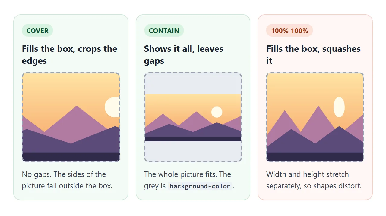
| Value | What it does | Use it for |
|---|---|---|
auto |
The image's own size (the default) | Small icons and tiles |
cover |
Fills the box, crops what sticks out | Hero sections, cards, full-screen photos |
contain |
Fits the whole image, leaves gaps | Logos and diagrams that must not be cut |
200px |
Sets the width, height follows the proportions | Tiles and patterns |
50% |
A share of the box's width | Images that scale with the box |
100% 100% |
Width and height set separately | Rarely: it distorts photos |
With contain, the gaps show the element's background-color. Set one that matches the picture's edges. CSS background-color covers the colour side.
background-position and the focus point
When cover crops the picture, background-position decides which part survives. Keywords such as center, left top and right bottom work. Percentages give finer control.
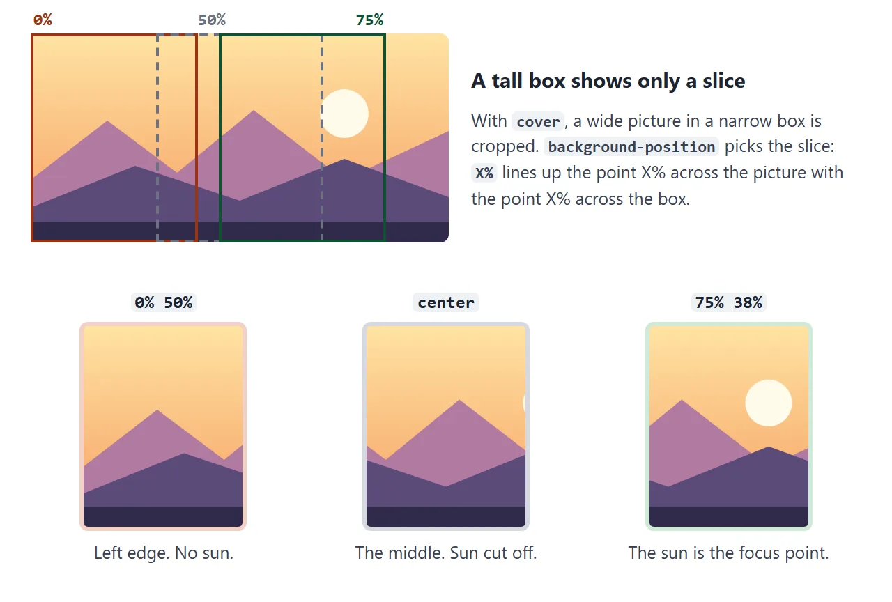
A percentage works like a pin. 75% 38% puts the point 75% across and 38% down the picture exactly 75% across and 38% down the box. Whatever the box's shape, that spot stays visible.
So find the important part of the picture, such as a face or a product, and write its position as percentages. That is the focus point. On a narrow phone screen the edges are cropped away and the focus point stays in view.
Pixel values behave differently. 20px 40px moves the image's top-left corner 20px right and 40px down. It does not follow the picture's content when the box changes size.
background-repeat and patterns
A background image repeats in both directions by default. For a photo, that makes copies appear beside it when the box is larger than the image, so set no-repeat.
For a pattern, repetition is the point. Draw one small tile and let the browser copy it:
.pattern {
  background-image: url("tile.svg");
  background-size: 40px 40px;
  background-repeat: repeat;
}
repeat-x and repeat-y repeat along one direction only. space spreads whole copies out with gaps between them, and round resizes the tile slightly so a whole number of copies fits.
Several layers and a gradient overlay
background-image takes a comma-separated list. The first image is painted on top, and background-color sits below every layer.
White text on a bright photo is often hard to read. The common fix is a see-through gradient laid over the photo:
.hero {
  color: #fff;
  background-image:
    linear-gradient(rgba(20, 16, 40, 0.1), rgba(20, 16, 40, 0.6)),
    url("images/photo.jpg");
  background-size: cover;
}
Turn the overlay on and off, and change how dark it gets:
<!doctype html>
<html lang="en">
<head>
<meta charset="utf-8">
<meta name="viewport" content="width=device-width, initial-scale=1">
<title>Gradient overlay for readable text</title>
<style>
  :root {
    /* a landscape drawn in SVG; in your own page use url("images/photo.jpg") */
    --scene: url("data:image/svg+xml,%3Csvg xmlns='http://www.w3.org/2000/svg' width='1200' height='600' viewBox='0 0 1200 600' preserveAspectRatio='none'%3E%3Cdefs%3E%3ClinearGradient id='s' x1='0' y1='0' x2='0' y2='1'%3E%3Cstop offset='0' stop-color='%23ffe3a3'/%3E%3Cstop offset='1' stop-color='%23f59e62'/%3E%3C/linearGradient%3E%3C/defs%3E%3Crect width='1200' height='600' fill='url(%23s)'/%3E%3Ccircle cx='900' cy='230' r='70' fill='%23fffbea'/%3E%3Cpath d='M0 420L220 250L420 400L640 220L900 420L1200 280V600H0Z' fill='%23b07aa1'/%3E%3Cpath d='M0 500L300 380L600 480L900 360L1200 470V600H0Z' fill='%235b4a7a'/%3E%3Crect y='540' width='1200' height='60' fill='%232f2a4a'/%3E%3C/svg%3E");
    --shade: 0.6;  /* how dark the overlay gets at the bottom */
  }
  body { margin: 0; padding: 16px; font-family: system-ui, sans-serif; background: #f4f5f7; color: #1d2330; }
  .hero {
    min-height: 240px; padding: 28px; border-radius: 12px;
    display: flex; flex-direction: column; justify-content: flex-end;
    color: #fff;
    background-image: var(--scene);
    background-size: cover;
    background-position: center;
  }
  /* the first layer is painted on top: a see-through gradient over the picture */
  .hero.overlay {
    background-image:
      linear-gradient(rgba(20, 16, 40, 0.1), rgba(20, 16, 40, var(--shade))),
      var(--scene);
  }
  .hero h2 { margin: 0 0 6px; font-size: 30px; }
  .hero p { margin: 0; font-size: 16px; max-width: 30em; }
  .controls { display: flex; flex-wrap: wrap; gap: 14px; align-items: center; margin: 14px 0 10px; font-size: 14px; }
  button { font: inherit; font-weight: 600; padding: 8px 14px; border-radius: 8px; border: 0; background: #1d2330; color: #fff; cursor: pointer; }
  input[type=range] { width: 150px; }
  pre { margin: 0; padding: 12px 14px; border-radius: 10px; background: #1d2330; color: #e5e9f0; font-size: 13px; line-height: 1.5; overflow-x: auto; }
</style>
</head>
<body>
<div class="hero" id="hero">
  <h2>Evening walks</h2>
  <p>White text straight on a bright photo is hard to read. A dark gradient layer fixes it.</p>
</div>

<div class="controls">
  <button id="toggle" type="button">Overlay: off</button>
  <label>Darkness <input id="shade" type="range" min="0.2" max="0.9" step="0.05" value="0.6"></label>
</div>

<pre id="css"></pre>

<script>
  const hero = document.getElementById('hero');
  const toggle = document.getElementById('toggle');
  const shade = document.getElementById('shade');
  const out = document.getElementById('css');

  function update() {
    const on = hero.classList.contains('overlay');
    toggle.textContent = 'Overlay: ' + (on ? 'on' : 'off');
    document.documentElement.style.setProperty('--shade', shade.value);
    out.textContent = on
      ? 'background-image:\n  linear-gradient(rgba(20,16,40,.1), rgba(20,16,40,' + shade.value + ')),\n  url("photo.jpg");'
      : 'background-image: url("photo.jpg");';
  }

  toggle.addEventListener('click', () => { hero.classList.toggle('overlay'); update(); });
  shade.addEventListener('input', () => {
    hero.classList.add('overlay');  // moving the slider turns the overlay on
    update();
  });
  update();
</script>
</body>
</html>
A gradient counts as an image, so it can be a layer like any file. CSS gradient background covers the gradient syntax in detail. The other background properties also take lists, one value per layer, in the same order.
A full-screen background image
For a hero that fills the screen, give the section min-height: 100vh and combine everything above: cover, a focus point, no-repeat and an overlay. Below it, a second section uses a repeating SVG tile.
<!doctype html>
<html lang="en">
<head>
<meta charset="utf-8">
<meta name="viewport" content="width=device-width, initial-scale=1">
<title>Full-screen background image</title>
<style>
  :root {
    /* a landscape drawn in SVG; in your own page use url("images/photo.jpg") */
    --scene: url("data:image/svg+xml,%3Csvg xmlns='http://www.w3.org/2000/svg' width='1200' height='600' viewBox='0 0 1200 600' preserveAspectRatio='none'%3E%3Cdefs%3E%3ClinearGradient id='s' x1='0' y1='0' x2='0' y2='1'%3E%3Cstop offset='0' stop-color='%23ffe3a3'/%3E%3Cstop offset='1' stop-color='%23f59e62'/%3E%3C/linearGradient%3E%3C/defs%3E%3Crect width='1200' height='600' fill='url(%23s)'/%3E%3Ccircle cx='900' cy='230' r='70' fill='%23fffbea'/%3E%3Cpath d='M0 420L220 250L420 400L640 220L900 420L1200 280V600H0Z' fill='%23b07aa1'/%3E%3Cpath d='M0 500L300 380L600 480L900 360L1200 470V600H0Z' fill='%235b4a7a'/%3E%3Crect y='540' width='1200' height='60' fill='%232f2a4a'/%3E%3C/svg%3E");
    /* a 40px tile: one dot and a thin grid line, repeated */
    --tile: url("data:image/svg+xml,%3Csvg xmlns='http://www.w3.org/2000/svg' width='40' height='40'%3E%3Ccircle cx='20' cy='20' r='4' fill='%23c7d2fe'/%3E%3Cpath d='M0 0h40v40' fill='none' stroke='%23e0e7ff'/%3E%3C/svg%3E");
    --fx: 75%;  /* focus point: where the sun is in the picture */
    --fy: 38%;
  }
  body { margin: 0; font-family: system-ui, sans-serif; color: #1d2330; }

  .hero {
    position: relative;
    min-height: 100vh;             /* the full screen, whatever its size */
    box-sizing: border-box; padding: 24px;
    display: flex; flex-direction: column; justify-content: flex-end;
    color: #fff;
    background-color: #5b4a7a;     /* shows while the image loads */
    background-image:
      linear-gradient(rgba(20, 16, 40, 0.05) 40%, rgba(20, 16, 40, 0.7)),
      var(--scene);
    background-size: cover;
    background-position: var(--fx) var(--fy);
    background-repeat: no-repeat;
  }
  .hero h1 { margin: 0 0 6px; font-size: clamp(28px, 7vw, 44px); }
  .hero p { margin: 0 0 8px; max-width: 32em; }

  .focus {
    position: absolute; top: 12px; right: 12px;
    display: grid; gap: 4px; padding: 10px 12px; border-radius: 10px;
    background: rgba(255, 255, 255, 0.92); color: #1d2330; font-size: 13px;
  }
  .focus b { font-size: 12px; }
  .focus input { width: 130px; }

  .pattern {
    padding: 40px 24px;
    background-color: #f5f7ff;
    background-image: var(--tile);
    background-size: 40px 40px;    /* one tile */
    background-repeat: repeat;     /* the default, written out for clarity */
  }
  .pattern .card { max-width: 420px; margin: 0 auto; padding: 18px 20px; border-radius: 12px; background: #fff; box-shadow: 0 6px 20px rgba(0, 0, 0, .08); }
  .pattern h2 { margin: 0 0 6px; font-size: 20px; }
  .pattern p { margin: 0; line-height: 1.5; }
</style>
</head>
<body>
<section class="hero">
  <div class="focus">
    <b id="readout">background-position: 75% 38%</b>
    <label>X <input id="fx" type="range" min="0" max="100" value="75"></label>
    <label>Y <input id="fy" type="range" min="0" max="100" value="38"></label>
  </div>
  <h1>Evening walks</h1>
  <p>The picture always covers the screen. Narrow the window: the focus point keeps the sun in view while the edges are cropped.</p>
  <p>Scroll down for a patterned section.</p>
</section>

<section class="pattern">
  <div class="card">
    <h2>A repeating pattern</h2>
    <p>This background is one 40px SVG tile. background-repeat copies it across and down the whole section, however tall it grows.</p>
  </div>
</section>

<script>
  const root = document.documentElement.style;
  const fx = document.getElementById('fx');
  const fy = document.getElementById('fy');
  const readout = document.getElementById('readout');

  function update() {
    root.setProperty('--fx', fx.value + '%');
    root.setProperty('--fy', fy.value + '%');
    readout.textContent = 'background-position: ' + fx.value + '% ' + fy.value + '%';
  }
  fx.addEventListener('input', update);
  fy.addEventListener('input', update);
</script>
</body>
</html>
Use min-height, not height. If the text grows longer than the screen on a small phone, the section grows with it instead of letting the text spill out.
background-attachment: fixed pins the image to the window so the content scrolls over it. Mobile browsers may ignore it and scroll the image with the page, so the section must still look right without the effect.
Relative paths in url()
A relative path inside a CSS file starts from the folder of the CSS file, not the HTML page. This is the most common reason a background image works in one place and not another.
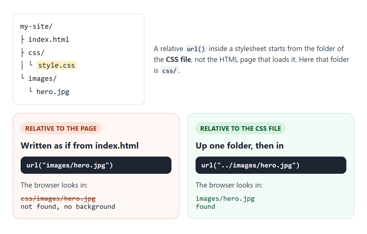
Inside a <style> block or a style attribute, the path starts from the HTML page instead. Moving CSS from the page into a separate file can therefore break every image path. Relative vs absolute path explains the rules.
Quote the path. Without quotes, spaces, brackets and quote marks in a file name must be escaped, and a stray space breaks the whole declaration.
If you send the page as a single file, a relative path points to a file the recipient does not have. Base64 images put the picture inside the page, and images not showing in HTML covers the other causes.
Background image or img?
Screen readers do not announce background images, and CSS has no alt text for them. That is correct for decoration and wrong for content.
- Content (a product photo, a team portrait, a chart): use
<img>with alt text. - Decoration (a texture, a mood photo behind a heading): a background image is fine.
- Text inside the picture: put the text in HTML on top of the background instead, so it can be read, searched and translated.
When it does not work
| What you see | Cause | Fix |
|---|---|---|
| Nothing at all, no error | The element is empty, so its height is 0 | Add content, padding or min-height |
| Works inline, breaks in a CSS file | The relative path starts from the CSS file's folder | Adjust the path, often with ../ |
| Nothing, file name has spaces or brackets | Unquoted url() |
Wrap the path in quotes |
| Size or position suddenly back to default | A later background shorthand reset them |
Put the shorthand first, longhands after it |
| Copies of the photo next to each other | Repeat is on by default | background-repeat: no-repeat |
| Important part cut off on phones | cover crops, and background-position picks what stays |
Set background-position to the focus point |
| Fixed background scrolls on a phone | Mobile browsers may ignore fixed |
Design the section to work without it |
The shorthand trap looks like this. background sets every sub-property it does not mention back to its initial value, so here the image ends up at auto size:
.hero {
  background-size: cover;
  background: url("photo.jpg") no-repeat;  /* resets size to auto */
}
Either write the size inside the shorthand, after the position and a slash (center / cover), or put the shorthand first.
Share it as a link
A background image depends on where the file sits, which is why a page that looks right on your computer can arrive blank. Pictures drawn as SVG or gradients inside the page travel with it.
To send the working version, paste the page into a NOS document and choose Create share link. HTML to link walks through it.
The page renders as written and its scripts run, so the people you send it to can try the controls themselves. If you change the code later, the same link shows the new version.