background-size sets how big each copy of a background image is drawn. cover scales it to fill the box and crops the rest, contain scales it to fit whole and leaves gaps, and auto (the default) uses the image's own size.
A length or percentage sets the width, and a second value sets the height.
.box {
  background-image: url("photo.jpg");
  background-repeat: no-repeat;
  background-size: cover;      /* or contain, auto, 150px, 50%, auto 100% */
  background-position: center;
}
Adding the image itself is covered in CSS background image. This guide is about the size: how the browser gets from a keyword to pixels.
Try each value on a 300 x 200 picture. The readout shows the size the image is drawn at, worked out the same way the browser does it. Drag the slider to change the box width.
<!doctype html>
<html lang="en">
<head>
<meta charset="utf-8">
<meta name="viewport" content="width=device-width, initial-scale=1">
<title>background-size values</title>
<style>
  body { margin: 0; padding: 14px; font-family: system-ui, sans-serif; background: #f4f5f7; color: #1d2330; }
  .box {
    box-sizing: border-box; width: 320px; max-width: 100%; height: 200px;
    border: 2px dashed #9aa3b2; border-radius: 10px;
    background-color: #fde68a;  /* shows in the gaps */
    /* the picture is 300 x 200 pixels */
    background-image: url("data:image/svg+xml,<svg xmlns='http://www.w3.org/2000/svg' width='300' height='200'><rect width='300' height='200' fill='%238ec5ff'/><circle cx='230' cy='60' r='28' fill='%23ffd166'/><polygon points='0,200 90,90 170,200' fill='%232d6a4f'/><polygon points='110,200 200,110 300,200' fill='%233a7d44'/><rect x='1.5' y='1.5' width='297' height='197' fill='none' stroke='%23c2410c' stroke-width='3'/><text x='12' y='28' font-family='sans-serif' font-size='18' font-weight='700' fill='%231d2330'>300 x 200</text></svg>");
    background-repeat: no-repeat;
    background-size: auto;  /* the buttons change this line */
  }
  .btns { display: flex; flex-wrap: wrap; gap: 6px; margin: 12px 0 8px; }
  button { font: 600 13px ui-monospace, Consolas, monospace; padding: 7px 10px; border: 1px solid #c9ced8; border-radius: 8px; background: #fff; cursor: pointer; }
  button.on { background: #1d2330; color: #fff; border-color: #1d2330; }
  label { font-size: 14px; display: flex; align-items: center; gap: 8px; }
  input { flex: 1; max-width: 240px; }
  output { display: block; margin-top: 10px; font: 13px/1.6 ui-monospace, Consolas, monospace; background: #fff; border-radius: 8px; padding: 8px 10px; }
</style>
</head>
<body>
<div class="box" id="box"></div>
<div class="btns" id="btns">
  <button class="on">auto</button><button>cover</button><button>contain</button>
  <button>150px</button><button>50%</button><button>auto 100%</button><button>100% 100%</button>
</div>
<label>Box width <input type="range" id="w" min="120" max="360" value="320"></label>
<output id="out"></output>

<script>
  const box = document.getElementById('box');
  const out = document.getElementById('out');
  const IW = 300, IH = 200;  // the picture's own size
  let value = 'auto';

  // Work out the drawn size the same way the browser does
  function drawnSize(v, W, H) {
    if (v === 'cover' || v === 'contain') {
      const s = (v === 'cover' ? Math.max : Math.min)(W / IW, H / IH);
      return [IW * s, IH * s];
    }
    const [a, b = 'auto'] = v.split(' ');
    const len = (t, full) => t.endsWith('%') ? full * parseFloat(t) / 100 : parseFloat(t);
    let w = a === 'auto' ? null : len(a, W);
    let h = b === 'auto' ? null : len(b, H);
    if (w === null && h === null) return [IW, IH];        // own size
    if (w === null) w = h * IW / IH;                       // keep proportions
    if (h === null) h = w * IH / IW;
    return [w, h];
  }

  function update() {
    box.style.width = document.getElementById('w').value + 'px';
    box.style.backgroundSize = value;
    const W = box.clientWidth, H = box.clientHeight;  // the padding box
    const [w, h] = drawnSize(value, W, H);
    const cut = w > W + 0.5 || h > H + 0.5, gap = w < W - 0.5 || h < H - 0.5;
    out.textContent =
      'background-size: ' + value + ';\n' +
      'box ' + W + ' x ' + H + '  ->  image drawn at ' + Math.round(w) + ' x ' + Math.round(h) +
      (cut ? '  (cropped)' : '') + (gap ? '  (gaps)' : '');
    out.style.whiteSpace = 'pre-wrap';
  }

  document.getElementById('btns').addEventListener('click', (e) => {
    if (e.target.tagName !== 'BUTTON') return;
    document.querySelector('.on').classList.remove('on');
    e.target.classList.add('on');
    value = e.target.textContent;
    update();
  });
  document.getElementById('w').addEventListener('input', update);
  update();
</script>
</body>
</html>
How cover and contain are calculated
Both keywords compare two ratios: box width divided by image width, and box height divided by image height. Both keep the image's proportions and scale it by one of those numbers.
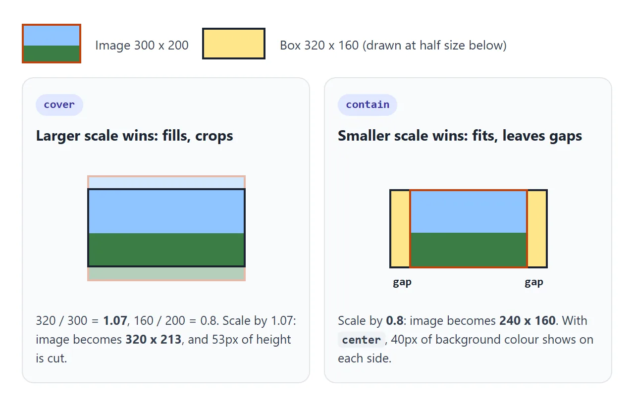
covertakes the larger ratio. The image reaches both edges, and the side that is too long gets cut.containtakes the smaller ratio. The whole image is inside, and the short side leaves gaps that showbackground-color.
So the shape of the box decides what gets lost.
In a wide hero, cover cuts off the top and bottom of a landscape photo. In a tall, narrow box on a phone, the same photo loses its sides instead. background-position chooses which part of the cropped image stays in view.
One value, two values and auto
A single value sets the width only. The height becomes auto, which means "keep the proportions". That is the most common surprise: background-size: 100% does not fill the box, it only matches its width.
| Value | Width | Height |
|---|---|---|
auto |
The image's own width | The image's own height |
150px |
150px | From the proportions |
50% |
Half the box width | From the proportions |
auto 100% |
From the proportions | The full box height |
100% 100% |
The full box width | The full box height, may distort |
cover / contain |
Scaled as above | Scaled as above |
A CSS gradient has no size of its own. For a gradient, auto is treated as 100%, so it fills the positioning area. That is why a gradient covers the whole box without any background-size at all. CSS gradient background covers the gradient side.
Percentages and background-origin
A percentage in background-size is measured against the background positioning area. background-origin decides which box that is, and the default is padding-box: the element inside its border.
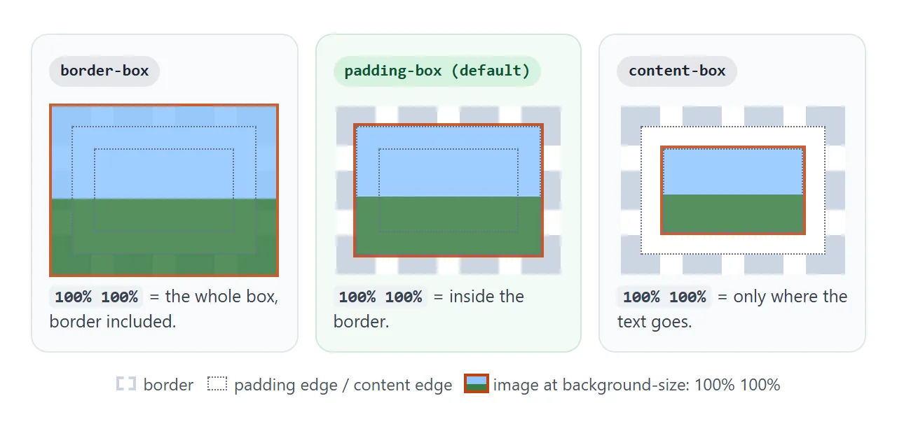
.card {
  border: 12px solid rgba(0, 0, 0, .2);
  padding: 24px;
  background-origin: content-box;  /* 100% now means the content area */
  background-size: 100% 100%;
}
background-origin changes where the image is sized and placed. It does not decide where painting stops; that is background-clip.
With the default clip of border-box, a repeating image still continues under the border. CSS background-clip covers the painting side, and the box model explains the three boxes.
background-repeat changes the size too
With repeat, the browser draws copies at exactly the size you set, and the last ones are cut at the edge. Two other values fit whole copies instead:
spacekeeps the size and spreads the leftover room as gaps between copies.roundchanges the size so a whole number of copies fits. The drawn width becomes the box width divided by the rounded number of copies.
Move the slider and watch the round box report the size it really draws:
<!doctype html>
<html lang="en">
<head>
<meta charset="utf-8">
<meta name="viewport" content="width=device-width, initial-scale=1">
<title>background-size with repeat, space and round</title>
<style>
  body { margin: 0; padding: 14px; font-family: system-ui, sans-serif; background: #f4f5f7; color: #1d2330; }
  .grid { display: grid; grid-template-columns: repeat(auto-fit, minmax(150px, 1fr)); gap: 10px; }
  .tile {
    height: 130px; border-radius: 10px; border: 1px solid #c9ced8;
    background-color: #fff;
    /* one 60 x 60 tile: a dot inside a square outline */
    background-image: url("data:image/svg+xml,<svg xmlns='http://www.w3.org/2000/svg' width='60' height='60'><rect x='1' y='1' width='58' height='58' fill='none' stroke='%2393a3b8' stroke-width='2'/><circle cx='30' cy='30' r='16' fill='%232563eb'/></svg>");
    background-size: 60px;  /* the slider changes this */
  }
  .repeat { background-repeat: repeat; }
  .space  { background-repeat: space; }
  .round  { background-repeat: round; }
  h3 { margin: 0 0 6px; font: 700 14px ui-monospace, Consolas, monospace; }
  p { margin: 6px 0 0; font-size: 13px; line-height: 1.45; color: #4b5563; }
  label { display: flex; align-items: center; gap: 8px; font-size: 14px; margin-top: 14px; }
  input { flex: 1; max-width: 260px; }
</style>
</head>
<body>
<div class="grid">
  <div><h3>repeat</h3><div class="tile repeat"></div><p>Copies run off the edge and get cut.</p></div>
  <div><h3>space</h3><div class="tile space"></div><p>Whole copies only, gaps spread between them.</p></div>
  <div><h3>round</h3><div class="tile round" id="round"></div><p id="note">Whole copies only, tile stretched to fit.</p></div>
</div>
<label>background-size <input type="range" id="size" min="24" max="100" value="60"> <b id="val">60px</b></label>

<script>
  const size = document.getElementById('size');
  const round = document.getElementById('round');

  function update() {
    const x = Number(size.value);
    document.querySelectorAll('.tile').forEach((t) => (t.style.backgroundSize = x + 'px'));
    document.getElementById('val').textContent = x + 'px';
    // round: tile width becomes W / round(W / X)
    const W = round.clientWidth;
    const n = Math.max(1, Math.round(W / x));
    document.getElementById('note').textContent =
      'Box ' + W + 'px wide: ' + n + ' copies, each drawn ' + (W / n).toFixed(1) + 'px wide instead of ' + x + 'px.';
  }

  size.addEventListener('input', update);
  window.addEventListener('resize', update);
  update();
</script>
</body>
</html>
round is useful for borders of dots or stripes, where a half copy at the edge looks broken. It means background-size is a starting point, not a promise.
background-attachment: fixed and why it fails on phones
background-attachment: fixed pins the image to the viewport. The element scrolls and its background stays still, so the section looks like a window onto a picture behind the page.
Two things change with fixed, and both surprise people.
- The size is measured against the viewport.
background-originis ignored, and the positioning area becomes the initial containing block, which is the size of the window.covercovers the whole window, so a short band shows only a slice of a large image. - Safari on iPhone and iPad ignores the effect. MDN's compatibility data says
fixedis recognized there but has no effect, so the image scrolls as if it werescroll. The CSS specification also allows browsers that cannot support fixed backgrounds to ignore them.
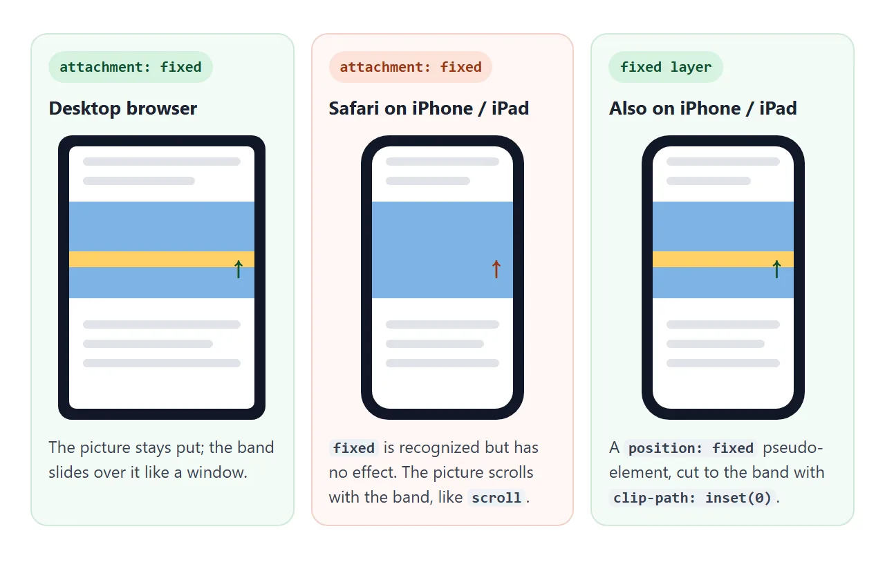
The layout must therefore look right when the image scrolls. If the still-picture effect matters on phones too, draw the picture on a position: fixed layer instead, and clip that layer to the section:
.band { position: relative; clip-path: inset(0); }
.band::before {
  content: "";
  position: fixed;
  inset: 0;
  z-index: -1;
  background: url("photo.jpg") center / cover no-repeat;
}
position: fixed is supported in Safari on iPhone, and clip-path: inset(0) cuts the layer to the band's shape, so every band shows its own picture. Parallax in HTML goes further with layers that move at different speeds.
A finished example: picture bands
The page below has two picture bands. Switch between normal scrolling, background-attachment: fixed and the fixed layer, then scroll inside the example.
<!doctype html>
<html lang="en">
<head>
<meta charset="utf-8">
<meta name="viewport" content="width=device-width, initial-scale=1">
<title>Fixed background bands</title>
<style>
  body { margin: 0; font-family: system-ui, sans-serif; color: #1d2330; background: #fff; }
  .bar {
    position: sticky; top: 0; z-index: 2; display: flex; flex-wrap: wrap; gap: 6px 14px;
    padding: 10px 14px; background: #1d2330; color: #fff; font-size: 13px;
  }
  .bar label { display: flex; align-items: center; gap: 5px; cursor: pointer; }
  .text { max-width: 560px; margin: 0 auto; padding: 22px 16px; line-height: 1.6; }
  .text h2 { margin: 0 0 6px; font-size: 20px; }

  .band {
    min-height: 260px; display: grid; place-items: center; text-align: center;
    color: #fff; font: 700 26px/1.2 system-ui, sans-serif; text-shadow: 0 2px 8px rgba(0, 0, 0, .45);
  }
  .one { --img: url("data:image/svg+xml,<svg xmlns='http://www.w3.org/2000/svg' width='1200' height='800'><rect width='1200' height='800' fill='%237fb3e6'/><circle cx='880' cy='220' r='90' fill='%23ffd166'/><polygon points='0,800 360,330 720,800' fill='%232d6a4f'/><polygon points='420,800 820,380 1200,800' fill='%233a7d44'/></svg>"); }
  .two { --img: url("data:image/svg+xml,<svg xmlns='http://www.w3.org/2000/svg' width='1200' height='800'><rect width='1200' height='800' fill='%23312e81'/><circle cx='300' cy='230' r='80' fill='%23fef3c7'/><rect y='560' width='1200' height='240' fill='%231e1b4b'/><rect x='640' y='420' width='90' height='140' fill='%23111827'/><rect x='760' y='360' width='120' height='200' fill='%23111827'/></svg>"); }

  /* Mode 1: normal background, scrolls with the band */
  .scroll .band { background: var(--img) center / cover no-repeat; }

  /* Mode 2: background-attachment: fixed (no effect in Safari on iPhone and iPad) */
  .attach .band { background: var(--img) center / cover no-repeat fixed; }

  /* Mode 3: a fixed layer inside each band, clipped to the band */
  .layer .band { position: relative; clip-path: inset(0); }
  .layer .band::before {
    content: ""; position: fixed; inset: 0; z-index: -1;
    background: var(--img) center / cover no-repeat;
  }
</style>
</head>
<body class="scroll">
<div class="bar" id="bar">
  <label><input type="radio" name="m" value="scroll" checked> scroll</label>
  <label><input type="radio" name="m" value="attach"> attachment: fixed</label>
  <label><input type="radio" name="m" value="layer"> fixed layer</label>
</div>

<div class="text"><h2>Scroll this page</h2><p>Pick a mode above, then scroll. With <b>scroll</b>, each picture moves with its band. With the two fixed modes, the picture stays put and the band slides over it like a window.</p></div>
<section class="band one">Mountains</section>
<div class="text"><p>On a desktop browser the two fixed modes look the same. On an iPhone or iPad, attachment: fixed has no effect and behaves like scroll, while the fixed layer still stays put.</p><p>The layer is a position: fixed pseudo-element. clip-path: inset(0) on the band cuts it to the band's shape, so each band shows its own picture.</p></div>
<section class="band two">City at night</section>
<div class="text"><p>End of the page.</p></div>

<script>
  document.getElementById('bar').addEventListener('change', (e) => {
    document.body.className = e.target.value;
  });
</script>
</body>
</html>
Each band uses center / cover, the shorthand form of background-position and background-size. The size must come right after the position and a slash; background: url(x) cover without a position is invalid and drops the whole declaration.
When it does not work
| What you see | Cause | Fix |
|---|---|---|
100% leaves a gap at the bottom |
One value sets the width only | Use cover, or 100% 100% if distortion is fine |
| Photo looks squashed | Two values that do not match the image's shape | Use cover or set one side to auto |
Size ignored after adding background |
The shorthand reset background-size to auto |
Put the shorthand first, or write center / cover inside it |
Whole background line ignored |
Size written without a position and slash | Write center / cover |
| Tile is not the size you set | background-repeat: round rescales it |
Use repeat or space |
| Percentage size looks too small | background-origin: content-box shrinks the area |
Use the default padding-box |
| Fixed image is huge on a short band | fixed sizes the image against the viewport |
Expected; choose a picture that works at window size |
| Fixed image scrolls on iPhone | fixed has no effect in Safari on iPhone and iPad |
Use a position: fixed layer |
Share it as a link
Background sizing depends on the box, and the box depends on the screen. A screenshot shows one width; the real page can be checked on a phone and a laptop by the same person.
To send the working version, paste the page into a NOS document and choose Create share link. HTML to link walks through it.
The page renders as written and its scripts run, so the people you send it to can scroll and resize it themselves. If you change the code later, the same link shows the new version.