background-clip sets the edge where an element's background stops being painted: the outside of the border (border-box, the default), the inside of the border (padding-box), the content area (content-box), or the shapes of the letters (text).
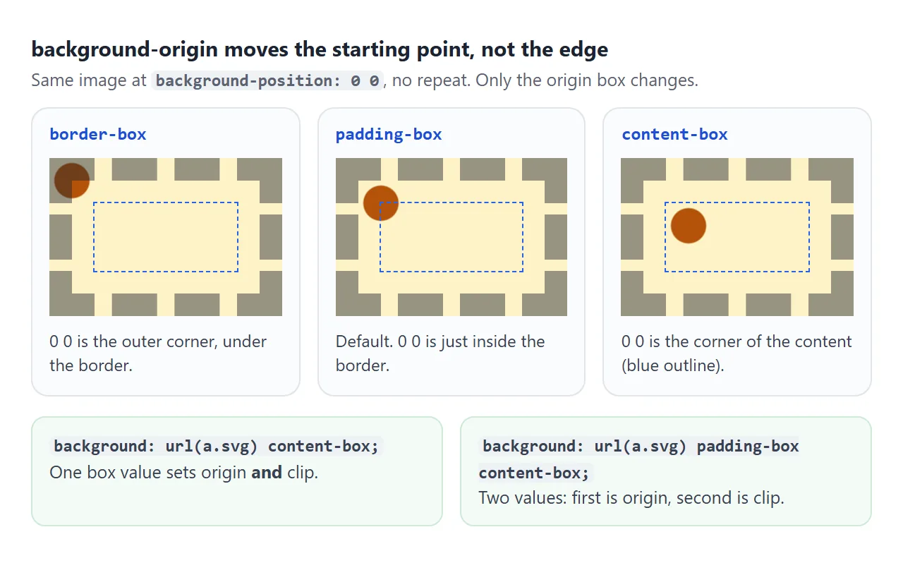
background-origin is its partner. It sets where the background image starts.
Try both in the lab. The border is dashed and see-through, so you can see whether paint runs under it.
<!doctype html>
<html lang="en">
<head>
<meta charset="utf-8">
<meta name="viewport" content="width=device-width, initial-scale=1">
<title>background-clip and background-origin lab</title>
<style>
  body {
    margin: 0; padding: 14px;
    font-family: system-ui, sans-serif; background: #f4f5f7; color: #1d2330;
  }
  .controls { display: grid; gap: 8px; margin-bottom: 14px; }
  .group { display: flex; flex-wrap: wrap; align-items: center; gap: 6px; font-size: 13px; }
  .group b { width: 132px; font-family: ui-monospace, Consolas, monospace; font-size: 12.5px; }
  .group label {
    padding: 5px 9px; border-radius: 99px; background: #fff;
    border: 1px solid #d5d9e0; cursor: pointer; font-size: 12.5px;
  }
  .group input { position: absolute; opacity: 0; }
  .group label:has(input:checked) { background: #1d2330; color: #fff; border-color: #1d2330; }
  .group label:has(input:focus-visible) { outline: 2px solid #2563eb; outline-offset: 2px; }

  /* The box under test: a thick see-through border, padding, and a tiled background */
  .box {
    max-width: 320px; margin: 0 auto;
    border: 22px dashed rgba(29, 35, 48, .55);
    padding: 26px;
    font: 800 30px/1.15 system-ui, sans-serif;
    /* 40px tile with a dark corner mark, so you can see where tiling starts */
    background-image: url("data:image/svg+xml,%3Csvg xmlns='http://www.w3.org/2000/svg' width='40' height='40'%3E%3Crect width='40' height='40' fill='%23fde68a'/%3E%3Crect width='12' height='12' fill='%23b45309'/%3E%3C/svg%3E");
    background-clip: border-box;    /* where painting stops */
    background-origin: padding-box; /* where the first tile starts */
  }
  /* the content area, outlined so you can see it */
  .content { outline: 2px dashed #2563eb; outline-offset: 0; }
  /* text clipping only shows if the text itself is see-through */
  .box.clip-text { color: transparent; -webkit-background-clip: text; }

  pre {
    margin: 14px auto 0; max-width: 368px; padding: 10px 12px; border-radius: 8px;
    background: #1d2330; color: #e5e7eb; font: 12.5px/1.5 ui-monospace, Consolas, monospace;
    white-space: pre-wrap;
  }
  .key { max-width: 368px; margin: 8px auto 0; font-size: 12px; color: #5b6270; }
  .key span { color: #2563eb; font-weight: 700; }
</style>
</head>
<body>
<div class="controls">
  <div class="group" id="clip"><b>background-clip</b>
    <label><input type="radio" name="clip" value="border-box" checked>border-box</label>
    <label><input type="radio" name="clip" value="padding-box">padding-box</label>
    <label><input type="radio" name="clip" value="content-box">content-box</label>
    <label><input type="radio" name="clip" value="text">text</label>
  </div>
  <div class="group" id="origin"><b>background-origin</b>
    <label><input type="radio" name="origin" value="border-box">border-box</label>
    <label><input type="radio" name="origin" value="padding-box" checked>padding-box</label>
    <label><input type="radio" name="origin" value="content-box">content-box</label>
  </div>
</div>

<div class="box" id="box"><div class="content">Border, padding, content.</div></div>
<p class="key">Dashes = border. <span>Blue outline</span> = content box. Brown squares mark the corner of each tile.</p>
<pre id="code"></pre>

<script>
  const box = document.getElementById('box');
  const code = document.getElementById('code');

  function update() {
    const clip = document.querySelector('input[name=clip]:checked').value;
    const origin = document.querySelector('input[name=origin]:checked').value;
    box.style.backgroundClip = clip;
    box.style.backgroundOrigin = origin;
    box.classList.toggle('clip-text', clip === 'text');
    code.textContent =
      'background-clip: ' + clip + ';\n' +
      'background-origin: ' + origin + ';' +
      (clip === 'text' ? '\n-webkit-background-clip: text;\ncolor: transparent;' : '');
  }

  document.querySelectorAll('input[type=radio]').forEach((r) => r.addEventListener('change', update));
  update();
</script>
</body>
</html>
The four clip values
Every element has three nested boxes: the border box on the outside, the padding box inside the border, and the content box inside the padding. Three of the clip values name one of those boxes. The fourth, text, uses the glyphs.
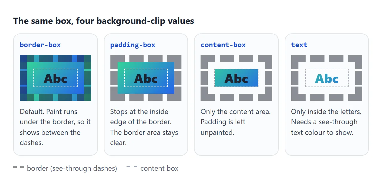
The clip applies to background-color too, not only to images. With padding-box, a dashed or dotted border shows the page behind the gaps instead of your background colour.
.panel {
  border: 8px dashed rgb(0 0 0 / .4);
  padding: 16px;
  background: #fde68a;
  background-clip: padding-box;  /* no yellow between the dashes */
}
background-origin: where the image starts
background-origin does not cut anything. It picks the box that background-position is measured from, and the box that percentage background-size values refer to.
The default is padding-box, which is why a tiled image does not normally line up with the outer edge of a thick border.
background-origin |
background-clip |
|
|---|---|---|
| Question it answers | Where does the image start? | Where does painting stop? |
| Default | padding-box |
border-box |
Accepts text |
No | Yes |
Affects background-color |
No | Yes |
The background shorthand sets both. One box keyword sets origin and clip to the same box. Two keywords set origin first, then clip. Because the shorthand also resets any clip you did not write, put a separate background-clip line after it.
For the image side of backgrounds, sizing and positioning, see CSS background-image.
Gradient text with background-clip: text
Gradient text is three steps: paint a gradient, clip it to the letters, then make the text colour see-through so the clipped paint shows.
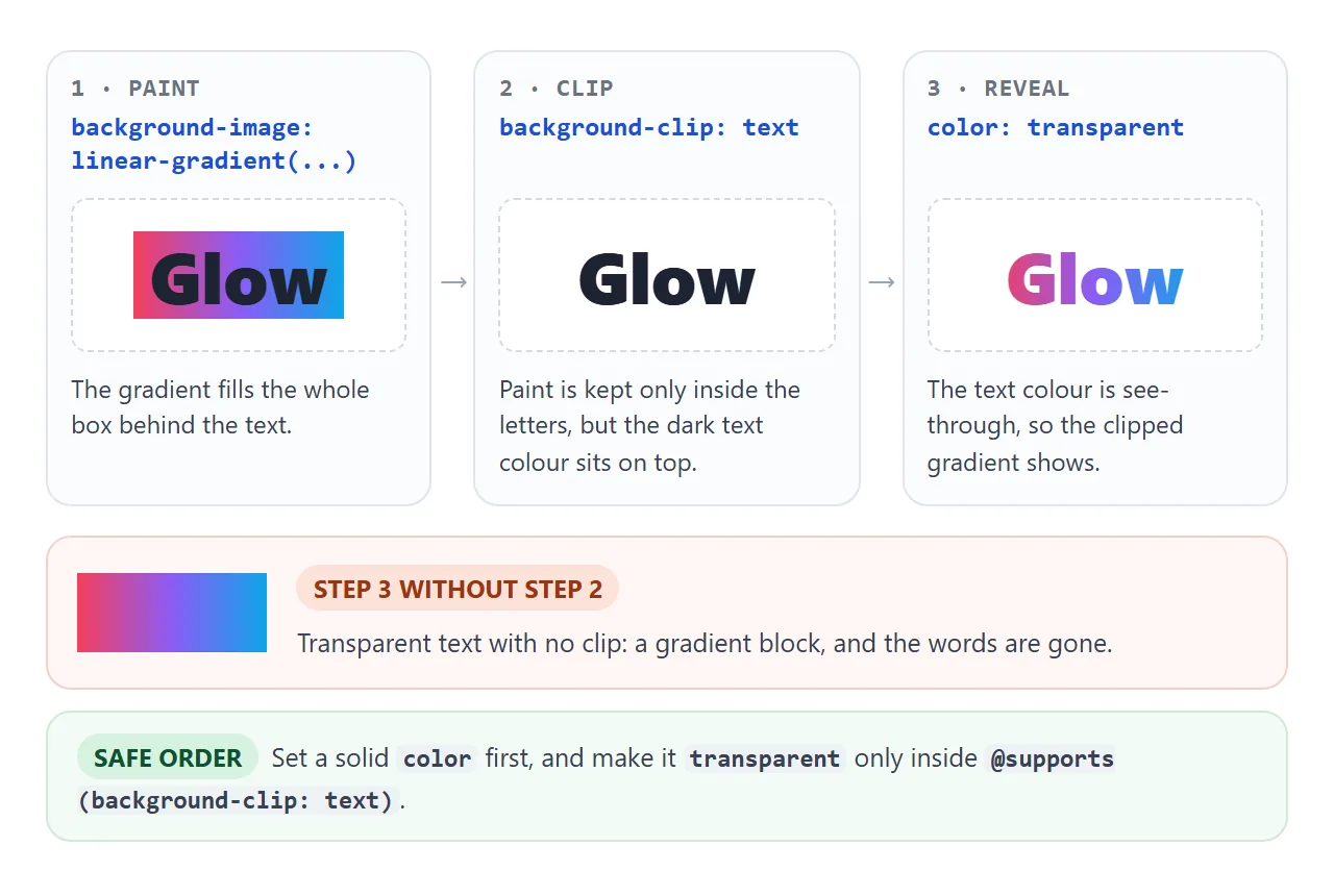
The order matters for safety. Set a solid colour first, and switch to transparent only when the browser says it supports text clipping:
.headline {
  color: #7c3aed;  /* fallback */
  background-image: linear-gradient(90deg, #f43f5e, #8b5cf6, #0ea5e9);
}
@supports (background-clip: text) or (-webkit-background-clip: text) {
  .headline {
    -webkit-background-clip: text;
    background-clip: text;
    color: transparent;
  }
}
Current Chromium accepts the unprefixed background-clip: text. The -webkit- line is kept for browsers that only know the prefixed form. -webkit-text-fill-color: transparent is an alternative to color: transparent, not an extra requirement.
The text stays real text. It can be selected, copied, found with the browser's search and read by a screen reader.
Build one and copy the CSS:
<!doctype html>
<html lang="en">
<head>
<meta charset="utf-8">
<meta name="viewport" content="width=device-width, initial-scale=1">
<title>Gradient text builder</title>
<style>
  body {
    margin: 0; padding: 14px;
    font-family: system-ui, sans-serif; background: #fff; color: #1d2330;
  }
  .preview {
    display: grid; place-items: center; min-height: 130px; padding: 10px;
    border: 1px solid #e1e4ea; border-radius: 12px; background: #f8f9fb;
  }

  /* The technique: paint a gradient, clip it to the glyphs, hide the text colour */
  .grad {
    margin: 0; text-align: center;
    font: 900 clamp(34px, 11vw, 64px)/1.05 system-ui, sans-serif;
    padding-bottom: .15em;                  /* room for g and y: nothing is painted outside the box */
    color: #7c3aed;                         /* fallback if clipping is unsupported */
    background-image: linear-gradient(var(--angle), var(--c1), var(--c2), var(--c3));
    background-size: 100% 100%;
  }
  @supports (background-clip: text) or (-webkit-background-clip: text) {
    .grad {
      -webkit-background-clip: text;
      background-clip: text;
      color: transparent;
    }
  }
  /* The moving version only runs for people who have not asked for less motion */
  @media (prefers-reduced-motion: no-preference) {
    .grad.moving {
      background-size: 200% 100%;
      animation: slide 4s linear infinite alternate;
    }
  }
  @keyframes slide { to { background-position: 100% 0; } }

  .controls { display: grid; grid-template-columns: 1fr 1fr; gap: 10px 14px; margin: 14px 0 10px; font-size: 13px; }
  .controls label { display: flex; align-items: center; gap: 8px; }
  .controls input[type=color] { width: 40px; height: 28px; padding: 0; border: 1px solid #d5d9e0; border-radius: 6px; background: #fff; }
  .controls input[type=range] { flex: 1; min-width: 0; }
  .wide { grid-column: 1 / -1; }
  .note { font-size: 12px; color: #5b6270; margin: 0 0 8px; }
  pre {
    margin: 0; padding: 10px 12px; border-radius: 8px; white-space: pre-wrap; overflow-wrap: anywhere;
    background: #1d2330; color: #e5e7eb; font: 12px/1.5 ui-monospace, Consolas, monospace;
  }
</style>
</head>
<body>
<div class="preview"><h1 class="grad" id="grad">Make it glow</h1></div>

<div class="controls">
  <label>Stop 1 <input type="color" id="c1" value="#f43f5e"></label>
  <label>Stop 2 <input type="color" id="c2" value="#8b5cf6"></label>
  <label>Stop 3 <input type="color" id="c3" value="#0ea5e9"></label>
  <label>Animate <input type="checkbox" id="anim"></label>
  <label class="wide">Angle <input type="range" id="angle" min="0" max="360" value="90"> <output id="angleOut">90deg</output></label>
</div>
<p class="note" id="note"></p>
<pre id="code"></pre>

<script>
  const grad = document.getElementById('grad');
  const ids = ['c1', 'c2', 'c3', 'angle', 'anim'];
  const $ = (id) => document.getElementById(id);
  const reduced = matchMedia('(prefers-reduced-motion: reduce)');

  function update() {
    const angle = $('angle').value + 'deg';
    const stops = [$('c1').value, $('c2').value, $('c3').value];
    grad.style.setProperty('--angle', angle);
    stops.forEach((c, i) => grad.style.setProperty('--c' + (i + 1), c));
    grad.classList.toggle('moving', $('anim').checked);
    $('angleOut').textContent = angle;
    $('note').textContent = $('anim').checked && reduced.matches
      ? 'Your system asks for reduced motion, so the animation stays off.' : '';

    let css =
      '.headline {\n' +
      '  color: ' + stops[1] + '; /* fallback */\n' +
      '  background-image: linear-gradient(' + angle + ', ' + stops.join(', ') + ');\n' +
      '}\n' +
      '@supports (background-clip: text) or (-webkit-background-clip: text) {\n' +
      '  .headline {\n' +
      '    -webkit-background-clip: text;\n' +
      '    background-clip: text;\n' +
      '    color: transparent;\n' +
      '  }\n' +
      '}';
    if ($('anim').checked) {
      css +=
        '\n@media (prefers-reduced-motion: no-preference) {\n' +
        '  .headline {\n' +
        '    background-size: 200% 100%;\n' +
        '    animation: slide 4s linear infinite alternate;\n' +
        '  }\n' +
        '}\n' +
        '@keyframes slide { to { background-position: 100% 0; } }';
    }
    $('code').textContent = css;
  }

  ids.forEach((id) => $(id).addEventListener('input', update));
  reduced.addEventListener('change', update);
  update();
</script>
</body>
</html>
Animating it. The simplest way to animate gradient text is to move the background, not change it. Make the background wider than the text, then slide it:
@media (prefers-reduced-motion: no-preference) {
  .headline {
    background-size: 200% 100%;
    animation: slide 4s linear infinite alternate;
  }
}
@keyframes slide { to { background-position: 100% 0; } }
Wrapping the animation in prefers-reduced-motion: no-preference means it only runs for people who have not asked their system for less motion. Everyone else gets the still gradient.
Textured text with an inline SVG pattern
Any background image works, not only gradients. A small SVG tile in a data: URI keeps the page self-contained, with no image file to host.
.texture {
  color: #fbbf24;             /* fallback */
  background-color: #fbbf24;  /* clipped too, so it fills between stripes */
  background-image: url("data:image/svg+xml,%3Csvg xmlns='http://www.w3.org/2000/svg' width='14' height='14'%3E%3Cpath d='M-2 2L2 -2M0 14L14 0M12 16L16 12' stroke='%23b45309' stroke-width='4'/%3E%3C/svg%3E");
}
@supports (background-clip: text) or (-webkit-background-clip: text) {
  .texture { -webkit-background-clip: text; background-clip: text; color: transparent; }
}
The path draws one diagonal plus two corner stubs, so the stripes join up when the 14px tile repeats.
Inside the URL, <, > and # are percent-encoded. Use heavy weights and large sizes: a pattern inside thin strokes turns into noise. For effects that fade or cut the element itself instead of its background, see CSS mask-image.
Gradient borders with padding-box and border-box
Clip also takes a list, one value per background layer. That gives a rounded gradient border on a single element: an opaque fill clipped to the padding box, over a gradient clipped to the border box.
.card {
  border: 3px solid transparent;
  border-radius: 16px;
  background-image:
    linear-gradient(#111a2e, #111a2e),
    linear-gradient(120deg, #22d3ee, #a78bfa, #f472b6);
  background-origin: border-box;
  background-clip: padding-box, border-box;
}
background-origin: border-box stretches the gradient under the border, so the rim does not show a seam. The fill colour must match what is behind the card. CSS gradient border compares this with three other methods, including one with a see-through middle.
A finished example
A gradient headline with a fallback colour and gentle animation, a gradient-border card, and a striped heading, all on one page:
<!doctype html>
<html lang="en">
<head>
<meta charset="utf-8">
<meta name="viewport" content="width=device-width, initial-scale=1">
<title>Gradient text, gradient border, textured heading</title>
<style>
  body {
    margin: 0; padding: 26px 18px;
    font-family: system-ui, sans-serif; background: #0b1220; color: #e5e7eb;
  }
  .wrap { max-width: 560px; margin: 0 auto; }

  /* 1. Gradient headline with a readable fallback */
  .hero {
    margin: 0 0 8px; font: 900 clamp(36px, 10vw, 58px)/1.15 system-ui, sans-serif;
    color: #a78bfa;                    /* shown if clipping is unsupported */
    background-image: linear-gradient(100deg, #22d3ee, #a78bfa 50%, #f472b6);
    background-size: 200% 100%;
  }
  @supports (background-clip: text) or (-webkit-background-clip: text) {
    .hero { -webkit-background-clip: text; background-clip: text; color: transparent; }
  }
  @media (prefers-reduced-motion: no-preference) {
    .hero { animation: shift 6s ease-in-out infinite alternate; }
  }
  @keyframes shift { to { background-position: 100% 0; } }
  /* selected text: solid colours, so it never depends on the gradient */
  .hero::selection { color: #0b1220; -webkit-text-fill-color: #0b1220; background: #a78bfa; }
  .lead { margin: 0 0 22px; color: #cbd5e1; line-height: 1.5; }

  /* 2. Gradient border card: two layers, two clip boxes */
  .card {
    border: 3px solid transparent;
    border-radius: 16px;
    padding: 18px 20px;
    background-image:
      linear-gradient(#111a2e, #111a2e),                 /* fill, clipped to padding box */
      linear-gradient(120deg, #22d3ee, #a78bfa, #f472b6); /* rim, clipped to border box */
    background-origin: border-box;
    background-clip: padding-box, border-box;
  }
  .card h2 { margin: 0 0 6px; font-size: 18px; color: #fff; }
  .card p { margin: 0; color: #cbd5e1; line-height: 1.5; font-size: 14.5px; }

  /* 3. Textured heading: an inline SVG pattern clipped to the letters */
  .texture {
    margin: 26px 0 0; font: 900 clamp(40px, 13vw, 72px)/1 system-ui, sans-serif; letter-spacing: 1px;
    color: #fbbf24;
    background-color: #fbbf24;
    background-image: url("data:image/svg+xml,%3Csvg xmlns='http://www.w3.org/2000/svg' width='14' height='14'%3E%3Cpath d='M-2 2L2 -2M0 14L14 0M12 16L16 12' stroke='%23b45309' stroke-width='4'/%3E%3C/svg%3E");
  }
  @supports (background-clip: text) or (-webkit-background-clip: text) {
    .texture { -webkit-background-clip: text; background-clip: text; color: transparent; }
  }

  /* Forced colours (Windows contrast themes): plain system text, no clipped paint */
  @media (forced-colors: active) {
    .hero, .texture {
      background: none; color: CanvasText; -webkit-text-fill-color: CanvasText;
    }
  }
</style>
</head>
<body>
<div class="wrap">
  <h1 class="hero">Ship the page, not a screenshot</h1>
  <p class="lead">The headline is ordinary text. Select it, copy it, or read it with a screen reader.</p>

  <div class="card">
    <h2>Gradient border, rounded corners</h2>
    <p>One element. The dark fill is clipped to the padding box and the gradient to the border box, so only the 3px rim shows the gradient.</p>
  </div>

  <h2 class="texture">STRIPED</h2>
</div>
</body>
</html>
Readability and contrast
- Check the lightest stop. Contrast checkers need one text colour. For gradient text, test each stop against the background and fix the weakest one.
- Keep it for display sizes. Use it on headings and short lines, where a large, heavy font leaves enough letter area for the colours to show.
- Set selection colours. A
::selectionrule with a solidcolorandbackgroundkeeps selected text in your palette instead of the browser default. - Plan for forced colours. In forced colours mode (such as Windows contrast themes) the browser swaps in the user's colours and drops gradient backgrounds. An explicit
@media (forced-colors: active)rule that setsbackground: noneandcolor: CanvasTextkeeps the heading plain and readable.
Shadows need a different tool. text-shadow is painted over the clipped background, so it covers the gradient. filter: drop-shadow() on the element draws the shadow behind the letters instead.
When it does not work
| What you see | Cause | Fix |
|---|---|---|
| Text is invisible, or a gradient block with no words | color: transparent without a working text clip |
Add both clip lines. Make the colour transparent only inside @supports |
| Clip worked, then stopped after an edit | A later background shorthand reset background-clip |
Put background-clip after the shorthand |
| Only the first colours of the gradient appear | The block is wider than the text, so the gradient spans empty space | display: inline-block or width: fit-content |
A wrapped inline <span> shows one gradient split across its lines |
Inline boxes paint one background across all line fragments | box-decoration-break: clone plus -webkit-box-decoration-break: clone |
| The tails of g, y and p are cut off | With a tight line-height the glyph reaches past the element's box, where no background is painted |
Add padding-bottom: .15em or a larger line-height |
| The gradient is hidden under a dark copy of the text | text-shadow is painted on top of the clipped background |
Use filter: drop-shadow() instead |
| Selected text is off-palette or hard to read | Browser default selection colours for transparent text | Add ::selection with solid colours |
| Heading is plain in a contrast theme | Forced colours mode removes gradient backgrounds | Expected. Make sure the forced text colour reads well |
| Tiles do not line up with the border edge | background-origin is padding-box by default |
Set background-origin: border-box |
Share it as a link
Clipped backgrounds are easy to get subtly wrong, and a screenshot hides it. A live page lets the person you send it to select the text, try a contrast theme and see the animation stop when they ask for reduced motion.
To send the working version, paste the page into a NOS document and choose Create share link. HTML to link walks through it.
The page renders as written and its scripts run, so the builder and lab work for whoever opens the link. If you change the code later, the same link shows the new version.