text-shadow draws a copy of the letters behind the text, moved and blurred. The value is x offset, y offset, blur, colour, for example text-shadow: 2px 3px 4px rgba(0, 0, 0, .3). Separate several shadows with commas to stack them.
Try it first. Move the sliders, add a second shadow, then select the CSS it prints.
<!doctype html>
<html lang="en">
<head>
<meta charset="utf-8">
<meta name="viewport" content="width=device-width, initial-scale=1">
<title>Text shadow generator</title>
<style>
  body { margin: 0; padding: 14px; font-family: system-ui, sans-serif; background: #eef0f3; color: #1d2330; }
  .preview {
    display: grid; place-items: center; height: 130px; border-radius: 12px;
    background: #f7f7f2; font: 800 clamp(34px, 11vw, 64px)/1 system-ui, sans-serif; color: #1d2330;
  }
  .layer {
    display: grid; grid-template-columns: auto 1fr; gap: 4px 10px; align-items: center;
    margin-top: 10px; padding: 10px 12px; border-radius: 10px; background: #fff; font-size: 13px;
  }
  .layer b { grid-column: 1 / -1; display: flex; justify-content: space-between; }
  .layer input[type=range] { width: 100%; }
  .layer button { border: 0; background: none; color: #9a3412; cursor: pointer; font-size: 13px; }
  .row { display: flex; gap: 8px; margin-top: 10px; }
  .row button { padding: 8px 12px; border: 0; border-radius: 8px; background: #1d2330; color: #fff; font-size: 14px; cursor: pointer; }
  output { display: block; margin-top: 10px; padding: 10px 12px; border-radius: 8px; background: #1d2330; color: #d6f2df; font: 13px/1.5 ui-monospace, Consolas, monospace; word-break: break-word; }
</style>
</head>
<body>
<div class="preview" id="preview">Shadow</div>
<div id="layers"></div>
<div class="row">
  <button id="add" type="button">+ Add another shadow</button>
  <button id="copy" type="button">Select CSS</button>
</div>
<output id="css"></output>

<script>
  const layers = document.getElementById('layers');
  const preview = document.getElementById('preview');
  const out = document.getElementById('css');

  // One row of controls per shadow: x, y, blur, colour, opacity
  function addLayer(x, y, blur, color, alpha) {
    const div = document.createElement('div');
    div.className = 'layer';
    div.innerHTML = `
      <b>Shadow <button type="button" class="del">remove</button></b>
      x <input type="range" class="x" min="-20" max="20" value="${x}">
      y <input type="range" class="y" min="-20" max="20" value="${y}">
      blur <input type="range" class="blur" min="0" max="30" value="${blur}">
      colour <span><input type="color" class="color" value="${color}">
      <input type="range" class="alpha" min="0" max="100" value="${alpha}" style="width:55%"></span>`;
    div.querySelector('.del').addEventListener('click', () => { div.remove(); update(); });
    layers.append(div);
    update();
  }

  function rgba(hex, alpha) {
    const n = parseInt(hex.slice(1), 16);
    return `rgba(${n >> 16}, ${(n >> 8) & 255}, ${n & 255}, ${alpha / 100})`;
  }

  function update() {
    const parts = [...layers.children].map((l) => {
      const v = (c) => l.querySelector(c).value;
      return `${v('.x')}px ${v('.y')}px ${v('.blur')}px ${rgba(v('.color'), v('.alpha'))}`;
    });
    const value = parts.length ? parts.join(',\n             ') : 'none';
    preview.style.textShadow = value;  // first shadow in the list is painted on top
    out.textContent = `text-shadow: ${value};`;
  }

  layers.addEventListener('input', update);
  document.getElementById('add').addEventListener('click', () => addLayer(0, 0, 12, '#2563eb', 60));
  document.getElementById('copy').addEventListener('click', () => {
    getSelection().selectAllChildren(out);  // then Ctrl+C / Cmd+C
  });

  addLayer(2, 3, 4, '#000000', 30);
</script>
</body>
</html>
The four values
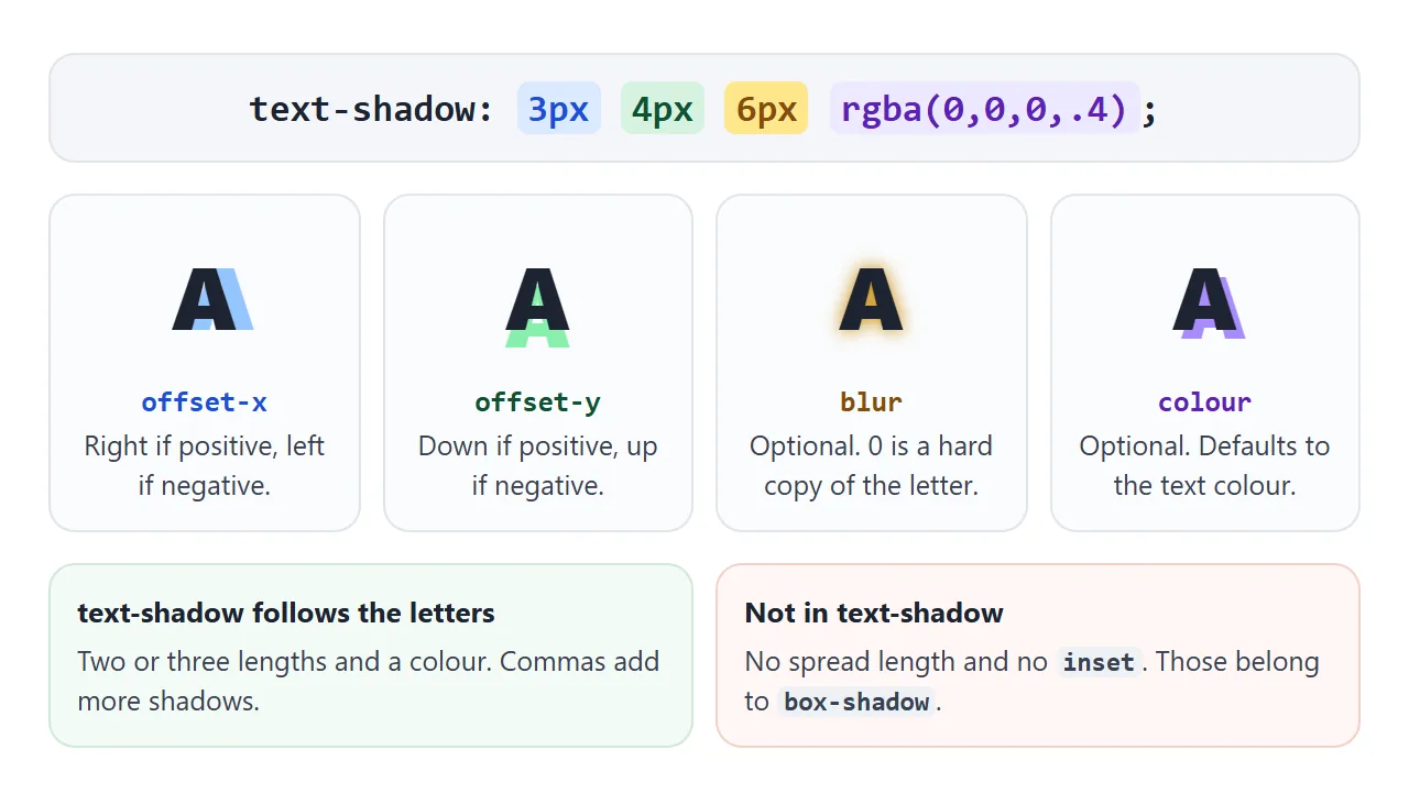
Each shadow takes two or three lengths and a colour. The two offsets are required. The blur and the colour are optional.
| Value | What it does | If you leave it out |
|---|---|---|
| offset-x | Moves the shadow right (positive) or left (negative) | Required |
| offset-y | Moves the shadow down (positive) or up (negative) | Required |
| blur | Softens the edges. A larger number spreads the shadow wider and fainter | 0, a hard copy |
| colour | Any CSS colour, before or after the lengths | The text colour |
A semi-transparent colour, such as rgba(0, 0, 0, .3), usually looks better than solid black. It darkens what is behind the letters instead of painting over it.
How text-shadow differs from box-shadow
box-shadow draws around the element's rectangle. text-shadow follows the shape of each letter. The syntax looks similar, but two parts are missing:
- No spread. A fourth length makes the whole declaration invalid, and the browser drops it. To make a shadow look thicker, stack several shadows instead.
- No inset. An inner shadow inside the letters is not part of
text-shadow.
Like box-shadow, a text shadow takes no space in the layout. Neighbouring text does not move when you add one.
Stacking shadows for effects
Most text effects are several shadows in one value, separated by commas. The first shadow in the list is painted on top, and each one after it goes further back.
<!doctype html>
<html lang="en">
<head>
<meta charset="utf-8">
<meta name="viewport" content="width=device-width, initial-scale=1">
<title>Text shadow effects</title>
<style>
  body { margin: 0; padding: 12px; font-family: system-ui, sans-serif; background: #eef0f3; }
  .grid { display: grid; grid-template-columns: repeat(auto-fill, minmax(170px, 1fr)); gap: 10px; }
  .tile { border-radius: 12px; padding: 14px 12px 10px; text-align: center; }
  .tile p { margin: 0; font: 800 40px/1.1 system-ui, sans-serif; }
  .tile small { display: block; margin-top: 8px; font: 12px ui-monospace, Consolas, monospace; opacity: .75; }

  /* 1. Subtle lift: one small, soft, dark shadow */
  .lift { background: #fff; color: #1d2330; }
  .lift p { text-shadow: 0 2px 3px rgba(0, 0, 0, .25); }

  /* 2. Glow: zero offset, blur only, light colour on dark */
  .glow { background: #111827; color: #fff; }
  .glow p { text-shadow: 0 0 12px rgba(255, 255, 255, .8); }

  /* 3. Neon: white-ish text, a few coloured blurs of growing size */
  .neon { background: #0b0b16; color: #fff0fb; }
  .neon p { text-shadow: 0 0 4px #fff, 0 0 10px #ff2ec4, 0 0 22px #ff2ec4, 0 0 40px #b0128a; }

  /* 4a. Outline with 8 shadows, one per direction */
  .out-sh { background: #fde68a; color: #fff; }
  .out-sh p {
    text-shadow: -2px -2px 0 #1d2330, 0 -2px 0 #1d2330, 2px -2px 0 #1d2330, 2px 0 0 #1d2330,
                 2px 2px 0 #1d2330, 0 2px 0 #1d2330, -2px 2px 0 #1d2330, -2px 0 0 #1d2330;
  }
  /* 4b. Outline with text-stroke (prefixed, centred on the letter edge) */
  .out-st { background: #fde68a; color: #fff; }
  .out-st p { -webkit-text-stroke: 2px #1d2330; }

  /* 5. Letterpress: dark text, 1px light shadow below */
  .press { background: #6b7280; color: #374151; }
  .press p { text-shadow: 0 1px 0 rgba(255, 255, 255, .45); }

  /* 6. Long shadow: many 1px steps, no blur (built in the script below) */
  .long { background: #2563eb; color: #fff; overflow: hidden; }

  /* 7. Blurred text: transparent colour, only the shadow is painted */
  .blurred { background: #fff; color: transparent; }
  .blurred p { text-shadow: 0 0 6px #1d2330; }
</style>
</head>
<body>
<div class="grid">
  <div class="tile lift"><p>Lift</p><small>0 2px 3px</small></div>
  <div class="tile glow"><p>Glow</p><small>0 0 12px white</small></div>
  <div class="tile neon"><p>Neon</p><small>4 coloured blurs</small></div>
  <div class="tile out-sh"><p>Outline</p><small>8 shadows</small></div>
  <div class="tile out-st"><p>Outline</p><small>-webkit-text-stroke</small></div>
  <div class="tile press"><p>Press</p><small>0 1px 0 light</small></div>
  <div class="tile long"><p id="long">Long</p><small>40 steps, built by JS</small></div>
  <div class="tile blurred"><p>Blurred</p><small style="color:#1d2330">color: transparent</small></div>
</div>

<script>
  // A long shadow is the same shadow repeated 1px further each time.
  const steps = [];
  for (let i = 1; i <= 40; i++) steps.push(`${i}px ${i}px 0 #1e40af`);
  document.getElementById('long').style.textShadow = steps.join(', ');
</script>
</body>
</html>
- Lift: one small, soft, dark shadow below the text, such as
0 2px 3px rgba(0, 0, 0, .25). - Glow: zero offsets and a blur only, in a light colour on a dark background.
- Neon: light text, then three or four blurs of one colour that grow in size.
- Letterpress: dark text on a mid-tone background with a 1px light shadow below. The letters look pressed into the surface.
- Long shadow: the same hard shadow repeated 1px further each time. A loop writes the list for you.
Here is the neon value from the example, to copy:
.neon {
  color: #fff0fb;
  text-shadow:
    0 0 4px #fff,
    0 0 10px #ff2ec4,
    0 0 22px #ff2ec4,
    0 0 40px #b0128a;
}
Outlined text: shadows or text-stroke
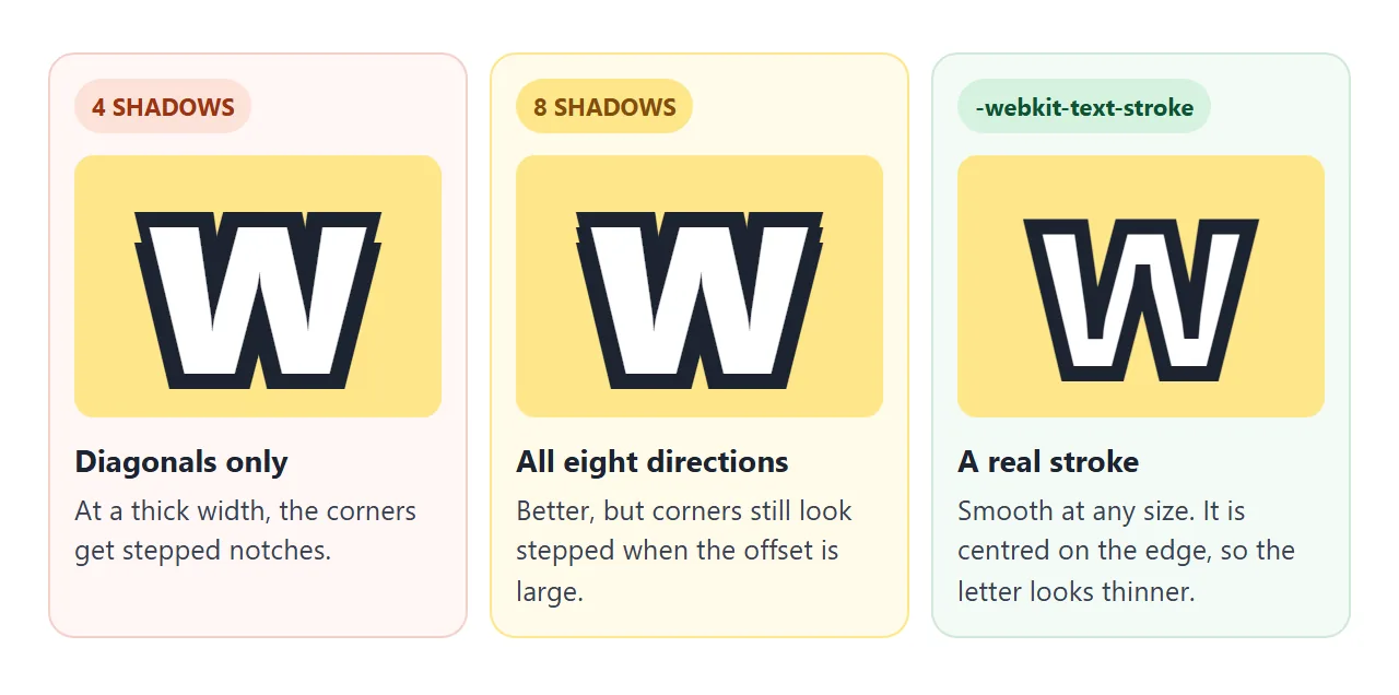
With no spread, the shadow way to outline text is several hard shadows pushed out in different directions. Four diagonal shadows leave notches. Eight directions close the gaps.
/* 8 directions, 2px outline */
.outline {
  color: #fff;
  text-shadow:
    -2px -2px 0 #1d2330, 0 -2px 0 #1d2330, 2px -2px 0 #1d2330, 2px 0 0 #1d2330,
    2px 2px 0 #1d2330, 0 2px 0 #1d2330, -2px 2px 0 #1d2330, -2px 0 0 #1d2330;
}
-webkit-text-stroke: 2px #1d2330 draws a real line along the letter edge instead. It is written with the -webkit- prefix. The line is centred on the edge, so half of it covers the fill. The CSS border guide explains why a border cannot do this job.
Use shadows for thin outlines of 1px to 2px. Use text-stroke for thick outlines on large display text.
Blurred and ghost text with a transparent colour
Set color: transparent and give the shadow its own colour. The letters disappear and only the shadow is painted, so 0 0 6px #1d2330 gives soft, blurred text.
The same trick with a zero blur and an offset draws a flat copy of the letters without the original.
The shadow needs an explicit colour here. Without one, it takes the text colour, which is now transparent, and nothing shows.
Text over images: shadow or overlay
White text on a photo reads fine over dark areas and disappears over light ones. There are two common fixes.
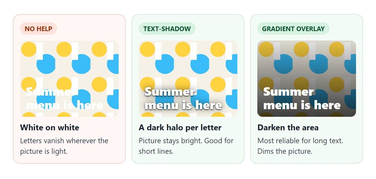
- text-shadow: one tight dark shadow plus one wider soft one. The picture stays bright and short headlines become readable.
- Gradient overlay: a dark gradient on a
::beforelayer between the picture and the text. It works for longer text too, at the cost of a dimmer picture.
Compare the two on a deliberately busy background:
<!doctype html>
<html lang="en">
<head>
<meta charset="utf-8">
<meta name="viewport" content="width=device-width, initial-scale=1">
<title>Readable hero headline</title>
<style>
  body { margin: 0; padding: 12px; font-family: system-ui, sans-serif; background: #eef0f3; }
  .modes { display: flex; flex-wrap: wrap; gap: 6px; margin-bottom: 10px; }
  .modes button {
    padding: 8px 12px; border: 1px solid #c9ced6; border-radius: 99px;
    background: #fff; font-size: 14px; cursor: pointer;
  }
  .modes button[aria-pressed="true"] { background: #1d2330; border-color: #1d2330; color: #fff; }

  .hero {
    position: relative; display: grid; align-content: center; min-height: 380px; padding: 24px;
    border-radius: 14px; overflow: hidden; color: #fff;
    /* a busy, high-contrast background drawn with inline SVG */
    background: url("data:image/svg+xml,%3Csvg xmlns='http://www.w3.org/2000/svg' width='120' height='120'%3E%3Crect width='120' height='120' fill='%23f5f1e6'/%3E%3Ccircle cx='30' cy='30' r='26' fill='%23ffd23f'/%3E%3Ccircle cx='90' cy='80' r='34' fill='%2338bdf8'/%3E%3Crect x='56' y='6' width='22' height='60' fill='%23ffffff'/%3E%3Cpath d='M0 110 L120 70' stroke='%23fb7185' stroke-width='10'/%3E%3C/svg%3E") 0 0 / 120px 120px;
  }
  .hero::before {               /* the overlay, off until .overlay is set */
    content: ""; position: absolute; inset: 0;
    background: linear-gradient(to top, rgba(0, 0, 0, .75), rgba(0, 0, 0, .15));
    opacity: 0; transition: opacity .2s;
  }
  .hero > * { position: relative; }  /* keep text above the overlay */
  .hero h1 { margin: 0 0 8px; font-size: clamp(30px, 8vw, 48px); line-height: 1.1; }
  .hero p { margin: 0; font-size: 18px; max-width: 30ch; }

  .hero.shadow h1, .hero.shadow p {
    text-shadow: 0 1px 2px rgba(0, 0, 0, .8), 0 0 12px rgba(0, 0, 0, .6);
  }
  .hero.overlay::before { opacity: 1; }
</style>
</head>
<body>
<div class="modes" id="modes">
  <button type="button" data-mode="" aria-pressed="false">No shadow</button>
  <button type="button" data-mode="shadow" aria-pressed="true">text-shadow</button>
  <button type="button" data-mode="overlay" aria-pressed="false">Gradient overlay</button>
</div>
<section class="hero shadow" id="hero">
  <h1>Summer menu is here</h1>
  <p>Twelve new dishes, one long table, every Friday night.</p>
</section>

<script>
  const hero = document.getElementById('hero');
  document.getElementById('modes').addEventListener('click', (e) => {
    const btn = e.target.closest('button');
    if (!btn) return;
    hero.className = ('hero ' + btn.dataset.mode).trim();
    document.querySelectorAll('#modes button').forEach((b) => b.setAttribute('aria-pressed', b === btn));
  });
</script>
</body>
</html>
For a real photo, set it as the section background. CSS background image covers sizing and placing it. Shadow and overlay can also be combined.
A note on performance
A large blur costs more paint work than a small one, and each layer adds some more. On long blocks of text, or when a shadow animates, keep the layers few and the blur modest. For a headline or a button label, it rarely matters.
When it does not work
| What you see | Cause | Fix |
|---|---|---|
| No shadow at all after adding a fourth length | text-shadow has no spread, so the value is invalid and ignored | Use three lengths, stack shadows for thickness |
| The shadow is there but invisible | Same colour as the background, or zero offsets and zero blur | Change the colour, or add an offset or blur |
| Transparent text shows nothing | The shadow has no colour and uses the transparent text colour | Give the shadow its own colour |
| Links and small text inside also get a shadow | text-shadow is inherited | text-shadow: none on the child |
| Outline looks jagged or notched on big text | Shadows are offset copies, not a stroke | Use eight directions, or -webkit-text-stroke |
| Glow looks muddy and grey | Too many layers, or a dark colour stacked many times | Two to four layers, light colours, growing blur |
Share it as a link
A neon heading or a readable hero is easier to show than to describe. A screenshot cannot show the sliders, and an .html attachment may open as plain code, or not at all, on a phone.
To send the working version, paste the page into a NOS document and choose Create share link. HTML to link walks through it.
The page renders as written and its scripts run, so the people you send it to can move the sliders themselves. If you change the code later, the same link shows the new version.