To set a background colour in CSS, give the element a background-color:
.card { background-color: #2563eb; }
The colour fills the element's content and padding, and runs under its border. It never fills the margin. The default value is transparent, and the property is not inherited: a child shows its parent's colour only because its own background is transparent.
Pick a colour and an alpha value below. The same colour is written three ways, and every line is valid CSS you can copy.
<!doctype html>
<html lang="en">
<head>
<meta charset="utf-8">
<meta name="viewport" content="width=device-width, initial-scale=1">
<title>One colour, three ways to write it</title>
<style>
  body { margin: 0; padding: 16px; font-family: system-ui, sans-serif; background: #f4f5f7; color: #1d2330; }
  .controls { display: flex; flex-wrap: wrap; gap: 14px; align-items: center; margin-bottom: 14px; }
  label { font-size: 14px; display: flex; align-items: center; gap: 8px; }
  input[type=color] { width: 48px; height: 36px; border: 0; padding: 0; background: none; }
  input[type=range] { width: 150px; }
  /* checkerboard so you can see through a see-through colour */
  .stage {
    border-radius: 12px; padding: 14px;
    background-color: #fff;
    background-image: linear-gradient(45deg, #d7dbe2 25%, transparent 25%, transparent 75%, #d7dbe2 75%),
                      linear-gradient(45deg, #d7dbe2 25%, transparent 25%, transparent 75%, #d7dbe2 75%);
    background-size: 20px 20px; background-position: 0 0, 10px 10px;
  }
  .sample { border-radius: 10px; padding: 18px; background-color: #2563eb; }
  .sample p { margin: 0; font-size: 18px; font-weight: 600; }
  .sample .dark { color: #111827; }
  .sample .light { color: #ffffff; margin-top: 6px; }
  .codes { margin-top: 14px; display: grid; gap: 6px; }
  .codes div { display: flex; gap: 10px; align-items: baseline; font-size: 14px; }
  .codes b { width: 44px; flex: none; color: #6b7280; font-weight: 600; }
  code { font: 14px ui-monospace, Consolas, monospace; background: #fff; border: 1px solid #e1e4ea; border-radius: 6px; padding: 3px 7px; word-break: break-all; }
</style>
</head>
<body>
<div class="controls">
  <label>Colour <input type="color" id="pick" value="#2563eb"></label>
  <label>Alpha <input type="range" id="alpha" min="0" max="100" value="100"> <span id="pct">100%</span></label>
</div>

<div class="stage">
  <div class="sample" id="sample">
    <p class="dark">Dark text on this background</p>
    <p class="light">White text on this background</p>
  </div>
</div>

<div class="codes">
  <div><b>hex</b><code id="hex"></code></div>
  <div><b>rgb</b><code id="rgb"></code></div>
  <div><b>hsl</b><code id="hsl"></code></div>
</div>

<script>
  const pick = document.getElementById('pick');
  const alpha = document.getElementById('alpha');
  const sample = document.getElementById('sample');

  // #rrggbb -> [r, g, b] as 0-255
  const toRgb = (hex) => [1, 3, 5].map((i) => parseInt(hex.slice(i, i + 2), 16));

  // [r, g, b] -> [hue 0-360, saturation %, lightness %]
  function toHsl([r, g, b]) {
    r /= 255; g /= 255; b /= 255;
    const max = Math.max(r, g, b), min = Math.min(r, g, b), d = max - min;
    const l = (max + min) / 2;
    let h = 0, s = 0;
    if (d) {
      s = d / (1 - Math.abs(2 * l - 1));
      if (max === r) h = ((g - b) / d) % 6;
      else if (max === g) h = (b - r) / d + 2;
      else h = (r - g) / d + 4;
      h = (h * 60 + 360) % 360;
    }
    return [Math.round(h), Math.round(s * 100), Math.round(l * 100)];
  }

  function update() {
    const a = alpha.value / 100;
    const [r, g, b] = toRgb(pick.value);
    const [h, s, l] = toHsl([r, g, b]);
    const aHex = Math.round(a * 255).toString(16).padStart(2, '0');
    const slash = a < 1 ? ' / ' + a : '';  // alpha part only when it is not solid

    const css = {
      hex: a < 1 ? pick.value + aHex : pick.value,
      rgb: `rgb(${r} ${g} ${b}${slash})`,
      hsl: `hsl(${h} ${s}% ${l}%${slash})`,
    };
    for (const k in css) document.getElementById(k).textContent = 'background-color: ' + css[k] + ';';
    document.getElementById('pct').textContent = alpha.value + '%';
    sample.style.backgroundColor = css.rgb;  // hex and rgb are exact; hsl is rounded to whole numbers
  }

  pick.addEventListener('input', update);
  alpha.addEventListener('input', update);
  update();
</script>
</body>
</html>
The colour formats
All of these paint the same kind of fill. Pick the one that is easiest to read in your stylesheet.
| Format | Example | Notes |
|---|---|---|
| Name | tomato |
A fixed list, from aliceblue to yellowgreen |
| Hex, 6 digits | #2563eb |
Red, green, blue in pairs |
| Hex, 3 digits | #26e |
Short form of #2266ee |
| Hex, 8 digits | #2563eb80 |
Last pair is alpha, 80 is about 50% |
| rgb() | rgb(37 99 235) |
Each channel 0 to 255 |
| rgb() with alpha | rgb(37 99 235 / 0.5) |
Same as rgba(37, 99, 235, 0.5) |
| hsl() | hsl(221 83% 53%) |
Hue, saturation, lightness |
| Keyword | transparent |
No paint at all |
The space-separated form with a slash is the modern syntax. The older comma form, rgba(37, 99, 235, 0.5), still works. Do not mix the two inside one function, or the whole declaration is dropped.
hsl() is the easiest to adjust by hand. Keep the hue and change only the lightness, and you get a lighter or darker shade of the same colour, which suits hover states and panels.
Transparent colours
An alpha value lets the parent show through. It fades only the fill, not the text on top, which is the usual reason to prefer it over opacity. CSS opacity shows the two side by side.
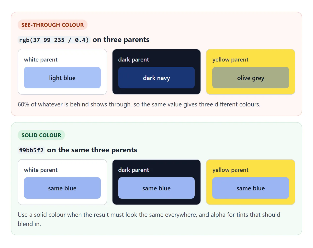
The catch is that a see-through colour has no fixed look. It mixes with whatever sits behind it.
background-color vs the background shorthand
background is a shorthand for the colour, image, position, size, repeat and a few more parts. Any part you leave out is reset to its default, and the default colour is transparent.
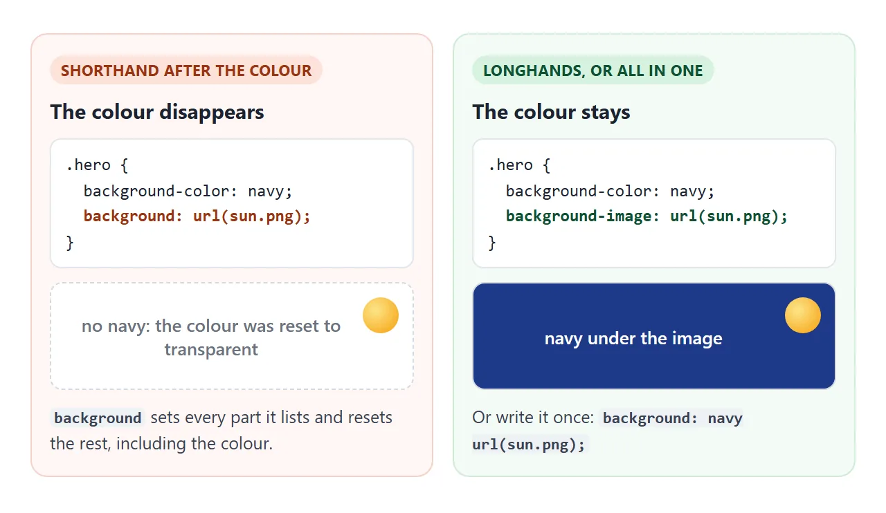
So this loses the navy:
.hero {
  background-color: navy;
  background: url(sun.png) no-repeat;  /* colour reset to transparent */
}
Either set the image with background-image, or put the colour in the shorthand: background: navy url(sun.png) no-repeat;. Gradients are images too, so the same rule applies to them. CSS gradient backgrounds cover those.
Where the background paints: padding, border, margin
By default the colour fills the border box. You only notice the part under the border when the border is dashed, dotted or see-through. background-clip changes where it stops.
<!doctype html>
<html lang="en">
<head>
<meta charset="utf-8">
<meta name="viewport" content="width=device-width, initial-scale=1">
<title>Where the background paints</title>
<style>
  body { margin: 0; padding: 16px; font-family: system-ui, sans-serif; background: #f4f5f7; color: #1d2330; }
  .opts { display: flex; flex-wrap: wrap; gap: 8px; margin-bottom: 14px; }
  .opts label { font: 14px ui-monospace, Consolas, monospace; background: #fff; border: 1px solid #d5d9e0; border-radius: 8px; padding: 7px 10px; cursor: pointer; }
  .opts input { margin: 0 6px 0 0; }
  /* the parent shows the margin area as stripes */
  .parent {
    background: repeating-linear-gradient(45deg, #fff, #fff 6px, #eceef2 6px, #eceef2 12px);
    border: 1px solid #d5d9e0; border-radius: 10px; overflow: hidden;
  }
  .box {
    margin: 28px;                              /* never painted by .box */
    border: 12px dashed rgb(17 24 39 / 0.55);  /* dashed, so you can see under it */
    padding: 24px;
    background-color: #fbbf24;
    background-clip: border-box;               /* the default */
  }
  .content { background: rgb(255 255 255 / 0.7); outline: 1px dashed #6b7280; padding: 10px; font-size: 14px; text-align: center; }
  .legend { display: flex; flex-wrap: wrap; gap: 6px 16px; margin-top: 12px; font-size: 13px; color: #374151; }
  #out { margin-top: 10px; font: 14px ui-monospace, Consolas, monospace; }
</style>
</head>
<body>
<div class="opts" id="opts">
  <label><input type="radio" name="clip" value="border-box" checked>border-box</label>
  <label><input type="radio" name="clip" value="padding-box">padding-box</label>
  <label><input type="radio" name="clip" value="content-box">content-box</label>
</div>

<div class="parent">
  <div class="box" id="box"><div class="content">content</div></div>
</div>

<div class="legend">
  <span>Stripes = margin (never painted)</span>
  <span>Dashes = border</span>
  <span>Yellow = background-color</span>
</div>
<div id="out"></div>

<script>
  const box = document.getElementById('box');
  const out = document.getElementById('out');

  function show() {
    out.textContent = 'background-clip: ' + getComputedStyle(box).backgroundClip + ';';
  }

  document.getElementById('opts').addEventListener('change', (e) => {
    box.style.backgroundClip = e.target.value;  // where the colour stops
    show();
  });
  show();
</script>
</body>
</html>
border-box(default): under the border as well.padding-box: stops at the inside edge of the border.content-box: only behind the content, padding stays clear.
Margin is always outside the element's paint. To colour the gap between two cards, paint their parent.
A background colour for the whole page
The root element's background covers the whole browser canvas, not just the height of the content. When html has no background, the browser uses the body background for the canvas instead.
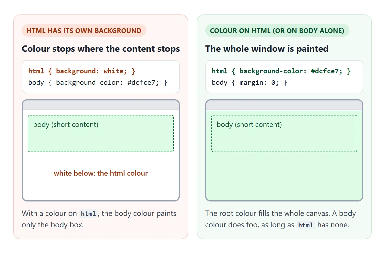
html { background-color: #f4f5f7; }
body { margin: 0; }
This is the simplest way to fill the window. Trouble starts when a reset or template sets html { background: white; } and you then colour only body.
Readable text on a coloured background
Every background colour needs a text colour that stands out from it. WCAG, the web accessibility guideline, asks for a contrast ratio of at least 4.5:1 for normal text and 3:1 for large text at level AA.
The theme demo below computes that ratio live. HTML font color has a table of safe text and background pairs.
Hover colours and themes with variables
Change the colour on :hover and add a short transition so the switch is smooth:
.cta { background-color: #2563eb; transition: background-color 0.2s; }
.cta:hover, .cta:focus-visible { background-color: #1d4ed8; }
For links, the order of the state rules matters. HTML link hover color walks through it.
When every background reads a CSS variable, one set of new values repaints the whole page. That is how theme switchers and dark mode work.
<!doctype html>
<html lang="en">
<head>
<meta charset="utf-8">
<meta name="viewport" content="width=device-width, initial-scale=1">
<title>Theme switcher with background-color variables</title>
<style>
  /* every background colour comes from one of these variables */
  :root {
    --page: #f4f5f7;
    --card: #ffffff;
    --text: #111827;
    --muted: #4b5563;
    --accent: #2563eb;
    --accent-hover: #1d4ed8;
    --on-accent: #ffffff;
  }
  html { background-color: var(--page); }  /* fills the whole frame */
  body { margin: 0; padding: 16px; font-family: system-ui, sans-serif; color: var(--text); }
  .themes { display: flex; flex-wrap: wrap; gap: 8px; margin-bottom: 14px; }
  .themes button {
    font: 14px system-ui, sans-serif; padding: 8px 12px; border-radius: 8px; cursor: pointer;
    border: 1px solid var(--muted); background-color: var(--card); color: var(--text);
  }
  .themes button[aria-pressed="true"] { outline: 3px solid var(--accent); outline-offset: 1px; }
  .card { background-color: var(--card); border-radius: 12px; padding: 18px; box-shadow: 0 4px 14px rgb(0 0 0 / 0.08); }
  .card h2 { margin: 0 0 6px; font-size: 20px; }
  .card p { margin: 0 0 14px; color: var(--muted); line-height: 1.5; }
  .cta {
    font: 600 15px system-ui, sans-serif; border: 0; border-radius: 8px; padding: 10px 16px; cursor: pointer;
    background-color: var(--accent); color: var(--on-accent);
    transition: background-color 0.2s;
  }
  .cta:hover, .cta:focus-visible { background-color: var(--accent-hover); }
  .check { margin-top: 14px; font: 14px ui-monospace, Consolas, monospace; display: grid; gap: 4px; }
</style>
</head>
<body>
<div class="themes" id="themes">
  <button type="button" data-theme="light" aria-pressed="true">Light</button>
  <button type="button" data-theme="dark" aria-pressed="false">Dark</button>
  <button type="button" data-theme="sand" aria-pressed="false">Sand</button>
  <button type="button" data-theme="forest" aria-pressed="false">Forest</button>
</div>

<div class="card">
  <h2>Monthly report</h2>
  <p>Every background on this page reads a CSS variable. The buttons above change the variables, not the rules.</p>
  <button type="button" class="cta">Open the report</button>
</div>

<div class="check" id="check"></div>

<script>
  const themes = {
    light:  { page: '#f4f5f7', card: '#ffffff', text: '#111827', muted: '#4b5563', accent: '#2563eb', 'accent-hover': '#1d4ed8', 'on-accent': '#ffffff' },
    dark:   { page: '#0f172a', card: '#1e293b', text: '#f1f5f9', muted: '#cbd5e1', accent: '#60a5fa', 'accent-hover': '#93c5fd', 'on-accent': '#0f172a' },
    sand:   { page: '#f5efe3', card: '#fffaf0', text: '#3b2f1e', muted: '#6b5a41', accent: '#9a3412', 'accent-hover': '#7c2d12', 'on-accent': '#ffffff' },
    forest: { page: '#0b2e22', card: '#123d2e', text: '#ecfdf5', muted: '#bbf7d0', accent: '#34d399', 'accent-hover': '#6ee7b7', 'on-accent': '#052e1f' },
  };

  // contrast ratio between two #rrggbb colours (WCAG formula)
  function lum(hex) {
    const c = [1, 3, 5].map((i) => parseInt(hex.slice(i, i + 2), 16) / 255)
      .map((v) => (v <= 0.03928 ? v / 12.92 : ((v + 0.055) / 1.055) ** 2.4));
    return 0.2126 * c[0] + 0.7152 * c[1] + 0.0722 * c[2];
  }
  function ratio(a, b) {
    const [hi, lo] = [lum(a), lum(b)].sort((x, y) => y - x);
    return (hi + 0.05) / (lo + 0.05);
  }

  function apply(name) {
    const t = themes[name];
    for (const k in t) document.documentElement.style.setProperty('--' + k, t[k]);
    document.querySelectorAll('#themes button').forEach((b) =>
      b.setAttribute('aria-pressed', String(b.dataset.theme === name)));

    const rows = [['text on card', t.text, t.card], ['muted on card', t.muted, t.card], ['button text', t['on-accent'], t.accent]];
    document.getElementById('check').innerHTML = rows.map(([label, fg, bg]) => {
      const r = ratio(fg, bg);
      return `<div>${label}: ${r.toFixed(1)}:1 ${r >= 4.5 ? 'passes' : 'below'} 4.5:1</div>`;
    }).join('');
  }

  document.getElementById('themes').addEventListener('click', (e) => {
    const b = e.target.closest('button');
    if (b) apply(b.dataset.theme);
  });
  apply('light');
</script>
</body>
</html>
:root { --page: #f4f5f7; --card: #ffffff; --accent: #2563eb; }
html  { background-color: var(--page); }
.card { background-color: var(--card); }
When it does not work
| What you see | Cause | Fix |
|---|---|---|
| No colour at all on a box | Its children are floated or absolutely positioned, so the box has no height | display: flow-root for floats, or a min-height |
| The colour worked, then vanished | A background shorthand later in the cascade reset it |
Use background-image, or put the colour in the shorthand |
| An rgba colour looks darker or lighter in one place | Alpha mixes with the parent behind it | Use a solid colour where it must match |
| Page colour stops halfway down | html has its own background, so body paints only its own box |
Put the colour on html |
| The rule is ignored | Invalid value, such as a 5-digit hex, none, or mixed commas and slash |
Use 3, 4, 6 or 8 hex digits, or transparent |
| Hover colour never shows | A more specific rule sets the colour | Match the selector's specificity in the :hover rule |
Browser developer tools show a crossed-out declaration when it is invalid or overridden. That is the fastest way to tell the last three cases apart.
Share it as a link
A screenshot of a colour scheme is a still picture. Nobody can hover the buttons, switch the themes or read the contrast check.
To send the live version, paste the page into a NOS document and choose Create share link. HTML to link walks through it.
The page renders as written and its scripts run, so the people you send it to can switch the themes themselves. If you change a colour later, the same link shows the new version.