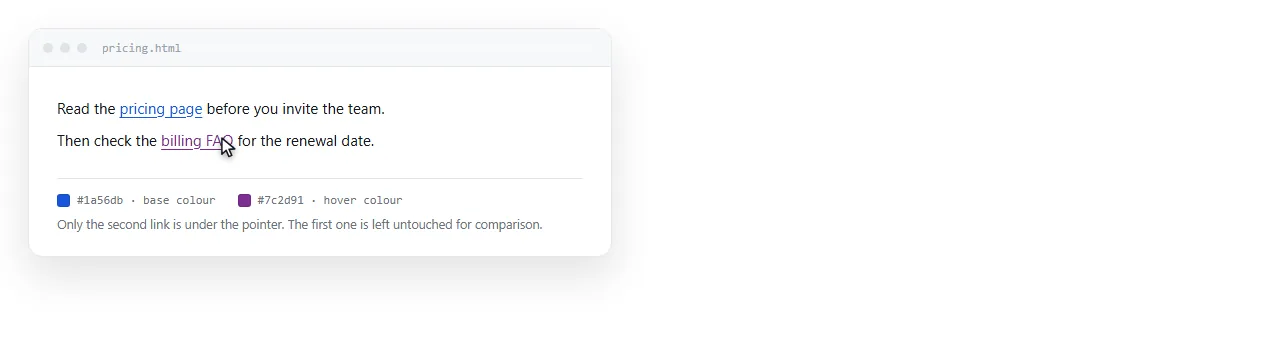
To set an HTML link hover color, write a rule for the :hover pseudo-class.
a { color: #2563eb; }
a:hover { color: #1e40af; }
The second rule applies while the pointer is over the link. That part is simple. The part that goes wrong is the order the rules appear in.
The order that makes it work
Five pseudo-classes describe a link's states, and they all have the same specificity. When two of them match at once, the one written last wins.
a:link    { color: #2563eb; }
a:visited { color: #7c3aed; }
a:focus-visible { outline: 2px solid #2563eb; }
a:hover   { color: #1e40af; }
a:active  { color: #172554; }
If a:visited is written below a:hover, then hovering a link the reader has already opened keeps the visited colour. The hover colour works on new links only.
That symptom, "it works on some links", is nearly always this. The usual memory aid is LVHA: link, visited, hover, active, with focus before hover.
| State | When it applies | Typical use |
|---|---|---|
:link |
An unvisited link | Base colour |
:visited |
Already opened | A muted variant |
:focus-visible |
Reached by keyboard | A visible ring |
:hover |
Pointer is over it | Colour or background shift |
:active |
Being pressed | A brief darker state |
What visited links will let you change
Browsers restrict styling on :visited deliberately, because a page could otherwise read a person's history by measuring how links render.
You can change colour, background colour and border colour. You cannot change size, weight, display or anything that alters layout, and the computed style is reported as if the link were unvisited.
So a visited style is a colour shift and nothing more. Plan around that rather than trying to work past it.
More than colour
Colour alone is a weak hover signal, and readers with low vision or a low contrast monitor may not register it.
a:hover {
  color: #1e40af;
  text-decoration-thickness: 2px;
}

.nav a:hover {
  background: rgba(0,0,0,.06);
  border-radius: 4px;
}
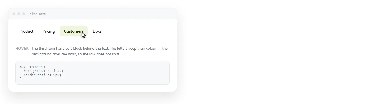
An underline that thickens, or a faint background block, is visible to more people than a shift from one blue to another.
For links that already have no underline, a background change is usually the clearest. Links without underlines covers which links should be in that group.
Focus needs its own rule
Hover does not exist for keyboard users. If your only clickable signal is a hover style, tabbing through the page shows nothing.
a:focus-visible {
  outline: 2px solid #2563eb;
  outline-offset: 2px;
}
:focus-visible shows the ring when the link is reached by keyboard and not on a mouse click, which is usually what people wanted when they removed the default outline.
Never write outline: none without a replacement. It is the most damaging single line in this area.
Touch devices
On a phone a tap fires hover briefly, then navigates. Some browsers leave the hover state stuck on the last tapped element.
The consequence is that hover cannot carry meaning. If a card is only identifiable as clickable on hover, half your readers never learn that it is.
If you want hover effects restricted to devices that actually have a pointer:
@media (hover: hover) {
  a:hover { background: rgba(0,0,0,.06); }
}
That keeps the stuck state off touch screens while leaving the desktop behaviour intact.
Contrast, in both themes
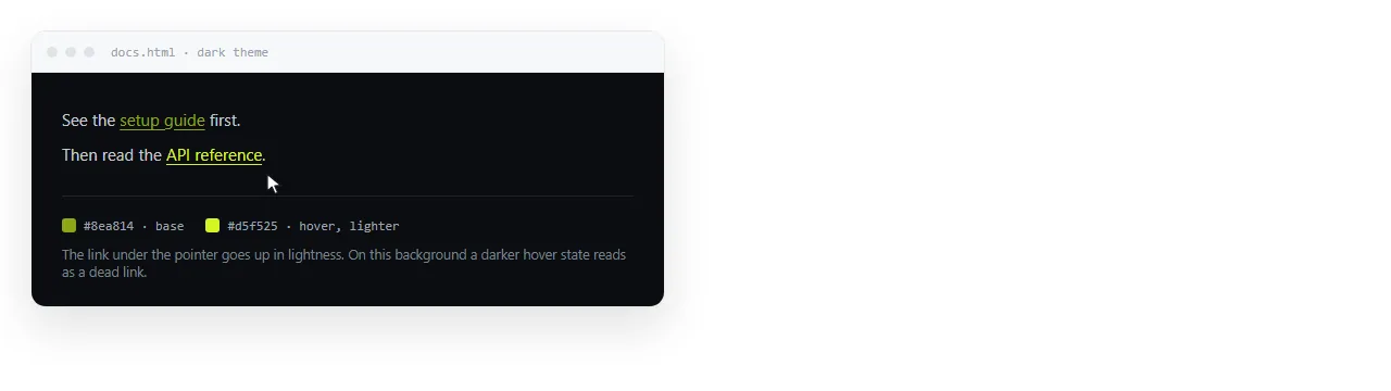
A hover colour has two jobs: differ from the base colour, and stay readable on the background.
Going darker on a light background is safe. Going darker on a dark background is the usual mistake, and the link becomes harder to read exactly while the reader is pointing at it.
a { color: #2563eb; }
a:hover { color: #1e40af; }

@media (prefers-color-scheme: dark) {
  a { color: #93c5fd; }
  a:hover { color: #dbeafe; }
}
On dark, hover moves toward white rather than away from it. Dark mode CSS covers the wider set of pairs.
A short transition
a {
  color: #2563eb;
  transition: color .15s ease;
}
Put the transition on the base rule, not on :hover, so it applies on the way out as well as on the way in.
Keep it short. Anything past about 200 milliseconds reads as lag rather than polish on an element people move across quickly.
Keeping the styles attached to the file
A page that gets pasted or emailed may arrive without its stylesheet, and pseudo-classes cannot be written in a style attribute.
That means hover styling needs a <style> block inside the document itself. Inline CSS covers the trade offs between the two.
<style>
  a { color: #2563eb; text-decoration: none; }
  a:hover { color: #1e40af; text-decoration: underline; }
</style>
In a NOS document the pasted HTML renders as written, including a style block of this kind, so hover states behave the same for the reader as in your own browser.
If the rules live in an external file the page cannot reach, fold them in before sharing.
A default to start from
a { color: #2563eb; transition: color .15s ease; }
a:visited { color: #6d28d9; }
a:focus-visible { outline: 2px solid #2563eb; outline-offset: 2px; }
a:hover { color: #1e40af; text-decoration-thickness: 2px; }
a:active { color: #172554; }
Five rules, in the order that makes them all apply. Change the colours to your own and the behaviour stays correct.
Three habits keep it working as the page grows.
- Add new link rules below this block, never above it, so the state order survives.
- Never delete the focus rule to tidy up the appearance. Replace it if you dislike the default ring.
- Check the hover colour against the background, not only against the base colour.
If the links in question are styled as buttons, hover usually belongs on the background rather than the text. HTML button with a link shows that variant.