A hover effect in CSS is a :hover rule that changes one property, plus a transition on the element's normal rule so the change eases in and back out. That covers every effect on this page.
The work is in picking the right property and making the effect reach keyboard and touch readers too.
Start with the two smallest ones. Hover the button and the link with a mouse, then press Tab to reach them with the keyboard.
<!doctype html>
<html lang="en">
<head>
<meta charset="utf-8">
<meta name="viewport" content="width=device-width, initial-scale=1">
<title>Hover effects: lift and underline</title>
<style>
  body { margin: 0; padding: 24px 16px; font-family: system-ui, sans-serif; background: #f4f5f7; color: #1d2330; }
  .row { display: flex; flex-wrap: wrap; gap: 18px; align-items: center; }

  /* 1. Lift: move up and deepen the shadow */
  .lift {
    font: 600 16px system-ui, sans-serif; color: #fff; background: #2563eb;
    border: 0; border-radius: 10px; padding: 12px 22px; cursor: pointer;
    box-shadow: 0 2px 6px rgba(0, 0, 0, .15);
    transition: transform .2s ease, box-shadow .2s ease;  /* on the resting state */
  }

  /* 2. Underline grow: a 2px background line from 0% to 100% wide */
  .grow {
    font-size: 17px; color: #1d4ed8; text-decoration: none;
    background: linear-gradient(currentColor, currentColor) left bottom / 0% 2px no-repeat;
    transition: background-size .25s ease;
  }

  /* Hover only where the main pointer can hover (not on touch screens) */
  @media (hover: hover) {
    .lift:hover { transform: translateY(-3px); box-shadow: 0 10px 20px rgba(0, 0, 0, .2); }
    .grow:hover { background-size: 100% 2px; }
  }

  /* The same look for keyboard focus, on every device */
  .lift:focus-visible { transform: translateY(-3px); box-shadow: 0 10px 20px rgba(0, 0, 0, .2); }
  .grow:focus-visible { background-size: 100% 2px; }
  :focus-visible { outline: 3px solid #f59e0b; outline-offset: 3px; }

  p { font-size: 14px; color: #4b5563; margin: 22px 0 0; line-height: 1.5; }
  #mode { color: #0f5132; }
</style>
</head>
<body>
<div class="row">
  <button class="lift" type="button">Lift button</button>
  <a class="grow" href="#">Underline grows</a>
</div>
<p>Hover with a mouse, or press Tab to focus them.<br>
This screen: <b id="mode"></b></p>

<script>
  // Show which hover media query matches on this device
  const mq = matchMedia('(hover: hover)');
  const show = () => {
    document.getElementById('mode').textContent = mq.matches
      ? '(hover: hover), hover effects on'
      : '(hover: none), hover effects off';
  };
  show();
  mq.addEventListener('change', show);
</script>
</body>
</html>
The pattern behind every effect
Each effect has three parts. The resting rule holds the transition. The :hover rule changes the property. A :focus-visible rule gives keyboard readers the same change.
| Effect | Property that changes | Used on |
|---|---|---|
| Lift | transform and box-shadow |
Buttons, cards |
| Underline grow | background-size |
Text links |
| Image zoom | transform: scale() on the image |
Photos, thumbnails |
| Overlay caption | transform: translateY() on the caption |
Gallery tiles |
All four change transform, box-shadow or a background. None of them changes width, height or margin, so the elements around them never move. Why the transition belongs on the resting rule, and not inside :hover, is covered in CSS hover transition.
Lift: move up, deepen the shadow
A button that rises a few pixels and casts a larger shadow reads as something you can press. Two properties do it:
.lift {
  box-shadow: 0 2px 6px rgba(0, 0, 0, .15);
  transition: transform .2s ease, box-shadow .2s ease;
}
.lift:hover {
  transform: translateY(-3px);
  box-shadow: 0 10px 20px rgba(0, 0, 0, .2);
}
Keep the distance small. A few pixels feels like a response, and a larger jump pulls the button away from the pointer. The same rule works on a whole card, as the finished gallery below shows.
Underline that grows from the left
The text-decoration underline has no length you can grow from zero. Draw the line as a background instead: a gradient of one colour, 2 pixels tall, 0% wide at rest and 100% wide on hover.
.grow {
  text-decoration: none;
  background: linear-gradient(currentColor, currentColor)
              left bottom / 0% 2px no-repeat;
  transition: background-size .25s ease;
}
.grow:hover { background-size: 100% 2px; }
currentColor makes the line match the link text, so it follows any colour you set on hover. To start the line from the centre, change left bottom to center bottom. For colour-only link effects, see HTML link hover color.
Image zoom and overlay caption
The next two work on pictures. The tiles below use CSS gradients in place of photos, and the rules are the same for an <img>.
<!doctype html>
<html lang="en">
<head>
<meta charset="utf-8">
<meta name="viewport" content="width=device-width, initial-scale=1">
<title>Hover effects: image zoom and overlay caption</title>
<style>
  body { margin: 0; padding: 16px; font-family: system-ui, sans-serif; background: #f4f5f7; color: #1d2330; }
  .grid { display: grid; grid-template-columns: repeat(auto-fit, minmax(150px, 1fr)); gap: 14px; max-width: 520px; }

  .tile {
    display: block; position: relative; aspect-ratio: 4 / 3;
    border-radius: 12px; color: #fff; text-decoration: none;
    overflow: hidden;  /* clips the zoomed image and the hidden caption */
  }
  .pic { width: 100%; height: 100%; transition: transform .4s ease; }
  .a { background: linear-gradient(160deg, #fde68a, #f97316 55%, #7c2d12); }
  .b { background: linear-gradient(200deg, #bae6fd, #0ea5e9 50%, #1e3a8a); }
  .label { position: absolute; top: 8px; left: 10px; font: 700 12px system-ui, sans-serif;
           background: rgba(0, 0, 0, .45); padding: 3px 7px; border-radius: 6px; }

  /* Caption is visible by default, so touch screens always show it */
  .cap { position: absolute; left: 0; right: 0; bottom: 0; padding: 10px 12px; font-size: 14px;
         background: rgba(15, 23, 42, .78); transition: transform .3s ease; }

  @media (hover: hover) {
    .zoom:hover .pic { transform: scale(1.12); }
    .over .cap { transform: translateY(100%); }   /* parked just below the tile */
    .over:hover .cap { transform: translateY(0); }
  }
  .zoom:focus-visible .pic { transform: scale(1.12); }
  .over:focus-visible .cap { transform: translateY(0); }
  .tile:focus-visible { outline: 3px solid #f59e0b; outline-offset: 3px; }

  p { font-size: 13px; color: #4b5563; margin: 12px 0 0; }
</style>
</head>
<body>
<div class="grid">
  <a class="tile zoom" href="#">
    <div class="pic a" role="img" aria-label="Orange sunset"></div>
    <span class="label">Image zoom</span>
  </a>
  <a class="tile over" href="#">
    <div class="pic b" role="img" aria-label="Blue sea"></div>
    <span class="label">Overlay caption</span>
    <span class="cap">Harbour at dawn, 6:10 am</span>
  </a>
</div>
<p>Hover, or press Tab to reach a tile. On a touch screen the caption is always shown.</p>
</body>
</html>
The zoom scales the image, not the tile. The tile has overflow: hidden, so the picture grows inside the same box and nothing around it moves.
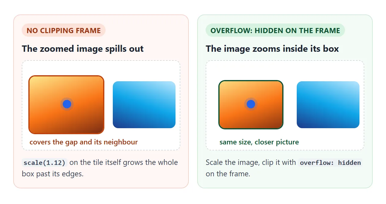
.tile { overflow: hidden; border-radius: 12px; }
.tile img { transition: transform .4s ease; }
.tile:hover img { transform: scale(1.12); }
The caption uses the same clipping. It is positioned at the bottom of the tile and pushed down by its own height with translateY(100%), which parks it just outside the visible box. On hover it moves back to zero.
Keyboard focus gets the same effect
A :hover rule does nothing for someone moving through the page with the Tab key. Give the element the same change under :focus-visible, and keep a visible outline so the reader can see where focus is.
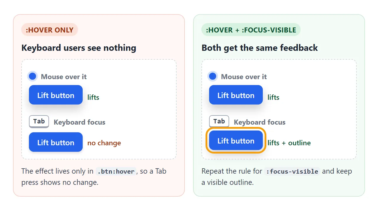
.lift:focus-visible {
  transform: translateY(-3px);
  outline: 3px solid #f59e0b;
  outline-offset: 3px;
}
:focus-visible is the right choice over :focus here. Browsers normally do not match it after a mouse click on a button, so mouse readers do not see an outline appear on every click.
For a card that wraps an image and a link, put the rule on the link element itself. For the outline options, see CSS outline.
Touch screens: the hover media query
A phone has no pointer that rests over an element. A tap can apply :hover for a moment, or leave it stuck until the reader taps somewhere else. An effect that hides content until hover can hide it from touch readers for good.
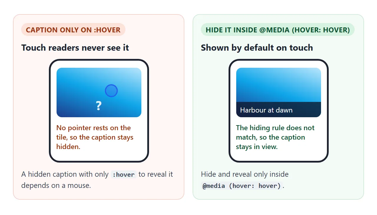
The fix is the hover media feature. (hover: hover) matches when the main input can hover, such as a mouse or trackpad. On a touch screen it does not match, so the rules inside it are skipped.
.cap { transform: none; }            /* touch: always visible */

@media (hover: hover) {
  .cap { transform: translateY(100%); }
  .tile:hover .cap { transform: none; }
}
Write the resting state as the version that works without hover, and add the hiding and revealing only inside the query.
The first example on this page prints which one your screen matches. There is also any-hover, which matches if any connected input can hover. More on media features in media queries.
A finished gallery card
The last example puts the four effects on one card. The card lifts, the image zooms, the caption slides in and the "View photos" link underlines, all from one hover or one keyboard focus.
<!doctype html>
<html lang="en">
<head>
<meta charset="utf-8">
<meta name="viewport" content="width=device-width, initial-scale=1">
<title>Hover effect gallery</title>
<style>
  body { margin: 0; padding: 16px; font-family: system-ui, sans-serif; background: #eef1f5; color: #1d2330; }
  .grid { display: grid; grid-template-columns: repeat(auto-fit, minmax(150px, 1fr)); gap: 16px; }

  .card {
    display: block; background: #fff; border-radius: 14px; overflow: hidden;
    color: inherit; text-decoration: none; box-shadow: 0 2px 6px rgba(0, 0, 0, .08);
    transition: transform .2s ease, box-shadow .2s ease;
  }
  .frame { position: relative; overflow: hidden; aspect-ratio: 4 / 3; }
  .pic { height: 100%; transition: transform .4s ease; }
  .cap { position: absolute; left: 0; right: 0; bottom: 0; padding: 8px 10px; font-size: 13px;
         color: #fff; background: rgba(15, 23, 42, .78); transition: transform .3s ease; }
  .text { padding: 10px 12px 14px; }
  .text h3 { margin: 0 0 6px; font-size: 15px; }
  .more { font-size: 14px; color: #1d4ed8;
          background: linear-gradient(currentColor, currentColor) left bottom / 0% 2px no-repeat;
          transition: background-size .25s ease; }

  /* Mouse and trackpad: all four effects on hover */
  @media (hover: hover) {
    .cap { transform: translateY(100%); }
    .card:hover { transform: translateY(-4px); box-shadow: 0 12px 24px rgba(0, 0, 0, .16); }
    .card:hover .pic { transform: scale(1.1); }
    .card:hover .cap { transform: none; }
    .card:hover .more { background-size: 100% 2px; }
  }

  /* Keyboard: the same four effects, plus an outline */
  .card:focus-visible { transform: translateY(-4px); box-shadow: 0 12px 24px rgba(0, 0, 0, .16);
                        outline: 3px solid #f59e0b; outline-offset: 3px; }
  .card:focus-visible .pic { transform: scale(1.1); }
  .card:focus-visible .cap { transform: none; }
  .card:focus-visible .more { background-size: 100% 2px; }

  /* Reduced motion: no lift, no zoom, no sliding. Caption and underline just appear. */
  @media (prefers-reduced-motion: reduce) {
    .card, .pic, .cap, .more { transition: none; }
    .card:hover, .card:focus-visible, .card:hover .pic, .card:focus-visible .pic { transform: none; }
  }
</style>
</head>
<body>
<div class="grid">
  <a class="card" href="#">
    <div class="frame">
      <div class="pic" style="background: linear-gradient(160deg, #fde68a, #f97316 55%, #7c2d12)" role="img" aria-label="Desert"></div>
      <span class="cap">Dunes, late afternoon</span>
    </div>
    <div class="text"><h3>Desert</h3><span class="more">View photos</span></div>
  </a>
  <a class="card" href="#">
    <div class="frame">
      <div class="pic" style="background: linear-gradient(200deg, #bae6fd, #0ea5e9 50%, #1e3a8a)" role="img" aria-label="Coast"></div>
      <span class="cap">Harbour at dawn</span>
    </div>
    <div class="text"><h3>Coast</h3><span class="more">View photos</span></div>
  </a>
  <a class="card" href="#">
    <div class="frame">
      <div class="pic" style="background: linear-gradient(170deg, #d9f99d, #22c55e 50%, #14532d)" role="img" aria-label="Forest"></div>
      <span class="cap">Pine trail after rain</span>
    </div>
    <div class="text"><h3>Forest</h3><span class="more">View photos</span></div>
  </a>
</div>
</body>
</html>
- One trigger: every rule starts from
.card:hoveror.card:focus-visible, so the parts move together. - Two clips: the card and the image frame both have
overflow: hidden, so the zoom and the caption stay inside. - Reduced motion: readers who ask their system for less motion get no lift and no zoom.
@media (prefers-reduced-motion: reduce) {
  .card, .pic, .cap, .more { transition: none; }
  .card:hover, .card:hover .pic { transform: none; }
}
The layout of the cards themselves is covered in HTML card layout, and a full photo grid in HTML image gallery.
When it does not work
| What you see | Cause | Fix |
|---|---|---|
| The effect snaps back with no easing | transition is inside the :hover rule |
Move it to the resting rule |
transform does nothing on a link |
An inline link cannot be transformed | Set display: inline-block |
| The zoomed image covers its neighbour | Nothing clips the scale | overflow: hidden on the frame |
| Neighbours shift when you hover | The hover changes width, padding or margin | Use transform instead |
| A tapped card stays lifted on a phone | Touch applied :hover and kept it |
Wrap hover rules in (hover: hover) |
| Keyboard readers see no change | The effect only exists on :hover |
Add the same :focus-visible rule |
| The caption never shows on a phone | It is hidden outside the media query | Hide it only inside (hover: hover) |
Share it as a link
Hover effects have to be felt with a pointer. A screenshot shows one frozen state, and an .html attachment may open as plain code, or not at all, on a phone.
To send the working version, paste the page into a NOS document and choose Create share link. HTML to link walks through it.
The page renders as written, so the people you send it to can hover the cards and Tab through them themselves. If you change the code later, the same link shows the new version.