A card layout in HTML is a list of <article> elements, each with an image, a heading, a short text and a button, laid out with CSS grid.
Two lines fix the problems everyone hits: display: flex; flex-direction: column on the card, and margin-top: auto on the button so every button lands on the same line.
Try it first. The middle card has more text than the others. Tick the box and watch the buttons line up.
<!doctype html>
<html lang="en">
<head>
<meta charset="utf-8">
<meta name="viewport" content="width=device-width, initial-scale=1">
<title>Equal-height cards</title>
<style>
  body { margin: 0; padding: 14px; font-family: system-ui, sans-serif; background: #f4f5f7; color: #1d2330; }
  label { display: inline-flex; gap: 8px; align-items: center; font-size: 14px; margin-bottom: 12px; cursor: pointer; }
  code { font-size: 13px; background: #e7eaf0; padding: 1px 5px; border-radius: 4px; }

  .grid {
    display: grid;
    grid-template-columns: repeat(auto-fit, minmax(105px, 1fr));
    gap: 12px;               /* grid rows stretch, so the cards are already equal height */
  }
  .card {
    display: flex;
    flex-direction: column;  /* stack image, text and button */
    background: #fff; border-radius: 12px; overflow: hidden;
    box-shadow: 0 2px 10px rgba(0, 0, 0, .08);
  }
  .card .img { aspect-ratio: 16 / 9; background: linear-gradient(135deg, #7dd3fc, #6366f1); }
  .card:nth-child(2) .img { background: linear-gradient(135deg, #fcd34d, #f97316); }
  .card:nth-child(3) .img { background: linear-gradient(135deg, #86efac, #0d9488); }
  .card h3 { margin: 12px 14px 4px; font-size: 16px; }
  .card p { margin: 0 14px 12px; font-size: 14px; line-height: 1.45; color: #4b5563; }
  .card button {
    margin: 0 14px 14px; padding: 9px; border: 0; border-radius: 8px;
    background: #1d4ed8; color: #fff; font: 600 14px system-ui, sans-serif; cursor: pointer;
  }

  /* The fix: auto margin eats the spare space above the button */
  .pinned .card button { margin-top: auto; }
</style>
</head>
<body>
<label><input type="checkbox" id="pin"> Pin buttons: <code>margin-top: auto</code></label>

<div class="grid" id="grid">
  <article class="card">
    <div class="img"></div>
    <h3>Starter</h3>
    <p>One short line.</p>
    <button type="button">Choose</button>
  </article>
  <article class="card">
    <div class="img"></div>
    <h3>Team</h3>
    <p>A longer description that wraps onto several lines, so this card grows taller than its neighbours.</p>
    <button type="button">Choose</button>
  </article>
  <article class="card">
    <div class="img"></div>
    <h3>Pro</h3>
    <p>Two lines of text in this one.</p>
    <button type="button">Choose</button>
  </article>
</div>

<script>
  const grid = document.getElementById('grid');
  document.getElementById('pin').addEventListener('change', (e) => {
    grid.classList.toggle('pinned', e.target.checked);
  });
</script>
</body>
</html>
The markup of one card
Each card is an <article>. It is a self-contained piece of content, so it makes sense on its own if you move it elsewhere. Inside, four parts in reading order: image, heading, text, actions.
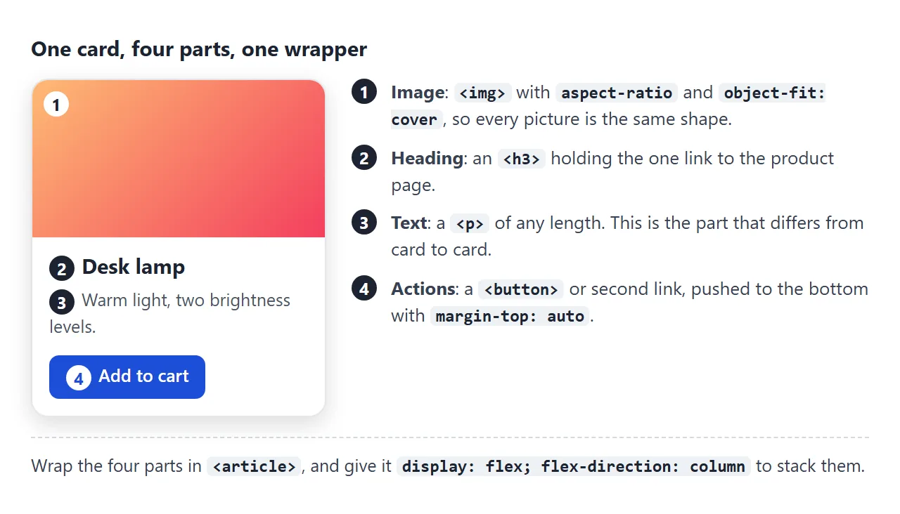
<ul class="grid">
  <li>
    <article class="card">
      <img src="lamp.jpg" alt="Brass desk lamp" width="600" height="450">
      <h3><a href="/lamp">Desk lamp</a></h3>
      <p>Warm light, two brightness levels.</p>
      <button type="button">Add to cart</button>
    </article>
  </li>
</ul>
A <ul> around the cards is optional. It marks the cards as a list, which screen readers can announce together with the number of items.
Use the heading level that fits your page. If the cards sit under an <h2>, each card title is an <h3>.
Equal-height cards with the button at the bottom
Put the cards in a grid and they are already the same height. Grid items stretch to fill their row by default, and so do items in a flex row. The problem in the first example is the content inside the card, not the card.
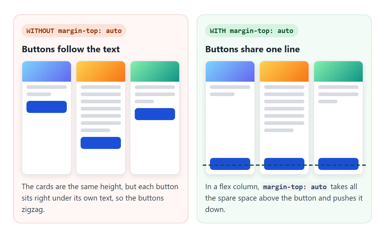
The content of each card stacks from the top, so the button ends wherever the text ends. Turn the card into a flex column and give the button an automatic top margin:
.card { display: flex; flex-direction: column; }
.card button { margin-top: auto; }
In a flex container, an auto margin takes all the free space on that side. The button gets pushed to the bottom of the card, and every card in the row ends with its button on the same line.
If the button is inside a footer <div>, put margin-top: auto on the footer instead. CSS flex-grow is the other way to fill the gap: flex-grow: 1 on the text makes the paragraph take the spare space.
A responsive card grid without media queries
One line decides how many columns there are:
.grid {
  display: grid;
  gap: 16px;
  grid-template-columns: repeat(auto-fit, minmax(min(220px, 100%), 1fr));
}
Read it from the inside out. Each column is at least 220px and at most one share of the free space.
auto-fit makes as many columns as fit, and when there are fewer cards than columns, the cards stretch to fill the row. auto-fill would keep the empty columns instead.
The min(220px, 100%) part is for small screens. With a plain minmax(220px, 1fr), a container narrower than 220px still gets a 220px column, and the card sticks out of the page. CSS grid-template-columns covers repeat() and minmax() in detail.
Making the whole card clickable
People expect to click anywhere on a product card, not just the title. The obvious fix is to wrap the whole card in <a>. That is valid as long as nothing else inside is clickable.
Once the card also needs a Save or Add to cart button, it breaks.
An <a> may not contain another link or a button. If you nest a link anyway, the HTML parser closes the first link when it reaches the second, and the card falls apart. The left card below shows what the browser actually built.
<!doctype html>
<html lang="en">
<head>
<meta charset="utf-8">
<meta name="viewport" content="width=device-width, initial-scale=1">
<title>Whole-card click: two ways</title>
<style>
body { margin: 0; padding: 14px; font-family: system-ui, sans-serif; background: #f4f5f7; color: #1d2330; }
.cols { display: grid; grid-template-columns: repeat(auto-fit, minmax(170px, 1fr)); gap: 16px; }
.col h2 { margin: 0 0 8px; font-size: 14px; }
.col.bad h2 { color: #9a3412; } .col.good h2 { color: #0f5132; }
.card {
display: block; position: relative;
background: #fff; border-radius: 12px; overflow: hidden;
box-shadow: 0 2px 10px rgba(0, 0, 0, .08);
color: inherit; text-decoration: none;
}
.img { aspect-ratio: 16 / 9; background: linear-gradient(135deg, #fda4af, #a855f7); }
.card h3 { margin: 10px 12px 4px; font-size: 16px; }
.card p { margin: 0 12px 10px; font-size: 13px; color: #4b5563; }
.actions { padding: 0 12px 12px; }
.save {
display: inline-block; padding: 7px 12px; border: 1px solid #c7ccd6; border-radius: 8px;
background: #fff; color: #1d2330; font: 600 13px system-ui, sans-serif; text-decoration: none; cursor: pointer;
}
/* Right card: the heading link stretches over the whole card */
.good h3 a { color: inherit; text-decoration: none; }
.good h3 a::after { content: ""; position: absolute; inset: 0; } /* covers the card */
.good .save { position: relative; z-index: 1; } /* sits above the cover */
.good .card:focus-within { outline: 3px solid #2563eb; outline-offset: 2px; }
.good h3 a:focus { outline: none; } /* the card shows the focus ring instead */
.dom { margin: 8px 0 0; padding: 8px; background: #fff7f5; border: 1px solid #f3d1c8; border-radius: 8px;
font: 11px/1.45 ui-monospace, Consolas, monospace; white-space: pre-wrap; word-break: break-all; }
#log { margin-top: 14px; padding: 10px 12px; border-radius: 8px; background: #1d2330; color: #e5e7eb; font-size: 14px; }
</style>
</head>
<body>
<div class="cols">
<div class="col bad">
<h2>Wrapped in <a> (with a link inside)</h2>
<a class="card" href="#lamp" id="wrapped">
<div class="img"></div>
<h3>Desk lamp</h3>
<p>Warm light, two brightness levels.</p>
<div class="actions"><a class="save" href="#save">Save</a></div>
</a>
<div class="dom" id="dom"></div>
</div>
<div class="col good">
<h2>Heading link + ::after</h2>
<article class="card">
<div class="img"></div>
<h3><a href="#lamp">Desk lamp</a></h3>
<p>Warm light, two brightness levels.</p>
<div class="actions"><button class="save" type="button">Save</button></div>
</article>
</div>
</div>
<div id="log">Click anywhere on either card, or press Tab.</div>
<script>
const log = document.getElementById('log');
// Show what the browser actually built from the left card's markup
const col = document.querySelector('.col.bad');
document.getElementById('dom').textContent =
'Parsed as:\n' + [...col.children].slice(1, -1).map((el) => el.outerHTML.replace(/\s+/g, ' ')).join('\n');
// Report clicks instead of leaving the page
document.addEventListener('click', (e) => {
const hit = e.target.closest('a, button');
if (!hit) return;
e.preventDefault();
const side = hit.closest('.bad') ? 'Left' : 'Right';
const what = hit.classList.contains('save') ? 'Save button' : 'card link (opens the product)';
log.textContent = side + ': ' + what;
});
</script>
</body>
</html>
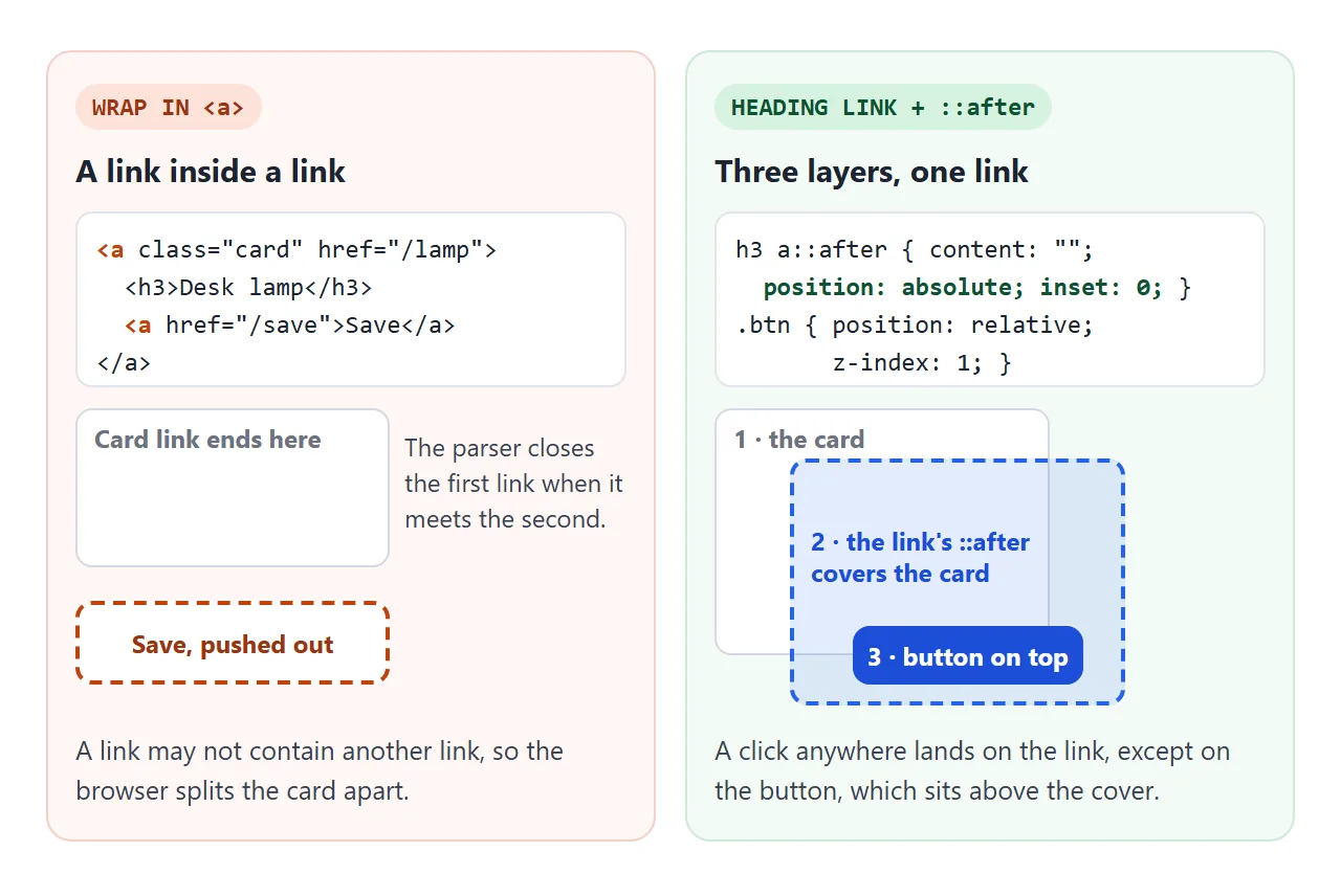
The pattern that works keeps a single link on the heading and stretches its clickable area over the card with a pseudo-element:
.card { position: relative; }
.card h3 a::after {
  content: "";
  position: absolute;
  inset: 0;              /* cover the whole card */
}
.card button {
  position: relative;
  z-index: 1;            /* stay above the cover */
}
The ::after box is absolutely positioned, so it sizes itself to the nearest positioned ancestor. That is the card, because of position: relative.
A click on the pseudo-element counts as a click on the link. The button gets its own stacking position above the cover, so it still receives its own clicks. CSS ::before and ::after explains pseudo-elements, and CSS z-index explains the stacking.
There is a second reason to prefer this pattern. A link's name, the text a screen reader reads out, comes from everything inside it.
Wrap a whole card and the name is the title, the description and the price in one breath. A heading link has a short name: the product title.
One side effect: the cover sits over the card text, so people cannot select that text with the mouse. If copying the text matters, lift the paragraph above the cover with position: relative; z-index: 1 too, and accept that it no longer opens the link.
Images that keep their shape
Product photos come in different sizes. Fix the shape in CSS so every card starts with the same picture area:
.card img {
  display: block;
  width: 100%;
  aspect-ratio: 4 / 3;
  object-fit: cover;
}
aspect-ratio sets the box, and object-fit: cover fills it by cropping the edges instead of squashing the photo. Without object-fit, the image is stretched to fit the box. CSS aspect-ratio and object-fit go further, including object-position to choose which part is kept.
Hover lift that keyboards can see
A small lift on hover tells people the card is clickable.
Apply the same style on :focus-within, which matches when anything inside the card has focus. Without it, someone moving through the page with the Tab key gets no sign of which card they are on.
.card { transition: transform .2s, box-shadow .2s; }
.card:hover,
.card:focus-within {
  transform: translateY(-4px);
  box-shadow: 0 12px 26px rgb(0 0 0 / .14);
}
.card:focus-within { outline: 3px solid #2563eb; outline-offset: 2px; }
transform moves the card without shifting its neighbours. For the shadow values, CSS box-shadow has presets. For timing, see CSS hover transition.
A finished product grid, with a horizontal card
Everything above, together. The first card spans the full row. It turns sideways when its own space is 340px or wider, using a container query. Drag the slider to narrow the grid and watch the columns and the featured card change.
<!doctype html>
<html lang="en">
<head>
<meta charset="utf-8">
<meta name="viewport" content="width=device-width, initial-scale=1">
<title>Responsive product card grid</title>
<style>
  * { box-sizing: border-box; }
  body { margin: 0; padding: 14px; font-family: system-ui, sans-serif; background: #f4f5f7; color: #1d2330; }
  .bar { display: flex; flex-wrap: wrap; gap: 8px 14px; align-items: center; font-size: 14px; margin-bottom: 12px; }
  .bar input { width: 160px; }
  #status { color: #0f5132; font-weight: 600; }

  /* 1. The grid: as many 150px+ columns as fit, never wider than the screen */
  .grid {
    list-style: none; margin: 0; padding: 0;
    display: grid; gap: 14px;
    grid-template-columns: repeat(auto-fit, minmax(min(150px, 100%), 1fr));
  }
  .grid > li { container-type: inline-size; }       /* each cell is a size container */
  .grid > li.wide { grid-column: 1 / -1; }          /* featured card spans the row */

  /* 2. The card: a flex column with the button pinned to the bottom */
  .card {
    position: relative; height: 100%;
    display: flex; flex-direction: column;
    background: #fff; border-radius: 14px; overflow: hidden;
    box-shadow: 0 2px 8px rgba(0, 0, 0, .08);
    transition: transform .2s, box-shadow .2s;
  }
  .card img { display: block; width: 100%; aspect-ratio: 4 / 3; object-fit: cover; }
  .body { display: flex; flex-direction: column; flex: 1; padding: 12px 14px 14px; }
  .card h3 { margin: 0 0 4px; font-size: 16px; }
  .card p { margin: 0 0 10px; font-size: 14px; line-height: 1.45; color: #4b5563; }
  .foot { margin-top: auto; display: flex; justify-content: space-between; align-items: center; gap: 8px; }
  .price { font-weight: 700; }
  .add {
    position: relative; z-index: 1;                 /* above the stretched link */
    padding: 8px 12px; border: 0; border-radius: 8px;
    background: #1d4ed8; color: #fff; font: 600 13px system-ui, sans-serif; cursor: pointer;
  }

  /* 3. Whole card clickable: the heading link covers the card */
  .card h3 a { color: inherit; text-decoration: none; }
  .card h3 a::after { content: ""; position: absolute; inset: 0; }

  /* 4. Lift on hover AND on keyboard focus */
  .card:hover, .card:focus-within { transform: translateY(-4px); box-shadow: 0 12px 26px rgba(0, 0, 0, .14); }
  .card:focus-within { outline: 3px solid #2563eb; outline-offset: 2px; }
  .card h3 a:focus { outline: none; }
  @media (prefers-reduced-motion: reduce) { .card { transition: none; } }

  /* 5. Horizontal layout when the card's own cell is wide */
  @container (min-width: 340px) {
    .card { flex-direction: row; }
    .card img { width: 45%; aspect-ratio: auto; }
  }
</style>
</head>
<body>
<div class="bar">
  <label>Grid width <input type="range" id="w" min="280" max="1000" value="1000"></label>
  <span id="wv"></span>
  <span id="status"></span>
</div>

<ul class="grid" id="grid">
  <li class="wide"><article class="card">
    <img alt="" data-c="#6366f1,#22d3ee">
    <div class="body">
      <h3><a href="#desk">Standing desk</a></h3>
      <p>Featured. This cell spans the whole row, so when it is 340px or wider the card turns sideways.</p>
      <div class="foot"><span class="price">$349</span><button class="add" type="button">Add to cart</button></div>
    </div>
  </article></li>
  <li><article class="card">
    <img alt="" data-c="#f97316,#facc15">
    <div class="body">
      <h3><a href="#lamp">Desk lamp</a></h3>
      <p>Warm light, two levels.</p>
      <div class="foot"><span class="price">$39</span><button class="add" type="button">Add to cart</button></div>
    </div>
  </article></li>
  <li><article class="card">
    <img alt="" data-c="#10b981,#a3e635">
    <div class="body">
      <h3><a href="#plant">Desk plant</a></h3>
      <p>Survives a dark office and a long weekend.</p>
      <div class="foot"><span class="price">$18</span><button class="add" type="button">Add to cart</button></div>
    </div>
  </article></li>
  <li><article class="card">
    <img alt="" data-c="#ec4899,#8b5cf6">
    <div class="body">
      <h3><a href="#mat">Desk mat</a></h3>
      <p>Felt, 80 x 30 cm.</p>
      <div class="foot"><span class="price">$25</span><button class="add" type="button">Add to cart</button></div>
    </div>
  </article></li>
  <li><article class="card">
    <img alt="" data-c="#0ea5e9,#1e3a8a">
    <div class="body">
      <h3><a href="#mug">Mug</a></h3>
      <p>Keeps coffee hot.</p>
      <div class="foot"><span class="price">$12</span><button class="add" type="button">Add to cart</button></div>
    </div>
  </article></li>
</ul>

<script>
  // Placeholder photos: a wide SVG, so object-fit: cover has something to crop
  document.querySelectorAll('img[data-c]').forEach((img) => {
    const [a, b] = img.dataset.c.split(',');
    const svg = `<svg xmlns="http://www.w3.org/2000/svg" width="600" height="300">
      <defs><linearGradient id="g"><stop offset="0" stop-color="${a}"/><stop offset="1" stop-color="${b}"/></linearGradient></defs>
      <rect width="600" height="300" fill="url(#g)"/><circle cx="300" cy="150" r="90" fill="#fff" fill-opacity=".35"/></svg>`;
    img.src = 'data:image/svg+xml,' + encodeURIComponent(svg);
  });

  // Width slider, so you can watch columns and the featured card change
  const grid = document.getElementById('grid'), w = document.getElementById('w'), wv = document.getElementById('wv');
  const setW = () => { grid.style.maxWidth = w.value + 'px'; wv.textContent = grid.offsetWidth + 'px'; };
  w.addEventListener('input', setW);
  addEventListener('resize', setW);
  setW();

  // Report what was clicked instead of leaving the page
  const status = document.getElementById('status');
  grid.addEventListener('click', (e) => {
    const card = e.target.closest('.card');
    if (!card) return;
    e.preventDefault();
    const name = card.querySelector('h3').textContent;
    status.textContent = e.target.closest('.add') ? 'Added: ' + name : 'Opened: ' + name;
  });
</script>
</body>
</html>
A media query asks how wide the window is. A container query asks how wide the card's own box is, which is what matters here: the same card can be narrow in a four-column row and wide when it spans the grid.
.grid > li { container-type: inline-size; }

@container (min-width: 340px) {
  .card { flex-direction: row; }
  .card img { width: 45%; aspect-ratio: auto; }
}
An element cannot query its own size, so container-type goes on the wrapper (the <li>) and the rule styles the card inside it.
When it does not work
| What you see | Cause | Fix |
|---|---|---|
| Buttons sit at different heights | The card is not a flex column, or the button has no auto margin | display: flex; flex-direction: column on the card, margin-top: auto on the button |
| Cards in one row have different heights | align-items: start on the grid, or height set on the cards |
Remove them so the items stretch |
| Inner button falls out of the card, or an empty link appears | A link or button nested inside an <a> |
Link the heading and stretch it with ::after |
| The inner button opens the card link | The ::after cover sits above the button |
position: relative; z-index: 1 on the button |
| The whole page is clickable | The card has no position: relative |
Add it, so ::after covers only the card |
| Cards overflow on a narrow phone | The minimum in minmax() is wider than the screen |
Use minmax(min(220px, 100%), 1fr) |
| Photos look squashed or stretched | aspect-ratio without object-fit |
Add object-fit: cover |
| Keyboard users see no highlight | Only :hover is styled |
Add :focus-within with the same style |
| The horizontal layout never appears | container-type is missing, or set on the card itself |
Put container-type: inline-size on the card's parent |
Share it as a link
A card grid is easier to judge when you can resize it and click it. A screenshot shows one width only, and an .html attachment may open as plain code, or not at all, on a phone.
To send the working version, paste the page into a NOS document and choose Create share link. HTML to link walks through it.
The page renders as written and its scripts run, so the people you send it to can hover, click and resize the cards themselves. If you change the code later, the same link shows the new version.