::before and ::after add one extra box at the start and one at the end of an element, straight from CSS. Each needs a content value, even an empty one, or it is not created.
They are inline by default and sit inside the element, next to its own content.
.box::before {
  content: "NEW";   /* required: use "" for a shape with no text */
}
Try it. Switch the options and watch the dashed box. The code underneath is exactly what is applied.
<!doctype html>
<html lang="en">
<head>
<meta charset="utf-8">
<meta name="viewport" content="width=device-width, initial-scale=1">
<title>::before and ::after playground</title>
<style>
  body {
    margin: 0; padding: 22px 14px 14px;
    font-family: system-ui, sans-serif; background: #f4f5f7; color: #1d2330;
  }
  .stage { padding: 12px 0 18px; }
  .box {
    max-width: 320px; margin: 0 auto; padding: 14px 16px;
    background: #fff; border: 2px solid #2563eb; border-radius: 10px;
    font-size: 15px;
  }
  .controls {
    display: grid; grid-template-columns: auto 1fr; gap: 8px 10px;
    align-items: center; font-size: 13px;
  }
  .controls b { font-weight: 600; color: #5b6270; }
  .controls div { display: flex; flex-wrap: wrap; gap: 4px 10px; }
  .controls label { white-space: nowrap; }
  pre {
    margin: 12px 0 0; padding: 10px 12px; border-radius: 8px;
    background: #1d2330; color: #e5e7eb; font-size: 12px; line-height: 1.5;
    white-space: pre-wrap;
  }
</style>
<!-- the rules below are rewritten by the script; the code box shows them -->
<style id="dyn"></style>
</head>
<body>
<div class="stage"><div class="box" id="box">The element's own text.</div></div>

<form class="controls" id="f">
  <b>Pseudo</b>
  <div>
    <label><input type="radio" name="which" value="before" checked> ::before</label>
    <label><input type="radio" name="which" value="after"> ::after</label>
  </div>
  <b>content</b>
  <div>
    <label><input type="radio" name="content" value='"NEW"' checked> "NEW"</label>
    <label><input type="radio" name="content" value='""'> "" (empty)</label>
    <label><input type="radio" name="content" value="none"> not set</label>
  </div>
  <b>display</b>
  <div>
    <label><input type="radio" name="display" value="inline" checked> inline</label>
    <label><input type="radio" name="display" value="inline-block"> inline-block</label>
    <label><input type="radio" name="display" value="block"> block</label>
  </div>
  <b>position</b>
  <div>
    <label><input type="radio" name="position" value="static" checked> static</label>
    <label><input type="radio" name="position" value="absolute"> absolute</label>
    <label><input type="checkbox" id="rel"> .box is relative</label>
  </div>
</form>
<pre id="code"></pre>

<script>
  const form = document.getElementById('f');
  const dyn = document.getElementById('dyn');
  const code = document.getElementById('code');

  function render() {
    const v = (name) => form.querySelector(`input[name=${name}]:checked`).value;
    const side = v('which') === 'before' ? 'left' : 'right';
    let css = `.box::${v('which')} {\n`;
    if (v('content') !== 'none') css += `  content: ${v('content')};\n`;
    css += `  display: ${v('display')};\n  width: 44px; height: 24px;\n`;
    if (v('position') === 'absolute') css += `  position: absolute; top: -10px; ${side}: -10px;\n`;
    css += `  background: #fed7aa; outline: 2px dashed #ea580c;\n}`;
    if (document.getElementById('rel').checked) css += `\n.box { position: relative; }`;
    dyn.textContent = css;   // apply it
    code.textContent = css;  // and show it
  }

  form.addEventListener('change', render);
  render();
</script>
</body>
</html>
Where the pseudo-elements sit
The names suggest the boxes appear before and after the element. They do not. ::before becomes the element's first child and ::after its last child, so both live inside its border and padding.
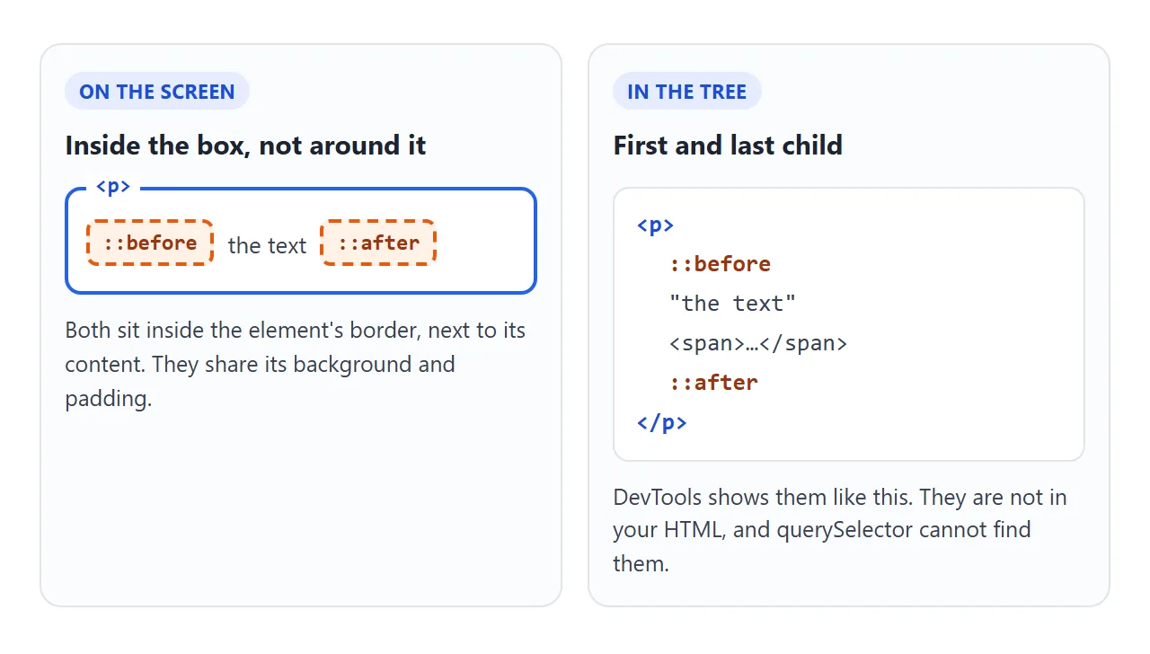
That has practical results:
- They inherit the element's font and colour, like any child.
- An element's
overflow: hiddenclips them. - They are not in your HTML. DevTools shows them in the Elements panel, but
querySelectorcannot find them and they have no event listeners of their own.
To change one from JavaScript, toggle a class or a data attribute on the element and let CSS do the rest. The badge and pricing examples below both work this way.
content is required
A pseudo-element is only created when content has a value other than none or normal. Forget the property and nothing appears, no matter how many other styles you set. In the example above, not set makes the box vanish.
| content value | What you get |
|---|---|
"NEW" |
The text NEW |
"" |
An empty box, for a shape, line or background |
"\201C" |
A character by its code, here a curly quote |
attr(data-count) |
The value of the element's attribute, as text |
counter(step) |
The current number of a CSS counter |
Not set, or none |
No pseudo-element at all |
Text in content cannot be selected or copied. Whether screen readers announce it varies by browser and screen reader. Treat it as decoration, and keep anything a reader must know in the HTML.
Inline by default: why width and height are ignored
A pseudo-element starts as display: inline, like a <span>. Inline boxes ignore width and height. With content: "" that means a box with no size, so it is there but invisible.
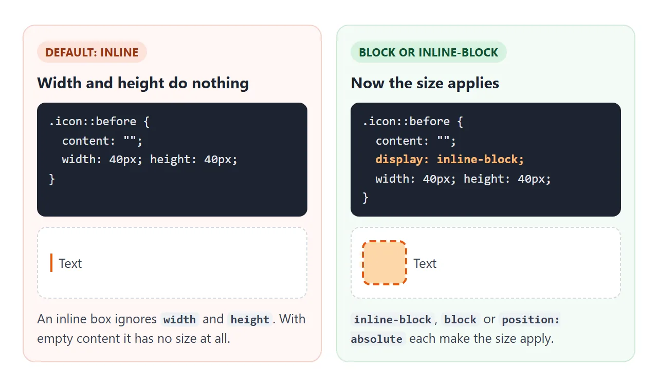
Any of these makes the size apply:
display: inline-blockkeeps it in the line of text, next to the content.display: blockputs it on its own line.position: absolutetakes it out of the flow and makes it a block.
CSS display covers the difference between these values in more detail.
Positioning them with absolute
Most decorative uses place the pseudo-element over a corner or an edge with position: absolute. Its top, right, bottom and left are measured from the nearest positioned ancestor. The element that owns the pseudo-element counts, but only if it is positioned itself.
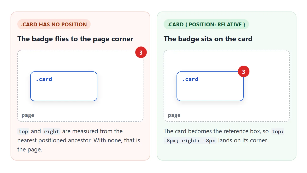
.card { position: relative; }   /* the reference box */
.card::after {
  content: "3";
  position: absolute;
  top: -8px;
  right: -8px;
}
Leave out the first line and the badge lands in a corner of the page. CSS position explains how absolute and relative work together.
Five everyday uses
These are the patterns you meet most. Hover, tab and click to try each one.
<!doctype html>
<html lang="en">
<head>
<meta charset="utf-8">
<meta name="viewport" content="width=device-width, initial-scale=1">
<title>Five everyday uses of ::before and ::after</title>
<style>
  body {
    margin: 0; padding: 12px;
    font-family: system-ui, sans-serif; background: #f4f5f7; color: #1d2330;
  }
  .grid { display: grid; grid-template-columns: repeat(auto-fit, minmax(160px, 1fr)); gap: 10px; }
  .cell { background: #fff; border-radius: 10px; padding: 10px 12px 14px; min-height: 96px; }
  .cell h3 { margin: 0 0 10px; font-size: 12px; color: #5b6270; font-weight: 600; }

  /* 1. Quote marks */
  .quote { margin: 0; padding: 0 6px; font-style: italic; font-size: 14px; }
  .quote::before { content: "\201C"; color: #2563eb; font-size: 28px; line-height: 0; vertical-align: -10px; margin-right: 2px; }
  .quote::after  { content: "\201D"; color: #2563eb; font-size: 28px; line-height: 0; vertical-align: -10px; margin-left: 2px; }

  /* 2. Required-field asterisk */
  .required::after { content: " *"; color: #dc2626; font-weight: 700; }
  .field label { display: block; font-size: 13px; margin-bottom: 4px; }
  .field input { width: 100%; box-sizing: border-box; padding: 5px 7px; font: inherit; font-size: 13px; }

  /* 3. Badge counter read from data-count with attr() */
  .inbox { position: relative; padding: 8px 14px; font: inherit; font-size: 14px; border: 1px solid #cbd0d8; border-radius: 8px; background: #fff; cursor: pointer; }
  .inbox::after {
    content: attr(data-count);
    position: absolute; top: -8px; right: -8px;
    min-width: 20px; height: 20px; padding: 0 5px; box-sizing: border-box;
    border-radius: 10px; background: #dc2626; color: #fff;
    font-size: 12px; line-height: 20px; text-align: center;
  }
  .inbox[data-count="0"]::after { display: none; }

  /* 4. Animated underline */
  .link { position: relative; color: #1d2330; text-decoration: none; font-size: 15px; font-weight: 600; }
  .link::after {
    content: "";
    position: absolute; left: 0; right: 0; bottom: -3px; height: 2px;
    background: #2563eb;
    transform: scaleX(0); transform-origin: left;
    transition: transform .25s;
  }
  .link:hover::after, .link:focus-visible::after { transform: scaleX(1); }

  /* 5. Tooltip with an arrow: ::after is the bubble, ::before the arrow */
  .tip { position: relative; padding: 6px 12px; font: inherit; font-size: 13px; border: 1px solid #cbd0d8; border-radius: 8px; background: #fff; cursor: pointer; }
  .tip::after {
    content: attr(data-tip);
    position: absolute; top: calc(100% + 8px); left: 0;
    width: max-content; max-width: 150px; padding: 5px 8px;
    background: #1d2330; color: #fff; font-size: 12px; border-radius: 6px;
  }
  .tip::before {
    content: "";
    position: absolute; top: calc(100% - 2px); left: 14px;
    border: 5px solid transparent; border-bottom-color: #1d2330;  /* a border triangle */
  }
  .tip::before, .tip::after { opacity: 0; pointer-events: none; transition: opacity .15s; }
  .tip:hover::before, .tip:hover::after,
  .tip:focus::before, .tip:focus::after { opacity: 1; }
</style>
</head>
<body>
<div class="grid">
  <div class="cell">
    <h3>1. Quote marks</h3>
    <blockquote class="quote">Make it work, then make it pretty.</blockquote>
  </div>

  <div class="cell field">
    <h3>2. Required asterisk</h3>
    <label class="required" for="email">Email</label>
    <input id="email" type="email" required placeholder="you@example.com">
  </div>

  <div class="cell">
    <h3>3. Badge from attr()</h3>
    <button class="inbox" id="inbox" data-count="3">Inbox</button>
    <p style="font-size:12px;color:#5b6270;margin:10px 0 0">Click: count goes down.</p>
  </div>

  <div class="cell">
    <h3>4. Animated underline</h3>
    <a class="link" href="#">Hover or tab to me</a>
  </div>

  <div class="cell">
    <h3>5. Tooltip with arrow</h3>
    <button class="tip" data-tip="Saved to your drafts">Hover or tap</button>
  </div>
</div>

<script>
  // The badge text lives in data-count; CSS reads it with attr()
  const inbox = document.getElementById('inbox');
  inbox.addEventListener('click', () => {
    const n = Number(inbox.dataset.count);
    inbox.dataset.count = n > 0 ? n - 1 : 3;
  });
</script>
</body>
</html>
- Quote marks.
::beforeand::afteradd curly quotes around a blockquote, so the HTML holds only the quote itself. - Required asterisk. A red
*after a label. The input still has therequiredattribute, which is what the browser and assistive technology use. - Badge via
attr(). The number lives indata-count. The script changes the attribute and the badge updates, becausecontent: attr(data-count)reads it live. - Animated underline. An absolute
::afterline scaled to zero, growing to full width on hover. CSS hover transition covers the transition side. - Tooltip with an arrow.
::afteris the bubble,::beforeis the arrow, drawn as a CSS border triangle. Pure HTML tooltip compares this with the title attribute.
One older use still shows up in existing code: the clearfix, an empty ::after with clear: both that makes a container wrap its floated children.
.row::after { content: ""; display: table; clear: both; }
In new code, display: flow-root on the container does the same job without a pseudo-element.
Numbering with counters
CSS counters let pseudo-elements number things for you. Reset a counter on the container, increase it on each item, and print it with counter().
.steps { counter-reset: step; list-style: none; }
.steps li { counter-increment: step; }
.steps li::before { content: "Step " counter(step) ". "; font-weight: 700; }
The numbers follow the order of the items, so adding or removing one renumbers the rest. Like any generated text, they cannot be selected, so use a real <ol> when the numbers matter to the reader.
A finished example: pricing cards
Every decoration in these cards is a pseudo-element: the ticks, the grey dashes, the corner ribbon and the green mark on the chosen plan. The HTML is just headings, prices, lists and buttons.
<!doctype html>
<html lang="en">
<head>
<meta charset="utf-8">
<meta name="viewport" content="width=device-width, initial-scale=1">
<title>Pricing cards drawn with ::before and ::after</title>
<style>
  body {
    margin: 0; padding: 14px 12px;
    font-family: system-ui, sans-serif; background: #f4f5f7; color: #1d2330;
  }
  .plans { display: grid; grid-template-columns: repeat(auto-fit, minmax(180px, 1fr)); gap: 12px; }
  .card {
    position: relative;   /* every ::before/::after below is placed inside this box */
    overflow: hidden;     /* clips the ribbon's ends */
    background: #fff; border-radius: 12px; padding: 16px 16px 14px;
    box-shadow: 0 4px 14px rgba(0, 0, 0, .08);
  }
  .card h3 { margin: 0; font-size: 15px; }
  .price { margin: 4px 0 10px; font-size: 26px; font-weight: 700; }
  .price small { font-size: 13px; font-weight: 400; color: #5b6270; }
  ul { list-style: none; margin: 0 0 14px; padding: 0; font-size: 13px; }
  li { position: relative; padding: 3px 0 3px 22px; }

  /* Checkmark: a rotated L made from two borders */
  li::before {
    content: "";
    position: absolute; left: 5px; top: 5px;
    width: 5px; height: 10px;
    border: solid #16a34a; border-width: 0 2px 2px 0;
    transform: rotate(45deg);
  }
  /* Not included: a grey dash instead */
  li.off { color: #9ca3af; }
  li.off::before { width: 9px; height: 0; top: 11px; left: 3px; border-width: 0 0 2px 0; border-color: #cbd0d8; transform: none; }

  /* Ribbon: its text comes from data-ribbon */
  .card[data-ribbon]::before {
    content: attr(data-ribbon);
    position: absolute; top: 16px; right: -36px;
    width: 130px; padding: 3px 0;
    transform: rotate(45deg);
    background: #2563eb; color: #fff;
    font-size: 11px; font-weight: 700; text-align: center; letter-spacing: .5px;
  }

  /* Chosen plan: a green tick after the plan name. inline-block so width and height apply */
  .card.chosen { box-shadow: 0 0 0 2px #16a34a, 0 4px 14px rgba(0, 0, 0, .08); }
  .card.chosen h3::after {
    content: "";
    display: inline-block; vertical-align: -4px; margin-left: 8px;
    width: 18px; height: 18px; border-radius: 50%;
    background: #16a34a url("data:image/svg+xml,%3Csvg xmlns='http://www.w3.org/2000/svg' viewBox='0 0 12 12'%3E%3Cpath d='M2 6.5l2.5 2.5L10 3.5' fill='none' stroke='white' stroke-width='2'/%3E%3C/svg%3E") center / 11px no-repeat;
  }

  button {
    width: 100%; padding: 8px; font: inherit; font-size: 14px; font-weight: 600;
    border: 1px solid #2563eb; border-radius: 8px; background: #fff; color: #2563eb; cursor: pointer;
  }
  .chosen button { background: #16a34a; border-color: #16a34a; color: #fff; }
  #status { margin: 12px 2px 0; font-size: 13px; color: #5b6270; }

  /* Narrow screens: name and price on one line, features in two columns */
  @media (max-width: 420px) {
    .card { padding: 12px 14px; }
    .card h3, .price { display: inline-block; }
    .price { margin: 0 0 6px 10px; font-size: 22px; }
    ul { display: grid; grid-template-columns: 1fr 1fr; column-gap: 6px; margin-bottom: 10px; }
  }
</style>
</head>
<body>
<div class="plans">
  <div class="card">
    <h3>Starter</h3>
    <div class="price">$0 <small>/ month</small></div>
    <ul>
      <li>1 project</li>
      <li>Share links</li>
      <li class="off">Custom domain</li>
      <li class="off">Team seats</li>
    </ul>
    <button>Choose</button>
  </div>

  <div class="card" data-ribbon="POPULAR">
    <h3>Pro</h3>
    <div class="price">$12 <small>/ month</small></div>
    <ul>
      <li>Unlimited projects</li>
      <li>Share links</li>
      <li>Custom domain</li>
      <li class="off">Team seats</li>
    </ul>
    <button>Choose</button>
  </div>

  <div class="card">
    <h3>Team</h3>
    <div class="price">$30 <small>/ month</small></div>
    <ul>
      <li>Unlimited projects</li>
      <li>Share links</li>
      <li>Custom domain</li>
      <li>5 team seats</li>
    </ul>
    <button>Choose</button>
  </div>
</div>
<p id="status">No plan chosen yet.</p>

<script>
  // Clicking a button only toggles a class; the tick is an h3::after in CSS
  const cards = document.querySelectorAll('.card');
  cards.forEach((card) => {
    card.querySelector('button').addEventListener('click', () => {
      cards.forEach((c) => {
        c.classList.toggle('chosen', c === card);
        c.querySelector('button').textContent = c === card ? 'Chosen' : 'Choose';
      });
      document.getElementById('status').textContent =
        'Chosen: ' + card.querySelector('h3').textContent;
    });
  });
</script>
</body>
</html>
- Ticks: an empty
li::beforewith only two borders, rotated 45 degrees into a check. - Ribbon:
content: attr(data-ribbon), rotated over the corner, clipped by the card'soverflow: hidden. - Chosen mark:
.chosen h3::afterwithdisplay: inline-block, so its 18 px size applies next to the name.
When it does not work
| What you see | Cause | Fix |
|---|---|---|
| Nothing appears | No content property |
Add content: "" or some text |
| Nothing appears on an image or input | img and most input types do not render them |
Put the pseudo-element on a wrapping span or div |
| Width and height are ignored | It is display: inline |
inline-block, block or position: absolute |
| The absolute shape lands in a page corner | The element is not positioned | position: relative on the element |
| The shape is cut off | The element has overflow: hidden |
Remove it, or move the shape inside the edges |
Old code writes :before with one colon |
That is the older CSS2 syntax | Both forms work for these two. Prefer ::before |
| JavaScript cannot find it | Pseudo-elements are not in the DOM | Toggle a class or data attribute on the element |
Share it as a link
Hover effects, badges and tooltips are hard to judge from a screenshot. To show the working version, send it as a page people can open and try.
Paste the page into a NOS document and choose Create share link. HTML to link walks through it.
The page renders as written and its scripts run, so the people you send it to can hover, tab and click for themselves. If you change the code later, the same link shows the new version.