float moves an element to the left or right edge of its container, and the text after it wraps around it.
Use float: left or float: right on an image inside a paragraph, add a margin on the side that faces the text, and you get a newspaper-style picture in a column of text.
Try it. Switch the side and drag the margin slider.
<!doctype html>
<html lang="en">
<head>
<meta charset="utf-8">
<meta name="viewport" content="width=device-width, initial-scale=1">
<title>Float an image in a paragraph</title>
<style>
  body { margin: 0; padding: 14px; font-family: system-ui, sans-serif; background: #f4f5f7; color: #1d2330; }
  .controls { display: flex; flex-wrap: wrap; gap: 6px 14px; align-items: center; margin-bottom: 10px; font-size: 14px; }
  .controls button { font: inherit; padding: 5px 10px; border: 1px solid #c9cdd4; border-radius: 6px; background: #fff; cursor: pointer; }
  .controls button[aria-pressed="true"] { background: #1d4ed8; border-color: #1d4ed8; color: #fff; }
  .controls label { display: flex; align-items: center; gap: 6px; }
  code { display: block; margin-bottom: 10px; padding: 6px 10px; border-radius: 6px; background: #1d2330; color: #d6f2df; font-size: 13px; }
  .text { margin: 0; padding: 14px; border-radius: 10px; background: #fff; font-size: 15px; line-height: 1.55; }

  /* the part that matters */
  .pic { float: left; margin: 0 16px 8px 0; width: 120px; height: 90px; border-radius: 8px; }
</style>
</head>
<body>
<div class="controls">
  <span>float:</span>
  <button data-f="left" aria-pressed="true">left</button>
  <button data-f="right" aria-pressed="false">right</button>
  <button data-f="none" aria-pressed="false">none</button>
  <label>margin <input id="m" type="range" min="0" max="32" step="4" value="16"> <span id="mv">16px</span></label>
</div>
<code id="css">.pic { float: left; margin: 0 16px 8px 0; }</code>

<p class="text">
  <svg class="pic" id="pic" viewBox="0 0 120 90" role="img" aria-label="Hills and sun">
    <rect width="120" height="90" fill="#cfe8ff"/>
    <circle cx="92" cy="24" r="12" fill="#fbbf24"/>
    <path d="M0 90 L0 62 Q30 36 60 60 T120 54 L120 90 Z" fill="#34a36b"/>
  </svg>
  A floated image leaves the normal line of content and moves to the left or right edge of its container.
  The lines of text that follow shorten themselves to fit beside it, then return to full width once they pass its bottom edge.
  That is the job float was designed for: pictures inside a column of text, the way a newspaper sets them.
  Switch to none and the image drops back into the line like a large letter, with the first line of text sitting next to its bottom.
</p>

<script>
  const pic = document.getElementById('pic');
  const m = document.getElementById('m');
  let side = 'left';

  function update() {
    const g = m.value + 'px';
    // keep the gap on the side that faces the text
    const margin = side === 'right' ? `0 0 8px ${g}` : side === 'left' ? `0 ${g} 8px 0` : '0';
    pic.style.float = side;
    pic.style.margin = margin;
    document.getElementById('mv').textContent = g;
    document.getElementById('css').textContent = `.pic { float: ${side}; margin: ${margin}; }`;
  }

  document.querySelectorAll('[data-f]').forEach((b) => {
    b.addEventListener('click', () => {
      side = b.dataset.f;
      document.querySelectorAll('[data-f]').forEach((x) => x.setAttribute('aria-pressed', x === b));
      update();
    });
  });
  m.addEventListener('input', update);
</script>
</body>
</html>
img.pic {
  float: left;
  width: 120px;
  margin: 0 16px 8px 0; /* gap on the right, where the text is */
}
What float actually does
A floated element leaves the normal flow of the page and moves sideways until it touches the edge of its container, or another float. Then the content after it lays out around it.
The detail that explains most float surprises: only the lines of text move aside. The boxes that hold them do not.
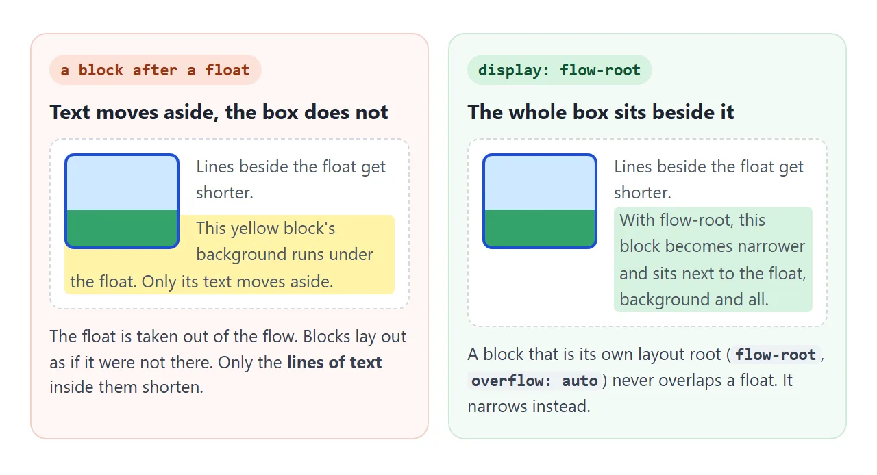
A paragraph after a float still starts at the container's left edge, and its background runs underneath the image. If that block needs to sit beside the float as a whole, give it display: flow-root and it becomes narrower instead of sliding under.
Float and margins
Margins on a float push text away from it, so put the margin on the side that faces the text: margin-right for float: left, margin-left for float: right. A small bottom margin keeps the first full-width line from touching the image.
Two other rules are useful to know:
- Float margins never collapse. A float's top margin is added in full, and it does not merge with the margin of the element above, as two stacked paragraphs would.
- A float becomes a block. A floated
<span>or<img>computes todisplay: block, so width, height and vertical margins all apply.
Give floated images a max-width: 100% as well. A float wider than its container sticks out of it.
clear: start below the float
Sometimes the next thing must not wrap. A new heading next to the previous section's picture looks like a mistake. clear moves an element down until it is below earlier floats.
| Value | Moves the element below |
|---|---|
clear: left |
Earlier float: left elements |
clear: right |
Earlier float: right elements |
clear: both |
Floats on either side |
clear: none |
Nothing, the default |
h2 { clear: both; } /* every section starts under the previous picture */
The collapsed parent problem
This is the classic "float not working" report. Put only floated children in a box, and the box's height becomes zero. Its border shrinks to a line at the top, its background disappears, and the next section slides up beside the floats.
<!doctype html>
<html lang="en">
<head>
<meta charset="utf-8">
<meta name="viewport" content="width=device-width, initial-scale=1">
<title>Collapsed parent and three fixes</title>
<style>
  body { margin: 0; padding: 14px; font-family: system-ui, sans-serif; background: #f4f5f7; color: #1d2330; }
  .controls { display: flex; flex-wrap: wrap; gap: 6px; margin-bottom: 8px; }
  .controls button { font: 13px system-ui, sans-serif; padding: 6px 10px; border: 1px solid #c9cdd4; border-radius: 6px; background: #fff; cursor: pointer; }
  .controls button[aria-pressed="true"] { background: #1d4ed8; border-color: #1d4ed8; color: #fff; }
  .readout { font-size: 14px; margin: 0 0 10px; }
  .readout b { color: #9a3412; }
  .readout b.ok { color: #0f5132; }

  .box { border: 3px solid #1d4ed8; border-radius: 10px; background: #e8efff; padding: 0 10px; }
  .card { float: left; width: 110px; margin: 10px 10px 10px 0; padding: 10px; border-radius: 8px; background: #fff; box-shadow: 0 3px 10px rgba(0, 0, 0, .12); font-size: 13px; }
  .card.tall { height: 110px; }
  .next { margin-top: 12px; padding: 10px 12px; border-radius: 8px; background: #fff3a8; font-size: 14px; }

  /* the three fixes: each one makes .box wrap its floats */
  .box.flow-root { display: flow-root; }
  .box.overflow  { overflow: auto; }
  .box.clearfix::after { content: ""; display: table; clear: both; }
</style>
</head>
<body>
<div class="controls">
  <button data-fix="" aria-pressed="true">no fix</button>
  <button data-fix="flow-root" aria-pressed="false">display: flow-root</button>
  <button data-fix="overflow" aria-pressed="false">overflow: auto</button>
  <button data-fix="clearfix" aria-pressed="false">clearfix ::after</button>
</div>
<p class="readout">Blue box height: <b id="h">0px</b></p>

<div class="box" id="box">
  <div class="card">Floated card</div>
  <div class="card tall">Taller floated card</div>
</div>
<div class="next">Next section. Without a fix it slides up and its text wraps around the cards.</div>

<script>
  const box = document.getElementById('box');
  const h = document.getElementById('h');

  function show() {
    const px = box.clientHeight;  // height inside the border
    h.textContent = Math.round(px) + 'px';
    h.className = px > 0 ? 'ok' : '';
  }

  document.querySelectorAll('[data-fix]').forEach((b) => {
    b.addEventListener('click', () => {
      box.className = 'box ' + b.dataset.fix;
      document.querySelectorAll('[data-fix]').forEach((x) => x.setAttribute('aria-pressed', x === b));
      show();
    });
  });
  show();
</script>
</body>
</html>
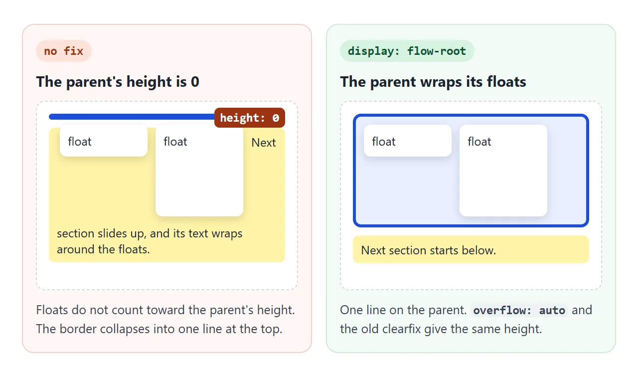
Three fixes, oldest last:
display: flow-rooton the parent. It exists for exactly this, and it has no side effects.overflow: autoon the parent. It works too, but anything that spills out of the box, such as a shadow or a dropdown, is clipped or gets a scrollbar.- The clearfix. An empty
::afterwithclear: bothat the end of the parent. You will still see it in older stylesheets. CSS ::before and ::after shows how the pseudo-element is built.
.box { display: flow-root; }

/* older code, same result */
.box::after { content: ""; display: table; clear: both; }
Wrap text around a circle with shape-outside
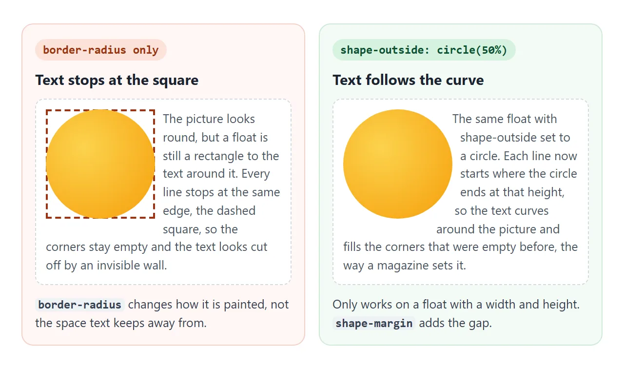
A round picture made with border-radius: 50% still looks square to the text. The lines stop at the edge of its box and the corners stay empty. shape-outside changes the shape the text flows around.
.round {
  float: right;
  width: 190px;
  height: 190px;
  border-radius: 50%;
  shape-outside: circle(50%);
  shape-margin: 10px;
}
It has two requirements. The element must be floated, since shape-outside does nothing on a non-floated element. And it needs a real width and height, because circle(50%) is measured from the element's box. ellipse(), polygon() and an image's transparent areas work as shapes too.
Why float is no longer used for page layout
For years, sidebars and card rows were built by floating boxes, then clearing them and fixing their parents. Flexbox and grid were designed for layout and replace that work: equal heights, vertical centring and reordering come built in.
| Job | Use |
|---|---|
| Text wrapping around a picture or quote | float |
| A row of buttons, a navbar, a card row | Flexbox |
| Rows and columns at once, a page grid | CSS grid |
The two do not mix inside one container. Once the parent is display: flex or display: grid, float on its children is ignored. CSS display explains how the parent's display value decides how children are laid out.
A finished example: a magazine page
This page puts it together. A round picture floats right with shape-outside, the first letter is a drop cap made with a floated ::first-letter, and a pull quote floats left. The footer line uses clear: both.
<!doctype html>
<html lang="en">
<head>
<meta charset="utf-8">
<meta name="viewport" content="width=device-width, initial-scale=1">
<title>Magazine layout with float and shape-outside</title>
<style>
  body { margin: 0; padding: 18px; font-family: Georgia, "Times New Roman", serif; background: #faf7f2; color: #2b2622; }
  article { max-width: 640px; margin: 0 auto; }
  .kicker { font: 700 12px system-ui, sans-serif; letter-spacing: .12em; text-transform: uppercase; color: #b45309; }
  h1 { margin: 4px 0 14px; font-size: 28px; line-height: 1.15; }
  p { margin: 0 0 12px; font-size: 16px; line-height: 1.6; }

  /* round picture: float it, then let the text follow the circle */
  .round {
    float: right;
    width: 190px; height: 190px;
    margin: 0 0 8px 14px;
    border-radius: 50%;
    shape-outside: circle(50%);  /* text follows the circle, not the square box */
    shape-margin: 10px;          /* gap between the circle and the text */
  }

  /* drop cap: the first letter floats left and spans about three lines */
  .lead::first-letter {
    float: left;
    font-size: 64px; line-height: .85;
    margin: 6px 8px 0 0;
    color: #b45309; font-weight: 700;
  }

  .quote {
    float: left; width: 42%;
    margin: 4px 16px 8px 0; padding: 10px 0 10px 12px;
    border-left: 4px solid #b45309;
    font-size: 19px; line-height: 1.35; font-style: italic;
  }
  .end { clear: both; padding-top: 10px; border-top: 1px solid #e3dcd2; font: 13px system-ui, sans-serif; color: #6b6259; }

  /* phones: too narrow to share a line, so stack instead */
  @media (max-width: 480px) {
    .round { float: none; display: block; margin: 0 auto 14px; width: 150px; height: 150px; shape-outside: none; }
    .quote { float: none; width: auto; margin: 0 0 12px; }
  }
</style>
</head>
<body>
<article>
  <div class="kicker">Field notes</div>
  <h1>A week on the coast, one tide at a time</h1>

  <svg class="round" viewBox="0 0 190 190" role="img" aria-label="Sunset over the sea">
    <defs><linearGradient id="sky" x1="0" y1="0" x2="0" y2="1"><stop offset="0" stop-color="#fca5a5"/><stop offset=".55" stop-color="#fcd34d"/><stop offset=".55" stop-color="#0e7490"/><stop offset="1" stop-color="#164e63"/></linearGradient><clipPath id="disc"><circle cx="95" cy="95" r="95"/></clipPath></defs>
    <g clip-path="url(#disc)">
    <circle cx="95" cy="95" r="95" fill="url(#sky)"/>
    <circle cx="95" cy="104" r="26" fill="#fff7ed" opacity=".9"/>
    <rect x="0" y="104" width="190" height="86" fill="#0e7490"/>
    <path d="M30 128 H90 M110 146 H170 M50 164 H130" stroke="#67e8f9" stroke-width="3" stroke-linecap="round"/>
    </g>
  </svg>

  <p class="lead">Mornings start with the tide table taped inside the door. Low water decides everything: when the rock pools open, when the path round the point is safe, and when the café by the harbour fills up with people in wet boots.</p>

  <p>By the third day the rhythm is easy to read. The sea pulls back, the beach doubles in width, and for two hours the whole bay belongs to anyone willing to walk out across the ripples in the sand.</p>

  <div class="quote">"Low water decides everything."</div>

  <p>Afternoons are slower. The light turns gold early, the wind drops, and the boats come back in a loose line that nobody seems to organise. It is the best time to sit on the wall and do nothing at all.</p>

  <p>On the last evening the tide comes in fast over the flats, filling the channels first and then the gaps between them, until the whole bay is one sheet of water again.</p>

  <div class="end">Resize the window or open this on a phone: below 480px the picture and the quote stop floating and stack.</div>
</article>
</body>
</html>
On a phone, a 190px picture beside the text leaves a column only a few words wide. The page switches floats off in a media query:
@media (max-width: 480px) {
  .round { float: none; display: block; margin: 0 auto 14px; shape-outside: none; }
  .quote { float: none; width: auto; }
}
When it does not work
| What you see | Cause | Fix |
|---|---|---|
| The parent's border or background disappears | All its children are floated, so its height is 0 | display: flow-root on the parent |
| The next heading wraps around the old picture | The float is taller than its section | clear: both on the heading |
float does nothing |
The parent is display: flex or grid |
Use the parent's alignment, or unwrap it |
float does nothing on a positioned box |
position: absolute or fixed turns float off |
Pick one: position it or float it |
shape-outside has no effect |
The element is not floated, or has no size | Add float and a width and height |
| Text is a thin strip beside the image on a phone | The float takes most of the width | float: none in a media query |
| The image sticks out of the text column | The float is wider than its container | max-width: 100% on the float |
Share it as a link
Text wrap only shows up at a real width. A screenshot freezes one screen size, and an .html attachment may open as plain code on a phone.
To send the working version, paste the page into a NOS document and choose Create share link. HTML to link walks through it.
The page renders as written and its scripts run, so the people you send it to can open it on their own phone and see where the floats switch off. If you change the code later, the same link shows the new version.