CSS grid is the layout system for anything in two dimensions: cards, dashboards, a label-track-value row, a page with a sidebar. You declare the columns on the parent and the children fall into them.
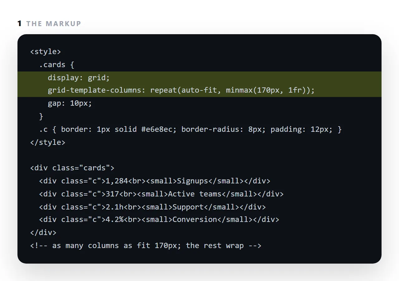
The one line worth memorising is grid-template-columns: repeat(auto-fit, minmax(170px, 1fr)), which fits as many 170px-or-wider columns as the container allows and wraps the rest, so a laptop gets four cards and a phone gets one with no media query at all.
This guide reads that declaration word by word, explains auto-fit versus auto-fill, gap and alignment, and where flexbox is the better tool.
.cards {
  display: grid;
  grid-template-columns: repeat(auto-fit, minmax(170px, 1fr));
  gap: 10px;
}
Four cards on a laptop, two on a tablet, one on a phone. No media queries, no breakpoints, nothing to maintain.
Reading the CSS grid declaration
repeat(auto-fit, …)— make as many columns as fit.minmax(170px, 1fr)— each at least 170px, and share the leftover space equally.
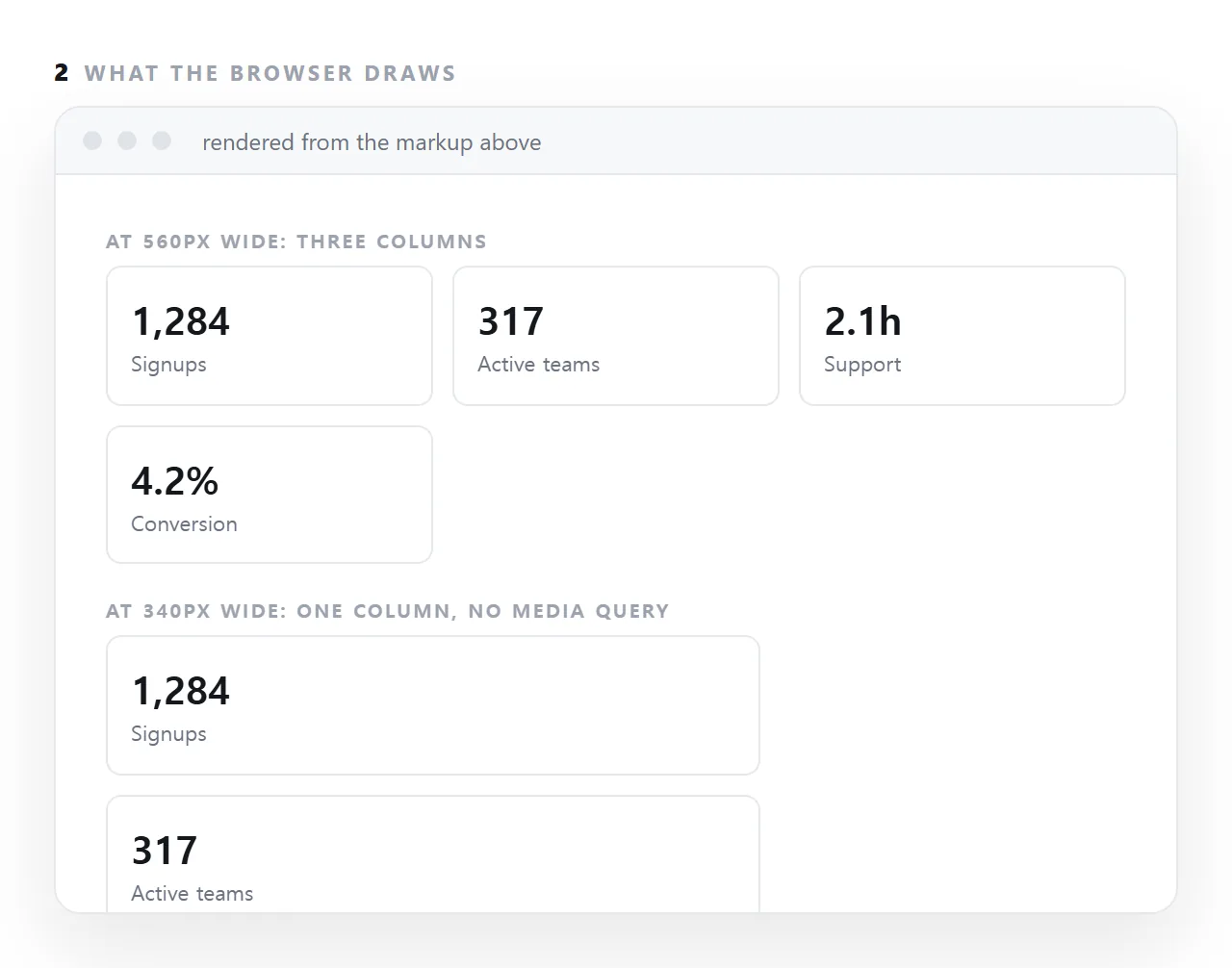
So the browser divides the available width by 170, makes that many columns, and stretches them to fill. On a 360px phone that is one column; on 1200px it is six.
This one line replaces most of what media queries used to be needed for.
auto-fit or auto-fill
/* two items in a wide container */
repeat(auto-fit,  minmax(170px, 1fr))   /* two wide items filling the row */
repeat(auto-fill, minmax(170px, 1fr))   /* two 170px items and empty space */
auto-fit collapses the empty tracks so the real items stretch. auto-fill keeps them, leaving a gap on the right.
For cards and dashboards you want auto-fit. auto-fill is right when column positions must stay consistent across a set of rows.
The properties worth knowing
.layout {
  display: grid;
  grid-template-columns: 220px 1fr;   /* fixed sidebar, flexible main */
  gap: 20px;
}

.row {
  display: grid;
  grid-template-columns: 130px 1fr 62px;   /* label, bar, value */
  align-items: center;
  gap: 11px;
}

.full { grid-column: 1 / -1; }   /* span every column */
Those three patterns cover a large share of real layouts:
| Pattern | Use |
|---|---|
repeat(auto-fit, minmax(…, 1fr)) |
Cards, tiles, anything that should reflow |
220px 1fr |
A sidebar next to content |
130px 1fr 62px |
A bar chart row — label, track, value |
grid-column: 1 / -1 |
A full-width element inside a grid |
The overflow trap
1fr means "one share of the free space", but it also has an implicit minimum of auto — which is the size of the content. So a grid item containing something that cannot shrink, like a long URL or a wide table, pushes the column wider than its share and the grid overflows.
/* the fix */
.cards { grid-template-columns: repeat(auto-fit, minmax(0, 1fr)); }
/* or on the item */
.card { min-width: 0; }
minmax(0, 1fr) allows the track to shrink below its content. This is the most common cause of a grid layout scrolling sideways on a phone, and it is hard to find by inspection because nothing in the markup looks wrong.
gap, not margins
/* good */ .cards { gap: 10px; }
/* avoid */ .card { margin: 5px; }
gap spaces items from each other without adding space at the outer edges. Margins do, so a margin-based grid is always slightly inset from its container in a way that has to be corrected with negative margins.
Grid or flexbox
| Grid | Flexbox | |
|---|---|---|
| Rows and columns together | Yes | One direction at a time |
| Equal columns | Natural | Needs flex: 1 on each |
| Items size themselves | No — tracks decide | Yes |
| A toolbar with a pushed-right item | Awkward | Natural |
| A card grid | Natural | Needs wrapping and widths |
Rule of thumb: grid when you are defining the container's shape, flexbox when you are distributing items along a line. A page layout is grid; a row of buttons is flexbox.
What to ask for in a prompt
Grids with repeat(auto-fit, minmax(170px, 1fr)) and gap.
Never a fixed column count. Use minmax(0, 1fr) so nothing overflows.
Generated CSS defaults to repeat(4, 1fr), which is the main cause of sideways scrolling on phones.
Three grid mistakes that cost the most
A hard-coded column count. grid-template-columns: repeat(4, 1fr) is four columns at every width, so a phone gets four columns each 80px wide. Use auto-fit with a minimum instead, and the count follows the space.
A minimum wider than a phone. minmax(400px, 1fr) cannot fit in a 360px screen, so the single column overflows. Keep the minimum at or below about 170px for cards, or use minmax(min(100%, 400px), 1fr) so it never exceeds the container.
Grid where flex was wanted. A single row of label, bar and value is a flex row; grid works but wants explicit column sizes. Flexbox does one line better.
Grid for the whole page
The same idea scales up. A page with a sidebar and content is grid-template-columns: 220px 1fr on wide screens and one column on narrow ones, with a single media query switching it.
Named areas, grid-template-areas, let you draw the layout as text: header across the top, sidebar and main in the middle, footer below, and rearrange it for a phone by rewriting the text.
That is the whole of page layout for most documents, in a dozen lines.
Laying out cards with grid: 4 steps
- Put
display: gridon the parent. The children become grid items; no wrapper around each one. - Declare the columns with auto-fit and a minimum.
repeat(auto-fit, minmax(170px, 1fr)). Choose the minimum by the narrowest a card can be and still read. - Add
gapinstead of margins.gap: 10pxspaces the cells in both directions with one property, and nothing doubles up at the edges. - Check at 360px. Cards should stack into one column. If something overflows, it has a fixed width; the mobile layout guide lists the usual culprits.