grid-auto-flow tells the browser how to place grid items that have no grid-row or grid-column of their own. row (the default) fills across and adds rows. column fills downwards and adds columns. Adding dense lets later items go back and fill holes.
Try all four combinations. The numbers are the HTML order, and the text under the grid counts the tracks the browser had to add.
<!doctype html>
<html lang="en">
<head>
<meta charset="utf-8">
<meta name="viewport" content="width=device-width, initial-scale=1">
<title>grid-auto-flow lab: row, column, dense</title>
<style>
  body { margin: 0; padding: 14px; font-family: system-ui, sans-serif; background: #f4f5f7; color: #1d2330; }
  .bar { display: flex; flex-wrap: wrap; gap: 6px; align-items: center; margin-bottom: 10px; }
  button { font: 600 13px system-ui, sans-serif; padding: 7px 12px; border-radius: 8px; border: 1px solid #c9cdd4; background: #fff; cursor: pointer; }
  button[aria-pressed="true"] { background: #1d2330; color: #fff; border-color: #1d2330; }
  label { font-size: 13px; display: flex; gap: 5px; align-items: center; margin-left: 4px; }
  .grid {
    display: grid;
    grid-template-columns: repeat(3, minmax(0, 1fr));  /* 3 declared columns */
    grid-template-rows: repeat(3, 40px);                /* 3 declared rows */
    grid-auto-columns: minmax(0, 1fr);  /* size of any column the browser adds */
    grid-auto-rows: 40px;               /* size of any row the browser adds */
    grid-auto-flow: row;                /* the buttons switch this */
    gap: 6px; padding: 6px; border-radius: 10px;
    background: repeating-linear-gradient(45deg, #fde2da 0 6px, #fff7f5 6px 12px);  /* shows empty cells */
  }
  .grid > div {
    border-radius: 7px; background: #fff; box-shadow: 0 1px 3px rgba(0, 0, 0, .15);
    display: grid; place-items: center; font-weight: 700; font-size: 17px;
  }
  .grid > .wide { grid-column: span 2; background: #dbeafe; }
  .grid > .tall { grid-row: span 2; background: #d6f2df; }
  .out { font-size: 13px; line-height: 1.55; margin-top: 10px; }
  code { font: 600 13px ui-monospace, Consolas, monospace; }
</style>
</head>
<body>
<div class="bar">
  <button id="row" aria-pressed="true">row</button>
  <button id="column" aria-pressed="false">column</button>
  <label><input type="checkbox" id="dense"> dense</label>
</div>

<!-- the numbers are the HTML order -->
<div class="grid" id="grid">
  <div>1</div><div>2</div><div class="wide">3</div><div>4</div><div class="tall">5</div>
  <div>6</div><div class="wide">7</div><div>8</div><div>9</div>
</div>

<div class="out">
  <div><code id="css"></code></div>
  <div id="tracks"></div>
  <div>Order on screen: <code id="order"></code></div>
</div>

<script>
  const grid = document.getElementById('grid');
  let dir = 'row';

  function update() {
    const flow = dir + (document.getElementById('dense').checked ? ' dense' : '');
    grid.style.gridAutoFlow = flow;
    document.getElementById('row').setAttribute('aria-pressed', dir === 'row');
    document.getElementById('column').setAttribute('aria-pressed', dir === 'column');
    document.getElementById('css').textContent = 'grid-auto-flow: ' + flow + ';';

    // the computed track list includes the tracks the browser added
    const cs = getComputedStyle(grid);
    const cols = cs.gridTemplateColumns.split(' ').length;
    const rows = cs.gridTemplateRows.split(' ').length;
    document.getElementById('tracks').textContent =
      'Columns: 3 declared + ' + (cols - 3) + ' added. Rows: 3 declared + ' + (rows - 3) + ' added.';

    // where the items landed: top to bottom, then left to right
    const seen = [...grid.children].sort((a, b) => a.offsetTop - b.offsetTop || a.offsetLeft - b.offsetLeft);
    document.getElementById('order').textContent = seen.map(d => d.textContent).join(' ');
  }

  document.getElementById('row').addEventListener('click', () => { dir = 'row'; update(); });
  document.getElementById('column').addEventListener('click', () => { dir = 'column'; update(); });
  document.getElementById('dense').addEventListener('change', update);
  update();
</script>
</body>
</html>
The grid declares 3 columns and 3 rows. In row flow the columns stay at 3 and rows are added. In column flow the rows stay at 3 and columns are added. One property decides both.
row and column: the two directions
The browser keeps a cursor that walks through the grid cells in order. With row, it walks left to right, then drops to the next row. With column, it walks top to bottom, then moves to the next column.
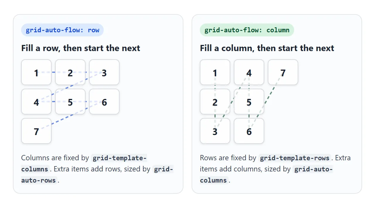
Each direction needs the other axis declared:
/* row flow: fixed columns, rows added as needed */
.list { display: grid; grid-template-columns: repeat(3, 1fr); }

/* column flow: fixed rows, columns added as needed */
.list { display: grid; grid-template-rows: repeat(3, auto); grid-auto-flow: column; }
Column flow with no grid-template-rows gives a grid with one row. Every item then gets its own new column, and they all sit side by side. That is a bug in a list, and exactly what you want in a sideways strip, covered below.
An item that spans more tracks than the grid has also adds tracks. grid-column: span 4 in a 3-column grid makes a fourth column.
Implicit tracks and grid-auto-rows
Tracks you list in grid-template-columns and grid-template-rows are the explicit grid. Anything the browser adds to fit more items is implicit. Implicit rows take their size from grid-auto-rows, implicit columns from grid-auto-columns.
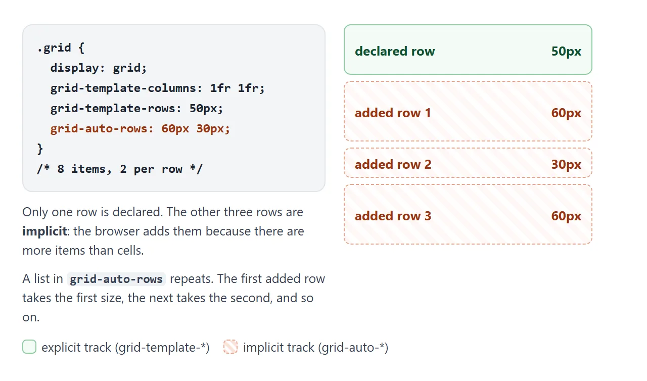
Both properties default to auto, which sizes each track to its content. For cards that usually means rows of uneven height. Common values:
| Value | What the added rows do |
|---|---|
auto (default) |
Each row is as tall as its tallest item |
120px |
Every added row is 120px, and longer content overflows |
minmax(120px, auto) |
At least 120px, taller when the content needs it |
60px 30px |
Sizes alternate: 60, 30, 60, 30 |
4px |
Tiny rows that items span many of, used for the masonry wall below |
minmax(120px, auto) is the safe choice for cards: they line up, and a long title does not spill out. Declaring the column side is covered in CSS grid-template-columns.
grid-auto-columns: a row that scrolls sideways
Column flow plus grid-auto-columns gives a horizontal strip with no extra markup. Every card becomes a new implicit column, and grid-auto-columns sets how wide each one is.
<!doctype html>
<html lang="en">
<head>
<meta charset="utf-8">
<meta name="viewport" content="width=device-width, initial-scale=1">
<title>A sideways row with grid-auto-flow: column</title>
<style>
  body { margin: 0; padding: 14px; font-family: system-ui, sans-serif; background: #f4f5f7; color: #1d2330; }
  .bar { display: flex; flex-wrap: wrap; gap: 6px; margin-bottom: 10px; }
  button { font: 600 13px system-ui, sans-serif; padding: 7px 10px; border-radius: 8px; border: 1px solid #c9cdd4; background: #fff; cursor: pointer; }
  button[aria-pressed="true"] { background: #1d2330; color: #fff; border-color: #1d2330; }
  .strip {
    display: grid;
    grid-auto-flow: column;   /* each new card becomes a new column */
    grid-auto-columns: 45%;   /* width of every added column; the buttons switch this */
    gap: 10px;
    overflow-x: auto;         /* the row scrolls sideways instead of squeezing */
    scroll-snap-type: x mandatory;
    padding: 4px 2px 12px;
  }
  .card {
    scroll-snap-align: start;
    height: 150px; border-radius: 12px; padding: 12px; box-sizing: border-box;
    color: #fff; font-weight: 700; display: flex; align-items: flex-end;
  }
  .out { font-size: 13px; line-height: 1.5; margin: 8px 0 0; }
  code { font: 600 13px ui-monospace, Consolas, monospace; }
</style>
</head>
<body>
<div class="bar">
  <button data-size="45%" aria-pressed="true">45%</button>
  <button data-size="80%" aria-pressed="false">80%</button>
  <button data-size="160px" aria-pressed="false">160px</button>
  <button id="add">+ Add card</button>
</div>

<div class="strip" id="strip"></div>
<p class="out"><code id="css"></code><br><span id="count"></span></p>

<script>
  const strip = document.getElementById('strip');
  const colors = ['#2563eb', '#0f766e', '#9333ea', '#c2410c', '#be123c', '#4d7c0f'];

  function report() {
    const cols = getComputedStyle(strip).gridTemplateColumns.split(' ');
    document.getElementById('css').textContent = 'grid-auto-columns: ' + strip.style.gridAutoColumns + ';';
    document.getElementById('count').textContent =
      cols.length + ' columns, all added by the browser, each ' + Math.round(parseFloat(cols[0])) + 'px wide.';
  }

  function addCard() {
    const n = strip.children.length + 1;
    const card = document.createElement('div');
    card.className = 'card';
    card.style.background = 'linear-gradient(135deg, ' + colors[n % colors.length] + ', #1d2330)';
    card.textContent = 'Card ' + n;
    strip.appendChild(card);
    report();
  }

  document.querySelectorAll('[data-size]').forEach(btn => {
    btn.addEventListener('click', () => {
      strip.style.gridAutoColumns = btn.dataset.size;
      document.querySelectorAll('[data-size]').forEach(b => b.setAttribute('aria-pressed', b === btn));
      report();
    });
  });
  document.getElementById('add').addEventListener('click', addCard);

  strip.style.gridAutoColumns = '45%';
  for (let i = 0; i < 4; i++) addCard();
</script>
</body>
</html>
.strip {
  display: grid;
  grid-auto-flow: column;
  grid-auto-columns: 45%;   /* each card is 45% of the strip */
  gap: 10px;
  overflow-x: auto;
  scroll-snap-type: x mandatory;
}
.strip > * { scroll-snap-align: start; }
A percentage is measured against the strip, so the cards keep the same share of the screen on a phone and a laptop. A length such as 160px keeps the cards the same size and shows more of them on wider screens.
The snapping part is explained in CSS scroll snap.
dense: filling the holes
By default the cursor only moves forward. When an item spans 2 columns and only 1 cell is left in the current row, the item moves to the next row and the cell stays empty. Later items do not go back for it.
dense changes that. Before placing each item, the browser starts again from the top and takes the first spot where the item fits. Small items drop into holes that wide items left behind.
In the lab above, switch to row and tick dense. Item 4 moves up into the empty cell next to 2, and one added row disappears.
The cost is order. Items are no longer drawn in HTML order, but keyboard focus and screen readers still follow the HTML. Use dense for photos and tiles. Keep the default for steps, prices and anything read in sequence.
Placing single items by line number is covered in CSS grid row start and span.
A masonry-style gallery with dense and span
A photo wall where each column stacks tiles of different heights with no gaps is often called masonry. With grid-auto-rows: auto, a short tile next to a tall one leaves a hole below it, because the whole row is as tall as the tall tile.
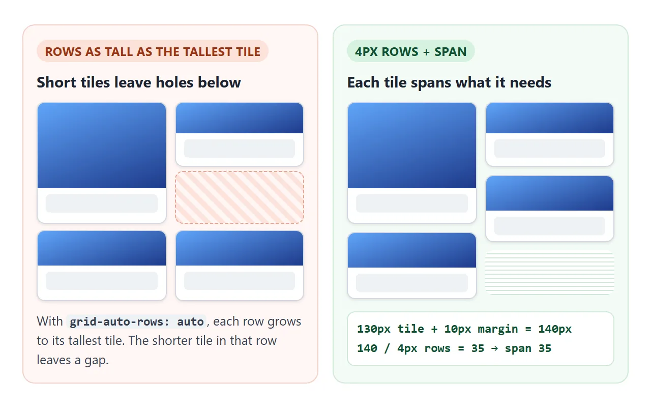
The fix is tiny rows. Set grid-auto-rows: 4px and row-gap: 0, then give every tile a row span that matches its height:
const row = 4;                                  // grid-auto-rows
for (const tile of wall.children) {
  const h = tile.offsetHeight + 10;             // tile + its 10px bottom margin
  tile.style.gridRowEnd = 'span ' + Math.ceil(h / row);
}
Wide tiles get grid-column: span 2, and grid-auto-flow: row dense lets later tiles fill the holes they leave.
<!doctype html>
<html lang="en">
<head>
<meta charset="utf-8">
<meta name="viewport" content="width=device-width, initial-scale=1">
<title>Masonry-style gallery with grid-auto-rows, span and dense</title>
<style>
  body { margin: 0; padding: 14px; font-family: system-ui, sans-serif; background: #f4f5f7; color: #1d2330; }
  .bar { display: flex; flex-wrap: wrap; gap: 6px 14px; align-items: center; margin-bottom: 10px; font-size: 13px; }
  label { display: flex; gap: 5px; align-items: center; }
  .wall {
    display: grid;
    grid-template-columns: repeat(auto-fill, minmax(100px, 1fr));
    grid-auto-rows: 4px;       /* tiny rows: each tile spans as many as its height needs */
    column-gap: 10px;
    row-gap: 0;                /* the space under a tile comes from its margin */
    grid-auto-flow: row dense; /* later tiles fill holes left by wide ones */
  }
  .tile { margin: 0 0 10px; border-radius: 10px; overflow: hidden; background: #fff; box-shadow: 0 1px 3px rgba(0, 0, 0, .15); }
  .tile.wide { grid-column: span 2; }
  .pic { display: grid; place-items: center; color: #fff; font-weight: 700; font-size: 20px; }
  .tile figcaption { padding: 7px 9px 9px; font-size: 12.5px; line-height: 1.35; }
  code { font: 600 12.5px ui-monospace, Consolas, monospace; }
</style>
</head>
<body>
<div class="bar">
  <label><input type="checkbox" id="dense" checked> dense</label>
  <span>Wall height: <code id="height"></code></span>
</div>

<div class="wall" id="wall"></div>

<script>
  const wall = document.getElementById('wall');
  // [picture height, caption, wide?] - sample tiles; the pictures are CSS gradients
  const tiles = [
    [90, 'Harbour at dawn'], [130, 'Stairwell'], [60, 'Two chairs', true],
    [70, 'Market stall'], [110, 'Rain on the window, a caption long enough to wrap'],
    [60, 'Bridge', true], [120, 'Lighthouse'], [80, 'Bicycles'], [60, 'Rooftops', true], [100, 'Cafe corner']
  ];
  tiles.forEach(([h, text, wide], i) => {
    const t = document.createElement('figure');
    t.className = 'tile' + (wide ? ' wide' : '');
    t.innerHTML = '<div class="pic" style="height:' + h + 'px;background:linear-gradient(160deg,hsl(' + (i * 37) +
      ' 60% 55%),hsl(' + (i * 37 + 40) + ' 55% 30%))">' + (i + 1) + '</div><figcaption>' + text + '</figcaption>';
    wall.appendChild(t);
  });

  // row span = (tile height + its 10px bottom margin) / row size, rounded up
  function layout() {
    const row = parseFloat(getComputedStyle(wall).gridAutoRows);
    for (const t of wall.children) {
      const h = t.querySelector('.pic').offsetHeight + t.querySelector('figcaption').offsetHeight + 10;
      t.style.gridRowEnd = 'span ' + Math.ceil(h / row);
    }
    document.getElementById('height').textContent = wall.offsetHeight + 'px';
  }

  document.getElementById('dense').addEventListener('change', (e) => {
    wall.style.gridAutoFlow = e.target.checked ? 'row dense' : 'row';
    layout();
  });
  new ResizeObserver(layout).observe(wall);  // captions rewrap when the width changes
  layout();
</script>
</body>
</html>
- Why margin, not gap: a
row-gapsits between every pair of 4px rows, so a tile spanning 35 rows would carry 34 gaps. A bottom margin on the tile is counted once. - Measure again on resize: captions wrap to more lines on narrow screens. A
ResizeObserveron the wall reruns the loop. - Images: a real
<img>has no height until it loads. Setwidthandheightattributes, or run the loop again on each image'sloadevent.
If you need no wide tiles, CSS multi-column stacks tiles with no JavaScript at all. It fills the first column top to bottom, then the second, so the order runs down, not across.
For a plain grid of equal photos, see an HTML image gallery.
When it does not work
| What you see | Cause | Fix |
|---|---|---|
| Column flow puts all items in one long row | No grid-template-rows |
Declare the rows, e.g. repeat(3, auto) |
| Added rows are uneven or squashed | grid-auto-rows is auto |
Set minmax(120px, auto) or a fixed size |
| Empty cells next to wide items | The default flow never goes back | Add dense if order does not matter |
| Tab order jumps around the screen | dense changed the drawn order only |
Remove dense from grids of links or buttons |
| Extra narrow column appears | A span larger than the column count |
Lower the span, or set grid-auto-columns |
| Masonry tiles overlap or leave strips | Span measured before text or images loaded | Measure again on resize and on image load |
| Masonry spacing is far too big | row-gap counted between tiny rows |
Set row-gap: 0 and use a bottom margin |
For how grids break onto new lines as the screen narrows, see CSS grid wrap. For the overall layout, start from CSS grid.
Share it as a link
Auto-placement is easiest to judge by switching it on a real screen, at a real width. A screenshot shows one width only, and an .html file sent as an attachment may open as plain code on a phone.
To send the working version, paste the page into a NOS document and choose Create share link. HTML to link walks through it.
The page renders as written and its scripts run, so the people you send it to can tick dense and resize the wall themselves. If you change the code later, the same link shows the new version.