CSS scroll snap makes a scrolling area stop on whole items. Put scroll-snap-type on the element that scrolls and scroll-snap-align on its children. When the user stops scrolling, the browser moves on to the nearest item edge.
Try it first. Scroll the row sideways with a trackpad, a mouse wheel with Shift, or a finger.
<!doctype html>
<html lang="en">
<head>
<meta charset="utf-8">
<meta name="viewport" content="width=device-width, initial-scale=1">
<title>CSS scroll snap: basic</title>
<style>
  body { margin: 0; padding: 16px; font-family: system-ui, sans-serif; background: #f4f5f7; color: #1d2330; }
  p { margin: 0 0 10px; font-size: 14px; }

  .strip {
    display: flex; gap: 12px;
    overflow-x: auto;               /* 1. the container must scroll */
    scroll-snap-type: x mandatory;  /* 2. snap on the x axis, always */
    padding-bottom: 8px;
  }
  .card {
    flex: 0 0 72%; height: 150px; border-radius: 12px;
    scroll-snap-align: start;       /* 3. which edge of the card lines up */
    display: grid; place-items: center;
    color: #fff; font-size: 22px; font-weight: 700;
  }
  .card:nth-child(1) { background: #2563eb; }
  .card:nth-child(2) { background: #0d9488; }
  .card:nth-child(3) { background: #d97706; }
  .card:nth-child(4) { background: #7c3aed; }
  .card:nth-child(5) { background: #db2777; }
</style>
</head>
<body>
<p>Scroll or swipe sideways. Every stop lands on the start of a card.</p>
<div class="strip" id="strip" tabindex="0" aria-label="Cards">
  <div class="card">1</div>
  <div class="card">2</div>
  <div class="card">3</div>
  <div class="card">4</div>
  <div class="card">5</div>
</div>
</body>
</html>
Here are the lines that do it:
.strip { display: flex; overflow-x: auto; scroll-snap-type: x mandatory; }
.card  { flex: 0 0 72%; scroll-snap-align: start; }
Two parts: the container and the items
Scroll snap always has two sides. The scroll container is the element with the scroll bar. It decides whether snapping is on and along which axis. The snap items are its descendants. Each one says where it wants to line up.
| Property | Goes on | What it does |
|---|---|---|
scroll-snap-type |
Container | Turns snapping on: axis and strictness |
scroll-padding |
Container | Moves the snap line inward, for example below a header |
scroll-snap-align |
Item | Which edge of the item lines up: start, center or end |
scroll-snap-stop |
Item | Whether a fast scroll may skip past this item |
scroll-margin |
Item | Moves the snap position of this one item |
The container must actually scroll. scroll-snap-type on an element with overflow: visible, or on one whose content fits, has nothing to snap. The CSS overflow guide explains how an element gets a scroll bar.
scroll-snap-type: axis and strictness
The first word is the axis: x for a row, y for a column, both for a grid that scrolls both ways. You can also write inline or block, which follow the writing direction of the text.
The second word is the strictness.
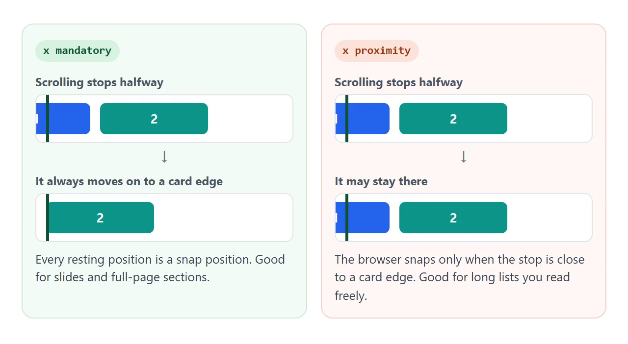
mandatory– the container always comes to rest on a snap position. Use it for slides and full-screen sections.proximity– the browser snaps only if scrolling stops near a snap position. Use it for long lists that people read at their own pace.
If you leave the second word out, scroll-snap-type: x means x proximity. With short items, that can look as if snapping sometimes fails. Write mandatory when you want every stop to land on an item.
scroll-snap-align: which edge lines up
scroll-snap-align goes on each item, not on the container. start lines up the item's left edge (in a row) with the container's left edge. center lines up the middles. end lines up the right edges.
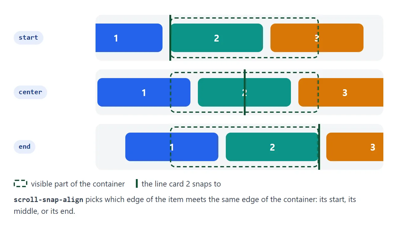
center suits a row where the next and previous items peek in on both sides. start suits a list that reads from left to right. An item without scroll-snap-align is not a stopping point at all, even inside a snapping container.
Change the settings below and scroll the row after each change.
<!doctype html>
<html lang="en">
<head>
<meta charset="utf-8">
<meta name="viewport" content="width=device-width, initial-scale=1">
<title>CSS scroll snap: try the settings</title>
<style>
  body { margin: 0; padding: 14px; font-family: system-ui, sans-serif; background: #f4f5f7; color: #1d2330; font-size: 14px; }
  .controls { display: grid; grid-template-columns: repeat(auto-fit, minmax(150px, 1fr)); gap: 8px 12px; margin-bottom: 12px; }
  label { display: flex; flex-direction: column; gap: 3px; font-weight: 600; font-size: 13px; }
  select { font: inherit; padding: 5px 6px; border: 1px solid #cfd4dc; border-radius: 6px; background: #fff; }

  .strip {
    display: flex; gap: 12px; overflow-x: auto; padding-bottom: 8px;
    background: repeating-linear-gradient(90deg, transparent 0 39px, #e2e6ec 39px 40px);
    scroll-snap-type: x mandatory;   /* the controls change these four lines */
    scroll-padding-left: 0;
  }
  .card {
    flex: 0 0 55%; height: 120px; border-radius: 12px;
    scroll-snap-align: start;
    scroll-snap-stop: normal;
    display: grid; place-items: center; color: #fff; font-size: 22px; font-weight: 700;
  }
  .card:nth-child(odd) { background: #2563eb; }
  .card:nth-child(even) { background: #0d9488; }

  pre { margin: 12px 0 0; padding: 10px 12px; background: #1d2330; color: #e5e7eb; border-radius: 8px; font-size: 12.5px; line-height: 1.5; white-space: pre-wrap; }
</style>
</head>
<body>
<div class="controls">
  <label>scroll-snap-type
    <select id="type"><option>x mandatory</option><option>x proximity</option><option>none</option></select></label>
  <label>scroll-snap-align
    <select id="align"><option>start</option><option>center</option><option>end</option></select></label>
  <label>scroll-padding-left
    <select id="pad"><option>0</option><option>40px</option></select></label>
  <label>scroll-snap-stop
    <select id="stop"><option>normal</option><option>always</option></select></label>
</div>

<div class="strip" id="strip" tabindex="0" aria-label="Cards">
  <div class="card">1</div><div class="card">2</div><div class="card">3</div>
  <div class="card">4</div><div class="card">5</div><div class="card">6</div>
</div>

<pre id="css"></pre>

<script>
  const strip = document.getElementById('strip');
  const cards = strip.querySelectorAll('.card');
  const pick = (id) => document.getElementById(id).value;

  function apply() {
    // container properties
    strip.style.scrollSnapType = pick('type');
    strip.style.scrollPaddingLeft = pick('pad');
    // item properties
    cards.forEach((c) => {
      c.style.scrollSnapAlign = pick('align');
      c.style.scrollSnapStop = pick('stop');
    });
    document.getElementById('css').textContent =
      '.strip { scroll-snap-type: ' + pick('type') + '; scroll-padding-left: ' + pick('pad') + '; }\n' +
      '.card  { scroll-snap-align: ' + pick('align') + '; scroll-snap-stop: ' + pick('stop') + '; }';
  }

  document.querySelectorAll('select').forEach((s) => s.addEventListener('change', apply));
  apply();
</script>
</body>
</html>
scroll-snap-stop: no skipping
By default, a strong flick can fly past several items and snap to one further along. scroll-snap-stop: always on an item asks the browser not to pass over it. The scroll stops at the next item, whatever the speed.
.slide { scroll-snap-align: start; scroll-snap-stop: always; }
Use it where each item must be seen, such as steps in a tutorial or one full-page section at a time. Leave it at normal for a long strip of photos, where people want to move fast.
scroll-padding and scroll-margin
A sticky header sits on top of the scroll area. With plain start snapping, every section snaps to the very top, and its title ends up under the header.
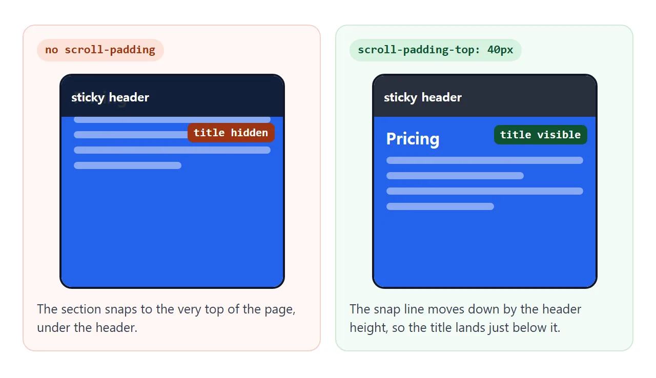
scroll-padding on the container moves the snap line inward for all items:
html { scroll-snap-type: y mandatory; scroll-padding-top: 48px; }
scroll-margin does the same from the other side, for one item only. Use it when a single item needs extra room, such as a card with a label above it.
Both properties also apply to anchor links and scrollIntoView(), so the same line fixes in-page links too. Smooth scroll CSS covers that side.
Full-page sections
For sections that each fill the screen, the page itself is the scroll container. Put scroll-snap-type on html, give each section the height of the screen, and snap each one to its start.
<!doctype html>
<html lang="en">
<head>
<meta charset="utf-8">
<meta name="viewport" content="width=device-width, initial-scale=1">
<title>Full-page sections with CSS scroll snap</title>
<style>
  html {
    scroll-snap-type: y mandatory;  /* on html, not body */
    scroll-padding-top: 48px;       /* keep sections below the sticky header */
    scroll-behavior: smooth;
  }
  body { margin: 0; font-family: system-ui, sans-serif; color: #fff; }

  header {
    position: sticky; top: 0; z-index: 1; height: 48px;
    display: flex; align-items: center; padding: 0 16px;
    background: rgba(17, 24, 39, .92); font-weight: 700;
  }

  section {
    height: calc(100vh - 48px);     /* one screen minus the header */
    scroll-snap-align: start;
    scroll-snap-stop: always;       /* a fast swipe cannot skip a section */
    display: grid; place-content: center; text-align: center; padding: 0 24px;
  }
  section h2 { margin: 0 0 6px; font-size: 30px; }
  section p { margin: 0; opacity: .9; }
  #s1 { background: #2563eb; } #s2 { background: #0d9488; }
  #s3 { background: #d97706; } #s4 { background: #7c3aed; }

  nav { position: fixed; right: 12px; top: 50%; transform: translateY(-50%); display: grid; gap: 10px; z-index: 2; }
  nav button { width: 14px; height: 14px; padding: 0; border-radius: 50%; border: 2px solid #fff; background: transparent; cursor: pointer; }
  nav button.on { background: #fff; }
</style>
</head>
<body>
<header>My product</header>

<section id="s1"><div><h2>One</h2><p>Scroll, swipe or press the dots.</p></div></section>
<section id="s2"><div><h2>Two</h2><p>Every stop is a whole section.</p></div></section>
<section id="s3"><div><h2>Three</h2><p>The header never covers a title.</p></div></section>
<section id="s4"><div><h2>Four</h2><p>The last one.</p></div></section>

<nav aria-label="Sections">
  <button data-to="s1" aria-label="Section 1"></button>
  <button data-to="s2" aria-label="Section 2"></button>
  <button data-to="s3" aria-label="Section 3"></button>
  <button data-to="s4" aria-label="Section 4"></button>
</nav>

<script>
  const dots = document.querySelectorAll('nav button');
  const sections = document.querySelectorAll('section');

  // dots scroll to their section; scroll-padding-top is respected
  dots.forEach((d) => d.addEventListener('click', () => {
    document.getElementById(d.dataset.to).scrollIntoView();
  }));

  // light up the dot of the section that fills the screen
  const io = new IntersectionObserver((entries) => {
    entries.forEach((e) => {
      if (!e.isIntersecting) return;
      dots.forEach((d) => d.classList.toggle('on', d.dataset.to === e.target.id));
    });
  }, { threshold: 0.6 });
  sections.forEach((s) => io.observe(s));
</script>
</body>
</html>
html    { scroll-snap-type: y mandatory; scroll-padding-top: 48px; }
section { height: calc(100vh - 48px); scroll-snap-align: start;
          scroll-snap-stop: always; }
The dots are the only JavaScript. Each one calls scrollIntoView() on its section, and an IntersectionObserver marks the section that fills most of the screen.
Keep full-page sections short enough to fit on a phone screen. Long text inside a snapping section is harder to read, because the page keeps pulling toward a section edge.
Carousels
A snapping row is already a simple carousel: it swipes on a phone and scrolls with a trackpad. Prev and next buttons only need scrollBy(). The HTML carousel guide builds one with buttons, and compares it with a sliding track that has dots and autoplay.
For a strip of images, pair snapping with a thin scroll bar. CSS scrollbar shows how.
When it does not work
| What you see | Cause | Fix |
|---|---|---|
| No snapping at all | The container does not scroll | Add overflow-x: auto or overflow-y: auto, and make the content larger than the box |
| No snapping at all | scroll-snap-align is missing on the items |
Add it to each item, not to the container |
| Full-page snapping does nothing | scroll-snap-type is on body |
Move it to html |
| It snaps only sometimes | The strictness was left out, so it is proximity |
Write mandatory |
| The wrong axis snaps, or nothing | x on a vertical list, or y on a row |
Match the axis to the scroll direction |
| Titles end up under the sticky header | The snap line is at the very top | scroll-padding-top with the header height on the container |
| A fast flick skips items | scroll-snap-stop is normal |
scroll-snap-stop: always on the items |
| Snapping looks jumpy with JavaScript | A scroll listener sets scrollLeft on every event |
Let CSS do the snapping and only call scrollBy() or scrollIntoView() |
Share it as a link
Snapping is something you have to feel. A screenshot shows a row of cards but not how it stops, and an .html attachment may open as plain code on a phone.
To send the working version, paste the page into a NOS document and choose Create share link. HTML to link walks through it.
The page renders as written and its scripts run, so people can swipe the row or the sections themselves. If you change the code later, the same link shows the new version.