A scrollbar is styled with two standard CSS properties: scrollbar-color sets the thumb and track colours, and scrollbar-width picks auto, thin or none.
The older ::-webkit-scrollbar pseudo-elements add pixel widths and rounded thumbs. In Chromium, if a standard property is set, the webkit rules are ignored.
Try it first. Pick colours and a width, then switch between the two methods and scroll the box.
<!doctype html>
<html lang="en">
<head>
<meta charset="utf-8">
<meta name="viewport" content="width=device-width, initial-scale=1">
<title>Scrollbar styler</title>
<style>
  body { margin: 0; padding: 16px; font-family: system-ui, sans-serif; background: #f4f5f7; color: #1d2330; }
  .wrap { display: flex; flex-wrap: wrap; gap: 16px; }
  .controls { display: grid; gap: 10px; flex: 1 1 200px; font-size: 14px; }
  .controls label { display: flex; justify-content: space-between; align-items: center; gap: 8px; }
  .controls fieldset { border: 1px solid #d5d9e0; border-radius: 8px; padding: 6px 10px; margin: 0; }
  .box {
    flex: 1 1 220px; height: 200px;
    overflow-y: auto;            /* the box scrolls when its content is taller */
    background: #fff; border: 1px solid #d5d9e0; border-radius: 10px; padding: 0 14px;
  }
  .box p { line-height: 1.5; }
  pre { background: #1d2330; color: #e5e7eb; border-radius: 10px; padding: 12px; font-size: 12.5px; overflow-x: auto; margin: 16px 0 0; }
</style>
<!-- the scrollbar rules the controls write -->
<style id="live"></style>
</head>
<body>
<div class="wrap">
  <div class="controls">
    <label>Thumb colour <input type="color" id="thumb" value="#2563eb"></label>
    <label>Track colour <input type="color" id="track" value="#e5e7eb"></label>
    <label>Width
      <select id="width">
        <option value="auto">auto</option>
        <option value="thin" selected>thin</option>
        <option value="none">none</option>
      </select>
    </label>
    <fieldset>
      <legend>Apply to the box</legend>
      <label><span>Standard properties</span><input type="radio" name="mode" value="std" checked></label>
      <label><span>::-webkit-scrollbar only</span><input type="radio" name="mode" value="wk"></label>
    </fieldset>
  </div>
  <div class="box" id="box">
    <p><b>Scroll this box.</b> The scrollbar on the right uses the colours and width you pick.</p>
    <p>With "Standard properties", scrollbar-color and scrollbar-width style it.</p>
    <p>With "::-webkit-scrollbar only", the thumb is rounded and its width is a pixel value.</p>
    <p>Firefox reads only the standard properties.</p>
    <p>Chromium browsers read both, and when a standard property is set they ignore the webkit rules.</p>
    <p>End of the box.</p>
  </div>
</div>
<pre id="out"></pre>

<script>
  const $ = (id) => document.getElementById(id);
  const px = { auto: 14, thin: 8 };  // pixel width used for the webkit version

  function update() {
    const thumb = $('thumb').value, track = $('track').value, width = $('width').value;
    const standard =
`.box {
  scrollbar-color: ${thumb} ${track}; /* thumb, then track */
  scrollbar-width: ${width};
}`;
    const webkit = width === 'none'
? `.box::-webkit-scrollbar { display: none; }`
: `.box::-webkit-scrollbar { width: ${px[width]}px; }
.box::-webkit-scrollbar-track { background: ${track}; }
.box::-webkit-scrollbar-thumb {
  background: ${thumb};
  border-radius: 99px;
}`;
    const mode = document.querySelector('input[name=mode]:checked').value;
    $('live').textContent = mode === 'std' ? standard : webkit;
    $('out').textContent = '/* Standard */\n' + standard + '\n\n/* Fallback: ::-webkit-scrollbar */\n' + webkit;
  }

  document.querySelectorAll('input, select').forEach((el) => el.addEventListener('input', update));
  update();
</script>
</body>
</html>
The short version, for a box that scrolls:
.box {
  overflow-y: auto;
  scrollbar-color: #2563eb #e5e7eb; /* thumb, then track */
  scrollbar-width: thin;
}
scrollbar-color and scrollbar-width
These two properties are the standard way. They go on the element that scrolls, not on a child.
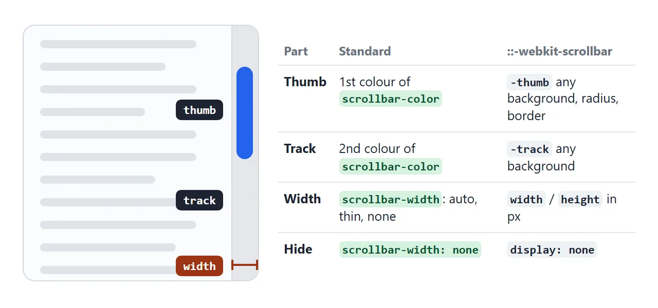
scrollbar-colortakes two colours: the thumb you drag, then the track behind it.transparentworks for the track.scrollbar-widthtakes a keyword only:auto(the normal bar),thin(a narrower bar), ornone(no bar, still scrolls).
There is no pixel value and no rounded corner setting. The browser draws the bar, and you choose its colours and one of three sizes. That limit is the price of working the same in Firefox and Chromium.
::-webkit-scrollbar for pixel widths and rounded thumbs
The pseudo-elements came first and give more control. Each part of the bar is its own element you can style with ordinary CSS:
.box::-webkit-scrollbar { width: 10px; height: 10px; } /* height is for horizontal bars */
.box::-webkit-scrollbar-track { background: #e5e7eb; }
.box::-webkit-scrollbar-thumb {
  background: #2563eb;
  border-radius: 99px;
}
.box::-webkit-scrollbar-thumb:hover { background: #1d4ed8; }
Firefox does not support ::-webkit-scrollbar at all. Chromium browsers and Safari do. So a site that only uses the pseudo-elements shows default bars in Firefox.
Which one the browser uses
Chromium supports both methods, and it does not mix them. The table below is the bar width measured on a test box in Chromium 147 (box width minus inner width):
| Rules on the box | Bar width seen |
|---|---|
| No scrollbar rules | 15px (default) |
::-webkit-scrollbar { width: 30px } |
30px |
Same, plus scrollbar-width: thin |
10px |
Same, plus scrollbar-color only |
15px |
Same, plus scrollbar-width: auto |
30px |
:root { scrollbar-color: ... } and the webkit rule on the box |
15px |
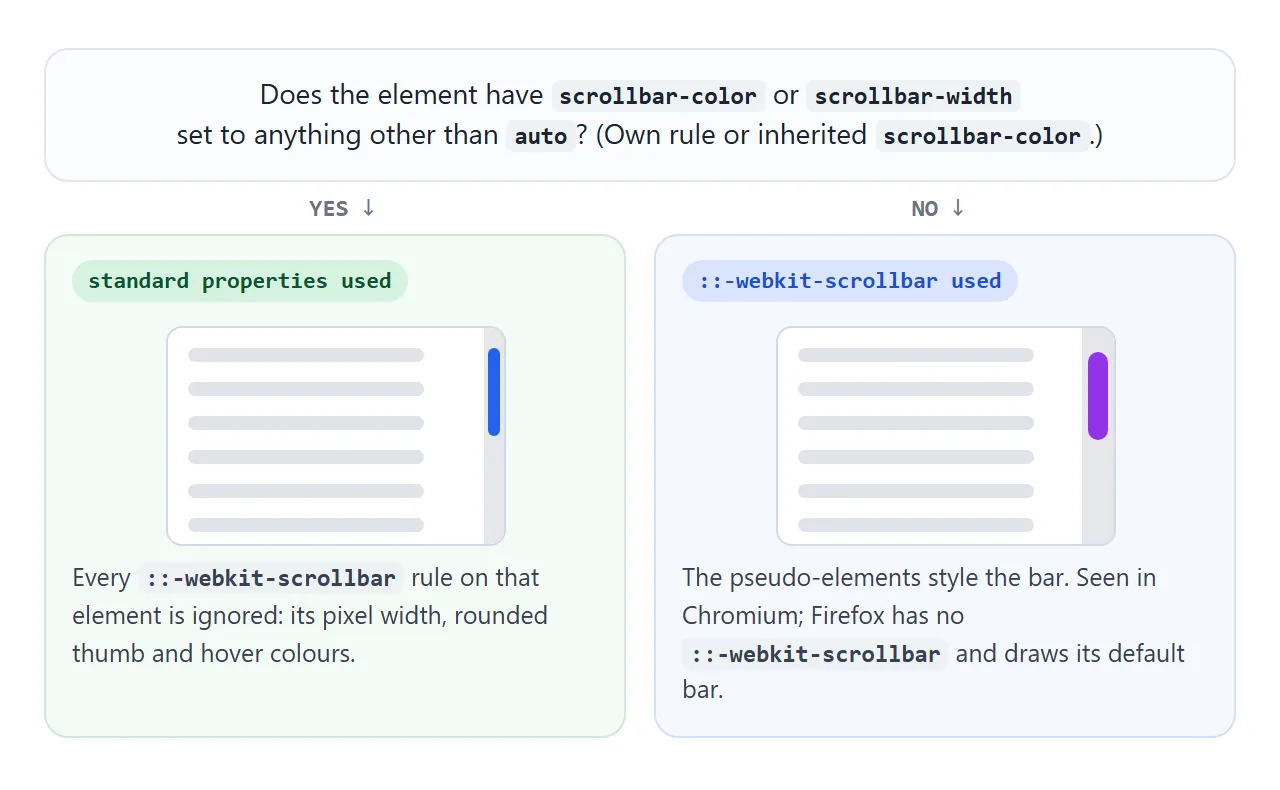
The last row is the one that catches people. scrollbar-color is inherited, so setting it once on :root or html turns off every ::-webkit-scrollbar rule on the page. scrollbar-width is not inherited, so it only affects the element it is on.
To get the webkit look where the pseudo-elements work and the standard look elsewhere, wrap the standard rules in a support check. In the same Chromium test this kept the 30px webkit bar:
@supports not selector(::-webkit-scrollbar) {
  .box { scrollbar-color: #2563eb #e5e7eb; scrollbar-width: thin; }
}
The page scrollbar: html, not body
The main page scrollbar belongs to the viewport.
In the same Chromium test, scrollbar-color and scrollbar-width on html changed the page bar, and the same rules on body did nothing to it. body::-webkit-scrollbar did style the page bar, so older snippets that use it still work there.
Put page-level scrollbar rules on html, and inner rules on the element that actually has overflow.
Hide a scrollbar but keep scrolling
scrollbar-width: none removes the bar and keeps the scrolling. Add the webkit rule for browsers that only know the pseudo-element:
.strip {
  overflow-x: auto;
  scrollbar-width: none;
}
.strip::-webkit-scrollbar { display: none; }
<!doctype html>
<html lang="en">
<head>
<meta charset="utf-8">
<meta name="viewport" content="width=device-width, initial-scale=1">
<title>Default, thin, hidden scrollbars and scrollbar-gutter</title>
<style>
  body { margin: 0; padding: 16px; font-family: system-ui, sans-serif; background: #f4f5f7; color: #1d2330; font-size: 14px; }
  .row { display: grid; grid-template-columns: repeat(auto-fit, minmax(100px, 1fr)); gap: 10px; }
  h3 { font-size: 13px; margin: 0 0 6px; font-family: ui-monospace, Consolas, monospace; }
  .box {
    height: 140px; overflow-y: auto;
    background: #fff; border: 1px solid #d5d9e0; border-radius: 8px; padding: 0 10px;
  }
  .box p { margin: 10px 0; }
  .thin { scrollbar-width: thin; }
  .hidden { scrollbar-width: none; }                 /* standard */
  .hidden::-webkit-scrollbar { display: none; }     /* ::-webkit-scrollbar fallback */

  .gutter-test { margin-top: 18px; }
  #list { height: 150px; overflow-y: auto; background: #fff; border: 1px solid #d5d9e0; border-radius: 8px; }
  #list.stable { scrollbar-gutter: stable; }         /* keep room for the bar even before it appears */
  #list div { margin: 6px; padding: 6px; background: #dbeafe; border-radius: 6px; text-align: center; }
  .bar { display: flex; flex-wrap: wrap; gap: 10px; align-items: center; margin: 8px 0; }
  button { font: inherit; padding: 6px 12px; border-radius: 6px; border: 1px solid #9aa3b2; background: #fff; cursor: pointer; }
  output { font-family: ui-monospace, Consolas, monospace; }
</style>
</head>
<body>
<div class="row">
  <div><h3>default</h3><div class="box"><p>1. Scroll me.</p><p>2</p><p>3</p><p>4</p><p>5</p><p>6. End.</p></div></div>
  <div><h3>thin</h3><div class="box thin"><p>1. Scroll me.</p><p>2</p><p>3</p><p>4</p><p>5</p><p>6. End.</p></div></div>
  <div><h3>none</h3><div class="box hidden" tabindex="0"><p>1. Scroll me.</p><p>2</p><p>3</p><p>4</p><p>5</p><p>6. End.</p></div></div>
</div>

<div class="gutter-test">
  <div class="bar">
    <button id="add">Add a row</button>
    <button id="reset">Reset</button>
    <label><input type="checkbox" id="stable"> scrollbar-gutter: stable</label>
  </div>
  <div id="list"></div>
  <p>Row width: <output id="w"></output></p>
</div>

<script>
  const list = document.getElementById('list');
  const w = document.getElementById('w');

  // show the inner width, so the shift is visible as a number too
  const measure = () => { w.textContent = list.clientWidth + 'px'; };

  function reset() {
    list.innerHTML = '<div>Row 1</div><div>Row 2</div><div>Row 3</div>';
    measure();
  }

  document.getElementById('add').addEventListener('click', () => {
    const row = document.createElement('div');
    row.textContent = 'Row ' + (list.children.length + 1);
    list.append(row);
    measure();
  });
  document.getElementById('reset').addEventListener('click', reset);
  document.getElementById('stable').addEventListener('change', (e) => {
    list.classList.toggle('stable', e.target.checked);
    measure();
  });
  reset();
</script>
</body>
</html>
Hiding has a cost. The bar is the only built-in sign that a box holds more than it shows. Without it:
- People may think the content ends at the edge.
- On a sideways strip, a mouse user with an ordinary vertical wheel has no bar to drag.
- Keyboard users need to reach the box. Add
tabindex="0"so it can take focus and scroll with the arrow keys.
If the bar is only too heavy, thin with a pale track is usually enough. If you do hide it, show the overflow some other way: a cut off last item, a fade at the edge, or arrows.
Stop layout shift with scrollbar-gutter
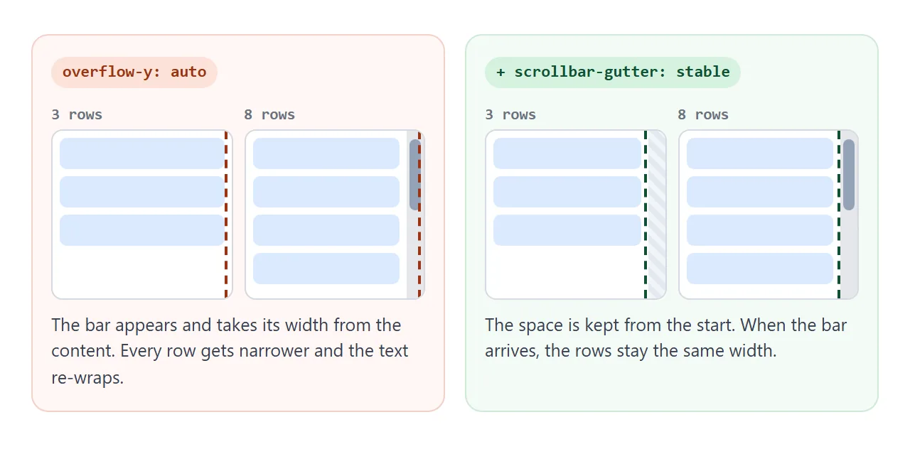
With overflow: auto, a classic bar appears only when the content overflows. When it arrives, it takes its width from the content box, so everything inside gets narrower and text can re-wrap.
.list {
  overflow-y: auto;
  scrollbar-gutter: stable;
}
In the demo above, the row width drops by the bar width when the eighth row arrives. Tick the checkbox and the width stays the same from the start.
scrollbar-gutter: stable both-edges reserves the same space on the opposite side too, so centred content stays centred.
The same line on html stops the page from jumping sideways when you move between a short page and a long one.
overflow: auto vs scroll, and overlay scrollbars
No scrollbar shows up until the element has a limited size and an overflow value that scrolls.
| Value | Content fits | Content overflows |
|---|---|---|
visible (default) |
No bar | Content spills out, no bar on the element |
hidden |
No bar | Clipped, no bar, scripts can still scroll it |
auto |
No bar | Bar appears |
scroll |
Bar and empty track shown | Bar appears |
Use auto almost everywhere. scroll keeps a classic bar visible even when there is nothing to scroll, which in the test above measured the same 15px as a real bar.
Some systems use overlay scrollbars instead of classic ones. Phones do, and macOS does depending on its Show scroll bars setting. Overlay bars float over the content and fade in while you scroll.
They take no layout space, so scrollbar-gutter has nothing to reserve and a width change moves nothing. When you test on a Mac, set Show scroll bars to Always to see the classic behaviour.
For tables that are wider than the screen, scrolling an HTML table covers the wrapper and the hints that tell readers there is more.
A finished example: chat window and photo strip
Both scrolling areas share one .scroll class with a thin bar and a transparent track. The chat list also keeps its gutter, and the photo strip snaps to whole cards.
<!doctype html>
<html lang="en">
<head>
<meta charset="utf-8">
<meta name="viewport" content="width=device-width, initial-scale=1">
<title>Chat window and image strip with styled scrollbars</title>
<style>
  body { margin: 0; padding: 16px; font-family: system-ui, sans-serif; background: #eef1f5; color: #1d2330; font-size: 14px; }

  /* one scrollbar style for every scrolling area on the page */
  .scroll {
    scrollbar-width: thin;
    scrollbar-color: #94a3b8 transparent;   /* thumb, track */
  }

  /* chat window */
  .chat { max-width: 420px; background: #fff; border-radius: 14px; box-shadow: 0 4px 16px rgba(0,0,0,.08); }
  .messages {
    height: 220px; overflow-y: auto; padding: 12px;
    display: flex; flex-direction: column; gap: 8px;
    scrollbar-gutter: stable;               /* bubbles do not shift when the bar appears */
  }
  .msg { max-width: 75%; padding: 8px 12px; border-radius: 14px; background: #f1f5f9; align-self: flex-start; }
  .msg.me { background: #2563eb; color: #fff; align-self: flex-end; }
  form { display: flex; gap: 8px; padding: 10px; border-top: 1px solid #e5e7eb; }
  input { flex: 1; min-width: 0; font: inherit; padding: 8px 10px; border: 1px solid #d5d9e0; border-radius: 8px; }
  button { font: inherit; padding: 8px 14px; border: 0; border-radius: 8px; background: #2563eb; color: #fff; cursor: pointer; }

  /* horizontal image strip */
  h3 { margin: 20px 0 8px; font-size: 15px; }
  .strip {
    display: flex; gap: 10px; overflow-x: auto; padding-bottom: 10px;
    scroll-snap-type: x mandatory;          /* stop on a whole card */
  }
  .strip figure {
    flex: 0 0 160px; height: 110px; margin: 0; border-radius: 10px;
    scroll-snap-align: start;
    display: grid; place-items: end start; padding: 8px; box-sizing: border-box;
    color: #fff; font-weight: 600; text-shadow: 0 1px 3px rgba(0,0,0,.4);
  }
</style>
</head>
<body>
<div class="chat">
  <div class="messages scroll" id="messages" tabindex="0" aria-label="Messages">
    <div class="msg">Hi! Is the order ready?</div>
    <div class="msg me">Packing it now.</div>
    <div class="msg">Great, thanks.</div>
    <div class="msg me">It ships this afternoon.</div>
    <div class="msg">Can you send the tracking number?</div>
    <div class="msg me">Sure, as soon as it is out.</div>
  </div>
  <form id="form">
    <input id="text" placeholder="Type a message" autocomplete="off">
    <button>Send</button>
  </form>
</div>

<h3>Photos</h3>
<div class="strip scroll" tabindex="0" aria-label="Photos">
  <figure style="background:linear-gradient(135deg,#f97316,#db2777)">Sunset</figure>
  <figure style="background:linear-gradient(135deg,#0ea5e9,#22c55e)">Coast</figure>
  <figure style="background:linear-gradient(135deg,#6366f1,#0ea5e9)">Lake</figure>
  <figure style="background:linear-gradient(135deg,#65a30d,#15803d)">Forest</figure>
  <figure style="background:linear-gradient(135deg,#a855f7,#6366f1)">Night</figure>
  <figure style="background:linear-gradient(135deg,#eab308,#f97316)">Desert</figure>
</div>

<script>
  const messages = document.getElementById('messages');
  const text = document.getElementById('text');

  // start at the newest message
  messages.scrollTop = messages.scrollHeight;

  document.getElementById('form').addEventListener('submit', (e) => {
    e.preventDefault();
    if (!text.value.trim()) return;
    const msg = document.createElement('div');
    msg.className = 'msg me';
    msg.textContent = text.value;
    messages.append(msg);
    text.value = '';
    messages.scrollTop = messages.scrollHeight;  // keep the newest message in view
  });
</script>
</body>
</html>
- Newest message in view: after appending, set
scrollToptoscrollHeight. - Snap to cards:
scroll-snap-type: x mandatoryon the strip andscroll-snap-align: starton each card. The HTML carousel guide builds a full slider on the same idea. - Keyboard: both areas have
tabindex="0"and anaria-label, so they can be focused and scrolled with the arrow keys.
When it does not work
| What you see | Cause | Fix |
|---|---|---|
::-webkit-scrollbar width and radius ignored in Chrome or Edge |
scrollbar-color or scrollbar-width is set on the element, or scrollbar-color is inherited from :root |
Remove the standard rule, or wrap it in @supports not selector(::-webkit-scrollbar) |
| Page scrollbar colour does not change | The rule is on body |
Put scrollbar-color on html |
| No scrollbar at all | No overflow, no fixed size, or the content fits |
Set a height or width and overflow: auto, then add content |
| Bar stays thin or hidden until you scroll, width change has no effect | Overlay scrollbars (phone, or macOS setting) | Expected. Test with macOS Show scroll bars: Always |
| Styled in Chrome, plain in Firefox | Only ::-webkit-scrollbar was used |
Add scrollbar-color and scrollbar-width |
| People miss the rest of the content | The bar is hidden | Use thin instead, or add a visible hint and tabindex="0" |
| Content jumps sideways when it grows | The bar takes space when it appears | scrollbar-gutter: stable |
Share it as a link
Scrollbars look different on every system, so a screenshot only shows one of them. A link lets each person see the bar their own browser and settings draw.
Paste the page into a NOS document and choose Create share link. HTML to link walks through it.
The page renders as written and its scripts run, so people can scroll the boxes and send chat messages themselves. If you change the code later, the same link shows the new version.