To make an HTML table scroll sideways with overflow, put the overflow on a wrapper around the table rather than on the table itself.
<div class="table-scroll" tabindex="0" role="region" aria-label="Quarterly figures">
  <table>...</table>
</div>
.table-scroll {
  overflow-x: auto;
  max-width: 100%;
  -webkit-overflow-scrolling: touch;
}
That is the working version. The rest of this page is why the obvious attempt fails, and the two settings that decide whether the columns squash before they ever scroll.
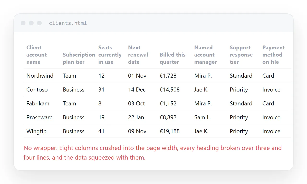
Why overflow on the table does nothing
A <table> is not an ordinary block. It generates a table box, which sizes itself around its content and treats a fixed height or an overflow value differently from a div.
Setting overflow-x: auto directly on the table is ignored in the common case, so nothing changes and the page keeps stretching. The fix is a plain box around it that does obey overflow.
Every responsive table pattern you have seen is this wrapper, sometimes with a class name borrowed from a framework.
The three behaviours a wide table can have
| Behaviour | What the reader gets | When to use it |
|---|---|---|
| Page stretches | Horizontal scrollbar on the whole page, header and nav slide too | Never on purpose |
| Columns squash | Every column visible, headings wrapped to four lines, numbers broken | Small tables with short values |
| Wrapper scrolls | Full width columns, the table scrolls inside the page | Wide data tables |
The middle one is what you get by default. It is why a table that looks fine on your monitor becomes unreadable on a phone.
The browser is not failing. It is following the rule that a table shrinks to fit its container before it overflows it.
Making the table wider than its wrapper
The wrapper scrolls only if there is something to scroll. Two ways to force it:
- Stop cells wrapping.
table { white-space: nowrap; }keeps every value on one line, so the table takes the width it needs. Best for numbers, dates and short labels. - Set a minimum width.
table { min-width: 720px; }guarantees overflow below that viewport size and allows wrapping above it. Best when some cells hold sentences.
You can combine them: nowrap on the header row and a min-width on the table. Long prose cells then still wrap, and the headings stay on one line.
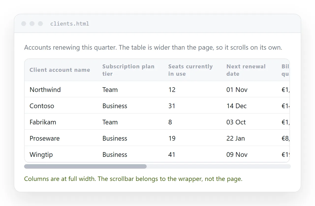
Telling the reader there is more
A scroll region that looks like a cut off table gets read as a broken table. Nothing in the markup announces the overflow, and on macOS and mobile the scrollbar stays hidden until a scroll starts.
Three things help, in order of how much they are worth:
- A pinned first column. The strongest signal, because the frozen labels make the sideways movement obvious. See sticky first column.
- An edge shadow. A small gradient on the right of the wrapper that reads as content continuing.
- A line of text. "Scroll sideways for the remaining months" above the table. Plain, and it works on every device.
Keyboard and screen reader access
A scrolling box that only a mouse can reach leaves out part of your audience. Two attributes fix it.
tabindex="0" puts the wrapper in the tab order, so arrow keys scroll it once focused. role="region" with an aria-label gives that stop a name rather than announcing an unlabelled group.
Both are on the wrapper, not the table. The table keeps its own semantics: <thead>, <th> with scope, and a <caption> if the table needs a title.
Vertical scrolling is a different problem
Sideways overflow is solved by the wrapper. A long table that should scroll up and down inside a fixed height needs a height on that wrapper as well.
.table-scroll { max-height: 70vh; overflow: auto; }
Once the wrapper has a height, the header row will scroll out of view, which is usually not what you want. Pin it with sticky positioning, covered in keeping the header visible.
Checking it on a narrow screen
The failure only appears below a certain width, so a desktop preview proves nothing. Narrow the browser window until the table overflows.
Then check three things: the page itself does not gain a scrollbar, the columns stay at full width, and the wrapper scrolls smoothly on touch.
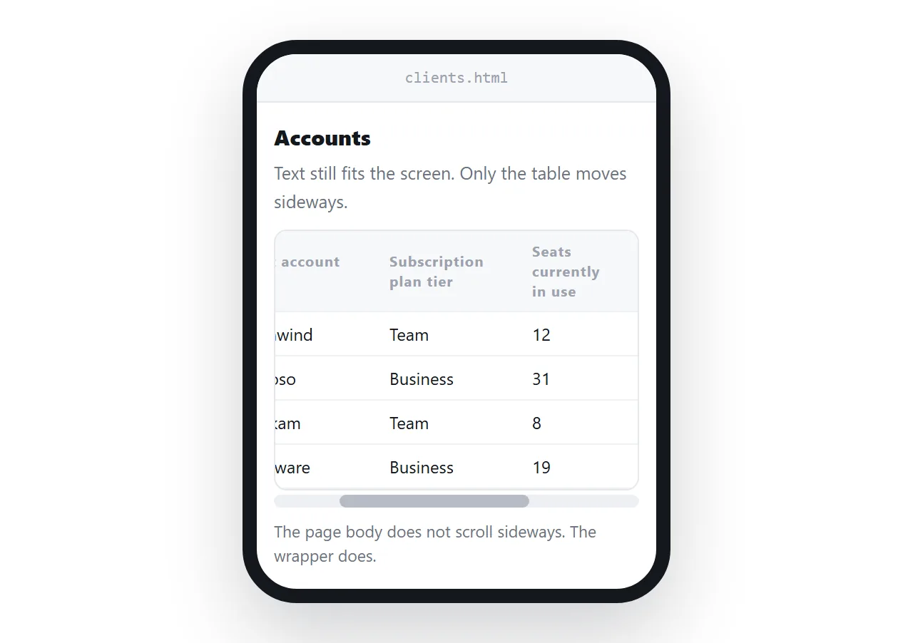
Open the file in the HTML file opener to see it outside your own project, where no inherited CSS can rescue it.
Getting the table in front of people
A scrolling table is only useful live. A screenshot cuts off exactly the columns the scroll existed to reach, and a PDF export freezes the visible slice.
Paste the HTML into a NOS document and it renders as written, wrapper and all, at its own address. Share, then Share link, then Create link gives an unlisted link that opens in one click on a phone.
Edits keep the same address, so a corrected figure reaches everyone who already has the link. HTML to link is the general version of that route, and responsive tables covers what else changes on small screens.