overflow-block is the flow-relative version of overflow-y. It takes the same five values (visible, hidden, clip, scroll, auto) and applies them to the block axis, the direction paragraphs stack. In horizontal text it acts like overflow-y. In vertical text it acts like overflow-x.
Try it. The box below uses overflow-block: auto. Switch the writing mode and watch which physical property the browser fills in.
<!doctype html>
<html lang="en">
<head>
<meta charset="utf-8">
<meta name="viewport" content="width=device-width, initial-scale=1">
<title>overflow-block basics</title>
<style>
  body { margin: 0; padding: 16px; font-family: system-ui, sans-serif; background: #f4f5f7; color: #1d2330; }
  .bar { display: flex; flex-wrap: wrap; gap: 8px; margin-bottom: 12px; }
  button { font: inherit; padding: 6px 12px; border: 1px solid #c9ced8; border-radius: 8px; background: #fff; cursor: pointer; }
  button[aria-pressed="true"] { background: #1d2330; color: #fff; border-color: #1d2330; }
  .box {
    width: min(100%, 320px); height: 150px; box-sizing: border-box;
    overflow-block: auto;    /* scroll along the block axis only when needed */
    overflow-inline: hidden; /* never scroll along the lines */
    padding: 12px; border-radius: 10px; background: #fff; border: 1px solid #dde1e8;
    line-height: 1.5;
  }
  .box.vertical { writing-mode: vertical-rl; }
  .readout { margin-top: 12px; font: 13px/1.5 ui-monospace, Consolas, monospace; }
</style>
</head>
<body>
<div class="bar">
  <button id="h" aria-pressed="true">horizontal-tb</button>
  <button id="v" aria-pressed="false">vertical-rl</button>
</div>

<div class="box" id="box">
  <p>Paragraphs stack along the block axis. In horizontal text that is top to bottom, so this box scrolls down.</p>
  <p>Switch to vertical-rl. Lines now run top to bottom and paragraphs stack right to left, so the same rule scrolls sideways.</p>
  <p>The CSS did not change. Only writing-mode did.</p>
</div>

<div class="readout" id="out"></div>

<script>
  const box = document.getElementById('box');
  const out = document.getElementById('out');

  function show() {
    const s = getComputedStyle(box);
    // the physical properties the browser worked out from overflow-block
    out.textContent = 'overflow-x: ' + s.overflowX + '   overflow-y: ' + s.overflowY;
  }

  function setMode(vertical) {
    box.classList.toggle('vertical', vertical);
    document.getElementById('h').setAttribute('aria-pressed', !vertical);
    document.getElementById('v').setAttribute('aria-pressed', vertical);
    show();
  }

  document.getElementById('h').addEventListener('click', () => setMode(false));
  document.getElementById('v').addEventListener('click', () => setMode(true));

  if (!CSS.supports('overflow-block', 'auto')) {
    out.textContent = 'This browser does not support overflow-block. The box will not scroll.';
  } else {
    show();
  }
</script>
</body>
</html>
The CSS stays the same. Only writing-mode changes, and the scrollbar moves from the bottom edge to the side.
Block axis and inline axis
Every box has two axes. The inline axis is the direction a line of text runs. The block axis is the direction lines and paragraphs stack. CSS writing mode decides which physical direction each one points.
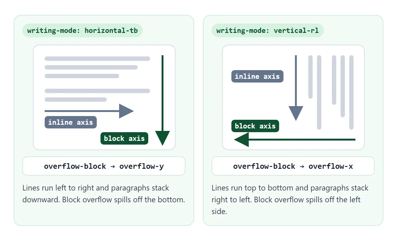
| Property | horizontal-tb | vertical-rl / vertical-lr |
|---|---|---|
overflow-block |
overflow-y |
overflow-x |
overflow-inline |
overflow-x |
overflow-y |
overflow-block and overflow-inline belong to the same family as block-size, margin-block and the other CSS logical properties. They are defined in CSS Overflow Module Level 3, which is a W3C Working Draft.
The values
The values mean the same as they do for overflow. The only difference is the axis they act on.
visible– content is not clipped and can spill out of the box. This is the initial value.hidden– content is clipped at the padding box. No scrollbar is shown.clip– content is clipped at the overflow clip edge, set withoverflow-clip-margin.scroll– content is clipped and a scrollbar is shown whether or not anything overflows.auto– content scrolls only when it does not fit.
The property applies to block containers, flex containers and grid containers. It is not inherited. For a full tour of the values themselves, see CSS overflow.
Why not just write overflow-y?
For a site that only ever shows horizontal text, overflow-y and overflow-block give the same result. The difference shows up when the same component is used in a vertical writing mode.
A common pattern is "scroll down, never sideways": overflow-y: auto with overflow-x: hidden. In vertical-rl text the content grows to the left, not downward. That pattern then hides the overflowing columns instead of scrolling to them.
<!doctype html>
<html lang="en">
<head>
<meta charset="utf-8">
<meta name="viewport" content="width=device-width, initial-scale=1">
<title>overflow-y vs overflow-block in vertical text</title>
<style>
  body { margin: 0; padding: 12px; font-family: system-ui, sans-serif; background: #f4f5f7; color: #1d2330; }
  .row { display: flex; flex-wrap: wrap; gap: 12px; }
  figure { margin: 0; flex: 1 1 150px; min-width: 0; }
  figcaption { font: 12px/1.4 ui-monospace, Consolas, monospace; margin-bottom: 6px; }
  .box {
    writing-mode: vertical-rl;   /* lines run down, paragraphs stack right to left */
    height: 170px; width: 100%; max-width: 220px; box-sizing: border-box;
    padding: 10px; border-radius: 10px; background: #fff; line-height: 1.5;
  }
  .physical { overflow-y: auto; overflow-x: hidden; border: 2px solid #f0a58a; }
  .logical  { overflow-block: auto; overflow-inline: hidden; border: 2px solid #8fd1a4; }
  p { margin: 0 0 0 1em; }
  .note { font-size: 13px; color: #4b5563; margin-top: 6px; }
</style>
</head>
<body>
<div class="row">
  <figure>
    <figcaption>overflow-y: auto<br>overflow-x: hidden</figcaption>
    <div class="box physical">
      <p>First paragraph. It is on the right.</p>
      <p>Second paragraph, to the left of the first.</p>
      <p>Third paragraph, further left.</p>
      <p>Fourth paragraph, with a few more words so it wraps.</p>
      <p>Fifth paragraph, also a little longer than the others.</p>
      <p>Sixth paragraph. The last one.</p>
    </div>
    <p class="note" id="n1"></p>
  </figure>
  <figure>
    <figcaption>overflow-block: auto<br>overflow-inline: hidden</figcaption>
    <div class="box logical">
      <p>First paragraph. It is on the right.</p>
      <p>Second paragraph, to the left of the first.</p>
      <p>Third paragraph, further left.</p>
      <p>Fourth paragraph, with a few more words so it wraps.</p>
      <p>Fifth paragraph, also a little longer than the others.</p>
      <p>Sixth paragraph. The last one.</p>
    </div>
    <p class="note" id="n2"></p>
  </figure>
</div>

<script>
  // report which way each box can scroll
  function report(box, note) {
    const s = getComputedStyle(box);
    const wide = box.scrollWidth > box.clientWidth;  // paragraphs spill past the left edge
    note.textContent = !wide ? 'Everything fits.'
      : s.overflowX !== 'hidden' ? 'Scrolls sideways: every paragraph is reachable.'
      : 'Cannot scroll sideways: the paragraphs on the left are cut off.';
  }
  const boxes = document.querySelectorAll('.box');
  const run = () => { report(boxes[0], document.getElementById('n1')); report(boxes[1], document.getElementById('n2')); };
  run();
  window.addEventListener('resize', run);
</script>
</body>
</html>
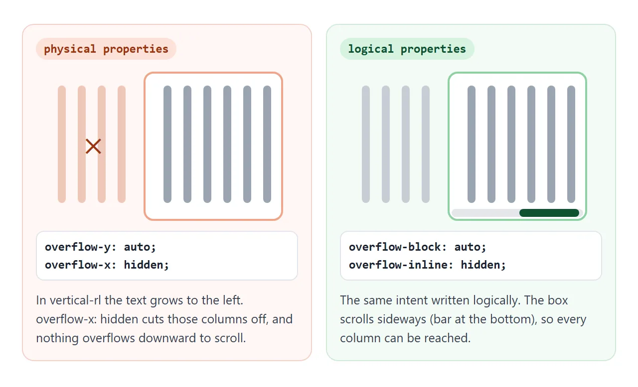
The logical pair states the intent directly: scroll through the paragraphs, keep the lines wrapped. The browser works out which physical edge that means.
How it combines with overflow and overflow-y
overflow-block, overflow-inline, overflow-x, overflow-y and the overflow shorthand form one logical property group. When a logical and a physical property land on the same axis, the declaration that wins the cascade decides. With equal specificity, that is the one written later.
.box {
  overflow-y: scroll;
  overflow-block: hidden;   /* horizontal text: this wins, overflow-y is hidden */
}
Swap the two lines and overflow-y: scroll wins instead. The overflow shorthand sets overflow-x and overflow-y, so a later overflow-block overrides one axis of it.
The rule about mixing values from CSS overflow still applies. If one axis is hidden, scroll or auto, a visible on the other axis computes to auto, and clip computes to hidden.
So overflow-block: auto on its own also makes the inline axis auto. Add overflow-inline: hidden if lines should never scroll.
Browser support and a fallback
MDN's compatibility data lists the overflow-block property as supported in Chrome and Edge from version 135, Firefox from 69 and Safari from 26. For the clip value, Firefox is listed from 81.
The demos on this page were run in the Playwright builds of Chromium 147, Firefox 148 and WebKit 26.4, and behaved the same in all three.
A browser that does not know a property ignores the declaration. So an older browser skips overflow-block and the box does not scroll. The simplest fallback is to write the physical property first:
.panel {
  overflow-y: auto;       /* older browsers */
  overflow-block: auto;   /* newer browsers: declared later, so it wins */
}
The fallback only suits horizontal text. For vertical components, test for overflow-block with @supports and give older browsers their own rules, as the finished example below does.
The overflow-block media feature
The same name is also a media feature, and it answers a different question. The property says what one box does with overflow. The media feature says what the whole device does when a page is longer than the screen or sheet.
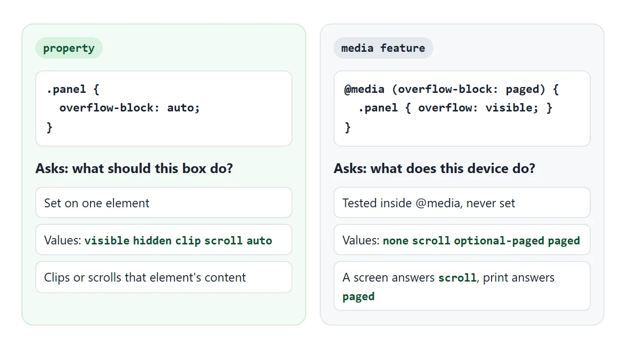
| Media feature value | Meaning |
|---|---|
none |
Overflowing content is not displayed |
scroll |
The user can scroll to overflowing content |
optional-paged |
Scrolls, but page breaks can be forced with properties such as break-inside |
paged |
Content is split into pages. Overflow goes onto the next page |
A screen matches scroll. Printing matches paged, which makes it a handy hook for print styles: a scrolling panel can drop its fixed height so its text flows onto paper.
The media feature is defined in Media Queries Level 4, a W3C Candidate Recommendation Draft. MDN lists it from Chrome and Edge 113, Firefox 66 and Safari 17.
A finished example: a reading panel
This panel uses only logical properties, so one rule set covers horizontal and vertical text. It has a fallback for older browsers and a print rule that uses the media feature.
<!doctype html>
<html lang="en">
<head>
<meta charset="utf-8">
<meta name="viewport" content="width=device-width, initial-scale=1">
<title>A reading panel that scrolls the right way</title>
<style>
body { margin: 0; padding: 16px; font-family: system-ui, sans-serif; background: #eef1f5; color: #1d2330; }
.panel { max-width: 460px; background: #fff; border-radius: 14px; box-shadow: 0 6px 20px rgba(0,0,0,.08); overflow: hidden; }
.head { display: flex; align-items: center; justify-content: space-between; gap: 8px; padding: 10px 14px; border-bottom: 1px solid #e5e7eb; }
.head b { font-size: 15px; }
label { font-size: 13px; display: flex; align-items: center; gap: 6px; cursor: pointer; }
/* Everything is logical, so one rule set fits both writing modes */
.text {
box-sizing: border-box;
block-size: 220px;
padding-block: 12px; padding-inline: 16px;
overflow-block: auto; /* scroll through paragraphs */
overflow-inline: hidden; /* lines wrap, never scroll */
line-height: 1.6;
}
.text p { margin-block: 0 .8em; margin-inline: 0; }
.panel.vertical .text { writing-mode: vertical-rl; block-size: 100%; inline-size: 220px; }
.foot { padding: 8px 14px; border-top: 1px solid #e5e7eb; font: 12.5px/1.5 ui-monospace, Consolas, monospace; color: #4b5563; }
.tag { display: inline-block; padding: 2px 7px; border-radius: 99px; background: #d6f2df; color: #0f5132; }
/* Older browsers: fall back to the physical property for horizontal text */
@supports not (overflow-block: auto) {
.text { overflow-y: auto; overflow-x: hidden; }
}
/* On paper there is nothing to scroll: let the text run onto the next page */
@media (overflow-block: paged) {
.text { block-size: auto; overflow: visible; }
}
</style>
</head>
<body>
<div class="panel" id="panel">
<div class="head">
<b>Reading notes</b>
<label><input type="checkbox" id="vert"> Vertical text</label>
</div>
<div class="text" id="text">
<p>This panel has a fixed size and more text than fits.</p>
<p>In horizontal text the paragraphs stack downward, so the panel scrolls down.</p>
<p>Tick "Vertical text". Paragraphs now stack from right to left, and the panel scrolls sideways instead.</p>
<p>No rule was rewritten. The panel asks for scrolling along the block axis, and the browser picks the direction.</p>
<p>Print this page and the media query below lets the text flow onto paper pages.</p>
</div>
<div class="foot" id="foot"></div>
</div>
<script>
const panel = document.getElementById('panel');
const text = document.getElementById('text');
const foot = document.getElementById('foot');
function update() {
const s = getComputedStyle(text);
const media = ['scroll', 'paged', 'optional-paged', 'none']
.find(v => matchMedia('(overflow-block: ' + v + ')').matches) || 'not supported';
foot.innerHTML = 'scrolls: <span class="tag">' + (s.overflowY === 'auto' ? 'down' : 'sideways') + '</span>'
+ ' · @media overflow-block: ' + media;
}
document.getElementById('vert').addEventListener('change', (e) => {
panel.classList.toggle('vertical', e.target.checked);
update();
});
update();
</script>
</body>
</html>
.text {
  block-size: 220px;
  overflow-block: auto;      /* scroll through paragraphs */
  overflow-inline: hidden;   /* lines wrap, never scroll */
}
@media (overflow-block: paged) {
  .text { block-size: auto; overflow: visible; }
}
The .text box also uses padding-block and padding-inline, so its spacing turns with the text as well.
When it does not work
| What you see | Cause | Fix |
|---|---|---|
| The box never scrolls | No size on the block axis | Set block-size or a height |
| Scrolls in one browser, spills out in another | That browser does not support overflow-block |
Write overflow-y first as a fallback |
| Vertical text is cut off on the left | Physical overflow-x: hidden in vertical-rl |
Use overflow-block and overflow-inline |
| An extra scrollbar on the other axis | visible next to auto computes to auto |
Add overflow-inline: hidden |
overflow-block seems ignored |
A later overflow or overflow-y overrides it |
Put overflow-block after it |
| The media query never matches on screen | Screens report scroll, not paged |
Check it in print preview |
Share it as a link
Writing-mode behaviour is easier to show than to explain. A screenshot cannot be scrolled, and a colleague on another browser may want to see how their own browser handles the logical property.
Paste the page into a NOS document and choose Create share link. HTML to link walks through it.
The page renders as written and its scripts run, so the people you send it to can switch writing modes and scroll the panel themselves. If you change the code later, the same link shows the new version.