To make text run vertically in CSS, set writing-mode: vertical-rl on the element. Lines then run from top to bottom and stack from right to left, the way Japanese and Chinese books are set.
text-orientation decides which way each letter faces, and text-combine-upright fits short numbers into one upright square.
Try it first. Switch the mode and the letter direction, and watch the green edge that marks where the first line starts.
<!doctype html>
<html lang="en">
<head>
<meta charset="utf-8">
<meta name="viewport" content="width=device-width, initial-scale=1">
<title>writing-mode and text-orientation switcher</title>
<style>
  body {
    margin: 0; padding: 14px;
    font-family: system-ui, sans-serif; background: #f4f5f7; color: #1d2330;
  }
  .row { display: flex; flex-wrap: wrap; gap: 6px; align-items: center; margin-bottom: 8px; }
  .row b { font-size: 12px; min-width: 110px; color: #5b6270; }
  button {
    font: 13px ui-monospace, Consolas, monospace; padding: 6px 9px;
    border: 1px solid #c9cdd4; border-radius: 7px; background: #fff; cursor: pointer;
  }
  button[aria-pressed="true"] { background: #0f5132; border-color: #0f5132; color: #fff; }
  .stage {
    height: 290px; overflow: auto; padding: 12px;
    background: #fff; border: 1px dashed #c9cdd4; border-radius: 10px;
  }
  /* The paragraph only uses logical properties, so they follow the writing mode */
  .text {
    margin: 0;
    inline-size: 14em;                     /* line length: width or height */
    padding-block: 6px; padding-inline: 10px;
    border-block-start: 4px solid #16a34a; /* marks where the first line sits */
    background: #f4fbf6; line-height: 1.7; font-size: 16px;
    font-family: "Hiragino Sans", "Yu Gothic", "Meiryo", "Noto Sans CJK JP", system-ui, sans-serif;
  }
  #out { font: 12px ui-monospace, Consolas, monospace; color: #374151; margin-top: 8px; }
</style>
</head>
<body>
<div class="row" data-prop="sample"><b>Sample</b>
  <button data-v="mixed" aria-pressed="true">Mixed</button>
  <button data-v="en">English</button>
  <button data-v="ja">Japanese</button>
</div>
<div class="row" data-prop="writingMode"><b>writing-mode</b>
  <button data-v="horizontal-tb">horizontal-tb</button>
  <button data-v="vertical-rl" aria-pressed="true">vertical-rl</button>
  <button data-v="vertical-lr">vertical-lr</button>
</div>
<div class="row" data-prop="textOrientation"><b>text-orientation</b>
  <button data-v="mixed" aria-pressed="true">mixed</button>
  <button data-v="upright">upright</button>
  <button data-v="sideways">sideways</button>
</div>

<div class="stage"><p class="text" id="text"></p></div>
<div id="out"></div>

<script>
  const samples = {
    mixed: '2026年9月、CSSのwriting-modeで縦書きを試す。英字と数字の向きに注目。',
    en: 'The first line starts at the green edge. In vertical-rl the lines stack from right to left.',
    ja: '縦書きでは、行は上から下へ流れ、次の行は右から左へ並ぶ。句読点の位置も変わる。'
  };
  const text = document.getElementById('text');
  const out = document.getElementById('out');

  function show() {
    const r = text.getBoundingClientRect();
    out.textContent = 'writing-mode: ' + text.style.writingMode +
      '; text-orientation: ' + text.style.textOrientation +
      '  |  box ' + Math.round(r.width) + ' x ' + Math.round(r.height) + ' px';
  }

  document.querySelectorAll('.row').forEach((row) => {
    row.addEventListener('click', (e) => {
      const btn = e.target.closest('button');
      if (!btn) return;
      row.querySelectorAll('button').forEach((b) => b.setAttribute('aria-pressed', b === btn));
      const prop = row.dataset.prop, v = btn.dataset.v;
      if (prop === 'sample') text.textContent = samples[v];
      else text.style[prop] = v;
      show();
    });
  });

  text.textContent = samples.mixed;
  text.style.writingMode = 'vertical-rl';
  text.style.textOrientation = 'mixed';
  show();
</script>
</body>
</html>
The printed box size below the example swaps between wide and tall. Nothing in the CSS mentions width or height; the paragraph only sets its line length with inline-size.
The three writing modes
writing-mode sets two directions at once: the inline direction, in which characters follow each other along a line, and the block direction, in which lines and paragraphs stack.
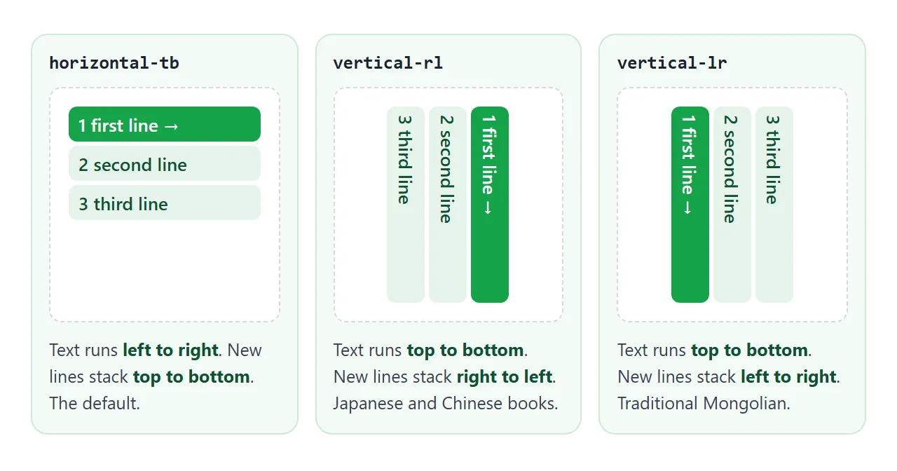
| Value | Text runs | New lines stack | Typical use |
|---|---|---|---|
horizontal-tb |
Left to right (or right to left with dir="rtl") |
Top to bottom | The default for most pages |
vertical-rl |
Top to bottom | Right to left | Vertical Japanese, Chinese and Korean |
vertical-lr |
Top to bottom | Left to right | Traditional Mongolian script |
The property is inherited, so setting it on an article turns every paragraph and heading inside it. The left-to-right versus right-to-left choice is a separate setting, the dir attribute, covered in right-to-left pages with dir="rtl".
Which way the letters face: text-orientation
In vertical text, each character needs an orientation. text-orientation sets it, and it only has an effect when the writing mode is vertical.
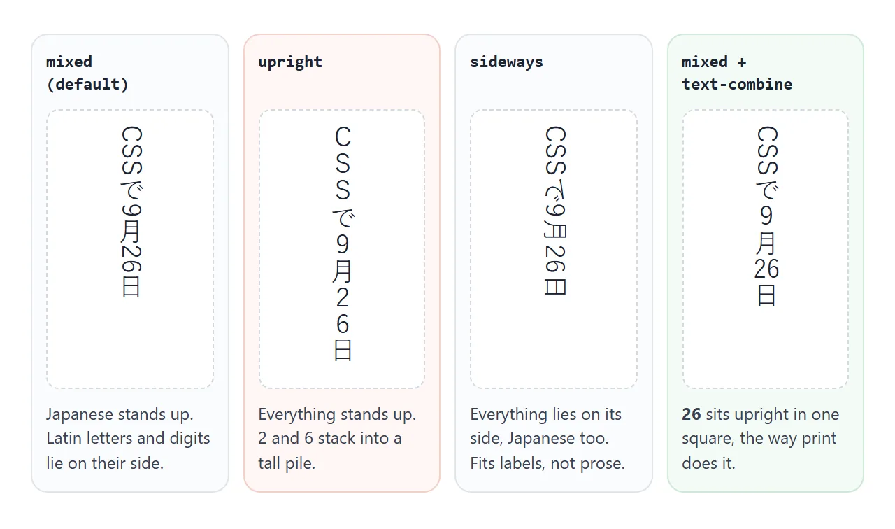
mixed(the default): Japanese and Chinese characters stand upright. Latin letters and digits are turned 90 degrees clockwise, so English words read sideways.upright: every character stands up, Latin letters included. Good for short acronyms, tiring for whole English sentences.sideways: every character is laid out as if the line were horizontal and then turned 90 degrees clockwise. Useful for Latin labels, wrong for Japanese prose.
For vertical Japanese, leave mixed on the paragraph and fix the few runs that need to stand up, such as a date.
Numbers in vertical text: text-combine-upright
A two-digit day like 26 is awkward either way. Under mixed it lies on its side. Under upright the digits stack into a tall pile. A common print convention sets the two digits side by side inside one character square.
<p class="poem">9月<span class="tcy">26</span>日</p>
.poem { writing-mode: vertical-rl; }
.tcy  { text-combine-upright: all; }
all squeezes every character in the span into the width of one character. It reads well for two digits, gets cramped at three or four, so keep the span short. Full-width digits such as 26 already stand upright under mixed, one per square.
Rotated labels: writing-mode versus transform: rotate
The other common job is a narrow label, such as a table column header. transform: rotate(-90deg) looks like the obvious tool, but a transform only changes how the element is painted. Its layout box keeps its original wide, short shape.
<!doctype html>
<html lang="en">
<head>
<meta charset="utf-8">
<meta name="viewport" content="width=device-width, initial-scale=1">
<title>transform: rotate vs writing-mode for table headers</title>
<style>
  body {
    margin: 0; padding: 14px;
    font-family: system-ui, sans-serif; background: #f4f5f7; color: #1d2330;
  }
  .grid { display: grid; grid-template-columns: repeat(auto-fit, minmax(300px, 1fr)); gap: 12px; }
  .card { background: #fff; border: 1px solid #e1e4ea; border-radius: 10px; padding: 10px 12px; }
  h3 { margin: 0 0 2px; font: 700 13px ui-monospace, Consolas, monospace; }
  .note { margin: 0 0 10px; font-size: 12px; color: #5b6270; }
  table { border-collapse: collapse; font-size: 13px; }
  th, td { border: 1px solid #d5d9e0; padding: 4px 6px; text-align: center; }
  th { vertical-align: bottom; background: #f8f9fb; font-weight: 600; }
  td:first-child, th:first-child { text-align: start; }

  /* Left: rotate only paints the label turned. Its layout box stays wide and short. */
  .rotated th span { display: inline-block; transform: rotate(-90deg); white-space: nowrap; }

  /* Right: writing-mode makes the label's own box tall and narrow. */
  .vertical th span { writing-mode: vertical-rl; transform: rotate(180deg); white-space: nowrap; }

  .boxes th { background: #fde2da; }  /* the space each header cell really gets */
  .meas { margin-top: 8px; font: 12px ui-monospace, Consolas, monospace; color: #374151; }
  label { display: inline-flex; gap: 6px; align-items: center; font-size: 13px; margin-bottom: 10px; }
</style>
</head>
<body>
<label><input type="checkbox" id="boxes"> Highlight the space each header cell gets</label>
<div class="grid" id="grid">
  <div class="card">
    <h3>transform: rotate(-90deg)</h3>
    <p class="note">The text turns, the space does not.</p>
    <table class="rotated">
      <tr><th>Team</th><th><span>Tickets</span></th><th><span>First reply</span></th><th><span>Reopened</span></th></tr>
      <tr><td>North</td><td>42</td><td>5m</td><td>3</td></tr>
      <tr><td>South</td><td>37</td><td>8m</td><td>1</td></tr>
    </table>
    <div class="meas" data-for="rotated"></div>
  </div>
  <div class="card">
    <h3>writing-mode: vertical-rl</h3>
    <p class="note">The header row grows to fit.</p>
    <table class="vertical">
      <tr><th>Team</th><th><span>Tickets</span></th><th><span>First reply</span></th><th><span>Reopened</span></th></tr>
      <tr><td>North</td><td>42</td><td>5m</td><td>3</td></tr>
      <tr><td>South</td><td>37</td><td>8m</td><td>1</td></tr>
    </table>
    <div class="meas" data-for="vertical"></div>
  </div>
</div>

<script>
  // Measure the header row and the widest header column in each table
  function measure() {
    document.querySelectorAll('.meas').forEach((m) => {
      const t = document.querySelector('table.' + m.dataset.for);
      const row = t.rows[0].getBoundingClientRect();
      const th = t.rows[0].cells[2].getBoundingClientRect();
      m.textContent = 'header row ' + Math.round(row.height) + 'px tall, "First reply" column ' + Math.round(th.width) + 'px wide';
    });
  }
  document.getElementById('boxes').addEventListener('change', (e) => {
    document.getElementById('grid').classList.toggle('boxes', e.target.checked);
  });
  measure();
</script>
</body>
</html>
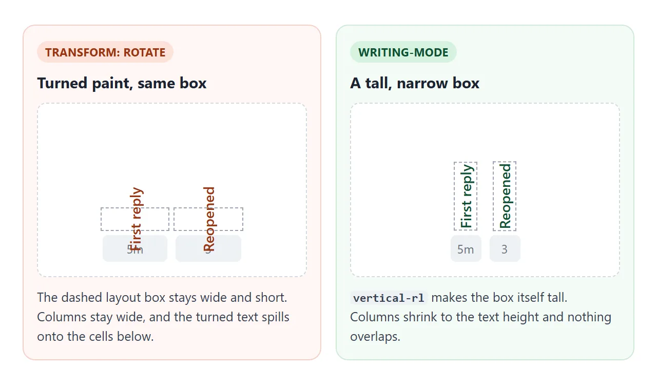
With rotation, the column stays as wide as the unrotated word and the header row stays one line tall. The turned text sticks out of its cell and over the rows around it.
With writing-mode: vertical-rl, the label's own box becomes tall and narrow, so the column shrinks and the header row grows to fit.
Vertical Latin text reads top to bottom. To read bottom to top, a common choice for column headers, add transform: rotate(180deg). A half turn leaves the box the same size, so layout is not affected:
th .side {
  writing-mode: vertical-rl;
  transform: rotate(180deg);   /* read from bottom to top */
  white-space: nowrap;
}
Put the rule on a div or span inside the th rather than on the cell.
CSS Writing Modes Level 4 also defines writing-mode: sideways-lr, which does this in one line; check that your target browsers support it before relying on it. CSS transform covers what rotate() is good for.
Logical properties follow the writing mode
width is always horizontal and height is always vertical, whatever the writing mode. In vertical text that means width limits how many columns fit, not how long each line is.
Logical properties name sizes and sides by the text flow instead:
| Logical property | horizontal-tb | vertical-rl | vertical-lr |
|---|---|---|---|
inline-size |
width | height | height |
block-size |
height | width | width |
margin-block-start |
margin-top | margin-right | margin-left |
margin-inline-start |
margin-left | margin-top | margin-top |
padding-block |
top and bottom | right and left | right and left |
The switcher above uses inline-size, padding-block and border-block-start. That is why its green edge moves to the right in vertical-rl and to the left in vertical-lr without any extra rules.
A finished example: a poem card and a data table
The card below is set in vertical-rl with a serif Japanese font stack and block-size for the column length. The date uses text-combine-upright. The table next to it uses sideways headers so five columns fit on a phone.
<!doctype html>
<html lang="en">
<head>
<meta charset="utf-8">
<meta name="viewport" content="width=device-width, initial-scale=1">
<title>Vertical poem card and sideways table headers</title>
<style>
  body {
    margin: 0; padding: 14px;
    font-family: system-ui, sans-serif; background: #f4f5f7; color: #1d2330;
  }
  .wrap { display: flex; flex-wrap: wrap; gap: 14px; align-items: flex-start; }
  label { display: flex; gap: 6px; align-items: center; font-size: 13px; margin-bottom: 10px; }

  /* Poem card: vertical Japanese, lines stack right to left */
  .poem {
    writing-mode: vertical-rl;
    block-size: 280px;             /* = height here: the length of each column */
    padding-block: 18px;           /* right and left in vertical-rl */
    padding-inline: 16px;          /* top and bottom in vertical-rl */
    background: linear-gradient(160deg, #fffdf6, #f5efe0);
    border: 1px solid #e4dcc6; border-radius: 12px;
    font-family: "Hiragino Mincho ProN", "Yu Mincho", "YuMincho", "Noto Serif CJK JP", "Noto Serif JP", serif;
    font-size: 20px; line-height: 1.9; letter-spacing: .08em;
  }
  .poem h2 { margin: 0; margin-block-end: .6em; font-size: 22px; }
  .poem p { margin: 0; }
  .poem .date { margin-block-start: 1.2em; font-size: 14px; color: #6b5d45; }

  /* Two digits sit upright, side by side, in one character cell */
  .tcy { text-combine-upright: all; }
  .off .tcy { text-combine-upright: none; }

  /* Data table with sideways column headers */
  table { border-collapse: collapse; font-size: 13px; background: #fff; }
  th, td { border: 1px solid #d5d9e0; padding: 5px 7px; text-align: center; }
  th { vertical-align: bottom; background: #f8f9fb; font-weight: 600; }
  th:first-child, td:first-child { text-align: start; }
  th .side {
    writing-mode: vertical-rl;
    transform: rotate(180deg);     /* read from bottom to top */
    white-space: nowrap; margin-inline: auto;
  }
</style>
</head>
<body>
<label><input type="checkbox" id="tcy" checked> text-combine-upright on the numbers</label>
<div class="wrap">
  <article class="poem" id="poem" lang="ja">
    <h2>古池</h2>
    <p>古池や</p>
    <p>蛙飛び込む</p>
    <p>水の音</p>
    <p class="date">松尾芭蕉 二〇二六年<span class="tcy">9</span>月<span class="tcy">26</span>日 写</p>
  </article>

  <table>
    <tr>
      <th>Store</th>
      <th><div class="side">Orders</div></th>
      <th><div class="side">Returns</div></th>
      <th><div class="side">Avg. basket</div></th>
      <th><div class="side">Repeat buyers</div></th>
    </tr>
    <tr><td>Osaka</td><td>318</td><td>12</td><td>¥4,200</td><td>41%</td></tr>
    <tr><td>Kyoto</td><td>264</td><td>9</td><td>¥3,850</td><td>38%</td></tr>
    <tr><td>Nara</td><td>121</td><td>4</td><td>¥3,100</td><td>45%</td></tr>
  </table>
</div>

<script>
  // Toggle text-combine-upright to see how the date looks without it
  document.getElementById('tcy').addEventListener('change', (e) => {
    document.getElementById('poem').classList.toggle('off', !e.target.checked);
  });
</script>
</body>
</html>
- Card:
writing-mode: vertical-rlon thearticle,block-size: 280pxfor the column length,margin-block-startto push the date one line further left. - Date:
9and26each sit in aspanwithtext-combine-upright: all. - Headers: a
divinside eachthwithvertical-rlplusrotate(180deg), andvertical-align: bottomon the cell so the labels line up at the base. thead and tbody covers the table markup itself.
Readings above kanji, set with <ruby>, also work in vertical text; see the ruby tag.
When it does not work
| What you see | Cause | Fix |
|---|---|---|
| Rotated header text overlaps the rows below or the cell next to it | transform: rotate() does not change the layout box |
Use writing-mode: vertical-rl on the label |
| English letters or digits lie on their side | text-orientation: mixed is the default |
upright for short runs, or text-combine-upright for numbers |
| Japanese characters lie on their side too | text-orientation: sideways is set, or inherited |
Set mixed on the Japanese text |
| A two-digit number stacks into a tall pile | upright puts each digit in its own square |
Wrap it in a span with text-combine-upright: all |
Setting width changes the number of columns, not the line length |
width is physical; in vertical text the line length is the height |
Use inline-size and block-size |
| Characters show as empty boxes, or the font looks different on each device | The device has no font for those characters, and system fonts vary | List several CJK fonts in font-family with a generic fallback |
For the font stack, name fonts found on different systems, then end with serif or sans-serif. HTML font-family lists explains how the browser walks the list.
Share it as a link
Vertical type is easier to judge on a real screen than in a screenshot, and fonts differ from device to device. Send the working page so people see it on their own phone.
Paste the page into a NOS document and choose Create share link. HTML to link walks through it.
The page renders as written and its scripts run, so the people you send it to can flip the switches themselves. If you change the code later, the same link shows the new version.