To make a page read right-to-left, put dir="rtl" on the <html> element, together with the language: <html lang="ar" dir="rtl">. Text aligns to the right, lines start on the right, and flex rows and grid columns run from right to left.
The attribute also works on any single element, so one quote, one card or one form can be right-to-left inside an English page. Switch the small interface below between the two directions and watch what moves.
<!doctype html>
<html lang="en">
<head>
<meta charset="utf-8">
<meta name="viewport" content="width=device-width, initial-scale=1">
<title>dir switcher</title>
<style>
  body { margin: 0; padding: 14px; font-family: system-ui, sans-serif; background: #f4f5f7; color: #1d2330; }
  .bar { display: flex; gap: 8px; align-items: center; margin-bottom: 12px; }
  .bar button { font: inherit; padding: 6px 14px; border: 1px solid #cbd2dc; border-radius: 8px; background: #fff; cursor: pointer; }
  .bar button[aria-pressed="true"] { background: #1d2330; color: #fff; border-color: #1d2330; }
  .cols { display: grid; grid-template-columns: repeat(auto-fit, minmax(250px, 1fr)); gap: 12px; }
  .panel { background: #fff; border-radius: 12px; padding: 12px; box-shadow: 0 2px 8px rgba(0,0,0,.08); }
  .panel h3 { margin: 0 0 10px; font-size: 13px; letter-spacing: .3px; }
  .logical h3 { color: #0f7a3e; }
  .physical h3 { color: #b4430f; }

  /* Flex rows follow the direction in BOTH panels */
  nav { display: flex; gap: 12px; align-items: center; padding-bottom: 8px; border-bottom: 1px solid #e5e7eb; font-size: 14px; }
  nav a { color: #1d4ed8; text-decoration: none; }
  .back svg { width: 16px; height: 16px; vertical-align: -3px; }
  .card { margin-top: 10px; padding: 10px; background: #f8fafc; border-radius: 8px; font-size: 14px; }
  .badge { display: inline-block; background: #e0e7ff; color: #3730a3; border-radius: 99px; padding: 1px 8px; font-size: 12px; }
  label { display: block; margin-top: 10px; font-size: 13px; }
  input { font: inherit; width: 100%; box-sizing: border-box; margin-top: 4px; padding: 6px 8px; border: 1px solid #cbd2dc; border-radius: 6px; }

  /* LOGICAL: start and end, so they swap sides with dir */
  .logical .back { margin-inline-end: auto; }             /* pushes the other links to the far end */
  :dir(rtl) .logical .back svg { transform: scaleX(-1); } /* a back arrow points toward the start */
  .logical .card { border-inline-start: 4px solid #0f7a3e; text-align: start; }
  .logical .badge { margin-inline-start: 8px; }
  .logical input { padding-inline-start: 30px; }

  /* PHYSICAL: left and right, fixed to the screen */
  .physical .back { margin-right: auto; }
  .physical .card { border-left: 4px solid #b4430f; text-align: left; }
  .physical .badge { margin-left: 8px; }
  .physical input { padding-left: 30px; }

  .field { position: relative; }
  .field span { position: absolute; top: 11px; font-size: 13px; color: #6b7280; }
  .logical .field span { inset-inline-start: 9px; }
  .physical .field span { left: 9px; }
</style>
</head>
<body>
<div class="bar">
  <button id="ltr" aria-pressed="true">dir="ltr"</button>
  <button id="rtl" aria-pressed="false">dir="rtl"</button>
</div>

<div id="app" dir="ltr" class="cols">
  <section class="panel logical">
    <h3>LOGICAL PROPERTIES</h3>
    <nav>
      <a href="#" class="back"><svg viewBox="0 0 16 16"><path d="M10 3 5 8l5 5" fill="none" stroke="currentColor" stroke-width="2"/></svg> Back</a>
      <a href="#">Help</a><a href="#">Account</a>
    </nav>
    <div class="card">Order 1042<span class="badge">Shipped</span></div>
    <label>Search<div class="field"><span>@</span><input placeholder="name"></div></label>
  </section>

  <section class="panel physical">
    <h3>PHYSICAL PROPERTIES</h3>
    <nav>
      <a href="#" class="back"><svg viewBox="0 0 16 16"><path d="M10 3 5 8l5 5" fill="none" stroke="currentColor" stroke-width="2"/></svg> Back</a>
      <a href="#">Help</a><a href="#">Account</a>
    </nav>
    <div class="card">Order 1042<span class="badge">Shipped</span></div>
    <label>Search<div class="field"><span>@</span><input placeholder="name"></div></label>
  </section>
</div>

<script>
  const app = document.getElementById('app');
  for (const id of ['ltr', 'rtl']) {
    document.getElementById(id).addEventListener('click', () => {
      app.dir = id;  // the same as dir="rtl" on <html>, just scoped to this part
      document.getElementById('ltr').setAttribute('aria-pressed', id === 'ltr');
      document.getElementById('rtl').setAttribute('aria-pressed', id === 'rtl');
    });
  }
</script>
</body>
</html>
The flex rows flip in both panels, because flexbox follows the direction. Everything written with left or right stays put, which is where most RTL bugs come from.
The three values: ltr, rtl and auto
dir takes three values. Each one sets the base direction of the element and everything inside it, until a child sets its own.
| Value | What it does | Use it for |
|---|---|---|
ltr |
Left to right | English and other left-to-right languages (the default) |
rtl |
Right to left | Arabic, Hebrew, Persian, Urdu |
auto |
The browser picks from the first strong letter inside | User text in an unknown language |
lang and dir do different jobs. lang="ar" says which language the text is in, which matters for fonts, hyphenation and screen readers. It does not change the direction. Set both on <html>, and again on any part in another language:
<html lang="ar" dir="rtl">
  ...
  <p lang="en" dir="ltr">This paragraph is in English.</p>
For comments, chat messages and form fields, dir="auto" is usually the right choice. An Arabic comment then reads right-to-left and the next, English one reads left-to-right, with no code deciding which is which.
The bidi algorithm in plain terms
Text is stored in the order it was typed. The browser then runs the Unicode bidirectional algorithm, or bidi for short, to decide what goes where on screen.
Characters fall into three groups. Strong characters have a direction of their own: Latin letters are left-to-right, Arabic and Hebrew letters are right-to-left.
Weak characters, mainly digits, go with the text around them. Neutral ones, such as spaces, colons and !, take the direction of their neighbours.
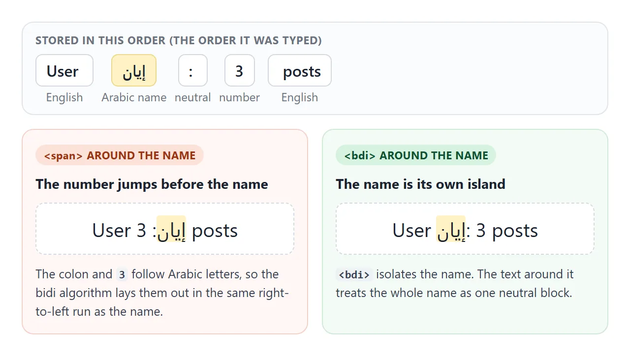
Most of the time this works. It goes wrong where text of one direction sits right next to text of the other, and a neutral or a number lands between them.
The browser has to guess which side that character belongs to, and the guess follows the rules, not your intention.
: user names of unknown direction
The classic case is a name inside a sentence. Code builds User ${name}: 3 posts, and when the name is Arabic, the colon and the 3 join the Arabic run. The line reads "User 3 :name posts".
<bdi>, short for bidirectional isolate, fixes it. The name inside is laid out on its own, with its direction taken from its own first letter, and the sentence around it treats the whole name as one block.
<!doctype html>
<html lang="en">
<head>
<meta charset="utf-8">
<meta name="viewport" content="width=device-width, initial-scale=1">
<title>bdi vs span</title>
<style>
body { margin: 0; padding: 14px; font-family: system-ui, sans-serif; background: #f4f5f7; color: #1d2330; }
.cols { display: grid; grid-template-columns: repeat(auto-fit, minmax(240px, 1fr)); gap: 12px; }
.panel { background: #fff; border-radius: 12px; padding: 12px 14px; box-shadow: 0 2px 8px rgba(0,0,0,.08); }
h3 { margin: 0 0 8px; font-size: 13px; letter-spacing: .3px; }
.bad h3 { color: #b4430f; } .good h3 { color: #0f7a3e; }
ul { margin: 0; padding: 0; list-style: none; }
li { padding: 7px 0; border-bottom: 1px solid #eef0f3; font-size: 16px; }
.name { background: #fff3c4; border-radius: 3px; }
.try { margin-top: 14px; background: #fff; border-radius: 12px; padding: 12px 14px; font-size: 14px; }
input { font: inherit; width: 100%; box-sizing: border-box; margin-top: 6px; padding: 7px 9px; border: 1px solid #cbd2dc; border-radius: 6px; }
</style>
</head>
<body>
<div class="cols">
<section class="panel bad">
<h3><span> AROUND THE NAME</h3>
<ul id="spanList"></ul>
</section>
<section class="panel good">
<h3><bdi> AROUND THE NAME</h3>
<ul id="bdiList"></ul>
</section>
</div>
<div class="try">
Try your own name (Arabic, Hebrew, English, with digits or "!"):
<!-- dir="auto": the box turns right-to-left when the first strong letter is Arabic or Hebrew -->
<input id="own" dir="auto" value="نور!">
</div>
<script>
// Names come from users, so their direction is unknown in advance
const users = [
{ name: 'Sara', posts: 3 },
{ name: 'إيان', posts: 3 },
{ name: 'דנה', posts: 12 },
];
function row(tag, name, posts) {
const li = document.createElement('li');
const el = document.createElement(tag); // 'span' or 'bdi'
el.className = 'name';
el.textContent = name;
li.append('User ', el, ': ' + posts + ' posts');
return li;
}
function render() {
const list = users.concat({ name: document.getElementById('own').value || ' ', posts: 5 });
document.getElementById('spanList').replaceChildren(...list.map(u => row('span', u.name, u.posts)));
document.getElementById('bdiList').replaceChildren(...list.map(u => row('bdi', u.name, u.posts)));
}
document.getElementById('own').addEventListener('input', render);
render();
</script>
</body>
</html>
<li>User <bdi>إيان</bdi>: 3 posts</li>
A <span> does not isolate, because it has no meaning of its own (see the span tag). A <span dir="auto"> does isolate, since any element with a dir attribute gets unicode-bidi: isolate. <bdi> is shorter and says what it is for.
: forcing a direction
<bdo> is the opposite tool. Instead of isolating text and letting the algorithm decide, it switches the algorithm off for its content. <bdo dir="rtl"> lays out every character from right to left, even Latin letters:
<bdo dir="rtl">Hello</bdo> <!-- shows: olleH -->
Always give it a dir attribute, since that is the direction it forces.
Use it when you really do want characters in a fixed order, such as a part number that must not be reordered or a teaching example. For real Arabic or Hebrew text, the normal algorithm is almost always what you want.
dir attribute or CSS direction
CSS has a direction property with the same values. Prefer the attribute. The HTML and CSS specifications both recommend it, because direction is part of the content, not its styling.
- It survives without CSS. If the stylesheet fails to load,
dir="rtl"still reads correctly. - It isolates. An inline element with
dirgetsunicode-bidi: isolate.direction: rtlon an inline element has no effect on ordering unless you also setunicode-bidi. - It drives
:dir(). The:dir(rtl)selector matches from the attribute, not from CSSdirection. - It supports
auto. CSSdirectionhas no automatic value.
Logical properties flip on their own
margin-left always means the left side of the screen. Logical properties are named after the flow of text instead: inline-start is where a line begins, and inline-end is where it ends. With dir="rtl", start is on the right.
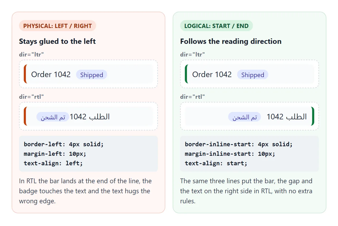
| Physical | Logical |
|---|---|
margin-left |
margin-inline-start |
padding-right |
padding-inline-end |
padding-left + padding-right |
padding-inline |
border-left |
border-inline-start |
left: 0 |
inset-inline-start: 0 |
text-align: left |
text-align: start |
border-top-left-radius |
border-start-start-radius |
text-align: start is also the default, so plain text aligns correctly without any rule. CSS text-align covers start and end in more depth.
Flexbox and grid need no changes. A flex row places its first item at the start side, and justify-content: flex-start and grid column 1 follow the direction too.
Which icons to mirror
Icons that point along the line mean "back" or "forward", and in a right-to-left page back is to the right. Icons that picture an object keep their shape: a clock turns clockwise in every language.
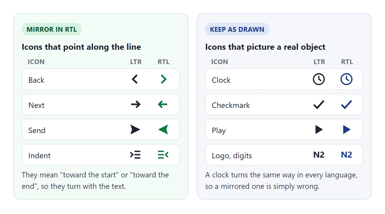
Flip only the icons that need it, with one rule:
:dir(rtl) .mirror { transform: scaleX(-1); }
Add class="mirror" to back, next, reply and send icons. Leave the class off everything else. For drawing the icons themselves, see SVG icons in HTML.
A finished example: a bilingual message thread
The thread below puts everything together. The whole interface switches with one dir attribute. Each message has dir="auto", so Arabic and English messages each read the right way whatever language the interface is in. Names sit in <bdi>, and only the arrows are mirrored.
<!doctype html>
<html lang="en">
<head>
<meta charset="utf-8">
<meta name="viewport" content="width=device-width, initial-scale=1">
<title>Bilingual message thread</title>
<style>
  body { margin: 0; font-family: system-ui, sans-serif; background: #eef1f5; color: #1d2330; }
  #app { max-width: 460px; margin: 0 auto; height: 100vh; display: flex; flex-direction: column; background: #fff; }
  header { display: flex; align-items: center; gap: 10px; padding: 10px 12px; border-bottom: 1px solid #e5e7eb; }
  header h1 { font-size: 16px; margin: 0; flex: 1; }
  button { font: inherit; cursor: pointer; }
  .icon-btn { border: 0; background: none; padding: 4px; display: flex; align-items: center; gap: 4px; color: #1d4ed8; }
  .lang { border: 1px solid #cbd2dc; border-radius: 8px; background: #fff; padding: 4px 10px; font-size: 13px; }
  svg { width: 18px; height: 18px; flex: none; }

  /* Icons that point along the line flip; clocks and checkmarks do not */
  :dir(rtl) .mirror { transform: scaleX(-1); }

  #list { flex: 1; overflow-y: auto; padding: 12px; display: flex; flex-direction: column; gap: 10px; }
  .msg { max-width: 80%; padding: 8px 12px; border-radius: 14px; background: #f1f3f6; }
  .msg.mine { margin-inline-start: auto; background: #dbeafe; border-end-end-radius: 4px; }
  .msg:not(.mine) { border-end-start-radius: 4px; }
  .who { font-size: 12px; font-weight: 600; color: #475569; }
  .msg p { margin: 2px 0 4px; font-size: 15px; line-height: 1.4; text-align: start; }
  .meta { display: flex; align-items: center; gap: 4px; justify-content: flex-end; font-size: 11px; color: #64748b; }
  .meta svg { width: 12px; height: 12px; }

  form { display: flex; gap: 8px; padding: 10px 12px; border-top: 1px solid #e5e7eb; }
  textarea { flex: 1; font: inherit; resize: none; height: 40px; box-sizing: border-box; padding: 8px 10px; border: 1px solid #cbd2dc; border-radius: 10px; }
  .send { border: 0; border-radius: 10px; background: #1d4ed8; color: #fff; padding: 0 14px; display: flex; align-items: center; gap: 6px; }
</style>
</head>
<body>
<div id="app" lang="en" dir="ltr">
  <header>
    <button class="icon-btn" type="button">
      <svg class="mirror" viewBox="0 0 16 16"><path d="M10 3 5 8l5 5" fill="none" stroke="currentColor" stroke-width="2"/></svg>
      <span data-t="back">Back</span>
    </button>
    <h1 data-t="title">Support chat</h1>
    <button class="lang" id="lang" type="button">العربية</button>
  </header>

  <div id="list"></div>

  <form id="form">
    <!-- dir="auto": the box follows whatever the user starts typing -->
    <textarea id="text" dir="auto" data-ph="write"></textarea>
    <button class="send" type="submit">
      <span data-t="send">Send</span>
      <svg class="mirror" viewBox="0 0 16 16"><path d="M2 2l12 6-12 6 2-6z" fill="currentColor"/></svg>
    </button>
  </form>
</div>

<template id="tpl">
  <div class="msg">
    <bdi class="who"></bdi>
    <p dir="auto"></p>
    <div class="meta">
      <svg viewBox="0 0 16 16"><circle cx="8" cy="8" r="6.5" fill="none" stroke="currentColor" stroke-width="1.5"/><path d="M8 4v4l3 2" fill="none" stroke="currentColor" stroke-width="1.5"/></svg>
      <time></time>
      <svg class="tick" viewBox="0 0 16 16"><path d="M2 8.5l4 4 8-9" fill="none" stroke="currentColor" stroke-width="2"/></svg>
    </div>
  </div>
</template>

<script>
  const UI = {
    en: { dir: 'ltr', back: 'Back', title: 'Support chat', send: 'Send', write: 'Write a message', you: 'You', other: 'العربية' },
    ar: { dir: 'rtl', back: 'رجوع', title: 'محادثة الدعم', send: 'إرسال', write: 'اكتب رسالة', you: 'أنت', other: 'English' },
  };
  let lang = 'en';

  const messages = [
    { who: 'نور', text: 'مرحبا! هل وصل طلبي رقم 1042؟', time: '10:41' },
    { who: 'me', text: 'Hi Nour, order 1042 shipped today. It should arrive by Friday!', time: '10:42' },
    { who: 'نور', text: 'شكرا جزيلا', time: '10:43' },
    { who: 'Sam O\'Neil', text: 'I can also help in English.', time: '10:44' },
  ];

  const app = document.getElementById('app');
  const list = document.getElementById('list');

  function render() {
    const t = UI[lang];
    app.lang = lang;
    app.dir = t.dir;  // one attribute flips the whole layout
    app.querySelectorAll('[data-t]').forEach(el => el.textContent = t[el.dataset.t]);
    document.getElementById('text').placeholder = t.write;
    document.getElementById('lang').textContent = t.other;

    list.replaceChildren(...messages.map(m => {
      const el = document.getElementById('tpl').content.firstElementChild.cloneNode(true);
      el.classList.toggle('mine', m.who === 'me');
      el.querySelector('.who').textContent = m.who === 'me' ? t.you : m.who;  // <bdi> isolates the name
      el.querySelector('p').textContent = m.text;                           // dir="auto" per message
      el.querySelector('time').textContent = m.time;
      return el;
    }));
    list.scrollTop = list.scrollHeight;
  }

  document.getElementById('lang').addEventListener('click', () => {
    lang = lang === 'en' ? 'ar' : 'en';
    render();
  });

  document.getElementById('form').addEventListener('submit', (e) => {
    e.preventDefault();  // nothing is sent anywhere; the message is only added to the page
    const box = document.getElementById('text');
    if (!box.value.trim()) return;
    const now = new Date();
    messages.push({ who: 'me', text: box.value.trim(), time: now.getHours() + ':' + String(now.getMinutes()).padStart(2, '0') });
    box.value = '';
    render();
  });

  render();
</script>
</body>
</html>
- One switch:
app.dir = 'rtl'andapp.lang = 'ar'flip the header, the bubbles and the composer. - Own messages at the end:
margin-inline-start: autopushes them right in English and left in Arabic. - Composer: the
<textarea dir="auto">turns right-to-left as soon as the first Arabic letter is typed.
When it does not work
| What you see | Cause | Fix |
|---|---|---|
! or ? at the wrong end of a line |
A neutral at the edge of text of the other direction | Set the right dir on the element, or dir="auto" for user text |
| Numbers jump before a name | The name is not isolated | Wrap the name in <bdi> |
| Margin or padding on the wrong side | margin-left and friends are physical |
Use margin-inline-start and other logical properties |
| An absolutely placed badge stays on the left | left: 0 is physical |
Use inset-inline-start: 0 |
CSS direction: rtl on a span changes nothing |
direction alone does not reorder inline text |
Use the dir attribute instead |
| A clock or checkmark looks backwards | Every icon was flipped | Mirror only arrows, with a class and :dir(rtl) |
| Arrows point the wrong way in RTL | No icon was flipped | Add :dir(rtl) .mirror { transform: scaleX(-1) } |
Share it as a link
Right-to-left layouts are easiest to check by switching back and forth on a real page, with a real phone keyboard typing Arabic or Hebrew. A screenshot shows one direction only.
To send the working version, paste the page into a NOS document and choose Create share link. HTML to link walks through it.
The page renders as written and its scripts run, so the people you send it to can flip the direction and type in the composer themselves. If you change the code later, the same link shows the new version.