CSS logical properties name the sides of a box by the flow of text instead of the screen. margin-inline-start is the side where a line begins: the left in English, the right in Arabic, the top in vertical Japanese.
inline-size is the size along the line, and block-size is the size across lines.
Pick a property below. Each tile applies it for real, then asks the browser which physical property received the value.
<!doctype html>
<html lang="en">
<head>
<meta charset="utf-8">
<meta name="viewport" content="width=device-width, initial-scale=1">
<title>Logical property mapping explorer</title>
<style>
  body { margin: 0; padding: 14px; font-family: system-ui, sans-serif; background: #f4f5f7; color: #1d2330; }
  label { font-weight: 600; font-size: 14px; }
  select { font: inherit; font-size: 15px; padding: 6px 8px; margin-block-start: 6px; inline-size: 100%; max-inline-size: 320px; }
  .grid { display: grid; grid-template-columns: repeat(2, 1fr); gap: 10px; margin-block-start: 12px; }
  .tile { background: #fff; border-radius: 10px; padding: 10px; box-shadow: 0 2px 8px rgba(0, 0, 0, .08); }
  .tile h3 { margin: 0 0 8px; font-size: 13px; font-weight: 600; color: #4b5563; }
  /* The stage is a fixed physical frame on purpose: it is the "screen" */
  .stage { position: relative; height: 130px; border: 1px dashed #b8c0cc; border-radius: 6px; overflow: hidden; }
  .box { background: #dbeafe; padding: 6px; font-size: 15px; line-height: 1.4; }
  .box.pad { background: #bbf7d0; }        /* padding shows as green */
  .box.pad span { display: block; background: #dbeafe; }
  .out { margin-block-start: 8px; font: 600 13px ui-monospace, Consolas, monospace; color: #0f5132; }
  .probe { position: absolute; visibility: hidden; }
</style>
</head>
<body>
<label for="prop">Logical property</label><br>
<select id="prop">
  <option>margin-inline-start</option>
  <option>margin-inline-end</option>
  <option>margin-block-start</option>
  <option>margin-block-end</option>
  <option>padding-inline-start</option>
  <option>padding-block-end</option>
  <option selected>border-inline-start</option>
  <option>border-block-start</option>
  <option>inset-inline-start</option>
  <option>inset-block-end</option>
  <option>inline-size</option>
  <option>block-size</option>
</select>

<div class="grid" id="grid"></div>

<script>
  // Four writing setups: the same CSS lands on a different physical side in each
  const modes = [
    { name: 'horizontal-tb, ltr', dir: 'ltr', wm: 'horizontal-tb', text: 'Text starts here' },
    { name: 'horizontal-tb, rtl', dir: 'rtl', wm: 'horizontal-tb', text: 'يبدأ النص هنا' },
    { name: 'vertical-rl', dir: 'ltr', wm: 'vertical-rl', text: '縦書きの文' },
    { name: 'vertical-lr', dir: 'ltr', wm: 'vertical-lr', text: '縦書きの文' },
  ];
  const grid = document.getElementById('grid');
  const select = document.getElementById('prop');

  modes.forEach((m) => {
    grid.insertAdjacentHTML('beforeend',
      `<div class="tile"><h3>${m.name}</h3>
        <div class="stage" dir="${m.dir}" style="writing-mode:${m.wm}">
          <div class="box"><span>${m.text}</span></div>
          <div class="probe">x</div>
        </div>
        <div class="out"></div></div>`);
  });

  // Ask the browser which physical property received the value
  function physicalName(probe, prop) {
    probe.style.cssText = '';
    if (prop === 'inline-size' || prop === 'block-size') {
      probe.style.setProperty(prop, '123px');
      return getComputedStyle(probe).width === '123px' ? 'width' : 'height';
    }
    const family = prop.split('-')[0];              // margin, padding, border, inset
    probe.style.setProperty(prop, family === 'border' ? '7px solid' : '7px');
    if (family === 'inset') probe.style.position = 'relative';
    const cs = getComputedStyle(probe);
    for (const side of ['top', 'right', 'bottom', 'left']) {
      const name = family === 'inset' ? side
        : family === 'border' ? `border-${side}-width` : `${family}-${side}`;
      if (cs.getPropertyValue(name) === '7px') return family === 'border' ? `border-${side}` : name;
    }
    return '?';
  }

  // Apply the property for real so you can see where it lands
  function show(box, prop) {
    box.style.cssText = '';
    box.className = 'box';
    const family = prop.split('-')[0];
    if (family === 'margin') box.style.setProperty(prop, '28px');
    if (family === 'padding') { box.classList.add('pad'); box.style.setProperty(prop, '28px'); }
    if (family === 'border') box.style.setProperty(prop, '6px solid #16a34a');
    if (family === 'inset') { box.style.position = 'absolute'; box.style.setProperty(prop, '0'); }
    if (prop === 'inline-size' || prop === 'block-size') box.style.setProperty(prop, '80px');
  }

  function update() {
    const prop = select.value;
    grid.querySelectorAll('.tile').forEach((tile) => {
      show(tile.querySelector('.box'), prop);
      tile.querySelector('.out').textContent = '= ' + physicalName(tile.querySelector('.probe'), prop);
    });
  }
  select.addEventListener('change', update);
  update();
</script>
</body>
</html>
The basics of right-to-left pages, including <bdi> and which icons to mirror, are in HTML dir="rtl". This guide is the property map itself and the traps in it.
Two axes: inline and block
Every logical name is built from two axes. The inline axis runs along a line of text. The block axis runs the way lines stack, like paragraphs down a page.
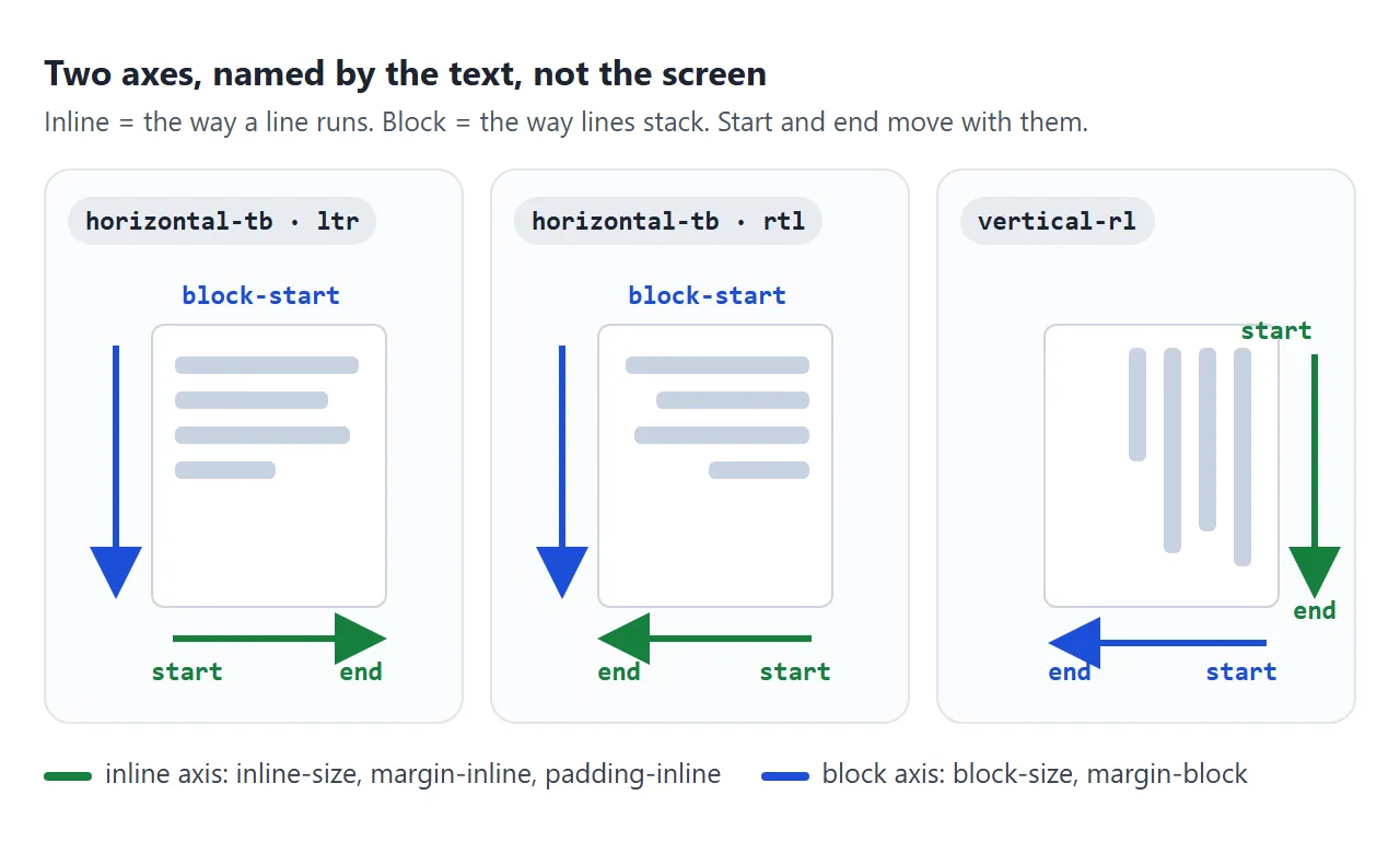
Each axis has a start and an end. Two things decide where they are:
dir(or the CSSdirectionproperty) flips inline start and end: inrtl, start is on the right.writing-modeturns the axes: invertical-rl, inline runs top to bottom and block runs right to left. CSS writing-mode covers the modes themselves.
The full physical-to-logical map
Every physical side and size has a logical partner. The name tells you the axis and the end.
| Physical (in ltr, horizontal) | Logical |
|---|---|
width / height |
inline-size / block-size |
min-width / max-width |
min-inline-size / max-inline-size |
min-height / max-height |
min-block-size / max-block-size |
margin-left / margin-right |
margin-inline-start / margin-inline-end |
margin-top / margin-bottom |
margin-block-start / margin-block-end |
padding-left / padding-top |
padding-inline-start / padding-block-start |
border-left / border-bottom |
border-inline-start / border-block-end |
left / right |
inset-inline-start / inset-inline-end |
top / bottom |
inset-block-start / inset-block-end |
border-top-left-radius |
border-start-start-radius |
border-bottom-right-radius |
border-end-end-radius |
text-align: left / right |
text-align: start / end |
The pattern repeats for every family: margin, padding, border, border-width, border-color, border-style and inset each have -inline-start, -inline-end, -block-start and -block-end versions.
Corner names put the block side first, then the inline side. border-start-end-radius is the corner where block-start meets inline-end: top-right in an English page.
For text-align, start is already the default, so ordinary text needs no rule at all. CSS text-align goes further into start, end and justify.
Where each one lands
Here is the same map read the other way: which physical side a logical property becomes in each setup. The explorer above measures these live.
| Logical | ltr | rtl | vertical-rl | vertical-lr |
|---|---|---|---|---|
margin-inline-start |
left | right | top | top |
margin-inline-end |
right | left | bottom | bottom |
margin-block-start |
top | top | right | left |
margin-block-end |
bottom | bottom | left | right |
inline-size |
width | width | height | height |
block-size |
height | height | width | width |
border-start-start-radius |
top-left | top-right | top-right | top-left |
Two things to notice. dir="rtl" only changes the inline row; block-start stays on top. And in vertical text block-size is the width, so min-block-size sets a minimum width there.
Shorthands read start, then end
The two-value logical shorthands are an easy trap. margin-inline: 8px 24px looks like margin: 8px 24px, but it means something else.
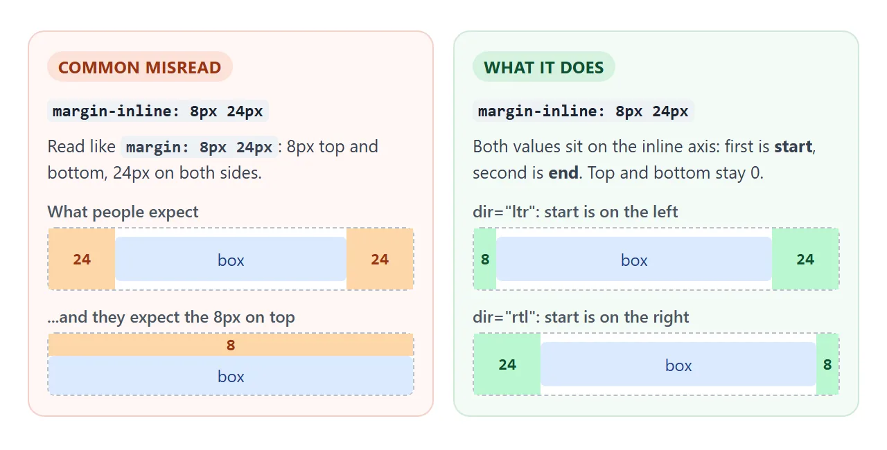
.a { margin-inline: 8px 24px; } /* start 8px, end 24px */
.b { margin-inline: 16px; }     /* start and end both 16px */
.c { padding-block: 12px 0; }   /* block-start 12px, block-end 0 */
.d { margin-inline: auto; }     /* centers a block along the line */
The same rule applies to padding-inline, padding-block, margin-block, inset-inline, inset-block, border-inline-width and friends.
Watch out for inset on its own. Despite the name, it is a physical shorthand for top right bottom left. It does not flip with dir.
Converting a component
Converting existing CSS is a search-and-replace with a rule for each family. Test with each language button below: only dir and writing-mode change, the CSS stays the same.
<!doctype html>
<html lang="en">
<head>
<meta charset="utf-8">
<meta name="viewport" content="width=device-width, initial-scale=1">
<title>Physical vs logical card</title>
<style>
  body { margin: 0; padding: 14px; font-family: system-ui, sans-serif; background: #f4f5f7; color: #1d2330; }
  .bar { display: flex; gap: 6px; flex-wrap: wrap; }
  .bar button { font: inherit; font-size: 14px; padding: 7px 12px; border: 1px solid #c7ced8; border-radius: 8px; background: #fff; cursor: pointer; }
  .bar button[aria-pressed="true"] { background: #1d2330; color: #fff; border-color: #1d2330; }
  .panels { display: flex; flex-wrap: wrap; gap: 14px; margin-top: 12px; }
  .panel { flex: 1 1 260px; }
  .panel h3 { margin: 0 0 8px; font-size: 13px; color: #4b5563; }
  .panel h3 b { color: #9a3412; }
  .panel.logical h3 b { color: #0f5132; }

  /* Shared look: flexbox already follows the text direction */
  .card { box-sizing: border-box; position: relative; display: flex; align-items: flex-start; background: #fff; box-shadow: 0 2px 10px rgba(0, 0, 0, .1); }
  .avatar { flex: none; width: 40px; height: 40px; border-radius: 50%; background: linear-gradient(135deg, #60a5fa, #2563eb); }
  .name { font-weight: 700; }
  .text { font-size: 14px; color: #4b5563; margin-top: 4px; }
  .badge { position: absolute; font-size: 11px; font-weight: 700; background: #fde68a; padding: 2px 7px; border-radius: 99px; }

  /* 1. Physical: every value names a side of the screen */
  .physical .card { width: 220px; padding: 14px 44px 14px 14px; border-left: 5px solid #f97316;
                    border-radius: 0 12px 12px 0; text-align: left; }
  .physical .avatar { margin-right: 12px; }
  .physical .badge { top: 10px; right: 10px; }

  /* 2. Logical: every value names a side of the text flow */
  .logical .card { inline-size: 220px; padding-block: 14px; padding-inline: 14px 44px; border-inline-start: 5px solid #16a34a;
                   border-start-end-radius: 12px; border-end-end-radius: 12px; text-align: start; }
  .logical .avatar { margin-inline-end: 12px; }
  .logical .badge { inset-block-start: 10px; inset-inline-end: 10px; }
</style>
</head>
<body>
<div class="bar" id="bar">
  <button data-lang="en" aria-pressed="true">English</button>
  <button data-lang="ar">Arabic (rtl)</button>
  <button data-lang="ja">Japanese (vertical)</button>
</div>

<div class="panels">
  <div class="panel physical"><h3><b>Physical:</b> width, margin-right, border-left, right</h3><div class="slot"></div></div>
  <div class="panel logical"><h3><b>Logical:</b> inline-size, margin-inline-end, border-inline-start, inset-inline-end</h3><div class="slot"></div></div>
</div>

<script>
  const content = {
    en: { dir: 'ltr', wm: 'horizontal-tb', name: 'Sam Lee', text: 'Sent you a new file.', badge: 'New' },
    ar: { dir: 'rtl', wm: 'horizontal-tb', name: 'سارة', text: 'أرسلت لك ملفا جديدا.', badge: 'جديد' },
    ja: { dir: 'ltr', wm: 'vertical-rl', name: '佐藤', text: 'ファイルを送りました。', badge: '新着' },
  };

  function render(lang) {
    const c = content[lang];
    document.querySelectorAll('.slot').forEach((slot) => {
      // Only dir and writing-mode change. The card CSS stays the same.
      slot.innerHTML =
        `<div class="card" dir="${c.dir}" lang="${lang}" style="writing-mode:${c.wm}">
           <div class="avatar"></div>
           <div><div class="name">${c.name}</div><div class="text">${c.text}</div></div>
           <span class="badge">${c.badge}</span>
         </div>`;
    });
    document.querySelectorAll('#bar button').forEach((b) =>
      b.setAttribute('aria-pressed', String(b.dataset.lang === lang)));
  }

  document.getElementById('bar').addEventListener('click', (e) => {
    if (e.target.dataset.lang) render(e.target.dataset.lang);
  });
  render('en');
</script>
</body>
</html>
- Sizes:
widthandheightbecomeinline-sizeandblock-size, including themin-andmax-versions. - Left and right:
margin-left,padding-leftandborder-leftbecome theinline-startversions. The right ones becomeinline-end. - Top and bottom: these become
block-startandblock-end. - Positions and corners:
leftandrightbecomeinset-inline-startandinset-inline-end.border-top-left-radiusbecomesborder-start-start-radius. - Alignment:
text-align: leftbecomesstart. - Test: set
dir="rtl", thenwriting-mode: vertical-rl, and check what moves.
The card's flex layout needed no change. Flexbox and grid already follow the inline direction, so only the margins, borders and positions inside them had to switch.
Logical properties are still part of the same box model: margin, border, padding and content. The CSS box model explains how those layers add up.
When physical properties are still right
Not everything should flip. Logical properties are for things placed relative to the words. Things tied to the screen, to light or to a picture should stay put.
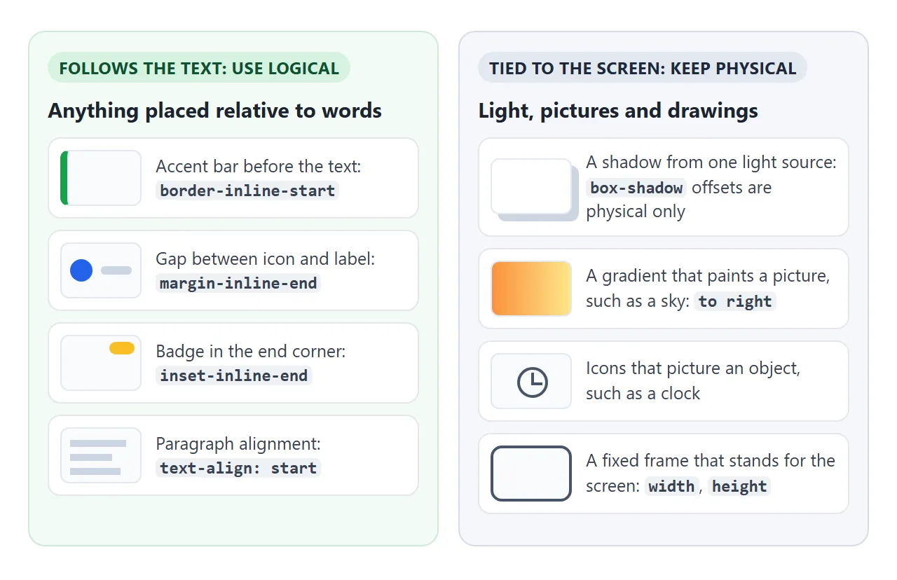
- Shadows:
box-shadowoffsets only take physical x and y values. A light source above and to the left does not move when the language changes. - Pictures: a gradient or background that draws a scene, such as a sunset, keeps
to right. - Screen frames: a box that stands for a device screen keeps
widthandheight. The frame in the chat example below does exactly that.
A finished example: chat and sidebar
This layout uses only logical properties for the sidebar, the bubbles, the timestamps and the input. The buttons switch the app between English, Arabic and a vertical Japanese preview.
<!doctype html>
<html lang="en">
<head>
<meta charset="utf-8">
<meta name="viewport" content="width=device-width, initial-scale=1">
<title>Chat and sidebar with logical properties</title>
<style>
  body { margin: 0; padding: 12px; font-family: system-ui, sans-serif; background: #eef1f5; color: #1d2330; }
  .bar { display: flex; gap: 6px; flex-wrap: wrap; margin-block-end: 10px; }
  .bar button { font: inherit; font-size: 14px; padding: 7px 12px; border: 1px solid #c7ced8; border-radius: 8px; background: #fff; cursor: pointer; }
  .bar button[aria-pressed="true"] { background: #1d2330; color: #fff; border-color: #1d2330; }

  /* The frame is the "screen", so it keeps physical width and height */
  .frame { width: 100%; height: 400px; }

  /* Everything below uses logical properties only */
  .app { inline-size: 100%; block-size: 100%; display: grid; grid-template-columns: 112px 1fr;
         background: #fff; border-radius: 12px; overflow: hidden; box-shadow: 0 4px 16px rgba(0, 0, 0, .1); }
  .side { background: #1d2330; color: #cbd5e1; padding-block: 12px; padding-inline: 10px; }
  .side a { display: block; padding-block: 8px; padding-inline: 10px; margin-block-end: 4px; border-radius: 8px;
            color: inherit; text-decoration: none; font-size: 14px; }
  .side a.on { background: #334155; color: #fff; border-inline-start: 3px solid #4ade80; }
  .chat { display: flex; flex-direction: column; min-inline-size: 0; }
  .head { padding-block: 10px; padding-inline: 14px; border-block-end: 1px solid #e5e7eb; font-weight: 700; }
  .list { flex: 1; overflow: auto; padding: 12px; display: flex; flex-direction: column; gap: 8px; }
  .msg { max-inline-size: 75%; padding-block: 8px; padding-inline: 12px; border-radius: 14px; line-height: 1.45; }
  .them { background: #f1f5f9; border-end-start-radius: 4px; }                     /* tail at start */
  .me { background: #2563eb; color: #fff; margin-inline-start: auto; border-end-end-radius: 4px; } /* pushed to end */
  .time { display: block; font-size: 11px; opacity: .7; text-align: end; margin-block-start: 2px; }
  .send { display: flex; gap: 8px; padding: 10px; border-block-start: 1px solid #e5e7eb; }
  .send input { flex: 1; min-inline-size: 0; font: inherit; padding-block: 8px; padding-inline: 12px; border: 1px solid #cbd5e1; border-radius: 99px; }
  .send button { font: inherit; padding-inline: 14px; border: 0; border-radius: 99px; background: #2563eb; color: #fff; }
</style>
</head>
<body>
<div class="bar" id="bar">
  <button data-lang="en" aria-pressed="true">English</button>
  <button data-lang="ar">العربية (rtl)</button>
  <button data-lang="ja">日本語 (vertical-rl)</button>
</div>

<div class="frame">
  <div class="app" id="app">
    <nav class="side" id="side"></nav>
    <section class="chat">
      <div class="head" id="head"></div>
      <div class="list" id="list"></div>
      <form class="send" id="form"><input id="input" autocomplete="off"><button id="btn"></button></form>
    </section>
  </div>
</div>

<script>
  const ui = {
    en: { dir: 'ltr', wm: 'horizontal-tb', nav: ['Chats', 'People', 'Settings'], head: 'Sam Lee', send: 'Send', hint: 'Message',
          msgs: [['them', 'Hi! Did the file arrive?'], ['me', 'Yes, got it. Thanks!'], ['them', 'Great, see you at 3.']] },
    ar: { dir: 'rtl', wm: 'horizontal-tb', nav: ['المحادثات', 'الأشخاص', 'الإعدادات'], head: 'سارة', send: 'إرسال', hint: 'رسالة',
          msgs: [['them', 'مرحبا! هل وصل الملف؟'], ['me', 'نعم، وصل. شكرا!'], ['them', 'رائع، أراك الساعة 3.']] },
    ja: { dir: 'ltr', wm: 'vertical-rl', nav: ['トーク', '連絡先', '設定'], head: '佐藤', send: '送信', hint: 'メッセージ',
          msgs: [['them', 'ファイルは届きましたか?'], ['me', 'はい、届きました。'], ['them', 'では三時に。']] },
  };
  const app = document.getElementById('app');
  const list = document.getElementById('list');
  let lang = 'en';

  function bubble(who, text) {
    const div = document.createElement('div');
    div.className = 'msg ' + who;
    div.textContent = text;
    div.insertAdjacentHTML('beforeend', '<span class="time">9:41</span>');
    list.append(div);
  }

  function render(next) {
    lang = next;
    const t = ui[lang];
    // The only switches: dir, lang and writing-mode on the app
    app.dir = t.dir; app.lang = lang; app.style.writingMode = t.wm;
    document.getElementById('side').innerHTML = t.nav.map((n, i) => `<a href="#" class="${i ? '' : 'on'}">${n}</a>`).join('');
    document.getElementById('head').textContent = t.head;
    document.getElementById('btn').textContent = t.send;
    document.getElementById('input').placeholder = t.hint;
    list.innerHTML = '';
    t.msgs.forEach(([who, text]) => bubble(who, text));
    document.querySelectorAll('#bar button').forEach((b) => b.setAttribute('aria-pressed', String(b.dataset.lang === lang)));
  }

  document.getElementById('bar').addEventListener('click', (e) => { if (e.target.dataset.lang) render(e.target.dataset.lang); });

  // Sending adds your message at the end side, in any direction
  document.getElementById('form').addEventListener('submit', (e) => {
    e.preventDefault();
    const input = document.getElementById('input');
    if (input.value.trim()) { bubble('me', input.value.trim()); input.value = ''; list.lastElementChild.scrollIntoView({ block: 'nearest', inline: 'nearest' }); }
  });
  render('en');
</script>
</body>
</html>
- Your bubbles:
margin-inline-start: autopushes them to the end of the line. - Bubble tails:
border-end-end-radiusandborder-end-start-radiuskeep the small corner next to the sender. - Sidebar:
padding-inlineandborder-inline-starton the active link. Grid places the sidebar at the inline start. - Width limits:
max-inline-size: 75%on bubbles andmin-inline-size: 0on the input so it can shrink.
When it does not work
| What you see | Cause | Fix |
|---|---|---|
A margin or border stays on the left in rtl |
A physical property is still in the CSS | Search for left and right and swap them |
| One side gets both values | Two-value shorthand read as physical | margin-inline: a b is start then end |
inset does not flip |
inset is physical |
Use inset-inline and inset-block |
inline-size does nothing |
The element is display: inline |
Use inline-block or block |
| A box is too wide in vertical text | block-size is the width there |
Set the column length with inline-size |
| A shorthand is ignored in an old browser | Some shorthands shipped later than longhands | Use the longhands, or check a support table |
The last row is about age, not correctness. The longhand properties, such as margin-inline-start, arrived in browsers before some of the shorthands and the inset-* family. If you need to support older browsers, check each property on MDN.
Share it as a link
Direction bugs only show up when someone reads the page in the other direction. A screenshot shows one direction; a working page lets a reviewer press the Arabic or Japanese button and check for themselves.
To send the working version, paste the page into a NOS document and choose Create share link. HTML to link walks through it.
The page renders as written and its scripts run, so the language switches work for whoever opens it. If you change the CSS later, the same link shows the new version.