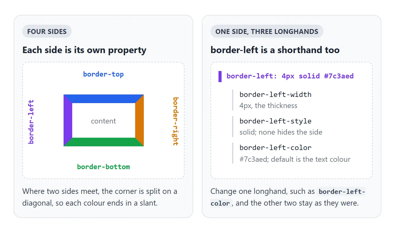
To put a border on one side, use the property for that side: border-left, border-top, border-right or border-bottom. Each takes the same three values as border, so border-left: 4px solid #4f46e5 draws a 4px line down the left edge and nothing else.
Tick the sides below and watch the CSS it prints. Only ticked sides get a line.
<!doctype html>
<html lang="en">
<head>
<meta charset="utf-8">
<meta name="viewport" content="width=device-width, initial-scale=1">
<title>One border side at a time</title>
<style>
  body { margin: 0; padding: 16px; font-family: system-ui, sans-serif; background: #f4f5f7; color: #1d2330; }
  .controls { display: flex; flex-wrap: wrap; gap: 8px 14px; align-items: center; font-size: 14px; }
  .controls label { display: inline-flex; align-items: center; gap: 5px; }
  .box {
    margin: 18px 0 14px; padding: 18px; max-width: 320px;
    background: #fff; font-size: 15px;
  }
  pre { margin: 0; padding: 10px 12px; min-height: 40px; background: #1d2330; color: #e5e7eb;
        border-radius: 8px; font: 13px/1.5 ui-monospace, Consolas, monospace; white-space: pre-wrap; }
</style>
</head>
<body>
<div class="controls">
  <label><input type="checkbox" id="top"> top</label>
  <label><input type="checkbox" id="right"> right</label>
  <label><input type="checkbox" id="bottom"> bottom</label>
  <label><input type="checkbox" id="left" checked> left</label>
</div>
<div class="controls" style="margin-top:10px">
  <label>width <input type="range" id="width" min="1" max="16" value="6"></label>
  <label>style
    <select id="style"><option>solid</option><option>dashed</option><option>dotted</option><option>double</option></select>
  </label>
  <label>colour <input type="color" id="color" value="#4f46e5"></label>
</div>

<div class="box" id="box">Tick a side. Each ticked side gets its own <b>border-*</b> line.</div>
<pre id="out"></pre>

<script>
  const box = document.getElementById('box');
  const out = document.getElementById('out');
  const sides = ['top', 'right', 'bottom', 'left'];

  function update() {
    const w = document.getElementById('width').value + 'px';
    const s = document.getElementById('style').value;
    const c = document.getElementById('color').value;
    let css = '';
    box.style.border = '0';  // start from no border, then add the ticked sides
    for (const side of sides) {
      if (!document.getElementById(side).checked) continue;
      const value = w + ' ' + s + ' ' + c;
      box.style.setProperty('border-' + side, value);
      css += 'border-' + side + ': ' + value + ';\n';
    }
    out.textContent = css || 'border: 0;';
  }

  document.querySelectorAll('input, select').forEach((el) => el.addEventListener('input', update));
  update();
</script>
</body>
</html>
The general border property, colours and border-radius are covered in CSS border. This page stays with single sides.
Four sides, each with three longhands
Every side is a shorthand of its own. border-left sets three longhands at once: border-left-width, border-left-style and border-left-color. The same pattern holds for top, right and bottom, which makes twelve longhands in all.
| Property | Sets | Example |
|---|---|---|
border-left |
Width, style and colour of one side | border-left: 4px solid red |
border-left-width |
Thickness only | border-left-width: 6px |
border-left-style |
Line type only | border-left-style: dashed |
border-left-color |
Colour only | border-left-color: teal |
border-width |
All four widths, top then clockwise | border-width: 0 0 2px 4px |
Use a longhand when you want to change one part and keep the rest. A hover state that only swaps the colour is a good fit:
.item { border-left: 4px solid transparent; }
.item:hover { border-left-color: #4f46e5; }
If the colour is left out, the side uses currentcolor, the text colour of the element.
The shorthand resets what you leave out
border-left: 4px looks reasonable and draws nothing. A shorthand sets every longhand it covers, and anything missing goes back to its starting value. The starting style is none, and a side whose style is none has a computed width of 0.
The same rule decides the order of lines. The four-side border also resets border-left, so write it first and override the side after it:
.note {
  border: 1px solid #e1e4ea;       /* all four sides */
  border-left: 5px solid #4f46e5;  /* then one side on top */
}
Swap those two lines and the thick left bar is gone, because border comes last and wins.
To remove a single side, use border-left: none or border-left: 0. Both leave the side with no visible line.
A left accent bar for notes and quotes
The most common one-sided border is a coloured bar on the left of a callout, a quote or the current item in a menu. It takes four steps:
- Give the box
border-leftwith a width, style and colour. - Add
padding-leftso text does not touch the bar. - Round only the right corners.
- Switch to
border-inline-startif the page can be shown right-to-left.
.callout {
  padding: 10px 14px;
  background: #fff;
  border-left: 5px solid #4f46e5;
  border-radius: 0 8px 8px 0;  /* right corners only */
}
Step 3 matters. With border-radius on all four corners, the bar follows the curve at the top and bottom and thins out towards its ends.
That happens because the other sides have no width to share the corner with. Rounding only the far corners keeps the bar straight.
The bar also adds to the box size. A 5px bar makes the box 5px wider unless the box uses box-sizing: border-box, explained in box-sizing.
border-block and border-inline: logical sides
The physical sides stay put whatever the language. The logical sides follow the direction of the text, which matters for Arabic, Hebrew and other right-to-left scripts.
| Logical property | In English (left to right) | In right-to-left text |
|---|---|---|
border-inline-start |
Left | Right |
border-inline-end |
Right | Left |
border-block-start |
Top | Top |
border-block-end |
Bottom | Bottom |
border-inline |
Left and right | Right and left |
border-block |
Top and bottom | Top and bottom |
border-block and border-inline set two sides at once, so border-block: 1px solid #ddd gives a box a top and a bottom rule. Each logical side also has width, style and colour longhands, such as border-inline-start-color.
In vertical writing modes the block and inline axes turn, so border-block-start is no longer the top. CSS writing-mode shows how. The full set of logical properties, beyond borders, is in CSS logical properties.
Underlines: border-bottom vs text-decoration
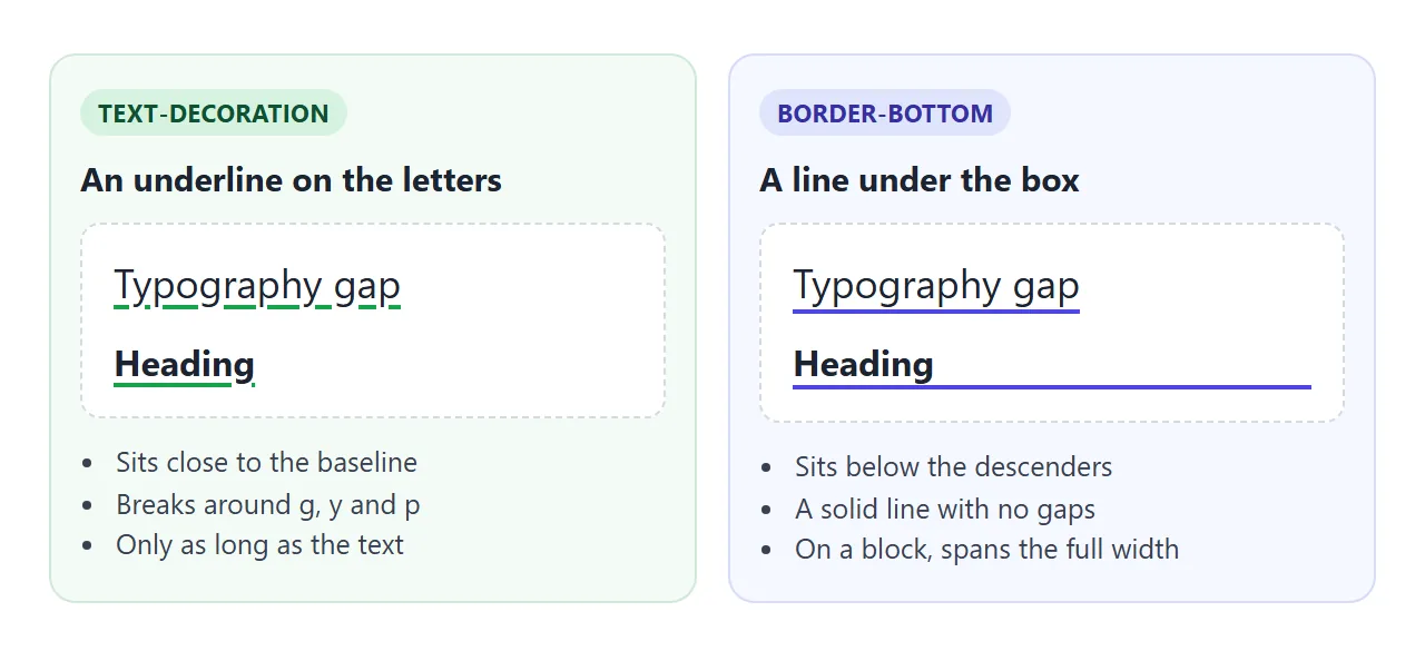
A line under text can be an underline or a bottom border. They look alike on one short word and behave differently everywhere else.
text-decoration |
border-bottom |
|
|---|---|---|
| Where the line sits | Near the baseline, adjustable | Under the box, below the descenders |
| Letters with tails (g, y, p) | Can leave a gap around them | Line runs straight through underneath |
| On a heading or other block | As long as the text | The full width of the block |
| Takes up space | No | On a block, yes. On inline text, no |
| Style options | Solid, double, dotted, dashed, wavy | Solid, double, dotted, dashed, groove and others |
Drag the slider to narrow the columns and see how each one wraps.
<!doctype html>
<html lang="en">
<head>
<meta charset="utf-8">
<meta name="viewport" content="width=device-width, initial-scale=1">
<title>border-bottom vs text-decoration</title>
<style>
  body { margin: 0; padding: 16px; font-family: system-ui, sans-serif; background: #f4f5f7; color: #1d2330; }
  .row { display: flex; flex-wrap: wrap; gap: 12px; }
  .col { flex: 1 1 150px; min-width: 0; background: #fff; border-radius: 10px; padding: 12px 14px; }
  .col code { font: 12px ui-monospace, Consolas, monospace; color: #4f46e5; }
  p { font-size: 17px; line-height: 1.6; margin: 10px 0 0; }
  h3 { font-size: 17px; margin: 14px 0 0; }

  /* Left: a real underline */
  .deco { text-decoration: underline 2px; text-underline-offset: 3px; }
  /* Right: a border drawn under the box */
  .line { border-bottom: 2px solid; }
  /* Headings are blocks, so their border runs the full width... */
  h3.fit { width: fit-content; }  /* ...unless the box shrinks to the text */

  label { display: block; font-size: 14px; margin-bottom: 12px; }
</style>
</head>
<body>
<label>Column width <input type="range" id="w" min="130" max="320" value="190"></label>
<div class="row">
  <div class="col">
    <code>text-decoration</code>
    <p>A <span class="deco">quickly typed, gappy underline</span> on wrapped text.</p>
    <h3 class="deco">Heading</h3>
  </div>
  <div class="col">
    <code>border-bottom</code>
    <p>A <span class="line">quickly typed, gappy underline</span> on wrapped text.</p>
    <h3 class="line">Heading</h3>
    <h3 class="line fit">Heading, fit-content</h3>
  </div>
</div>

<script>
  // Narrow the columns to see how each underline wraps
  const w = document.getElementById('w');
  w.addEventListener('input', () => {
    document.querySelectorAll('.col').forEach((c) => {
      c.style.flex = '0 1 ' + w.value + 'px';
    });
  });
  w.dispatchEvent(new Event('input'));
</script>
</body>
</html>
Two things to notice. On a wrapped inline element, each line gets its own bottom border.
On a heading the border runs to the edge of the column, because the heading is a block. width: fit-content or display: inline-block shrinks the box to the text.
A thick bottom border on inline text does not push the lines apart. Vertical borders and padding on inline elements do not change the line height, so a heavy border can overlap the next line. Increase line-height if that happens.
For readable underlines on links, CSS text-decoration covers text-underline-offset and thickness.
Triangles made from borders
Where two borders meet, the browser splits the corner on a diagonal. Shrink the box to nothing and the four borders become four triangles.
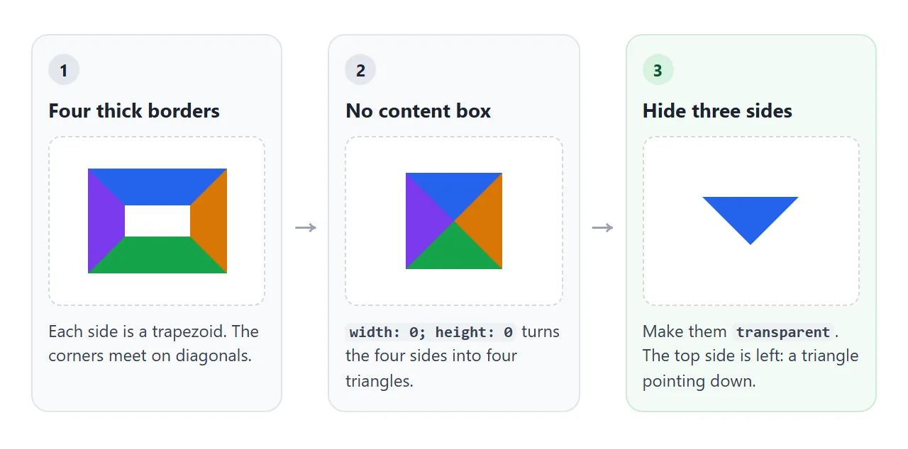
.arrow-down {
  width: 0;
  height: 0;
  border: 8px solid transparent;
  border-top-color: #1d2330;
}
The coloured side decides the direction: border-top-color gives a triangle pointing down, border-left-color one pointing right. For a flatter or taller shape, set the widths separately. border-width: 10px 8px 0 makes a down arrow 16px wide and 10px tall.
The usual place for this is the little arrow on a tooltip or a speech bubble, drawn with ::after so no extra element is needed. A pure HTML tooltip uses the same trick.
A finished example: callouts, tabs and a bubble
This example uses only side borders. The callouts use border-inline-start, the tabs use border-bottom, and the bubble arrow is a border triangle. Press the button to flip the page to right-to-left.
<!doctype html>
<html lang="en">
<head>
<meta charset="utf-8">
<meta name="viewport" content="width=device-width, initial-scale=1">
<title>Callouts, tabs and a bubble built from border sides</title>
<style>
  body { margin: 0; padding: 16px; font-family: system-ui, sans-serif; background: #f4f5f7; color: #1d2330; }
  button { font: inherit; cursor: pointer; }
  .flip { padding: 6px 12px; border: 1px solid #c9ced8; border-radius: 8px; background: #fff; font-size: 14px; }

  /* Tabs: every tab reserves a transparent bottom border, so nothing jumps */
  .tabs { display: flex; gap: 4px; margin: 14px 0 12px; border-bottom: 1px solid #d5d9e0; }
  .tab { padding: 8px 12px; background: none; border: 0; border-bottom: 3px solid transparent;
         margin-bottom: -1px; color: #5b6472; font-size: 15px; }
  .tab.on { border-bottom-color: #4f46e5; color: #1d2330; font-weight: 600; }

  /* Callout: one logical side, so it moves to the right in right-to-left text */
  .callout { padding: 10px 14px; margin: 0 0 10px; background: #fff; font-size: 15px;
             border-inline-start: 5px solid var(--c); border-start-end-radius: 8px; border-end-end-radius: 8px; }
  .info { --c: #4f46e5; } .warn { --c: #d97706; } .ok { --c: #16a34a; }

  /* Bubble with an arrow made of borders */
  .bubble { position: relative; display: inline-block; margin-top: 8px; padding: 8px 12px;
            background: #1d2330; color: #fff; border-radius: 8px; font-size: 14px; }
  .bubble::after {
    content: ""; position: absolute; top: 100%; inset-inline-start: 18px;
    width: 0; height: 0;
    border: 8px solid transparent;  /* four transparent triangles */
    border-top-color: #1d2330;      /* show only the top one: it points down */
  }
</style>
</head>
<body>
<div id="app" dir="ltr">
  <button class="flip" id="flip">Switch to right-to-left</button>

  <div class="tabs" role="tablist">
    <button class="tab on" role="tab">Notes</button>
    <button class="tab" role="tab">Warnings</button>
    <button class="tab" role="tab">Done</button>
  </div>

  <p class="callout info" data-tab="0">Info: border-inline-start draws this bar</p>
  <p class="callout warn" data-tab="1" hidden>Warning: the bar is 5px wide</p>
  <p class="callout ok" data-tab="2" hidden>Done: no extra element needed</p>

  <div class="bubble">Saved: the arrow is a border</div>
</div>

<script>
  const app = document.getElementById('app');
  const tabs = document.querySelectorAll('.tab');

  // Flip the writing direction: the logical bar and the arrow follow
  document.getElementById('flip').addEventListener('click', (e) => {
    const rtl = app.dir === 'ltr';
    app.dir = rtl ? 'rtl' : 'ltr';
    e.target.textContent = rtl ? 'Switch to left-to-right' : 'Switch to right-to-left';
  });

  // Tabs: move the coloured bottom border and show the matching callout
  tabs.forEach((tab, i) => tab.addEventListener('click', () => {
    tabs.forEach((t) => t.classList.toggle('on', t === tab));
    document.querySelectorAll('.callout').forEach((c) => { c.hidden = c.dataset.tab != i; });
  }));
</script>
</body>
</html>
- Callouts:
border-inline-startputs the bar where text starts. - Tabs: every tab has a 3px transparent bottom border. Only its colour changes, so nothing jumps.
- Bubble: the arrow sits at
top: 100%and usesinset-inline-start, so it moves with the text direction too.
When it does not work
| What you see | Cause | Fix |
|---|---|---|
border-left: 4px draws nothing |
No style, so the side is none |
Add a style, such as solid |
| The side border vanished | A later border line reset it |
Put the side property after border |
| The bar curves and thins at its ends | border-radius on all corners |
Round only the far corners |
| A heading underline runs across the page | The heading is a block | width: fit-content |
| Tabs jump when one becomes active | Only the active tab has a border | Give all tabs a transparent one |
| A thick underline overlaps the next line | Inline borders do not affect line height | Increase line-height |
| The bar stays on the left in Arabic | border-left is physical |
Use border-inline-start |
| The triangle is a square or a trapezoid | The box has width, height or padding | width: 0, height: 0, no padding |
Share it as a link
Border tricks are easiest to judge in the browser, where you can flip the direction and resize the column. A screenshot shows one state, and an .html attachment may open as plain code on a phone.
To send the working version, paste the page into a NOS document and choose Create share link. HTML to link walks through it. The page renders as written and its scripts run, so the people you send it to can press the buttons themselves.
If you change the code later, the same link shows the new version.