text-decoration is the CSS property that draws a line under, over or through text. The shorthand takes the line, style, colour and thickness in any order. For example, text-decoration: underline wavy #e11d48 2px; gives a thin red wave under the text.
Try every combination below. Change the controls and the box prints the CSS to copy.
<!doctype html>
<html lang="en">
<head>
<meta charset="utf-8">
<meta name="viewport" content="width=device-width, initial-scale=1">
<title>text-decoration builder</title>
<style>
  body { margin: 0; padding: 16px; font-family: system-ui, sans-serif; background: #f4f5f7; color: #1d2330; }
  .preview {
    background: #fff; border-radius: 12px; padding: 22px 16px;
    font-size: 30px; line-height: 1.8; text-align: center;
  }
  form { display: grid; grid-template-columns: repeat(auto-fit, minmax(160px, 1fr)); gap: 10px 16px; margin: 14px 0; font-size: 14px; }
  fieldset { border: 0; padding: 0; margin: 0; }
  legend, .lbl { font-weight: 600; margin-bottom: 4px; display: block; }
  label { display: block; }
  select, input[type=range] { width: 100%; }
  pre {
    margin: 0; padding: 12px 14px; border-radius: 10px;
    background: #1d2330; color: #e5e7eb; font-size: 13px; white-space: pre-wrap;
  }
</style>
</head>
<body>
<div class="preview"><span id="text">Typography, quietly</span></div>

<form id="f">
  <fieldset>
    <legend>Line</legend>
    <label><input type="checkbox" name="line" value="underline" checked> underline</label>
    <label><input type="checkbox" name="line" value="overline"> overline</label>
    <label><input type="checkbox" name="line" value="line-through"> line-through</label>
  </fieldset>
  <div>
    <label class="lbl" for="style">Style</label>
    <select id="style">
      <option>solid</option><option>double</option><option>dotted</option>
      <option>dashed</option><option selected>wavy</option>
    </select>
    <label class="lbl" for="color" style="margin-top:8px">Colour</label>
    <input type="color" id="color" value="#e11d48">
  </div>
  <div>
    <label class="lbl" for="thick">Thickness: <span id="tv"></span></label>
    <input type="range" id="thick" min="0" max="8" value="2">
    <label class="lbl" for="offset">Underline offset: <span id="ov"></span></label>
    <input type="range" id="offset" min="0" max="12" value="4">
    <label><input type="checkbox" id="skip"> draw through descenders</label>
  </div>
</form>

<pre id="out"></pre>

<script>
  const text = document.getElementById('text');
  const f = document.getElementById('f');
  const $ = (id) => document.getElementById(id);

  function update() {
    const lines = [...f.querySelectorAll('[name=line]:checked')].map((c) => c.value);
    const t = $('thick').value;  // 0 means "auto": let the browser choose
    const rules = {
      'text-decoration-line': lines.join(' ') || 'none',
      'text-decoration-style': $('style').value,
      'text-decoration-color': $('color').value,
      'text-decoration-thickness': t === '0' ? 'auto' : t + 'px',
      'text-underline-offset': $('offset').value + 'px',  // only moves the underline
      'text-decoration-skip-ink': $('skip').checked ? 'none' : 'auto',
    };
    text.removeAttribute('style');
    for (const [prop, val] of Object.entries(rules)) text.style.setProperty(prop, val);

    $('tv').textContent = rules['text-decoration-thickness'];
    $('ov').textContent = rules['text-underline-offset'];
    $('out').textContent =
      '.fancy {\n' + Object.entries(rules).map(([p, v]) => `  ${p}: ${v};`).join('\n') + '\n}';
  }

  f.addEventListener('input', update);
  update();
</script>
</body>
</html>
Only the underline moves with the offset slider. Overline and line-through stay where the font puts them.
The four longhands and the shorthand
The shorthand is a short way of writing four separate properties. Each one can also be set on its own, which is handy for hover states that change a single part.
| Property | Values | Default |
|---|---|---|
text-decoration-line |
none, underline, overline, line-through, or several |
none |
text-decoration-style |
solid, double, dotted, dashed, wavy |
solid |
text-decoration-color |
any colour | currentColor (the text colour) |
text-decoration-thickness |
auto, from-font, a length or a percentage |
auto |
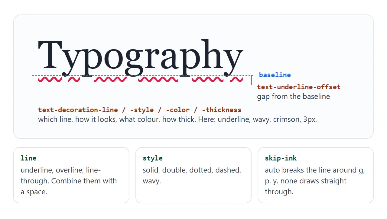
Two related properties are not part of the shorthand. text-underline-offset sets the gap between the underline and the text. text-decoration-skip-ink decides whether the line breaks around letters that hang below the baseline.
.note {
  text-decoration: underline dotted #0f766e 2px;
  text-underline-offset: 0.25em;
  text-decoration-skip-ink: none; /* draw through g, p, y */
}
Offset and thickness: making underlines readable
A default underline sits close to the letters and can touch them. text-underline-offset opens a gap. Use an em value such as 0.2em so the gap grows and shrinks with the font size.
Thickness works the same way. auto and from-font let the browser or the font file decide, so the same rule can look heavier in one font than another. A length such as 2px or 0.08em gives a fixed result in every font.
Why a child cannot remove its parent's underline
This one is easy to walk into. A paragraph is underlined, and one span inside it gets text-decoration: none. The span stays underlined.
<!doctype html>
<html lang="en">
<head>
<meta charset="utf-8">
<meta name="viewport" content="width=device-width, initial-scale=1">
<title>Why a child cannot remove its parent's underline</title>
<style>
  body { margin: 0; padding: 16px; font-family: system-ui, sans-serif; background: #f4f5f7; color: #1d2330; }
  .case { background: #fff; border-radius: 12px; padding: 12px 16px; margin-bottom: 12px; }
  .case h3 { margin: 0 0 4px; font-size: 13px; color: #5b6270; font-weight: 600; }
  code { font-size: 12px; background: #eef1f5; border-radius: 4px; padding: 0 4px; }

  /* The parent draws the underline */
  .parent { font-size: 24px; margin: 6px 0; text-decoration: underline 3px #e11d48; }

  /* Case 1: does NOT work. The span is still inside the parent's underline */
  .try-none { text-decoration: none; color: #0f766e; }

  /* Case 2: works. An inline-block is not decorated by its parent */
  .fix { display: inline-block; text-decoration: none; color: #0f766e; }

  /* Case 3: the child draws its own line over the parent's */
  .cover { text-decoration: underline 3px #0f766e; color: #0f766e; }
</style>
</head>
<body>
<div class="case">
  <h3>1. Child has <code>text-decoration: none</code></h3>
  <p class="parent">Parent text <span class="try-none">child span</span></p>
</div>

<div class="case">
  <h3>2. Child is also <code>display: inline-block</code></h3>
  <p class="parent">Parent text <span class="fix">child span</span></p>
</div>

<div class="case">
  <h3>3. Child draws its own underline on top</h3>
  <p class="parent">Parent text <span class="cover">child span</span></p>
</div>
</body>
</html>
The line belongs to the parent. The parent draws it across all of its inline content, children included. The child's none only means the child adds no line of its own.
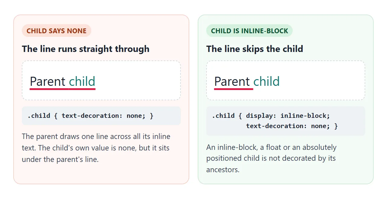
There are three ways out.
Make the child display: inline-block. Decorations are not carried into inline-block children, floats or absolutely positioned elements.
Draw over it. Give the child its own underline in another colour. It is painted on top of the parent's line, so with the same font and a thickness at least as large it hides it.
Move the decoration. Put the underline only on the parts that need it, not on the whole parent. This is usually the cleanest fix.
Strikethrough: s, del or CSS
A line through text can carry meaning, so pick the element before the style. Browsers draw line-through on both <s> and <del> by default.
| Use | For | Example |
|---|---|---|
<s> |
No longer accurate or relevant | An old price |
<del> |
Removed in an edit of the document | A changed date in minutes |
line-through in CSS |
Visual only, no meaning | A finished to-do item |
Screen readers may not announce a strikethrough at all. For prices, add words such as "Was" and "now", hidden visually if you like, so the old price is not read as the current one.
<p class="price">
  <s><span class="sr">Was </span>$49</s> $29
</p>
The <strike> element is obsolete. Use <s> or <del> instead.
Links: keep a cue that is not colour
Inside running text, a link needs something besides colour to stand out, because some readers cannot tell the colours apart. WCAG, the web accessibility guideline, makes the same point in its rule on use of colour.
You can still make the underline quiet. A thin, lighter line with a small offset that thickens on hover and focus reads as a link without shouting.
Removing it entirely is covered in HTML link without underline, and the hover colour order in HTML link hover color.
An underline that grows on hover
Transitions on the decoration itself are limited: you can fade the colour or slide the offset. For a line that grows from left to right, draw it as a background instead.
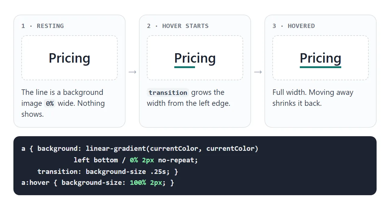
A linear-gradient of one colour makes a solid bar. background-size sets it to 0% wide and 2px tall, pinned to the bottom left. On hover the width goes to 100%, and transition animates the change.
The finished example puts it all together: quiet underlines for links in text, growing underlines for navigation, a struck-through price and a spelling-style wave.
<!doctype html>
<html lang="en">
<head>
<meta charset="utf-8">
<meta name="viewport" content="width=device-width, initial-scale=1">
<title>Text decoration in a real page</title>
<style>
  body { margin: 0; padding: 16px; font-family: system-ui, sans-serif; background: #f4f5f7; color: #1d2330; line-height: 1.6; }
  .box { background: #fff; border-radius: 12px; padding: 14px 16px; margin-bottom: 12px; }
  h3 { margin: 0 0 6px; font-size: 13px; color: #5b6270; }

  /* 1. Links in text: a quiet underline pushed below the letters */
  .prose a {
    color: #1d4ed8;
    text-decoration: underline 1px;     /* colour follows the link colour */
    text-underline-offset: 0.2em;
    text-decoration-color: rgba(29, 78, 216, .45);
  }
  .prose a:hover, .prose a:focus-visible {
    text-decoration-thickness: 2px;       /* thicker on hover and keyboard focus */
    text-decoration-color: currentColor;
  }

  /* 2. Navigation: an underline that grows from the left */
  nav { display: flex; gap: 18px; flex-wrap: wrap; }
  nav a {
    color: #1d2330; font-weight: 600; text-decoration: none;
    background: linear-gradient(currentColor, currentColor) left bottom / 0% 2px no-repeat;
    transition: background-size .25s;
    padding-bottom: 2px;
  }
  nav a:hover, nav a:focus-visible, nav a[aria-current] { background-size: 100% 2px; }

  /* 3. Prices: the old one struck through */
  .price { font-size: 26px; font-weight: 700; }
  .price s { font-size: 16px; font-weight: 400; color: #6b7280; text-decoration-thickness: 2px; }
  .sr { position: absolute; width: 1px; height: 1px; overflow: hidden; clip-path: inset(50%); white-space: nowrap; }

  /* 4. A spelling-style mark */
  .typo { text-decoration: underline wavy #dc2626; text-decoration-skip-ink: none; text-underline-offset: 3px; }
</style>
</head>
<body>
<div class="box">
  <h3>Links</h3>
  <nav>
    <a href="#home" aria-current="page">Home</a>
    <a href="#pricing">Pricing</a>
    <a href="#help">Help</a>
  </nav>
  <p class="prose">Read the <a href="#guide">setup guide</a> first, then check the <a href="#faq">questions page</a> if something looks off.</p>
</div>

<div class="box">
  <h3>Price</h3>
  <p class="price"><s><span class="sr">Was </span>$49</s> $29 <span class="sr">now</span></p>
</div>

<div class="box">
  <h3>Spelling mark</h3>
  <p>The meeting is on <span class="typo" title="Did you mean Wednesday?">Wensday</span> at ten.</p>
</div>
</body>
</html>
For effects that need extra shapes, such as a double bar or a highlight behind the text, ::before and ::after add them without extra markup.
When it does not work
| What you see | Cause | Fix |
|---|---|---|
A child still has the underline after none |
The line is drawn by an ancestor | display: inline-block on the child, or move the decoration |
| The underline touches or cuts the letters | Default offset for that font | text-underline-offset: 0.2em |
| Thickness looks different in another font | auto or from-font follow the font |
Set a length such as 2px |
| The colour or thickness you set disappeared | A later text-decoration shorthand reset them |
Put the shorthand first, longhands after |
| Offset has no effect | The line is an overline or line-through | Offset moves only the underline |
| Links look like plain text | Underline removed and colour is the only cue | Keep a thin underline, or add weight or an icon |
The shorthand trap is common. Writing text-decoration: underline after text-decoration-color: red sets the colour back to its default.
Share it as a link
Decoration details are hard to judge from a description. A wave, an offset or a hover animation shows up only when someone sees the real page, at their own font size.
To send the working version, paste the page into a NOS document and choose Create share link. HTML to link walks through it.
The page renders as written and its scripts run, so the people you send it to can hover the links and try the builder themselves. If you change the code later, the same link shows the new version.