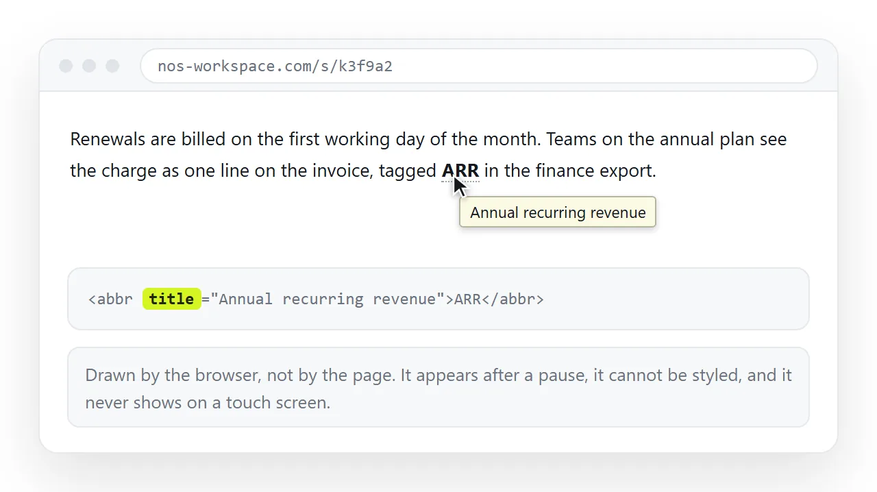
A pure HTML tooltip is one attribute: put title="..." on any element and the browser draws the tooltip on hover, with no CSS and no script.
<abbr title="Monthly Recurring Revenue">MRR</abbr>
<button title="Copies the table as CSV">Export</button>
That is the complete version. It works in every browser, survives being emailed, and costs nothing. It also gives you no control over position, delay, width or colour, and it does nothing on a touch screen.
This page covers the native version, the CSS-only version for when you need styling, and how to keep either one readable for people who are not using a mouse.
What each route gives you
| Route | JavaScript | Styleable | Works on touch | Screen reader support |
|---|---|---|---|---|
title attribute |
None | No | No | Partial, varies by reader |
| CSS pseudo-element | None | Yes | If the trigger is focusable | Only with aria-describedby |
| Popover API | None | Yes | Yes | Yes |
| Script-driven library | Yes | Yes | Yes | Depends on the library |
Most tables, dashboards and internal reports never need to leave the first two rows.
The CSS-only tooltip
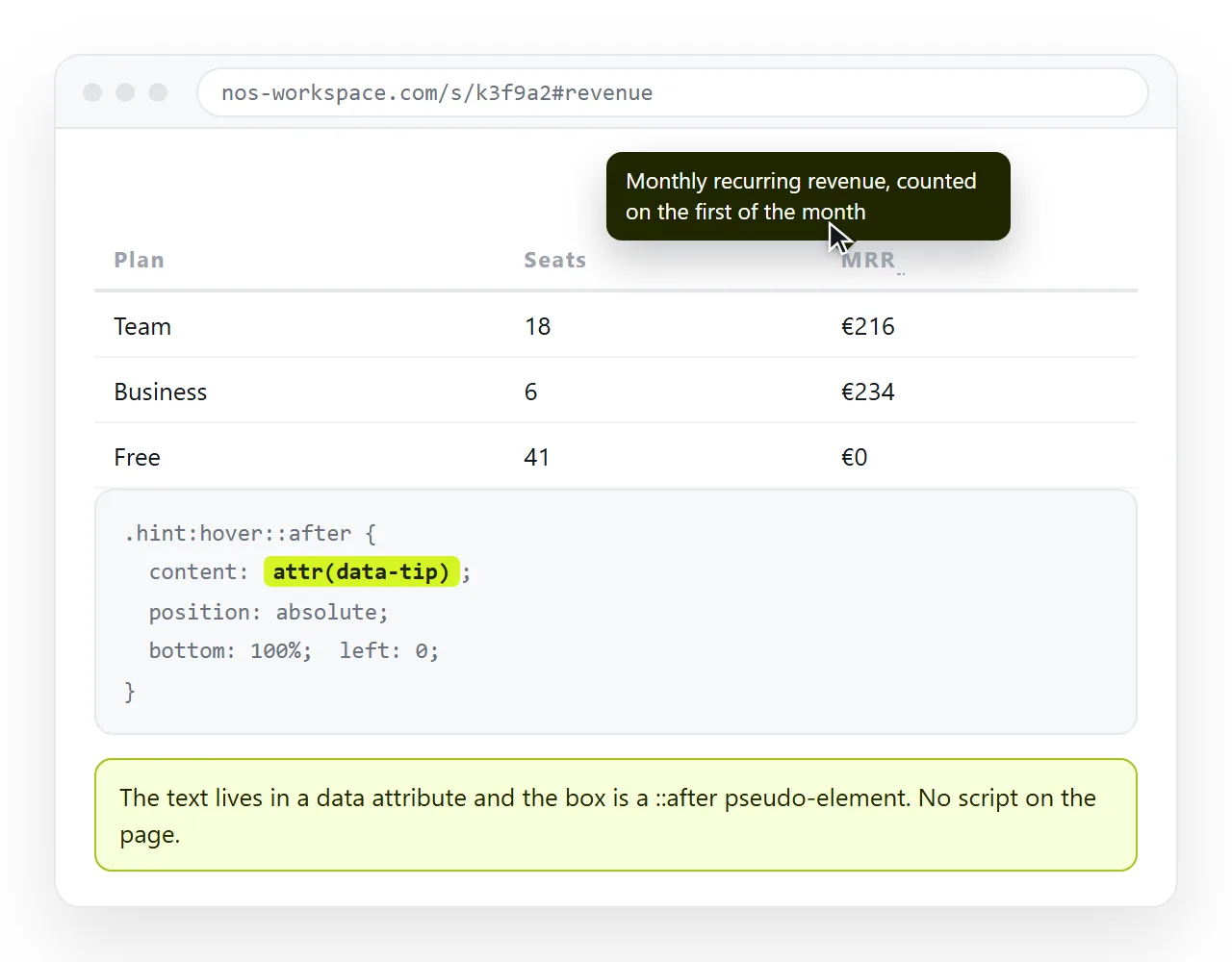
The idea is to store the tooltip text in a data attribute, then draw it with a pseudo-element that is hidden until the trigger is hovered or focused.
<style>
  .tip { position: relative; border-bottom: 1px dotted #888; cursor: help; }
  .tip::after {
    content: attr(data-tip);
    position: absolute;
    left: 50%;
    bottom: 100%;
    transform: translate(-50%, -6px);
    white-space: nowrap;
    background: #1f2430;
    color: #fff;
    padding: 6px 9px;
    border-radius: 6px;
    font-size: 13px;
    opacity: 0;
    pointer-events: none;
    transition: opacity .12s;
  }
  .tip:hover::after,
  .tip:focus-visible::after { opacity: 1; }
</style>

<span class="tip" tabindex="0" data-tip="Excludes cancelled orders">Net units</span>
Four details in that block do the real work, and each one fixes a specific failure.
position: relative on the trigger. Without it the tooltip positions itself against the page rather than the word, and lands somewhere unrelated.
pointer-events: none on the tooltip. Without it the tooltip can sit under the cursor, which hides it again, which shows it again, which flickers.
:focus-visible alongside :hover. This is what makes the tooltip reachable by keyboard, and it is the line most examples on the web leave out.
white-space: nowrap. Keeps a short tip on one line. Drop it and set a max-width instead when the text is a sentence.
Making it work for keyboard and touch
A tooltip that only responds to :hover is invisible to roughly everyone on a phone. Two changes fix most of it.
- Make the trigger focusable. A
<button>or<a>already is. A<span>is not, so addtabindex="0". - Match
:hoverwith:focus-visiblein the CSS, as above. - Describe the trigger properly with
aria-describedbywhen the tip carries information rather than decoration.
<button aria-describedby="tip-net">Net units</button>
<span role="tooltip" id="tip-net" class="sr-tip">Excludes cancelled orders</span>
The rule behind all three is the same. A tooltip is a second reading of something, never the only place a fact appears.
If the reader has to hover to learn the number, put the number on the page. Descriptive labels cover the same ground for controls that have only an icon.
There is one more decision worth making early: what the tip is for. Definitions and unit explanations work well. Instructions do not, because the reader has to keep hovering while trying to act on them.
Column headings in a dense table are the clearest good case. The heading stays short, and the definition sits one hover away for the person who needs it.
Where tooltips get clipped
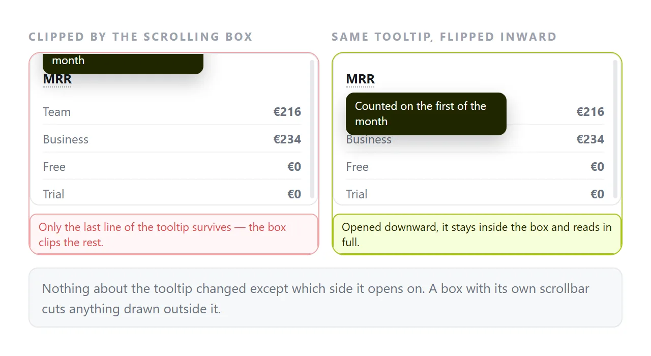
The most common bug report is not that the tooltip fails to appear, but that it appears cut in half.
That happens when an ancestor has overflow: hidden or overflow: auto, which is normal for scrolling tables and cards. The absolutely positioned tooltip is clipped at that boundary.
Three ways out, in order of effort:
- Flip the tooltip to the inside, so it points down from the top row rather than up out of the container.
- Remove
overflowfrom the specific wrapper if nothing depends on it. - Use the browser's popover attribute, which renders in the top layer and ignores ancestor clipping.
Test this by opening the finished file in the HTML file opener, scrolling the container, and hovering the first and last rows. Clipping shows up at the edges, not in the middle.
Putting the finished page somewhere people can open it
A tooltip is something you have to move a cursor over, which means a screenshot cannot show it and a PDF cannot carry it. The page has to stay a page.
Paste the HTML into a NOS document and it renders as written, tooltips included, at an address of its own. Share, then Share link, then Create link, and the reader hovers the real thing.
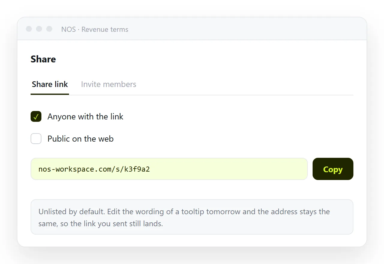
Because the words in the document stay clickable, correcting the wording of a tip later does not mean regenerating and resending a file. Turning HTML into a link is that step for any page.
Self-contained HTML matters here in particular. A tooltip drawn from an external stylesheet disappears entirely if that stylesheet does not travel with the page, and what the reader sees is a plain word with no hint that anything was meant to happen.
That failure is quiet, which is what makes it worth checking. Nothing errors, nothing logs, and the page looks finished. The only way to catch it is to open the file somewhere that has never seen your folder.
A short checklist
- Does the tip appear on keyboard focus, not only on hover?
- Is the trigger a button, a link, or something with
tabindex="0"? - Is the tooltip text also available somewhere that does not require hovering?
- Does it survive being scrolled inside its container?
- Is the CSS inline in the file or otherwise travelling with it?
If all five pass, the tooltip is doing its job without a single line of JavaScript.