The <abbr> element marks an abbreviation or acronym. Put the full form in its title attribute: <abbr title="Statement of Work">SOW</abbr>. With a mouse, resting on the word shows the title as a tooltip.
That tooltip is usually not available to touch and keyboard users, so the reliable pattern is to spell the term out in the text the first time.
Compare the two versions below. Hover the first "SOW" with a mouse, then try the same on a phone.
<!doctype html>
<html lang="en">
<head>
<meta charset="utf-8">
<meta name="viewport" content="width=device-width, initial-scale=1">
<title>abbr with title vs expanded text</title>
<style>
  body { margin: 0; padding: 16px; font-family: system-ui, sans-serif; background: #f4f5f7; color: #1d2330; }
  .box { background: #fff; border-radius: 10px; padding: 12px 14px; margin-bottom: 12px; box-shadow: 0 2px 8px rgba(0, 0, 0, .08); }
  h3 { margin: 0 0 6px; font-size: 13px; color: #5b6270; }
  p { margin: 0; font-size: 16px; line-height: 1.5; }
  .note { font-size: 13px; color: #5b6270; background: #fff7e6; border-radius: 8px; padding: 10px 12px; line-height: 1.45; }
</style>
</head>
<body>
<div class="box">
  <h3>1. title only</h3>
  <!-- the expansion lives only in the title tooltip -->
  <p>Send the <abbr title="Statement of Work">SOW</abbr> before Friday.</p>
</div>

<div class="box">
  <h3>2. Expanded on first use</h3>
  <!-- the words are in the text, so everyone reads them -->
  <p>Send the Statement of Work (<abbr>SOW</abbr>) before Friday. The <abbr>SOW</abbr> needs a signature.</p>
</div>

<p class="note"><b>With a mouse:</b> rest the pointer on "SOW" in box 1 and a tooltip appears.<br>
<b>On a phone or with the keyboard:</b> box 1 usually shows no expansion at all. Box 2 reads the same for everyone.</p>
</body>
</html>
The markup is the same element in both boxes. The difference is where the full words live: in an attribute only some readers can reach, or in the text everyone reads.
What abbr does and does not do
<abbr> is an inline element with no behaviour of its own. It says "this word is a short form". The only visible effects come from the browser's default style and from the title attribute.
<p>Send the <abbr title="Statement of Work">SOW</abbr> by Friday.</p>
- Semantics: tools and scripts can find every abbreviation on the page with
querySelectorAll('abbr'). - Tooltip: only when
titleis present, and only on mouse hover. - Style: a dotted underline in many browsers, but not the same everywhere.
title is optional. An <abbr> without it is still valid and still marks the word as a short form.
Who sees the title tooltip
The tooltip is drawn by the browser, not by the page. It appears after the pointer rests on the word for a moment. You cannot style it or change its delay.
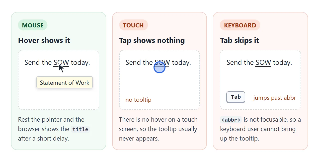
- Touch screens: there is no hover, so tapping the word usually shows nothing.
- Keyboard:
<abbr>is not focusable, so Tab skips it and nothing opens. - Screen readers: whether the
titleis read out depends on the reader and its settings. Do not count on it.
The title attribute tooltip guide covers these limits for title on any element. For <abbr>, the fix is mostly about writing, not code.
Expand the term the first time
Write the full words once, with the short form in brackets. After that, the short form alone is fine, because the reader has already seen it spelled out.
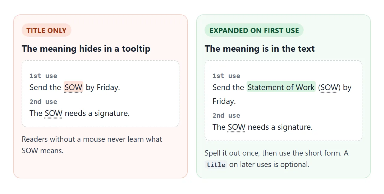
<p>Send the Statement of Work (<abbr>SOW</abbr>) by Friday.</p>
<p>The <abbr title="Statement of Work">SOW</abbr> needs a signature.</p>
A title on the later uses is a bonus for mouse users who jump into the middle of the page. It does not replace the first expansion.
For long documents with many terms, a glossary at the end helps too. The finished example builds one from the markup.
Styling the underline
The HTML spec suggests a dotted underline for abbr[title], and browsers do not all draw it the same way. A CSS reset can remove it. If the underline matters to your design, set it yourself.
<!doctype html>
<html lang="en">
<head>
<meta charset="utf-8">
<meta name="viewport" content="width=device-width, initial-scale=1">
<title>Styling abbr</title>
<style>
  body { margin: 0; padding: 16px; font-family: system-ui, sans-serif; background: #f4f5f7; color: #1d2330; }
  ul { list-style: none; margin: 0 0 14px; padding: 0; background: #fff; border-radius: 10px; box-shadow: 0 2px 8px rgba(0, 0, 0, .08); }
  li { padding: 10px 14px; font-size: 15px; border-bottom: 1px solid #eceef1; }
  li:last-child { border-bottom: 0; }
  code { font: 12px ui-monospace, Consolas, monospace; color: #5b6270; display: block; margin-top: 2px; }

  .reset  { text-decoration: none; }                    /* what many resets do */
  .dotted { text-decoration: underline dotted; text-underline-offset: 3px; }
  .border { text-decoration: none; border-bottom: 1px dashed #2563eb; }

  /* CSS-only tooltip: shows on hover and on keyboard focus */
  .tip { position: relative; text-decoration: underline dotted; text-underline-offset: 3px; cursor: help; }
  .tip::after {
    content: attr(data-title);        /* read the text from the attribute */
    position: absolute; left: 0; top: calc(100% + 6px); z-index: 1;
    width: max-content; max-width: 220px; padding: 6px 9px; border-radius: 6px;
    background: #1d2330; color: #fff; font-size: 13px; line-height: 1.35;
    opacity: 0; pointer-events: none; transition: opacity .15s;
  }
  .tip:hover::after, .tip:focus::after { opacity: 1; }
  .tip:focus { outline: 2px solid #2563eb; outline-offset: 2px; border-radius: 2px; }
  .twice::after { content: attr(title); }   /* same tooltip, but reads title */

  h3 { margin: 0 0 6px; font-size: 13px; color: #5b6270; }
</style>
</head>
<body>
<h3>Underline styles</h3>
<ul>
  <li><abbr title="Application Programming Interface">API</abbr> browser default<code>no CSS</code></li>
  <li><abbr class="reset" title="Application Programming Interface">API</abbr> removed by a reset<code>text-decoration: none</code></li>
  <li><abbr class="dotted" title="Application Programming Interface">API</abbr> set on purpose<code>underline dotted; text-underline-offset: 3px</code></li>
  <li><abbr class="border" title="Application Programming Interface">API</abbr> dashed border<code>border-bottom: 1px dashed</code></li>
</ul>

<h3>CSS tooltips (hover, or Tab to focus)</h3>
<ul>
  <li><abbr class="tip twice" tabindex="0" title="Service Level Agreement">SLA</abbr> reads title: two tooltips on hover<code>content: attr(title)</code></li>
  <li><abbr class="tip" tabindex="0" data-title="Service Level Agreement">SLA</abbr> reads data-title: one tooltip<code>content: attr(data-title)</code></li>
</ul>
</body>
</html>
| Goal | CSS |
|---|---|
| Dotted underline everywhere | text-decoration: underline dotted; |
| More space under the text | text-underline-offset: 3px; |
| No underline | text-decoration: none; |
| A line under the whole box | border-bottom: 1px dashed; |
| A "help" pointer on hover | cursor: help; |
text-decoration is set on the <abbr> element itself. A rule on a parent paragraph does not remove it, so look for a reset that targets abbr or *.
A CSS-only tooltip that also opens on focus
A pseudo-element can show the full form in your own style. content: attr(...) copies an attribute's text into ::after. CSS ::before and ::after explains how pseudo-elements are placed.
abbr[data-title] { position: relative; }
abbr[data-title]::after {
  content: attr(data-title);
  position: absolute; left: 0; top: calc(100% + 6px);
  opacity: 0; pointer-events: none;
}
abbr[data-title]:hover::after,
abbr[data-title]:focus::after { opacity: 1; }
Add tabindex="0" to each <abbr> so the Tab key can reach it, and :focus shows the tooltip for keyboard users.
Notice the attribute. If the CSS reads title, the browser still shows its own tooltip on hover, and the reader sees two.
The second row of the demo reads data-title instead, so only your tooltip appears. The pure HTML tooltip guide covers CSS tooltips for any element.
abbr or dfn?
<dfn> marks the place where a term is defined. The sentence or paragraph around it is the definition. Browsers usually show it in italics.
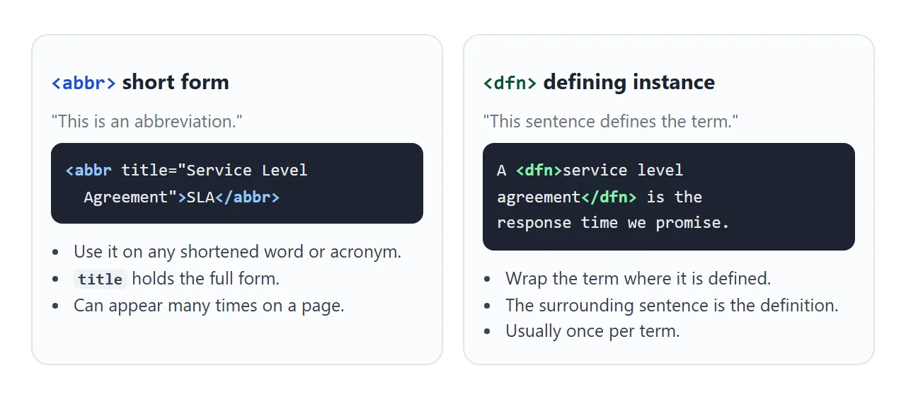
<p>A <dfn id="sla"><abbr title="Service Level Agreement">SLA</abbr></dfn>
is the response time we promise each customer.</p>
Nesting them says both things: this is a short form, and this is where it is defined. Give the <dfn> an id and later mentions can link to it with href="#sla".
A finished example: popups and a glossary
This paragraph uses four abbreviations. A short script turns each <abbr title> into a term you can tap, click or Tab to, and lists every term in a glossary below.
<!doctype html>
<html lang="en">
<head>
<meta charset="utf-8">
<meta name="viewport" content="width=device-width, initial-scale=1">
<title>Abbreviations with popups and a glossary</title>
<style>
  body { margin: 0; padding: 16px; font-family: system-ui, sans-serif; background: #f4f5f7; color: #1d2330; }
  article { background: #fff; border-radius: 10px; padding: 14px 16px; box-shadow: 0 2px 8px rgba(0, 0, 0, .08); }
  p { margin: 0 0 10px; font-size: 15px; line-height: 1.6; }
  abbr {
    text-decoration: underline dotted; text-underline-offset: 3px;
    cursor: help; border-radius: 3px;
  }
  abbr:focus { outline: 2px solid #2563eb; outline-offset: 1px; }
  abbr.open { background: #e8f0fe; }
  #pop {
    position: absolute; z-index: 10; max-width: 240px;
    padding: 7px 10px; border-radius: 7px;
    background: #1d2330; color: #fff; font-size: 13px; line-height: 1.4;
    box-shadow: 0 6px 18px rgba(0, 0, 0, .2);
  }
  h2 { font-size: 14px; margin: 14px 0 6px; color: #5b6270; }
  dl { margin: 0; display: grid; grid-template-columns: max-content 1fr; gap: 4px 12px; font-size: 14px; }
  dt { font-weight: 700; }
  dt abbr { text-decoration: none; cursor: auto; }
  dd { margin: 0; }
</style>
</head>
<body>
<article>
  <p>Our <abbr title="Customer Relationship Management">CRM</abbr> logs every call. When the
  <abbr title="Interactive Voice Response">IVR</abbr> hands a caller to an agent, the
  <abbr title="Average Handle Time">AHT</abbr> clock starts.</p>
  <p>We report <abbr title="Average Handle Time">AHT</abbr> weekly against the
  <abbr title="Service Level Agreement">SLA</abbr>, and flag any week where the
  <abbr title="Interactive Voice Response">IVR</abbr> drops more than usual.</p>
  <p style="font-size:13px;color:#5b6270">Tap, click or Tab to an underlined term. Esc closes.</p>

  <h2>Glossary</h2>
  <dl id="glossary"></dl>
</article>
<div id="pop" role="tooltip" hidden></div>

<script>
  const pop = document.getElementById('pop');
  const seen = new Map();  // short form -> expansion, for the glossary
  let current = null;

  document.querySelectorAll('abbr[title]').forEach((ab) => {
    const full = ab.title;
    ab.dataset.full = full;
    ab.removeAttribute('title');       // no second, native tooltip
    ab.tabIndex = 0;                   // reachable with Tab
    seen.set(ab.textContent.trim(), full);

    ab.addEventListener('focus', () => show(ab));
    ab.addEventListener('click', () => show(ab));
    ab.addEventListener('blur', hide);
  });

  function show(ab) {
    if (current && current !== ab) current.classList.remove('open');
    current = ab;
    pop.textContent = ab.dataset.full;
    pop.hidden = false;
    ab.classList.add('open');
    ab.setAttribute('aria-describedby', 'pop');  // screen readers can read it as a description
    // place under the term, but keep it inside the window
    const r = ab.getBoundingClientRect();
    const left = Math.min(r.left, innerWidth - pop.offsetWidth - 8);
    pop.style.left = Math.max(8, left) + scrollX + 'px';
    pop.style.top = r.bottom + 6 + scrollY + 'px';
  }

  function hide() {
    if (!current) return;
    current.classList.remove('open');
    current.removeAttribute('aria-describedby');
    current = null;
    pop.hidden = true;
  }

  document.addEventListener('keydown', (e) => { if (e.key === 'Escape') hide(); });
  document.addEventListener('click', (e) => { if (!e.target.closest('abbr')) hide(); });

  // build the glossary from the same abbr elements, A to Z
  const dl = document.getElementById('glossary');
  [...seen].sort((a, b) => a[0].localeCompare(b[0])).forEach(([short, full]) => {
    dl.insertAdjacentHTML('beforeend', `<dt><abbr>${short}</abbr></dt><dd>${full}</dd>`);
  });
</script>
</body>
</html>
- Move the title: the script copies
titleintodata-fulland removestitle, so the native tooltip never doubles the popup. - Make it focusable:
tabIndex = 0puts each term in the Tab order. - One popup for all: a single positioned
<div>is filled and moved under the active term, and kept inside the window. - Close it: on blur, on Escape, and on a click outside a term.
- Build the glossary: a
Mapcollects each short form once, sorted A to Z into a<dl>.
The glossary is plain text, so it reaches every reader no matter how they browse. Keep expanding terms on first use as well.
When it does not work
| What you see | Cause | Fix |
|---|---|---|
| The tooltip never shows on a phone | title needs hover, and touch has none |
Expand on first use, or add a tap popup |
| Tab never reaches the term | <abbr> is not focusable |
Add tabindex="0" |
| No underline | A reset sets text-decoration: none |
Set underline dotted on abbr yourself |
| The custom tooltip is cut off | A parent has overflow: hidden or auto |
Move the popup outside the parent, as the glossary demo does |
| Two tooltips on hover | CSS reads title, and the browser shows it too |
Read data-title, or remove title with a script |
A validator flags <acronym> |
<acronym> is obsolete |
Replace it with <abbr> |
Share it as a link
A page full of abbreviations is often a spec, a report or a handbook. Sent as an .html file, it may open as plain code on a phone, and a screenshot cannot show a single popup.
To send the working version, paste the page into a NOS document and choose Create share link. HTML to link walks through it.
The page renders as written and its scripts run, so the people you send it to can tap each term themselves. If you add terms later, the same link shows the new version.