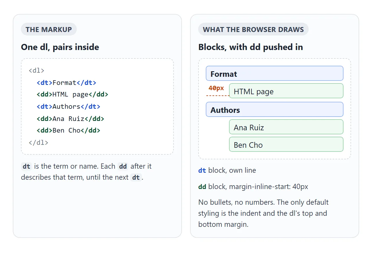
A description list is three tags. <dl> wraps the list, <dt> holds a term or name, and each <dd> after it holds the description or value. There are no bullets or numbers. The browser puts each part on its own line and indents the dd.
<dl>
  <dt>Format</dt>
  <dd>HTML page</dd>
  <dt>Authors</dt>
  <dd>Ana Ruiz</dd>
  <dd>Ben Cho</dd>
</dl>
Switch between the default look and two grid versions below. The dashed outlines show where each dt and dd box sits.
<!doctype html>
<html lang="en">
<head>
<meta charset="utf-8">
<meta name="viewport" content="width=device-width, initial-scale=1">
<title>dl: default vs grid</title>
<style>
  body { margin: 0; padding: 14px; font-family: system-ui, sans-serif; color: #1d2330; background: #f4f5f7; }
  .modes { display: flex; flex-wrap: wrap; gap: 6px; margin-bottom: 12px; }
  .modes button {
    font: inherit; font-size: 13px; padding: 7px 11px; border-radius: 8px;
    border: 1px solid #c9cdd4; background: #fff; cursor: pointer;
  }
  .modes button[aria-pressed="true"] { background: #1d2330; border-color: #1d2330; color: #fff; }
  .box { background: #fff; border-radius: 10px; padding: 4px 16px; box-shadow: 0 2px 8px rgba(0, 0, 0, .08); }
  dt { font-weight: 600; }
  /* the dt/dd outlines only make the boxes visible */
  dt, dd { outline: 1px dashed #c9cdd4; outline-offset: 1px; }

  /* 1. two columns, nothing else */
  dl.grid { display: grid; grid-template-columns: max-content 1fr; gap: 6px 16px; }
  dl.grid dd { margin: 0; }
  /* 2. pin every dt to column 1 and every dd to column 2 */
  dl.fixed dt { grid-column: 1; }
  dl.fixed dd { grid-column: 2; }

  pre {
    margin: 12px 0 0; padding: 10px 12px; border-radius: 8px; background: #1d2330; color: #e6e9ef;
    font: 12.5px/1.5 ui-monospace, Consolas, monospace; white-space: pre-wrap;
  }
</style>
</head>
<body>
<div class="modes">
  <button data-mode="" aria-pressed="true">Default</button>
  <button data-mode="grid">Grid</button>
  <button data-mode="grid fixed">Grid + grid-column</button>
</div>

<div class="box">
  <dl id="meta">
    <dt>Format</dt>
    <dd>HTML page</dd>
    <dt>Authors</dt>
    <dd>Ana Ruiz</dd>
    <dd>Ben Cho</dd>
    <dt>Updated</dt>
    <dd>26 September 2026</dd>
    <dt>License</dt>
    <dd>CC BY 4.0</dd>
  </dl>
</div>

<pre id="css"></pre>

<script>
  const dl = document.getElementById('meta');
  const css = document.getElementById('css');
  const code = {
    '': '/* no CSS: dd is indented by the browser\'s\n   margin-inline-start: 40px */',
    'grid': 'dl { display: grid;\n     grid-template-columns: max-content 1fr; }\ndd { margin: 0; }\n/* "Ben Cho" drops into the term column */',
    'grid fixed': 'dl { display: grid;\n     grid-template-columns: max-content 1fr; }\ndd { margin: 0; grid-column: 2; }\ndt { grid-column: 1; }',
  };

  document.querySelectorAll('.modes button').forEach((btn) => {
    btn.addEventListener('click', () => {
      document.querySelectorAll('.modes button').forEach((b) => b.setAttribute('aria-pressed', b === btn));
      dl.className = btn.dataset.mode;
      css.textContent = code[btn.dataset.mode];
    });
  });
  css.textContent = code[''];
</script>
</body>
</html>
How dl, dt and dd fit together
A dd belongs to the nearest dt above it. There is no closing wrapper around a pair: the next dt starts the next group. That is how "Authors" above owns both names.
A group can take several shapes, and all of them are valid:
| Shape | Markup | Example |
|---|---|---|
| One name, one value | dt + dd |
Weight: 250 g |
| One name, several values | dt + dd + dd |
Authors: two people |
| Several names, one value | dt + dt + dd |
"Email" and "E-mail" share one rule |
| Grouped | <div> around dt and dd |
Cards, hiding a group, styling a row |
Two rules come from the HTML standard. Within one dl, each name should appear in only one dt. And the standard says a dl is not the right element for dialogue, such as a chat transcript.
Removing the default dd indent
The indent is not padding on the list. It is a default margin on each dd: margin-inline-start: 40px, which is the left margin in a left-to-right page. The dl itself also gets a default top and bottom margin, like a paragraph.
dd { margin: 0; }            /* no indent */
dl { margin: 0; }            /* no space above and below */
dt { font-weight: 600; }     /* make the names stand out */
Only the look changes. The browser still knows which text is the name and which is the value.
A two-column dl with CSS grid
The layout people usually want puts names on the left and values on the right. Setting display: grid on the dl with two columns gets close, and it breaks as soon as one name has two values.
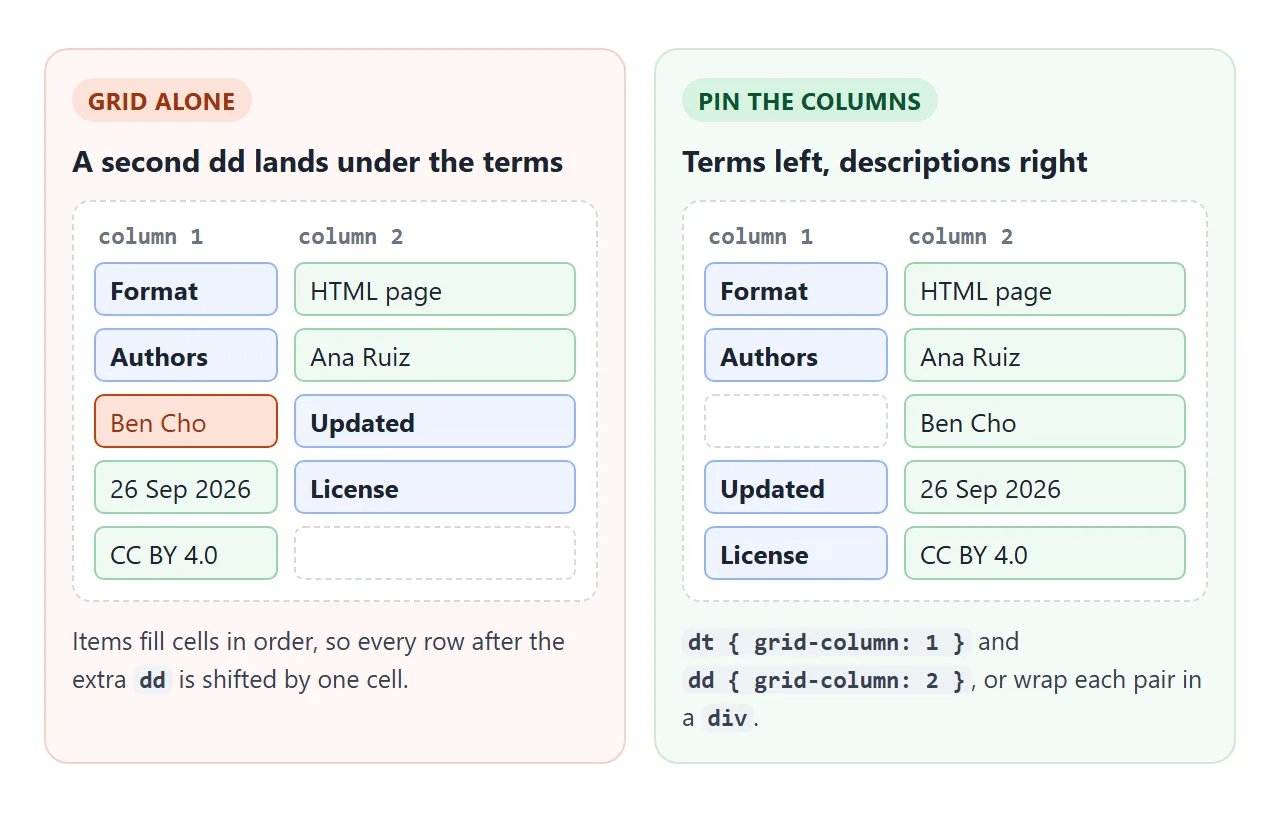
Grid fills cells one after another. The second author lands in column 1, and every name after it shifts to column 2. Pin each element to its column and the browser starts a new row when it needs to:
dl { display: grid; grid-template-columns: max-content 1fr; gap: 6px 16px; }
dt { grid-column: 1; }
dd { grid-column: 2; margin: 0; }
max-content makes the first column as wide as the longest name. For long names, use a fixed width such as 10em instead, so a single long label does not squeeze the values. The CSS grid guide covers the column syntax.
Wrapping groups in a div
Current HTML allows a <div> directly inside dl around each group. The div is there for styling and for attributes that apply to the whole group. Inside it go one or more dt elements followed by one or more dd elements.
<dl>
  <div>
    <dt>Sign in</dt>
    <dd>Verb: "Sign in to your account."</dd>
    <dd>Noun: "sign-in".</dd>
  </div>
</dl>
It is all or nothing: once one group has a div, every group in that dl needs one.
With a wrapper, each group becomes a box you can turn into a card, give a border, or hide in one step. Type in the filter below and whole groups disappear together.
<!doctype html>
<html lang="en">
<head>
<meta charset="utf-8">
<meta name="viewport" content="width=device-width, initial-scale=1">
<title>dl with div groups</title>
<style>
  body { margin: 0; padding: 14px; font-family: system-ui, sans-serif; color: #1d2330; background: #f4f5f7; }
  label { display: block; font-size: 13px; color: #5b6270; margin-bottom: 10px; }
  input {
    display: block; width: 100%; box-sizing: border-box; margin-top: 4px;
    font: inherit; padding: 8px 10px; border: 1px solid #c9cdd4; border-radius: 8px;
  }
  /* the dl is the card grid; each div is one card */
  dl {
    display: grid; grid-template-columns: repeat(auto-fill, minmax(190px, 1fr));
    gap: 10px; margin: 0;
  }
  dl > div {
    background: #fff; border-radius: 10px; padding: 12px 14px;
    box-shadow: 0 2px 8px rgba(0, 0, 0, .08);
  }
  dt { font-weight: 700; }
  dt + dt { color: #5b6270; font-weight: 600; }  /* a second name for the same thing */
  dd { margin: 6px 0 0; font-size: 14px; line-height: 1.45; }
  dd + dd { border-top: 1px solid #eceef1; padding-top: 6px; }
  #count { font-size: 12px; color: #5b6270; margin: 10px 0 0; }
</style>
</head>
<body>
<label>Filter the style guide
  <input id="q" type="search" placeholder="Try: email, verb, log">
</label>

<dl id="guide">
  <div>
    <dt>Email</dt>
    <dt>E-mail</dt>
    <dd>Write it as "email": lower case, no hyphen.</dd>
  </div>
  <div>
    <dt>Sign in</dt>
    <dd>Verb: "Sign in to your account."</dd>
    <dd>Noun or adjective: "sign-in", as in "the sign-in page".</dd>
  </div>
  <div>
    <dt>Log in</dt>
    <dt>Login</dt>
    <dd>Do not use. Say "sign in".</dd>
  </div>
  <div>
    <dt>Set up</dt>
    <dd>Verb: "Set up your team."</dd>
    <dd>Noun: "setup", as in "a quick setup".</dd>
  </div>
</dl>
<p id="count"></p>

<script>
  const q = document.getElementById('q');
  const groups = document.querySelectorAll('#guide > div');
  const count = document.getElementById('count');

  function filter() {
    const text = q.value.trim().toLowerCase();
    let shown = 0;
    groups.forEach((g) => {
      // hiding the div hides the terms and their descriptions together
      const hit = g.textContent.toLowerCase().includes(text);
      g.hidden = !hit;
      if (hit) shown++;
    });
    count.textContent = shown + ' of ' + groups.length + ' groups shown';
  }

  q.addEventListener('input', filter);
  filter();
</script>
</body>
</html>
What goes inside dt and dd
A dd can hold any flow content: paragraphs, lists, images, links, even another dl. A dt is a little stricter. It can hold flow content such as a paragraph, but no headings, no header or footer, and no sectioning elements such as section or article.
In practice, keep the dt short, a word or a phrase. When the names are abbreviations, the abbr tag can expand them inside the dt, which is a natural fit for a glossary.
dl vs table vs ul
All three can hold a list of facts. Pick by the shape of the data, not by the look you want, because CSS can make each one look like the others.
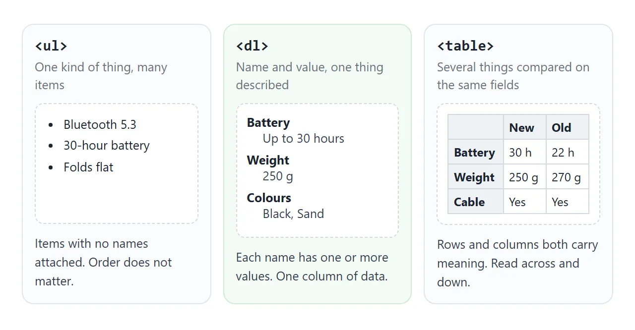
| Element | Data shape | Good for |
|---|---|---|
<ul> |
Items without names | Features, tags, menus |
<dl> |
Name and value pairs | Glossaries, specs, metadata, simple FAQs |
<table> |
Rows and columns | Comparing products, schedules, prices |
The ul tag guide covers bullets, and the ol tag guide covers numbered steps. A short FAQ also fits a dl: the question in dt, the answer in dd.
Screen readers treat the three differently. Many announce a dl as a list, and some also identify terms and their descriptions. The exact wording depends on the screen reader and browser. A dl built from div and span elements carries none of that meaning.
A finished example: spec sheet and order summary
This page uses two description lists. The spec sheet wraps each pair in a div that is its own two-column grid. The order summary puts the label left and the amount right with flexbox.
<!doctype html>
<html lang="en">
<head>
<meta charset="utf-8">
<meta name="viewport" content="width=device-width, initial-scale=1">
<title>Spec sheet and order summary</title>
<style>
body { margin: 0; padding: 14px; font-family: system-ui, sans-serif; color: #1d2330; background: #f4f5f7; }
.page { display: grid; grid-template-columns: 3fr 2fr; gap: 12px; align-items: start; }
.card { background: #fff; border-radius: 12px; padding: 14px 16px; box-shadow: 0 2px 8px rgba(0, 0, 0, .08); }
h2 { font-size: 16px; margin: 0 0 10px; }
/* spec sheet: label column + value column, one row per div */
.specs { margin: 0; }
.specs > div {
display: grid; grid-template-columns: 8.5em 1fr; gap: 12px;
padding: 7px 0; border-top: 1px solid #eceef1;
}
.specs dt { color: #5b6270; font-size: 14px; }
.specs dd { margin: 0; font-size: 14px; }
.specs dd + dd { grid-column: 2; } /* extra values stay in the value column */
/* order summary: label left, amount right */
.sum { margin: 0; }
.sum > div { display: flex; justify-content: space-between; gap: 12px; padding: 5px 0; font-size: 14px; }
.sum dd { margin: 0; font-variant-numeric: tabular-nums; }
.sum .total { border-top: 1px solid #d5d9e0; margin-top: 6px; padding-top: 9px; font-weight: 700; font-size: 16px; }
.qty { display: flex; align-items: center; gap: 8px; margin-bottom: 8px; font-size: 14px; }
.qty button { width: 30px; height: 30px; border-radius: 8px; border: 1px solid #c9cdd4; background: #fff; font-size: 16px; cursor: pointer; }
/* phones: one column, and each spec label sits above its value */
@media (max-width: 520px) {
.page { grid-template-columns: 1fr; }
.specs > div { grid-template-columns: 1fr; gap: 2px; }
.specs dd + dd { grid-column: 1; }
}
</style>
</head>
<body>
<div class="page">
<section class="card">
<h2>Trail 2 headphones</h2>
<dl class="specs">
<div><dt>Driver</dt><dd>40 mm dynamic</dd></div>
<div><dt>Battery</dt><dd>Up to 30 hours</dd></div>
<div><dt>Connection</dt><dd>Bluetooth 5.3</dd><dd>3.5 mm cable</dd></div>
<div><dt>Weight</dt><dd>250 g</dd></div>
<div><dt>Colours</dt><dd>Black</dd><dd>Sand</dd><dd>Sage</dd></div>
<div><dt>In the box</dt><dd>Headphones, USB-C cable, 3.5 mm cable, pouch</dd></div>
</dl>
</section>
<section class="card">
<h2>Order summary</h2>
<div class="qty">Quantity
<button id="minus" aria-label="One fewer">−</button>
<b id="n">1</b>
<button id="plus" aria-label="One more">+</button>
</div>
<dl class="sum">
<div><dt>Subtotal</dt><dd id="sub"></dd></div>
<div><dt>Shipping</dt><dd id="ship"></dd></div>
<div class="total"><dt>Total</dt><dd id="total"></dd></div>
</dl>
</section>
</div>
<script>
const PRICE = 89, SHIP = 6, FREE_FROM = 150; // free shipping from 150
let n = 1;
const money = (v) => '$' + v.toFixed(2);
function render() {
const sub = PRICE * n;
const ship = sub >= FREE_FROM ? 0 : SHIP;
document.getElementById('n').textContent = n;
document.getElementById('sub').textContent = money(sub);
document.getElementById('ship').textContent = ship ? money(ship) : 'Free';
document.getElementById('total').textContent = money(sub + ship);
}
document.getElementById('plus').addEventListener('click', () => { n = Math.min(n + 1, 9); render(); });
document.getElementById('minus').addEventListener('click', () => { n = Math.max(n - 1, 1); render(); });
render();
</script>
</body>
</html>
- Several values per name: "Connection" and "Colours" have more than one
dd.dd + dd { grid-column: 2; }keeps the extra values in the value column. - Phones: a media query under 520px switches the page to one column and stacks each label above its value.
- Totals:
font-variant-numeric: tabular-numsmakes the digits the same width, so amounts line up.
When it does not work
| What you see | Cause | Fix |
|---|---|---|
| Values are pushed 40px to the right | Default margin-inline-start on dd |
dd { margin: 0; } |
| Grid rows shift after one name | A name has two dd, and grid fills cells in order |
dt { grid-column: 1 }, dd { grid-column: 2 }, or div groups |
| A dd sits next to the wrong name | Several dt share one dd and it lines up with the last one |
Wrap the group in a div and style the div |
| Validator error on the div | Some groups wrapped, some bare, or a div with other content | Wrap every group, only dt and dd inside |
| Validator error on the dt | A heading or section inside dt |
Keep the dt to text or a paragraph |
| A dl used only to indent text | No name and value in the content | Use margin or padding on a div or p |
| Hidden group still shows | A display rule on the div overrides hidden |
Add [hidden] { display: none; } |
Share it as a link
A spec sheet or a glossary is meant to be read by someone else. A screenshot cannot be searched or copied from, and an .html attachment may open as plain code on a phone.
To send the working version, paste the page into a NOS document and choose Create share link. HTML to link walks through it.
The page renders as written and its scripts run, so the filter and the quantity buttons work for the people you send it to. If you change the code later, the same link shows the new version.