The <ul> tag makes an unordered list: a group of items whose order does not matter. Each item goes in its own <li>, and the browser draws a bullet in front of it and indents the whole list.
<ul>
  <li>Coffee</li>
  <li>Tea</li>
  <li>Milk</li>
</ul>
Everything else is CSS. Change the bullet type, move it inside the text, recolour it or resize it below, and copy the CSS it prints.
<!doctype html>
<html lang="en">
<head>
<meta charset="utf-8">
<meta name="viewport" content="width=device-width, initial-scale=1">
<title>ul list-style playground</title>
<style>
  body { margin: 0; padding: 14px; font-family: system-ui, sans-serif; background: #f4f5f7; color: #1d2330; }
  .wrap { display: grid; grid-template-columns: 1fr 1fr; gap: 14px; }
  @media (max-width: 560px) { .wrap { grid-template-columns: 1fr; } }
  .panel { background: #fff; border-radius: 12px; padding: 12px 14px; box-shadow: 0 2px 8px rgba(0, 0, 0, .06); }
  .controls { display: grid; grid-template-columns: 1fr 1fr; gap: 10px 12px; align-content: start; }
  label { display: block; font-size: 13px; }
  label span { display: block; font-weight: 600; margin-bottom: 4px; }
  select, input[type=range] { width: 100%; font: inherit; }
  .radios label { display: inline-block; margin-right: 10px; }
  .radios label:first-child { display: block; }

  /* The list being styled. The playground only changes these values. */
  #list {
    --marker-color: #2563eb;
    --marker-size: 1em;
    list-style-type: disc;
    list-style-position: outside;
    background: #eef4ff;           /* shows the padding the marker sits in */
    margin: 0;
    padding-left: 40px;             /* the browser default, written out */
  }
  #list li { background: #fff; margin: 4px 0; padding: 2px 4px; }
  #list li::marker { color: var(--marker-color); font-size: var(--marker-size); }

  pre { margin: 12px 0 0; padding: 10px; background: #1d2330; color: #e5e7eb; border-radius: 8px; font-size: 12px; overflow-x: auto; }
</style>
</head>
<body>
<div class="wrap">
  <div class="panel controls">
    <label><span>list-style-type</span>
      <select id="type">
        <option>disc</option><option>circle</option><option>square</option>
        <option>decimal</option><option>lower-alpha</option><option>upper-roman</option>
        <option value='"→ "'>"→ " (a string)</option><option>none</option>
      </select>
    </label>
    <div class="radios"><label><span>list-style-position</span></label>
      <label><input type="radio" name="pos" value="outside" checked> outside</label>
      <label><input type="radio" name="pos" value="inside"> inside</label>
    </div>
    <label><span>::marker color</span>
      <input type="color" id="color" value="#2563eb">
    </label>
    <label><span>::marker font-size: <b id="sizeOut">1em</b></span>
      <input type="range" id="size" min="0.6" max="2" step="0.1" value="1">
    </label>
  </div>

  <div class="panel">
    <ul id="list">
      <li>Coffee</li>
      <li>Tea</li>
      <li>A longer item that wraps onto a second line, so you can see where the second line starts.</li>
    </ul>
    <pre id="css"></pre>
  </div>
</div>

<script>
  const list = document.getElementById('list');
  const type = document.getElementById('type');
  const color = document.getElementById('color');
  const size = document.getElementById('size');

  function update() {
    const pos = document.querySelector('input[name=pos]:checked').value;
    list.style.listStyleType = type.value;
    list.style.listStylePosition = pos;
    list.style.setProperty('--marker-color', color.value);
    list.style.setProperty('--marker-size', size.value + 'em');
    document.getElementById('sizeOut').textContent = size.value + 'em';
    // Show the CSS a reader would copy
    document.getElementById('css').textContent =
      'ul {\n  list-style-type: ' + type.value + ';\n  list-style-position: ' + pos + ';\n}\n' +
      'li::marker {\n  color: ' + color.value + ';\n  font-size: ' + size.value + 'em;\n}';
  }

  document.querySelectorAll('select, input').forEach((el) => el.addEventListener('input', update));
  update();
</script>
</body>
</html>
ul, ol or dl: which list to use
HTML has three list elements. Pick by what the items mean, not by how they should look, because CSS can make any of them look like the others.
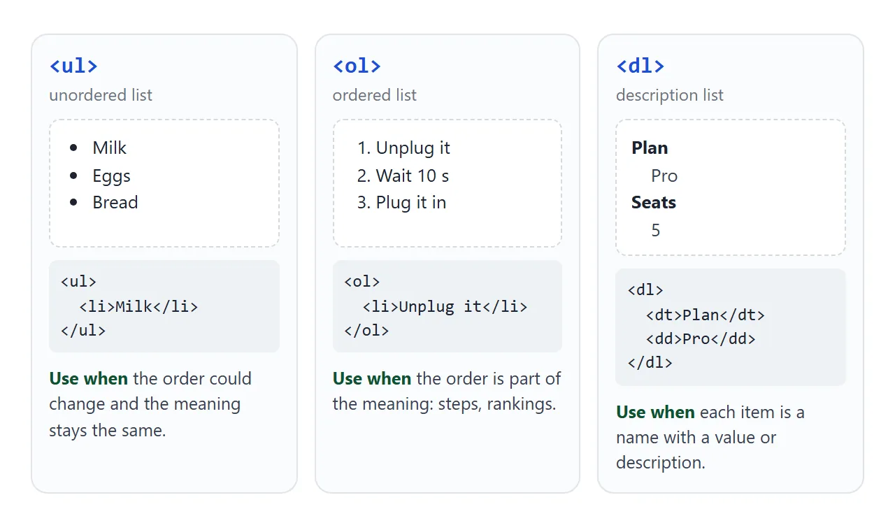
| Element | Items | Default look | Use it for |
|---|---|---|---|
<ul> |
<li> |
Bullets | Feature lists, menus, tags |
<ol> |
<li> |
Numbers | Steps, rankings, anything in sequence |
<dl> |
<dt> + <dd> |
Name, indented value | Specs, glossaries, key and value pairs |
The choice matters to people using a screen reader.
When they reach a list, the reader generally announces that it is a list and how many items it has, then reads each item as part of it. Three <div> lines with a bullet character typed in front get none of that.
Nested lists
A list inside a list goes inside the <li> it belongs to, after that item's text. The <ul> element may only contain <li> elements (plus script and template), so a <ul> placed straight inside another <ul> is invalid.
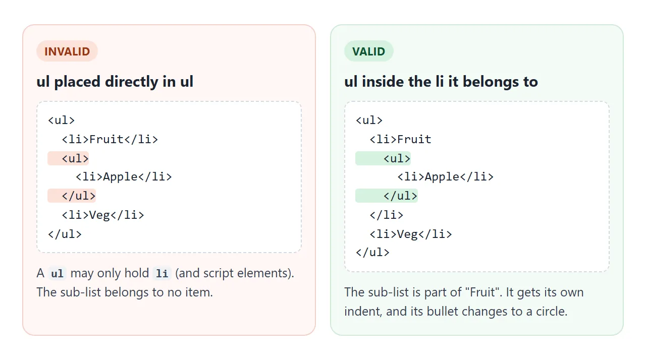
The browser styles nested lists on its own. Each level gets another 40 pixels of indent, the bullet changes from disc to circle at the second level and to square at the third, and nested lists lose their top and bottom margin.
To keep the same bullet at every level, set it on each level:
ul, ul ul, ul ul ul { list-style-type: disc; }
Bullet types: list-style-type values
list-style-type sets the bullet. It is inherited, so setting it on the ul reaches every li.
| Value | Bullet |
|---|---|
disc |
Filled circle, the default for a ul |
circle |
Hollow circle |
square |
Filled square |
decimal |
1, 2, 3 |
lower-alpha / upper-roman |
a, b, c / I, II, III |
"- " |
Any text you put in quotes |
none |
No bullet |
Numbered values work on a <ul>, but if the numbers matter, the list is an <ol>. A quoted string covers most "custom bullet" needs in one line.
list-style-image: url(...) also exists, and uses an image as the bullet. It gives no control over the image's size or position, which is why the SVG approach further down is the usual choice.
Where the bullet sits: position and the default indent
Browsers give every ul about 40 pixels of left padding (padding-inline-start) and a margin of 1em above and below. With the default list-style-position: outside, the bullet hangs in that padding, to the left of the item's box.
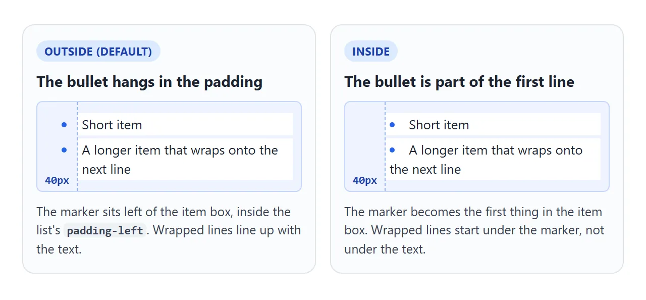
list-style-position: inside moves the bullet into the item box, as the first thing on the first line. Wrapped lines then start under the bullet instead of under the text.
That padding is the cause of most "unexpected indent" questions. Reduce it rather than removing it while bullets are still showing, or the outside bullets end up past the left edge of the list:
ul { padding-left: 1.25em; margin: 0 0 1em; }
To remove the bullets completely and pull the items flush left, see HTML list without bullets, which also covers a screen reader side effect in Safari.
Styling the bullet with ::marker
li::marker selects the bullet itself. It is the cleanest way to recolour or resize bullets, because the real marker stays in place and nothing else changes.
li::marker {
  color: #16a34a;
  font-size: 1.2em;
}
::marker only accepts a short list of properties. Anything else is ignored without an error, which is why a padding or background on it appears to do nothing.
| Works on ::marker | Ignored on ::marker |
|---|---|
color |
background |
font-size, font-weight, other font properties |
padding, margin |
content |
width, height, border |
white-space, direction |
transform, position |
animation, transition |
display |
content replaces the bullet text, for example li::marker { content: "→ "; }. Test it in each browser you care about, and fall back to list-style-type: "→ " if you only need a different character.
Custom bullets with ::before or an SVG
When the bullet needs a shape, a size of its own or a two-colour icon, hide the real marker and draw a new one. There are three common ways, from lightest to richest.
<!doctype html>
<html lang="en">
<head>
<meta charset="utf-8">
<meta name="viewport" content="width=device-width, initial-scale=1">
<title>Custom bullets three ways</title>
<style>
  body { margin: 0; padding: 14px; font-family: system-ui, sans-serif; background: #f4f5f7; color: #1d2330; }
  .grid { display: grid; grid-template-columns: repeat(auto-fit, minmax(150px, 1fr)); gap: 12px; }
  .card { background: #fff; border-radius: 12px; padding: 12px 14px; box-shadow: 0 2px 8px rgba(0, 0, 0, .06); }
  h3 { margin: 0 0 8px; font-size: 14px; }
  code { font-size: 12px; background: #eef1f5; padding: 1px 4px; border-radius: 4px; }
  ul { margin: 10px 0 0; line-height: 1.5; font-size: 15px; }
  li { margin: 4px 0; }

  /* 1. ::marker: keep the real marker, change its colour and size */
  ul.marker { list-style-type: square; padding-left: 1.4em; }
  ul.marker li::marker { color: #16a34a; font-size: 1.2em; }

  /* 2. ::before: hide the marker, draw a shape in its place */
  ul.shape { list-style: none; padding-left: 0; }
  ul.shape li { position: relative; padding-left: 1.4em; }
  ul.shape li::before {
    content: "";
    position: absolute; left: .2em; top: .55em;
    width: .45em; height: .45em;
    background: #2563eb;
    transform: rotate(45deg);        /* a small diamond */
  }

  /* 3. Inline SVG: a real icon in each item */
  ul.svg { list-style: none; padding-left: 0; }
  ul.svg li { display: flex; gap: .5em; align-items: flex-start; }
  ul.svg svg { flex: none; width: 1.1em; height: 1.1em; margin-top: .2em; }
</style>
</head>
<body>
<div class="grid">
  <div class="card">
    <h3>1. <code>::marker</code></h3>
    <ul class="marker">
      <li>Colour and size</li>
      <li>Still a real bullet</li>
      <li>Wrapped lines stay aligned with the text</li>
    </ul>
  </div>

  <div class="card">
    <h3>2. <code>::before</code> shape</h3>
    <!-- role="list" keeps Safari announcing it as a list after list-style: none -->
    <ul class="shape" role="list">
      <li>Any shape CSS can draw</li>
      <li>Placed with position</li>
      <li>Wrapped lines stay aligned with the text</li>
    </ul>
  </div>

  <div class="card">
    <h3>3. Inline SVG</h3>
    <ul class="svg" role="list">
      <li><svg viewBox="0 0 20 20" aria-hidden="true"><circle cx="10" cy="10" r="10" fill="#dcfce7"/><path d="M5.5 10.5l3 3 6-7" fill="none" stroke="#16a34a" stroke-width="2.2" stroke-linecap="round" stroke-linejoin="round"/></svg><span>A real checkmark</span></li>
      <li><svg viewBox="0 0 20 20" aria-hidden="true"><circle cx="10" cy="10" r="10" fill="#dcfce7"/><path d="M5.5 10.5l3 3 6-7" fill="none" stroke="#16a34a" stroke-width="2.2" stroke-linecap="round" stroke-linejoin="round"/></svg><span>Scales with the text</span></li>
      <li><svg viewBox="0 0 20 20" aria-hidden="true"><circle cx="10" cy="10" r="10" fill="#dcfce7"/><path d="M5.5 10.5l3 3 6-7" fill="none" stroke="#16a34a" stroke-width="2.2" stroke-linecap="round" stroke-linejoin="round"/></svg><span>Wrapped lines stay aligned with the text</span></li>
    </ul>
  </div>
</div>
</body>
</html>
::marker– keep the real bullet and change its colour and size.::beforeshape – setlist-style: none, give eachlisomepadding-leftandposition: relative, then position an empty::beforebox in that space. Any shape CSS can draw works: a dot, a diamond, a bar.- Inline SVG – put an
<svg>at the start of eachliand lay the item out withdisplay: flex. The icon scales with the text and can use several colours. HTML SVG icons covers the options for reusing one icon.
Mark decorative icons with aria-hidden="true", so a screen reader does not try to read them. With options 2 and 3, add role="list" to the ul: Safari stops announcing a list as a list once list-style: none is set, and the attribute puts that back.
Horizontal lists for navigation
A menu is a list of links, so it is usually marked up as a ul inside a <nav>. Three declarations turn the vertical list into a row:
nav ul {
  list-style: none;   /* no bullets */
  margin: 0;
  padding: 0;         /* no default indent */
  display: flex;      /* items in a row */
  flex-wrap: wrap;
  gap: 4px;
}
nav a { display: block; padding: 8px 12px; }
display: flex goes on the ul, not on each li. The gap spaces the items evenly, and flex-wrap sends them to a second row on a narrow screen.
Flexbox explains the rest of the row layout, and HTML CSS navbar goes further with a mobile menu.
The finished example below uses the same element twice: a nav bar across the top, and a feature checklist in each pricing card with an SVG tick or cross per item.
<!doctype html>
<html lang="en">
<head>
<meta charset="utf-8">
<meta name="viewport" content="width=device-width, initial-scale=1">
<title>Pricing checklist and nav from ul</title>
<style>
  * { box-sizing: border-box; }
  body { margin: 0; font-family: system-ui, sans-serif; background: #f4f5f7; color: #1d2330; }

  /* Horizontal nav: a ul laid out with flex */
  .nav {
    list-style: none; margin: 0; padding: 0;   /* drop bullets and default indent */
    display: flex; flex-wrap: wrap; gap: 4px;
  }
  header { background: #1d2330; padding: 10px 14px; }
  .nav a {
    display: block; padding: 8px 12px; border-radius: 8px;
    color: #cbd5e1; text-decoration: none; font-size: 14px;
  }
  .nav a:hover { background: #2d3545; color: #fff; }
  .nav a[aria-current="page"] { background: #2563eb; color: #fff; }

  main { padding: 16px 14px; display: grid; grid-template-columns: repeat(auto-fit, minmax(220px, 1fr)); gap: 14px; }
  .plan { background: #fff; border-radius: 14px; padding: 16px 18px; box-shadow: 0 2px 10px rgba(0, 0, 0, .07); border: 2px solid transparent; }
  .plan.pick { border-color: #2563eb; }
  .plan h2 { margin: 0; font-size: 16px; }
  .price { font-size: 28px; font-weight: 700; margin: 6px 0 10px; }
  .price small { font-size: 14px; font-weight: 400; color: #6b7280; }

  /* Feature checklist: no marker, an SVG icon per item */
  .features { list-style: none; margin: 0; padding: 0; }
  .features li { display: flex; gap: 8px; align-items: flex-start; padding: 6px 0; border-top: 1px solid #eef0f3; font-size: 14px; }
  .features svg { flex: none; width: 18px; height: 18px; margin-top: 1px; }
  .features li.no { color: #9aa3b2; }
  /* Text for screen readers only: the grey cross is not enough on its own */
  .sr { position: absolute; width: 1px; height: 1px; overflow: hidden; clip: rect(0 0 0 0); white-space: nowrap; }
</style>
</head>
<body>
<header>
  <nav aria-label="Main">
    <ul class="nav" role="list">
      <li><a href="#home">Home</a></li>
      <li><a href="#pricing" aria-current="page">Pricing</a></li>
      <li><a href="#docs">Docs</a></li>
      <li><a href="#contact">Contact</a></li>
    </ul>
  </nav>
</header>

<!-- One icon each, reused with <use> -->
<svg width="0" height="0" style="position:absolute" aria-hidden="true">
  <symbol id="yes" viewBox="0 0 20 20"><circle cx="10" cy="10" r="10" fill="#dcfce7"/><path d="M5.5 10.5l3 3 6-7" fill="none" stroke="#16a34a" stroke-width="2.2" stroke-linecap="round" stroke-linejoin="round"/></symbol>
  <symbol id="no" viewBox="0 0 20 20"><circle cx="10" cy="10" r="10" fill="#f1f3f6"/><path d="M7 7l6 6M13 7l-6 6" stroke="#9aa3b2" stroke-width="2" stroke-linecap="round"/></symbol>
</svg>

<main id="pricing">
  <section class="plan" id="free">
    <h2>Free</h2>
    <div class="price">$0 <small>/ month</small></div>
    <ul class="features" role="list">
      <li><svg aria-hidden="true"><use href="#yes"/></svg>3 projects</li>
      <li><svg aria-hidden="true"><use href="#yes"/></svg>Share links</li>
      <li class="no"><svg aria-hidden="true"><use href="#no"/></svg><span>Custom domain <span class="sr">(not included)</span></span></li>
      <li class="no"><svg aria-hidden="true"><use href="#no"/></svg><span>Priority support <span class="sr">(not included)</span></span></li>
    </ul>
  </section>
  <section class="plan pick" id="pro">
    <h2>Pro</h2>
    <div class="price">$12 <small>/ month</small></div>
    <ul class="features" role="list">
      <li><svg aria-hidden="true"><use href="#yes"/></svg>Unlimited projects</li>
      <li><svg aria-hidden="true"><use href="#yes"/></svg>Share links</li>
      <li><svg aria-hidden="true"><use href="#yes"/></svg>Custom domain</li>
      <li><svg aria-hidden="true"><use href="#yes"/></svg>Priority support</li>
    </ul>
  </section>
</main>


<script>
  // Mark the clicked nav link as the current one
  const links = document.querySelectorAll('.nav a');
  links.forEach((a) => a.addEventListener('click', () => {
    links.forEach((l) => l.removeAttribute('aria-current'));
    a.setAttribute('aria-current', 'page');
  }));
</script>
</body>
</html>
The crossed-out items carry a visually hidden "(not included)" text, because the grey cross alone is only a picture. The current page link uses aria-current="page", which a screen reader announces and CSS can style.
When it does not work
| What you see | Cause | Fix |
|---|---|---|
| No bullets appear | A CSS reset set list-style: none on every ul, and li inherits it |
Set list-style-type: disc on the lists that need bullets |
| No bullets appear, only on some items | The li has display: flex, block or inline-block, so it is no longer a list item |
Keep display: list-item, or draw the bullet with ::before or an SVG |
| The list is indented further than expected | The default 40px padding-left on the ul |
Set padding-left to the indent you want |
| Bullets vanish off the left edge | padding-left: 0 with outside bullets still on |
Keep some padding, use inside, or remove the bullets |
padding or background on ::marker does nothing |
::marker ignores most properties |
Use ::before for a styled bullet |
| A nested list sits too far right, or not indented at all | Each level adds its own padding, or the sub-list was placed outside the li |
Put the sub-list inside the li, then set padding-left on ul ul |
| A bullet shows with no list, or hangs outside the page | An li placed outside any ul or ol |
Wrap it in a ul. An li is only valid inside ul, ol or menu |
Share it as a link
A styled list is easier to judge in a browser than in a screenshot, especially a nav bar that wraps on a phone. An .html attachment may open as plain code, or not at all, on the other person's device.
To send the working page, paste it into a NOS document and choose Create share link. HTML to link walks through it.
The page renders as written and its scripts run, so the person you send it to can click the menu and resize the window themselves. If you change the code later, the same link shows the new version.