An HTML CSS navbar is a <nav> element wrapping an unordered list of links, laid out with display: flex.
<nav aria-label="Main">
  <ul>
    <li><a href="/">Overview</a></li>
    <li><a href="/reports" aria-current="page">Reports</a></li>
    <li><a href="/pricing">Pricing</a></li>
    <li><a href="/contact">Contact</a></li>
  </ul>
</nav>
That is the whole structure. Everything below is layout, state and the narrow screen pass.
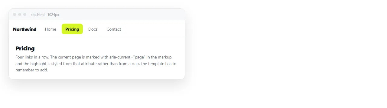
Why a list and not a row of divs
Three reasons, and they are not style preferences.
A screen reader announces "list, four items" before reading them, so the reader knows how far the bar goes. A row of divs announces nothing.
The <nav> element is a landmark, so keyboard and screen reader users can jump past it or to it in one command.
And a bare <a> inside a div gives no structural relationship between the links, so navigating by item does not work.
The HTML CSS navbar layout
nav ul {
  display: flex;
  gap: 1.25rem;
  list-style: none;
  margin: 0;
  padding: .75rem 1rem;
  align-items: center;
}
nav a { color: #b6bcc6; text-decoration: none; padding: .35rem 0; }
nav a:hover { color: #e6e8eb; }
nav a[aria-current="page"] { color: #fff; border-bottom: 2px solid #1f6feb; }
gap replaces the margin juggling that older navbars needed. It applies between items only, so there is no stray space at the ends.
To push part of the bar to the right, add margin-left: auto to the first item of the right group. That is simpler than splitting the list in two and is what flexbox is for.
Marking the current page
aria-current="page" is both the state and the styling hook.
nav a[aria-current="page"] { color: #fff; border-bottom: 2px solid #1f6feb; }
Styling from the attribute rather than a class means the two can never disagree. A class named active with no aria-current looks correct and tells assistive technology nothing.
Never remove the href from the current link. A link with no href is not focusable, so tabbing through the bar silently skips the item the reader is standing on.
The narrow screen decision
| Number of links | Under 600px | Extra code |
|---|---|---|
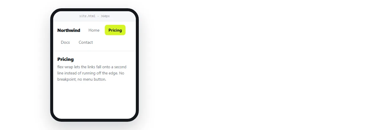
| Up to 5 short labels | Let them wrap onto two lines | One flex-wrap line |
| 5 to 7 | Horizontal scroll strip | Three lines |
| 7 or more | Disclosure button | About 10 lines |
| With sub-menus | Disclosure button | More, plus the sub-menu rules |
Start at the top of that table. A hamburger is not a requirement, it is a response to running out of room, and it costs a click plus the accessibility work every time it is used.
Shortening the labels is worth trying before any of the rows below the first. "Reports" instead of "Analytics reports" often buys enough width to keep every link visible.
The measurement that decides it is the total width of the labels at your smallest supported screen. If they fit on two lines, wrapping is the answer and the rest of the table is work you do not have to do.
Wrapping:
nav ul { flex-wrap: wrap; }
Scroll strip:
@media (max-width: 40rem) {
  nav ul { flex-wrap: nowrap; overflow-x: auto; scrollbar-width: none; }
  nav li { flex: 0 0 auto; }
}
The disclosure version
When you do need a button, it is a button, and it announces its state.
<button type="button" id="burger" aria-expanded="false" aria-controls="nav-list">Menu</button>
<ul id="nav-list" hidden> ... </ul>
var b = document.getElementById('burger'), l = document.getElementById('nav-list');
b.onclick = function () {
  var open = b.getAttribute('aria-expanded') === 'true';
  b.setAttribute('aria-expanded', String(!open));
  l.hidden = open;
};
Show the list unconditionally on wide screens so the hidden attribute only applies where the button exists:
@media (min-width: 40rem) { #nav-list[hidden] { display: flex; } }
Sub-menus hanging off a bar item are their own component, covered in dropdown menus.
The logo and the alignment split
Most bars are a mark on the left and links on the right. Two elements inside a flex container, not a grid.
<header class="bar">
  <a class="logo" href="/">Acme</a>
  <nav aria-label="Main"> ... </nav>
</header>
.bar { display: flex; align-items: center; gap: 2rem; padding: .75rem 1rem; }
.bar nav { margin-left: auto; }
Keep the logo outside the <nav>. It is a link to the home page, not a navigation item, and counting it as one makes the announced item count wrong.
If the logo is an image with no text, it needs an alt value naming the destination rather than describing the picture. "Acme home" is right and "Acme logo" is not. Alt text covers the general rule.
Touch target size
A navbar link with no vertical padding is a few pixels tall on a phone, and readers miss it.
nav a { display: inline-block; padding: .6rem .25rem; }
Roughly 44 pixels of height is the usual working minimum for a touch target. Padding is the way to get there without changing the text size, and it also widens the hover area on a laptop, which makes the bar feel less fragile.
Two things that are always worth adding
A skip link. The first focusable element on the page, visually hidden until focused, jumping to the main content.
<a class="skip" href="#main">Skip to content</a>
Without it, every keyboard user tabs through every navbar link on every page.
A landmark label. aria-label="Main" on the <nav>. If the page has two nav elements, one main and one in the footer, the label is how they are told apart. Semantic HTML covers the rest of the landmark set.
Sticking it to the top
position: sticky keeps the bar in the document flow, so the content below is not overlapped. position: fixed removes it from the flow and needs padding added to the content to compensate.
Prefer sticky. The details, including the anchor link offset problem, are in sticky headers, and the two bar layout is in fixed header and footer.
Checking it
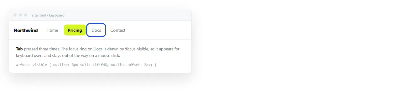
Open the file in the HTML file opener and tab through the bar. Every link should take focus with a visible ring, in the order they appear.
Narrow the window to phone width and confirm nothing is cut off at the right edge. Then paste the HTML into a NOS document so the bar renders at its own address and the reader opens a link rather than a file.